Personalized Satin Sewing Labels: Order the Right Fit
Personalized Satin Sewing labels solve a narrow problem very well: the brand detail has to look refined, stay comfortable against skin, and survive repeated handling without fraying into a cheap-looking edge. That is why personalized satin sewing labels keep showing up in boutique apparel, babywear, sleepwear, handmade goods, and soft accessories where the label is part of the product experience, not an afterthought.
Most label failures are easy to recognize once you have handled enough finished goods. The edge curls after cutting. The surface feels rough against the neck. The print softens into the background when the garment is folded. Or the label looks clean on a screen and cramped once it is reduced to actual size. Satin performs well because it sits in a practical middle ground: soft enough to wear, smooth enough for crisp printing, and polished enough to read as intentional.
The label is small, but it changes perception quickly. A one-inch sewn-in tag can make a handmade product feel like a real line. It can also make a private-label garment feel finished instead of improvised. Buyers notice that before they study the care instructions. Packaging and fabric quality matter, but the label is often the first proof that the brand understood the details.
The catch is that the best label is not the prettiest mockup. It is the one that fits the garment, the seam allowance, the wash cycle, the artwork, and the order quantity without creating production friction. People tend to skip those constraints until the quote changes or the proof starts looking tighter than expected. The technical part is the part that saves money.
Why Personalized Satin Sewing Labels Still Work for Clean Branding
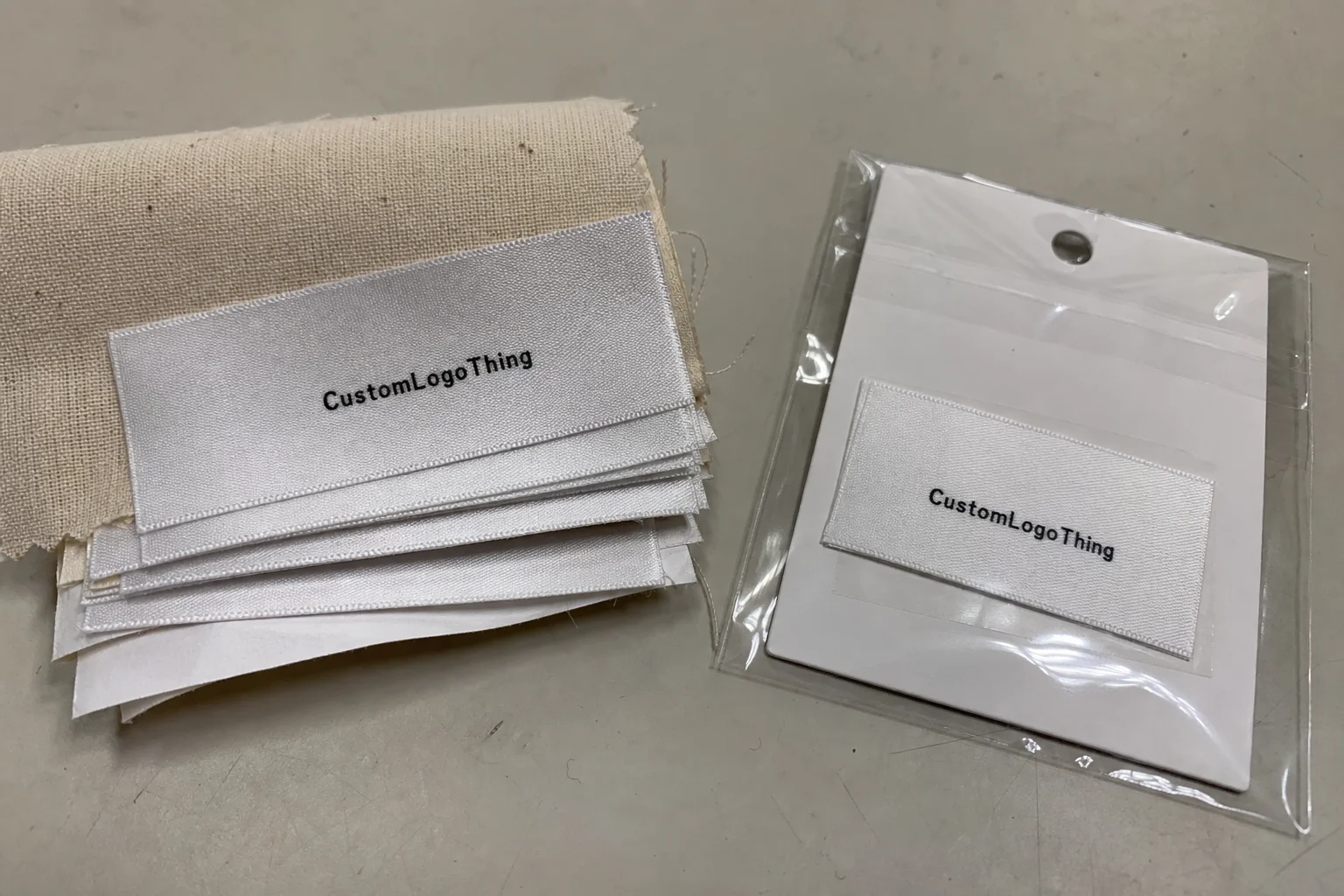
Satin earns its place because it balances softness and visibility better than many alternatives. It is smoother than a standard woven label, less industrial than a raw printed tag, and easier to read than a crowded care strip with too much information packed into too little space. For apparel branding, that balance matters more than people usually admit.
In practice, personalized satin sewing labels make the most sense for products where comfort and presentation have to coexist. Boutique tees, kidswear, loungewear, robes, scarves, and light soft goods are all common fits. If the label touches skin, the smoother face matters. If the label shows, the satin sheen gives the branding enough lift without turning it into decoration for its own sake.
They also serve brands that want a more refined finish without moving to a fully woven construction. Woven labels have texture and a traditional apparel feel. Satin gives you a cleaner printed surface and often better legibility for logos, size marks, care icons, or short product copy. That becomes important when the label has to do more than one job.
A label should support the garment, not compete with it. If it scratches, twists, or overpowers the seam, the spec is wrong even when the artwork looks good.
If you are comparing label formats, the first question is not design. It is use case. Kidswear and loungewear tend to benefit from soft, low-bulk sewn-in labels. Outerwear can tolerate a more structured tag. Accessories often need a smaller, cleaner format so the label does not hang awkwardly or distort the item.
For buyers building a small apparel program, it helps to compare sewn-in labels alongside other packaging components before locking a spec. Our Custom Labels & Tags category is useful for that comparison because it puts the label decisions in the context of the full product, not just the artwork file.
The useful standard here is simple: soft enough to wear, clear enough to brand, durable enough to keep doing both after repeated laundering. Anything else is ornamental, and ornament is not the same thing as function.
How the Label Is Built and What Buyers Actually Receive
A satin sewing label is not just a printed strip. It is a small manufacturing component built to be cut, folded, stitched, washed, and handled under real use. Buyers usually receive satin face material with branding applied by print or woven detail, then cut or finished according to the sewing method. Depending on the specification, the edges may be heat-sealed, folded inward, or trimmed for direct seam insertion.
The most common formats are single-sided and double-sided. A single-sided label carries the logo or brand name on one face, with the reverse blank or lightly finished. A double-sided label gives more room for care symbols, size, origin information, or a brief brand line. If the garment needs both identity and instructions, a double-sided layout often keeps the face cleaner.
Fold style affects how the label sits on the garment, and it matters more than first-time buyers expect. A center fold is common for seam insertion. End folds work well when the label is attached at an edge or side seam. Straight cut labels are simpler and can be cheaper, but they rely on the sewing team to finish the attachment properly. If the fold choice does not match the garment construction, the result can twist, bubble, or sit off-center.
Artwork files should be treated like production files, not presentation graphics. Tiny type, thin strokes, and low-contrast color combinations are risky on satin because the surface already reflects light and movement. A logo that looks crisp on a laptop can lose clarity fast once it is reduced to label size. That is especially true when the design includes fine legal text or detailed icons.
What buyers actually receive depends on the spec, but the component has to perform in three places at once: the sewing machine, the wash cycle, and the customer’s hand. If the label survives those three, the spec is doing its job.
For a broader packaging benchmark, the ISTA standards site is a useful reference point for thinking about how components are evaluated under shipment and handling conditions. It is not a label guide, but it reinforces the right mindset: test the item in the environment where it will live.
Material Specs That Change the Final Result
Material choices affect more than appearance. Satin can be built in different weights, finishes, and weave densities, and those variables influence drape, print sharpness, edge behavior, and tactile feel. A smoother satin with a tighter face usually gives cleaner print contrast, while a looser or glossier surface can look more reflective but may soften the edges of small text.
Texture is another detail people overlook. A label that feels too slick may slide during sewing. A label that is too thin can wrinkle or fold irregularly. Too stiff, and it starts to behave like a small plastic insert instead of a textile component. That is why the best spec is usually not the thickest one. It is the one that threads through the construction cleanly and still feels appropriate against skin.
Edge treatment also changes the outcome. Heat-sealed edges help reduce fraying, but if the seal is aggressive it can create a firmer perimeter. That may be fine for outerwear or accessories and less ideal for delicate apparel. Folded edges often feel cleaner because the raw edge is hidden, but the fold adds bulk and requires more careful alignment during sewing.
Print method matters too. Some designs need high-contrast text and logo clarity. Others need a softer look with fewer graphic demands. The more detail the artwork contains, the more important it is to confirm that the chosen print method will hold up at label size. Glossy elements, gradients, and narrow serif type deserve extra scrutiny before approval.
There is also a practical constraint that often gets missed: light-colored satin can show stitching more clearly, while darker satin can hide minor seam variation but reduce contrast for text if the print palette is weak. That tradeoff is not theoretical. It affects whether the label looks premium on the finished garment or merely acceptable on a proof.
Cost, Pricing, and MOQ: What Changes the Quote
Pricing on personalized satin sewing labels is driven mainly by five variables: size, quantity, print complexity, fold style, and finishing requirements. Change one of those and the quote can move more than expected. A longer label with more text and a more complex fold increases material usage, setup time, and the chance of rework during proofing.
The lowest price is rarely the best target. Low-volume orders carry setup cost across fewer units, so the unit price rises. Once the run gets larger, the cost per label drops because the setup is spread over more pieces. That is why a small launch can feel expensive while a recurring restock starts to look efficient.
| Order type | Typical MOQ behavior | Approx. unit cost | Best fit |
|---|---|---|---|
| Simple satin label, one color, basic fold | Lower minimums are often available, but setup is spread over fewer units | $0.18-$0.45 at small quantities | Samples, launches, short runs |
| Mid-volume run with logo and short text | Better pricing usually begins at mid-tier quantities | $0.07-$0.18 | Regular restocks, boutique apparel lines |
| Larger production run with custom finishing | Best unit economics, but proofing must be locked early | $0.05-$0.12 | Established brands, seasonal orders |
Those numbers are practical ranges, not a promise. Special folding, dense artwork, extra color work, unusual sizing, or rush schedules can move the price up quickly. Sampling can also change the economics if the buyer wants to verify feel, wash behavior, or edge quality before committing to a production run.
If the label sits inside a hidden seam, it is often worth simplifying the spec. If it is visible and part of the brand story, the premium may be justified. That is the real decision. Not whether the quote is low in isolation, but whether the label supports the product without creating hidden costs downstream.
Brands that order hangtags, inserts, or cartons at the same time should compare the full packaging plan, not just the label line item. If paper-based components are part of the order, the FSC site is a useful reference for certified paper sourcing and chain-of-custody basics.
Production Steps and Turnaround: From File to Finished Roll
The path from artwork to finished label is straightforward when the files are clean and the spec is clear. First comes file review. Then proofing. Then production. After that, the labels are cut or folded, checked, packed, and shipped. The process sounds ordinary because it should be. Reliable label production is mostly about eliminating surprises.
Simple orders move faster because there is less to resolve before approval. A clean logo, one or two lines of text, and a standard fold can usually move through proofing with limited revision. A crowded layout with tiny care copy, custom colors, and unclear seam placement takes longer because each detail has to be checked against the final use case, not just the artwork file.
Typical turnaround depends on proof approval speed and order complexity. A simple order can often move in about 7 to 12 business days after proof approval. More detailed specifications, special folding, or larger quantities often extend that to 12 to 20 business days. Shipping time sits on top of that.
Delays usually come from predictable places:
- Artwork files with missing fonts, low resolution, or broken links.
- Late changes after the proof is already built.
- Measurements that do not match the actual seam allowance.
- Color feedback that arrives after production has begun.
Lead time is not just a factory detail. It is a launch issue. If the product deadline matters, the proof needs to be reviewed quickly and accurately. If the artwork needs cleanup, that time belongs in the schedule from the start. There is no cheap shortcut around a bad proof.
Rush orders are possible in some cases, but they reduce the margin for error. If the text is too small, the fold mark is off, or the label size was guessed instead of measured, there is less time to correct it later. The risk is not abstract. It lands on the sewing line.
For quality-focused programs, it helps to ask whether the supplier has any internal wash or wear checks before release. Many apparel teams compare those results against their own laundering tests or against broader industry methods. ASTM and ISTA references are useful because they keep the conversation grounded in handling, durability, and repeatability rather than vague claims.
How to Choose the Right Size, Fold, and Artwork
Start with the garment, not the logo. The sewing location determines how much space you actually have, and the space determines what the label can safely carry. A neck seam on a small tee does not behave like a side seam on a jacket lining. Same brand, different constraints.
Size should be large enough to remain readable, but not so large that the label dominates the seam. For kidswear and smaller apparel, compact formats usually work better because they stay out of the way. For larger garments or accessories, a wider label can support more text without looking cramped. The right size is the one that fits the actual construction, not the mockup.
Fold style should follow the sewing location. A center fold works well in many neck seams. End folds are common for side seams and edge placement. Straight cut labels can be simple and economical, but only if the sewing team knows how to finish them cleanly. A fold mismatch is one of the fastest ways to turn a useful label into waste.
Artwork hierarchy matters more than decorative polish. Put the logo first. Put the brand name second. Put care, origin, or sizing information only if it genuinely belongs on the label. Tiny labels punish bad hierarchy because there is no room for extra decoration. If the brand name and care text fight each other, both lose readability.
Color contrast is another quiet problem. Dark text on a pale background usually reads best. Light text on glossy or busy satin is where legibility starts falling apart. A brand color can be technically correct and still look muddy once printed at label size. That is not a design win. It is a production mistake with a pretty file attached.
Before final approval, test the design against the garment. Tape a sample shape to the seam. Check the scale. Check the fold. Check whether the label scratches, curls, or distracts from the piece. A five-minute physical test catches more issues than a full round of optimistic email comments.
Our Custom Labels & Tags category can help compare sewn-in options against printed and folded formats before you settle on the final size and construction.
Quality Checks That Matter Before You Approve a Run
Quality control on labels sounds simple until a batch arrives and the issue is visible across every finished garment. That is why the checks that matter most are not cosmetic. They are practical. Verify the width and height against the garment seam. Confirm the fold direction. Check that the logo is centered relative to the stitch line. Then review the type size in actual final dimensions, not in design software.
One of the most useful checks is edge behavior. A label can look clean in a flat sample and still curl after handling if the finish is too aggressive or the material is too light. Another useful check is stitch visibility. The thread should not swallow the label design or create an uneven border that makes the tag look crooked. Small defects become obvious when the garment is folded or worn.
Wash durability deserves real attention. Labels that hold their color but become scratchy after laundering still fail. Labels that stay soft but fade too much also fail. Buyers rarely ask for both softness and durability in the same conversation, but the product has to deliver both if the garment is going to retain its brand feel after repeated use.
Alignment is where many otherwise decent labels get downgraded. If the fold is off by a few millimeters, the label can sit twisted in the seam. If the artwork is too close to the edge, the sewing process may crop part of it. If the spec is tight, the sample should be reviewed with a ruler, not just by eye.
If the order is large enough to matter financially, ask for a pre-production sample or a clear digital proof with dimensions marked. That extra step is not bureaucracy. It is insurance against inventory that looks correct only at a glance.
Common Ordering Mistakes That Waste Time and Money
The biggest mistake is designing for a screen instead of a one-inch piece of fabric that has to be stitched and washed. A layout that looks elegant in a desktop mockup can become unreadable the moment it is folded and scaled down. That is not a printing flaw. It is a planning error.
Another frequent problem is overcrowding. Brands want logo, size, origin, care instructions, a website, and sometimes a slogan. On a satin label, that is usually too much. Some of that belongs on a hangtag or insert. Some of it does not belong on the sewn-in label at all. The more information you force into the tag, the less useful the tag becomes.
Buyers also misjudge seam allowance. They choose a width with no room for stitching or pick a fold that does not match the garment construction. The result is a twisted or hidden label, and the fix is obvious only after the fact: measure the sewing location before placing the order.
Proofing errors create their own type of waste. Misspelled copy, reversed fold marks, a logo approved against the wrong background, or a color that looked fine in isolation but failed against the actual fabric. Those mistakes are preventable, and they are costly because they often get discovered after the order has already moved forward.
Chasing the cheapest quote can also backfire. A low price is useful only if the label is still soft enough, clear enough, and consistent enough to sew cleanly. If the tag arrives stiff, too small, or difficult to attach, the cost difference gets erased in labor, rework, or replacement inventory.
The right label usually disappears into the product until the customer looks for the brand. If it grabs attention for the wrong reasons, the spec needs work.
Expert Tips for Better Satin Label Results
Keep the hierarchy simple. Logo first. Brand name second. Extra information only if it genuinely helps the product. That formula is boring, and boring tends to print better than clever. It also survives sewing and washing more reliably than a label trying to prove how much it can fit into one square inch.
Give small text real breathing room. Microscopic type looks smart on a mockup and awkward on a finished label. There is no award for cramming legal copy into a space that was never designed to hold it. If the information matters, make it readable. If it does not matter, remove it.
Match finish to audience. Babywear and luxury basics usually benefit from a softer, quieter label. Fashion basics and elevated streetwear can tolerate a sharper branded look. That does not mean the label should be loud. It means the tag should feel like it belongs to the garment category instead of fighting it.
Ask for a sample or a proof whenever the artwork uses fine lines, gradients, or delicate typography. Those details can work, but only when they are checked at actual size. A supplier worth using will understand that request. A rushed approval process is where expensive label mistakes are born.
Design for repeated wear, not just the first unboxing moment. If the label becomes rough, curls, or fades after laundering, the brand experience gets worse each time the garment is used. Sewn-in branding should age with the item, not age against it.
If your packaging program includes cartons, mailers, or inserts, keep the label spec aligned with the rest of the brand system. A polished satin label paired with a chaotic outer package sends mixed signals. Consistency is not flashy, but it is visible.
Next Steps Before You Request a Quote
Measure the sewing location on the garment. Decide the fold style. Count the number of text lines you actually need. Those three steps eliminate most of the uncertainty before you request pricing on personalized satin sewing labels.
Then gather the file basics: logo artwork, preferred colors, target quantity, and whether the label needs care instructions, sizing, or origin text. Quotes are only useful when the specs are comparable. If one supplier is pricing a simple cut label and another is pricing a folded double-sided version, the numbers are not speaking to the same job.
Ask about setup fees, proof timing, sample options, and shipping before approving the order. If the timeline matters, get the lead time in writing. If the supplier cannot tell you whether the job takes 7 business days or 15, that is not a minor gap. It is a scheduling risk.
Review the proof against an actual garment or a serious mockup. Check spelling, contrast, label direction, and placement. Verify that the artwork is still readable at final size. That one review catches more problems than optimistic assumptions ever will.
If you want a label that looks intentional instead of generic, lock the spec first and place the order with final artwork. The fewer guesses you make up front, the fewer expensive surprises you pay for later.
Good labels do not need attention to prove they matter. They do their job quietly. That is usually the right outcome for personalized satin sewing labels: clean on the seam, legible after use, and durable enough to disappear into the product until someone looks for the brand.
FAQs
What size should personalized satin sewing labels be for clothing?
Choose the smallest size that still keeps the brand name readable. Larger garments can handle wider labels, while kidswear and neck seams usually need a compact format. Size should match seam placement and text load, not just appearance.
What affects the price of personalized satin sewing labels most?
Quantity, label size, fold style, print complexity, and color count have the biggest impact. Low-volume orders usually cost more per label because setup gets spread over fewer units. Rush timelines and custom finishing can raise the quote as well.
How long does production usually take for satin sewing labels?
Turnaround depends on proof approval, order size, and whether the design is simple or detailed. Fast approval moves the job; revisions slow it down. A common range is about 7 to 12 business days after proof approval for simple orders, with longer timelines for more complex specs.
Can personalized satin sewing labels include care instructions?
Yes, if there is enough room and the text stays readable after printing and folding. Many buyers keep care details minimal on the label and move longer instructions to a hangtag or insert. Overloading the label usually hurts legibility.
Are satin sewing labels better than woven labels?
Satin usually gives a softer hand feel and a smoother surface for a polished look. Woven labels can be better when the brand wants more texture or a traditional apparel-label feel. The right choice depends on garment type, branding style, and whether comfort matters more than texture.
What should I check before approving the proof?
Check size, fold direction, text spelling, contrast, and placement against the seam allowance. It also helps to view the proof beside the actual garment color, since satin sheen can change how colors read once printed at final size.