Personalized wine label stickers can make an ordinary bottle feel deliberate, polished, and memorable without changing what is inside. That is the real appeal: the bottle keeps the same wine, but the presentation starts to feel like a gift, a keepsake, or a finished brand piece instead of a generic package.
For buyers, the attraction is practical as much as visual. You get a custom look without committing to a fully printed bottle or a large inventory gamble, which matters for weddings, seasonal promotions, private-label trials, and short-run events where the timeline is tight and the quantity is modest.
What personalized wine label stickers are and why they stand out
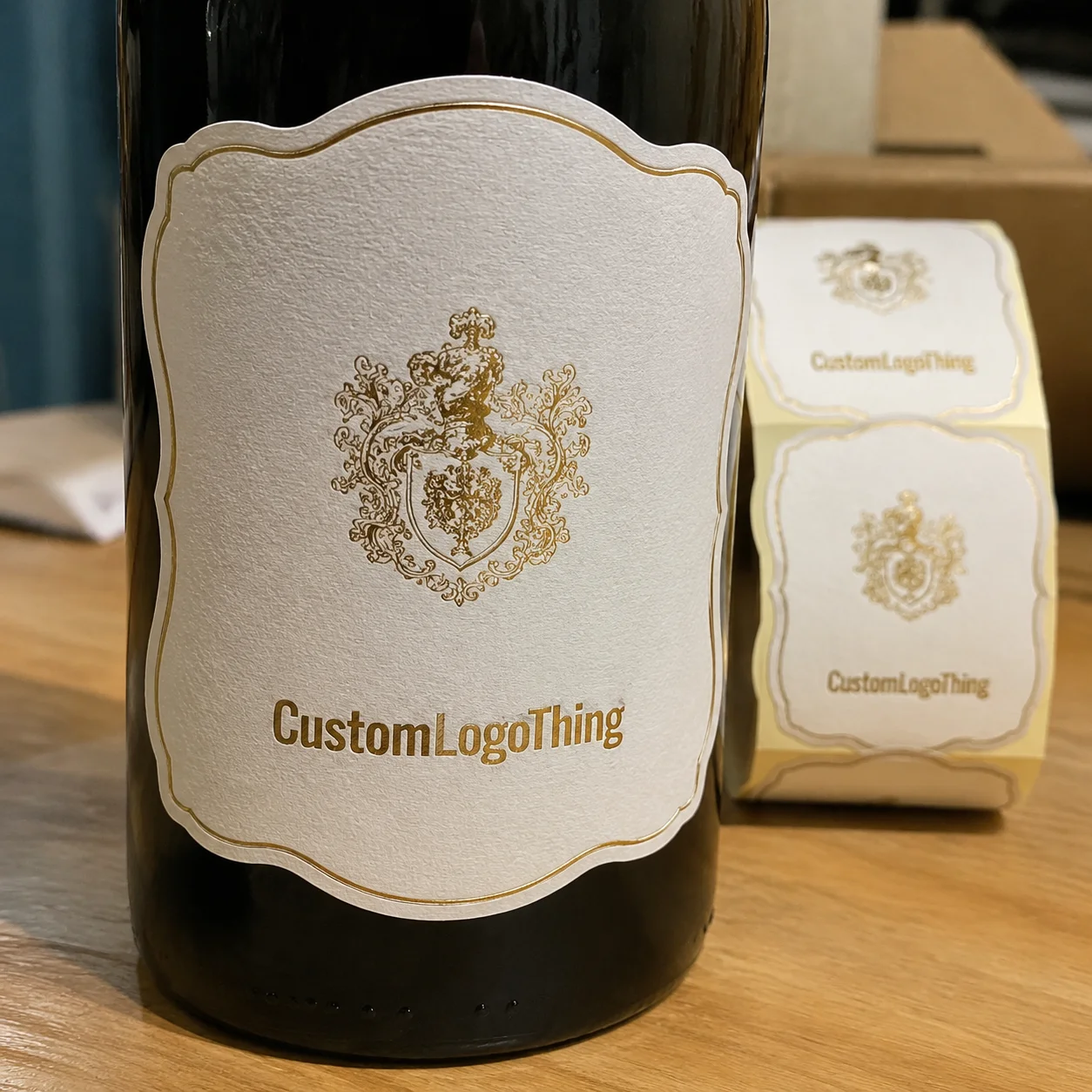
Personalized wine label stickers are adhesive labels designed for wine bottles, usually printed as front labels, back labels, neck labels, or coordinated sets. They can carry a name, date, logo, event message, or product details, and they are often built around the exact bottle dimensions so the label lands cleanly on glass instead of fighting the shape of the container.
They stand out because they sit in a useful middle ground. Compared with hang tags, they feel integrated. Compared with direct bottle printing, they are easier to produce in small quantities and much simpler to revise. Compared with plain stock labels, they let you control the message, finish, and tone with much more precision.
That flexibility is why they show up so often in gifting and short-run packaging. A wedding bottle usually needs elegance and quick readability from a few feet away. A tasting-room bottle may need more brand presence and a finish that still looks clean after chilling. A corporate gift may need to feel restrained rather than promotional. The same label format can support all three, but not with the same material or design approach.
In practice, they are used for:
- Weddings and anniversaries where the bottle becomes part of the table setting or gift bag.
- Corporate gifts that need a custom touch without looking overly commercial.
- Seasonal and tasting-room releases with small quantities and specific launch dates.
- Private-label testing when a brand wants to trial a design before scaling up.
- Celebration bottles for birthdays, retirements, showers, and milestone events.
The label should match the use case. A bottle that will sit on a reception table all evening needs a different construction than one that will be packed cold, shipped, or opened after a few months in retail display. That sounds obvious, but many label problems begin when the artwork is approved before the handling conditions are fully defined.
How the label production process and timeline works
Most custom label jobs move through the same basic stages: artwork review, proofing, material selection, printing, finishing, cutting, and packing. The order is familiar, but the details matter because a label that looks clean on screen can behave very differently once it is applied to curved glass, exposed to condensation, or handled repeatedly.
The proof is the first serious checkpoint. A good proof should show the actual label size, bleed, safe area, and die line, not just a pretty mockup. If the bottle tapers at the shoulder or narrows at the neck, the flat design may need to be adjusted so text does not crowd the curve. Fine type, thin rules, and small logos can disappear faster than expected once the label is wrapped onto a real container.
Production speed depends on the print method and finish. Digital printing is often the fastest route for short runs and variable artwork. Flexographic and offset processes can be more efficient at larger volumes, but the setup is heavier. Special finishes such as foil, embossing, or spot UV add extra handling and sometimes curing time. Custom die shapes also lengthen the schedule because cutting has to be aligned carefully with the printed sheet or roll.
A realistic timeline for many orders looks like this:
- Artwork review and proofing: 1-3 business days if the file is clean and complete.
- Standard production: often 5-10 business days after proof approval.
- Special finishes or custom shapes: usually add several more days.
- Rush service: possible on some jobs, but only when the spec is simple and press time is available.
Shipping is the last step, yet it can become the real constraint if an event date is fixed and approval takes too long. For that reason, buyers who need personalized wine label stickers for a launch or celebration should build in time for at least one revision round. A clean approval process matters more than many people expect because one overlooked date, typo, or color shift can push the whole schedule back.
If you want a broader packaging reference for material and structure thinking, the Flexible Packaging Association is a useful industry resource for understanding how substrates and constructions influence converting decisions.
Cost, pricing, and MOQ factors that change your quote
Pricing usually comes down to five variables: quantity, size, substrate, adhesive, and finishing. Once those are set, the quote becomes much easier to interpret because you can see whether you are paying for basic decoration or for a more durable, premium build.
Minimum order quantity has a bigger effect than many buyers expect. A short run may look expensive on a per-label basis because setup, proofing, and cutting are spread across fewer pieces. At higher quantities, the unit cost drops because those fixed costs are distributed more efficiently. That is why 100 labels and 5,000 labels can come back with very different pricing structures even when the artwork is the same.
Here is a practical view of how common options compare:
| Option | Typical Use | Relative Cost | Notes |
|---|---|---|---|
| Paper label with standard adhesive | Events, gifts, short display life | Lower | Best for dry handling and limited refrigeration |
| BOPP film label | Chilled bottles, retail, handling | Moderate | Better moisture resistance and scuff resistance |
| Clear film with specialty finish | Premium releases, sleek branding | Higher | Creates a clean look on glass when the design is well controlled |
| Textured stock with foil or spot UV | Luxury gifts, high-end packaging | Highest | More tactile, but slower and more expensive to produce |
For planning purposes, many standard runs land somewhere around $0.18-$0.45 per label at moderate quantities, with premium builds moving higher depending on size, coverage, and embellishment. That range is not universal, but it is a useful starting point for budget discussions. Specialty shapes, multiple SKUs, serialized names, and split shipping can shift the final number more than a small change in artwork ever will.
Revision time also has a cost. If the design needs multiple proof rounds, individualized names, or careful typography adjustments, that work should be scheduled into the job rather than treated as a last-minute favor. A clear spec sheet is one of the easiest ways to protect both price and timeline.
Material, adhesive, and finish choices that affect performance
Material selection is where a good label becomes reliable or starts creating problems. Wine bottles are handled, boxed, chilled, and sometimes carried through humid spaces, so the face stock and adhesive need to match the real environment instead of just looking good in a mockup.
Paper stocks are still common for gifting, indoor display, and controlled conditions. They print cleanly and can feel refined, especially on a wedding or celebration bottle. The limitation shows up when the bottle is chilled or moved through moisture. In those cases, film stocks such as BOPP generally hold up better against condensation and scuffing.
Clear film is worth considering when you want the bottle itself to remain visible and the branding to feel lighter. White film is the safer choice when readability matters more than glass exposure. Textured paper can add warmth and a more traditional feel, though it usually makes the label less forgiving if the artwork is dense or the typography is too fine.
Adhesive choice matters just as much. Permanent adhesive is appropriate for retail bottles, long display life, and packages that need to stay put through handling and cold storage. Removable adhesive has a place on keepsake bottles, wedding favors, and short-term promotions where the label may be peeled away later. Removable does not mean weak, and permanent does not mean right for every surface. The bottle finish, condensation level, and storage time all need to be considered together.
Finish changes both appearance and legibility. Gloss gives brighter color and a sharper shelf presence. Matte and satin reduce glare, which can make type easier to read. Foil creates a premium accent, but too much metallic coverage can overwhelm the layout. Spot UV can draw attention to a logo or name, although it works best when the base design has enough contrast for the effect to stand out.
If the bottles will be refrigerated or iced, ask specifically about moisture resistance, edge lift, and scuff performance. A label that starts curling at the corners after 20 or 30 minutes in condensation does not hold a premium impression for long. It is better to choose a construction that can tolerate the intended use than to rely on a pretty surface treatment and hope for the best.
For environmental or sourcing questions, the FSC site is useful if you need to understand responsibly sourced paper options and what certification does, and does not, mean for packaging purchases.
Step-by-step guide to ordering personalized labels confidently
The cleanest order starts with the bottle, not the artwork. Measure the label panel, note the taper, and decide exactly where the label should sit on the glass. A tall, narrow design may look elegant, but if the shoulder pinches the available space, the artwork can end up cramped or awkward once it is applied.
- Measure the bottle carefully. Capture the flat panel, diameter, and any taper so the label matches the actual container.
- Define the use case. Gift, event, retail, and cold storage each call for different substrate and adhesive choices.
- Choose the format. Decide whether you need a front label only or a set with neck and back labels.
- Prepare the file correctly. Include bleed, safe zones, and outlined fonts when the supplier requests them.
- Review the proof slowly. Check spelling, dates, small type, QR codes, and edge spacing.
- Confirm timing and quantity. Make sure production, packing, and delivery fit the event or launch window.
If the job includes fine type, metallic ink, or personalized names, a sample or press proof is worth requesting. Catching a spacing issue before a full run is far easier than discovering it after the labels are cut. Careful proofing also protects the bottle’s presentation because the label has to read cleanly from arm’s length and still hold up under a closer look.
For buyers coordinating multiple package pieces, it can help to treat the label as one part of the bottle presentation rather than a standalone item. If there are matching hang tags or secondary labels involved, consistency in typography, color, and finish matters more than trying to make every element do something different.
Common mistakes that weaken the final presentation
The most common mistake is designing for a flat rectangle instead of a curved bottle. Artwork can look balanced on screen and still feel crowded once it wraps around glass. Small text is especially vulnerable here. If the type is already thin, the label can start to look busy or difficult to read from a few feet away.
Another frequent problem is choosing the wrong adhesive for a chilled environment. If the bottle will be stored cold, condensation can challenge edge adhesion quickly. Once the corners lift, the label loses the polished look that made it appealing in the first place.
People also underestimate moisture. Paper can work very well in the right setting, but if the bottle will be iced, handled by guests with wet hands, or shipped through humid conditions, a film construction usually performs better. The same logic applies to scuffing during transport and gift-bag handling.
Overdesign is another easy trap. Too many fonts, too much foil, or too many tiny decorative elements can make the label feel less refined rather than more premium. Strong hierarchy and a restrained layout usually outperform a crowded design with several competing effects.
A polished bottle usually comes from restraint: the right material, a clean layout, and a few details that feel intentional instead of piled on.
Expert tips for a sharper custom wine label result
Start with contrast. If the brand name, event, or gift message is the main point, it should be visible immediately, even from across a room. Large type, clear spacing, and a disciplined information hierarchy do more for the package than a long list of visual effects.
Match the label to the bottle shape and glass color. Dark glass can support lighter accents and metallic details well, while clear glass often works best with a cleaner, more minimal layout. A label that respects the bottle’s proportions usually looks more expensive because it seems built for that container, not pasted onto it.
Keep premium touches selective. One foil accent, one soft-touch finish, or one embossed-style element can feel refined. Three or four effects at once usually begin to compete. From a buyer’s perspective, restraint also helps hold down Cost and Lead Time.
Use specs where they matter. If the bottles will travel with other goods, ask about shipping and handling expectations. If refrigeration is involved, confirm moisture resistance. If the project includes serialized names or lot details, make sure every variable is checked before release. The label should be planned for the conditions it will actually face, not the conditions that look best on a proof.
Personalized wine label stickers work best when the production details are treated with the same care as the artwork. That means measuring accurately, choosing materials for the right environment, and giving the proof a slower look than most buyers think they need.
Next steps to spec and order the right label
Start by measuring the bottle and deciding how the label will be used. A chilled retail bottle, a wedding favor, and a short-term tasting-room promotion do not need the same adhesive or stock, even if the artwork looks similar on screen.
Then gather the artwork, preferred finish, and quantity range. If you can provide a realistic delivery date, bottle dimensions, and the intended environment, a supplier can usually recommend a tighter build and quote more accurately. That conversation should also clarify whether a standard die shape will work or whether a custom cut is needed.
It helps to compare two or three material choices against the actual use case rather than against the prettiest option alone. Matte paper may look refined, but BOPP may be the safer choice if the bottles will be cold. Clear film may feel premium, but textured stock may be better for a more tactile gift presentation.
Before production starts, review the proof one more time. Check spacing, spelling, and finish callouts, then confirm the timeline. That is usually the point where the job either moves smoothly or starts collecting avoidable revisions.
Done well, personalized wine label stickers give a bottle a polished, memorable presence without overcomplicating the packaging. When the material, adhesive, and artwork all line up with the real use case, the result feels intentional from the first glance to the last pour.
FAQs
What size should personalized wine label stickers be for a standard bottle?
Measure the flat label area on the bottle before designing, then leave room for the curve of the glass. Bordeaux and Burgundy-style bottles often need different proportions, and keeping the key text centered helps it read cleanly after application.
Are personalized wine label stickers waterproof for chilled bottles?
Many film stocks and coated papers handle moisture better than uncoated paper. A moisture-resistant finish plus the right adhesive helps the label stay in place during refrigeration and condensation, but you should always ask for the exact performance spec if the bottles will be iced.
How much do personalized wine label stickers usually cost?
Price depends mainly on quantity, size, material, finish, and print complexity. Higher quantities usually lower the unit cost, while specialty finishes and custom shapes raise it, so the fastest estimate comes from deciding the bottle count, label dimensions, and finish level first.
Can I use personalized wine label stickers for gifts and weddings?
Yes, they are commonly used for weddings, anniversaries, showers, and corporate gifting. A short, strong message and a clean layout usually work better than dense copy, and removable adhesive can help if the label should come off after the event.
How far in advance should I order personalized wine label stickers?
Order early enough to cover proofing, revisions, production, and shipping. Custom shapes, specialty finishes, and larger quantities usually need more lead time, and it is smart to add extra buffer if your event date is fixed because artwork changes can extend the schedule.