Buyer Fit Snapshot
| Best fit | printed boxes comparison for packaging buyers comparing material specs, print proof, MOQ, unit cost, freight, and repeat-order risk where brand print, material, artwork control, and repeat-order consistency matter. |
|---|---|
| Quote inputs | Share finished size, material target, print colors, finish, packing count, annual reorder estimate, and delivery region. |
| Proofing check | Approve dieline scale, logo placement, barcode or warning zones, color tolerance, and any recyclable or compostable wording before bulk production. |
| Main risk | Vague material claims, crowded artwork, or missing packing details can create delays even when the unit price looks attractive. |
Fast answer: Printed Boxes Comparison: Costs, Quality, and Timing should be specified like a repeatable production item. The safest quote includes material, print method, finish, artwork proof, carton packing, and reorder notes in one written spec.
What to confirm before approving the packaging proof
Check the product dimensions against the actual filled item, not only the sales mockup. Ask for tolerance on folds, seals, hang holes, label areas, and retail display edges. If the package carries a logo, QR code, warning copy, or legal claim, reserve that space before decorative graphics fill the panel.
How to compare quotes without losing quality
Compare board or film grade, print process, finish, sampling route, tooling charges, carton quantity, and freight assumptions side by side. A lower quote is only useful if the supplier can repeat the same color, closure quality, and packing count on the next order.
Printed Boxes Comparison: Costs, Quality, and Timing
A printed boxes comparison can look straightforward on paper and still go sideways once production starts. Two quotes may land within a few cents of each other, yet the printed boxes comparison that actually matters will show differences in board grade, coating, print method, freight, and reorder consistency before a single carton is ordered. That gap matters because packaging is not decoration alone; it protects the product, supports shelf presence, and quietly shapes a cost line that gets expensive fast when the spec is vague.
From a packaging buyer's point of view, the problem is usually not choosing the "wrong" box style. It is comparing boxes that were never built on the same assumptions. One supplier may quote lighter board, another may include a finish that improves scuff resistance, and a third may tuck freight or setup charges into separate line items. A strong printed boxes comparison keeps those variables in view so you can judge the real tradeoff between brand impact, damage risk, and total landed cost.
I have seen plenty of projects where the lowest number looked great right up until the samples arrived. Then the board curled, the color shifted on the stock, or the inserts were packed in a way that made receiving a pain. That is why a careful printed boxes comparison is less about chasing the cheapest quote and more about matching the box to the job it has to do.
Printed Boxes Comparison: What You're Really Comparing
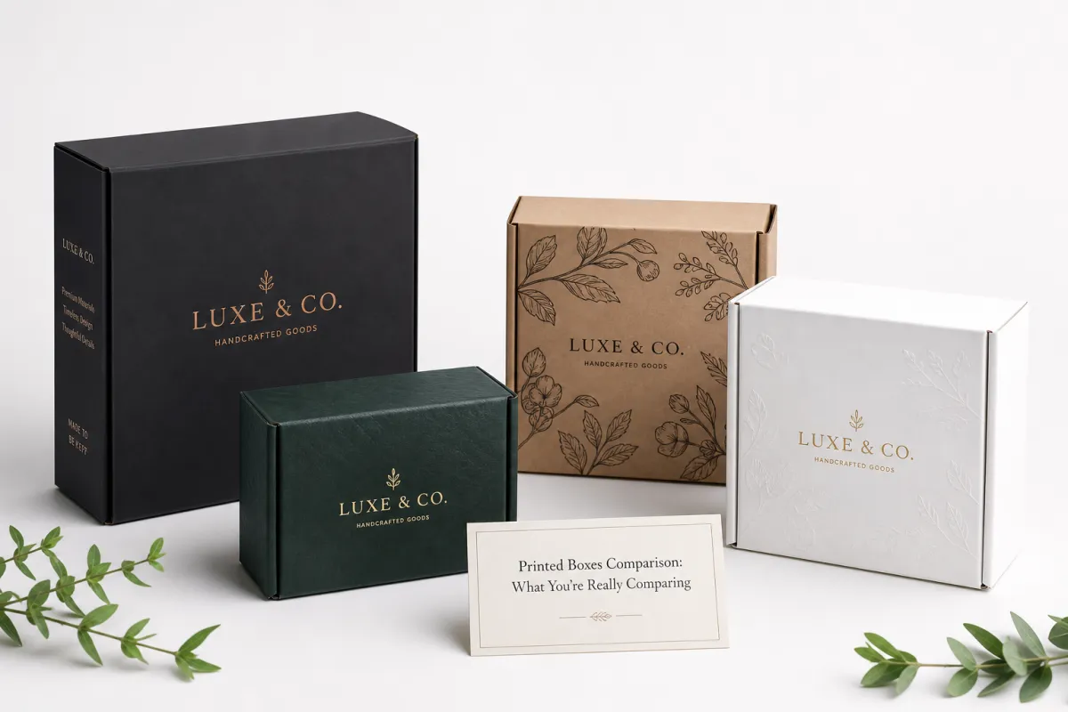
A printed boxes comparison starts with a hard truth: two boxes can look nearly identical online and still behave very differently on shelf, in transit, and at checkout. A glossy render does not tell you whether the ink will hold density on kraft board, whether the structure will crush in a mixed freight lane, or whether the box will arrive flat in a pack count that fits your warehouse. That is why the first layer of any printed boxes comparison should move beyond artwork and into the physical build.
The scorecard needs a few basics at minimum: board grade, print method, coating, structural strength, minimum order quantity, and reorder consistency. Those details get ignored because they sound technical, yet they decide whether the box protects the product and whether the next purchase matches the first. A useful printed boxes comparison also includes inside dimensions, caliper or flute profile, color expectations, and whether inserts or partitions are needed to keep the product safe in transit.
Buyers often misread packaging because the cheapest quote can hide cost somewhere else. A lower unit price may come with heavier shipping charges, slow setup, a plate or tooling fee, or weaker ink coverage that makes premium branding look flat. Ecommerce brands feel that pain quickly because the outer carton often becomes the first physical touchpoint. Retail brands feel it too, since the box may have only a second or two to earn attention on a crowded shelf. In either setting, a printed boxes comparison should answer one question first: does this package do the job without creating extra friction?
The best frame is simple. Do not hunt for the fanciest box on the supplier list. Hunt for the best fit across three things: product protection, brand presentation, and total landed cost. A box that saves ten cents on the quote but adds breakage, repacking, or slower line speed is not a win. The strongest printed boxes comparison looks at the full path from warehouse to customer, not just the sample in your hand.
"The proof looked fine. The real test was the shipper: one carton style packed faster, stacked cleaner, and still protected the product after a rough route." That is the kind of comment that usually follows a careful printed boxes comparison.
How Printed Boxes Comparison Works in Practice
A practical printed boxes comparison begins with one clean spec sheet. Share the box dimensions, the finished product weight, the branding goal, the quantity, and the required delivery date. Then ask each supplier to quote against the same information. If one vendor is pricing a 24-point paperboard mailer and another is quoting an E-flute corrugated shipper, you are not comparing the same thing even if the artwork is identical. That sounds obvious, yet it is one of the most common reasons printed boxes comparison shopping goes sideways.
The next step is print method, and this shifts the final result more than many buyers expect. Digital printing is often the most flexible choice for short runs, variable artwork, and faster setup. Offset printing can deliver sharper premium graphics at higher volumes, especially on coated paperboard where fine type and solid color blocks matter. Flexographic printing often wins on efficiency for simpler graphics and larger corrugated orders. In a real printed boxes comparison, the best method is not the one with the most impressive name; it is the one that fits the artwork, quantity, and deadline.
Proofing deserves more attention than it usually gets. A digital proof checks layout, copy, and the basic color expectation on screen or on paper. A hard sample answers different questions: does the structure fold correctly, does the product fit, does the finish feel right, and does the print hold up on the actual substrate? A production sample is even more valuable because it shows what the line will truly produce. If the job is delicate or the brand is sensitive to color drift, ask for a sample that reflects the actual board and coating rather than an abstract mockup. That step can change the printed boxes comparison immediately, because what looks polished on a monitor may print dull on a porous stock.
Logistics belongs in the comparison too. Ask how many boxes are packed per carton, how many cartons sit on a pallet, whether the order ships flat or assembled, and whether inserts are packed separately. Those details affect freight class, warehouse handling, and the time it takes for your team to receive usable packaging. A printed boxes comparison that ignores logistics is incomplete, because a cheap box that arrives in awkward pack counts can be slower to receive and harder to store.
If you want an industry yardstick for transit testing, the ISTA test methods are a useful reference point. For recycled content and responsible sourcing questions, the FSC standards site is worth reviewing before you lock in a material choice. Those references do not replace a supplier quote, but they make a printed boxes comparison more grounded.
Printed Boxes Comparison: Cost, Materials, and Print Methods
Cost is the most visible part of a printed boxes comparison, but it is also the easiest part to misunderstand. Unit price matters, yet it is only one piece of the bill. Board stock, print coverage, finishing, tooling or plates, setup charges, shipping, and storage all shape the real number. A supplier quoting $0.29 per unit may look cheaper than a supplier quoting $0.36, but that gap disappears fast if the first quote excludes freight or requires higher waste rates during setup. The smartest printed boxes comparison looks at cost per usable box, not just cost per printed blank.
Material choice shifts price and performance at the same time. Corrugated board is the workhorse for shipping and protection. SBS paperboard gives a cleaner print surface and often supports a premium retail feel. Kraft boards can support a natural, honest aesthetic, but print coverage may look different from coated white stock. Specialty stocks can work well for high-touch presentation, yet they can also increase lead time and scrap. A printed boxes comparison should ask not only "What does it cost?" but also "What does this board do for the customer experience and the shipping lane?"
Finishes can move the cost curve faster than people expect. Aqueous coating is common because it adds some protection without pushing the budget too hard. Matte and gloss varnishes alter the look and abrasion resistance. Soft-touch lamination gives a quieter, velvety feel, but it adds cost and can slow production. Foil and spot UV can create a strong premium signal, yet they also require tighter registration and more careful handling. In a printed boxes comparison, every added finish should earn its place by supporting the brand or improving durability. If it does not help the carton do its job, it is probably extra.
The table below shows a simple way to compare common options in a printed boxes comparison. The numbers are typical planning ranges for mid-volume orders, not universal prices. Even so, they help buyers see how materials and methods push the quote in different directions.
| Option | Typical unit cost | Best use | Setup or tooling | Typical lead time |
|---|---|---|---|---|
| Digital printed folding carton | $0.45-$0.95 | Short runs, artwork changes, fast testing | Low to none | 7-12 business days |
| Offset printed paperboard carton | $0.30-$0.70 | Sharper premium graphics at scale | $250-$800 for plates and setup | 12-18 business days |
| Flexographic corrugated box | $0.22-$0.48 | Simple artwork, larger shipping runs | $150-$500 for plates | 8-14 business days |
| Specialty rigid style box | $1.10-$3.50 | Gift sets, high-end retail, presentation boxes | Higher dieline and assembly labor | 15-25 business days |
Those ranges show why a printed boxes comparison cannot stop at the lowest headline number. A $0.22 corrugated quote may be perfect for a subscription shipper, while a $0.95 digital carton may be the better choice for a launch that needs 300 units and a specific graphic change. Quantity matters too. At 500 pieces, setup burden is spread across fewer boxes, so the unit price climbs. At 5,000 or more, the quoted price often becomes more efficient, especially on offset or flexo runs. That is where a printed boxes comparison becomes a planning tool, not just a procurement exercise.
There is also a print-quality side to the story. Digital tends to work well for shorter runs because it avoids many traditional setup costs and handles artwork updates quickly. Offset usually produces richer detail and stronger color control at volume, especially on smoother stocks. Flexographic printing is often chosen for speed and efficiency on corrugated packaging, though the artwork style should match the process. If your design uses tiny reversed type, subtle gradients, or large color fields, those details should be tested during the printed boxes comparison rather than after the order is approved.
One more point: total landed cost should include waste. If a supplier needs extra overruns, adds high freight charges, or has a pattern of late shipments that force emergency replenishment, the real cost rises. A printed boxes comparison that ignores waste can overstate the cheaper option by a meaningful margin. Even a small difference of six or eight cents per carton can become a serious line item over thousands of units, especially once freight and damage are added.
Step-by-Step Printed Boxes Comparison Process and Timeline
A structured printed boxes comparison keeps the project moving and reduces surprises. Start with a precise brief: product dimensions, target retail channel, protection needs, annual or launch quantity, and any brand standards that cannot change. If the box must fit a shelf tray, survive parcel handling, or match an existing product line, say that up front. The clearer the brief, the cleaner the quotes. A good supplier can still make suggestions, but the starting point should be consistent across every option in the printed boxes comparison.
After the brief, map the workflow from quote to delivery. A typical path includes specification review, art adjustment, proof approval, sampling, production, finishing, quality check, and shipping. Each step can add or save time. A digital short run might move quickly if the file is clean and the dimensions are standard. A more complex printed boxes comparison, especially one involving custom inserts or special coatings, usually needs more lead time because each extra variable must be checked before the press runs.
Delays usually come from the same places. Late dieline changes are one. Color approval loops are another. If the customer keeps shifting between matte and soft-touch, the comparison becomes harder to finalize because the tactile feel changes the perceived brand value. Custom inserts also slow things down because they often have their own tooling, fit checks, and packing sequence. Freight coordination can create another bottleneck, especially if the cartons are bulky or the order needs staged delivery. A printed boxes comparison should therefore include timing notes, not just quote numbers.
Realistic planning helps. Short-run digital projects often move from proof approval to delivery in a short window if the art is stable and no special tooling is needed. Larger or more complex printed box orders can take longer, especially if the supplier must coordinate plates, coating, testing, and freight. For buyers, the key question is not "How fast can it be made?" but "How much time should be reserved so there is room for proof corrections and one round of surprises?" That mindset usually produces a more accurate printed boxes comparison.
Testing is worth a dedicated step if the packaging will travel. Distribution testing can reveal more than a mockup ever will. If the shipment is fragile, ask whether the package was evaluated under ISTA protocols or a comparable transit test rather than only under visual inspection. A carton that survives compression, vibration, and drop tests is a different packaging choice than one that merely photographs well. A serious printed boxes comparison should treat testing as part of the proof, not an optional extra.
For buyers building a broader packaging lineup, it can help to compare structure families alongside print options. That is where Custom Packaging Products can be a useful starting point, because you can review different formats before you narrow your printed boxes comparison to one final style.
Common Mistakes in a Printed Boxes Comparison
The first mistake is comparing quotes without comparing specs. If one supplier quotes a lighter board, a simpler coating, or a smaller print area, the lower price is not really lower. It is just different. A printed boxes comparison only works if the dimensions, material, print coverage, and finish level are aligned. Otherwise, the decision is built on false equivalence, and that is how buyers end up purchasing packaging that misses the mark in use.
The second mistake is ignoring unboxing and shelf impact. Packaging often acts like a silent salesperson. In ecommerce, the box is the first physical brand moment. In retail, the graphics have to carry the message before a shopper picks the product up. A printed boxes comparison that focuses only on cost can miss a strong branding opportunity. That does not mean overdesigning the box. It means understanding that a well-chosen carton can support conversion, reinforce quality, and reduce the need for extra marketing inside the pack.
The third mistake is skipping sample testing. A screen mockup does not tell you if the flaps close cleanly, if the board bends at the score line, or if the print scuffs in the packout process. A decent printed boxes comparison should include a fit check, a crush test, and a color check on the actual stock. If a carton fails one of those tests, it is better to learn that before the full run than after pallets have been shipped.
The fourth mistake is forgetting about reorder reality. A box that is easy to buy once may be harder to repeat later if the artwork files are not organized, the coatings are special order, or the supplier's capacity changes. A good printed boxes comparison should ask how the box will be reordered in six months or a year. Can the same artwork be reproduced? Will the same paper or corrugated grade still be available? Will a second run match the first run closely enough to avoid brand drift?
Another mistake is focusing only on unit economics and ignoring process speed. If the box slows packing, creates damage, or needs more labor at fulfillment, the savings vanish. A printed boxes comparison should include operational friction. Even a small change in pack-out speed can matter if the order volume is large or the warehouse is busy. Buyers who think through labor, freight, and damage rates tend to make stronger packaging choices. That part is kinda unglamorous, but it is where a lot of the real money sits.
Expert Tips for Sharper Printed Boxes Comparison Decisions
Ask every supplier for an apples-to-apples matrix. Keep the same rows across all quotes: material, board thickness or flute profile, print method, coating, finishing, lead time, MOQ, pack counts, and freight terms. That format makes a printed boxes comparison much easier to read because the hidden assumptions move into plain sight. It also reduces the chance that a vendor wins simply because its quote format is cleaner.
Request both a digital mockup and a physical sample if the budget allows. Screen color is only a starting point. Ink absorbs differently on SBS, kraft, and corrugated stock, and finishing changes the final feel even more. A sample can also show whether the glue line looks tidy, whether the scores hold, and whether the box opens in a way that suits your team. In a printed boxes comparison, physical evidence is far more persuasive than a polished render.
Use total cost, not just quote cost. That means adding freight, waste, rework risk, and the labor impact of a slower pack line. It can even mean accounting for fewer returns if the packaging protects fragile items better. A box that costs five or six cents more can still be the better decision if it lowers breakage or improves shelf conversion. That is a real packaging buyer's lesson, and it shows up again and again in printed boxes comparison work.
Build in flexibility for the next run. If your volumes may rise, ask whether the design can move to a lower-cost finish later without changing the core structure. If seasonal artwork is likely, confirm how quickly the supplier can swap print files and whether the board choice stays stable across reorders. A printed boxes comparison should not only answer the immediate project; it should also leave room for the next one.
One more practical tip: keep a simple decision note after every comparison. Write down what won, why it won, what the tradeoffs were, and what should be checked on the next reorder. That record becomes a powerful internal reference. After two or three jobs, the printed boxes comparison stops being guesswork and starts becoming a repeatable buying process.
Next Steps After Your Printed Boxes Comparison
Once the quotes are in, turn your notes into a decision sheet. Rank each option by cost, quality, lead time, branding impact, and risk. Keep the scoring simple. A five-point scale is usually enough, because the goal is to compare tradeoffs clearly rather than create a false sense of precision. In a printed boxes comparison, clarity beats complexity every time.
Then narrow the field to two or three suppliers and ask for final samples, revised quotes, and a confirmed production schedule. At that stage, the real questions are practical: can they hit the deadline, can they hold the standard, and can they repeat the result on reorder? If one supplier is slightly more expensive but clearly better on fit or consistency, that may be the better long-term choice. If another is faster and good enough for a launch test, that may be the right temporary answer. A thoughtful printed boxes comparison leaves room for those distinctions.
It also helps to keep one backup option ready. Packaging schedules slip. Paperboard availability changes. Freight can get messy. A second approved source gives you a path forward without restarting the printed boxes comparison from scratch. That can matter a great deal for seasonal products, promotions, and launch programs where delay has a visible cost.
Before you close the project, document the final spec in one place: dimensions, material, coating, print files, proof date, sample approval, carton count, pallet pattern, and reorder notes. Next time, you will have a stronger baseline. That is how a printed boxes comparison stops being a one-off task and becomes part of a cleaner packaging buying system. Do that, and the next comparison will be faster to run, easier to defend, and less likely to produce a surprise on the dock.
Frequently Asked Questions About Printed Boxes Comparison
What should I compare first in printed boxes comparison shopping?
Start with box size, board type, and print method, because those three choices drive protection, appearance, and price more than almost anything else. Then compare minimum order quantity, lead time, and freight so you can see which quote fits your inventory plan. A printed boxes comparison is most useful when those core variables are matched before you look at the quote total.
How do I compare printed boxes pricing accurately?
Use total landed cost instead of unit price alone. That means adding setup charges, finishing, freight, waste, and any proofing costs that are not included in the first quote. Make sure every supplier is quoting the same dimensions, material, print coverage, and finish level. If one quote looks much lower, check whether it excludes tooling, delivery, or a required proof step. A careful printed boxes comparison exposes those gaps early.
Which print method is best for short-run printed boxes?
Digital printing is often the most practical choice for short runs because it avoids many setup costs and can handle artwork changes faster. Offset can still make sense if you need premium detail and the quantity is large enough to absorb setup costs. Flexographic is usually strongest when you need efficiency on simpler artwork and larger volumes. The right answer depends on the artwork, the substrate, and the schedule, so a printed boxes comparison should test all three against the same brief.
How long does a printed boxes comparison and production cycle take?
A simple digital project may move from quote to delivery in a short window if the file is ready and no custom tooling is needed. More complex orders often take longer because of sampling, approvals, finishing, and freight planning. The safest approach is to leave room for proof revisions before you commit to a launch date. A printed boxes comparison that includes time buffers usually produces fewer surprises later.
What questions should I ask a supplier before ordering printed boxes?
Ask what material, print method, coating, and finishing are included in the quote. Confirm the exact lead time, proof process, minimum order quantity, and whether reorders will match the first run. Request a sample or mockup and ask how the packaging is packed for shipping so you can avoid damage surprises. If you document those answers, your printed boxes comparison becomes a practical buying tool instead of a rough estimate.
How do I know if a printed boxes comparison is strong enough to approve?
It is strong enough when the quotes are based on the same structure, the samples match the intended use, and the supplier can explain the tradeoffs without hiding key costs. If you can identify the material, finish, lead time, freight method, and reorder path for each option, you are in good shape. A final printed boxes comparison should leave you confident about fit, Cost, and Timing, not just impressed by the artwork.
If you document the spec, sample, lead time, freight terms, and reorder notes, your next printed boxes comparison starts with better data and fewer surprises.