Buyer Fit Snapshot
| Best fit | CMYK Printed Mailer Boxes projects where brand print, material claims, artwork control, MOQ, and repeat-order consistency need to be specified before quoting. |
|---|---|
| Quote inputs | Share finished size, material target, print colors, finish, packing count, annual reorder estimate, ship-to region, and any compliance wording. |
| Proofing check | Approve dieline scale, logo placement, barcode or warning zones, color tolerance, closure strength, and carton packing before bulk production. |
| Main risk | Vague material claims, crowded artwork, missing packing details, or unclear freight terms can make a low unit price expensive after revisions. |
Fast answer: CMYK Printed Mailer Boxes: Design, Cost, and Timing should be specified like a repeatable production item. The safest quote records material, print method, finish, artwork proof, packing count, and reorder notes in one written spec.
Production checks before approval
Compare the actual filled-product size with the drawing, then confirm tolerance on folds, seals, hang holes, label areas, and retail display edges. Reserve space for logos, QR codes, warning copy, and material claims before decorative graphics fill the panel.
Quote comparison points
Review material grade, print process, finish, sampling route, tooling charges, carton quantity, and freight assumptions side by side. A quote is only useful when the supplier can repeat the same color, closure quality, and packing count on the next order.
CMYK Printed Mailer Boxes: Design, Cost, and Timing
cmyk Printed Mailer Boxes can look stunning on a screen and still land a little flat once they are printed and folded. That is not a flaw in the design file. It is the difference between light coming from a monitor and ink sitting on board. Screens forgive a lot. Boxes do not.
For ecommerce brands, subscription programs, PR kits, and retail shipments, cmyk printed mailer boxes hit a useful middle ground. They let you run full-color graphics, repeat logos, and campaign-specific artwork without sitting on a mountain of preprinted stock. The catch is straightforward: the file has to be built for print, not for a glowing rectangle.
I have seen the same mistake enough times to recognize the pattern. A designer sends over a bright mockup, the buyer assumes the sample will behave, and everybody gets surprised when the finished box looks darker, softer, or a little less punchy than expected. That is usually the board, not the art. And sometimes it is just a mismatched expectation, which is honestly more common than it should be.
Once you understand how color is built, what drives cost, and where the timeline can stall, cmyk printed mailer boxes become a lot easier to manage. Fewer revisions. Less back-and-forth. Better odds that the first unboxing feels like the brand actually meant it.
What Makes CMYK Printed Mailer Boxes Different?
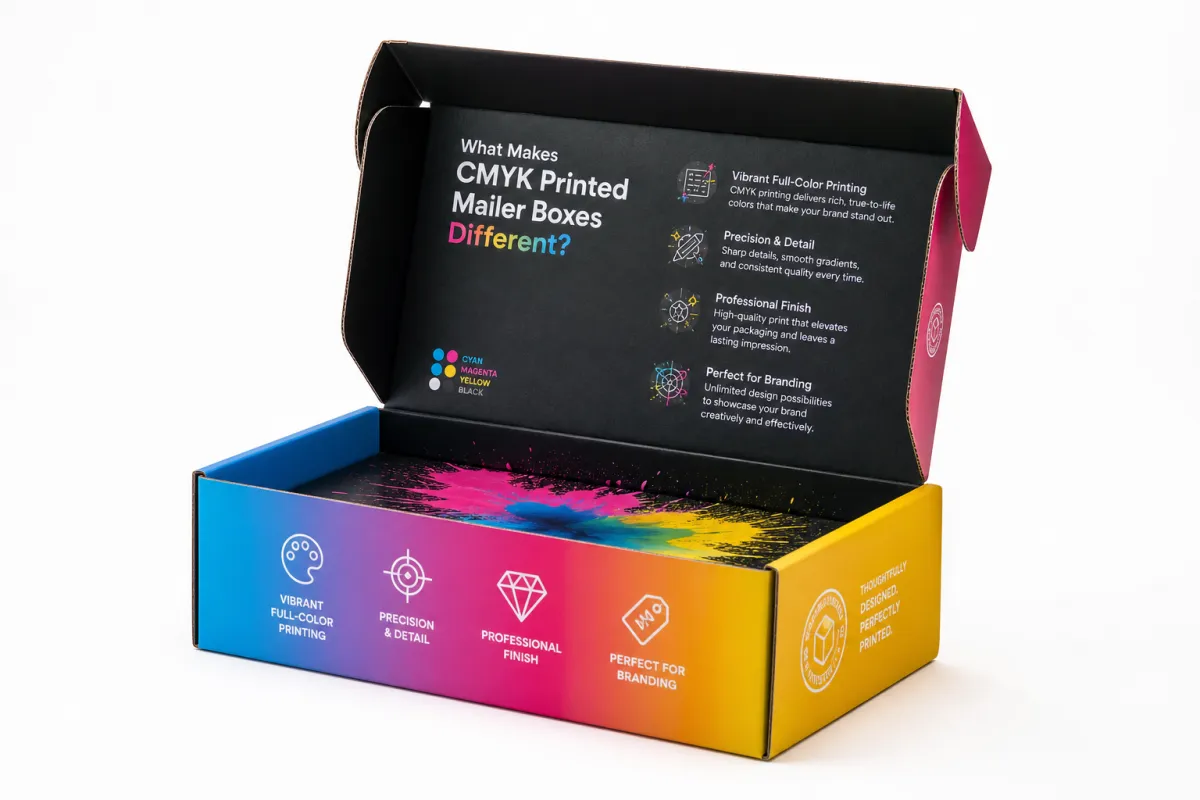
cmyk printed mailer boxes differ because they use process color instead of one premixed ink per color. Cyan, magenta, yellow, and black combine in tiny dots to simulate a full image, which means the final result depends on more than the artwork itself. Ink gain, board texture, coating, and even room lighting all influence how the color reads.
That matters because a packaging box is not a poster. It has folds, scores, glue seams, and crush-resistance requirements. A strong design for cmyk printed mailer boxes has to survive those structural realities and still look clean in hand and in photos. Pretty is nice. Functional is required.
These boxes show up in ecommerce, subscription programs, influencer kits, and retail inserts because they balance customization with practical production. You can run small or medium quantities, change artwork between campaigns, and keep the outer pack on brand. That kind of flexibility is exactly why cmyk printed mailer boxes are so common.
The other reason is cost control. Compared with specialty spot-color work or heavy decorative add-ons, cmyk printed mailer boxes can often deliver a strong brand presence without pushing every order into a premium custom process. There is still a ceiling, though. If a brand wants neon-bright color on brown kraft board, no print method is gonna perform miracles.
A lot of teams blur the line between flexibility and fidelity. cmyk printed mailer boxes are flexible enough for short runs and quick campaign changes, but they do not guarantee screen-level brightness. Knowing that up front makes paperboard, coating, and image treatment much easier to choose.
How CMYK Printing Reproduces Color on Mailer Boxes
CMYK builds color by layering dots of cyan, magenta, yellow, and black until the eye reads a continuous tone. A photo, a gradient background, or a multi-color logo gets translated into a halftone pattern, and those dots land on the board in controlled ratios. cmyk printed mailer boxes depend on that structure for most of the artwork.
Ink density matters more than most people expect. If the dots spread too much into the fiber of the board, edges soften and dark areas can fill in. If the board absorbs too much, the colors can look muted. That shows up fast on cmyk printed mailer boxes made with uncoated or natural kraft surfaces, where the paper tone itself changes the final look.
Coated and uncoated materials behave differently. A coated liner keeps ink closer to the surface, which usually improves sharpness and vibrancy. An uncoated surface gives a softer, more organic look, but bright reds, greens, and blues usually lose some punch. With cmyk printed mailer boxes, that decision should be deliberate, not accidental.
Digital printing is common for shorter runs and faster artwork changes because it skips some of the setup tied to offset printing. Flexographic printing can work well for certain corrugated applications and longer runs, but it is usually less forgiving with detailed photographic images than digital or offset methods. The right path depends on quantity, artwork complexity, and the substrate used for cmyk printed mailer boxes.
A spot color can still help inside a mostly CMYK design if one brand tone has to stay exact, especially for a logo or signature accent. That hybrid setup is common when marketing wants full-color imagery and brand teams want one precise hue holding the whole package together. cmyk printed mailer boxes can handle that kind of layout if the printer has the right workflow.
A practical benchmark helps. Photos and gradients usually belong in CMYK. Exact corporate colors, especially deep blues and distinctive reds, may need a spot color or a tighter proofing step. cmyk printed mailer boxes support both, but they reward clean artwork setup and a designer who is not winging it.
CMYK Printed Mailer Boxes: Cost and Pricing Factors
Pricing for cmyk printed mailer boxes comes down to a handful of variables that stack up fast. Box size, board grade, print coverage, quantity, finishing, and whether the structure is a stock style or a true custom dieline all affect the quote. Change one piece and the price can move more than a buyer expects.
Quantity is the biggest lever. Low-volume cmyk printed mailer boxes usually cost more per unit because setup, proofing, and operator time get spread across fewer cartons. That is why 500 units can look oddly expensive next to 5,000. The exact spread changes by spec, but the pattern stays the same.
Artwork coverage matters almost as much. A simple one-color logo on the lid costs less than a full-bleed interior and exterior print with large photo areas. More ink means more prepress attention, more room for color variation, and sometimes more drying or finishing time. cmyk printed mailer boxes with heavy graphics usually earn a higher quote for a reason.
Here is the cleanest way to think about it: you are not only buying a box. You are buying board, print, finishing, converting, and the time it takes to make all of that behave. That is why two cmyk printed Mailer Boxes That look nearly identical on paper can land at very different price points.
| Option | Typical Fit | Relative Cost | Practical Notes |
|---|---|---|---|
| Digital print on corrugated mailer | Short runs, frequent art changes, campaign kits | Medium to higher at low quantities | Fast setup, strong for variable graphics, good for cmyk printed mailer boxes with moderate coverage |
| Offset print with laminated liner | Higher volume, sharper imagery, premium branding | Higher setup, better unit economics at scale | Excellent image quality, stronger for photo-heavy cmyk printed mailer boxes, requires more planning |
| Flexographic print | Large runs, simpler graphics, durability-focused projects | Efficient at volume | Good for bold branding and simpler layouts, less ideal for fine tonal detail on cmyk printed mailer boxes |
For rough planning, small and mid-size orders of cmyk printed mailer boxes can land anywhere from about $0.75 to $2.50 per unit depending on size, board, coverage, and finishing. Larger runs can dip lower, but only when tooling, freight, and proofing get absorbed across more units. Those numbers are directional, not universal. A custom insert, soft-touch lamination, or specialty coating can move the economics fast.
Finishing deserves its own line in the buyer's head. Matte varnish can soften contrast a bit. Gloss can make saturated colors feel brighter, though it can also show scuffs more easily. Soft-touch creates a premium feel, but it can make dark artwork look heavier. cmyk printed mailer boxes often live or die on that last finish choice because the tactile experience is part of the brand impression.
A box quote is never just a box quote. It is a board choice, a color choice, and a timeline choice hiding in one number.
Step-by-Step: From Artwork to Approved Sample
The smartest cmyk printed mailer boxes projects start with the dieline, not the artwork. Once the template is in hand, the design team can place logos, patterns, barcodes, and messaging where they will survive folds, seams, and tuck flaps. Skip that step, and you get a pretty file that falls apart in production. Classic move. Very expensive.
Start With Production-Ready Files
File prep is where a lot of avoidable mistakes happen. Use bleed so the art extends beyond the cut line, keep important text inside the safe area, and convert images to the final print size before approval. Logos and type should stay vector whenever possible, because vector art keeps edges clean on cmyk printed mailer boxes even when the box scales up.
Image resolution matters more than people want to admit. A photograph that looks fine on a phone can fall apart when stretched across a large lid panel. A high-resolution image at final size cuts down the chance of pixelation, especially on cmyk printed mailer boxes with full-panel artwork or detailed product photography.
Check Color And Structure Together
Then comes the proof stage. Do not only look at color. Check seam placement, barcode readability, panel alignment, and how the design behaves near folds. A gradient that looks elegant across one panel can turn awkward at a joint. cmyk printed mailer boxes reward anyone willing to inspect the visual design and the physical structure at the same time.
If a sample is available, review it under the lighting your customers actually use. Office light, warehouse light, and retail light all reveal different things. A proof that looks perfect under one bulb can look cooler, flatter, or darker somewhere else. That is not the box being broken. That is printed packaging doing what printed packaging does.
Use A Review Checklist
Before approving cmyk printed mailer boxes for mass production, check the following:
- Artwork matches the approved dieline and no important elements cross a fold unintentionally.
- Color mode is set up for print, not just screen display.
- Text is legible at actual size, especially on side panels and inside flaps.
- Barcodes, QR codes, and legal copy are readable and placed with enough white space.
- Any special finish, such as matte, gloss, or soft-touch, is represented accurately in the sample.
That checklist sounds basic because it is. Basic is good. It prevents the ugly surprises that show up after thousands of units are already moving through the line. A slightly shifted logo, a barcode that scans inconsistently, or a dark panel that prints a shade too muddy can derail the whole campaign. cmyk printed mailer boxes are unforgiving in that way.
For sourcing and material standards, many packaging teams also look at whether the board or paper supply is certified or verified through programs such as FSC. If the pack has to survive transit abuse, it can also make sense to review testing guidance from ISTA. Those references do not design the box for you, but they keep the process grounded in normal packaging practice instead of guesswork.
Process and Timeline: What Happens After You Approve
Once you approve cmyk printed mailer boxes, the work shifts from design to production discipline. Prepress files get finalized, plates or digital output files are prepared, materials are allocated, and the line is scheduled. It sounds tidy on paper. Real life likes to make a mess of tidy plans.
The usual sequence is prepress, proof approval, printing, cutting, gluing, packing, and shipping. Fast projects are the ones where art is already clean and materials are in stock. Slow projects usually involve a late revision, a custom board request, or a finish that needs extra coordination. cmyk printed mailer boxes rarely run late because of one giant issue; they slip because three small ones stack up.
Lead time depends on quantity and complexity, but many cmyk printed mailer boxes projects need roughly 12 to 20 business days after proof approval, plus shipping. Smaller digital runs can move faster. Larger or more decorative orders can take longer, especially if the print includes full coverage, inside-out graphics, or complex finishing. Those are not mysterious delays; they are normal manufacturing steps that need room.
Freight and receiving should be planned at the same time as production. A box that leaves the plant on schedule but lands at the warehouse after a launch date still misses the brief. Build in buffer for transit, inspection, and put-away. cmyk printed mailer boxes are part of a supply chain, not a standalone item, and the calendar needs to treat them that way.
If the boxes sit inside a larger brand kit, line up the box timing with inserts, tape, tissue, and outbound shipping materials. Many teams also coordinate cmyk printed mailer boxes with Custom Packaging Products so the whole presentation stays consistent, and with Custom Poly Mailers when lighter SKUs need a different shipping format.
One useful comparison: digital printing shortens the artwork-to-output gap, offset printing usually rewards planning and larger runs, and flexographic printing can be efficient when graphics are simpler and volume is high. cmyk printed mailer boxes can be made through all three paths, but the calendar changes with each one. A realistic timeline beats an optimistic one every time.
Common Mistakes That Hurt Color and Fit
The most common color mistake is designing in RGB and hoping the final box will match the screen. It will not. RGB is built for light-emitting devices, while print is built from ink on substrate. On cmyk printed mailer boxes, that gap shows up as a flatter blue, a deeper shadow, or a gradient that loses some of its shine.
Another recurring problem is ignoring box tolerances. Corrugated structures have folds, slots, and closure flaps that change how artwork sits on the surface. A border that looks elegant in a mockup may come out uneven once the box is cut and folded. cmyk printed mailer boxes need room for those structural realities, especially near corners and closure tabs.
Fine detail can also be a mess. Tiny reverse type, thin lines, and tightly packed icons can lose clarity once ink meets fiber. A busy background might look exciting on a laptop, but it can fight the logo and reduce legibility on the actual carton. With cmyk printed mailer boxes, visual hierarchy matters more than decoration density.
Here is a mistake that comes from operations rather than design: approving artwork without testing how the box opens, fills, and ships. If the lid opens awkwardly or the interior print lands in an area that gets folded during packing, the customer never sees the part you paid for. cmyk printed mailer boxes should be reviewed as objects, not just images.
- Do not expect a kraft liner to behave like a white coated liner.
- Do not place essential copy too close to a seam or score.
- Do not use ultra-light type over a textured or dark background.
- Do not approve a sample until everyone agrees on color, fit, and finish.
Another subtle issue is overconfidence in prepress visuals. Digital proofs are useful, but they do not fully predict how ink will sit on the chosen board. That is why physical samples still matter. For cmyk printed mailer boxes, the sample is the bridge between design intent and production reality.
Expert Tips and Next Steps for Better Results
If the launch matters, start with a test run. Even a small sample lot can reveal more than ten rounds of screen mockups. Brands that invest in a pilot on cmyk printed mailer boxes usually catch the problems that get expensive at scale: color drift, seam collisions, awkward folds, or a finish that looks better in theory than in hand.
Design with the substrate in mind. Strong contrast beats delicate tones on many corrugated surfaces. Large shapes read better than fragile line art. Gradients can work, but they need care, especially if the board has natural variation. cmyk printed mailer boxes usually look best when the design respects the material instead of pretending the material is not there.
Physical proofing is still the safest move. A PDF proof can confirm placement, but only a real sample shows how the box handles light, texture, and touch. If you are choosing between a digital mockup and a printed sample, pick the sample for anything brand-critical. That is especially true for cmyk printed mailer boxes that will show up in social content, press kits, or retail unboxings.
For teams planning the next order, the practical sequence is simple: confirm dimensions, finalize artwork, request a quote, compare sample options, and match the ship date to the campaign calendar. Then leave enough slack for receiving, inspection, and rework if needed. cmyk printed mailer boxes are easier to manage when the approval path is treated like a manufacturing process, not a creative afterthought.
My blunt view? Good printed packaging is rarely an accident. It is a chain of small decisions made in the right order. When those decisions line up, cmyk printed mailer boxes do more than ship a product. They carry color, structure, and brand confidence in the same piece of packaging.
If you are still deciding how much customization makes sense, compare your box spec against the rest of your pack line. Browse Custom Packaging Products, check whether lighter SKUs need Custom Poly Mailers, and then decide where cmyk printed mailer boxes create the most visible value. The right answer usually balances print impact, unit Cost, and Timing without making the launch wait around.
How do cmyk printed mailer boxes compare with Pantone printing?
CMYK usually works better for photos, gradients, and mixed-color artwork, while Pantone is stronger for exact spot color matching. If brand color precision is critical, ask whether a hybrid setup or spot ink is possible for the key logo areas on cmyk printed mailer boxes.
What file type works best for cmyk printed mailer boxes artwork?
Vector files for logos and type are ideal, while images should be high resolution and sized at the final dimensions. Ask for a production-ready PDF with bleed, outlines, and linked image checks before approval so cmyk printed mailer boxes do not pick up avoidable file errors.
Why do cmyk printed mailer boxes sometimes look duller than the screen?
Screens use light to display color, while print relies on ink layered onto board, so brightness is naturally lower. Kraft liners, uncoated surfaces, and heavy ink coverage can all mute intensity, which is why cmyk printed mailer boxes need realistic expectations during proofing.
What affects the cost of cmyk printed mailer boxes the most?
Quantity, box size, board material, print coverage, and finishing are usually the biggest cost drivers. Custom tooling, sample rounds, and complex graphics can also push the price higher, especially when cmyk printed mailer boxes require extra setup or special handling.
How long does it usually take to produce cmyk printed mailer boxes?
Timing depends on artwork approval, material availability, and production queue, but proofing and revisions often add the most time. Build extra cushion for shipping and receiving so the boxes arrive before the campaign or launch date, not after the deadline.


