Buyer Fit Snapshot
| Best fit | Printed Carton Inserts for Branding projects where brand print, material claims, artwork control, MOQ, and repeat-order consistency need to be specified before quoting. |
|---|---|
| Quote inputs | Share finished size, material target, print colors, finish, packing count, annual reorder estimate, ship-to region, and any compliance wording. |
| Proofing check | Approve dieline scale, logo placement, barcode or warning zones, color tolerance, closure strength, and carton packing before bulk production. |
| Main risk | Vague material claims, crowded artwork, missing packing details, or unclear freight terms can make a low unit price expensive after revisions. |
Fast answer: Printed Carton Inserts for Branding: Board, Finish, Dieline, and Unit Cost should be specified like a repeatable production item. The safest quote records material, print method, finish, artwork proof, packing count, and reorder notes in one written spec.
Production checks before approval
Compare the actual filled-product size with the drawing, then confirm tolerance on folds, seals, hang holes, label areas, and retail display edges. Reserve space for logos, QR codes, warning copy, and material claims before decorative graphics fill the panel.
Quote comparison points
Review material grade, print process, finish, sampling route, tooling charges, carton quantity, and freight assumptions side by side. A quote is only useful when the supplier can repeat the same color, closure quality, and packing count on the next order.
Printed Carton Inserts for branding can look minor on a costing sheet and decisive in a customer’s hands. The outer carton may win the shelf photograph, but the insert often becomes the first interior surface a buyer actually studies. That gives it a rare job: hold the product, explain it, and carry brand voice at the exact moment the pack opens.
The opening moment is not decorative. It changes how the product is judged. A carton that looks polished outside and improvised inside creates a split impression, like a storefront with a refined window and a storage room behind the counter. A well-made insert tightens that gap. It secures the item, keeps components from wandering, and makes the opening feel deliberate rather than accidental.
For brands comparing packaging options, the value sits in the overlap. A plain support piece solves one problem. Printed carton inserts for branding can solve several at once. If you are building a broader packaging system, it often makes sense to pair inserts with other branded pieces such as Custom Labels & Tags, or to study real projects in our Case Studies library.
There is also a quieter reason brands pay attention to interior packaging now: customers open more boxes under better lighting than they once did. Product videos, unboxing clips, and review photos put the inside of the pack on display. That means the insert is no longer hidden support. It is part of the evidence trail that tells a buyer whether the brand cut corners or cared about the details.
Printed Carton Inserts for Branding: Why They Matter
Brands tend to start with the exterior carton because that is the visible face on a shelf, in a mailer, or in a product photo. Fair enough. Once the box opens, the outer surface stops carrying the whole story. The insert steps in as the last controlled surface before the item is handled, which is why printed carton inserts for branding carry more weight than their size suggests.
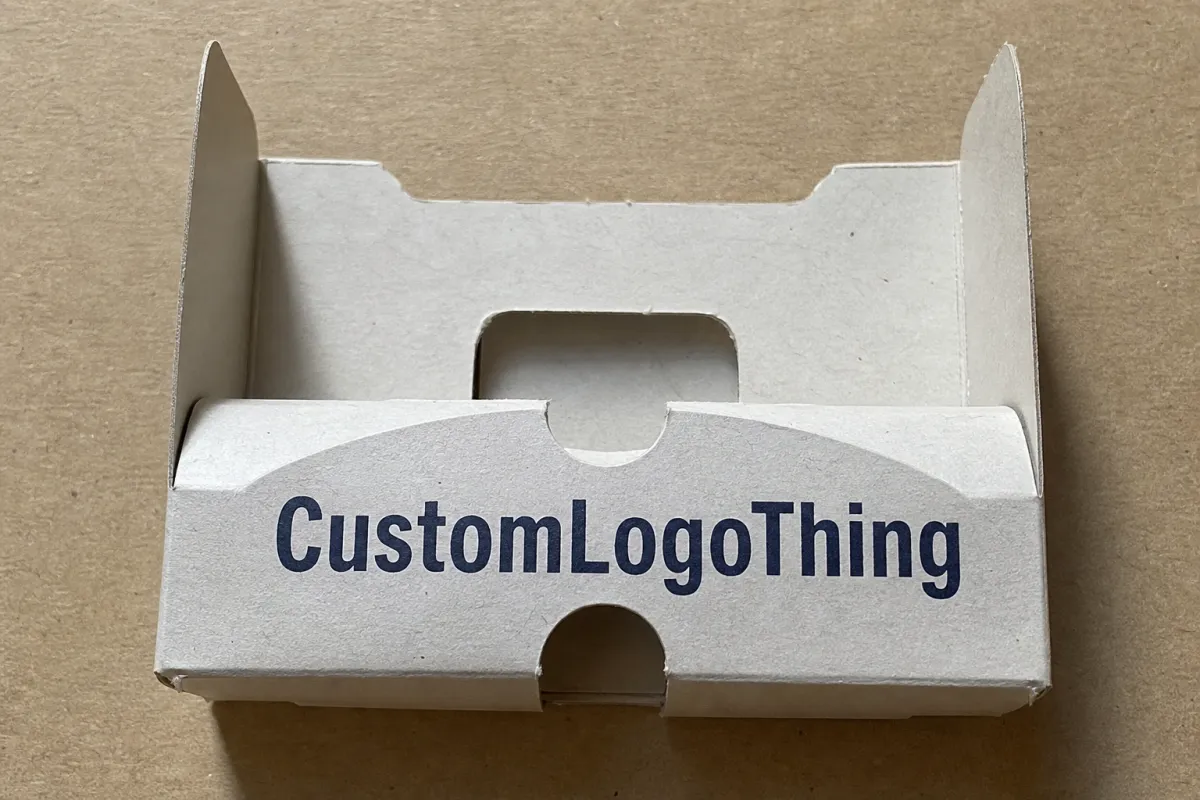
In practical terms, an insert is a paperboard or carton component that stabilizes the product, organizes the contents, and speaks in the brand’s voice while doing it. The form may be a folded tray, a locking cradle, a printed sleeve, a die-cut card, or a multi-panel structure with instructions and a reveal sequence. The job stays the same across formats: keep the product in place and shape the experience of discovery.
That interior space gets overlooked because it sits inside the pack. Buyers do not glance there; they linger there. They lift, unfold, and inspect. They notice whether the board feels crisp or flimsy, whether the print looks considered or generic, whether the interior echoes the promise on the outside. A small panel can behave like a miniature billboard, especially in categories where trust matters more than novelty.
Compare that with plain packing material. White tissue and unprinted dividers can protect a product just fine, but they rarely deepen recognition. They do not create visual rhythm. They do not guide the eye. They do not help a customer connect a feature, an ingredient, or a care step to the larger brand story. Printed inserts can do all three while staying practical.
The perception issue is easy to spot once you have watched enough product launches. If the exterior says premium and the interior looks improvised, the experience feels divided. If the carton and insert match in typography, tone, and structure, the pack feels disciplined. That discipline matters in retail, direct-to-consumer shipping, subscription kits, and gift packaging alike.
"The insert is not filler. It is often the last chance to confirm that the product inside matches the promise on the outside."
That is why cosmetics, supplements, electronics, gift sets, and curated retail packs keep returning to printed carton inserts for branding. The return is not only visual. It is mechanical and financial too. A better insert can reduce movement, speed up packing, and cut the chance of damage claims. The design earns its keep in more than one line of the budget.
There is a useful comparison here with store fixtures. A display shelf can be structurally sound, but if the facing panels are awkward or the graphics are off, the whole aisle feels less premium. The same logic applies inside a carton. Structure, print, and fit work together. If one of them is off by even a small margin, the customer notices the imbalance long before they identify the cause.
The useful questions are direct: how does the insert work structurally, which design choices affect brand impact most, how long does production usually take, and what actually pushes the quote up or down? Those decisions separate a pretty sample from a packaging component that performs under shipping pressure.
How Printed Carton Inserts Work Inside the Pack
The core task of an insert is simple: hold the product in place. The hard part is doing that without adding unnecessary weight, extra waste, or a confusing assembly process. The best insert reduces movement, improves presentation, and still leaves enough room for efficient packing on a line or at a fulfillment table.
That functional role turns into branding when the insert controls what the customer sees first. A reveal panel can hide the product until the box opens fully. A cutout can frame the item so it feels chosen rather than dropped in. A folded wing can carry a thank-you line or a short brand message. None of those changes the protection job, but they change the emotional read of the pack.
Common applications make the pattern obvious. A cosmetics compact may sit in a die-cut paperboard cradle with a printed interior message. A supplement kit may use a tray with compartments for bottles and inserts. An electronics accessory pack may combine a carded insert with setup instructions. Gift sets often need the richest presentation because the insert is part of the storytelling, not just the support structure.
Structure matters more than many teams expect. Folds, locks, tabs, sleeves, and cutouts create a sequence. A flat card speaks differently from a multi-panel insert that opens in stages. A tray with accurate product cavities feels more engineered than a loose sleeve. A reveal panel can delay the reveal by one second, but that second can change the entire unboxing experience.
Print placement deserves the same care. Not every surface needs ink. In many packs, the front-facing panel carries the main message, the inside panel carries the welcome note, and a hidden underside carries care instructions, compliance text, or a QR code. That layered approach keeps the exterior cleaner and the message hierarchy easier to read.
Fit and print work together. When the insert hugs the product and the printing is deliberate, the pack feels premium. When the insert is loose, oversized, or generic, the brand feels less disciplined. Buyers notice that faster than they usually admit. They may not say "bad structure," but they will say the pack feels cheap, noisy, or overstuffed. The insert is often the reason.
For products that need transport protection, testing matters. Inserts should be evaluated with the full pack, not treated as isolated pieces of art. Standards and test protocols from organizations such as ISTA help confirm that the interior structure survives vibration, compression, and drop conditions. That applies whether the carton is retail-facing or built only for e-commerce. Those methods do not replace product-specific validation, but they do give teams a common benchmark when they are comparing two structures that look equally good on screen.
There is another practical point here: an insert can change packing speed. A design that looks elegant but requires fussy hand placement may slow down fulfillment more than a slightly simpler structure. In small batches that may be acceptable. In higher-volume operations, one extra second per unit becomes a real labor cost. That is why experienced buyers look at presentation and assembly together, not as separate decisions.
Key Design Factors That Shape Brand Impact
Brand impact does not come from print alone. It comes from a visual system that feels consistent from the outside of the carton to the first interior layer. Typography, color, illustration style, iconography, and whitespace all influence whether the insert reads as luxurious, playful, clinical, technical, or eco-conscious. The insert becomes a compact version of brand identity, which means small decisions carry a lot of weight.
Visual system and tone
If a brand uses restrained typography and generous spacing on the carton, the insert should usually follow that rhythm. If the outer pack is energetic and graphic, the insert can echo that energy with a pattern, accent color, or bolder headline. The aim is not repetition for its own sake. It is consistency that feels intentional rather than copied and pasted.
Color carries a surprising amount of meaning. Deep black on uncoated board feels different from a bright brand color on coated stock. A warm neutral can soften a premium food or wellness product. High-contrast layouts can improve readability for instructions or setup steps. In every case, color starts shaping perception before the customer reads a single line.
For buyers managing more than one SKU, color systems matter almost as much as logo placement. A family of products may need one insert style that can flex across variants without losing recognition. In that situation, subtle shifts in accent color, rule weight, or interior pattern can preserve consistency while still helping each flavor, scent, or model stay distinct.
Material choice and tactile signal
Material selection is not a purely technical spec. It is part of the message. A 14pt or 16pt paperboard insert may be enough for lighter products and simpler assemblies. An 18pt to 24pt SBS or similar board can feel sturdier and hold shapes better for heavier items or sharper cutouts. Coated stocks can sharpen print detail, while uncoated stocks often feel more natural and less glossy.
Texture matters too. Soft-touch lamination creates a muted, premium feel, though it can raise cost and sometimes complicate recyclability depending on the build. A matte aqueous coating can keep a cleaner, lighter look. A natural or kraft appearance supports sustainability messaging, but the print palette needs to be tuned so the layout does not disappear into the substrate.
If sustainability is a central promise, buyers should verify fiber sourcing instead of relying on broad eco language. The FSC framework remains one of the most recognized signals for responsible paper sourcing, and it helps align the insert story with broader packaging claims. It is a sourcing and chain-of-custody signal, not a blanket claim that every board choice is automatically low impact.
That distinction matters because consumers have become skeptical of vague green language. A kraft look, for example, can suggest natural materials without proving anything about sourcing or end-of-life behavior. Honest packaging teams now separate appearance from evidence. That is a healthier standard, and it protects the brand if a retailer, auditor, or customer asks follow-up questions.
Print method and color behavior
Different print methods create different tradeoffs. Digital printing is useful for shorter runs, fast revisions, and variable versions. Offset printing usually gives stronger consistency and sharper detail on larger volumes. Flexographic printing can work well for certain board applications and scalable production, but it needs careful setup to keep color stable.
For brands with strict color standards, ask how the supplier controls matching. A Pantone reference helps, but board absorption, coating choice, and print method all affect the final result. That is especially true for deep brand colors, metallic accents, and gradients. A beautiful design file is not the same thing as a stable production outcome.
Ask to see the color under the lighting the customer will actually use. A cool retail environment, a warm home kitchen, and a camera flash can each shift the appearance of the same ink. Teams that skip that check often discover the mismatch after the run is finished, which is the most expensive time to have the conversation.
Copy strategy and information hierarchy
The strongest insert copy is usually short, useful, and deliberate. A welcome note can make the purchase feel human without drifting into sentimentality. A three-step setup guide can prevent frustration. A QR code can link to care instructions, tutorials, or a refill program. Sustainability claims should be specific and supportable, not vague enough to sound like filler.
Too much copy is a common failure. Once a user has to decode several messages at once, the insert starts working against itself. Keep the layout centered on one primary brand line, one secondary support message, and one practical instruction area if needed. That keeps the insert readable and makes the brand voice easier to trust.
Brands that combine inserts with other packaging elements often get a stronger result because the whole system feels aligned. A printed carton insert can echo the typography used on the outer box, while a small label or tag can repeat the same icon or seal. That is one reason so many packaging teams eventually compare insert decisions with broader pack architecture and with complementary pieces like Custom Labels & Tags.
There is a direct relationship between hierarchy and confidence. If the first line answers the buyer’s immediate question, the pack feels helpful. If the first line tries to sell, explain, and impress all at once, it feels uncertain. Buyers can sense that uncertainty even when they cannot articulate it. Clear hierarchy reads as competence.
Compliance and product fit
Branding does not matter if the product rattles, breaks, or fails a fit check. That is where the practical side of the insert comes back into view. Tolerances need to account for product variation, closure depth, and real assembly conditions. A cavity that looks perfect on screen may be too tight once the item is wrapped, capped, or labeled.
Any legal, regulatory, or safety text should be reviewed separately from the visual design. That includes ingredients, warnings, setup steps, disposal guidance, and region-specific language. If the insert carries regulated information, the artwork process should include a clear approval path so the final proof is correct before tooling or print plates are committed.
For regulated categories, the safest rule is simple: do not let decorative layout decisions change required content. A shifted icon or a resized panel can push warnings out of visibility or create a layout that is hard to read in production. That kind of error is avoidable, but only if the legal and packaging reviews happen early enough.
Process and Timeline: From Brief to Production Steps
Most delays happen before production starts. That sounds obvious, but it is where a lot of projects lose time. The cleaner the brief, the faster the insert moves through dieline development, artwork, sampling, and approval. If measurements are vague or product dimensions are incomplete, the schedule can slip by days or even weeks.
The most reliable workflow starts with the product itself. Define the item’s dimensions, weight, closure style, surface treatments, and any accessories that must fit inside the pack. Then translate those facts into an insert structure. The structure should support the product first; the graphic treatment should build on that instead of fighting it.
A typical sequence looks like this:
- Confirm product dimensions, weight, and handling requirements.
- Share the target carton size and any internal clearance limits.
- Approve a dieline or structural concept.
- Place artwork on the dieline and review copy, color, and hierarchy.
- Request a prototype or sample for fit, fold behavior, and presentation.
- Revise if needed, then release to production.
That sequence appears linear on paper, but it rarely is. A prototype often reveals that a product is heavier than expected, the flap sequence is awkward, or a printed panel lands in the wrong visual zone. Catching those issues early saves more money than any late-stage cosmetic tweak ever will.
A realistic timeline depends on complexity. A straightforward printed insert with standard board and one print pass may move from approved dieline to production in roughly 10 to 15 business days after proof sign-off. More intricate projects, especially those with specialty finishes, multiple revisions, or complex die-cuts, can stretch closer to three or four weeks before shipment. Rush orders can compress that schedule, but usually at a noticeable premium.
Clean handoffs matter. The brand team should provide the story, tone, and must-have claims. The designer should translate those into a readable layout with correct bleed and safe areas. The packaging supplier should confirm manufacturing limits, assembly implications, and any issues with ink coverage or board direction. When those three roles stay aligned, printed carton inserts for branding are much easier to execute.
Before production, check these items:
- Final product dimensions and weight
- Carton internal dimensions and clearance
- Dieline version number and approval date
- Bleed, safe areas, and trim marks
- Color references or PMS targets
- Finish notes, including coating or lamination
- Assembly method and folding order
- Quantity, lead time, and delivery location
If the insert sits inside a larger launch, the timeline should also account for other packaging elements. Labels, outer cartons, and printed collateral can all affect the final fit or the brand tone. Coordinating those pieces early avoids the common problem where the insert is approved last and then has to match components already locked elsewhere in the pack.
That coordination also helps teams make better tradeoffs. A premium insert may be a smart investment for a hero SKU, while a simpler version may be better for a secondary product line. The timeline improves when those decisions are made with the whole packaging system in view, not as isolated line items.
Cost and Pricing: What Drives Quote Differences
Pricing for printed carton inserts is usually less mysterious than it first appears. The quote moves with a handful of predictable variables: quantity, board grade, print coverage, finishing, structure complexity, and whether the insert ships flat or pre-formed. Once you know those levers, you can read a quote like a packaging buyer instead of treating it as a black box.
Quantity is the largest one. Small runs tend to carry a higher unit price because setup costs are spread across fewer pieces. Larger runs usually improve per-piece economics, especially on offset work. For early-stage launches, limited editions, or premium trials, a smaller run may still make sense if the insert materially improves presentation or reduces damage.
Board choice comes next. A basic paperboard insert with simple folds is easier to produce than a heavier stock with custom cavities or multiple glue points. If the insert must support a fragile bottle, device, or glass component, the board spec may need to move up. That increases cost, but so does product damage if the spec is too light.
Print coverage matters too. A single-color insert on one side costs less than full-coverage, four-color printing across multiple panels. Specialty finishes such as soft-touch coating, foil, spot gloss, embossing, or custom varnish increase both material and setup costs. Those effects can be worth it in a premium category, but they should be justified by the product margin and customer expectation.
Assembly can hide a surprising amount of cost. A flat-packed insert that is folded during packing may be efficient for one operation and inefficient for another. Pre-formed inserts can save labor at the point of packout, yet they may raise freight or storage needs. In other words, the cheapest quote on paper is not always the cheapest total system.
Sampling and tooling are other common cost drivers. A dieline may need several adjustment cycles before the fit is right. If the project uses a custom die-cut shape, there may be tooling or setup fees. Color matching can also add time and expense, especially if the brand has strict requirements for repeatability across SKUs.
For a practical comparison, here is a simple framework buyers use when evaluating options:
| Insert Type | Typical Use | Relative Unit Cost | Branding Value | Notes |
|---|---|---|---|---|
| Plain unprinted insert | Basic protection and separation | Lowest | Low | Best for utility-first packs and tight budgets |
| Single-color printed insert | Simple messaging, care steps, or logo use | Low to moderate | Moderate | Works well for high-volume lines and clean visual systems |
| Full-color printed insert | Brand storytelling, launch kits, premium retail | Moderate | High | Strong choice when the insert remains visible for several seconds during unboxing |
| Printed insert with specialty finish | Luxury goods, gifts, premium direct-to-consumer packs | Highest | Very high | Best reserved for product lines where the finish matches the price point |
As a rough planning range, many printed insert projects land somewhere around $0.12 to $0.45 per unit at moderate quantities, with simpler designs on the lower end and more complex, premium builds on the higher end. Smaller orders can cost more per piece. That range shifts with board spec, finish, and quantity, so it should be treated as a planning frame rather than a promise.
Freight, color proofs, rush requests, and rework can matter as much as the print itself. A short lead time may push the project onto a faster production slot. A sample that needs a second round of revisions may add days. If the insert is folded by hand or packed in a secondary process, labor can exceed the cost of the printed stock over the life of the project.
The best cost question is not "How cheap can we make this?" It is "What is this insert preventing or improving?" If the insert reduces breakage, makes the pack easier to assemble, or raises perceived value enough to support a better margin, the cost can be justified quickly. That is especially true for products where the box is part of the purchase decision, not just the shipping container.
There is also an important hidden cost: confusion. If a low-cost insert creates assembly mistakes, customer complaints, or returns, the savings disappear quickly. Buyers who look only at the unit price often miss that the most expensive packaging is the kind that looks cheap after it reaches the customer.
Common Mistakes That Weaken the Insert Strategy
The most common mistake is treating the insert like filler. Brands sometimes leave the interior untouched because they assume the outer carton has already done the branding work. That assumption misses how people actually open packages. The interior is where the product becomes personal, and the insert is often the first surface a customer actually reads.
Another frequent problem is vague sizing. If product dimensions are incomplete or the tolerance is too loose, the insert allows movement. Movement leads to scuffing, rattling, or broken seals. It also makes the box feel less considered. A pack that sounds empty rarely feels premium, no matter how good the print looks.
Overdesign is just as risky. Some teams try to use every surface for a different message. The result is clutter. Too many colors, too much text, and too many competing icons weaken hierarchy and make the insert harder to trust. A stronger answer is usually one clear message, one useful instruction zone, and one visual cue that ties back to the brand system.
Production mistakes usually happen when teams approve artwork before structural testing. A layout can look excellent on screen and still fail once folded, die-cut, or assembled at scale. Board thickness, grain direction, glue behavior, and fold memory all influence the final outcome. None of those details are glamorous, but they separate a sample from a production-ready component.
Brand inconsistency is another quiet problem. If the outer carton is minimal and the insert is loud, or if the insert uses a different tone, color logic, or typography, the packaging story fragments. Buyers may not be able to name the issue, but they feel it. The pack stops reading as one coherent system.
Another trap is assuming that a premium finish can rescue a weak structure. Foil, gloss, or soft-touch coating can improve the first impression, but they cannot fix a tray that bends, a cavity that rattles, or a design that takes too long to assemble. Surface treatment should support the structure, not mask it.
To avoid those pitfalls, start with the job the insert must perform. Is it there to protect, instruct, reveal, upsell, or reassure? If the answer is "all of the above," then the structure and messaging need discipline. One insert can do multiple jobs, but it cannot do all of them at full volume without losing clarity.
Brands concerned with environmental claims should also avoid loose language. If the insert is meant to support a sustainability story, the board spec, sourcing claim, and end-of-life behavior should all line up. A clean visual cue is not enough by itself. Buyers now look for traceable proof, not just green-looking graphics.
A final mistake is ignoring the hand feel of the opening sequence. A pack may photograph beautifully and still feel awkward if the insert catches on the product, tears too easily, or requires two hands where one should be enough. That kind of friction does not show up in a mockup, but it shows up immediately in the customer experience.
Expert Tips and Next Steps for Better Inserts
Start with the product journey, not the print file. Follow the item from packing to shipping to opening, and identify the exact moments where the insert can reduce risk or improve the reveal. That sequence often exposes a simpler and better structure than the one imagined in the first design round.
If you want the insert to do real branding work, choose one strong cue and give it room. That might be a welcome line, a saturated interior color, a repeat pattern, or a clean product callout. One sharp idea usually lasts longer than six competing ones. It also prints more reliably.
Always ask for samples. A board sample tells you more than a spec sheet because it shows how the material behaves in hand, how the fold lines hold up, and whether the print still feels premium after shipping and handling. A pack can look excellent in a PDF and flat in reality, so physical testing matters.
If your product travels through parcel networks, confirm that the insert and carton together still protect the item after vibration, compression, and drop simulation. Standards and lab testing approaches from groups such as ISTA are useful references. They help separate design preference from packaging performance.
A short internal review checklist helps teams move faster:
- Does the insert protect the product under normal shipping conditions?
- Does the print support the tone of the outer carton?
- Is the copy brief, readable, and useful?
- Does the material match the price point of the product?
- Can the insert be assembled without slowing the line too much?
- Does the final quote still make sense against the value it creates?
One useful test is to compare the insert against your best-performing pack, not your cheapest one. If the new version strengthens brand recognition, improves the opening sequence, and lowers damage risk, the extra cost may be easier to defend. Packaging teams often overlook this because the insert seems small. Small components can produce outsized effects.
For brands preparing a launch, the next steps are practical: audit the current pack, define the insert’s job, gather product measurements, request structural options, and test one prototype before scaling. That process keeps printed carton inserts for branding grounded in real manufacturing choices rather than abstract design talk. It also gives you a clearer basis for pricing, timelines, and supplier conversations.
The strongest programs usually do not begin with a decorative concept. They begin with a measurement, a sample, and a clear decision about what the insert must do before it is allowed to look impressive. That order of operations saves money and produces better packaging.
FAQ
What do printed carton inserts for branding actually do?
They hold the product in place while also giving the brand a second surface for messaging, instructions, or storytelling. In practice, that makes the opening feel more deliberate and organized, and it can improve perceived product value without changing the outer carton. They can also reduce movement inside the box, which helps protect the product during shipping and handling.
How much do printed carton inserts for branding usually cost?
Pricing depends on quantity, board type, print coverage, finish, structural complexity, and whether samples are needed. Small runs usually have a higher unit cost, while larger runs lower the per-piece price because setup is spread across more units. Rush jobs, special coatings, and custom die-cuts can raise the quote quickly, so it helps to compare cost against the damage reduction and branding lift the insert can deliver.
How long does the production timeline take for printed carton inserts?
The timeline depends on artwork readiness, sample approval, print method, and the number of revision rounds. Simple inserts can move faster, while complex structures or premium finishes usually add lead time. A clean brief, final dimensions, and print-ready files are the fastest path to staying on schedule, and many straightforward projects land in the 10 to 15 business day range after proof approval.
What materials work best for printed carton inserts for branding?
Paperboard is common because it balances print quality, structure, and cost. Thicker or coated stocks may feel more premium, but they still need to fit the product, the carton, and the assembly method. The right material depends on product weight, shipping conditions, and the brand look you want to create, so the best choice is usually the one that supports both function and presentation.
What files do printers need for carton insert artwork?
Printers usually need a dieline, layered artwork, bleed, and clearly marked safe areas. Color expectations, finish notes, and any special print instructions should be included in the handoff so the production team can check the file against the structure. A prototype review is useful before full production because it helps catch fit issues, copy placement problems, and folding surprises before the whole run is committed.
How do printed carton inserts for branding affect customer perception?
They signal whether the brand planned the inside of the pack as carefully as the outside. A tidy, well-structured insert suggests control, which can raise confidence in the product itself. A loose or generic insert does the opposite. Even when customers do not mention the insert directly, they often describe the result as premium, thoughtful, or cheap based on that interior experience.
Printed carton inserts for branding work best when they are treated as part of the packaging system, not as an afterthought. If the structure protects the product, the print supports the message, and the material matches the price point, the insert becomes one of the most efficient tools available for improving the full pack experience. The clearest next step is simple: define the insert’s job first, then design around that requirement.


