Buyer Fit Snapshot
| Best fit | Printed Corrugated Packaging with Cmyk projects where brand print, material claims, artwork control, MOQ, and repeat-order consistency need to be specified before quoting. |
|---|---|
| Quote inputs | Share finished size, material target, print colors, finish, packing count, annual reorder estimate, ship-to region, and any compliance wording. |
| Proofing check | Approve dieline scale, logo placement, barcode or warning zones, color tolerance, closure strength, and carton packing before bulk production. |
| Main risk | Vague material claims, crowded artwork, missing packing details, or unclear freight terms can make a low unit price expensive after revisions. |
Fast answer: Printed Corrugated Packaging with Cmyk: Material, Print, Proofing, and Reorder Risk should be specified like a repeatable production item. The safest quote records material, print method, finish, artwork proof, packing count, and reorder notes in one written spec.
Production checks before approval
Compare the actual filled-product size with the drawing, then confirm tolerance on folds, seals, hang holes, label areas, and retail display edges. Reserve space for logos, QR codes, warning copy, and material claims before decorative graphics fill the panel.
Quote comparison points
Review material grade, print process, finish, sampling route, tooling charges, carton quantity, and freight assumptions side by side. A quote is only useful when the supplier can repeat the same color, closure quality, and packing count on the next order.
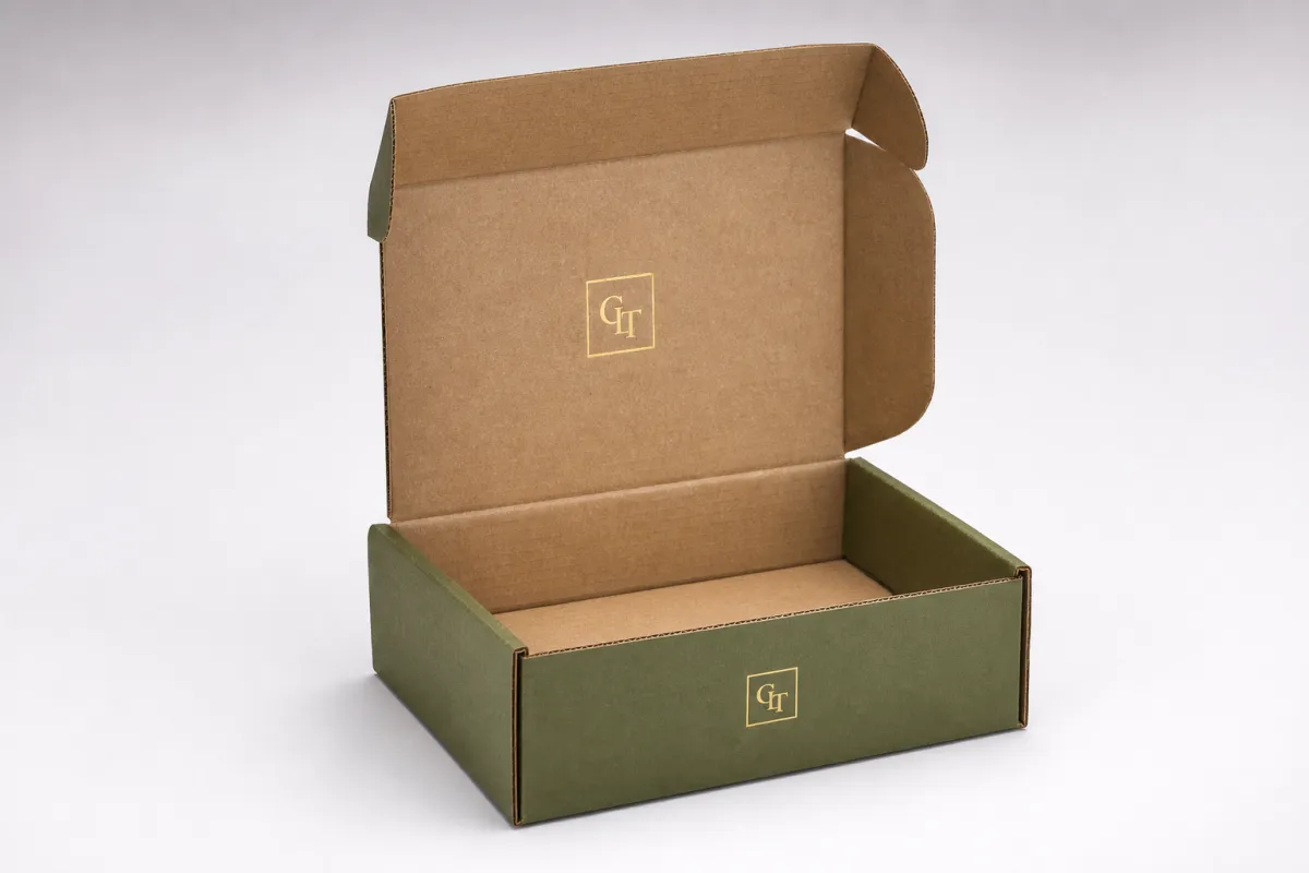
Printed corrugated packaging with cmyk can look premium or plain in a single glance, and the thing that usually decides it is the board long before the artwork gets a fair shot. I have watched good logos lose a little authority simply because the substrate was too rough, too dark, or too absorbent for the print method that was chosen. A polished layout helps, sure, but the box structure, liner, and press setup are doing a lot of the heavy lifting behind the scenes.
At a practical level, printed corrugated packaging with cmyk means four-color process printing on corrugated board so full-color branding, packaging graphics, illustrations, and photography can live on the box instead of being reduced to one or two spot inks. Brands like it because it handles complex artwork well, supports several SKUs without a messy ink program, and usually gives more flexibility than building every project around special colors. The tradeoff is real: printed corrugated packaging with cmyk is not coated magazine stock, and pretending it is usually leads to disappointment. It can still look sharp, clean, and controlled, but the liner, flute, and print method matter far more than most buyers expect on the first round.
If you are comparing custom printed boxes for retail packaging, shipping, or subscription sets, the questions are straightforward. How will the color behave on the board? What Drives the Cost? How long will production take? Where do projects usually go sideways? Those are the answers I would want before approving printed corrugated packaging with cmyk. Nobody wants to discover the weak point after a pallet is already on a truck.
Printed Corrugated Packaging with CMYK: The Part Most Brands Miss
A box often looks disappointing because the board was wrong for the artwork, not because the artwork was weak. Dark kraft liners mute soft colors. Rough recycled liners make tiny type look tired. Coarse flute structures can soften line work that looked crisp on screen. That is why printed corrugated packaging with cmyk needs substrate planning before anyone gets attached to gradients, hero images, or a fancy render.
CMYK itself is simple enough. Cyan, magenta, yellow, and black are printed in tiny dots, and those dots build the image and text. Corrugated board is less forgiving than coated paper, so the same file can look richer, duller, or less precise depending on the liner, flute profile, and press setup. Seen that way, printed corrugated packaging with cmyk is not only a color choice. It is a material choice, and the material usually gets the final vote.
Brands keep using it because it solves real problems. A company with several flavors, sizes, or seasonal versions can often manage a single four-color setup more easily than a collection of custom spot inks. It also works well for photography, illustrated patterns, and branded packaging that needs visual range across multiple panels. For a buyer, printed corrugated packaging with cmyk often lands in a sensible middle ground: richer than one-color print, less rigid than a spot-color program, and easier to adapt as products change.
A box is not a poster. If the liner absorbs ink unevenly, the artwork will never match a coated proof exactly, no matter how confident the mockup looked in the sales deck.
The expectation should be set early. Process color on corrugated can look clean and premium, but it will not behave like offset printing on a coated brochure sheet. That is normal. Good packaging work respects the material instead of pretending it is something else. Once that is understood, printed corrugated packaging with cmyk becomes a practical production tool rather than an expensive surprise.
Another practical point matters during sourcing. If you are weighing Custom Shipping Boxes against other Custom Packaging Products, the print expectations should shift with the job. A mailer box does not need the same density, finish, or color discipline as a shelf-facing retail carton. That difference is obvious in theory and ignored in plenty of projects, which is how people end up comparing the wrong samples side by side.
How Printed Corrugated Packaging with CMYK Actually Works
CMYK printing on corrugated begins with separated artwork. The file is split into cyan, magenta, yellow, and black plates or digital channels, and the press lays those colors down in tiny dots to build the final image. With printed corrugated packaging with cmyk, those dots interact with a textured board surface that absorbs ink differently than smooth paper. Solids can darken, neutrals can shift, and fine detail can soften a little, especially on rougher liners.
The construction of the box matters just as much as the ink. A corrugated carton usually has an outer liner, a flute in the middle, and often an inner liner. The outer liner is the surface the press sees. A white, smoother liner gives printed corrugated packaging with cmyk a better chance at accurate color and readable detail. Kraft or heavily recycled liners usually bring more visible fiber, less brightness, and a slightly muted result. That is not a defect. It is the behavior of the material, and fighting that reality usually costs more than accepting it early.
Three common print routes are used, and they do not deliver the same look. Direct print, often flexographic, lays ink straight onto the board. Litho-lamination prints the artwork on a separate sheet and mounts it to the corrugated, which usually creates a smoother, more retail-ready finish. Digital printing tends to be the best fit for short runs or faster turnarounds because it skips plate-heavy setup, though the economics shift as volume grows. For printed corrugated packaging with cmyk, the method matters almost as much as the design file, and sometimes more.
| Print Method | Best Fit | Typical Setup | Color Look | Usual Lead Time |
|---|---|---|---|---|
| Direct flexo | High-volume shipping boxes and simple branded packaging | Lower setup, with plate costs still part of the process | Strong for bold graphics; fine detail depends on board quality | Often 7-14 business days after approval |
| Litho-lamination | Retail packaging and premium custom printed boxes | Higher setup because of the printed face sheet and mounting step | Best for rich visuals, smoother solids, and sharper branding | Often 12-20 business days after approval |
| Digital printing | Short runs, test launches, and many-SKU programs | Low setup, sometimes no plates at all | Strong for short runs; coverage and consistency depend on equipment | Often 3-7 business days after final proof |
That table is a working map rather than a promise. It still shows the tradeoff most buyers face with printed corrugated packaging with cmyk: the smoother and more retail-like the finish, the more setup and cost can creep in. The rougher the board and the faster the process, the more the artwork needs to respect the material instead of trying to overpower it. That balance is the real job.
Proofing is where many projects reveal their weak spots. A screen mockup helps with layout, but it is not color truth. A paper proof is better for checking text, alignment, and panel order. A press sample is the closest thing to reality, and for strict color or retail packaging work, that sample is the one that matters. If the brand color is critical, printed corrugated packaging with cmyk should never be approved on a gut feeling alone.
For neutral packaging references and terminology, I often point buyers to the Fibre Box Association and to ISTA for transit-testing logic. Those resources do not replace a supplier conversation, but they give buyers a better baseline than guessing. A little homework there saves a lot of awkwardness later, honestly.
Key Factors That Change Color, Quality, and Shelf Appeal
If you want printed corrugated packaging with cmyk to look good, start with the board. Kraft liners bring a natural, earthy tone and suit simple branding, but bright colors will calm down on them. White liners improve brightness and contrast, which helps especially with product packaging that needs photography or subtle gradients. Coated liners or litho faces can move the box closer to premium retail packaging, but they raise cost and may change how the surface feels in hand.
Flute profile matters too. Finer flutes like E-flute or B-flute tend to print cleaner than coarse options because the surface is smoother and the panel telegraphs less texture through the image. That can make a real difference for small type, QR codes, and thin rule lines. Coarser flutes still have a place, but printed corrugated packaging with cmyk on a rough structure needs more generous typography and less fussy artwork. If the design depends on hairline details, the wrong flute will fight you every step of the way.
Ink coverage is another place where budgets and expectations can collide. Large dark solids, rich blacks, and saturated brand colors require tighter control than light graphics. Heavy coverage on textured board can create muddy fills, slower drying, and scuff marks before the box leaves the plant. A smart packaging design for printed corrugated packaging with cmyk uses color where it helps the brand and leaves room for the substrate to breathe a little.
Finish is not decoration. It affects how the box performs. An aqueous coating can improve scuff resistance without making the carton feel plastic. A varnish can add protection at a lower cost than full lamination. Lamination offers the most protection and can make the surface pop, but it adds cost and may reduce recyclability depending on the structure. If the project needs a greener position, FSC-certified board and a simpler finish can make more sense than chasing mirror-gloss shine. The sourcing side matters too; FSC is the certification buyers ask about most often for good reason.
Design choices can rescue or sink the job. Oversized solids make flaws obvious. Reversed-out text can disappear if the print is too rough. Tiny legal copy on a busy panel can become unreadable. That is why printed corrugated packaging with cmyk should be designed with production limits in mind, not just with a polished mockup on a laptop.
Three rules tend to save the most headaches:
- Use contrast wisely so text survives the board texture.
- Reserve heavy ink coverage for areas that can tolerate slight color shift.
- Match artwork to the substrate instead of forcing a coated-paper look onto corrugated.
That is also why brands with multiple product lines often standardize box formats. If your printed corrugated packaging with cmyk uses the same board spec, the same finish, and similar color logic across SKUs, reorders are easier to manage and the shelves look more consistent. That approach is not flashy, but it saves time and money in the long run.
Production Steps and Timeline for Printed Corrugated Packaging with CMYK
Production starts with the dieline. Before anything gets approved, the dimensions, bleed, safe zones, panel orientation, and fold lines need to be correct. If the dieline is wrong, printed corrugated packaging with cmyk can look great and still fail during assembly or stacking. A panel can land upside down. A seam can cut through important text. A barcode can end up too close to an edge. That is a packaging problem, not a color problem, and it is usually preventable.
Prepress comes next. This stage cleans up artwork, converts colors, checks overprints, adjusts trap settings, and builds the proof. It also eats time when files are messy. RGB imagery, low-resolution photos, missing fonts, and random transparency effects are the usual troublemakers. If you want printed corrugated packaging with cmyk to move quickly, send clean press-ready files. Hopes are not a file format, and they never have been.
Sampling usually happens in layers. A digital mockup shows layout. A structural sample confirms size and assembly. A color proof checks tone, contrast, and panel balance. A press approval sample is the closest thing to the final run. Some jobs only need one of those. Others need all three. For printed corrugated packaging with cmyk, the more sensitive the color match or the larger the order, the more likely at least one physical sample step will be needed.
Typical timeline ranges are predictable enough, assuming the client responds on time:
- Simple reorders: often 5-10 business days after approval.
- New artwork on an existing structure: often 10-15 business days.
- New structure plus new artwork: often 15-25 business days.
- Premium finishes or press approvals: add several business days, sometimes more.
Those ranges can stretch quickly if revisions pile up. The biggest delays I see are usually dull, which is exactly why they get ignored. Missing files. Late sign-off. Unclear quantity splits. A color reference that only exists in someone’s head. For printed corrugated packaging with cmyk, projects usually slip because of indecision, not because the machine is slow.
Color matching requests take time as well. If a brand wants a specific Pantone feel, the supplier may need extra proofing, adjusted ink mixes, or a different print method. That is normal. It is not a sign the project is failing. It means the gap between expectation and substrate has to be closed before the full run starts. A vendor who promises near-perfect color without proofing deserves a careful look. Fast is nice. Reprints are not.
Cost, MOQ, and Quote Traps
Pricing for printed corrugated packaging with cmyk comes down to a few real variables: board grade, box size, print coverage, finish, converting complexity, and shipping. Bigger boxes use more material. White-lined board usually costs more than basic kraft. Heavy graphics often need more careful press time. A custom die-cut tray costs more than a simple mailer. None of that is mysterious, although quote sheets often try to hide it behind one tidy number.
MOQ is where many buyers feel the pressure. Small runs cost more per unit because setup, proofing, and machine time get spread across fewer boxes. That does not make small runs a mistake. It just means the economics are honest. A 500-piece order of printed corrugated packaging with cmyk may be perfect for a launch or pilot run, even if the unit price feels high. A 10,000-piece order can pull unit cost down, but only if storage, cash flow, and forecast can support it.
Here are the quote traps that cause trouble:
- Plates or dies not included in the headline price.
- Samples billed separately after the buyer already assumed they were free.
- Coating or lamination upgrades appearing late in the process.
- Freight and duties left out until the very end.
- Rework allowances never discussed until a problem shows up.
That is why the cheapest quote is often not the cheapest order. A cleaner estimate with every major line item visible is usually better than a suspiciously low number that grows later. For printed corrugated packaging with cmyk, ask for the total landed cost, not just the per-unit box price. Landed cost tells the truth. Everything else is sales theater, and it can get expensive fast.
There are times when CMYK lowers cost. If you need a full-color design, a photo-heavy panel, or several SKU variations, one process setup can be more efficient than managing multiple spot inks and separate separations. That is especially true for custom printed boxes that change often or need seasonal graphics. A tight CMYK workflow can simplify the art process and make reorders easier. The savings are real, but only when the artwork fits the method.
For buyers comparing options, this is the practical checklist I would use:
- Compare unit cost at your real quantity, not an imaginary volume.
- Compare setup cost, including plates, dies, and any prepress charges.
- Compare sample cost if color matters.
- Compare freight and import charges if the supplier is not local.
- Compare finish cost only after deciding whether you actually need it.
If you are still deciding on structure, start with the box family first. The right Custom Shipping Boxes spec can save more money than shaving a few cents off print. For broader sourcing, Custom Packaging Products gives you a starting point across formats instead of forcing one box style to do every job.
Common Mistakes That Make CMYK Corrugated Look Cheap
The quickest way to ruin printed corrugated packaging with cmyk is to treat it like a screen graphic instead of a production file. RGB files are the classic mistake. They often look vivid on a monitor, then collapse into dull neutrals, strange blacks, and odd skin tones once converted. If the artwork is not converted early, the printer ends up guessing, and guessing is expensive.
Another common error is expecting spot-color precision from process print. CMYK can perform very well, but it is not the same as a dedicated Pantone ink laid down on the exact right substrate. If a brand needs exact color control, especially for logo protection, the design and production method need to be chosen around that requirement. Printed corrugated packaging with cmyk is strong at full-color flexibility. It is weaker at absolute brand-color rigidity. That tradeoff should be accepted before production, not discovered after the pallet arrives.
Kraft liner surprises people more than it should. Light grays, soft pastels, and clean white backgrounds all change on natural brown board. That is not a printer issue. It is how color interacts with the base tone. A buyer who approves packaging design on a white screen mockup and then chooses kraft corrugated is setting up a mismatch. If you want printed corrugated packaging with cmyk to stay bright, white liner usually gives you more room to work.
Ink coverage can also turn against the design. Large solid panels on textured board can look flat in the wrong way, almost waxy or patchy. Dark fills can show streaks. Reversed-out type can fill in. Fine gradients may step. The fix is usually not more ink. It is better art direction. Use the board texture as part of the brand instead of fighting it on every panel of printed corrugated packaging with cmyk.
Skipping a sample is the last mistake, and it is a costly one. A sample is cheaper than a reprint, cheaper than lost launch time, and cheaper than explaining to sales why the box looks different from the approved render. If the project has any color sensitivity at all, sample it. If the box is going on a retail shelf, sample it. If the run is large, sample it. Printed corrugated packaging with cmyk is too visible to wing.
For packaging buyers who want fewer surprises, the safest route is usually to start with the substrate, not the artwork. Decide whether the board should feel natural, bright, premium, or rugged. Then build the graphics around that choice. That order saves money, time, and a fair amount of awkward discussion later.
Expert Tips and Next Steps for Printed Corrugated Packaging with CMYK
If I were putting together a new project for printed corrugated packaging with cmyk, I would lock the substrate first. Board type, finish, and print method should shape the design. Not the other way around. That means choosing between kraft, white-lined, or coated corrugated before anyone gets too attached to a color palette that only works on a screen.
I would also build a simple approval checklist. It does not need to be fancy. It only needs to stop missed details from becoming production errors. A good checklist for printed corrugated packaging with cmyk should include box size, dieline version, quantity, finish, color target, shipping destination, and the person who has final sign-off. One page is enough. Two if the team tends to scatter details across email threads.
Ask suppliers better questions. Instead of asking, “Can you match the color?” ask, “What proof will I see, what tolerance range are you comfortable with, and what changes after the sample is approved?” That gets you a real answer. Printed corrugated packaging with cmyk works best when expectation and process are aligned before money changes hands.
For multi-SKU programs, standardization is the smart move. Keep box sizes as consistent as possible. Keep the print setup as similar as possible. Keep finishes limited unless there is a clear brand reason to vary them. That makes reorders easier and usually keeps pricing cleaner. If one SKU needs a different insert, that is fine. If every SKU needs a different board spec, the admin cost climbs fast, and nobody enjoys that.
Before you place the order, I would run through this short list:
- Confirm the board and liner color.
- Confirm the print method and what it means for color.
- Review the dieline on the actual panel layout.
- Ask for a sample if the color matters at all.
- Check the total landed cost, not just the unit price.
That is also where standards help. If the box needs to survive transit, ask whether the packaging is being evaluated against something like ASTM or ISTA test logic. If the board is being positioned as responsibly sourced, ask for the actual certification chain instead of vague green language. Buyers do not need a lecture. They need proof. That is the difference between careful procurement and expensive optimism.
Printed corrugated packaging with cmyk is worth doing when you need color, speed, and flexibility in one structure. It is not a magic trick. It is a controlled process with tradeoffs. Use the right board, Choose the Right print method, and approve the sample like it matters, because it does. If you do that, printed corrugated packaging with cmyk can deliver branded packaging that looks intentional instead of improvised.
The best next move is simple: gather the specs, confirm the quantity, request a physical sample, and only move forward with printed corrugated packaging with cmyk once the proof makes sense in hand. That keeps the order looking like a brand asset instead of a lesson learned the hard way.
FAQ
Is printed corrugated packaging with CMYK good for retail boxes?
Yes, especially if you need photos, gradients, or multi-color branding on the outside of the box. Printed corrugated packaging with cmyk works best when the board, finish, and artwork are chosen with print limits in mind. If exact color matching is mission-critical, ask for a sample or proof before you approve production.
What files do I need for printed corrugated packaging with CMYK?
Send press-ready vector files when possible, usually AI, PDF, or EPS, with images placed at final size. Convert artwork to CMYK early and make sure small text, barcodes, and legal copy stay readable on the dieline. High-resolution images matter. RGB-only exports are a headache unless the printer specifically asks for them.
How much does printed corrugated packaging with CMYK cost?
Cost depends on box size, board grade, print coverage, finishing, and how many units you order. Smaller runs usually have a higher unit cost because setup is spread over fewer boxes. Ask for a full quote that includes tooling, samples, freight, and any coating or lamination upgrades so you can compare the real numbers.
How long does the printed corrugated packaging with CMYK process take?
Artwork and proofing can move in a few days if the files are clean and the specs are clear. Sampling or press approval adds time, especially for new structures or strict color targets. Production lead time usually depends on quantity, print method, and finishing complexity. Simple reorders move faster than custom launch jobs.
Why does printed corrugated packaging with CMYK look different from the screen?
Screens use light, while printed boxes use ink on textured board, so the color will never match perfectly. Corrugated absorbs and spreads ink differently than coated paper, which changes saturation and contrast. A printed sample is the safest way to judge the real result before you commit to a full run of printed corrugated packaging with cmyk.


