For a skincare launch, the smallest printed detail can shape the first impression, and printed Hang Tags for Skincare launches material thickness guide decisions matter more than many brands expect. A hang tag is often the first tactile proof that a serum, cream, or oil belongs in the premium lane, so the paper, stiffness, and finish need to support the bottle rather than fight it.
Too many launches lose polish because the tag looks flimsy next to a carefully designed label. The reverse happens too: a heavy card tag can crowd a petite cleanser bottle and make the whole pack feel awkward, as if the accessory was designed for a different product line.
Printed Hang Tags for Skincare Launches: Why Thickness Matters
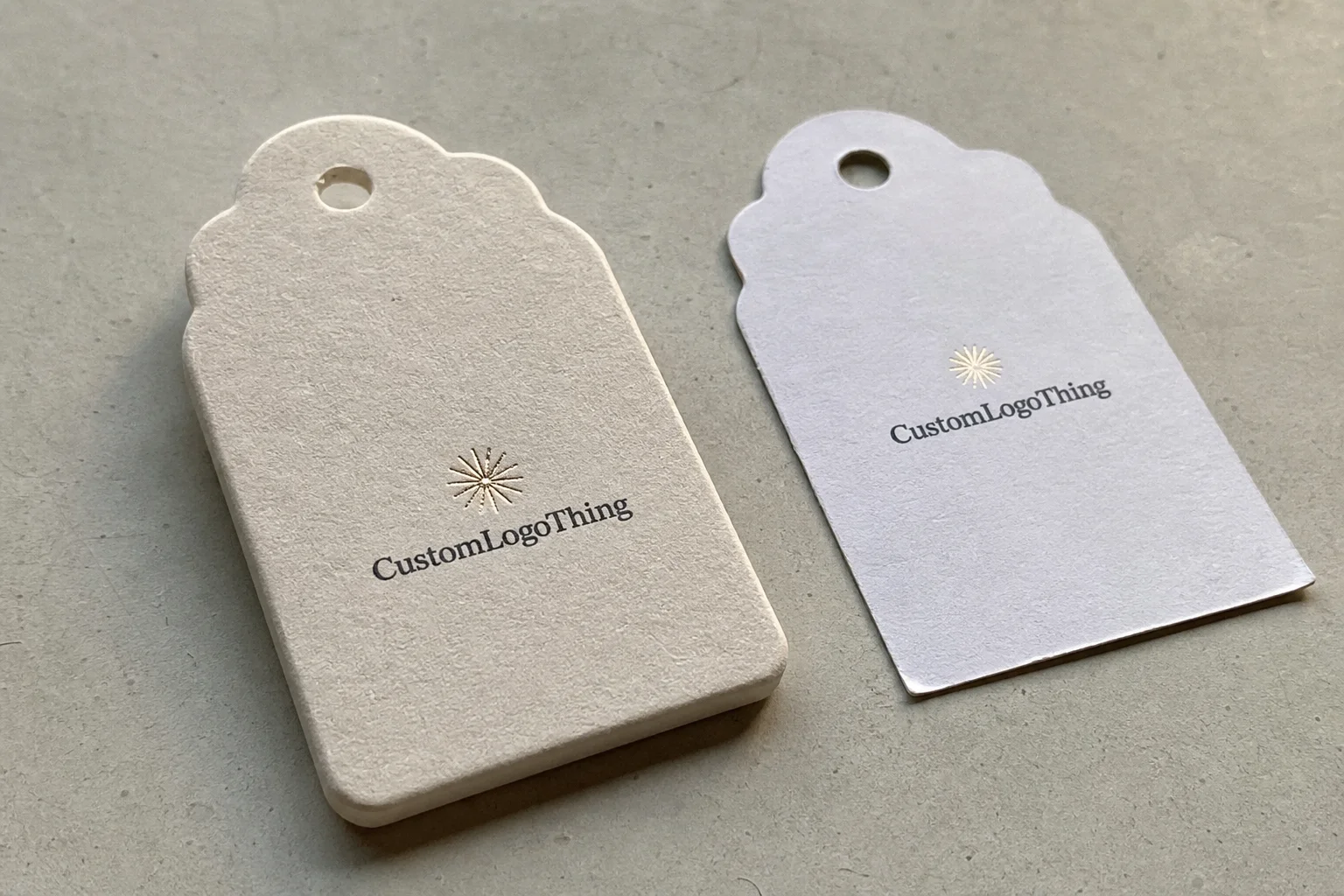
Thickness changes how a tag sits, swings, and reads from a few feet away. On shelf, buyers rarely measure caliper with a ruler; they feel proportion, weight, and confidence. That is why thickness decisions should start with the package itself, not with the artwork.
A tag that is too thin can make a premium serum feel underbuilt before anyone opens the cap. A tag that is too heavy can overpower a small pump bottle or dropper bottle, especially if the closure is narrow and the neck finish is delicate. The right choice depends on how much presence the brand wants to project and how much physical support the packaging can handle.
In practice, a lightweight cleanser line can usually live comfortably with a slimmer stock, while a midrange cream often benefits from a more substantial sheet that still bends cleanly at the hole. A luxury facial oil, meanwhile, may justify a heavier board or a premium textured paper because the tag becomes part of the sensory cue set.
That is the core idea here: thickness is not a style preference alone. It has to work with bottle size, closure shape, string attachment, and the feel the brand wants at shelf. If those pieces are out of balance, even good artwork can feel off.
“The most expensive-looking hang tag is not always the thickest one. It is the one that feels intentional on the actual bottle.”
How Stock, Finish, and Print Method Work Together
One mistake that comes up often is treating board thickness like the only decision. It is part of a system: stock, coating, print method, and finishing all affect the final feel, and the final feel is what the customer notices. A 14 pt sheet with a rich matte coat can present very differently from the same thickness in an uncoated kraft paper.
Coated stocks usually give sharper color and cleaner contrast, which is useful when the tag includes fine ingredient text, a shade name, or small compliance details. Uncoated papers tend to feel softer and more natural, which fits clean beauty, earth-forward branding, and recycled materials positioning. If the brand language leans toward sustainability, uncoated FSC certified paper or a tag made with post-consumer waste content can reinforce that story without shouting.
Print method matters too. Digital printing handles short runs well and can be excellent for multiple SKUs with variable copy, while offset printing usually gives stronger color consistency on larger runs and can handle solid areas with more control. Tiny type, hairline rules, and dense black text all need to survive the print process without fuzzing out, especially when tags carry batch code references, ingredient claims, or barcode support information.
Then comes finishing. Soft-touch lamination can make a tag feel luxurious in the hand, but it adds a layer that can affect schedule and cost. Matte and satin finishes usually sit between elegant and practical. Spot UV, foil, and embossing can elevate the piece, but each one adds setup time, inspection steps, and more risk if the artwork is not locked early.
If your packaging mix includes cartons, inserts, and labels, align the hang tag with the broader system. A tag with a high-gloss finish next to a natural kraft carton can feel disconnected, while a tag with a tactile matte finish beside a premium printed label tends to read as one coherent package family. For buyers comparing options, related solutions like Custom Labels & Tags can help keep the visual language aligned across the line.
Material Thickness Choices for Serum, Cream, and Oil Lines
For launch planning, it helps to think in practical thickness bands rather than chasing one perfect number. A slimmer build often works for entry-level or minimalist product lines, while thicker card or board makes sense for premium SKUs that need more presence. The exact caliper depends on the paper family, coating, and whether the tag is single-sided or double-sided printed, but the feel of 12 pt, 14 pt, and 16 pt-style builds is a useful starting point.
| Typical build | Best fit | Feel in hand | Common tradeoff |
|---|---|---|---|
| 12 pt-style stock | Light cleansers, introductory lines, value sets | Flexible, lighter, easy to hang | Can feel thin next to premium bottles |
| 14 pt-style stock | Most creams, balanced mid-market launches | Noticeably sturdier without feeling bulky | May need careful hole placement on smaller necks |
| 16 pt-style stock | Premium serums, oils, gift sets, hero SKUs | Substantial, polished, more collectible | Higher material cost and more visual weight |
For serum lines, a slightly heavier stock often works because the bottle itself is usually slender, glass, and visually premium. The hang tag needs enough stiffness to avoid curling or looking limp beside the bottle. For creams, especially if the jar or bottle is broader, a midweight tag can balance well without making the neck area feel crowded. Oils often sit in the luxury zone, so a thicker board, special finish, or textured uncoated sheet can help signal value.
Size matters just as much as thickness. A small neck or narrow closure can make a heavy tag seem oversized, especially after die-cutting and punching. Once a tag is rounded, hole-punched, or made with a reinforced eyelet, the handling changes a bit, because the cut edges and attachment point influence how it hangs. A reinforced hole is worth considering on sharper launches or on tags that will be handled often during fulfillment and retail set-up.
If you are launching multiple SKUs at once, do not assume every item needs the same build. A hero serum may deserve the heavier stock, while a cleanser or toner can use a slimmer version that keeps the family coordinated and protects margin. Matching the layout across the line matters, but matching the exact thickness does not always help.
For brands that want more sustainable positioning, paper choices can include FSC certified sheets, recycled content, or kraft paper with a natural finish. Those options can pair nicely with biodegradable packaging claims, but the claim should always be accurate to the full package structure, not just the hang tag itself.
Buyer-side reality check: on launch jobs, the difference between 12 pt and 16 pt is not just hand feel. It changes packing efficiency, the way string knots sit, how tags stack before kitting, and how much risk there is of corner damage during transit. If a supplier quotes the same handling method for all thicknesses, ask how they plan to pack and count the finished pieces.
Process and Lead Time: From Proof to Production Steps
Good launch timing usually starts with a clean dieline review. That means confirming dimensions, hole position, corner style, and the actual hanging method before any production order is locked. If the tag is meant to loop around a pump, cap, or bottle neck, the attachment needs to be tested against the real container size, not just a design mockup.
The proofing path is usually straightforward, but delays often creep in when one step is vague. First comes artwork review, where copy, logo placement, and bleed are checked. Then comes stock selection, which should be confirmed with enough detail to avoid last-minute substitutions. After that, the printer confirms ink expectations, finish choices, and any custom cut or punch requirements. Each of those choices can affect the schedule by a day or two, and specialty finishing can add more.
Clean input files save time. Final logo files, copy blocks, barcode data, and any required claim text should arrive ready for prepress rather than being assembled piecemeal. If there are multiple SKUs, it helps to provide a master file with clearly labeled versions instead of sending each one as a separate, loosely named revision. That kind of organization matters more than most people think, especially when a launch timeline is already tight.
Turnaround often runs about 12 to 15 business days after proof approval for a straightforward tag order, though specialty stock, foil, embossing, or multiple versions can push that longer. Shipping time and internal receiving also need room, because a tag that arrives on time at the printer but late in your warehouse still creates a launch problem.
If the brand is tying the launch to broader packaging standards, it is smart to check references from recognized bodies such as ISTA for distribution testing and FSC for responsible fiber sourcing. Not every hang tag needs formal testing, but the standards mindset helps keep packaging decisions grounded in real performance, not just visual appeal.
One practical detail that gets missed: if tags are pre-strung, ask whether stringing happens before or after final inspection. That changes both lead time and the defect risk. Pre-strung tags are faster for your team, but they also add another handling step that can introduce twist, length inconsistency, or damaged corners if the process is rushed.
Cost, Pricing, and MOQ Tradeoffs for Launch Quantities
Pricing is mostly driven by five things: stock thickness, sheet size, print coverage, finish complexity, and whether the order needs custom cutting or matching across several SKUs. The more variables you add, the more setup time and inspection time usually appear in the job. That does not mean the order becomes impossible; it just means the price structure needs to reflect real labor and material use.
For small runs, setup costs can dominate the price. A few hundred tags may cost disproportionately more per unit than a few thousand because the press, cutting, and finishing setup are spread across fewer pieces. As quantities rise, unit cost usually drops, especially when the design uses the same stock and the same die across the family.
MOQ rules are often about production efficiency rather than a hard rule of nature. A supplier may set a minimum because of sheet usage, press make-ready, or the way a finishing step is run. That is normal. The goal is to keep waste reasonable and maintain consistency. If a supplier quotes a higher minimum for a specialty finish, that usually reflects actual production conditions, not just sales preference.
For launch budgets, a practical rule works better than a generic “go premium everywhere” approach: spend more where the tag is touched and seen most, then simplify details that do not change shelf impact or durability. The tag face, the hole area, and the finish are usually where quality shows first. Background patterns, rarely read copy, or hidden back-panel decoration can often be simplified without damaging the brand impression.
| Order style | Typical setup burden | Best use | Cost behavior |
|---|---|---|---|
| Single SKU, simple print | Low | Small test launch or pilot run | Higher unit cost, lower complexity |
| Multi-SKU, shared stock | Moderate | Family launch with consistent branding | Better unit economics across the set |
| Multi-SKU, specialty finish | High | Premium launch or gift collection | Higher setup and more schedule coordination |
For buyers comparing options, the total landed value usually tells the more honest story. A tag that costs a little more but arrives with fewer defects, better color accuracy, and a more appropriate thickness can save time and headaches during fill and merchandising. The cheapest quote is not always the cheapest outcome once reprints, spoilage, and launch delays are counted.
Common Mistakes That Make Skincare Tags Feel Cheap
The first and most obvious mistake is a stock mismatch. A flimsy tag on a premium bottle can make the whole package feel underfunded. A tag that is too thick on a petite tube can look clumsy and out of scale. That kind of visual imbalance gets noticed immediately, even by people who cannot explain why it feels off.
Another common issue is weak attachment design. Tiny hole placements, fragile strings, or unreinforced punches can tear during packing or retail handling. If the tag is going through fulfillment, display set-up, and consumer handling, the hole area needs enough strength to survive the trip. This is where a small detail can have a big practical effect.
Layout problems also drag down perceived quality. Overcrowded copy, weak contrast, and tiny text can make the tag feel rushed, even if the print itself is technically clean. Skincare customers often read for ingredients, benefit claims, and usage notes, so the information hierarchy needs to be calm and legible. If everything is shouted at once, nothing feels premium.
Inconsistent sizing across a product family is another easy way to weaken the launch. If the serum tag, cream tag, and oil tag all follow different proportions without a clear reason, the line can look fragmented. A family set works best when there is a shared visual logic, even if the thickness or finish varies by SKU.
One more subtle issue: trying to make every tag do every job. The tag should support the package first, then promote the product second. If it becomes too crowded with claims, ingredient callouts, and branding flourishes, it starts to feel like a billboard hanging from a bottle. That is rarely the look a skincare brand wants.
From a packaging buyer’s point of view, the cleanest path is usually the one that balances simplicity with enough material substance to feel intentional. That is where a Printed Hang Tags for skincare launches material thickness guide approach saves money later, because it reduces rework, prevents visual mismatches, and makes the final package feel more considered.
Expert Tips and Next Steps Before You Request a Quote
Before requesting pricing, gather the basics: final bottle or jar dimensions, hanging method, quantity by SKU, target thickness, finish requests, and any regulatory text that must appear on the tag. The more complete the brief, the cleaner the quote. If the brand is still deciding between coated and uncoated stock, ask for two or three options instead of guessing.
Whenever possible, ask for a physical swatch. Paper and board always feel different in hand than they look on screen, and that difference matters more on beauty packaging than on many other categories. A swatch can reveal whether the tag feels too thin, too glossy, too smooth, or just right for the launch tone.
Test the tag on the actual bottle or cap before final approval. That single step catches a lot of avoidable problems: hole size, string length, hang position, and whether the tag swings cleanly or lands awkwardly against the bottle. It is a simple check, but it saves a surprising amount of grief later.
If sustainability is part of the brief, confirm what the claim really covers. FSC certified paper, recycled materials, and post-consumer waste content are valuable details, but they should be accurate and specific. A tag can support a more responsible message, yet the full package structure still needs to be reviewed honestly. For example, a kraft paper hang tag can support a natural aesthetic, but that does not automatically make the entire pack biodegradable packaging.
Here is a straightforward launch-ready checklist:
- Confirm bottle dimensions and closure type.
- Choose one primary thickness range and one backup option.
- Approve finish choices early.
- Provide final artwork and copy in organized files.
- Request a proof and, if possible, a sample swatch.
- Test the tag on the real product before production release.
- Lock the timeline with shipping buffer included.
If you keep the process grounded in the actual container, the actual shelf, and the actual customer hand feel, the rest gets easier. A thoughtful approach to thickness does more than improve appearance: it reduces packing issues, supports clearer pricing decisions, and helps the launch feel finished rather than improvised.
FAQs
What thickness is best for skincare hang tags on small bottles?
Start with a midweight stock that looks intentional without overpowering the bottle, then test it on the actual closure. Thinner stock usually works better for petite cleanser or treatment bottles, while a stiffer board suits premium serums or gift sets that need a more substantial feel.
Should skincare hang tags use coated or uncoated stock?
Use coated stock when you want sharper color, stronger contrast, and better protection for printed artwork. Use uncoated stock when the brand language is softer, cleaner, or more tactile and natural. The better choice is the one that matches the rest of the package system.
How does material thickness affect pricing on printed hang tags for skincare launches?
Heavier stocks usually raise material cost and can affect cutting, punching, and packing time. More complex finishes and custom shapes increase setup cost, especially on smaller orders. Pricing often improves when the launch is planned as a coordinated multi-SKU run.
How much lead time should I allow before a skincare launch?
Allow time for artwork review, proof approval, and any sample checks before production begins. Add extra schedule buffer if you need specialty finishing, multiple versions, or a tight color match. Shipping and internal receiving should also be built into the plan so the tags arrive before line fill.
What should be on a skincare hang tag besides the brand name?
Include the product name, key benefit, and any required regulatory or ingredient information that fits the format. Add barcode, shade or SKU identifiers, and care or usage notes if they support retail handling. Keep the hierarchy simple so the tag is useful first and promotional second.