Buyer Fit Snapshot
| Best fit | Printed Kraft Labels for Jars projects where brand print, material claims, artwork control, MOQ, and repeat-order consistency need to be specified before quoting. |
|---|---|
| Quote inputs | Share finished size, material target, print colors, finish, packing count, annual reorder estimate, ship-to region, and any compliance wording. |
| Proofing check | Approve dieline scale, logo placement, barcode or warning zones, color tolerance, closure strength, and carton packing before bulk production. |
| Main risk | Vague material claims, crowded artwork, missing packing details, or unclear freight terms can make a low unit price expensive after revisions. |
Fast answer: Printed Kraft Labels for Jars: Material, Adhesive, Artwork, and MOQ should be specified like a repeatable production item. The safest quote records material, print method, finish, artwork proof, packing count, and reorder notes in one written spec.
Production checks before approval
Compare the actual filled-product size with the drawing, then confirm tolerance on folds, seals, hang holes, label areas, and retail display edges. Reserve space for logos, QR codes, warning copy, and material claims before decorative graphics fill the panel.
Quote comparison points
Review material grade, print process, finish, sampling route, tooling charges, carton quantity, and freight assumptions side by side. A quote is only useful when the supplier can repeat the same color, closure quality, and packing count on the next order.
What Are Printed Kraft Labels for Jars?
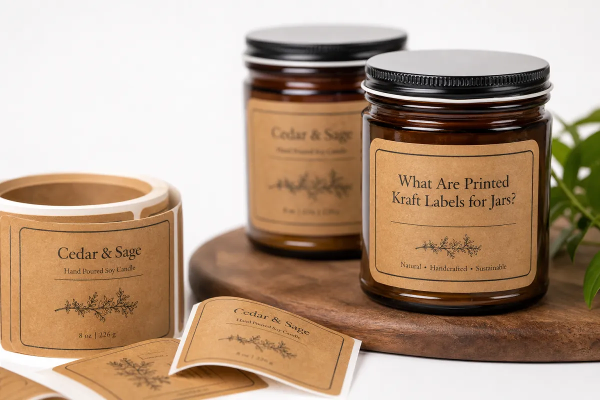
Printed Kraft Labels for jars give a product that handmade, grounded look without making the package feel overworked. They read honest. A little rough. Not sloppy, just unpolished in the right way. That is usually the appeal. The catch is that printed kraft labels for jars only hold up when the paper, adhesive, print method, and storage conditions all play nicely together. Put the wrong stock on a humid shelf or in a cold room, and the rustic charm starts peeling off. Literally.
At the simplest level, printed kraft labels for jars are pressure-sensitive labels made with kraft-style paper stocks. Most are uncoated or lightly coated. Most have that familiar brown, recycled-looking tone. Some use true kraft paper with visible fiber and variation. Others mimic the look with texture and print choices. Either way, the effect is the same: matte, earthy, low-gloss, and not trying too hard.
That is why printed kraft labels for jars show up on food jars, candles, bath salts, honey, spices, granola, jams, and pantry staples. The label does a lot of branding before anyone reads the ingredient panel. It signals small-batch. It signals warmth. It can support a premium price without dressing up like it owns the place. The flip side is just as real. A bad kraft label can make a product look dusty, crowded, or flat-out cheap.
The tradeoff is simple: the more natural the label looks, the more disciplined the spec has to be. Fibrous paper can soften contrast. Inks can sink differently. Fine type can disappear into the surface. None of that makes printed kraft labels for jars a bad choice. It just means the label has to function like packaging, not wall art.
"A kraft label earns its keep only when it survives the same abuse as the jar: handling, moisture, and shelf wear."
For brands that want something tactile and grounded, printed kraft labels for jars sit in a useful middle zone. They feel less formal than white labels and less expensive than custom cartons. They also keep the package light and simple, which is a nice bonus when you do not want the branding to start a shouting match with the product.
How Printed Kraft Labels for Jars Work
To judge printed kraft labels for jars properly, break the label into four parts: the face stock, the adhesive, the liner, and the printed layer. Each one matters. The face stock sets the look and texture. The adhesive decides whether the label stays put on glass or plastic. The liner affects how the label converts and applies. The printed layer determines whether the art still looks sharp on a textured surface.
The jar matters just as much. A flat carton gives you room to breathe. A curved glass jar does not. Curves pull on the edges. That is where labels lift if the adhesive is wrong or the artwork is too wide for the panel. Cold-fill products can create condensation fast. Oily hands can leave dull smears. Refillable jars can get washed, rubbed, and handled again and again. Those details separate solid printed kraft labels for jars from labels that only behave in a mockup.
Print method matters too. Digital printing usually makes the most sense for short runs because setup is lighter and changes are easy. Flexographic printing starts making more sense at higher volumes because the unit cost improves once the plates are made. Offset printing can deliver strong detail and color control for some projects, though it is less common for pressure-sensitive label work and not always the best fit for highly variable runs. For printed kraft labels for jars, the right method is the one that matches volume and artwork complexity, not the lowest quote in a spreadsheet.
Finish choices can improve durability without killing the kraft look. Matte varnish adds protection while keeping the paper feel. Soft-touch lamination gives a more upscale touch, though it can mute the rustic character if you go too far. Spot coating helps protect high-wear zones like logos or handling areas. On printed kraft labels for jars, the finish should help the label survive rub and moisture, not turn it into a shiny sheet that fights the material story.
Adhesive choice is where a lot of buyers get surprised. Permanent adhesive is usually the safest call for retail jars that will ship, sit on shelves, and get handled by customers. Removable adhesive makes more sense for refillable containers, seasonal products, and jars that need clean removal. Cold storage, humidity, and condensation all push the spec toward a label adhesive built for those conditions. Standard paper-label adhesive often is not enough, and yes, that detail gets ignored way too often.
- Face stock: choose natural brown kraft, bleached kraft, or a kraft-look paper based on contrast needs and brand tone.
- Adhesive: match permanent or removable adhesive to temperature, washability, and reuse cycle.
- Finish: use matte varnish, spot coating, or light lamination only where abrasion risk makes it worth it.
- Print method: pick digital, flexo, or offset based on volume, detail, and how often the artwork changes.
One practical test for printed kraft labels for jars is simple: how does the label behave after the customer has touched it three times, moved it through a fridge, and set it on a countertop? That is the real test. If the answer feels shaky, the spec is not done.
Key Factors in Printed Kraft Labels for Jars
Material selection comes first. Not every kraft paper behaves the same way. A recycled-content sheet with a rough fiber structure looks more natural, but it can absorb ink faster and soften edge detail. A smoother kraft-look paper improves readability while keeping the earthy look. Basis weight matters too. A lighter face stock can wrap around a small jar better. A heavier one can feel sturdier and resist tearing during application. For printed kraft labels for jars, the right paper fits the jar size, the brand tone, and the handling conditions at once.
Contrast is the next lever, and this is where a lot of label designs get lazy. Dark brown text on dark brown kraft may look tasteful on screen. In a store, it can vanish. Thin serif fonts can feel elegant. They can also disappear into the paper texture. Small ingredient text gets hit hardest. Curved jars make the readable area even smaller. Strong printed kraft labels for jars usually use deep black, charcoal, dark green, or another high-contrast ink and keep the smallest text large enough to read without squinting like you are checking a contract in bad light.
Durability comes after that. A jar label may face refrigeration, humidity, shipping abrasion, oily fingerprints, and the occasional wipe-down. Some products sit near a stove or in a bathroom, where steam and splashes are part of the job. Others get packed into cartons and bounced around in distribution. If the label has to survive more than a calm pantry shelf, the spec should call for moisture resistance and rub resistance. That is where printed kraft labels for jars often need a finish upgrade, even if the look stays matte and paper-like.
Brand fit is easy to get wrong. A kraft label can strengthen a handmade or premium story. It can also make a product feel too rustic if the typography, artwork, and color palette are not controlled. For some brands, that warmth is exactly right. For others, it clashes with a cleaner, more clinical, or more upscale look. The best printed kraft labels for jars feel deliberate. Not vaguely "natural." Deliberate.
Regulatory needs are the part people love to postpone. Bad idea. Ingredient panels, net weight statements, lot codes, and barcode placement all need space. Barcode scanability depends on quiet zone, contrast, and print quality. Small jars have a tiny amount of room to hold a lot of information. Planning for compliance early avoids ugly redesigns later. It is a lot easier to reserve space at the start than to cram legal copy into the artwork after everything else is already approved.
For sustainability claims, ask for specifics. If the paper is FSC-certified, check the chain-of-custody status and what that certification actually covers. The Forest Stewardship Council explains its standards at fsc.org. If a supplier says "recyclable" or "eco-friendly" without explaining the substrate and adhesive, keep pressing. Printed kraft labels for jars can support a responsible packaging story, but only when the claims are true and the components fit the disposal path in the market where the jars are sold.
For distribution testing, good suppliers think beyond the art file and talk about handling. The ISTA test protocols are useful because they focus on shipment hazards, not just visual approval. That matters. A label can look perfect on day one and still fail after vibration, compression, or temperature swings. With printed kraft labels for jars, the question is not only "Does it look good?" It is "Will it still look good after it has been moved, chilled, stacked, and touched?"
Printed Kraft Labels for Jars: Cost and Pricing Factors
Pricing for printed kraft labels for jars depends on more variables than most buyers expect. Material grade is a big one. A premium kraft stock with consistent fiber and better print holdout costs more than basic paper. Adhesive selection moves the price too. Permanent, freezer-grade, or moisture-resistant adhesives usually cost more than standard removable options. Finish matters as well. Matte varnish is usually cheaper than soft-touch lamination, and spot coating sits somewhere in the middle depending on coverage and setup.
Run size changes the economics fast. Small runs carry heavier setup costs because the artwork, proofing, and conversion time get spread over fewer labels. Larger orders usually bring the unit price down because press setup and material handling are divided across more pieces. That does not mean a giant run is always smart. If flavors, scents, or seasonal artwork change quickly, overbuying labels creates dead inventory. The better move for printed kraft labels for jars is to compare several quantity tiers before locking in the order.
Shape and die-cut complexity matter too. A simple rectangle usually costs less than a custom contour cut with rounded corners, a hang tab, or a strange silhouette that looks cool and prints like a headache. Labels with many colors, fine reverse type, or large solid ink areas can also raise cost if the print process needs tighter control. Rush production is another budget trap. Faster timelines usually mean extra labor, priority scheduling, or expedited freight. If the project is urgent, the quote should show those charges clearly instead of hiding them inside a vague total.
Sustainability choices can raise cost in one line and lower it in another. A recycled-content paper may cost more than a generic stock, but it can help a brand avoid extra outer packaging or reduce the need for separate inserts and promo pieces. In some cases, printed kraft labels for jars can do the branding work that a box, sleeve, or insert would otherwise handle. That is not a magic savings trick. It is a system-level tradeoff worth checking.
A simple buying framework keeps quotes honest: use the same specification across multiple quantities, request samples on the actual jar size, and compare print method, adhesive, finish, and delivery terms line by line. Two quotes can look close while hiding very different performance. If one supplier uses a heavier stock or a better adhesive, the cheaper option may not be the better value.
| Option | Typical Order Size | Approx. Unit Cost | Best Fit | Notes |
|---|---|---|---|---|
| Short-run digital kraft labels | 500-2,000 pieces | $0.18-$0.45 | New SKUs, test launches, small batch products | Lower setup cost, good for frequent artwork changes |
| Mid-run flexo kraft labels | 3,000-10,000 pieces | $0.06-$0.18 | Stable SKUs, repeat orders, broader retail distribution | Better economics once plate and setup costs are spread out |
| Premium finished kraft labels | 2,000-8,000 pieces | $0.14-$0.38 | High-touch brands, gift sets, upscale food or candle jars | Soft-touch, spot coating, or specialty finish can raise the price |
| Freezer-grade or moisture-resistant labels | 1,000-10,000 pieces | $0.16-$0.40 | Cold-fill foods, refrigerated products, humid storage | Adhesive and finish costs rise, but failure risk falls |
For many buyers, the real comparison is not kraft versus white. It is what you gain by choosing printed kraft labels for jars. If the answer is stronger shelf appeal, a more believable handmade signal, and fewer extra package components, a slightly higher label price can still make sense. If the answer is only "it looks natural," the math gets weaker fast.
Step-by-Step Process for Printed Kraft Labels for Jars
The smartest place to start is the jar itself. Measure the usable label panel, the curve of the body, the diameter, the shoulder shape, and the surface finish. A glossy straight-sided jar behaves differently from a frosted jar or a tapered container. A label that looks fine in a mockup can wrap badly once it hits the real container. That is why printed kraft labels for jars should be planned from the package outward, not from the artwork inward.
Next, build the artwork with production in mind. Leave safe margins around the edges so important copy does not get dragged into the curve. Make the hierarchy obvious. Product name first. Variant second. Required copy where it can actually be read. If the brand uses a logo with delicate strokes, test whether those lines hold cleanly on kraft paper. A thicker typeface usually performs better than a thin elegant one on printed kraft labels for jars, especially when the labels are small.
After the artwork, choose the substrate and adhesive based on the jar’s life cycle. A jam jar that will be refrigerated, shipped, and then opened slowly at home needs different performance than a candle jar sitting in a dry living room. A refillable spice jar needs different removability than a retail honey jar. If the container will be chilled or exposed to condensation, the label spec should account for that from the start. A supplier can usually recommend a face stock that fits the real use case instead of some generic "kraft" option that sounds fine and behaves badly.
Proofing should happen on the real substrate, not just on a screen. Ask for a sample or proof that uses the same paper, adhesive, and finish as the final order. Then test application speed, bubble resistance, edge lift, and barcode scanability. If the jar is curved, apply the label under the same conditions the production team will face. A label that behaves in a controlled sample can still misbehave on a real line if the curve is tighter than expected. Good printed kraft labels for jars should be tested on the jar, not admired in isolation.
Rollout planning matters more than many teams think. Labels should arrive with enough lead time for packing, QA, and any adjustment needed before launch. Keep a small buffer for reorders if the product sells faster than expected. Tie label inventory to sales velocity instead of a rough guess. If the line is growing, it can make sense to bundle related items through Custom Labels & Tags so material and artwork standards stay consistent across the range.
- Measure the jar accurately. Capture diameter, straight panel height, and usable space before design starts.
- Design for the curve. Keep critical text inside the flatter part of the jar body and avoid delicate details near the edges.
- Choose the right stock. Match the face stock and adhesive to refrigeration, humidity, oil exposure, or reuse.
- Test the proof. Check adhesion, scanability, and appearance on the actual jar under normal lighting.
- Plan the reorder. Keep a reserve and set a clear trigger point for replenishment.
That process sounds methodical because it is. Printed kraft labels for jars reward calm planning. The brands that rush straight to the look usually pay later in reprints, reapplication labor, or compliance edits. Packaging has a sense of humor like that.
Common Mistakes with Printed Kraft Labels for Jars
The most common mistake is weak contrast. Kraft already brings texture, so text that is too light, too thin, or too small disappears quickly. Some teams defend the choice by calling it "subtle" or "artisan." On the shelf, subtle can just mean unreadable. Strong printed kraft labels for jars use enough contrast that the brand still reads clearly at arm’s length and under warm retail lighting.
The second mistake is choosing the wrong adhesive. A dry pantry jar is one thing. A chilled salsa jar is another. A refillable jar is another again. Edges curl when the adhesive is not built for the environment. Residue shows up when removable adhesive gets used where permanent hold is needed. Labels slide when condensation breaks the bond before it sets. The fix is not to blame the press. It is to specify the right adhesive for printed kraft labels for jars before the run starts.
Overcrowding comes next. Kraft already brings texture and warmth, so the label does not need every icon, seal, claim, and badge available. Too many elements fight for attention and make the product look busy. A better design leaves room around the logo and keeps the hierarchy clean. Often, a simpler layout feels more premium because the material gets space to do its job. With printed kraft labels for jars, restraint usually reads as confidence.
Skipping tests on the actual jar is another classic mistake. A flat sample sheet is not enough. A curved body can reveal bubbles, wrinkles, and edge lift that never showed up in the proof. If the product line includes multiple jar sizes, each one should be reviewed separately. The smallest jar may need a different label shape or tighter copy layout. That detail matters because printed kraft labels for jars do not behave the same across container families.
Finally, many teams leave compliance copy until the end. Ingredient text, lot codes, nutrition panels, warning statements, and barcodes all take room. If the concept eats most of the label area before those items are placed, the final version becomes crowded or awkward. The safer path is to reserve that information early and build the art around it. That keeps the design cleaner and reduces the risk of a late-stage layout scramble.
There is also a quieter failure mode that gets missed a lot: the label may look too natural for the product. A minimalist kraft label can work beautifully on candles or handmade granola. On a more technical or clinical product, it can feel too casual. The point is not that printed kraft labels for jars are always right or always wrong. The point is that the visual code has to match the product category, the price point, and the buyer’s expectations.
Expert Tips and Next Steps for Printed Kraft Labels for Jars
The best decision process is simple: confirm the jar conditions first, then choose the label spec. Not the other way around. Too many teams fall in love with the look of printed kraft labels for jars and only later ask whether the label can tolerate cold storage, humid production rooms, or repeated handling. That order is backwards. Start with the environment, then fit the aesthetic inside it.
Ask suppliers for sample packs that match the exact print method, finish, and adhesive you intend to order. A paper description alone does not tell you how the label will behave on glass. A matte kraft sheet with a standard adhesive can feel very different from a moisture-resistant version with a permanent acrylic bond. If possible, test at least three things before scaling: condensation resistance, rub resistance, and readability under the same lighting your customer will see.
A useful question for any label project is whether the sustainability story is visible and credible across the whole package, not just the label. If the jar is heavy, the cap uses mixed materials, or the outer shipper is overbuilt, the kraft label may become a weak signal rather than a strong one. Brands that do well with printed kraft labels for jars usually align the label with the rest of the package system so the story feels consistent from shelf to shipping case.
That is where a real spec sheet helps. List jar dimensions, finish expectations, adhesive requirements, quantity tiers, shelf life, and any compliance text that has to fit. Then request quotes at multiple volume levels. If you are building a wider package family, it also helps to discuss the label as part of a broader system through Custom Labels & Tags, especially if the same brand needs seasonal versions or multiple SKUs.
One last thing: do not treat testing as some optional extra. It is usually cheaper than a reprint. A small pilot order on one jar size can show whether the stock is too rough for fine text, whether the adhesive holds on chilled glass, and whether the label panel gives the design enough room to breathe. That kind of pilot often saves weeks later. For printed kraft labels for jars, a short trial run is often the smartest insurance on the table.
- Request tiered quotes: 1,000, 3,000, and 10,000 pieces usually reveal the real price curve.
- Test the real jar: curvature, condensation, and lighting change the result.
- Match the story: make sure the label, cap, and shipper support the same brand position.
- Keep one buffer: reserve a small extra lot so the launch is not exposed to a stockout.
If the project gets this level of discipline, printed kraft labels for jars can deliver the mix most packaging buyers actually want: shelf appeal, practical durability, and a sustainability signal that feels grounded instead of performative. That balance does not happen by accident. It gets designed.
Common Questions
Are printed kraft labels for jars good for refrigerated products?
Yes, if the adhesive and face stock are built for cold and moisture exposure. Ask for condensation testing on the exact jar and chill cycle you use, not a generic sample. For products that move in and out of the fridge, a moisture-resistant finish usually helps preserve readability and edge adhesion.
What adhesive works best for printed kraft labels for jars?
Permanent adhesive is usually best for retail jars that need to stay labeled through shipping, handling, and storage. Removable adhesive makes more sense for refillable jars, seasonal batches, or reusable containers. If the jar will be cold-filled or stored in humidity, choose an adhesive rated for that environment instead of a standard paper label adhesive.
Do printed kraft labels for jars cost more than white labels?
They can, depending on the stock, finish, and print process. Small runs often cost more per label because setup and proofing are spread across fewer units. The price gap may shrink when kraft labels replace extra outer packaging or support a stronger premium brand position.
How do I make printed kraft labels for jars easier to read?
Use dark, high-contrast ink colors and avoid thin fonts that disappear into the textured surface. Keep the most important text large enough to read on a curved jar from arm's length. Leave enough open space so the kraft texture feels intentional instead of crowded.
Can printed kraft labels for jars include barcodes and ingredient text?
Yes, but the layout needs enough clean space for scanning and compliance copy. Test barcode readability on the final material, because texture and low contrast can affect scan performance. If the label is small, prioritize the legal text hierarchy early in the design process rather than adding it at the end.
Printed kraft labels for jars are not just a style choice. They are a packaging decision that touches print quality, durability, compliance, and unit economics all at once. If those pieces line up, printed kraft labels for jars can do exactly what buyers want: look natural, read clearly, and hold up long enough to justify the spend. The practical next step is boring, but it works: test the label on the real jar, in real conditions, before you place the full order.


