Buyer Fit Snapshot
| Best fit | Printed Soap Boxes with Logo projects where brand print, material claims, artwork control, MOQ, and repeat-order consistency need to be specified before quoting. |
|---|---|
| Quote inputs | Share finished size, material target, print colors, finish, packing count, annual reorder estimate, ship-to region, and any compliance wording. |
| Proofing check | Approve dieline scale, logo placement, barcode or warning zones, color tolerance, closure strength, and carton packing before bulk production. |
| Main risk | Vague material claims, crowded artwork, missing packing details, or unclear freight terms can make a low unit price expensive after revisions. |
Fast answer: Printed Soap Boxes with Logo: Board, Finish, Dieline, and Unit Cost should be specified like a repeatable production item. The safest quote records material, print method, finish, artwork proof, packing count, and reorder notes in one written spec.
Production checks before approval
Compare the actual filled-product size with the drawing, then confirm tolerance on folds, seals, hang holes, label areas, and retail display edges. Reserve space for logos, QR codes, warning copy, and material claims before decorative graphics fill the panel.
Quote comparison points
Review material grade, print process, finish, sampling route, tooling charges, carton quantity, and freight assumptions side by side. A quote is only useful when the supplier can repeat the same color, closure quality, and packing count on the next order.
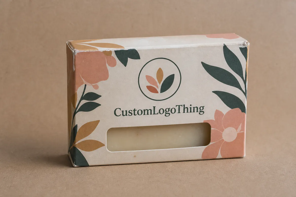
Printed soap Boxes with Logo do more than hold a bar of soap. They shape the first impression, protect a product that can pick up scuffs, dents, or scent transfer, and quietly tell a buyer whether the brand feels handcrafted, clinical, premium, or gift-ready. Two soaps can share almost the same formula and still land very differently on shelf. The carton does part of the talking before anyone lifts the bar.
That is the real job of printed soap boxes with logo: not decoration for decoration's sake, but packaging that supports trust, handling, and the sale itself. A small brand may need a carton that looks refined enough for retail, sturdy enough for shipping, and simple enough to produce without trapping cash in excess inventory. If you are comparing box styles, you can also browse Custom Packaging Products to see how different carton structures affect fit, print area, and presentation.
Soap is a deceptively simple product. Buyers usually cannot judge the formula from a distance, so they read the pack for clues: the paper texture, the sharpness of the logo, how the ingredients are laid out, and whether the box feels aligned with the scent profile. That is why printed soap boxes with logo matter so much for handmade bars, natural skincare lines, aromatherapy soaps, and seasonal gift sets. The packaging becomes a signal of care, and in retail, care sells.
From a packaging buyer's point of view, the smartest soap carton balances four things at once: structure, print quality, Cost, and Shelf Impact. A carton that looks lovely but crushes in transit creates returns and complaints. A carton that protects the bar but reads poorly on shelf leaves money on the table. The sections below break down how printed soap boxes with logo are made, what they cost, which materials deserve a look, and how to avoid the mistakes that slow a launch or weaken shelf presence.
Printed soap boxes with logo: why the first impression matters
Buyers decide faster than most brands expect. A soap sitting in plain stock can still be perfectly made, but it often feels anonymous, and anonymous products need more effort to earn attention. By contrast, printed soap boxes with logo create instant context. The carton can say "natural," "luxury," "artisan," "sensitive skin," or "giftable" before the buyer even touches the bar.
That matters because soap is bought in more than one way. Some customers are restocking a household item. Others are shopping with their eyes and noses, choosing a bar as a small indulgence or a host gift. In those second and third scenarios, printed soap boxes with logo influence perceived value as much as the soap itself. The product may be the same, but the presentation changes the story.
A box is often the first salesperson. It does not close the deal alone, but it starts the conversation. Good printed soap boxes with logo build trust through visible order: the logo is crisp, the typography is balanced, the ingredients are readable, and the structure feels intentional rather than improvised. If the carton feels rushed, the brand can feel rushed too.
A well-made soap carton has to do three jobs at once: protect the bar, communicate the brand, and survive the handling that comes with packing, shipping, and retail display.
Structure and design should be treated as one conversation. A clean tuck-end carton can work beautifully for a lightweight bar. A heavier soap may need thicker board or a tighter fit. A premium line may benefit from soft-touch lamination or foil, while an earthy brand may look better on kraft with restrained ink coverage. Printed soap boxes with logo should feel like they belong to the product, not like they were dropped on top of it as an afterthought.
There is also a practical side to first impressions. Retail buyers notice consistency across a line. If one scent has a box that looks sharp and another has fuzzy type or mismatched color, the range feels less settled. That is why printed soap boxes with logo should be designed as a system. Even small brands usually benefit from a repeatable layout: logo placement, scent name, net weight, ingredients, and a shared visual language across the collection.
A useful comparison is a bookstore spine. The best covers still matter, yet a strong spine lets the product stand in a crowded row and carry its identity from several feet away. Soap cartons behave in the same way. On shelf, a customer does not study the box like a design critic. They scan. Clear type, a sensible hierarchy, and a clean logo turn that scan into recognition.
For brands that want a more retail-ready look, the broader packaging guidance available through the Packaging School and packaging industry resources offers a useful benchmark. The design principles stay consistent whether the box is for soap, lotion, or a specialty gift item: clarity, structure, and consistency matter more than ornament alone.
I have sat through enough press checks to know this: even a beautiful design can fall flat if the board choice is wrong or the logo is placed too close to a fold. The carton can look elegant on screen and still read as cramped once folded. That gap between mockup and object is where experienced packaging teams earn their keep.
How printed soap boxes with logo are made: process and timeline
The production path for printed soap boxes with logo usually starts with a dieline. That flat drawing shows panel sizes, folds, glue tabs, and bleed areas, and it is the map that tells the printer and carton maker how the finished box will assemble. If the brand is using an existing style, such as a tuck-end carton or sleeve, the process moves faster. If the structure is custom-sized around a specific soap bar, the project takes longer because the dimensions have to be confirmed before print can begin.
Once the dieline is approved, artwork setup becomes the next critical step. The logo, ingredients, scent name, regulatory text, barcode, and any claims need to fit the panel layout without feeling crowded. With printed soap boxes with logo, the artwork stage is where most avoidable delays appear. A logo placed too close to the fold, a barcode too small, or a font outlined incorrectly can all create rework before the press ever starts.
The physical production flow is straightforward on paper: proofing, print, coating or finishing, cutting, creasing, folding, gluing, inspection, and packing. The catch is that every one of those steps can shift the timeline. A simple one-color kraft carton may move quickly. A carton with foil, embossing, spot UV, or a custom window may need more setup and drying time. That is why printed soap boxes with logo often take longer because of finishing decisions, not because of the printing itself.
Typical turnaround depends on order size and complexity, but a realistic planning window for many custom carton jobs is often 12-15 business days from proof approval, then shipping time on top of that. If the artwork is already prepared and the structure is standard, the project can move faster. If the brand needs structural revisions, special inks, or a new size, the timeline stretches. Approval speed is part of production speed. Fast approvals shorten lead time. Late revisions lengthen it.
The best way to avoid surprises is to clarify the variables before the quote is finalized. Ask whether the box is being produced from an existing style or a fully custom size. Ask which print method is being used. Ask whether the finish is aqueous coating, gloss lamination, matte lamination, or soft-touch. Those details shape how printed soap boxes with logo will look, feel, and arrive.
If the cartons will travel through distribution, it is smart to think beyond the box itself and consider transit stress. The ISTA testing standards are useful because they remind brands that compression, vibration, and drop impact matter just as much as shelf appeal. A pretty carton that bursts open in shipping is not a good carton.
There is also a difference between what happens on press and what happens after press. Printing may take only a portion of the schedule, but curing, converting, finishing, and packing can take longer than expected. In small runs, the setup time can dominate the job. In larger runs, machine scheduling and post-press handling matter more. Either way, printed soap boxes with logo move through a chain of steps, and the whole chain has to stay aligned.
A clean approval cycle is worth a lot. The faster the proof is approved, the sooner the job enters production. The more complete the artwork file, the fewer back-and-forth questions come up. For a brand trying to hit a launch date or a holiday sell-in, those days matter. A week lost in proofing can become a missed retail window, and packaging delays rarely care about the marketing calendar.
There is a strong analogy here with tailoring. A well-fitted suit does not happen because the fabric is expensive. It happens because measurements are right and the fitting stages are handled with care. Soap cartons work the same way. The fit, the fold, and the finish all need to line up, or the whole presentation loses authority.
Printed soap boxes with logo cost and pricing factors
Pricing for printed soap boxes with logo is shaped by several moving parts, and the final number usually makes sense once those parts are visible. Quantity is the biggest one. A run of 500 cartons almost always carries a higher unit price than 5,000 cartons because setup costs are spread across fewer pieces. That is not a trick; it is how print and converting economics work.
Box dimensions matter too. A larger carton uses more board and can require a larger press sheet or different imposition, which changes yield. Board thickness also affects price. A lightweight cosmetic carton may be inexpensive, but if the soap is dense, wrapped tightly, or intended for premium retail display, the board may need to be sturdier. With printed soap boxes with logo, a small change in caliper can shift material cost and folding performance at the same time.
Print coverage is another major driver. A single-color kraft box with restrained ink coverage is usually simpler than a full-bleed, full-color design with white underprint, foil accents, and a special coating. Special finishing adds setup time and material cost. Embossing, debossing, foil stamping, and spot UV can make printed soap boxes with logo feel premium, but those details should be tied to the brand position, not added because they sound attractive in a quote.
Short runs can be a smart tool for testing. If a brand is launching a seasonal scent, a limited collaboration, or a new format, a smaller order helps avoid overcommitting to inventory. In that case, the unit price may be higher, but the business risk is lower. That tradeoff often makes sense. If a soap line is already stable and repeat orders are likely, larger quantities usually bring better pricing efficiency for printed soap boxes with logo.
| Option | Best for | Typical unit price impact at 5,000 pcs | Notes |
|---|---|---|---|
| Natural kraft, 1-color print | Earthy, handmade, ingredient-led brands | Lowest | Good value if the design is simple and the look should feel organic. |
| SBS white board, full-color print | Bright retail presentation and detailed graphics | Moderate | Better for clean color reproduction and finer typography. |
| Matte lamination | Modern, calm, premium positioning | Moderate to higher | Improves scuff resistance and gives printed soap boxes with logo a softer surface. |
| Soft-touch finish with foil | Gift sets and premium lines | Higher | Creates a strong tactile cue, but it should match the product price point. |
| Custom insert or specialty structure | Fragile bars, bundles, display kits | Highest | Adds material, tooling, and assembly complexity. |
That table is useful because it shifts the conversation from "cheap versus expensive" to "what are you actually buying?" A quote for printed soap boxes with logo should be read in the same way a buyer reads a spec sheet. Look at board grade, print method, finish, size, and conversion complexity. Two quotes that look close on paper may differ quite a bit in real-world durability or shelf appeal.
Another factor worth watching is compliance and sourcing. If your brand wants recycled content, FSC-certified paper, or a specific environmental claim, confirm the supporting documentation before placing the order. The FSC system is a useful reference for paper sourcing and chain-of-custody thinking. For many brands, that documentation matters as much as the visual finish because it affects how the product is marketed and how claims are supported.
There is also a hidden cost in inconsistency. If a soap line uses one carton for lavender and a different carton style for citrus without a clear design system, the brand can end up paying more for less recognition. In practice, repeating a common box structure across scents often saves time and helps printed soap boxes with logo feel like a family of products instead of disconnected one-offs. A unified system also makes reorders simpler, which matters more than many teams admit once the first launch is over and the business moves into replenishment mode.
Key design and material choices for printed soap boxes with logo
Material choice should start with the soap itself. A heavier bar may need a firmer board to resist crushing and keep the sides crisp. A wrapped bar with higher oil content may benefit from a coating that handles contact better. A moisture-sensitive formula may do better with packaging that protects against humidity while still allowing the brand to present well on shelf. That is why printed soap boxes with logo should always be matched to the product, not just to the artwork.
Kraft board gives an earthy, handmade feel and works especially well for brands that want to emphasize simple ingredients, low-key beauty, or a less polished artisan look. SBS white board, by contrast, usually gives brighter print reproduction and a cleaner premium finish. Matte lamination softens the visual effect and cuts glare, while gloss adds shine and can make color pop under retail lighting. Soft-touch feels velvety and refined, though it is not the best choice for every soap line. The best printed soap boxes with logo are the ones where the material supports the message instead of fighting it.
Typography matters more than many brands expect. Soap cartons often have limited face area, so the type has to do a lot of work. A logo should be large enough to read at arm's length, but not so large that it crowds out the product name or ingredient details. In a small package, hierarchy is everything. Buyers should be able to spot the brand, identify the scent, and understand the basic promise in a quick glance. That is the point of well-planned printed soap boxes with logo.
Color choice should be tied to the product story. Greens, creams, and browns can support natural positioning. Crisp whites, cool grays, and restrained accents can feel clinical or derm-inspired. Rich jewel tones can push a more indulgent, gift-worthy mood. The wrong color can make a soap feel off-brand even if the print quality is excellent. Clean artwork can lose impact quickly when the colors do not match the scent family or the shelf environment.
Do not forget the practical information. Ingredient lists, net weight, barcode placement, and any required claims need room. If the front panel becomes overloaded, the box can start to feel noisy and less premium. Good printed soap boxes with logo leave breathing room. They also account for retail needs, which often means keeping the barcode in a clean zone, aligning the scent name consistently, and giving the ingredients enough contrast to remain readable.
If the brand sells through stores, think about how the box looks from a few feet away and how it behaves in a tray or shelf set. A carton that reads well in a flat mockup can look cramped once folded. That is why proofing on the correct dieline matters so much. A good designer does not just place graphics; they place them where the finished box can actually display them. The difference shows up in the hand, not only on the screen.
Small design choices that change the result
One thin rule line, one shift in logo size, or one change in the amount of empty space can transform how printed soap boxes with logo feel in the hand. Small brands often discover that a less crowded design looks more premium than a busier one, even when the busy version uses more decoration. That is because restraint gives the eye a place to rest.
Sometimes the smartest move is to let the paper texture do part of the talking. Kraft stock with a single dark ink can look far more confident than a carton packed with gradients and tiny type. On the other hand, if the line is built for upscale retail or gifting, a white board with a controlled matte finish may carry the cleaner, more polished story. There is no universal winner, only the right match for the soap and the brand.
Panel balance matters too. A front face with too much copy feels crowded; a side panel with too little information feels unfinished. Designers often talk about "white space," but on soap cartons the better word may be "breathing room." The carton needs enough open area to keep the logo legible and enough structure to keep the ingredients from looking like an afterthought.
Step-by-step guide to ordering printed soap boxes with logo
The easiest way to order printed soap boxes with logo is to treat the project like a short production checklist instead of a design mystery. Start with the soap dimensions, including length, width, height, and any wrap or label allowance. A bar that measures 3.5 by 2.25 by 1.1 inches should not be boxed as if it were smaller, because a loose carton will slide around and a tight carton may crush the wrap or distort the sides.
Next, choose the box style. Common options include tuck-end cartons, reverse tuck, sleeve and tray combinations, and specialty display formats. For most bar soaps, a simple folding carton is enough. For gift sets or multi-bar bundles, a more structural format may make sense. If you need help comparing structures, the soap-specific and carton-specific options under custom packaging options are a practical place to start.
After that, gather the brand assets: logo files, color references, ingredient copy, barcode, product name, and any claim language. Then request a dieline before building the final artwork. That dieline should show bleed, safe area, folds, and glue zones. With printed soap boxes with logo, that one file is often the difference between a smooth proof stage and a frustrating round of revisions.
Artwork preparation deserves a careful check. Keep files in the correct color mode, build images at print resolution, and outline fonts before sending the file if your printer requests it. Verify that the logo is not too close to the cut lines. Make sure the barcode has enough quiet space around it. If you are printing on kraft, remember that colors may appear less bright than they do on a white screen mockup.
- Confirm finished soap dimensions and target quantity.
- Choose the carton style and board type.
- Request the dieline and place all artwork on it.
- Check bleeding, safe zones, and barcode placement.
- Review the proof line by line before approval.
- Confirm packaging counts, packing method, and delivery timing.
Proof review is where many brands save themselves from expensive mistakes. Read every line of copy. Check the spelling of scent names and ingredient statements. Look at the logo placement in relation to folds and seams. If the proof shows a premium finish, ask how it will appear on the actual board because soft-touch, foil, and gloss can each change the visual tone of printed soap boxes with logo in very different ways.
It is also smart to ask how the cartons will be packed for shipment. Are they flat-packed? Bundled in inner cartons? Palletized in a way that minimizes corner damage? Those details matter once the boxes leave production. A smooth order is not just about how the cartons look coming off the press; it is about how they arrive and how quickly your team can fill them.
If you are building a new line, consider ordering a small proof run or sample set before committing to a larger quantity. That one extra step can reveal issues with fit, print contrast, or handling that are easy to fix before scale-up. In soap packaging, a small mistake can repeat hundreds or thousands of times if you do not catch it early. A sample that costs a little now can save an entire pallet later.
One thing I tell buyers regularly: approve the proof only after folding the carton mentally from flat to finished. The flat artwork can be correct and still feel wrong if the seam lands on a headline or if a scent name gets chopped by a crease. That habit saves reprints.
Common mistakes with printed soap boxes with logo
One of the most common mistakes is designing for a screen instead of a carton. A logo that looks elegant at full size on a laptop can become awkward on a small folding box. If the type is too thin, the details can disappear. If the graphics are too busy, the carton can feel cramped. With printed soap boxes with logo, every square inch has to earn its place.
Another frequent issue is picking materials based only on appearance. A carton may look great in a mockup, but if the soap contains oils, sits in humid storage, or travels through a rough distribution chain, the board and coating need to be chosen with real handling in mind. A beautiful box that scuffs, warps, or absorbs moisture quickly is not doing its job.
Brands also underestimate lead time. They approve artwork late, then expect the boxes to arrive immediately. In reality, proofing, production scheduling, finishing, and shipping all take time. Special effects add more time. Custom sizes add more time. Changes after approval add even more. Printed soap boxes with logo reward early planning and clean approvals. Last-minute changes almost always cost more than they should.
Brand inconsistency is another problem I see often. A lavender soap in soft lilac, a citrus soap in bright orange, and a charcoal soap in black can work if the system is deliberate. If the boxes are just random variations, though, the range starts to look scattered. That weakens recognition. Printed soap boxes with logo work best when the overall family feels connected, even if each scent has its own accent color or small graphic detail.
Here are a few mistakes worth avoiding:
- Overloading the front panel with too much text.
- Choosing a finish that looks premium but does not suit handling conditions.
- Skipping a physical proof and relying only on screen images.
- Using different box formats across the same product line without a clear reason.
- Ignoring how the carton will look once it is folded and filled.
There is also a subtle mistake around print contrast. White ink on kraft, for example, can be lovely, but it needs to be planned carefully because not every design reproduces the same way on textured stock. Similarly, delicate grayscale artwork may not have enough punch on a carton with a matte finish. The safest route is to test the look in proof form before you commit to the full run of printed soap boxes with logo.
One more trap hides in copying trends too closely. A packaging style that works for candles or supplements does not automatically work for soap. Moisture, oils, and handling create a different set of demands. Soap cartons need the discipline of a beauty product and the toughness of a shipping box. That combination is easy to underestimate from a mood board.
Expert tips for better printed soap boxes with logo
If you want stronger shelf appeal, design for the unboxing moment and the retail moment at the same time. The front panel should make a quick statement from a distance, while the side or back panel can carry ingredients, story, or usage notes. A box that opens cleanly and feels satisfying in the hand can leave a better impression than one that looks loud but feels awkward. That is where thoughtful printed soap boxes with logo really earn their keep.
Keep the logo hierarchy simple. One primary focal point usually works better than three competing ones. If the soap name, scent, and logo all fight for attention, the carton loses clarity. If the logo leads and the supporting details sit beneath it with enough space, the box feels calmer and more premium. In a crowded category, calm often wins.
Choose structure with shipping in mind. A soap carton should protect the bar from edge crush, but it also needs to open easily for display or gifting. If the product is sold online, consider the outer shipping pack as well, because the best inner carton in the world still has to survive carton-to-carton contact, stacked weight, and routine handling. Some brands even use simple distribution checks based on ISTA methods before scaling a design.
Test one or two versions before you lock the full line. A small shift in logo size, a different board choice, or a change from gloss to matte can alter the entire feel of the pack. I have seen a modest redesign make a soap look more expensive without increasing the material budget much at all. That is the kind of decision that makes printed soap boxes with logo feel like a smart investment instead of a decorative expense.
For brands that are still shaping their packaging system, it helps to compare a few carton styles and request samples before committing to volume. The right starting point is usually the one that fits the soap securely, gives the artwork room to breathe, and stays inside the price band your margin can support. If you need a practical starting place, review Custom Packaging Products and narrow the options by board type, structure, and finish.
My honest advice is this: do not chase the most complicated packaging unless the product truly needs it. Good printed soap boxes with logo are often simple, disciplined, and well proportioned. They protect the bar, guide the eye, and tell the brand story in a few clear seconds. That is usually enough.
Before you place the order, confirm these points:
- Finished soap dimensions and carton fit.
- Board choice and finish selection.
- Logo hierarchy and readable ingredient space.
- Proof approval before production.
- Delivery timing that matches your launch or replenishment plan.
There is a reason experienced buyers keep the process simple. Simple choices are easier to repeat, easier to reorder, and easier to manage across a product line. The goal is not to make every carton flashy. The goal is to make printed soap boxes with logo feel reliable, attractive, and true to the soap inside.
What are printed soap boxes with logo used for?
They protect the soap, organize product details, and make the brand easier to recognize on shelf or in a gift set. They also help a plain bar feel more polished, which can improve perceived value and trust.
How much do printed soap boxes with logo usually cost?
Price depends on quantity, box size, board type, number of colors, and any special finishes or coatings. Higher quantities usually reduce unit cost, while short runs are better for testing or seasonal products.
What is the usual turnaround for printed soap boxes with logo?
Turnaround depends on artwork approval, proofing, print method, finishing, and shipping distance. Fast approvals and simple specs usually shorten lead time, while custom sizes and premium finishes add time.
Which material is best for printed soap boxes with logo?
Kraft works well for natural or handmade brands, while coated white board often gives a brighter, more refined print finish. The best choice depends on the soap formula, shelf conditions, shipping needs, and the visual style you want to create.
Do printed soap boxes with logo need a coating or lamination?
Not every box needs it, but a coating can help with scuff resistance, color protection, and moisture handling. The right finish depends on how the soap will be stored, displayed, and shipped, plus the look you want on shelf. For many brands, printed soap boxes with logo work best when the finish matches the product's handling needs, price point, and brand voice.
Practical takeaway: Before You Order, lock the finished soap size, choose the board and finish based on real handling conditions, and approve a physical proof that confirms fold placement, barcode readability, and logo clarity. Those three decisions do more for printed soap boxes with logo than any trend-driven embellishment ever will.


