Resort Retail Caps Embroidery Proof Checklist Basics
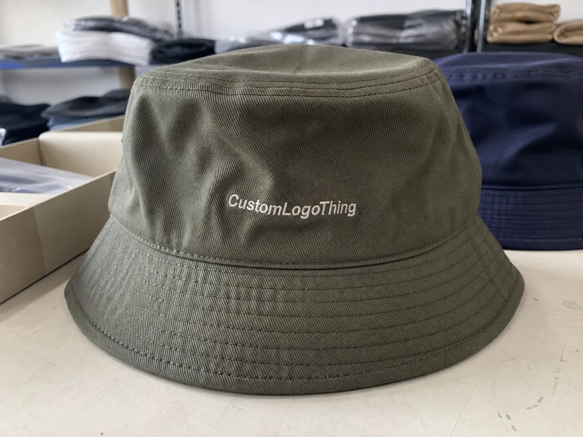
A cap can look clean in a flat PDF and still stitch badly once the front panel curves, the center seam shifts thread off line, or a structured crown pushes the logo higher than expected. That gap between screen and product is why a resort retail caps embroidery proof checklist matters. It gives the buyer one place to verify artwork, thread colors, placement, cap style, decoration limits, and approval notes before production starts.
Resort retail caps are not ordinary giveaway hats. They sit in gift shops, golf shops, beach boutiques, spa retail areas, lobby markets, marina stores, and event shops where guests judge them as apparel, not advertising. A cap priced at $28-$42 has to earn the purchase with fit, fabric, proportion, and restraint. Too promotional, and it turns into clutter. Too subtle, and it disappears on the shelf.
An embroidery proof works as both a visual approval and a manufacturing instruction. It may show logo width, stitch location, thread colors, cap color, decoration method, and sometimes a digitized sew-out image or photo sample. The mockup is only part of the value. The real job is turning a brand mark into thread, tension, fabric, and machine movement.
From a retail buying standpoint, proofing protects margin as much as appearance. One thread color chosen without checking contrast, one logo placed 3/8 inch too low, or one cap style approved without considering crown height can lead to rework, markdowns, or slow sell-through. The checklist keeps the review tied to the finished cap instead of the idea of the cap.
Practical rule: approve the cap you expect to receive, not the artwork you hope will work. Embroidery has thickness, shine, pull, density, and limits.
How an Embroidered Cap Proof Works Before Production
The process usually begins with submitted logo files. Vector artwork such as AI, EPS, or a clean PDF is preferred because it gives the digitizer crisp shapes to interpret. Raster files can sometimes work, but low-resolution screenshots or copied web images often create guesswork. Guesswork is a poor starting point for retail merchandise.
Once the artwork is reviewed, the logo gets digitized. Digitizing turns artwork into stitch data: needle movement, stitch direction, stitch density, underlay, trims, thread changes, and pull compensation. Saving a file in another format does not do that. Good digitizing anticipates how thread behaves on a specific surface.
Buyers usually see three kinds of proof. A digital art proof shows layout, color callouts, size, and placement. A digitized embroidery proof shows how the art is expected to stitch, sometimes with simulated thread texture or stitch paths. A physical sew-out or production sample answers the harder question: how does it actually look at cap scale, on fabric, under thread tension?
Cap construction changes the answer. A structured six-panel cap supports embroidery differently than an Unstructured Dad Hat. A rope cap limits lower logo placement because the rope competes with the design. Trucker caps may combine foam, twill, and mesh, each behaving differently under thread. Visors have limited vertical space. Lightweight performance caps can pucker when the stitch count is too dense for the fabric.
Decoration method matters just as much. Front-center flat embroidery, side embroidery, back arch text, 3D puff, embroidered patches, woven labels, appliqué, and mixed decoration all need different review habits. Puff embroidery needs thicker shapes and fewer tight gaps. Woven labels can hold finer detail than direct embroidery, but they introduce edge finish, fold, attachment, and placement questions.
Resort artwork often includes small details that need discipline: palm fronds, coordinates, fine script, tiny establishment dates, coastline outlines, course icons, boat silhouettes, crests, shells, or wildlife. Those details can look great at poster size and turn muddy at 2.25 inches wide. The proof should confirm whether the smallest letters stay readable and whether fine lines have enough thread width to hold shape.
Approval should be written, specific, and tied to a proof version. Confirm cap style, cap color, thread colors, logo size, placement, spelling, quantity breakdown, and whether the proof is approved as shown or approved with changes. Vague notes such as “make it pop” or “more premium” may help in a creative meeting, but they do not tell an embroidery machine what to do.
Key Proof Details That Protect Retail Shelf Appeal
Start with logo size. Many cap embroidery problems come from asking thread to behave like ink. A resort crest that looks crisp at 4 inches wide on paper may need heavier line weights, fewer interior details, or a simplified border when stitched at 2.5 inches across a curved crown.
For direct embroidery, small block letters often need roughly 0.20-0.25 inch of height to remain legible, depending on font, thread, fabric, and machine setup. Script usually gives less room for error. Condensed fonts can close up. Thin serifs may break apart or look uneven once stitched.
Placement deserves the same attention. Front-center designs should be checked against panel seams, visor curve, crown height, and the wearer’s sightline. A logo placed too low can crowd the brim seam. A logo placed too high can look awkward on a low-profile cap. Side marks and back marks need clearance from closures, sweatband seams, ponytail openings, and size-adjustment hardware.
Thread color is not a perfect Pantone exercise. Embroidery thread has sheen, twist, and texture, so a close match may look brighter or darker than expected on washed cotton, navy twill, heather performance fabric, or straw-look material. Tonal embroidery can look refined in resort retail, but only if the contrast is intentional. Cream thread on sage green may feel quiet and expensive. Cream thread on white may vanish under store lighting.
Stitch density and underlay affect comfort. Too much density can make the front panel stiff, pucker lightweight fabric, or create a heavy patch-like feel when the buyer expected a relaxed vacation cap. Underlay stitches stabilize the design, but too much underlay on an unstructured cap can change the hand of the fabric. This is one of the proof details buyers miss because color draws the eye first.
Cap silhouette should match the guest use case. Beach retail often favors breathable unstructured cotton, pigment-dyed twill, or mesh-back caps. Golf shops may need moisture-wicking performance fabrics and structured profiles that hold shape in a locker or cart. Luxury resort boutiques often do better with smaller logos, low-contrast embroidery, brushed cotton, leather strap closures, and fewer overt souvenir cues.
Review every SKU variation, not just the hero color. A proof for navy caps does not guarantee the same logo will work on stone, white, sage, blush, or charcoal. Background color changes contrast, perceived scale, and retail personality. A disciplined resort retail caps embroidery proof checklist requires colorway-by-colorway review before production is released.
| Cap Option | Typical Retail Feel | Proofing Watchout | Common Use |
|---|---|---|---|
| Unstructured cotton dad hat | Relaxed, soft, beach-friendly | Light fabric may pucker with dense embroidery | Beach boutiques, lobby markets, spa retail |
| Structured six-panel cap | Clean, stable, classic | Center seam can affect fine vertical details | Golf shops, resort uniforms, general retail |
| Performance cap | Sporty, lightweight, active | Stretch or thin fabric may need lower stitch density | Golf, tennis, pickleball, marina shops |
| Rope cap | Vintage, nautical, polished | Rope reduces vertical room for embroidery | Marinas, yacht clubs, destination shops |
Retail buyers also need to think about how the cap will sit on a shelf, not just on a head. A large, bold logo may sell well in a souvenir rack, while a quiet tonal mark may fit better in a luxury boutique display. The proof should reflect that intent before production starts.
Packaging can affect the final impression too. A cap that arrives perfectly stitched but crushed in transit can still lose shelf appeal. If the launch depends on a retail-ready presentation, the proof review should confirm whether the cap will ship flat, pre-shaped, bagged, or boxed.
Look closely at scale when the artwork includes text. Resort names, location lines, coordinates, and slogans can shrink faster than the logo mark itself. The proof should show exact dimensions so there is no guesswork about what will remain legible after stitching.
Process, Timeline, and Lead Time for Cap Proof Approval
Proof timing usually starts with the art handoff. Clean vector artwork moves faster, while low-resolution images add back-and-forth. A basic art proof may come back quickly, but digitized embroidery proofing often takes more time because the design has to be translated into stitch logic, not just displayed on a screen.
Complexity changes the schedule. A single-color logo on a standard cap can move through review in a short window. Multi-color resort crests, small text, puff elements, special placement, or mixed decoration need more review cycles. Every extra revision adds time, especially when the buyer is checking color accuracy, legibility, and placement across multiple cap colors.
Samples usually take longer than digital proofs because they require machine setup, thread selection, stitching, inspection, and sometimes a second pass. A physical sample is worth the wait when the design depends on fine detail, tonal thread, or a cap shape that behaves unpredictably. The sample answers real-world questions that digital renderings cannot.
Lead time also depends on order size and factory workflow. Small runs may move quickly if the production line is open. Larger orders can wait behind earlier approvals, thread procurement, or trim sourcing. When the launch date matters, buyers should treat proof approval as a schedule milestone, not a casual email step.
Delays often come from missing information rather than production speed. Unclear artwork, no thread standard, no cap color confirmation, or no approval deadline can slow everything down. A complete checklist shortens the loop because the decorator has fewer reasons to guess.
Resort retail calendars add another layer. Seasonal launches, holiday windows, tournament weekends, and group arrivals can make a one-week delay expensive. Proofs sent late in the season usually compress sampling time, which raises the chance of rushed decisions. Early artwork review protects the launch.
Cost, Pricing, and MOQ Factors Behind Embroidered Resort Caps
Pricing starts with the decoration setup. Embroidery generally includes digitizing, machine setup, thread, labor, and sometimes sample development. More colors, more stitch count, more locations, and more complicated constructions usually raise the cost. A small front logo costs less than a front-and-back combination with a side hit and custom patch.
MOQ, or minimum order quantity, affects the unit price because setup work spreads across the run. Lower quantities can still make sense for a boutique launch, but the per-cap cost is usually higher. Larger orders improve efficiency, yet they also increase risk if the proof is wrong. A clean approval matters at every quantity.
Cap style changes pricing too. Structured caps, performance fabrics, rope details, specialty closures, and premium materials often cost more than basic cotton dad hats. Some styles also require extra care during embroidery, especially when the crown is thin, stretchy, or shaped in a way that makes placement less forgiving.
Design complexity has a direct effect on labor. Fine text, dense fills, multiple thread changes, 3D puff, or mixed decoration can add machine time. A simple one-color mark may be quick to sew, but a detailed resort crest can take enough time to influence both price and production flow.
Color matching can add another layer of cost if the thread line needs special ordering or if the design uses several thread shades. Matching multiple SKU colors across one program also increases the review burden. A thread choice that looks great on one cap color may need adjustment on another, which is why proofing across colorways matters.
Retail margin should be part of the conversation from the beginning. A cap that lands at a wholesale price that leaves no room for markup is a weak retail program, no matter how good the embroidery looks. Proof approval and pricing approval should move together so the design matches both the shelf and the margin target.
Step-by-Step Review Before You Approve the Proof
Start with the artwork itself. Check spelling, punctuation, logo proportions, and any small text that could blur in stitch form. Even a strong design can stumble if a location name, date, or slogan is wrong. Once embroidery starts, fixing the wording costs time and money.
Next, confirm the cap style and construction. A design made for a structured six-panel cap may not sit the same way on a soft unstructured dad hat. Rope placement, closure type, and crown height all affect where the embroidery should land. The same logo can look polished on one style and awkward on another.
Review the size and placement against the proof image and the actual cap dimensions. The front mark should sit where the eye expects it, not just where the mockup makes it look balanced. Side and back embroidery need enough breathing room so they do not crowd seams, straps, or vents.
Check thread colors under the background fabric. A shade that looks balanced on screen may read too bright or too faint once stitched. If the cap will be sold in multiple colors, look at each version separately. What works on navy can fall flat on white or stone.
Inspect the stitch style for the intended retail feel. Dense fills create a more solid look, while lighter stitch coverage can feel softer and more relaxed. Puff, patch, appliqué, and direct embroidery all create a different impression on shelf and in hand. The choice should match the store and the price point.
Finish with the approval note. Spell out what is approved, what must change, and which proof version is final. If the buyer approves a sample with changes, the changes should be listed clearly. Loose comments create avoidable mistakes later in production.
Common Proofing Mistakes That Cause Rework or Weak Sell-Through
One common mistake is approving artwork without checking stitch limitations. A design that looks elegant in vector form may be too detailed for cap embroidery. Tiny lines, thin fonts, and crowded elements often fail once they hit thread and fabric.
Another problem is ignoring the cap surface. Curved crowns, seams, foam fronts, mesh backs, and stretch fabrics all change how embroidery behaves. A proof that looks centered on a flat screen can land in the wrong place once it is stitched on a real cap.
Thread color mistakes are easy to miss at approval and hard to fix later. Some shades read more saturated in thread than they do in paint or print. Resort styles often depend on subtle color balance, so a slightly off thread choice can make the cap feel cheaper or less refined.
Buyers also run into trouble when they approve one colorway and assume the rest will follow automatically. Each cap color interacts differently with the logo. Navy, white, sage, blush, and charcoal all change the final look. A single approved version is not enough for a full retail line.
Overlooking retail context can hurt sell-through even when the embroidery is technically correct. A logo that is too large for a premium boutique, too flashy for a spa, or too understated for a souvenir wall can miss the customer entirely. The proof should support the selling environment, not just the logo.
Delays happen when approval notes are vague. Comments like “adjust as needed” or “looks okay” leave too much room for interpretation. Clear instructions reduce rework and keep production moving.
Next Steps for a Clean Approval and Strong Resort Cap Launch
A strong launch starts with clean artwork, a realistic cap choice, and a proof that reflects the final retail use. The best approvals are specific, versioned, and easy to trace. That makes production smoother and reduces the chance of surprises once the caps arrive.
Buyers who sell into resort retail should treat the proof as a buying tool, not just a production form. The same cap has to work on shelf, in hand, and on the guest. If the proof supports all three, the program is in good shape.
Before signing off, compare every version side by side. Look at the logo scale, the thread contrast, the placement, and the cap silhouette across the full color range. Small differences at this stage can save a lot of rework later.
Once the proof is approved, keep the final version in one place where the production team and the buyer can find it fast. Clear records make reorder time easier and keep the next round consistent.
FAQ
What should be included in a resort retail caps embroidery proof checklist?
The checklist should cover artwork, cap style, cap color, thread colors, logo size, placement, stitch method, quantity, and final approval notes. A version number helps keep every change organized.
Why does a cap embroidery proof look different from the final product?
Embroidery uses thread, not ink. Curved panels, fabric stretch, stitch density, and machine tension all affect the final look, so the proof is only a guide until the cap is stitched.
How many colors should be reviewed before approval?
Every cap color in the order should be reviewed. A logo that looks right on navy may not work the same way on white, stone, blush, or charcoal.
Is a digital proof enough for resort retail caps?
A digital proof is useful for layout and placement, but a sew-out sample is better when the design is detailed, tonal, or sensitive to cap construction. Physical sampling gives the clearest picture of the finished result.
Can small text work on embroidered resort caps?
Small text can work if the font is bold enough and the size is large enough for thread. Thin scripts and tiny serif type often lose clarity at cap scale.
What causes the most rework in cap embroidery?
The biggest issues are unclear artwork, poor placement, thread mismatch, and approving a design without checking how it behaves on the actual cap style. A careful proof review prevents most of that.