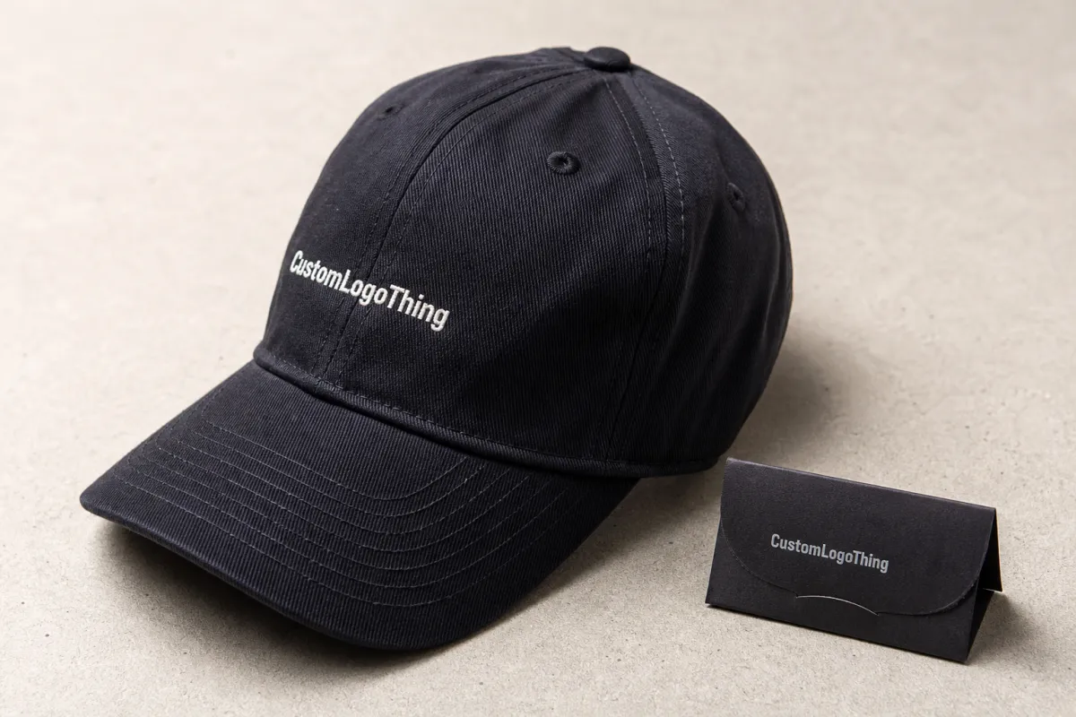
Retail merch caps Artwork File Setup looks simple until a front-panel logo has to bend with the crown, work around seams, and still read cleanly from a few steps away. A file that behaves on a hoodie or flyer can fall apart on a cap because the product changes the rules. Stitch paths, panel shape, closure type, fabric weight, and decoration method all shape what counts as production-ready, especially when the target is a 2.25 to 2.75 inch front placement on a structured six-panel cap.
That gap between screen-ready and cap-ready is where most delays start. Send the right file package, and buyers usually get proofs faster, with fewer revision loops and fewer questions about why the art needs to be rebuilt for embroidery, patches, or transfer work. The cap sets the limit, not the logo, and a clean setup can save 1-2 proof rounds and a few business days.
Retail merch caps artwork file setup: why good files still fail
A cap is not a flat surface. The front panel bends, the crown rises, and seams break up what looks clean in a mockup, so a logo that feels balanced on a hoodie chest can end up cramped on a six-panel cap. Low-profile caps make that tighter, since the panel curves down sooner near the seam.
Resolution is the wrong thing to lean on. A 300 dpi JPG can still be useless when the design has tiny counters, thin strokes, or type that needs to be stitched instead of printed. It opens fine and still misses the production target. In practice, a clean vector file beats a high-resolution raster file almost every time for embroidery, woven labels, patches, and debossed details.
The real question is not whether the artwork looks polished. It is whether the design can survive the decoration method and the cap structure at the same time. A front logo may need a simpler outline for embroidery, a stronger border for a patch, or a thicker stroke for a heat transfer. A good monitor image does not answer any of that; a sew-out, strike-off, or sample patch does.
“If the art only exists as a screenshot, expect delay. A decorator cannot read seam clearance from a phone capture.”
Start with the final method, not the prettiest file on someone’s desktop. Embroidery cares about stitch count, underlay, and shape, while patches care about edge clarity and border width, and printed transfers care about contrast, minimum line thickness, and white underbase behavior. Each method changes the file requirement in its own way, and caps expose every weak spot.
What proper cap artwork setup actually includes
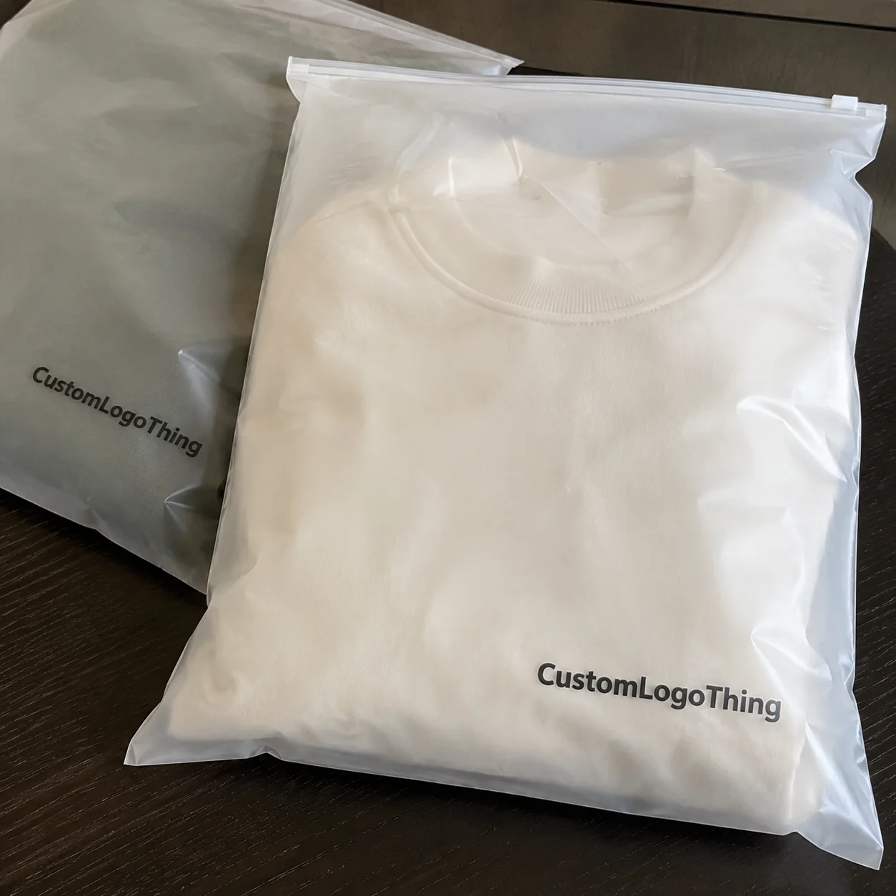
A usable setup package is more than “we sent the logo.”
It usually includes editable vector art, outlined text, color references, placement notes, and a mockup that shows where the design lands on the cap. Without those pieces, proofing turns into guesswork.
Guessing costs time. A complete handoff also helps the factory confirm whether the order is going to embroidery, woven patch, printed patch, silicone badge, or direct transfer work before pricing gets locked.
For most jobs, the best starting point is an AI, EPS, or editable PDF file with clean paths and text converted to outlines. That gives the decorator room to scale, separate, or digitize the design without rebuilding it from scratch. If the logo includes tiny type, gradients, shadows, or hairline strokes, those details need review before pricing and proofing move forward. For embroidery, the digitizer usually turns the art into stitch commands in a second file, so the cleaner the source art, the fewer edits are needed.
The decoration method controls how strict the file requirements become:
- Embroidery: works best with vector art, simplified shapes, 0.15 to 0.18 inch minimum text height where possible, and enough detail to survive 8,000 to 12,000 stitches without closing in.
- Patches: need a clear border, safe edge spacing, 2 to 3 mm of border room, and space for backing and sewing; PVC, woven, and embroidered patches all handle detail differently.
- Screen print: wants clean separations, 1.5 to 2.0 mm minimum positive line weight, and a size that fits the print zone without distortion.
- Woven labels or heat transfers: do better with compact art that still reads when reduced, plus simpler gradients and a strong outer silhouette.
Why treat cap art like general merch art? A logo that works on a carton, hangtag, or tee can fail on a cap front because caps punish weak detail. In a small placement zone, even a little spacing problem shows up right away. For organic cotton or recycled fiber programs, buyers often also ask for material documentation such as GOTS, OEKO-TEX Standard 100, GRS, WRAP, or BSCI records before they approve the final order.
Process and turnaround: how art moves from brief to proof
The production path looks simple on paper. The buyer sends the brief. The art gets checked. Cleanup happens if needed. A digital proof goes out. Missing details force the backtrack. In a typical cap program, file review, digitizing, sample approval, and bulk production are separate checkpoints, and each one needs a yes before the next step starts.
Timelines get stretched in the same few places every time:
- Clean vector file: proofing often starts the same day or the next business day, especially when placement and color references are already in the brief.
- Minor cleanup: 1-3 business days is common when the work is small, like outlining text, adjusting stroke weight, or separating colors.
- Redraw or digitizing: 3-7 business days is more realistic if the logo has to be rebuilt, converted into stitch file format, or separated for patch production.
- Extra revision rounds: add 1-3 business days, sometimes more if approvals move slowly or the cap style changes after the proof is issued.
Time disappears in predictable places: missing vector files, no Pantone targets, vague placement instructions, and cap styles that were never confirmed before the proof was made. If the proof shows a front logo at one width and the buyer changes the cap style later, the earlier proof is not much use anymore; it turns into a sketch. For bulk orders, the full timeline often lands around 18-22 business days after approval, with sampling and transit time added on top if the order is custom-dyed or has a specialty patch.
A clean setup package cuts that drag down. The decorator still needs to verify stitch density, safe zones, and final sizing, but there is a big difference between a small adjustment and a full rebuild. One changes an afternoon. The other changes a week. On a 500-piece order, a clean source file can mean a $35-$75 digitizing fee instead of a redraw plus a second sample charge, and the unit price can stay closer to $2.50-$4.00 per cap for basic embroidered decoration.
Specs that control color, placement, and stitch clarity
Caps are small. Small surfaces expose weak design choices, and a logo that looks crisp at poster size can turn muddy when it is reduced to a 2.25 to 2.75 inch front placement. At that scale, thin strokes disappear first, then tight counters, then any detail that depends on clean separation between colors.
``` If you want, I can keep going on the rest of the HTML once you send the remaining portion.