Custom Wine Paper Bags Artwork File Setup for a Fast Quote
Most wine-bag delays start in the file, not on press. A narrow panel, handle cutout, and fold line leave little room for guesswork, so a clean artwork setup can save more time than a rush fee.
For buyers, the job is simple: send art that matches the bag structure, paper stock, handle style, and print method. In practice, the dieline, bleed, safe zone, vector art, and color mode all need to be correct before pricing and timing can be trusted.
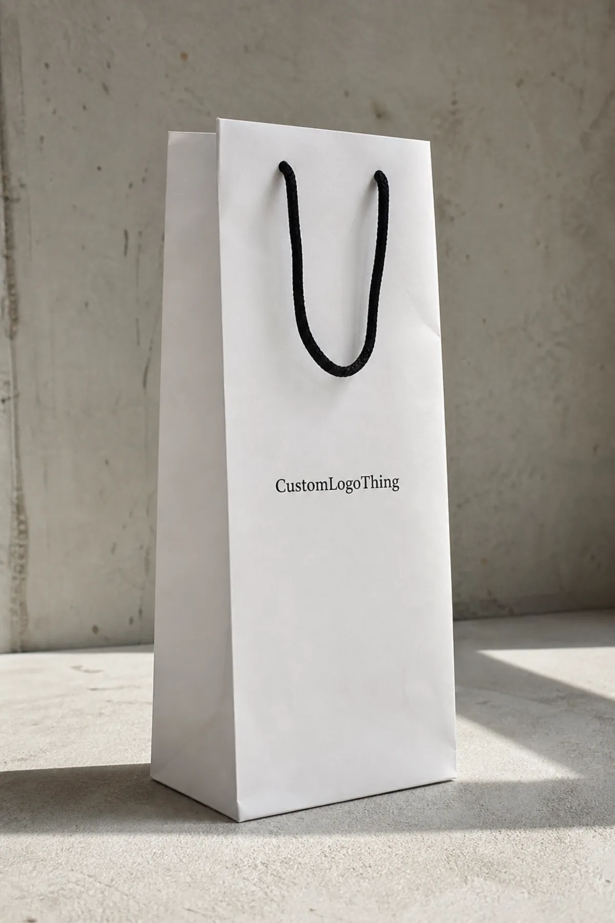
Wine bags are less forgiving than flat labels or cartons. They have gussets, creases, and a tall format that exposes weak design choices quickly. A logo that looks balanced on a box can look too high, too small, or crowded on a paper bag.
Why artwork setup matters for wine paper bags
A wine bag works like a vertical billboard with a fold through it. The artwork has to survive the crease, the handle holes, and the movement that comes from paper stock flexing during production and shipping. That is why file setup matters before anyone talks about foil, embossing, or quantity.
The core terms do real work. The dieline shows the cut and fold structure. Bleed gives the printer trim allowance. The safe area keeps type and logos away from folds and edges. Vector art keeps lines sharp. CMYK and Pantone control how color is built on press.
Bag format also changes the design strategy. A narrow front panel usually rewards a bold logo, one short message, and clear contrast. It rarely rewards tiny taglines, layered gradients, or busy backgrounds. That is true for retail packaging, gifting, and event use.
Material adds another layer. Common wine bags use kraft or coated paper in the range of roughly 150 to 200 gsm, depending on size and coverage. Heavier stock feels sturdier and resists scuffing better, but it can cost more and behave differently around folds. Twisted paper handles, cotton rope, and ribbon handles each affect look, feel, and cost.
For buyers who need documentation, FSC references help clarify paper sourcing claims, and simple transit testing standards help define how the bag or carton should hold up in shipment. Those details do not make the bag better by themselves, but they make the claim set more credible.
Artwork file process, proofing, and turnaround
The production sequence is usually predictable. First comes the dieline and the core specs: bag size, paper weight, handle type, print sides, and quantity. Then the designer places the art, checks folds and margins, exports a proof, and flags anything that needs approval before the file reaches prepress.
Prepress checks the practical details: Is the logo vector? Are fonts outlined? Are linked images sharp enough at final print size? Are spot colors named clearly? Are overprint settings correct? Small issues like those decide whether a job moves quickly or gets stuck in revision loops.
Simple jobs move fast: one-color artwork, clean vector logos, and files that already match the template. What slows things down is consistent too: missing fonts, low-resolution photos, transparency effects, and layouts that push important artwork across a fold or into the handle zone.
A digital proof often arrives within one to three business days after the complete file arrives. Production then depends on quantity and finish. A straightforward paper bag order may ship in roughly 10 to 15 business days after approval, while foil stamping, embossing, complex color matching, or a high-volume run can push the schedule closer to three weeks. Freight is separate.
A printer can forgive a bold layout. It cannot guess a missing bleed.
Buyers speed the process by sending complete specs before design starts. Include the final quantity, destination, deadline, intended use, and any non-negotiables about color or finish. If the bag needs to match Custom Printed Boxes or another branded package, say so early.
Cost, pricing, and MOQ factors for custom wine bags
Artwork setup affects price because complex files increase review time, proofing time, and production risk. The main drivers are print method, ink count, bag size, paper weight, handle style, and finish options such as foil stamping, embossing, or matte lamination.
For a typical run of 5,000 bags, simple one-color printing might land around $0.18-$0.28 per unit. A two-color layout usually moves closer to $0.24-$0.38. Full-bleed CMYK designs can reach the $0.28-$0.45 range, while foil or embossing often pushes the unit price to $0.45-$0.85+, depending on coverage and workflow.
MOQ matters because setup labor is spread across fewer bags on a smaller run. A 500-piece order often carries a much higher per-unit cost than a 5,000-piece order, even if the artwork is identical. The same principle applies to proofing: a file that needs several corrections costs more in time, and that time usually shows up in the quote.
| Artwork style | Setup complexity | Typical unit cost at 5,000 | Best fit |
|---|---|---|---|
| One-color logo | Low | $0.18-$0.28 | Simple retail packaging and event giveaways |
| Two-color design | Moderate | $0.24-$0.38 | Branded packaging with stronger shelf presence |
| Full-bleed CMYK | Higher | $0.28-$0.45 | Detailed packaging design with photo elements |
| Foil or emboss finish | Highest | $0.45-$0.85+ | Gift sets and higher-end presentation |
Ask for line-item pricing. Setup charge, print charge, proof rounds, sample cost, and freight should all be visible. Without that split, two quotes can look similar while hiding different assumptions.
Step-by-step file setup for press-ready bags
Start by requesting the correct dieline and confirming the exact bag dimensions before any artwork is placed. A wine bag that is even slightly off size can push the logo too close to a fold or too high under the handle.
Build in vector format whenever possible. Logos, icons, rules, and type should remain editable until the last export. If the file uses fonts, outline them or package them correctly so the printer does not inherit a missing-font issue.
For photos, use the actual print size rather than a screen preview. A 300 dpi image at final size is a solid baseline; a web graphic is not. If the design is simple, keep it simple all the way through prepress.
Set color with the production method in mind. CMYK is fine for process work. Pantone is better when brand color has to match across bags, labels, and other packaging. Spot colors should be labeled clearly, especially if the design includes white ink or metallic ink.
Add bleed, usually around 1/8 inch unless the supplier template says otherwise, and keep critical content inside the safe zone. Borders are especially unforgiving; if they are too close to trim, even a good press run can look uneven.
Export one clean production PDF and keep the editable source file ready in case the prepress team needs a fix. A tidy file name helps too. Include the SKU, quantity, and version number so the wrong PDF does not end up in the approval chain.
If the bag includes special finishing, separate each element clearly in the file. Foil plates, emboss layers, spot UV, and white ink often need their own labeled components. The best production files are easy to inspect.
Common file mistakes that slow approvals
The most common mistake is the wrong template. An outdated dieline can shift artwork outside the print area, and once that happens, the proof becomes a correction request. That one error can waste a day or more.
Low-resolution logos are next. They look acceptable in a browser tab, then soften on press. Tiny text is another trap. If a line of copy is difficult to read on screen, it will usually feel weaker on a textured paper bag.
RGB images, missing fonts, and transparency effects can also create surprises. Color may shift during conversion. Fonts may substitute. Transparent layers may flatten in ways that alter the edge of a logo or background panel.
Border placement is another frequent issue. A thin rule that looks centered in the file can print unevenly if the artwork is too close to trim or if the paper shifts during finishing. On a premium bag, that small imbalance is obvious.
If a logo touches the edge in the file, it is already too risky for press.
One missed detail can trigger another proof cycle, and another proof cycle usually means extra time and a higher chance of budget drift. File hygiene matters as much as print choice because the file is part of the production schedule.
Expert tips for color, finish, and brand consistency
Design for contrast first. Wine bags rarely reward busy layouts. A strong logo, a clear background, and one accent color usually outperform a crowded design with too many gradients and competing elements.
If the budget is tight, choose one premium touch instead of several. Foil often adds more perceived value than a second ink color. Better paper stock can do more for the finished look than an overworked pattern.
Ask for the right proof type. A digital proof is fast and useful for placement, spelling, and layout. A printed proof costs more but helps when color accuracy matters or when the bag is part of a retail launch that cannot tolerate surprises.
Paper tone, handle style, and logo placement should support the bottle experience. A kraft bag with a cotton handle feels different from a bright white bag with twisted paper handles. Neither is wrong; they just signal different things.
Color also behaves differently on paper than on a monitor. Warm kraft stock can mute blues and darken neutrals. Coated white stock usually gives sharper contrast and a cleaner read on small type. Metallic inks should be treated carefully because they can shift between proofs and production runs.
Finish should follow the content, not the other way around. A matte bag can feel understated and expensive; gloss can make saturated colors pop but also expose surface scuffs faster. Spot UV is useful on coated stocks, though it is not always the best choice for bags that will be handled a lot.
What to check before you request a quote
A supplier can quote faster when the brief is complete. Send quantity, bag size, stock preference, handle type, print sides, finish notes, and whether the design is one color, multiple colors, or full bleed. If those details are missing, the estimate is usually rough.
Share the target delivery date and the ship-to location. Freight assumptions matter, and so do calendar realities. A bag that needs to land before an event has a very different planning window than a reorder for shelf inventory.
Send the brand assets early: logos, Pantone references, legal copy, and any line that must not move. If the order needs matching with custom printed boxes or another retail packaging format, say that now.
Ask directly about setup charges, proof rounds, sample timing, and what happens if the art needs major revision. A clear answer on those points usually means the supplier is quoting against the real production path instead of padding in vague assumptions.
Use the quote request as a preflight test. If anything is unclear, fix it before the file moves into production. That is how a setup turns into a clean approval instead of avoidable delays.
Next steps to send a print-ready file
Run a final checklist before sending: correct dieline, bleed added, fonts outlined, images at proper resolution, colors set for print, and critical content inside the safe zone. Then export a press-ready PDF and keep the editable source file on hand.
Add a short note with finish expectations, brand color priorities, and any areas that cannot shift. If a logo must stay centered between the handles, say so. If a foil stamp must match a label system, say that too.
From there, send the files with the quote request and ask for proof timing, revision limits, and the expected production window. That gives a clean comparison across suppliers and a realistic sense of how quickly the job can move.
The simplest rule is still the most useful one: a clean Artwork File Setup protects the design, keeps the quote honest, and reduces the chance that a small file problem turns into a production delay.
What file format works best for custom wine paper bags artwork file setup?
A print-ready PDF is usually the safest submission format, with the editable AI file included if the printer asks for it. Outline fonts and embed linked images so the file opens consistently across systems. If the design uses spot colors, label them clearly so prepress can match them quickly.
Do custom wine paper bags need bleed and a safe zone?
Yes, because trim and fold tolerances can shift artwork slightly during production. A common starting point is 1/8 inch bleed, but the supplier’s template should control the final spec. Keep logos, type, and borders away from edges so they do not look clipped or uneven.
How does MOQ change artwork setup cost?
Lower quantities usually raise the unit cost because the same setup work is spread across fewer bags. Simple artwork can help keep the quote cleaner when the run is small. Larger MOQs often make premium finishes and extra revisions easier to absorb.
Can I use RGB photos in custom wine paper bags artwork file setup?
RGB images should be converted to CMYK or matched to approved print colors before submission. Photos need enough resolution for the actual print size, not just the screen preview. A proof helps catch color shifts that are hard to judge on a monitor.
What should I send with my artwork file before asking for a quote?
Send the dieline, final quantity, bag size, stock preference, and any finish notes. Include brand colors, logo files, and the target delivery date so the quote is accurate. Add any special instructions about handle placement, readability, or retail presentation.

