Round Address Labels Custom for Clothing Brand Orders
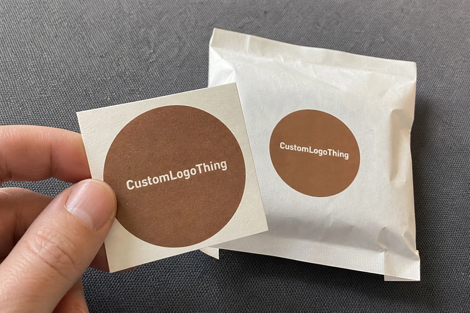
For a clothing brand, round address labels custom do more than show a sender line. They make a parcel look branded before the customer opens it. That matters on plain poly bags, recycled envelopes, and generic shippers because the circle shape reads like a seal instead of a leftover sticker.
These labels show up on DTC mailers, sample packs, subscription boxes, pop-up orders, and thank-you inserts. The best versions are quiet: they identify the sender, support the brand, and stay out of the way of the packaging system. Trying to pack too much messaging into a tiny sticker usually makes it worse.
It is also worth separating packaging labels from garment labels. These are adhesive labels for exterior packaging, sender details, short brand messages, and closure points. They are not sewn-in labels, wash labels, or compliance labels. That distinction affects size, finish, and adhesive more than the artwork does.
On apparel shipments, the label often creates the first brand read. Customers may never inspect the stock, but they notice whether the parcel looks deliberate.
What Round Address Labels Custom Actually Do for Clothing Orders
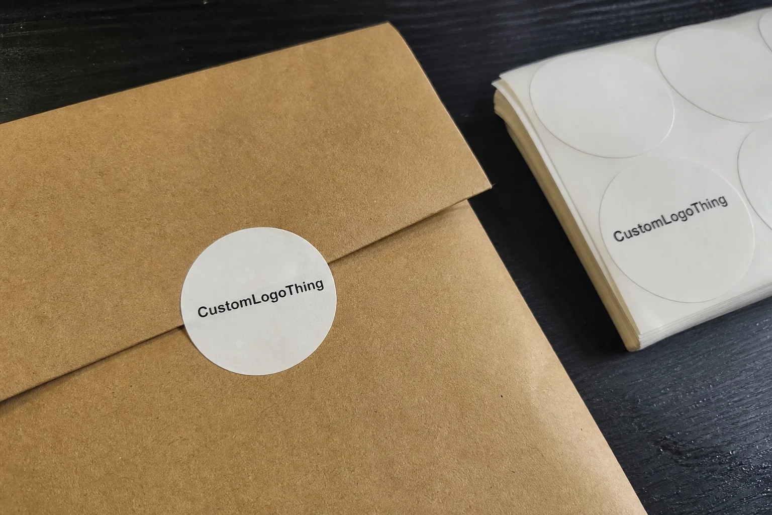
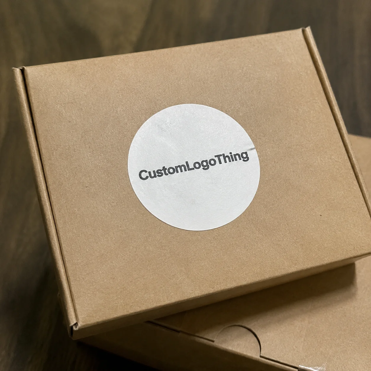
Round labels work because the shape feels complete. A circle makes even a simple logo and return address look intentional. On a kraft mailer, a matte white circle can tidy up the front panel. On a glossy envelope, the same label adds contrast and keeps the package from looking flat.
The job is simple: identify the sender, reinforce the brand, and survive handling. In practice, clothing brands use them as return-address labels, packaging seals, small promo labels, and occasional QR-code stickers for returns or product pages. The design can be minimal or more decorative, but it still has to read cleanly at arm’s length.
There is a hard line between packaging branding and compliance. A package label is not meant to carry fiber content, care instructions, or legal garment information. It sits on the outside of the shipment and contributes to the presentation first, logistics second.
Most clothing brands use the format in four places:
- Direct-to-consumer mailers sent after an online order
- Sample packs and press kits
- Subscription boxes and loyalty shipments
- Event, pop-up, and wholesale presentation packs
The value is practical. A label is cheaper and faster than rebuilding the whole packaging system, but it still changes how the parcel lands. A good circle on the right surface can do more for perceived quality than a louder design on the wrong stock.
How the Format Works: Size, Adhesive, and Print Setup
Round labels are small, but the spec sheet is not forgiving. Diameter, material, finish, adhesive, and application format all affect the result. A 1.5-inch circle can fit a short return address and a small mark. A 2-inch version usually gives more room for a logo, sender details, and whitespace, which matters because crowded circles look worse than crowded rectangles.
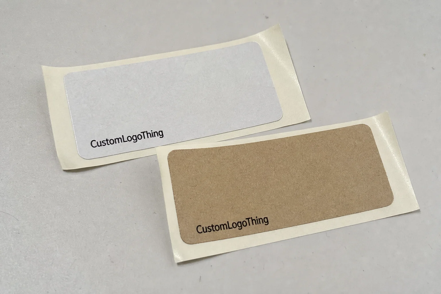
Material choice affects cost and performance. Paper stock is the cheapest route and works well for clean indoor handling. Matte paper feels softer. Gloss paper sharpens contrast and reads more retail-oriented. If the parcel may scuff, sit in humid storage, or travel through rough handling, a film-based label such as polypropylene is safer, though it costs more.
Adhesive is the part buyers often underestimate. A permanent acrylic adhesive is usually the default because it sticks to a wide range of mailers and boxes. Removable adhesive can work for short-term promotions or inserts, but it is not the right answer for shipping labels that need to survive transit. Surface texture matters too: recycled mailers, coated envelopes, frosted bags, and soft-touch packaging all behave differently.
Rolls and sheets serve different workflows. Rolls make sense for higher-volume packing because they feed faster through a dispenser and reduce labor. Sheets are more practical for lower-volume brands, office use, or manual application. If a team packs a few hundred orders a week, the wrong format can slow the line enough to matter.
Artwork setup is where avoidable mistakes pile up. Vector files in PDF, AI, or EPS are best for logos and text. Raster files should be at least 300 dpi at final size. Include bleed, usually 0.125 inch, and keep key elements inside a safe margin. Round shapes are less forgiving than they look because the edge is always visible.
The right way to build the file is for the real substrate, not the screen. A design that looks balanced on a white artboard may look cramped on kraft, too stark on black packaging, or too faint on a textured bag. The mockup is only a start.
Pricing, MOQ, and Unit Cost Drivers
Pricing is shaped by more than quantity. Size, color count, material, finish, adhesive, and whether the labels are supplied on rolls or sheets all affect the quote. A simple one-color paper label is cheaper than a waterproof film label with a stronger adhesive and specialty finish.
MOQ changes the math fast. Small runs carry higher unit costs because setup, proofing, and waste are spread across fewer pieces. Larger runs bring the price down. If a clothing brand reuses the same sender design for several months, a larger order usually makes more sense than placing a series of tiny reorders.
| Order volume | Common spec | Indicative unit cost | Best fit |
|---|---|---|---|
| 1,000 pieces | 1.5-2 inch paper, sheeted, one or two colors | $0.09-$0.18 | Launch tests, sample packs, low-volume packing |
| 5,000 pieces | 2 inch paper or gloss, rolls or sheets | $0.04-$0.08 | Most DTC apparel brands with stable art |
| 10,000+ pieces | 2 inch paper or film, permanent adhesive | $0.02-$0.05 | Repeatable sender design and steady volume |
Those numbers are directional, not fixed. Foil, white ink, varnish, lamination, custom die changes, and rush scheduling all push cost up. Proof corrections do too. A buyer who asks for the cheapest entry price without matching diameter, stock, finish, and adhesive is not comparing the same product.
Ask for the unit price at the quantity you actually expect to reorder. That number says more than the lowest teaser price and helps you decide whether the labels should stay a packaging add-on or become part of a broader branded kit.
One practical caveat: the cheapest option can create hidden labor cost. If the label curls, feeds badly, or needs hand correction during packing, the savings disappear. Packaging buyers often miss that because labor does not show up on the label quote.
Production Steps, Timeline, and Turnaround
The production flow is usually predictable: brief, proof, approval, print, cut, finish, pack, ship. The delays happen between those steps. Low-resolution artwork creates proof revisions. Missing dimensions slow prepress. Late copy changes after approval add time where there is almost no slack.
For standard digital orders, a realistic window is often 5-10 business days after proof approval, then shipping time on top of that. Specialty finishes, heavier runs, or offset production can stretch to 12-15 business days or more. Rush work may be possible if stock is available and the file is clean, but the rush fee should be in the quote from the start.
Ask three questions before approval: When does production actually start? How long will proof approval take if the file is clean? Is shipping included in the quoted turnaround or separate? Those details matter if the labels are tied to a launch date, a pop-up, or a wholesale ship window.
Quality control should not stop at print approval. A useful production check includes trim alignment, color consistency, adhesive performance, and pack-out count. A good label order can still fail if the rolls are wound poorly, the labels stick to themselves, or the edge cuts are inconsistent.
For shipping-related packaging, it helps to think like a transit tester, not just a designer. The package needs to survive movement, abrasion, temperature shifts, and handling pressure. Standards such as ISTA are worth referencing because they focus attention on distribution conditions, not just desktop approval.
If the file is locked, the proof is reviewed quickly, and the spec stays fixed, round address labels custom can move from order to delivery without becoming a bottleneck.
Common Mistakes That Make Labels Look Off or Fail
The most common visual mistake is crowding. Brands try to fit the logo, return address, website, social handle, and a promo line into a two-inch circle, then wonder why the label feels busy. The issue is not the shape. It is the amount of content.
Low contrast causes another problem. Light gray type on a white label can look elegant on a screen and weak on a real parcel. Dark ink on kraft stock can look excellent, but only if the tone is strong enough to survive store lighting and motion.
Adhesive mistakes show up later, which makes them expensive. A label that sticks well to coated packaging may behave differently on recycled mailers, textured envelopes, or chilled storage conditions. If the adhesive is too weak, the edge lifts. If it is too aggressive, the label wrinkles during application.
Skipping a peel test is a classic miss. A label can look perfect in the proof and still fail on the real surface. Test it on the actual mailer, not a desk sample. Press it, rub it lightly, and leave it alone for a few hours. If the edge curls or the print smears, the spec needs adjustment.
Do not approve a label from a mockup alone. Real packaging surfaces expose problems that screens hide, especially on recycled stock and textured films.
Alignment and cut tolerance matter too. A circle that is slightly off-center or too tight to the edge reads as sloppy even if the order is technically within spec. Experienced buyers check bleed, margin, adhesion, and final surface together because they are looking for a label that behaves like part of the system.
If the label needs to sit beside Custom Printed Boxes, tissue, or inserts, consistency becomes even more important. A circle with the wrong white point, gloss level, or type style can make a strong package set look pieced together.
Expert Tips for Cleaner Branding and Better Shelf Impact
Start with one dominant idea. Usually that is the logo or the sender block. If the label needs extra function, add one secondary element only if it earns the space. A QR code can help with returns or product pages, but only if it does not crowd the circle.
Finish should match brand tone and handling reality. Matte stock reads softer and more fashion-forward. Gloss stock feels sharper and more retail-oriented. Film stock suits rough transit, humidity, or any parcel that may take abuse. There is no universal best choice.
Test two or three diameters before committing. A size that feels balanced in a digital proof can look too small once it is on a mailer, especially if the shipper itself is oversized. Many brands discover they need a slightly larger circle than they expected because the package background is doing part of the visual work.
White space is not wasted space. It is part of the brand system. A round label with enough breathing room usually looks cleaner than one packed edge to edge. That rule holds for apparel, accessories, and most retail packaging.
If sustainability claims matter, ask for documentation instead of relying on broad wording. FSC-certified paper is a legitimate sourcing option, but the claim should be backed by the proper paperwork. The organization’s site at FSC is a useful reference if you need to verify what the certification actually covers.
Think in systems, not pieces. A label, insert, tissue sheet, and box do not need to match perfectly, but they do need to feel like they belong to the same brand family. That is the difference between packaging that feels assembled and packaging that feels designed.
Next Steps: Build a Quote-Ready Spec Sheet
The fastest way to get a usable quote is to send the details suppliers actually need. Size, quantity, material, finish, adhesive, artwork format, and the surface the label will stick to should all be on the first email or form submission. If the label will go on a coated mailer, recycled envelope, or textured bag, say so up front.
Ask for three numbers: the unit cost, the proof timeline, and the delivery window. If a supplier cannot give those clearly, the quote is not ready for comparison. You are not just buying labels. You are buying a production slot inside a packaging schedule.
- Confirm diameter and shape tolerance
- Choose paper, gloss, matte, or film based on the mailer surface
- Specify rolls or sheets based on the packing workflow
- Send vector artwork whenever possible
- Request a physical or digital proof before production starts
If the label is going on a new mailer, a seasonal packaging change, or a revised shipping kit, order a small test run first. Check it at arm’s length. Check it under warehouse lighting. Check adhesion after handling, not just right after application.
From a buyer’s point of view, round address labels custom are easiest to scale when the spec is simple, the artwork is clean, and the surface has been tested. Do that, and the label stops being a guess. It becomes a repeatable part of the brand system.
What size works best for round custom address labels on clothing mailers?
Use the smallest diameter that still fits the return address, brand name, and any required details without crowding. If the label needs a logo and address together, 2 inches is often easier to read than 1.5 inches, especially from arm’s length. Always test the size on the actual mailer or box before approving the full run.
Are round address labels custom better on rolls or sheets?
Rolls usually work better for higher-volume packing because they apply faster and fit dispenser setups. Sheets are more practical for smaller brands, office use, or manual application where speed is less important. The right choice depends on workflow first, then cost and storage.
Can custom round address labels hold up during shipping?
Yes, if you match the stock and adhesive to the packaging surface and transit conditions. Water-resistant film or a stronger adhesive is worth considering for recycled mailers, coated surfaces, or parcels that may see rough handling. Always test on the real package material before placing a full order.
How many round labels should a small apparel brand order?
Base the quantity on monthly order volume plus a buffer for misprints, samples, and packaging changes. Smaller orders lower risk, but the unit cost is often higher. If the design will be reused, ask for pricing at both the trial quantity and the next reorder level so you can see the break point clearly.
What should I prepare before requesting a quote for custom round address labels?
Prepare the size, quantity, material, finish, adhesive, and exact artwork text. Include the surface the label will go on, your delivery deadline, and whether you need a proof before production. The cleaner the spec sheet, the faster you can get a useful quote without back-and-forth.