Paper Bags

Small Retail Paper Bags Logo Placement for Your Order

✍️ Sarah Chen 📅 May 12, 2026 📖 13 min read 📊 2,564 words
Small Retail Paper Bags Logo Placement for Your Order

On a small bag, Small Retail Paper Bags logo placement can make a brand look deliberate or sloppy in a single glance. Move the mark a few millimeters and it can feel crowded, timid, or oddly adrift. The artwork is often fine; the position is what breaks the effect.

Why logo placement on small bags gets tricky fast

Why logo placement on small bags gets tricky fast - CustomLogoThing packaging example

Small retail bags are less forgiving than mockups suggest. The printable area shrinks, handles eat visual space, and folds dictate where the eye can rest. That is why placement is really a readability issue, not a decorative one. The bag has to work while it is being carried, stacked, photographed, and set on a counter.

A logo can look balanced on a flat artboard and still fail on the finished bag if it sits a few millimeters too low, drifts toward a gusset, or gets swallowed by the top fold once the bag is filled. On compact formats, the bag size usually decides what looks right.

Simple graphics tend to win. A clean wordmark on a narrow front panel often reads better than a detailed crest that needs more breathing room than the bag can give. Fine lines, thin outlines, and small taglines are the first things to suffer when the stock is textured or the ink gains a little dot spread during production.

Think of the bag as a moving sign with hard borders. The customer sees the front while walking, the side when turning, and the back if the bag is set down or photographed. Placement has to hold up across all three moments.

How printed bag placement works on each panel

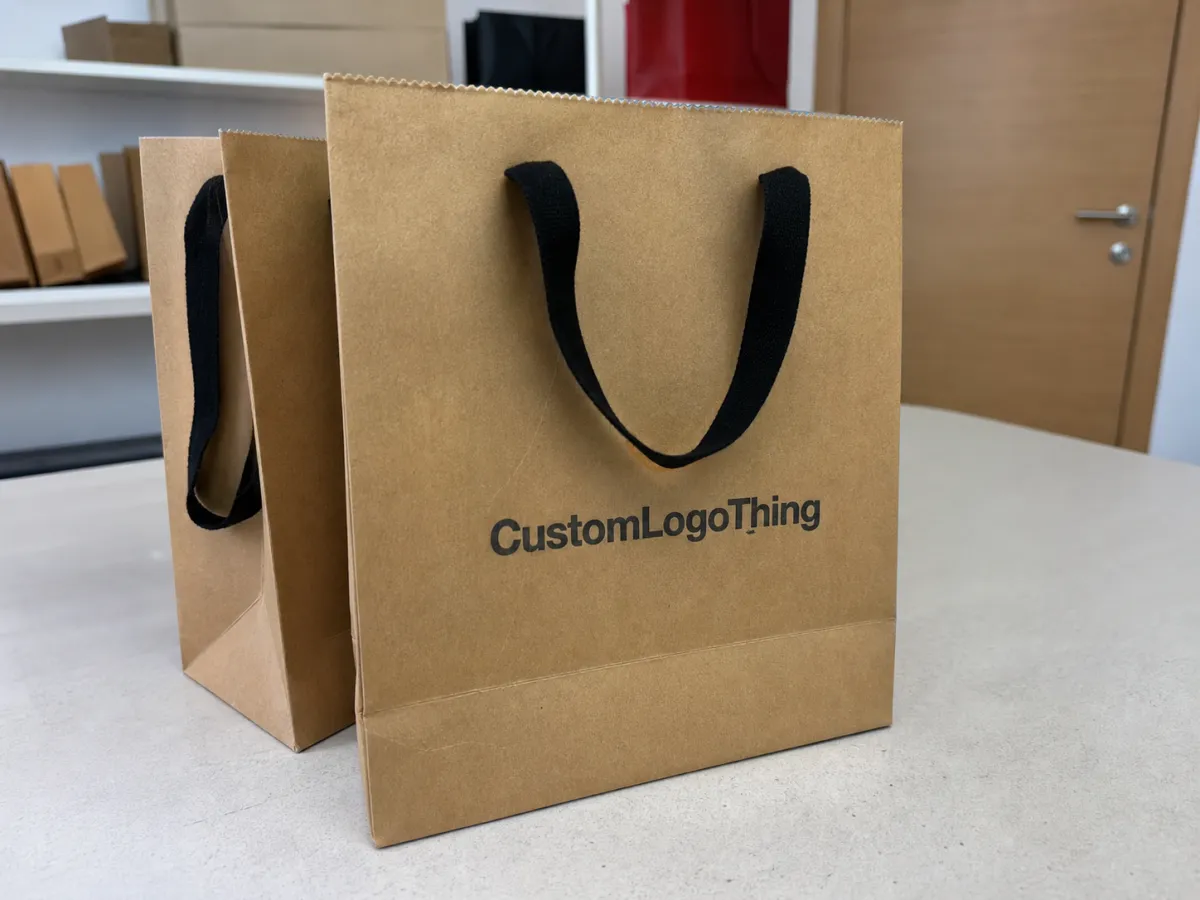
A handled paper bag usually gives you a front panel, a back panel, two gussets, and sometimes a bottom panel. Each one behaves differently once the bag is folded, filled, and carried. The main front panel is the safest place for branding because it faces outward for most of the customer journey. The back panel works well if the design is simple and you want repeat exposure without crowding the front.

Gussets are useful, but only for restrained elements: a monogram, a short web address, or a small symbol. They are not a good home for detail-heavy marks. The panel is narrow, the fold line is close, and the print area is often interrupted by the bag structure.

Front-only placement is still the cleanest option for most small retail bags. It keeps the eye on one message and avoids spending ink on surfaces that disappear in use. Front-and-back placement can feel more premium, especially for boutiques and gift shops, but only if the artwork is simple enough to survive twice. Wrap-style placement can look expensive when it is aligned well, but it can also look careless if the logo gets chopped by a gusset or lands too close to a fold.

Handle style changes the visual field more than many buyers expect. Twisted paper handles, ribbon handles, and die-cut handles all create different interruptions near the top edge. Handle anchors can block a small part of the print window, and the top fold can swallow lower text once the bag is filled. If the proof does not show those details, ask for them.

Centered, high-set, and lower placements send different signals. A centered logo usually feels balanced and retail-friendly. A slightly higher logo can help on short bags, where the fold line would otherwise cut into the mark. A lower placement can leave room for a tagline or product line, but it works only if the logo remains immediately readable.

What placement does to cost, pricing, and MOQ

Placement affects cost more than many first-time buyers expect. The stock may stay the same, but every extra print area adds setup, ink, drying time, and registration risk. A one-color front print is still the cheapest starting point for most small retail runs. Add a second side, a bigger print window, foil, or multiple colors, and the unit price climbs.

For a rough buying range, a small paper bag with a one-color front print often lands around $0.18-$0.32 per unit at 5,000 pieces, depending on bag size, paper weight, and handle type. Add a second printed side and the price may rise by another $0.03-$0.08 per bag. Foil stamping, metallic ink, or a more complex multi-color layout can add $0.10-$0.30+ because setup and finishing take longer. At 500 to 1,000 pieces, the same decisions usually cost more per bag because the setup is spread across fewer units.

Placement option Best use Typical cost impact at 5,000 pcs Notes
Front-only, one color Boutiques, gift shops, everyday retail Baseline $0.18-$0.32 Lowest setup burden; strongest readability
Front and back Stores with heavy carry time or frequent photos + $0.03-$0.08 Better repetition; more print passes
Wrap-style or large side print Premium presentations, stronger shelf impact + $0.06-$0.15 Higher registration risk near folds and gussets
Foil or multi-color Luxury positioning, event packaging + $0.10-$0.30+ More setup time; tighter proof control needed

The cheapest-looking choice is not always the cheapest order. A crowded design can push teams into reprints, especially if the first run looks fine on screen but reads badly in hand. One strong print area usually beats trying to cover every surface on a compact bag.

When buyers compare suppliers, ask how cartons will hold up in transit. If a packed carton gets crushed, bags can crease at the handles or scuff at the print edges. Standards such as ISTA testing are worth knowing about if shipping conditions are rough or mixed.

Production steps and turnaround for custom paper bags

The production flow is usually straightforward: artwork review, proofing, plate or screen setup, printing, drying, finishing, packing, and shipment. The part that slows orders down is often the buyer, not the machine. A tiny placement change after approval can restart part of the workflow, especially if the change affects the print plate or requires a fresh sample.

For a typical custom paper bag order, expect 1-2 business days for artwork review, 1-3 business days for proofing, and about 7-12 business days for production after approval. Total turnaround often lands in the 12-18 business day range if the stock is available and the artwork is ready. Rush orders can shorten that window, but they usually reduce flexibility on finishing, color matching, or placement refinement.

Delays usually appear in three places: unclear artwork, late color revisions, and placement changes that force a new proof or sample. Set the logo position before the run starts, not after the first cartons are already moving. A one-color centered print is fast. A foil mark with exact top placement is slower because alignment and drying need more attention.

Paper choice matters too. Lightweight kraft around 120-150 gsm works well for smaller gift or boutique bags. Heavier stocks around 150-180 gsm give more body and help the bag stand up, but they also make folds stiffer and can change how the logo sits near creases. Coated white paper can sharpen detail, while natural kraft softens contrast and makes thin lines harder to read.

Keep the logo where the eye lands first. If you need to hunt for it, the customer will probably miss it too.

If paper sourcing matters for procurement or sustainability claims, check whether the stock is FSC-certified. The FSC system is widely recognized and gives buyers a clearer paper trail.

Key factors that change the final logo position

Bag dimensions come first. Width, depth, and height define how much safe space exists before the logo runs into folds, handles, or the bottom seam. A design that works on a wider bag may look crowded on a narrow one because the print window is smaller. One artwork file rarely fits every bag size without adjustment.

Paper color is the next variable. A pale logo on natural kraft can fade into the background if the contrast is too soft. A dark logo on a white coated bag usually reads more cleanly, but glossy stocks can make the same artwork feel flatter or more reflective than expected. On natural kraft, bold shapes and simplified lines usually print better than thin, intricate detail.

Print method matters as much as the art. Flexographic printing works well for larger runs and straightforward graphics. Offset can deliver sharper detail on certain stocks, especially when type is small and the color count is controlled. Digital printing is useful for short runs or projects that need faster changes. Foil behaves differently again: it can look striking, but it needs precise registration and a design that can handle a little metal sheen.

The use case changes the answer as well. A boutique bag is often seen at arm’s length and in photos. A food counter bag may be carried in stacks and viewed quickly. A gift shop bag may sit under stronger light and need more contrast to hold its shape visually. The carry distance, lighting, and surrounding clutter all affect how bold the placement should be.

Step-by-step: choose the right placement before ordering

Start with the brand tone. Is the bag meant to feel premium, minimal, playful, or utilitarian? A playful shop can use a slightly lower mark or a looser layout. A premium boutique usually looks better with a centered or high-set logo and more blank space around it.

Next, measure the visible area. Leave a safe margin from the top fold, side folds, handle anchors, and bottom seam. For small retail bags, a safe zone of 6-10 mm is common, and heavier stocks or prominent handles justify the larger end of that range. If the design includes a tagline, give it room.

Then mock up at actual size. A screen thumbnail is not enough. Print two or three options, hold them at arm’s length, and check them under the lighting used in the store. If one version reads clearly while the others look busy, that is the winner.

  1. Decide the tone - premium, minimal, playful, or utilitarian.
  2. Measure the print window - account for folds, handles, and gussets.
  3. Test two or three layouts - front-only, front-and-back, and a slightly higher placement.
  4. Choose clarity over size - the clearest logo usually performs better than the largest one.

For most buyers, the best layout is the one that balances cost, readability, and the physical shape of the bag.

Common mistakes that make small bags look cheap

The most common mistake is crowding the panel. A logo that fills every spare millimeter has no visual air, and that makes even decent stock look underthought. Negative space is part of the design language.

Another frequent error is placing key text too close to a fold. Once the bag is filled, the fold line changes shape and the text can distort or disappear into shadow. A web address sitting on a gusset may look sharp in the proof and awkward in real use. That is why proofing should include the folded structure, not just a flat rectangle.

Low-contrast color combinations also cause trouble. Dark brown on dark kraft, cream on tinted paper, or thin gold on rough stock may look elegant in a swatch, but they can lose the logo in the store. If the brand wants recognition, the print needs enough contrast to do actual work.

Skipping a preproduction proof is the fastest way to waste an order. A proof shows whether the logo fits the bag dimensions, the handles, and the fold lines. It also exposes problems like a symbol that is technically centered but visually too low because the handle area pulls attention upward.

Another subtle failure is using the same layout across different bag sizes without adjusting the safe zone. A logo can look perfect on a medium shopping bag and awkward on a smaller takeout-size version because the proportions of the print field change.

Expert tips and next steps before you approve the proof

Ask for a placement mockup at actual size, not a loose logo floating on a white sheet. That single request removes a lot of guesswork because it shows how the mark behaves against the real edges of the bag. If the supplier can mark fold lines, handle anchors, and the bottom seam, even better.

Keep one master logo file with a clear safe zone, plus a second version for narrow formats. That helps when the same brand needs both a compact boutique bag and a taller shopping bag. Wordmarks often need a tighter version; symbols can usually stay more consistent across sizes.

Before production starts, confirm five details in writing: print side, ink color, finish, MOQ, and turnaround. Those five items control most surprises. If anything changes after proof approval, ask whether it affects the schedule or the unit price.

Here is the checklist I would use before signing off:

  • Verify the proof against the bag dimensions.
  • Check the logo position from arm’s length.
  • Confirm the safe margin from folds and handles.
  • Review ink contrast on the actual paper stock.
  • Lock the layout only after it feels balanced in hand.

One useful habit: ask for a photo of the physical sample beside a ruler or scale reference. A digital proof can hide proportion problems that become obvious once the bag exists in space. If a logo feels too low in a photo, it will usually feel lower in the customer’s hand.

That is the cleanest way to spec placement without paying for a run that looks almost right. If the layout reads clearly, respects the structure of the bag, and stays inside budget, it is doing its job.

FAQ

Where should small retail paper bags logo placement usually go?

Most brands place the logo on the main front panel because it gives the strongest visibility while the bag is being carried. If the bag is narrow, a slightly higher placement usually works better than a low one that gets swallowed by the fold.

How big should a logo be on a small retail paper bag?

Big enough to read from arm’s length, but not so large that it touches folds, handles, or side gussets. A clean, centered mark often beats an oversized logo that leaves no margin and makes the bag feel cramped.

Does double-sided logo placement increase the price a lot?

Usually yes, because more ink coverage and more print passes raise production cost. The jump is smaller on larger quantities, but on low MOQs the extra side can change the unit price noticeably.

What affects turnaround time for printed paper bags?

Artwork readiness, proof approval speed, print method, and quantity all affect how fast the order can move. Any placement change after proofing can add days, especially if it requires a revised sample or a new setup.

What file do I need for the best logo placement proof?

A vector file like AI, EPS, or PDF usually gives the cleanest edges and the most accurate placement review. Include size notes, color references, and the preferred placement position so the proof matches the bag dimensions.

Get Your Quote in 24 Hours
Contact Us Free Consultation

Warning: file_put_contents(/www/wwwroot/customlogothing.com/storage/cache/blog/7e21279912c4edb3a490ed3f5ecc6235.html): Failed to open stream: Permission denied in /www/wwwroot/customlogothing.com/inc/blog/PageCache.php on line 20