Snapback Caps Logo Placement Guide: What Actually Changes the Final Look
The same logo can look premium, cheap, sporty, quiet, loud, or painfully awkward depending on where it lands on a cap. That is why a good snapback Caps Logo Placement guide is not design fluff. It is a buying tool for avoiding ugly inventory.
Placement means more than “put the logo on the front.” It covers exact position, size, orientation, decoration method, and how the mark sits against the cap structure. Front center. Left panel. Right panel. Back arch. Side hit. Underbrim. Closure area. Multi-location layouts. Each option changes how the cap reads from five feet away, in a product photo, on a shelf, or on someone’s head.
Snapbacks are tempting because the front panel looks like a mini billboard. Nice thought. Not quite reality.
The crown seam, panel shape, sweatband, bill angle, embroidery hoop, and fabric tension all decide what can actually be produced cleanly. A mockup may show a perfect rectangle of artwork. The real cap has curves, seams, stitching, thickness, and limits. It is not a flat poster with a brim attached.
Cap decoration works a lot like custom box printing: a clean file does not guarantee a clean finished product. You still need the right substrate, the right process, the right scale, and enough room for production tolerance. For packaging standards and testing context, groups like ISTA are useful reminders that physical products behave differently once they leave the screen.
This guide covers placement options, size ranges, cost effects, timeline expectations, production constraints, and the checks worth making before approval. Practical stuff. The kind that saves money before anyone threads a machine.
How Logo Placement Works on a Snapback Cap
A snapback has a crown, front panels, side panels, back panels, bill, underbrim, top button, eyelets, sweatband, and adjustable plastic closure. Most buyers only think about the front. Production people think about all of it, because every part changes access, tension, and decoration quality.
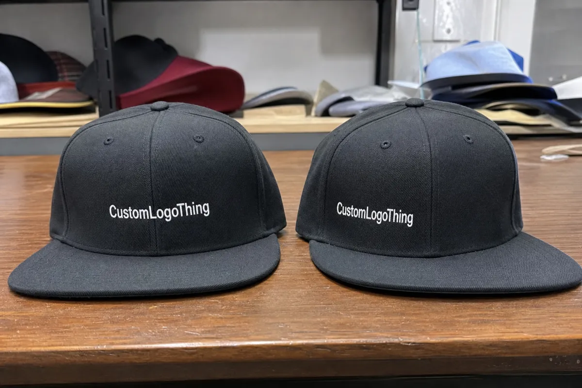
Front center is the most common placement because it gives the strongest visual hit. It works for retail merch, uniforms, gyms, breweries, schools, teams, music drops, restaurant caps, and giveaway programs. If a cap needs to communicate the brand in one second, front center usually wins.
Structured snapbacks have a supported front that holds its shape. That support helps embroidery look cleaner and keeps the logo facing forward instead of collapsing into fabric wrinkles. Unstructured caps can look relaxed and casual, but logos may curve more, pucker more, or sit less evenly. Neither option is automatically better. Different job, different cap.
Decoration method matters. Embroidery works well on front and side panels because thread has texture and durability. Patches also work well on front panels, including woven patches, embroidered patches, leather patches, PVC patches, and printed patches. Woven labels suit side or back details. Screen printing is more limited on curved fabric areas, though it can work on foam fronts, flat panels, or underbrims depending on the build.
Safe zones matter too. Logos need breathing room from seams, eyelets, panel edges, and the bill seam. A compact front embroidery often looks best around 2.25 to 2.75 inches wide. A wider wordmark may sit around 4 to 4.75 inches wide if the panel allows it. Push too close to the bill and the hoop may not reach cleanly. Push too close to the seams and thread can distort.
Practical rule: every logo location should have a job. Front logo for recognition. Side logo for detail. Back embroidery for a finished look. Random extra logos are just clutter wearing a hat.
Multi-location branding can look sharp. It can also look like someone got excited in the approval email and forgot people have eyes. The best custom snapback hats usually have one hero mark and one supporting detail, not six competing messages.
Best Front, Side, Back, and Underbrim Placement Options
Front center is the default for a reason. It gives the highest visibility and works for main logos, mascots, wordmarks, school marks, team marks, restaurant marks, and bold icons. If the cap has to sell at a merch table or read clearly in an ecommerce thumbnail, front center is the safe bet.
Front offset placement can feel more fashion-driven. A small icon shifted left or right can look premium, especially on a clean five-panel snapback. Keep it restrained. Oversized offset logos often look less “streetwear” and more “the machine missed.” A 1 to 1.75 inch icon can work. A 4 inch offset wordmark usually does not.
Side panel placement is best for secondary details: initials, small icons, flags, short event dates, sponsor marks, or website abbreviations. Side embroidery should usually stay compact because the panel curves quickly. Think 1 to 2 inches wide, depending on the cap and artwork. Fine detail should be simplified, not bullied into thread.
Back placement near the closure works for small wordmarks, slogans, city names, social handles, or short URLs. Back arch embroidery must account for the plastic snap closure and the seam above the opening. Available height may be only 0.35 to 0.75 inches in some styles. That is not much room, so skip long phrases unless you enjoy illegible thread.
Underbrim printing or embroidery is a surprise detail. It suits limited drops, sports teams, streetwear caps, hidden messages, or color stories tied to apparel. It is not ideal for the primary logo because people will not see it during normal wear. Underbrim decoration is a detail, not a billboard.
| Placement | Best Use | Typical Size Range | Best Method | Buyer Warning |
|---|---|---|---|---|
| Front center | Main brand logo, mascot, badge, wordmark | 2.25-4.75 in wide | Embroidery or patch | Do not crowd the bill seam or side seams |
| Front offset | Fashion icon, minimalist mark | 1-2 in wide | Embroidery or small patch | Large offset logos look accidental fast |
| Side panel | Initials, flag, sponsor, small icon | 1-2 in wide | Embroidery or woven label | Curved panels reduce usable detail |
| Back | Slogan, location, handle, short wordmark | 0.35-0.75 in tall | Embroidery or label | Closure limits space |
| Underbrim | Hidden graphic, drop detail, team message | Varies by bill shape | Print or embroidery | Low visibility during normal wear |
Use a simple hierarchy. One logo? Put it on the front. Two logos? Front plus side or back. Three or more? Make each one justify its existence. A cap can carry detail without looking like a sponsorship spreadsheet.
Key Factors That Decide Logo Size, Position, and Method
Logo shape comes first. Wide wordmarks need horizontal space, so front center usually makes sense. Tall emblems need height and may look cramped above the bill. Circular badges are forgiving. Shield logos can look great if they are not overloaded with tiny internal lines. Mascot heads need careful simplification, especially around eyes, teeth, fur, and outlines.
Embroidery has limits because thread is not a printer. Tiny text, gradients, hairline borders, shadows, and detailed illustrations can turn into thread soup. On many caps, text under roughly 0.20 inches tall becomes risky. Script fonts are worse because thin strokes fill in. Nice on screen does not mean nice in cotton twill.
Cap material changes the result. Cotton twill is common and reliable. Wool blends can feel premium but may shift slightly during embroidery. Polyester can be crisp, especially for performance caps. Mesh backs are common on trucker snapbacks, but they are not good candidates for direct decoration. Foam fronts can take bold printing or patches well, though they have their own texture and compression issues.
Color contrast matters more than buyers want to admit. A black logo on a navy cap may match the brand guide and still be visually useless. Tone-on-tone can look sharp when intentional, especially with raised embroidery, but accidental low contrast just disappears. Approve thread colors or Pantone references under real lighting, not only on a glowing laptop screen.
Panel construction also matters. Six-panel snapbacks often have a center seam that can interrupt small details. Five-panel caps give a cleaner front surface for patches, wide artwork, and bold graphics. If your logo has tiny text running down the middle, a five-panel front may save you a headache.
The cap profile changes perception too. High-profile snapbacks give more visual room and lean bolder. Mid-profile caps are easier for broad uniform programs because they suit more face shapes. Low-profile styles can feel more subtle, but they leave less vertical space for tall logos. If the logo must be large, do not choose a shallow crown and then act surprised.
Use case should drive the placement. Retail caps need shelf appeal and clean photos. Staff caps need legibility at normal distance. Event caps need fast recognition. Influencer merch needs the logo to read in selfies and product shots. A premium apparel drop can be subtle. A volunteer crew cap probably should not require detective work.
For sustainability claims or responsibly sourced materials, ask for documentation instead of vibes. FSC-certified paper hangtags or packaging can be verified through FSC, and recycled-content claims should be handled carefully. Caps, packaging, and labels are separate supply chain pieces. Do not assume one claim covers all of them.
Cost, Pricing, and MOQ Effects of Different Placements
Logo placement affects cost because every extra location usually means extra setup, extra machine time, more handling, and more quality checks. Shocking, I know: more work costs more money.
The main pricing drivers are cap style, order quantity, decoration method, number of logo locations, stitch count, patch type, thread colors, special materials, packaging, and shipping destination. A basic structured snapback with one front embroidery is very different from a custom five-panel cap with a woven front patch, side embroidery, underbrim print, private label, hangtag, and retail polybag.
As a broad buying range, decorated snapbacks may land around $6-$14 per unit for mid-size wholesale runs, depending on cap quality and decoration. Smaller runs can be higher, sometimes $12-$25 per unit once setup and handling are spread across fewer pieces. Larger bulk orders can drop the unit cost because setup gets divided across more caps. Not always. Special fabric, high stitch count, premium blanks, and complex patches can keep pricing up.
A front embroidered logo is usually the baseline. Adding side embroidery might add roughly $0.75-$2.50 per cap. Back embroidery may add a similar range. Underbrim printing or specialty decoration can add more because it may require different handling or cap construction. Embroidery digitizing often runs around $25-$75 per logo, though some suppliers waive it at higher quantities.
Patch pricing depends on type and attachment. Woven patches can capture finer detail than embroidery, but they require patch production plus application. Leather patches can look premium, yet tiny detail and exact color matching are limited. PVC patches handle bold shapes and weather exposure well, but they can feel too heavy or too tactical for some brands. Printed patches allow detail and gradients, though the finish may feel less dimensional.
MOQ depends on how custom the cap is. Standard blank snapbacks with decoration can often start at lower quantities, such as 24, 48, or 72 pieces. Fully custom caps with special fabric, custom panels, private label details, custom closures, or unique color blocking may require 144, 288, 576, or more pieces. The more you customize the cap itself, the less flexible the minimum usually becomes.
Quote preparation is simple if you send the right details. Include cap style, quantity, logo files, placement preferences, thread or print colors, deadline, shipping location, and any retail packaging needs. If you want hangtags, stickers, belly bands, FSC paper cards, custom mailers, or individual polybags, mention that early. Those choices affect both timeline and shipping dimensions.
A serious supplier should ask questions before quoting a complicated cap. If they do not ask about placement size, cap structure, artwork type, or decoration method, that is not confidence. That is guessing with an invoice attached.
Process and Timeline From Artwork to Finished Snapbacks
A typical order moves through artwork review, placement recommendation, quote, digital mockup, decoration file setup, sample or pre-production proof if needed, production, quality control, packing, and shipping. Skip steps only when the order is simple or already repeated. New custom snapback hats need more attention.
Artwork review comes first. The supplier checks whether your logo works for embroidery, patching, or printing. Vector files are preferred: AI, EPS, PDF, or SVG. A high-resolution PNG can help if vector art does not exist. Low-resolution screenshots are not artwork. They are a cry for help.
For embroidery, the logo must be digitized. Digitizing converts artwork into stitch instructions, including stitch direction, density, underlay, pull compensation, thread path, and how the design behaves on a curved cap front. Good digitizing can make an average logo look clean. Bad digitizing can make a good logo look like it lost a fight with a sewing machine.
Mockups and samples are not the same thing. A digital mockup shows placement, scale, color direction, and general layout. A physical sample shows real thread, fabric texture, patch thickness, stitch shine, distortion, and actual cap behavior. Samples cost more and often take 5-10 business days before full production starts, but they reduce risk on serious retail or bulk orders.
Timeline varies by order type. A simple repeat order on available blank caps may move in 7-12 business days after proof approval. A new decorated order often needs 12-20 business days, depending on quantity and decoration load. Fully custom caps can take 30-60 days or more because materials, panels, closures, samples, approvals, and freight all stack up.
Approval speed matters. The factory can be efficient, but if the buyer takes five days to approve a mockup, the calendar does not pause out of politeness. If you have a trade show, retail launch, tournament, or staff rollout date, give the supplier the real deadline, not the optimistic one someone invented in a meeting.
Quality control should check placement consistency, thread trims, loose stitches, patch alignment, cap shape, closure function, color match, packing count, and carton labeling. For shipped product, packaging and distribution standards can help buyers think about transit risk, especially for bulk merch going to events, warehouses, or fulfillment centers.
Common Logo Placement Mistakes That Make Caps Look Cheap
Oversized front logos are the classic mistake. Bigger is not always better. A logo that nearly touches the seams or bill can look heavy, warped, and amateur. The cap starts wearing the logo instead of the other way around.
Tiny text is another repeat offender. Taglines, phone numbers, long URLs, and thin script often disappear in embroidery. If text cannot be stitched cleanly, simplify it, enlarge it, move it to a woven label, or use a patch. Thread has physical width. It does not care about your brand deck.
Ignoring the center seam can split detailed artwork. This matters especially on six-panel snapbacks. A large bold icon may cross the seam fine, but small letters, faces, and thin outlines can break visually. If seam interruption is a concern, use a five-panel cap or shift the design strategy.
Too many logo locations can make a cap look cheap fast. Front, both sides, back, underbrim, and closure branding can turn a cap into a NASCAR hood. Unless sponsorship overload is the actual brief, edit harder.
Poor contrast ruins otherwise decent caps. Tone-on-tone can look expensive when planned with raised embroidery or texture. Accidental low contrast just looks like the budget ran out halfway through the design meeting. Ask for thread references. Compare colors in daylight. Do not approve a navy-on-black logo from a tiny PDF thumbnail.
Mockup blindness is real. Flat digital layouts can hide curvature, stitch thickness, thread shine, cap compression, and panel distortion. Ask how the logo will behave on the actual cap structure. Better yet, ask for measurements: logo width, logo height, distance from bill seam, and placement notes.
The last mistake is choosing the decoration method too late. Placement, logo detail, and production method should be decided together before the quote is locked. A detailed crest may need a woven patch. A bold icon may work in 3D puff embroidery. A tiny side mark may be better as flat embroidery. The method is not an afterthought; it is part of the design.
Final Checks Before You Approve a Custom Cap Order
Before approving a cap order, build a short checklist. Choose the primary logo location. Define any secondary placements. Confirm the cap structure. Pick the decoration method. Approve logo size. Check color contrast. Confirm quantity. Confirm deadline. Basic, yes. Still skipped constantly.
Create a placement hierarchy before adding decoration. Decide what must be seen first, what can be a detail, and what can be removed. Strong caps usually have one hero mark and one supporting detail. Weak caps have six ideas fighting for rent on the same crown.
Request a mockup with measurements, not just a pretty picture. Ask for logo width or height, distance from the bill seam, thread colors, patch size, and placement notes. If the supplier gives only a floating logo on a generic cap image, push for specifics. Production needs numbers.
Send the right files. AI, EPS, PDF, or SVG files are best for vector artwork. Use high-resolution PNG only if vector art does not exist. Include Pantone, thread, or brand color references if color accuracy matters. If you are matching caps to apparel, packaging, or printed inserts, say that early because fabric, thread, and paper all reflect color differently.
Request a sample for retail launches, premium merch, large bulk orders, complex embroidery, unusual placements, or any design where guessing would be expensive. For simple repeat orders, a detailed mockup with measurements may be enough if the supplier has already produced the same cap style before.
A useful snapback Caps Logo Placement guide should leave you with fewer decorations, better decisions, and a cleaner quote request. Prepare your artwork, quantity, cap style, placement notes, decoration preferences, color references, shipping location, and deadline before asking for pricing. You will get fewer surprises and a cap people might actually want to wear. Funny how that works.
FAQs
What is the best logo placement for custom snapback caps?
Front center is usually the best placement for the main logo because it gives the highest visibility and works well for embroidery, patches, and bold brand marks. Side or back placement works better for secondary details like initials, slogans, locations, or small icons. If the cap needs to sell quickly online or at an event, prioritize front placement before adding extra decoration.
How large should a logo be on a snapback hat?
Most front logos need enough size to read clearly without crowding the seams, bill seam, or panel edges. Compact badges often work around 2.25 to 2.75 inches wide, while wide wordmarks may need 4 to 4.75 inches if the panel allows it. The right size depends on cap structure, logo shape, decoration method, and whether the front panel has a center seam.
Does logo placement affect the cost of snapback cap orders?
Yes. Each added logo location can increase setup, decoration time, handling, and quality control. A single front embroidery is usually more cost-efficient than front plus side plus back decoration. Patch type, stitch count, thread colors, MOQ, cap style, packaging, and shipping destination also affect the final unit cost.
Can I put a logo on the side or back of a snapback cap?
Yes, side and back placements are common for small logos, slogans, dates, initials, sponsor marks, and location names. Keep side logos compact because curved panels reduce the usable decoration area. Back embroidery must account for the snap closure, seam position, and available space above the opening.
Do I need a sample before approving snapback cap logo placement?
A sample is recommended for retail orders, large quantities, complex logos, premium caps, or unusual placements like underbrim decoration. A digital mockup is helpful for layout, but it cannot fully show thread texture, curvature, stitch density, or real fabric behavior. For simple repeat orders, a detailed mockup with measurements may be enough if the supplier has already produced the style before.


