Why Five Panel Caps Make Logo Placement Less Forgiving
A five panel cap gives you a cleaner front branding zone than a six panel cap. Nice. Also dangerous. Mistakes have nowhere to hide, which is why any serious five panel Caps Logo Placement guide has to start with the front panel.
The build is simple on paper: one uninterrupted front panel, two side panels, two rear panels or a shaped back construction, a brim, and some kind of closure. Many orders also add a woven label, strap tab, interior tag, patch, or custom trim. The missing center seam is the appeal. It gives flat embroidery, screen print, heat transfer, and patches a cleaner surface than many six panel styles.
Clean does not mean easy.
A cap is a small moving billboard. People read it from three to six feet away, not from a designer’s monitor at 200% zoom. The wearer turns their head. Light changes. The panel curves. A 2.25-inch-wide mark can look calm and expensive. Push the same artwork to 3.5 inches, keep the tiny tagline, add a thin outline, and suddenly it looks like table swag from a trade show nobody wanted to attend.
Cap branding behaves a lot like label placement on a small jar or folding carton. The usable area is limited. The brand has to register fast. Material, contrast, decoration method, and production tolerance all matter. The difference is that a cap is worn in public, photographed, handed to staff, and judged as apparel. People are pickier with apparel. As they should be.
Logo placement is not just a mockup exercise. It is a production decision. The best position depends on the cap material, logo shape, decoration method, order quantity, budget, and how the cap will actually be used. Make that decision before the proof lands in your inbox, not after the sample looks crowded and everyone pretends to be surprised.
How Logo Placement Works on a Five Panel Cap
The main logo zones on a five panel cap are predictable: centered front panel, low front panel, side panel, back arch, closure tab, brim top, brim underside, and interior label. Each one has a job. The front carries the brand. The side adds tone. The back confirms identity. The interior label supports sizing, care, retail presentation, or brand detail. It is not doing long-distance recognition. Let it stay in its lane.
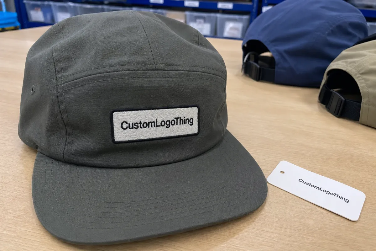
The centered front panel wins most orders for retail merch, events, uniforms, and promotional campaigns. It photographs well. It reads at eye level. It gives the strongest return on decoration spend because one clean mark can carry the whole cap.
Low front placement can look excellent on surf, skate, outdoor, and fashion-led caps, especially with a short horizontal logo. It can also go wrong fast. Put a detailed badge too close to the brim seam and the cap starts to feel bottom-heavy. On soft or low-profile builds, the logo may also distort where the panel tension changes near the brim.
Decoration method changes the map. Flat embroidery likes clean shapes, moderate stitch counts, and enough spacing between letters. 3D puff embroidery wants bold strokes, not hairline type. Woven patches handle detail better than embroidery, but the patch edge adds thickness and changes the visual scale. Leather patches can feel premium, though they limit color and may stiffen the front. Rubber patches give crisp shape and depth, but tooling and mold costs can raise setup charges. Screen print and heat transfer can work on cotton, nylon, polyester, or foam fronts if the artwork is built for the surface. Sublimation is material-dependent and usually better suited to polyester than standard cotton twill.
Here is the rule I would use before adding anything: choose one hero placement, then add one secondary brand cue only if it has a purpose. A front logo plus a small back strap mark can feel intentional. A front logo, side logo, brim logo, back logo, and interior hit can feel nervous. Branding should not look like it is trying to win an argument.
Buyer test: If the cap needs five logo positions to feel branded, the main placement probably is not doing enough work.
A technical imprint area is not the same as a good visual area. A supplier may say the front panel accepts a 4-inch-wide decoration. That does not mean your 4-inch logo will look good once the cap curves around a head. The practical question is not “Will it fit?” The question is “Will anyone want to wear it?”
Key Factors That Decide the Best Cap Logo Position
Logo shape decides more than many buyers expect. A horizontal wordmark usually belongs on the centered front panel or in a low front layout. A stacked badge can sit higher and narrower. A monogram may work on the side panel. A mascot needs space, contrast, and simplified linework. Round emblems often work well as woven patches because the patch edge becomes part of the design instead of an afterthought.
Scale matters. A cap logo is not a business card. Nobody studies it from nine inches away under perfect desk lighting. Most people see it at walking distance, which means small type under about 0.18 inches high can disappear, especially in embroidery. Fine outlines may close up. Gradients can flatten. Thin gaps between letters can fill with thread, adhesive, or ink spread.
Fabric matters too. Cotton twill is the familiar workhorse: stable enough for embroidery, patches, and many printed applications. Canvas has a heavier texture, which can make fine printed detail less crisp. Nylon is light and outdoor-friendly, but heat and stitch tension need careful control. Corduroy adds texture that fights small typography. Foam fronts create bold retro branding, especially with screen print or patches. Mesh panels usually push branding back to the front panel, closure, or label instead of the side.
Structure changes the result. A firm structured front gives embroidery and patches a more predictable surface. An unstructured five panel cap can look relaxed and retail-ready, but the logo may ripple slightly when worn unless the decoration is light and well-positioned. That is not always a defect. Sometimes it is just fabric behaving like fabric.
Audience should guide the placement. Merch drops need desirability; people must want to wear the cap after the campaign ends. Staff caps need quick recognition, often from six feet or more. Trade show giveaways need fast brand recall, but oversizing the logo can make the cap look disposable. Outdoor caps need durability, so thread selection, patch adhesive, wash behavior, and sweat exposure matter.
Color contrast is the quiet killer. Black embroidery on dark navy can look refined in a mockup and nearly invisible in a warehouse, parking lot, or conference hall. A cream patch on washed khaki may feel premium, while bright white thread on the same cap can look too sharp. Ask for thread colors by code when possible, and compare them against the actual cap material under natural and indoor light.
Do not treat sustainability claims like decoration. If you specify recycled fabric, FSC-certified hangtags, paper belly bands, or plastic-free packaging, ask for documentation. The Forest Stewardship Council provides chain-of-custody standards for certified paper and board, but an FSC mark on a hangtag does not verify the cap fabric. Different claim. Different proof.
The common mistake is judging the logo in isolation. A better Five Panel Caps logo placement guide judges the cap as a finished object: curved, textured, worn, shipped, handled, photographed, and viewed at real distance. That is where weak placement shows up.
Cost, Pricing, MOQ, and Unit Cost Trade-Offs
Logo placement affects cost because every added location usually adds setup, labor, material, handling, and inspection time. A front-only embroidered cap follows one production path. Add a side logo, back strap mark, custom woven label, hangtag, and individual polybag, and the order becomes slower to quote, sample, decorate, check, and pack.
Typical pricing drivers include cap style, order quantity, decoration method, number of logo positions, stitch count, patch material, color changes, trims, packaging, and freight. For a basic five panel cotton twill cap, a 5,000-piece order with front flat embroidery may land around $3.20-$6.50 per unit depending on blank quality, stitch count, country of origin, and packing requirements. Smaller runs of 100-250 pieces can sit much higher, sometimes $8-$18 per unit, because setup and handling are spread across fewer caps.
Embroidery can be efficient for simple logos. A clean wordmark under 8,000 stitches may price well and keep the front panel flexible. A dense badge at 14,000-18,000 stitches can raise cost, slow production, and stiffen the cap. Patches often cost more upfront because they involve patch production plus application, but they can make detailed artwork look controlled. Woven patches may add about $0.60-$1.80 per cap at moderate volumes. Leather or rubber patches often run higher depending on size, mold, debossing, color fill, backing, and attachment method.
| Branding Option | Best Use | Typical Cost Impact | Buyer Watchout |
|---|---|---|---|
| Front flat embroidery | Simple logos, staff caps, promo runs | Often lowest setup-to-impact ratio | Small text and dense fills can distort |
| 3D puff embroidery | Bold initials, block lettering, sports styling | Higher than flat embroidery | Thin strokes and tiny gaps fail quickly |
| Woven patch | Detailed badges, retail merch, complex color | Moderate to high depending on size | Patch edge thickness changes visual scale |
| Leather or rubber patch | Premium outdoor or lifestyle caps | Higher setup and material cost | Material stiffness can fight curved panels |
| Secondary side or back logo | Subtle brand cue or sponsor mark | Adds setup, handling, and QC time | Can make the cap feel over-branded |
MOQ depends on supplier, blank availability, decoration method, and whether the cap is stock or custom cut-and-sew. Small runs may be possible with embroidery or heat transfer, but unit cost usually drops once setup charges are spread over more caps. A buyer comparing 144 caps to 576 caps may see a real difference. The cap itself is only part of the math; machines, operators, proofs, trims, cartons, inspections, and admin time still have to be paid for.
Do not compare quotes by unit price alone. A cheaper cap with weak logo placement can reduce perceived value and campaign performance. Ask for line-item pricing for front logo only, front plus side logo, and retail-ready packaging. That shows the marginal cost of each branding decision instead of hiding the trade-offs inside one blended number.
Process and Timeline From Artwork to Finished Caps
A typical cap order moves through artwork review, placement recommendation, digital mockup, proof approval, digitizing or patch sampling, optional pre-production sample, bulk production, quality control, packing, and shipping. Each handoff can be clean. Each can also become a delay if the brief is vague.
For standard Custom Five Panel Caps, front embroidery without a physical sample might take 10-15 business days after proof approval at many production scales. Add a custom woven patch and the timeline may move to 18-30 business days. Add a pre-production sample, revised artwork, special fabric, custom trims, retail packaging, or split shipping, and the schedule stretches. Any timeline should stay conditional until artwork, cap style, stock status, and approval requirements are confirmed.
The hidden delay is often the logo file. Raster screenshots, low-resolution PNGs, missing fonts, flattened PDFs, and notes like “make it normal size” can burn several days before production even starts. Vector files such as AI, EPS, or SVG are preferred because they scale cleanly. High-resolution PDFs can work if fonts are embedded or outlined and the artwork is not just a low-res image placed inside a PDF shell. Yes, that happens.
Approvals need specifics. Confirm logo size in inches or centimeters. Confirm position relative to the panel center, brim seam, or side seam. Confirm thread colors, patch colors, cap color, closure type, and decoration method. If the proof says “front logo,” that is not enough. A production-ready proof should answer where, how large, in what color, by which method, and on which cap.
Build a buffer for launches, employee onboarding, trade shows, influencer kits, and retail drops. Caps are public-facing. A crooked, crowded, or unreadable logo will be worn in photos, not hidden inside a shipping carton. If the order ships to multiple locations, packing specs and carton labeling add another layer of coordination.
The fastest orders are rarely the ones with the plainest designs. They are the orders with clear approvals. A two-color logo with exact dimensions, approved thread codes, and defined placement can move faster than a “simple” one-color logo that arrives as a blurry social crop.
For shipping validation, some buyers also reference distribution testing standards such as ISTA when cartons, retail packs, or ecommerce kits need to survive handling. Caps are soft goods, but crushed brims, dirty polybags, and poorly labeled cartons still create real receiving problems.
Step-by-Step Placement Guide Before You Approve a Proof
A proof is not decoration. It is a decision document. Use it that way. This five panel Caps Logo Placement guide is most useful at approval stage, where a buyer can still prevent cost, delay, and disappointment.
- Define the cap's job. Is it retail merch, staff uniform, customer giveaway, outdoor kit, influencer mailer, or campaign merchandise? A retail cap can be quieter. A staff cap may need stronger front recognition.
- Choose the primary logo zone. The centered front panel is usually best for visibility. A side panel creates a quieter retail look. Back placement should usually support the front, not replace it.
- Match artwork to decoration method. Simplify tiny text, thin outlines, gradients, distress effects, and fine detail before quoting. A logo built for a website header may not survive thread, patch weave, or curved fabric.
- Set logo size using real measurements. Do not approve from a screenshot alone. A half-inch change can shift a cap from refined to crowded, especially on low-profile five panel shapes.
- Check contrast in real light. Review cap color, thread color, patch background, and edge color under natural and indoor light. Low-contrast branding can be intentional, but it should be a choice.
- Request a production-ready proof. It should show placement, size, colors, decoration method, cap style, and any secondary logo areas. Ask for side-view mockups if the logo sits near a curve.
- Approve from normal viewing distance. Print the proof if possible or view it at realistic scale. If the mark cannot be read from arm's length, it may not work on a moving person.
One practical trick: reduce the mockup on your screen until the cap is roughly the size it appears in a social photo. Can you still recognize the logo? If not, the issue may not be production. It may be design scale.
For detailed brand systems, ask for two mockups: one high-visibility version and one premium retail version. Stakeholders argue less when they can compare options side by side. The goal is not to make every logo smaller. It is to match the mark to the cap’s actual job.
Common Logo Placement Mistakes That Make Caps Look Cheap
Oversizing the front logo is the classic mistake. Bigger can reduce wearability, especially on retail-style Five Panel Caps. A person may accept a huge logo on a giveaway cap at an event. They may not wear it on a weekend. That matters if the cap is supposed to keep advertising after the first handout.
Placing detailed artwork too low on the front panel is another common failure. The cap looks visually heavy, and the logo may distort near the brim seam. A low logo can look sharp if it is simple, horizontal, and intentionally placed. A detailed badge shoved downward because “there was space” usually looks unresolved.
Many buyers reuse the same logo file across shirts, boxes, bags, stickers, and caps. Efficient? Sure. Wise? Not always. A box panel might tolerate tiny registration marks, legal text, or a delicate tagline. A cap will punish them. The branding field is smaller, curved, textured, and seen from farther away.
Over-branding is not premium by default. Front logo, side logo, back logo, brim logo, woven label, and custom interior taping can work for a full retail program if a real brand system supports it. For most campaigns, it just adds cost and noise.
Production mistakes buyers can prevent include approving mockups without dimensions, ignoring thread contrast, choosing 3D puff for thin text, placing decoration across stress points, or failing to confirm whether the logo is centered visually or mathematically. Those are not tiny details. They change the finished cap.
Quality control should check more than “logo exists.” Review placement consistency across a sample set, not just one cap. Check whether the logo sits level when the cap is worn, whether thread tension puckers the panel, whether patch edges lift, whether adhesive shows, and whether the brim shape survives packing. For embroidery, look for loose threads, thread breaks, filled-in counters, and inconsistent density. For patches, check edge alignment, stitch-down quality, heat seal strength, and color match.
Many failed cap orders are not manufacturing failures. They are decision-chain failures. The designer sends a full-detail logo. The buyer approves a pretty mockup. The supplier decorates what was approved. Then everyone notices the logo is unreadable at real-world scale.
That pattern shows up across custom packaging and branded merchandise all the time. Errors often happen upstream. The embroidery head, heat press, or patch machine gets blamed after the brief already made the result likely.
Next Steps: Build a Placement Brief Your Supplier Can Quote
A good placement brief saves money because it reduces guessing. It also makes quotes easier to compare. If one supplier prices front embroidery only and another includes a back logo, custom label, and individual polybagging, the unit prices are not telling the same story.
Include the basics first: cap style, quantity, cap color, target use, deadline, shipping location, and packaging needs. Then add artwork details: primary logo file, preferred placement, decoration method, size range, thread or patch colors, and any secondary placement. If you are open to supplier recommendations, say so. A capable supplier may flag that a woven patch will protect detail better than embroidery, or that a side logo needs to move higher to avoid panel curvature.
- Cap style: five panel camper, foam front, nylon, cotton twill, canvas, corduroy, or another specified build.
- Quantity: include target quantity and any price-break quantities, such as 250, 500, 1,000, or 5,000 pieces.
- Primary logo: send AI, EPS, SVG, or production-ready PDF files with fonts outlined or embedded.
- Placement: state centered front, low front, side panel, back arch, closure tab, brim, or label area.
- Decoration method: embroidery, woven patch, leather patch, rubber patch, print, heat transfer, or supplier recommendation.
- Packaging: bulk pack, individual polybag, FSC paper tag, belly band, carton labeling, or retail-ready presentation.
Ask for two mockup options: one high-visibility version and one premium retail version. Also request cost options for front-only branding versus front plus secondary placement. That turns the conversation from “Which looks nicer?” into “What does each choice cost, and what job does it do?”
Ask the supplier to flag artwork risks before sampling, especially small type, gradients, fine lines, low-contrast colors, and rigid patch shapes. A good warning at proof stage can save a paid sample round. Sometimes it can save the entire order.
Use this placement brief before sending artwork: if the logo reads clearly at arm’s length, fits the cap’s purpose, and does not force unnecessary production cost, the placement is probably doing its job. Not every cap needs to shout. It does need to look deliberate.
FAQ
What is the best logo placement for five panel caps?
The centered front panel is usually the best logo placement for visibility because it provides a clean, seam-free branding area. Side placement works better for understated retail merch or fashion-led designs. Back or closure placement is usually strongest as a secondary brand cue rather than the main logo location.
How large should a logo be on a five panel cap?
Most logos should be sized for readability from a few feet away, not just for appearance on a digital mockup. Simple marks can often run larger, while detailed logos, small text, and thin outlines should be reduced or simplified. Ask for proof dimensions in inches or centimeters before approving production.
Does this five panel cap logo placement guide apply to embroidery and patches?
Yes, but embroidery and patches behave differently on the cap surface. Embroidery is strong for simple logos and text, while patches are often better for detailed, retail-style branding. The best placement may change if the patch has a thick edge, unusual shape, or rigid material.
How does logo placement affect five panel cap pricing?
Each added placement can increase setup, labor, decoration, and quality control costs. Front-only branding is usually the most cost-efficient option. Request separate quotes for each placement combination so you can compare unit cost clearly instead of relying on one blended price.
What files should I send for custom five panel cap logo placement?
Vector files such as AI, EPS, or SVG are preferred because they scale cleanly. High-resolution PDF files may also work if fonts and artwork are properly embedded. Avoid sending screenshots or low-resolution PNG files as final production artwork because they often delay proofing and can lead to poor decoration results.


