Buyer Fit Snapshot
| Best fit | subscription box exterior branding before open for packaging buyers comparing material specs, print proof, MOQ, unit cost, freight, and repeat-order risk where brand print, material, artwork control, and repeat-order consistency matter. |
|---|---|
| Quote inputs | Share finished size, material target, print colors, finish, packing count, annual reorder estimate, and delivery region. |
| Proofing check | Approve dieline scale, logo placement, barcode or warning zones, color tolerance, and any recyclable or compostable wording before bulk production. |
| Main risk | Vague material claims, crowded artwork, or missing packing details can create delays even when the unit price looks attractive. |
Fast answer: Subscription Box Exterior Branding Before Open: Dieline, Finish, Proof, and Buyer Review should be specified like a repeatable production item. The safest quote includes material, print method, finish, artwork proof, carton packing, and reorder notes in one written spec.
What to confirm before approving the packaging proof
Check the product dimensions against the actual filled item, not only the sales mockup. Ask for tolerance on folds, seals, hang holes, label areas, and retail display edges. If the package carries a logo, QR code, warning copy, or legal claim, reserve that space before decorative graphics fill the panel.
How to compare quotes without losing quality
Compare board or film grade, print process, finish, sampling route, tooling charges, carton quantity, and freight assumptions side by side. A lower quote is only useful if the supplier can repeat the same color, closure quality, and packing count on the next order.
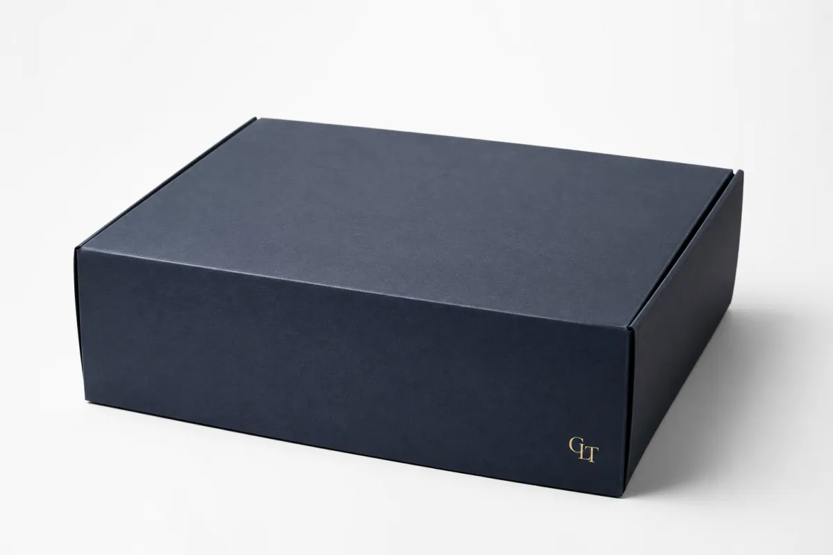
Subscription box exterior branding is the first proof point a customer sees, and often the one that shapes their opinion before the lid lifts. A mailer, sleeve, or outer carton can signal premium value, practical durability, or forgettable sameness in a single glance. That matters because subscription box exterior branding does more than decorate shipping packaging; it sets expectations, influences customer perception, and turns a moving parcel into a visible piece of brand identity.
From a packaging buyer’s point of view, the outside has a hard job. It has to survive carrier handling, read clearly at arm’s length, and still look intentional on a porch, in a lobby, or in a social post. If the outer pack looks generic, the product is gonna feel cheaper than it is. If the exterior is too loud or too flimsy, the customer notices that too. Subscription box exterior branding sits in that narrow space between marketing and operations, and the best programs treat it like both.
That is the practical tension behind stronger subscription box exterior branding: the outside has to work as a brand asset, not just a shipping shell. The right material, finish, and structure can raise perceived value before anyone opens the box. The wrong choices can make even a strong subscription feel inconsistent. Good visual branding starts there, and it starts with the promise the box is supposed to make in the first place.
I have watched more than one polished mockup lose its shine once the first test cartons hit the conveyor. A finish that looked rich on a render can pick up scuffs in transit, and a logo that felt bold on screen can disappear once the outer carton is sitting under warehouse lighting. That kind of mismatch is why the exterior deserves a real sample review, not just approval in a slide deck.
Subscription Box Exterior Branding: Why the Outside Wins
The outside wins because it speaks first. Before the unboxing experience begins, the customer has already seen color, logo placement, box shape, and closure style. Subscription box exterior branding is the combination of those signals, plus the tactile cues that come with the carton in hand. In practice, that first contact is doing a lot of work. It can suggest luxury, fun, wellness, utility, or sustainability in less than a second.
Think about the settings where a box is seen. It appears in checkout confirmation imagery, on a delivery truck, on a porch, in a shared office, and sometimes in a social post before the inner contents are revealed. Subscription box exterior branding has to hold up across every one of those moments. A plain kraft mailer may protect the goods just fine, but it can make a premium product feel anonymous. A well-branded exterior can do the opposite: it can make a mid-priced item feel more intentional and more worth keeping.
That is not hype. It is brand recognition in motion. The exterior becomes a traveling impression, and that impression matters because subscribers do not evaluate packaging in a lab. They evaluate it while balancing groceries, opening mail, or photographing a delivery for friends. Strong subscription box exterior branding reduces friction in that moment. The customer does not need to decode the brand. They understand it instantly.
"The outside of the box is not a wrapper; it is the first page of the product story."
Here is the part many teams miss: subscription box exterior branding is not only for premium companies. It can lift the perception of an ordinary product, and it can protect the reputation of a great one. A simple white corrugate box with a clean logo and a single accent color often performs better than an overdesigned pack that looks expensive on screen but weak in hand. The trick is to match the packaging promise to the product promise, then keep that promise consistent across replenishment cycles.
For teams refining their package strategy, internal examples can help. The Case Studies page is a useful place to compare how different package formats affect presentation and repeat ordering. The lesson is usually the same: subscription box exterior branding works best when the exterior is designed as a shopper-facing surface, not an afterthought.
There is also a retention angle. Customers who perceive a subscription as more valuable are often more forgiving of small content fluctuations. That is one reason subscription box exterior branding deserves more budget attention than it usually gets. It can influence the emotional math of renewal. The box arrives, the outside feels considered, and the customer starts the experience with a favorable bias.
How Subscription Box Exterior Branding Works
Good subscription box exterior branding usually does three jobs at once: it protects the product, signals the brand, and builds anticipation. If one of those jobs is weak, the whole package feels off. A plain box protects well but says very little. A flashy exterior without structural integrity creates disappointment. A balanced build gives the customer a clear read before the opening and a satisfying reveal after it.
The exterior gets seen in more places than most teams expect. It shows up in shipping labels, returns handling, doorstep delivery, first pickup from a mailbox or lobby, and the unboxing content customers share online. Subscription box exterior branding has to read correctly in all of those conditions. That means the logo cannot hide in a low-contrast corner. It means typography needs enough weight to survive printing on corrugate or coated board. It means any finish should be chosen for durability, not only appearance.
Shape matters too. A tuck-top mailer, a sleeve over a rigid carton, a standard corrugated shipper, and a custom printed foldable all tell different stories. Subscription box exterior branding is partly about structure because the silhouette itself communicates value. A box that closes neatly and opens cleanly feels more deliberate than a package that looks patched together with tape. Small details add up: edge alignment, flap strength, score quality, and print registration all shape how the box is read.
Common exterior methods include:
- Printed mailers for full visual coverage and cleaner brand recognition.
- Custom tape for low-cost reinforcement and repeat visibility.
- Branded sleeves for seasonal changes or tiered campaigns.
- Labels and seals for short runs or test launches.
- Full-color corrugated boxes for stronger shelf-like presence in transit and at home.
Each option changes the reading of the brand. A subscription beauty box may need high contrast, crisp typography, and a satin or soft-touch finish to signal care. A kids' craft subscription may benefit from bolder color blocks and playful illustration. A wellness program often leans toward calmer palettes, quieter layouts, and recyclable board that reinforces trust. Subscription box exterior branding should match the product category, but it should also match the promise the brand is trying to make.
The inside matters too. If the exterior says one thing and the interior says another, the experience breaks. A playful outside that opens into a generic interior can feel flat. A restrained exterior that opens into a thoughtful interior feels more coherent. That is brand consistency in action. Subscription box exterior branding should set up the reveal, not overpromise it.
For programs using tactile branding elements, Custom Labels & Tags can be a smart bridge between a plain structural box and a fully printed outer pack. Used well, labels, seals, and tags can carry enough visual branding to support smaller runs without sacrificing identity.
One more practical point: the shipping environment is unforgiving. A design that looks beautiful in a mockup may scuff, crush, or smear once it moves through parcel networks. That is why subscription box exterior branding should be tied to real handling conditions. A box that survives the route and still looks clean on arrival is doing its job.
There is a technical reason for this, too. Ink adhesion, coating choice, and board caliper all affect how a box behaves after abrasion. Even the best artwork can look off if the substrate is wrong. In my own packaging reviews, I always ask for one sample that has actually been handled, because that tells the truth in a way a fresh proof never will.
Key Factors Shaping Subscription Box Exterior Branding
Four factors usually decide whether subscription box exterior branding feels strong or forgettable: visual hierarchy, material choice, finish selection, and audience fit. Each one affects customer perception differently, and none of them should be treated as decoration only.
Visual hierarchy
The logo does not always need to be huge. Sometimes a smaller, well-placed mark does more for brand recognition than a box covered in competing graphics. The best subscription box exterior branding makes the eye travel in a clear order: brand first, then offer or theme, then supporting detail. Color contrast helps here. A dark logo on kraft board reads differently from a metallic logo on white SBS board, and that reading affects how premium the box feels.
Typography matters just as much. Thick sans serif type can signal boldness and youth; a more restrained serif or custom wordmark can feel more editorial or luxury-oriented. But legibility wins over cleverness. If the box has to be deciphered from six feet away, the exterior is failing.
Material choice
Material changes everything. Kraft corrugate signals earthiness and honesty, though it can mute fine detail. White corrugate gives better print clarity and often better color fidelity. SBS or coated paperboard supports sharper graphics and is often used for retail-ready outer cartons or premium sleeves. Rigid board raises the perception of value again, but it costs more and usually belongs in a different price band. Subscription box exterior branding should pick the substrate that matches the delivery promise and the budget.
Material also affects durability. A 32 ECT or stronger corrugated structure may make sense for heavier contents or longer transit paths. A lighter mailer can be fine for small, low-risk items. That is why subscription box exterior branding cannot be separated from shipment weight, parcel class, and closure method. A pretty box that bows under pressure is a poor investment.
Finish selection
Finish is where the hand meets the brand. Matte lamination feels quieter and often more premium. Gloss reflects light and can sharpen color, though it may read more promotional than luxurious. Soft-touch coating gives a velvety feel that many beauty and lifestyle brands like, but it can raise unit cost. Spot UV can highlight a logo or pattern without covering the whole box. Foil, embossing, and debossing add depth and a more tactile signature, though they also add tooling and setup complexity. In subscription box exterior branding, finish is one of the fastest ways to change perceived value without reworking the entire pack.
Not every finish belongs on every box. Soft-touch on a box that gets handled heavily may show wear. Heavy foil on a low-margin box can eat the budget before it helps retention. That is why experienced teams test samples in hand, not just on screen. A little skepticism here saves money later.
Sustainability and audience fit
Sustainability is not a side note. It can shape trust, especially in wellness, food, pet, and eco-conscious categories. Recyclable corrugate, FSC-certified paper, and lower-ink designs often perform well because they signal restraint and responsibility. For brands reviewing packaging claims, the FSC certification system is a useful reference point, and packaging teams should also understand the basics of ship testing through ISTA. Those standards help separate attractive packaging from Packaging That Actually survives transport.
Audience fit pulls all of this together. A luxury candle subscription, a children's STEM box, and a men’s grooming box all need different visual branding logic. Subscription box exterior branding should speak in the tone of the subscriber, not the internal marketing deck. The best work feels obvious once you see it. The worst work feels borrowed from another category.
Some teams think the answer is always more printing. Often it is not. A tighter palette, clearer logo placement, or a better board choice can deliver more brand consistency than an extra layer of graphics. Good subscription box exterior branding tends to be disciplined. It knows what to leave out.
| Exterior Option | Typical Use | Approx. Unit Cost at Mid Volume | Lead Time | Brand Effect |
|---|---|---|---|---|
| Plain mailer + custom label | Test launches, low-budget programs, seasonal trials | $0.12-$0.30 | 7-12 business days | Light visual branding, fast to deploy |
| Printed corrugated mailer | Mainstream subscription shipments | $0.45-$0.95 | 12-18 business days | Strong brand recognition and better shelf-like presence |
| Printed sleeve over plain box | Campaigns, tier changes, seasonal refreshes | $0.35-$0.80 | 10-16 business days | Flexible, easier to change artwork without replacing the full box |
| Rigid outer carton | Premium beauty, luxury gifts, high-value memberships | $2.50-$6.00 | 18-30 business days | High perceived value, stronger tactile impact |
Those numbers are directional, not promises. Subscription box exterior branding costs shift with order size, ink coverage, finishing, freight, and setup. Still, the table shows an important pattern: a modest upgrade in the exterior often changes the emotional value of the whole subscription more than the raw unit price suggests.
Subscription Box Exterior Branding Process, Timeline, and Lead Time
The production path for subscription box exterior branding is usually straightforward, but there are enough decision points to slow a launch if the team is not organized. The process often starts with a brief, then moves into dielines, artwork layout, proofing, sampling, production, and shipment. Each step has a way of creating delay if the previous one was incomplete.
A good brief should name the audience, shipping method, budget range, box dimensions, finishing preferences, and any constraints around recycling or storage. Without that, subscription box exterior branding becomes guesswork. Suppliers can still quote, but they are quoting around uncertainty. Better briefs reduce back-and-forth and improve the quality of the samples.
Dieline changes are one of the most common bottlenecks. A logo moved a quarter inch, a barcode shifted, or a flap dimension revised too late can push the schedule. Color revisions also take time, especially if the team is asking for a specific brand red or a metallic accent that needs testing. Subscription box exterior branding is not a place to improvise at the last minute.
Sampling deserves more respect than it usually gets. Digital proofs can be helpful, but they do not tell the whole story. A physical sample shows print density, texture, fold accuracy, corner strength, and how the box behaves in hand. That matters because subscription box exterior branding is tactile as much as it is visual. A sample can reveal whether a matte finish feels elegant or dull, whether a dark ink floods too heavily, or whether a closure needs more tolerance.
Lead time depends on complexity. A simple branded mailer may land in roughly one to two weeks after proof approval, while a highly finished rigid box with foil or embossing can take longer, sometimes several weeks from final sign-off to delivery. Larger volumes can also move differently than short runs. Subscription box exterior branding for 1,000 pieces is a different production conversation from 20,000 pieces. The press setup, finishing line, and shipping plan all change.
From a planning point of view, the smartest move is to work backward from the launch date. Allow time for photography, sample shipments, influencer kits, and replenishment inventory. If a subscription launch depends on outside marketing partners, create padding for revision cycles. More than once, a box design was not the issue; the calendar was.
There is a reason experienced teams keep a repeatable packaging brief on file. It reduces friction on future drops. It also helps compare quotes with some consistency. If you want examples of how packaging programs are structured, the Case Studies page can help connect supplier promises to actual package outcomes.
One practical benchmark: if a supplier cannot clearly describe the steps between artwork approval and shipment, subscription box exterior branding may be at risk. Clear production language is often a sign that the vendor understands real packaging operations, not just graphics. That clarity matters just as much as the art file itself.
Subscription Box Exterior Branding Cost, Pricing, and MOQ
Cost is where most subscription teams feel the tension first. They want the exterior to look better, but they also need the box to fit a recurring margin. Subscription box exterior branding can stay affordable if the team understands the cost drivers and does not treat every visual improvement as mandatory.
The main variables are box style, board grade, print coverage, color count, finishing effects, quantity, and shipping distance. MOQ matters a lot. A lower MOQ often raises the unit cost because setup is spread across fewer boxes. Larger runs usually lower the per-unit price, though they also tie up more cash and storage. Subscription box exterior branding is one of those places where volume planning and brand strategy intersect very directly.
Here is a simple comparison to show how the economics shift:
| Cost Lever | Lower-Cost Choice | Higher-Impact Choice | Typical Trade-Off |
|---|---|---|---|
| Print coverage | One-color logo + label | Full-color exterior print | Lower cost vs stronger shelf presence |
| Finish | Uncoated or standard aqueous | Soft-touch, spot UV, foil | Less tactile impact vs higher perceived value |
| Structure | Standard mailer | Rigid box or custom sleeve system | Better budget control vs a more premium reveal |
| Quantity | Short run | Higher volume | Faster test cycle vs lower unit cost |
A realistic way to judge spend is not just unit price. It is landed cost. That means print, setup, freight, warehousing, samples, and any waste created by overordering or redesigning too often. A quote that looks cheap can become expensive once storage and freight are added. Subscription box exterior branding should be assessed as a total packaging cost, not a single line item.
There is also the lifetime value argument, and it is not hypothetical. If a better-looking exterior helps one additional renewal across a subscriber segment, the box may pay for itself quickly. That does not happen in every category, and I would not pretend it does. But in categories where presentation affects gifting, sharing, or emotional attachment, the exterior can influence retention enough to matter. That is a practical business case, not just a branding claim.
For teams exploring lower-cost entry points, labels, seals, and custom tape can create visible improvement without committing to a fully printed run. That is especially useful for pilot programs or seasonal drops. In those cases, subscription box exterior branding can begin with a restrained system and expand as order volume grows.
One mistake I see often: a brand focuses on unit cost alone and ignores the cost of looking generic. If a box feels forgettable, the savings can be smaller than the downstream risk. Customer perception is hard to price, but it is real.
Common Mistakes That Hurt Subscription Box Exterior Branding
The first mistake is designing for a presentation slide instead of a shipping surface. Subscription box exterior branding has to work in the real world, where corners get crushed, labels get added, and packages sit under bad lighting. A mockup can hide those problems. A production sample cannot.
The second mistake is overcrowding the box. Too much copy, too many logos, too many badges, and too many calls to action can make the exterior look expensive to produce and hard to read. Good packaging design has restraint. It gives the eye a clear path. Subscription box exterior branding is strongest when the brand mark and key message can be understood from a quick glance, not a full study.
The third mistake is mismatch. A brand may promise premium care, but the exterior feels flimsy, the closure is messy, or the print quality is grainy. That mismatch lowers trust. Customers may not know what stock grade was used, but they know when a box does not feel aligned with its promise. Brand consistency depends on more than a matching logo color.
The fourth mistake is ignoring the logistics layer. Barcode placement, carrier tape, scuff-prone finishes, and corner crush all affect the finished experience. If the shipping label covers the best part of the design, the exterior loses impact. If the finish scratches easily, the box may arrive looking tired. Subscription box exterior branding should be designed with handling in mind, not only visual branding in mind.
The fifth mistake is chasing trends without a repeatable system. A one-off foil treatment or a novelty shape may work for a special release, but a subscription program needs repeatability. Seasonal changes are fine. In fact, they can be smart. But the core system should flex without forcing a new production puzzle every month. Subscription box exterior branding works best when it is durable as a system, not just attractive as a single design.
Here is another overlooked issue: some teams add complexity because they are trying to impress internal stakeholders rather than subscribers. That rarely ends well. If a customer cannot read the box from a distance, or if the package feels more like a marketing deck than a shipping carton, the exterior has drifted too far from its job.
Honestly, the boxes that hold up best tend to be simpler than the trendier ones. They use one strong idea, one clear hierarchy, and one material choice that supports both cost and performance. That is usually enough. Subscription box exterior branding does not need to shout to be effective; it needs to feel deliberate.
Expert Tips and Next Steps for Subscription Box Exterior Branding
The strongest subscription box exterior branding systems are repeatable. They do not depend on one clever campaign or one unusually generous budget. They rely on a framework that can flex across launches, tiers, and seasonal drops without losing brand recognition. That is the real advantage: consistency that still feels fresh.
Start by auditing one existing box. Look at it in three states: on a screen, in a sample room, and under shipping conditions. Ask a blunt question: what does this exterior say before the customer opens it? If the answer is vague, the design needs work. Subscription box exterior branding should communicate value instantly, not after a long explanation.
Then test two or three versions, if possible. One may use a quieter palette and better finish. Another may rely on bolder graphics and a simpler structure. A third may combine a lower-cost substrate with a strong label system. Small tests often reveal how much weight color contrast, logo placement, and tactile finish carry. That feedback is worth more than guessing.
Physical samples should be part of the process whenever the schedule allows. Screen color is useful, but it does not tell the whole story. Texture, coating, and ink density change in hand. A box that looks flat in a mockup can feel excellent in person, or the reverse. Subscription box exterior branding is one of those categories where touch can shift the whole evaluation.
Before you request quotes, write a one-page packaging brief. Include the audience, shipping method, quantity, reorder expectations, finish priorities, and the budget ceiling. If you already know the required lane tests or certification constraints, add those too. That document reduces ambiguity and gives suppliers a cleaner path to a meaningful estimate. Good subscription box exterior branding starts with a good brief.
Here are the next actions I would recommend:
- Audit one current box and identify the weakest exterior touchpoint.
- Compare at least two material or finish options against your budget range.
- Request a physical sample and review it under real lighting.
- Confirm lead time, MOQ, and landed cost before approving artwork.
- Build a packaging brief that can be reused for future drops.
If you are choosing where to improve first, start with the outside. Subscription box exterior branding is often the least expensive way to shift perceived value, and it can lift the entire unboxing experience without changing the product itself. For some brands, a cleaner outer carton or a better closure system is enough. For others, the answer is a stronger print system or a more durable board. Either way, the exterior deserves more attention than it usually gets.
Subscription box exterior branding is not a luxury line item. It is a customer-facing asset, a shipping tool, and a retention signal all at once. Handle it that way, and the box starts working before the lid opens. The takeaway is simple: choose one exterior system that survives shipping, reads clearly from a distance, and matches the promise inside, then test it in hand before you place a full order.
What is subscription box exterior branding in practical terms?
It is the design and production of everything a customer sees before opening the box: color, logo treatment, graphics, material, structure, and finish. Good subscription box exterior branding also has to survive shipping so the box still reads clearly when it arrives.
How much does subscription box exterior branding usually cost?
Cost depends on box style, material weight, print coverage, finishing effects, quantity, and whether you need custom tooling or special coatings. Lower MOQ usually raises the unit price, while larger runs often reduce it. Ask for landed cost, not just print cost, so freight, setup, and samples are included.
What is the fastest way to improve subscription box exterior branding without changing the whole box?
Add stronger logo placement, cleaner color contrast, and one tactile upgrade such as matte stock or spot UV. If a full printed box is not in budget, custom tape, seals, or a branded sleeve can improve the exterior without slowing the shipping process.
How long does the subscription box exterior branding process take?
Timeline depends on artwork readiness, proof rounds, sampling, print method, and order quantity. Simple branded mailers can move faster than fully finished custom boxes with specialty effects. Build extra time for approvals because artwork delays are one of the most common launch bottlenecks.
What should I ask a packaging supplier about subscription box exterior branding?
Ask about MOQ, unit cost at different quantities, lead time, sample availability, and supported print finishes. Request dieline files, material options, and examples of similar subscription packaging work. Confirm how the exterior will hold up during shipping so the design and performance stay aligned.


