Swing Tag Printing looks straightforward until a poor tag weakens a product that should have sold itself. A hang tag is one of the first pieces of packaging a shopper handles, and that first touch changes the price perception before the product is even tried on, opened, or used. Thin stock, muddy color, crooked holes, or a barcode that does not scan all send the same signal: the brand cut corners where it was easy to see.
The better approach is less glamorous and more effective. Choose the Right paper, match the finish to the product, keep the information hierarchy clean, and treat the file as a production document rather than a mood board. That usually produces a tag that hangs straight, reads fast, and survives the practical abuse of retail handling.
Swing tag printing basics: what shoppers notice first
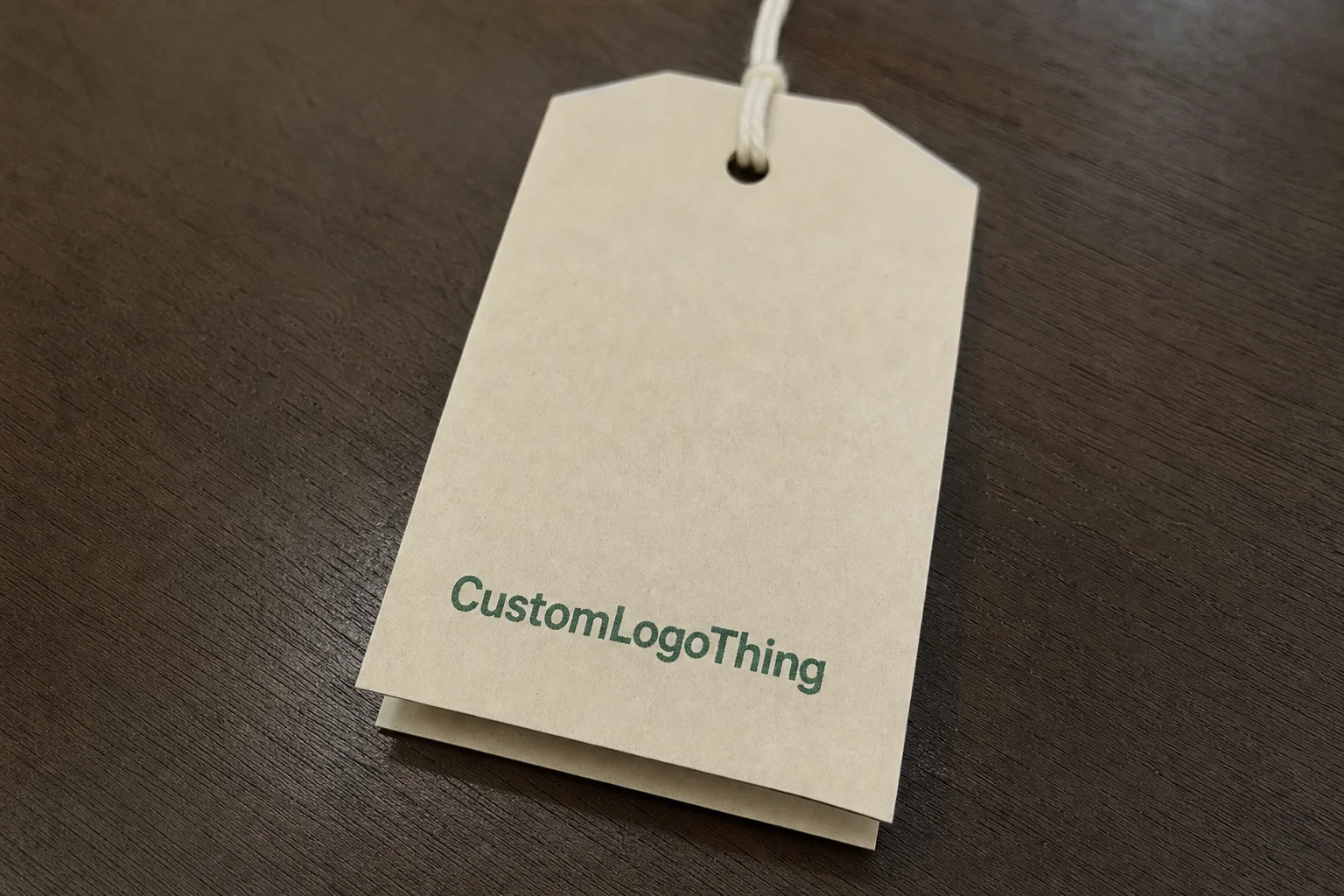
Swing tags, also called hang tags, are the printed cards attached to apparel, accessories, gifts, and packaged goods with string, ribbon, plastic loops, or fasteners. They do several jobs at once: they identify the brand, carry product details, support pricing, and sometimes satisfy compliance or inventory needs. The best tags accomplish all of that without feeling crowded.
In practice, swing tag printing is less about decoration than control. Control over how the tag feels in the hand, how it hangs from the product, how the color behaves on the chosen stock, and how clearly the information reads from a normal browsing distance. A premium jacket can lose some of its value signal if the tag is flimsy. A simple cotton tee can feel more intentional if the tag has a precise layout and a solid stock weight.
The details buyers should actually specify are concrete: stock, size, finish, shape, hole style, attachment method, and any variable data such as SKU, barcode, QR code, size code, or care instructions. "Make it look good" is too vague to quote against. Retail packaging needs measurable decisions.
- Stock controls stiffness, opacity, texture, and how premium the tag feels.
- Size affects readability and whether the copy can breathe or gets trapped.
- Finish changes color response, surface feel, and resistance to scuffing.
- Attachment affects how the tag hangs and how quickly it can be assembled.
Category matters too. Fashion labels usually need a refined look and careful color matching. Promotional products can tolerate lighter construction. Luxury lines often justify thicker stock, tighter print control, and more deliberate finishing, but only if the added cost supports the product position. A tag is a small object. It still has to match the price point.
If you are managing multiple SKUs, keep one master dieline and one spec sheet. That prevents tiny variations from turning into costly inconsistencies on repeat orders. For broader packaging support, our Custom Labels & Tags page is a practical starting point, and our Manufacturing Capabilities page outlines what can be produced in-house.
How the printing process works from file to finished tag
Good swing tag printing starts before a press ever runs. The workflow usually moves through artwork setup, proofing, print production, finishing, die cutting, hole punching, stringing, and packing. That order looks obvious on paper. In production, most delays come from a file that was not truly final, or a proof that was approved too quickly because the launch date was already under pressure.
Digital printing tends to suit shorter runs, fast turns, and jobs with multiple versions or variable data. Offset printing usually becomes more efficient at higher quantities because setup costs spread across more pieces, and color consistency is easier to control over a large batch. Flexographic printing can be relevant for certain roll-based or simplified tag programs, though most buyers comparing paper swing tags will start with digital and offset.
The right process is not just about price. It is about what the job actually needs. A 300-piece seasonal drop with a barcode on every tag is a different production problem from a 20,000-piece core retail run with one static design. The first job needs flexibility. The second rewards efficiency.
Variable data deserves early planning. Sequential numbering, custom barcodes, QR codes, multilingual versions, and size-specific copy all need to be declared before proofing begins. Late changes to data files are where orders start slipping. A printer can work with variable content, but not if the final file changes after the layout is already locked.
Proofing should confirm more than color. It should verify final size, bleed, safe area, hole position, barcode placement, back copy, and any finish that will change the feel or reflectivity of the tag. A screen preview is useful, but it is not a substitute for an approved production proof. Paper, coating, and ink behave differently under real light than they do on a monitor.
For most jobs, CMYK handles the core print needs well. Spot colors make sense when a brand color must stay tight across repeat runs or when a logo needs a cleaner edge than four-color mixing can deliver. The critical point is not the print method itself. It is whether the file is built to the correct dieline and the printer is working from the correct version.
Specs that control the final look and feel
The physical spec does most of the work. That is the part many buyers underestimate. A tag can have a strong layout and still feel wrong if the stock is too light, the finish is overdone, or the attachment fights the shape. In retail, the hand feel and the visual impression usually arrive together.
For paper swing tags, stock weight often sits between 300gsm and 450gsm. That range covers a lot of ground. Around 300gsm is usable for lighter products and promotional items. Around 350gsm is a common middle point for apparel because it balances stiffness, cost, and print quality. Heavier boards can feel more substantial, but they also increase cost, weight, and sometimes the time needed for cutting and stringing.
Uncoated stock has a softer, more natural look. It can make a product feel less glossy and more tactile, which works well for lifestyle brands and goods that lean on craft or sustainability cues. Coated stock sharpens color and keeps detail crisp. Soft-touch lamination gives a muted finish that feels expensive in hand, but it also changes contrast and can make dark tones appear slightly denser than expected under store lighting. That is worth testing if color accuracy matters.
Shape deserves more attention than it usually gets. Rectangular tags are economical and easy to stack. Rounded corners remove the sharp edge that can catch on packaging or clothing. Custom die-cut shapes can strengthen brand identity, but they make cutting more complex and can slow assembly. A tag that looks inventive in a mockup can become annoying on the packing table if it does not stack cleanly.
Attachment is not a decorative afterthought. Cotton cord gives a crafted look and works well for fashion or gift packaging. Ribbon is elegant but slows hand assembly. Elastic loops are quick and tidy for volume jobs. Plastic fasteners are efficient and common when speed matters more than presentation. Metal eyelets reinforce the hole and reduce tearing on heavier stock or repeated handling. The right choice depends on product use and production speed, not on whichever sample happened to look attractive in isolation.
Readability has to survive distance and motion. Type should stay legible at arm's length, contrast should remain strong enough under mixed store lighting, and the barcode or QR code needs enough quiet space to scan reliably. If the back of the tag is available, use it well. Double-sided printing often solves the problem of limited space better than shrinking the front copy until it becomes brittle and hard to read.
"A good tag does not try to prove everything at once. It gives the shopper the brand first, the useful detail second, and enough visual restraint to feel deliberate."
Pricing, MOQ, and unit cost: what actually moves the number
Price is driven by a short list of variables: quantity, stock, number of colors, finishing, die cutting complexity, attachment type, and whether variable data is involved. Quotes get messy when buyers compare jobs that are not actually equivalent. A 1,000-piece flat tag on standard board is not the same product as a 1,000-piece custom shape with foil and serialized barcodes.
MOQ matters because setup cost has to be recovered somewhere. On small runs, prepress, cutting, and assembly setup are distributed across fewer units, so the per-piece price rises quickly. That does not mean small runs are bad. It means they are expensive for structural reasons, not because the printer is being difficult. Once quantities climb, unit cost usually drops in a noticeable way.
| Run size | Typical unit cost | Best fit | Notes |
|---|---|---|---|
| 250-500 pieces | $0.45-$1.10 | Samples, launches, small drops | Higher setup share; digital printing usually fits best |
| 1,000-5,000 pieces | $0.18-$0.45 | Standard retail runs | Good balance of speed, flexibility, and cost |
| 10,000+ pieces | $0.08-$0.22 | Core programs, repeated SKU orders | Offset printing often becomes more efficient here |
Special finishes should earn their place. Foil, embossing, debossing, spot UV, and soft-touch lamination all add cost, sometimes substantially. They make sense when the product price point and brand story can support them. They make less sense when the item itself is simple and the tag is doing more cosmetic work than strategic work. A finish can improve perception, but it cannot repair a weak product fit.
Multiple SKUs also raise cost. Each version adds proofing time, file checks, packing complexity, and sometimes sorting after print. If you need a quote that helps you compare suppliers properly, ask for a breakdown by stock, print method, finishing, attachment, and packing format. Otherwise the numbers are too easy to misread.
If environmental credentials matter, ask for FSC-certified paper and confirm whether the printer can document chain-of-custody where required. If the order has to move through distribution or extended transit, it is also sensible to think about handling standards such as those published by ISTA. Swing tags are not shipping cartons, but the same discipline around material choice and stress testing still applies.
Production steps and timeline: from approval to delivery
Production timing is manageable if the artwork is actually ready. The usual path is straightforward: file preparation, proof approval, printing, finishing, cutting, assembly, packing, and shipment. The point where schedules slip is usually not the press run itself. It is the approval that arrived late, or the file revision that came in after the proof had already been signed off.
Simple tags can move quickly once the proof is approved. Complex shapes, multiple versions, foil, embossing, and variable data require more lead time because each step adds handling and quality checks. A realistic production window for straightforward runs is often around 12-15 business days after proof approval, though that changes with quantity, finishing, and workload. Heavy seasons, custom packing, and unusual file corrections can extend that.
Before placing the order, a few decisions should already be locked:
- Final quantity.
- Stock weight and surface finish.
- Print method and color count.
- Tag shape and hole style.
- Attachment method.
- Whether tags ship flat or pre-stringed.
- Delivery destination and required arrival date.
Shipping speed and production speed are separate. A fast courier does not fix a file that still needs approval. That sounds obvious, but launch schedules often assume logistics can absorb prepress delays. They cannot. If the tags are tied to a product release, they should be scheduled with the same discipline as labels, cartons, and tickets.
Build buffer time for product launches, seasonal resets, and retail onboarding. Tags are small, yet they can still become the thing that blocks a shipment if they are treated as an afterthought. For buyers checking materials and handling requirements, the FSC guidance is a useful reference point for certified sourcing and chain-of-custody expectations.
Common mistakes that make tags look cheap or print wrong
The fastest way to ruin a tag is weak file preparation. Low-resolution logos, missing bleed, incorrect color conversions, and artwork built without the dieline in mind all create avoidable problems. A printer can correct some issues. It cannot recover a fuzzy logo or a layout that ignores the hole position.
Too much copy is another common failure. A tag is not a brochure, and trying to make it act like one usually leaves the front cluttered and the important detail hard to find. Keep the primary message on the front and move supporting content to the reverse side. That gives the design room to breathe and makes the product easier to read on the rack.
Hole placement can do more damage than many buyers expect. If the hole interrupts the logo, shifts the visual balance, or sits too close to an edge, the tag will hang awkwardly. Custom shapes make alignment even more sensitive because the shape itself starts carrying part of the brand impression. A small misplacement becomes obvious very quickly.
Barcode and QR code issues are often discovered too late. If the code is too small, too close to the edge, or printed with weak contrast, scanning becomes unreliable. That is not a cosmetic problem. It can slow inventory checks, retail intake, and customer interaction. Once the run is printed, the fix is expensive.
Stock choice matters just as much. Thin board can curl, bend, or tear before the product is sold, which makes the whole line feel less considered. If the item is meant to communicate quality, the tag cannot collapse in the shopper's hand. The mismatch is immediate and hard to ignore.
- Check artwork resolution before approval.
- Leave proper bleed and safe margins.
- Confirm barcode size, contrast, and quiet zone.
- Verify hole placement on the dieline.
- Request a sample when stock or finish will affect perception.
A single physical sample often prevents a far more expensive reprint. That is not overcautious. It is practical. A matte stock can read darker than expected, a soft-touch laminate can flatten color, and a foil accent can look expensive or excessive depending on the rest of the layout. The sample answers those questions before the full run commits cash.
Expert tips and next steps for a cleaner order
Start with the product and the channel. A retail apparel tag, an ecommerce insert, a luxury accessory tag, and a promotional giveaway do not need the same structure. The first decision is not whether the design should feel elegant or minimal. It is what information the tag has to carry, how the item will be handled, and how much room the product price point gives you.
The strongest tags usually follow a clear hierarchy. Brand first. Product details second. Compliance, origin, or care information third. Decorative elements after that. This order keeps the tag readable and prevents the layout from competing with itself. When everything is equally loud, nothing feels resolved.
Ask for a paper sample or a press-approved swatch when the finish matters. Screens do not show how matte stock absorbs light, how soft-touch changes the apparent depth of color, or how a coated sheet reacts to dark solids. Those differences are subtle in a file and obvious in hand. The better your order is aligned to the physical sample, the fewer surprises you get during final packing.
Keep one master dieline and one master spec sheet for repeat work. That is where a lot of clean production comes from. If the tag changes every time, every order becomes a new problem. If the file is stable, only the variable data changes, and that is far easier to manage.
Before quoting, confirm the essentials:
- Size and shape.
- Stock weight.
- Print method.
- Finish.
- Quantity.
- Attachment method.
- Whether variable data is required.
From there, the order becomes much easier to control. The most reliable path is usually simple: audit the current tag, tighten the spec, approve the proof only after checking the practical details, and schedule production early enough that swing tag printing does not become the bottleneck. That is where the savings tend to show up. Not in flashy extras, but in the absence of avoidable mistakes.
FAQ
What is the difference between swing tag printing and hang tag printing?
In most retail contexts, there is no meaningful difference. The terms are used interchangeably. Some teams say "swing tag" more often in apparel, while "hang tag" is used more broadly, but the print process, artwork requirements, and production steps are the same.
How much does swing tag printing cost per unit?
Price depends on quantity, stock, print coverage, finishing, and whether the order uses variable data. Small runs usually cost more per piece because setup is spread over fewer tags. Once custom shapes, foil, or other premium finishes are added, the unit price rises quickly.
What file do I need to send for custom swing tag printing?
A print-ready vector file is the safest starting point, with fonts outlined and linked images at print resolution. Include the dieline, bleed, and final copy. If barcodes or variable data are part of the job, provide the source data in the required format before proofing begins.
How long does the swing tag printing process usually take?
Simple orders can move quickly after artwork approval. Custom shapes, special finishes, and variable data add lead time. In many cases, the slowest step is not the print run itself but the waiting period before the file is actually approved.
What should I prioritize when ordering swing tags for retail products?
Prioritize readability, durability, and product fit before decorative extras. Choose a stock and finish that match the handling conditions and the price point, and make sure the tag carries the information the sales channel actually needs.