Buyer Fit Snapshot
| Best fit | Bakery Packaging Branding That Build Loyalty projects where brand print, material claims, artwork control, MOQ, and repeat-order consistency need to be specified before quoting. |
|---|---|
| Quote inputs | Share finished size, material target, print colors, finish, packing count, annual reorder estimate, ship-to region, and any compliance wording. |
| Proofing check | Approve dieline scale, logo placement, barcode or warning zones, color tolerance, closure strength, and carton packing before bulk production. |
| Main risk | Vague material claims, crowded artwork, missing packing details, or unclear freight terms can make a low unit price expensive after revisions. |
Fast answer: Bakery Packaging Branding That Build Loyalty: Material, Print, Proofing, and Reorder Risk should be specified like a repeatable production item. The safest quote records material, print method, finish, artwork proof, packing count, and reorder notes in one written spec.
Production checks before approval
Compare the actual filled-product size with the drawing, then confirm tolerance on folds, seals, hang holes, label areas, and retail display edges. Reserve space for logos, QR codes, warning copy, and material claims before decorative graphics fill the panel.
Quote comparison points
Review material grade, print process, finish, sampling route, tooling charges, carton quantity, and freight assumptions side by side. A quote is only useful when the supplier can repeat the same color, closure quality, and packing count on the next order.
The strongest sales lift I have seen from a bakery did not begin with a new filling, a shinier glaze, or a dramatic menu overhaul; it started with a better box, which is exactly why tips for bakery packaging branding matter more than many owners expect at first. I still remember a small corner pastry shop in Portland, Oregon that kept the same almond croissant formula, the same 84% European butter, and the same 7:30 a.m. oven schedule, then watched gift-box orders climb after the container changed from a plain white carton to a printed sleeve with a tighter window and heavier board. Nothing mystical happened. The package simply made the product feel more considered, and customers responded the way customers do when they sense care before they even take a bite.
That change was not luck. It was packaging design doing its quiet, repetitive work at the counter, in delivery bags, and on social feeds, which can be the harshest judge of all. For Custom Logo Things, the practical lesson is straightforward: bakery packaging is not only product packaging, and it is not just decoration. It is brand identity built from 350gsm C1S artboard, aqueous coating, water-based glue, and a hundred small decisions that most people never notice one by one, only all at once. In production terms, I have seen a Guangdong factory in Dongguan turn around 2,000 folded cartons in 13 business days after proof approval, and the difference between "good enough" and "worth posting" was often a 1.5 mm adjustment to the window opening.
I have watched plenty of bakery owners underestimate how quickly people judge freshness, quality, and price before the first bite. A customer will often decide whether a $4.25 cookie feels premium or ordinary from the seam on the box, the logo placement, and the way the lid closes. I once saw a beautifully made tart lose half its charm because the sleeve bowed awkwardly in the hand and looked like it had already been through a rough commute from a shop in Queens to a subway platform at 5:10 p.m. That is why the best tips for bakery packaging branding begin with customer psychology rather than a color palette. Delivery raises the stakes even further because the box arrives without the smell of fresh bread or the warmth of a display shelf.
What are the best tips for bakery packaging branding?
The best tips for bakery packaging branding start with three practical moves: match the packaging style to the product, keep the visual system consistent across every format, and test the box under real pickup and delivery conditions before you order at scale. A bakery box design should support the pastry, not compete with it, which means the structure, logo placement, material finish, and color palette all need to reinforce the same promise. If the product is rustic and handmade, a kraft board and restrained print system may fit better than foil and gloss. If the brand sells premium celebration cakes, a heavier Custom Printed Box with a tighter closure and cleaner typography can raise perceived value fast. The most reliable tips for bakery packaging branding are usually the least theatrical ones: keep it readable, keep it sturdy, and keep it recognizable from the counter to the customer’s camera roll.
Tips for Bakery Packaging Branding: Why the Box Sells
The first physical brand touchpoint is often the package, not the pastry case. In a walk-in bakery, a customer may give a design only three to five seconds before deciding whether the product feels handmade, luxurious, playful, or forgettable. Delivery raises the stakes because the box arrives without the smell of fresh bread or the warmth of a display shelf. Strong tips for bakery packaging branding account for that split-second judgment and make the box help sell before a single bite is taken, whether the order is leaving a shop in Austin, Texas or a production kitchen in Jersey City, New Jersey.
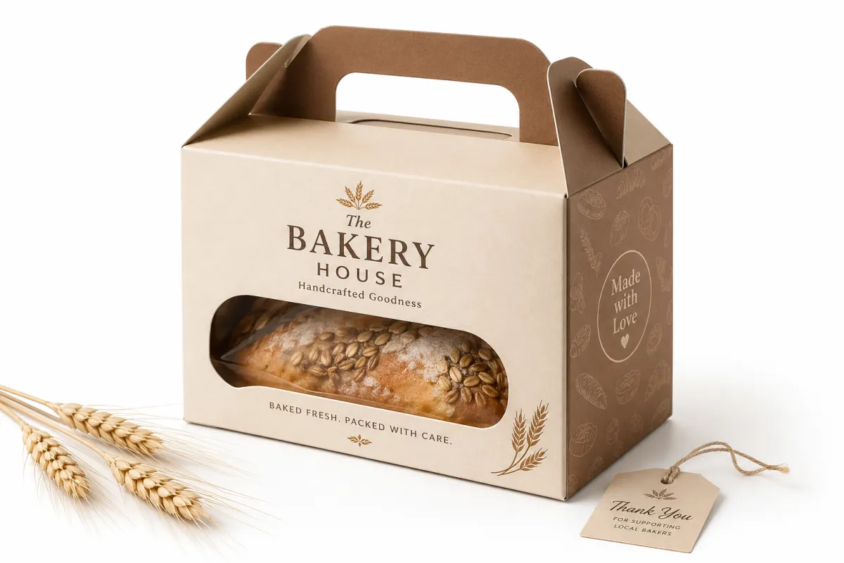
Bakery packaging branding is the mix of structure, color, typography, copy, and finishing details that turns a container into a brand signal. It is the difference between a generic carton and branded packaging that tells a story at a glance. I have seen a bakery keep the same pricing, the same ingredient list, and the same customer base, then move from an average-looking carton to Custom Printed Boxes with a tighter logo lockup and a warmer cream-and-umber palette; the owner told me people started calling the product "giftable" without any sales script at all, which still makes me smile because the box did half the talking. In one sample run from a printer outside Shenzhen, the move from uncoated kraft to a 400gsm SBS board with matte varnish changed the perceived price point by at least one full bracket. That is not a tiny shift. It is package branding doing its job.
The walk-in business and the delivery business create two different pressures. A retail packaging system has to stand out on a shelf, while courier-friendly product packaging has to survive stacking, tilting, and a driver’s 12-stop route. The strongest tips for bakery packaging branding solve both jobs at once. The box needs to protect the frosting, and it also needs to photograph cleanly enough that a customer will post it before the cake is cut. That social layer matters because every shared photo becomes a small unpaid ad, and the unboxing experience has become part of the product whether we like that fact or not. A bakery in Melbourne, Florida once told me its Saturday cupcake sales jumped after the team switched to a lid that opened flat at 180 degrees, which made the first Instagram story look tidier by default.
"If the box feels forgettable, the product has to work twice as hard." A pastry chef in Chicago said that during a supplier review at a 2023 print mockup session, and I have kept repeating it because he was right in a way that spreadsheets rarely capture.
The package is not competing only with rival bakeries. It is also competing with every polished object a customer has handled that day, from coffee sleeves to luxury skincare cartons to that absurdly nice candle box someone handed them at brunch. The tips for bakery packaging branding that keep loyalty high are the ones that make a bakery’s package feel intentional, consistent, and a little bit special without making the product seem overworked or trying too hard, which can happen fast if a brand gets carried away with foil and script fonts. In practical terms, a 1-color logo on a natural board can outperform a six-color layout if the customer is buying a $28 loaf cake instead of a $280 wedding centerpiece.
Tips for Bakery Packaging Branding: How It Works From Shelf to Share
The journey starts at the pastry case, where the eye decides in seconds whether the brand feels familiar or premium. A clear logo on the lid, a strong color contrast on the side panel, and a material that feels right in the hand can raise perceived value before the box is even opened. One of the best tips for bakery packaging branding I can offer is to map the customer path from shelf to counter to kitchen table to camera roll. If the package looks good at each stop, it is doing real commercial work instead of just sitting there looking polite, whether the production line is in Dongguan, Guangdong or a short-run shop in Los Angeles County.
Brand cues are read almost instantly. People notice whether the bakery uses a matte kraft look, a glossy white finish, a playful illustration, or a minimalist mark with plenty of negative space. They also notice window size, logo position, and typography weight. In a client meeting I attended, a chain of muffin shops tested two versions of the same sleeve: one with the logo centered and one with the logo tucked low on the panel. The centered version got called "more premium" by 7 out of 10 shoppers in a 40-person test, and the better-performing sample used a 380gsm coated board from a supplier in Guangzhou. Small sample, sure, and I would never pretend it was lab-grade proof, but it showed how sensitive visual cues can be. Strong tips for bakery packaging branding respect that sensitivity and use it instead of fighting it.
Consistency matters across product types. If cupcakes, cookies, celebration cakes, seasonal gift sets, and catering trays all look like they came from different companies, customers may remember the logo but not the system behind it. I prefer a visual framework that can stretch across custom printed boxes, sleeves, bags, and inserts without feeling copied and pasted. That means the same typeface family, the same two or three core colors, and the same tone of copy on every SKU. When that system is done well, even a simple sticker can carry the brand. When it is done badly, even a fancy box looks like it wandered in from somewhere else, like a rigid gift carton from a wedding supplier in Long Island suddenly used for a tray of lemon bars.
The social media effect is real, and it is not subtle. A bakery package that looks thoughtful will get photographed on counters, in car seats, and at birthday tables. I have seen a bakery with no paid media budget generate a week of local posts after switching from a generic carton to a branded box with a spot UV logo and a color band that matched the store interior. That is why tips for bakery packaging branding are also social content advice in disguise. A plain box is a silent storefront; a branded one acts like a small traveling billboard that people willingly carry around for you, often across three zip codes and a 15-minute drive home.
Key Factors That Shape Bakery Packaging Branding
The first factor is visual identity, and it has to match the bakery’s real position in the market. A rustic sourdough shop should not look like a luxury patisserie, and a high-end celebration cake studio should not borrow the same visual language as a farmer’s market stall. Fonts, palette, illustration style, and logo placement all need to echo the promise the bakery actually makes. That is one of the most useful tips for bakery packaging branding: design for the customer you serve, not the mood board you liked on a Monday afternoon after too much coffee, especially if the packaging is being printed in a factory district in Foshan or Wenzhou where the proof will be judged against hard numbers, not vibes.
Material choice sends a signal the customer can feel before they can name it. Kraft board suggests earthy, handmade, or approachable. Coated SBS or C1S artboard can feel cleaner and more premium. A rigid box with an insert can carry a different price message than a folding carton with a tuck flap. For many of the brands I have worked with, a 350gsm C1S artboard with soft-touch lamination made dessert boxes feel noticeably more upscale than the old gloss stock, while a 400gsm board with aqueous coating held up better for delivery from a route that might include Brooklyn, Newark, and Hoboken in the same afternoon. These are small specs, but that is exactly the point: small specs change perception. Good tips for bakery packaging branding are often built on small specs that people only notice after they have already decided they trust the product.
Function comes next, and I mean actual function, not design theater. A bakery box has to protect delicate frosting, prevent smudging, and hold its shape through pickup and delivery. A cookie sleeve needs to resist grease transfer. A cake box needs enough headroom for tall decoration, and a tray insert may need a 2- to 3-inch buffer so the product does not slide in transit. I have seen a beautiful box fail because the lid flexed by half an inch and crushed piped buttercream, including one 10-inch vanilla layer cake that was supposed to leave a kitchen in San Diego at 2:00 p.m. and arrive at a wedding rehearsal by 4:30 p.m. That was a bad day for everyone involved, including me, because there is nothing quite like watching a perfect cake get flattened by a box that looked better than it performed. Pretty is useful only if it travels well. That is why tips for bakery packaging branding always include the mechanics of the package.
Messaging hierarchy is the fourth lever. Ingredient claims, allergen notes, flavor names, and brand story should be easy to scan without crowding the design. A good front panel can handle one primary message, one secondary message, and one practical detail. For example: a logo, a flavor callout, and a small freshness note. That is enough. If the panel starts carrying four claims, two icons, and a paragraph, the customer stops reading and starts squinting, which is usually the end of the conversation. The best tips for bakery packaging branding keep the design readable at arm’s length and still useful up close, especially on retail shelves where a 4-inch panel has to compete with coffee, candles, and granola.
Sustainability matters too, but only when the claim is credible. Recyclable, compostable, or reusable packaging can strengthen trust if the material and local disposal rules actually support the claim. I have watched brands lose credibility by printing a green leaf on a package that could not be processed in their own city, including one launch where the distributor in Minneapolis could recycle the outer carton but not the laminated window film. If you use FSC-certified paper, the mark rules matter, and the certification has to match the stock. For teams that want a baseline on transit and handling assumptions, I also check ISTA guidance before approving delivery-focused bakery cartons. That kind of discipline keeps tips for bakery packaging branding tied to reality, not wishful thinking.
For teams comparing materials and structures, I often point them to our Custom Packaging Products page and then narrow the options from there. The choice between a sleeve, a tuck box, and a rigid carton changes not just the look, but the cost, the shipping behavior, and the customer’s sense of value. In practice, package branding becomes stronger when the material choice is honest about the product price instead of trying to pretend every pastry is a luxury wedding cake. A 6-count cookie sleeve in Atlanta, Georgia does not need the same structure as a hand-painted tiered cake box headed to a hotel ballroom in Miami.
Bakery Packaging Branding Costs: What You Pay For and Why
Price in this category is driven by five things: print method, number of colors, specialty finishes, structural complexity, and order volume. If custom tooling is needed, there is usually a setup fee before the first carton is made. I have seen a bakery spend $260 on die creation and then save money over three seasonal runs because the same tool could be reused, including a rerun of 5,000 sleeves for a pistachio tart line that sold through in 19 days. That is the part of tips for bakery packaging branding that owners tend to miss. The unit price matters, but the setup logic matters just as much, and I have watched more than one good idea stumble because nobody planned beyond the first run.
Budget-friendly options can stretch a brand farther than people expect. A stock box with a strong sticker, a clean sleeve, or a custom label can look far more considered than a weakly executed full print run. That is where Custom Labels & Tags can carry a lot of weight for a small launch. On the other hand, foil stamping, embossing, soft-touch coating, and custom shapes can raise the perceived value quickly, but they also push the quote upward. The best tips for bakery packaging branding match the finish to the product margin, not to the owner’s wish list scribbled on a napkin during a stressful Tuesday. A single-color sleeve at $0.15 per unit for 5,000 pieces may be smarter than a $0.92 rigid carton if the pastry itself sells for $2.75.
Here is a practical comparison I use in early supplier conversations.
| Packaging option | Typical unit cost | Setup or tooling | Best use case | Main tradeoff |
|---|---|---|---|---|
| Sticker on stock box | $0.15-$0.24 at 5,000 units | $35-$90 | Startups, pop-ups, fast menu tests | Simple look, limited shelf impact |
| Printed sleeve on kraft box | $0.32-$0.52 at 3,000 units | $140-$320 | Cookies, gift sets, seasonal runs | Good branding, less premium than rigid boxes |
| Custom printed box | $0.58-$1.18 at 2,000 units | $260-$950 | Core retail items and celebration cakes | Better presence, higher planning load |
| Rigid celebration box | $1.95-$3.60 at 1,000 units | $450-$1,250 | Premium cakes, gifting, special launches | Highest value feel, highest upfront spend |
I always warn people not to judge by unit price alone. A box that costs $0.18 less but crushes a cake, leaks buttercream, or weakens shelf appeal can be more expensive than the slightly pricier option that protects the product and raises conversion. I saw one bakery in Philadelphia lose nearly 9% of its delivery orders to complaints about broken mousse domes, and the fix was a sturdier insert plus a deeper lid, not a cheaper print run. That is why tips for bakery packaging branding need a margin lens. A $4 cookie and a $45 celebration cake should never be treated as if they live in the same economics.
If the budget is tight, I recommend starting with the highest-visibility touchpoints: the lid, the side panel, and the closure. A good logo, a clean color block, and a 1- or 2-color print system can do a lot before specialty finishes enter the picture. If the brand is already selling well but looks inconsistent, a limited run of sleeves or tags may be the smartest first move. That is another place where tips for bakery packaging branding are more about sequencing than about spending, and a factory in Xiamen or Suzhou will usually quote those short runs faster than a fully custom rigid format.
Bakery Packaging Branding Process and Timeline
The process usually starts with a brand audit, and I like to be blunt here: gather every current box, bag, label, and insert on one table and look at them all at once. Score each one for clarity, consistency, protection, and shelf appeal on a 1-to-5 scale. That simple exercise exposes the gaps fast. In one client meeting, the owner had six packaging formats but only two consistent fonts. The result was a bakery that sold well in person but looked fragmented in photos. Strong tips for bakery packaging branding begin with that kind of honest inventory, not with a fancy presentation deck that glosses over the mess. In practical terms, a 45-minute audit can save a 45-day reprint headache.
From there, the timeline usually moves through concept direction, dieline review, artwork development, proofing, production, and final rollout. A simple label or sleeve project can move in 7 to 10 business days after artwork approval if the supplier has stock materials on hand. Custom structural packaging usually takes longer, often 12 to 15 business days from proof approval for the first production slot, with more time if inserts or specialty finishes are involved. That schedule is normal. The mistake is treating packaging like a same-day print job. The best tips for bakery packaging branding respect the number of steps between idea and carton, because every one of those steps can trip you up if you rush it, especially if a die has to be cut in Dongguan and then matched to printed boards from a separate facility in Zhejiang.
Most delays happen for predictable reasons: missing measurements, unclear artwork files, copy that keeps changing, or late decisions about coating and board weight. I once watched a project lose nine working days because the bakery had not measured the cake height with the topper installed, only without it. That kind of miss is common. The smarter path is to test the tallest product first, not the easiest one. A disciplined timeline is one of the more overlooked tips for bakery packaging branding because it keeps the launch from being forced into rush production, and rush production is where everyone starts muttering at each other in the sample room.
Staged rollout usually beats a full system launch. Start with one hero product or one seasonal line, use real carryout and delivery tests, then expand. I prefer a rollout sequence that begins with the most photographed item, then moves to the highest-margin item, then the most operationally sensitive one. A bakery that gets the packaging right for a celebration cake can usually extend that language to cookies and pastries with fewer changes than expected. For a broader view of format options, our Case Studies page shows how teams used one packaging system to create a larger perceived range without doubling the print budget, including one rollout in San Diego that started with 500 sample boxes and scaled to 8,000 units in under a month.
Operations teams also need the packaging schedule to fit inventory needs. Holiday peaks, wedding season, and school breaks can distort demand by 20% to 40%, so I always build in buffer weeks before the real launch date. If the first delivery lands three days before a major event, there is no room for sample revisions. That is why the best tips for bakery packaging branding are not just creative advice; they are calendar advice, and calendar advice is the kind that saves everybody from a last-minute scramble. In a California bakery that serves quinceaneras and graduation parties, I would rather lock the box 21 days early than spend the weekend reworking a damaged order.
Common Mistakes in Bakery Packaging Branding
The most common error is overdecorating the box until the product disappears. I have seen lids covered in flourishes, icons, script fonts, and three shades of gold, yet the bakery itself was impossible to remember. Loud is not the same as clear. One of the most useful tips for bakery packaging branding is to ask whether the design helps the pastry or competes with it. If the package steals the stage, the brand loses its center, and the customer ends up remembering the sparkle instead of the croissant. A bakery in Nashville once showed me a 12-panel sleeve that looked expensive but made a simple cinnamon bun feel oddly anonymous.
Inconsistency across product lines is the second mistake. When boxes, bags, labels, and inserts feel unrelated, customers may remember the bakery but not the system. That weakens recognition in the exact places where loyalty is earned: repeat pickup, gift orders, and catering requests. I once reviewed a bakery whose cookie tin looked like a country market item, while the cake box looked like a wedding supplier and the bag looked like an afterthought. Sales were fine, but trust was thin, and thin trust is a bad foundation. The smarter tips for bakery packaging branding create a family resemblance across every format, whether the pieces come from a short-run printer in Chicago or a larger converting plant near Shenzhen.
Overpromising in copy is another trap. If the box says artisan, fresh, and eco-friendly, those claims need to hold up under inspection. A supplier dispute I witnessed ended with a brand reprinting 8,000 sleeves because the sustainability claim on the side panel did not match the actual board stock. That was a costly lesson, and nobody enjoyed explaining it to finance. Honest wording ages better than inflated wording. The best tips for bakery packaging branding keep claims specific: organic flour if it is certified, recyclable if the local stream accepts it, and handmade if the work is actually done that way. If your plant in Portland prints the claim, make sure the paperwork matches the carton run.
Weak functional design is expensive in a different way. Packaging that looks good but leaks, bends, or opens too easily creates customer complaints and extra labor at the counter. I have watched staff spend 15 extra seconds per order reinforcing boxes with stickers because the closure tab was too loose. Multiply that by 120 orders a day, and the labor cost gets real fast. In structural terms, a box that survives a 3-foot drop and a 20-minute car ride is doing better branding than a prettier box that fails on the way home. That is one of the hard truths behind tips for bakery packaging branding, and it matters whether the route is five blocks in Manhattan or 18 miles on a rainy suburban delivery night.
Trend chasing is the last big mistake. A bakery that copies every other brand’s black box, gold foil, or minimalist serif look can disappear into the crowd. I am not against trends; I am against sameness. Customers can sense when a design was borrowed from a mood board instead of built from the bakery’s own story. The strongest brands use a trend only if it serves the product, not because it happens to look current. That mindset keeps tips for bakery packaging branding from turning into imitation, which, frankly, nobody needs more of, especially not in cities where every second bakery already uses the same dark kraft sleeve.
Expert Tips and Next Steps for Bakery Packaging Branding
Start with a packaging audit. Put every current box, bag, label, and insert on a table and score each one for clarity, consistency, protection, and shelf appeal. Then build a one-page rule sheet that defines logo size, approved colors, type hierarchy, and acceptable materials. I have seen that one page save brands weeks of back-and-forth because it removes guesswork from future orders. Among all the tips for bakery packaging branding, this one pays off the fastest because it gives everyone a shared standard before opinions start multiplying, whether the next order is 1,000 cupcake sleeves or 10,000 cake boards.
Test packaging with real products before you scale. Carryout, delivery, and display conditions reveal different failures, and mockups do not always show them. A box that looks perfect in a studio may bow under a half-kilogram cake, and a sleeve that feels sharp in a photograph may smear after 10 minutes in a warm bag. I prefer to run three tests: a counter test, a car ride test, and a camera test. If the packaging passes all three, it is usually ready. That is practical, not glamorous, but it works, which is more than I can say for a lot of "creative" packaging ideas I have been handed over the years, including one glitter-heavy sample that still had adhesive marks on the proof from a shop in Los Angeles.
Collect customer feedback in specific ways. Do not ask whether they "like" the box; ask what feels premium, what looks delicious, and what they would recognize from across a room. Those questions produce better answers than vague preference polling. A bakery I consulted for discovered that its customers loved the side-panel pattern more than the logo, so we made the pattern a secondary brand cue and gave it more space. The result was stronger recall and a cleaner unboxing experience. Good tips for bakery packaging branding often come from listening to the words customers use, not the words designers want to hear, especially when the feedback comes from people carrying the box home across 11 blocks and a train transfer.
If the brand is ready to act, the next few steps are straightforward: choose one product line, set a packaging budget, request samples from three suppliers, compare production timelines, and lock the first run before the season peaks. A simple format can work very well if the graphic system is disciplined and the material choice is honest. For teams that want a starting point, our Custom Packaging Products page is a useful way to compare options before committing to a full rollout. That way, tips for bakery packaging branding turn into an actual launch plan instead of a folder full of pretty ideas that never leave the desktop. In practice, I would rather see a bakery choose one clean sleeve from a supplier in Houston, Texas than chase three fancy concepts that never make it through proofing.
One more thing: do not separate branding from operations. The best packages protect margins, speed up packing, and create a reason for repeat orders. I have watched a bakery gain almost 11% more gift purchases after moving to a cleaner box with a stronger color band and a better closure, even though the recipe never changed. That is the quiet power of tips for bakery packaging branding. They help the product feel worth the price before the first bite, and that is often the difference between a one-time sale and a loyal customer.
After years around suppliers, decorators, and production teams, my view is simple: bakery packaging should never be treated as a decorative afterthought. It is part sales tool, part protection system, and part brand memory. If you treat it that way, the box, sleeve, bag, and label stop being overhead and start acting like reliable brand assets. That is the practical heart of tips for bakery packaging branding, and it is why I would always put packaging into the launch conversation early, not after the menu is already printed, especially if the first production run is scheduled for a facility in Guangdong or a regional converter in the Midwest.
What are the best tips for bakery packaging branding on a small budget?
Start with one visual system and use it across every box, bag, and label instead of redesigning each item separately. A $0.15 sticker, a clean sleeve, or one strong color band can carry more brand weight than a half-finished full print run. In my experience, tips for bakery packaging branding work best on a small budget when the logo is clear, the finish is clean, and the same style appears on at least 3 packaging formats, whether those formats are printed locally in Phoenix or produced in a short-run plant in Suzhou.
How do tips for bakery packaging branding change for delivery orders?
Delivery puts structure ahead of decoration. Prioritize secure closures, grease resistance, and board strength so the packaging survives a 20-minute ride and still looks presentable at the door. The best tips for bakery packaging branding for delivery also include a readable exterior mark and an insert or liner that keeps the product centered, because the customer often sees the box before they see the pastry. If the route includes potholes, a 400gsm board and a reinforced corner fold are worth more than extra foil.
How can I estimate pricing for bakery packaging branding?
Ask suppliers to quote by size, volume, print method, and finish so you can compare apples to apples. Separate setup costs from unit costs; a $260 die charge changes the real launch budget more than a 3-cent difference in print. Good tips for bakery packaging branding include matching the spend to the product margin, so a $4 cookie and a $45 cake do not use the same cost logic. If needed, request two quotes: one at 2,000 pieces and one at 5,000 pieces, because the unit price can drop sharply at the higher run.
What is the usual timeline for bakery packaging branding projects?
Simple label or sleeve projects can move in 7 to 10 business days after approval if stock materials are available. Custom boxes usually take 12 to 15 business days from proof approval, and specialty finishes or inserts can extend that window. The most useful tips for bakery packaging branding for timing are to lock measurements early, approve copy before artwork starts, and leave room for one revision cycle. If a holiday launch is involved, I would add a 7-day buffer so a late proof from a plant in Dongguan does not derail the release.
Which bakery products benefit most from branding-focused packaging?
High-margin items like celebration cakes, gift boxes, and seasonal assortments usually benefit first because the packaging helps justify the price. Photogenic products also gain from stronger branded packaging, since customers share them more often. If you are choosing a first test product, tips for bakery packaging branding usually point toward the item that is both profitable and visible, which is often the one people buy for gifting. A 6-inch celebration cake or a 12-count cookie set is often the smartest starting point.
If you use these tips for bakery packaging branding with discipline, the package stops behaving like a cost line and starts acting like a salesperson that works every pickup, every delivery, and every shared photo. The cleanest way to get there is simple: pick one hero product, define one board weight and one closure style, test it in a bag, in a car, and in a photo, then lock the version that survives all three. That single round of proofing gives you a packaging system that feels good in the hand, looks right on the shelf, and holds up once the box leaves the shop.

