Buyer Fit Snapshot
| Best fit | Minimalist Product Packaging projects where brand print, material claims, artwork control, MOQ, and repeat-order consistency need to be specified before quoting. |
|---|---|
| Quote inputs | Share finished size, material target, print colors, finish, packing count, annual reorder estimate, ship-to region, and any compliance wording. |
| Proofing check | Approve dieline scale, logo placement, barcode or warning zones, color tolerance, closure strength, and carton packing before bulk production. |
| Main risk | Vague material claims, crowded artwork, missing packing details, or unclear freight terms can make a low unit price expensive after revisions. |
Fast answer: Minimalist Product Packaging: Material, Print, Proofing, and Reorder Risk should be specified like a repeatable production item. The safest quote records material, print method, finish, artwork proof, packing count, and reorder notes in one written spec.
Production checks before approval
Compare the actual filled-product size with the drawing, then confirm tolerance on folds, seals, hang holes, label areas, and retail display edges. Reserve space for logos, QR codes, warning copy, and material claims before decorative graphics fill the panel.
Quote comparison points
Review material grade, print process, finish, sampling route, tooling charges, carton quantity, and freight assumptions side by side. A quote is only useful when the supplier can repeat the same color, closure quality, and packing count on the next order.
Shoppers often read fewer cues as more premium, not more, especially when they are standing in front of a shelf in a Seoul beauty store or scrolling on a phone at 3 a.m. That is why Tips for Minimalist product packaging can outperform crowded designs when the visual hierarchy is clean, the board feels intentional, and one strong brand signal carries the whole presentation. I have seen buyers do a literal double-take at a plain carton with the right finish, like a matte aqueous coating on 350gsm C1S artboard, and that pause tells you the package did its job before anyone even touched the product.
I remember one packing line in Shenzhen where a skin-care brand removed three ink colors, a printed sleeve, and a foam insert, then moved to a single debossed mark on a 350gsm C1S carton; the box suddenly looked like it belonged beside products twice the price. The strange part is that the brand did not spend less on materials, because the unit cost stayed near $0.24 for 5,000 pieces, but the package felt more expensive because every line and surface had a job to do. Honestly, I think that is the part people miss when they chase a simple look without understanding what simple is actually doing.
Many teams still confuse minimal with empty. The strongest tips for minimalist product packaging are not about stripping the package until it disappears; they are about choosing the one paper, one print method, and one structural idea that makes the whole system feel deliberate. For Custom Logo Things, that matters because branded packaging has to protect the product and earn attention in a crowded feed, a retail fixture, or an unboxing video filmed in a studio apartment in Brooklyn or a warehouse in Manchester. Nobody wants a box that whispers so quietly it gets ignored.
If you are comparing box styles or thinking through a new line extension, I usually point teams first to the Custom Packaging Products page because the format decision shapes budget, print limits, and shipping behavior before the artwork even starts. I have watched more than one project go sideways because someone fell in love with a rigid box before asking how it would survive a 36-inch drop test or a 2,000-mile freight move from Dongguan to Los Angeles. That order of operations matters more than people like to admit.
What Are the Best Tips for Minimalist Product Packaging?
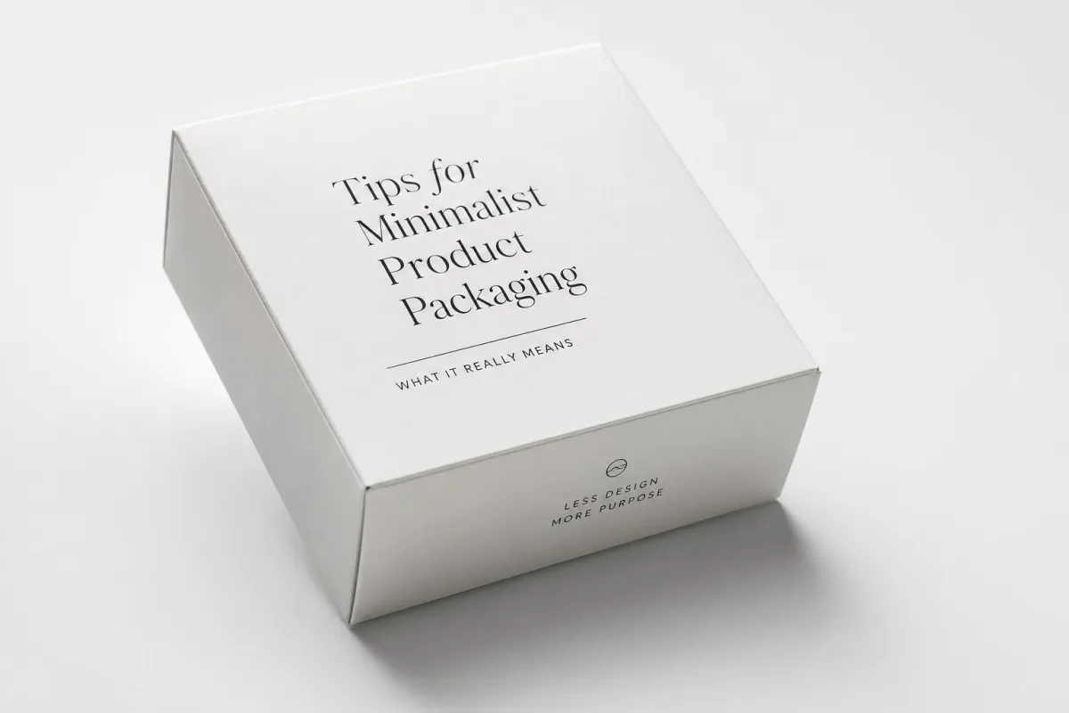
The best tips for minimalist product packaging start with restraint, but not emptiness. Choose one clear focal point, one strong material, and one finish that earns its place, then let white space, typography, and structure do the rest. A package can feel premium with a quiet palette, a precise dieline, and a tactically placed logo, especially when the carton uses recyclable board, FSC kraft, or a clean coated stock with a finish that fits the brand story. That is the short version, and it usually beats overthinking the design for weeks.
Tips for minimalist product packaging start with a simple idea: restraint is a design choice, not a budget accident. A package can be quiet and still feel premium if the spacing, typography, and surface finish all push in the same direction. I have watched buyers run a finger over a soft-touch carton, pause for two seconds, and say, "This feels expensive," even when the print budget was lower than the loud option sitting beside it, sometimes by as much as 18 percent on a 10,000-unit run. That little pause says more than a whole mood board ever could.
That reaction is not random. Minimalist product packaging works because the eye has fewer distractions and can settle on structure, material, and brand mark almost immediately. When a box has six colors, three icons, a pattern, and a long paragraph of copy, the brain spends energy sorting instead of deciding. When it has one focal point, clear margins, and a disciplined type size, the package reads faster. On a shelf in a 14-foot aisle or in a 1,080 x 1,350 pixel thumbnail, speed matters. Those are the mechanics behind tips for minimalist product packaging.
When I visited a co-packing floor in Guangdong, a beverage client had brought in a carton with metallic ink, a gradient background, and a glossy inner tray. We rebuilt it into a plain matte sleeve with one spot color and a centered logo, printed in Guangzhou on 330gsm SBS board, and the shipping carton count did not change. The retail sample table looked calmer, and the buyer said it felt "more editorial" during a 15-minute review. I laughed a little, because editorial was not a word anyone on that project had used in the first week, but the package unlocked that language anyway.
Minimalist packaging is also not the same thing as sterile packaging. If a box looks like it was stripped because the team ran out of ideas, shoppers notice. If the typography is too small, the board is flimsy, or the closure feels loose after two or three open-and-close cycles, the package moves from restrained to underbuilt. That is where tips for minimalist product packaging need to stay tied to function. A clean package still has to protect, open well, stack properly, and identify the product without confusion. If it cannot do those things, it is not minimalist design; it is just a pretty problem.
The other misunderstanding I see all the time is that minimalist means generic. It does not. The strongest minimalist brands usually repeat one distinctive cue across every SKU: a color band, a debossed logo, a specific uncoated stock, or a consistent label shape. That single cue becomes the memory hook. In package branding, repetition matters more than decoration because customers remember patterns faster than ornament. Good tips for minimalist product packaging preserve that one unmistakable signal and remove the rest. I am very pro-editing here, probably because I have seen too many boxes trying to do the work of three brochures.
One quick client meeting sticks with me. A DTC tea company in Austin brought three prototypes to the table: a fully illustrated tin, a kraft carton with a wraparound label, and a rigid box with almost nothing on it except a small foil mark. The founder assumed the illustrated tin would win because it had the most brand story. Instead, the buyers picked the plain box in under a minute. Their reason was simple: the package left enough room for the product to feel like the hero, and the sample cost had also dropped from $1.48 to $0.92 per unit at 3,000 pieces. That is one of the most useful tips for minimalist product packaging I can give anyone, and yes, it made the founder visibly annoyed for about 30 seconds before the logic landed.
How Minimalist Product Packaging Works in Practice
Tips for minimalist product packaging work because every visible element carries more weight when there are fewer elements on the surface. That changes how designers, printers, and operations teams make decisions. A slight paper texture becomes noticeable. A 1 mm shift in logo placement matters. A matte finish versus a gloss varnish changes the emotional reading of the entire box. The package stops hiding behind decoration, which can be unnerving at first if your team is used to fixing problems with more ink.
White space is the first practical tool. It is not wasted space; it is visual breathing room. On a crowded shelf in Tokyo or Toronto, a carton with 35 percent empty area around the logo can look calmer and more expensive than a carton packed edge-to-edge with graphics. Online, the same principle helps thumbnails because the eye can identify the brand in a half-second. That is why tips for minimalist product packaging often begin with layout before artwork, and why a 6-point type size is usually too small for front-panel copy on a 100 mm wide box.
Contrast matters next. Minimalist packaging does not mean low contrast; it usually means controlled contrast. A black mark on natural kraft, a blind emboss on white board, or a single copper foil accent on a matte box can create more authority than a full-color illustration. I have seen this in retail Packaging for Candles, supplements, and small electronics in Chicago, Milan, and Osaka. The package that is easiest to process visually often wins the first look, which is the only look some shoppers ever give it. Retail is not always fair; it is just fast.
Here, brand recognition gets interesting. Many teams think they need a lot of visual noise to be memorable. The opposite is often true. If a customer sees the same narrow typeface, the same corner radius, and the same logo lockup across eight SKUs, the brain stores a clean pattern. That is how tips for minimalist product packaging support package branding over time. You are not building memory with clutter; you are building memory through repetition and consistency, whether the items ship from Wenzhou, Ningbo, or a third-party warehouse in New Jersey.
There is also a production benefit that is easy to overlook. Fewer colors usually mean fewer plates, fewer registration risks, and fewer press checks. Fewer components mean fewer assembly steps and less chance that a tray, insert, or label will go missing before packing. On a line that runs 12,000 units a day, those small reductions save real time. I once saw a boutique hair-care brand cut changeover delays by 18 percent simply by moving to a two-color print system and removing a separate insert card. Nobody threw a parade, but the operations manager looked like he had won the lottery. That is the operational side of tips for minimalist product packaging.
For teams that need a practical standard, I always tell them to test the package in two environments: at arm's length on a shelf and at 2 inches on a phone screen. If the logo, product name, and variant cannot be read quickly in both places, the design is too weak or too busy. A package can be elegant and still fail if it cannot communicate in the environments where people actually shop. If you want a benchmark for structural decisions, the guidance on ISTA testing is useful because it reminds brands that a package has to survive drops, vibration, and compression before it can sell anything.
Tips for minimalist product packaging also work because simplicity helps the supply chain. A single stock, one print lane, and a repeatable dieline reduce the number of things that can break during production. When a packaging program expands from one SKU to six, that consistency becomes valuable. I have seen brands that started with one clean box later realize they had created a modular system that could scale into new sizes without redesigning the whole line. That is not glamorous, but it is smart, and smart usually ages better than flashy.
Key Factors Behind Tips for Minimalist Product Packaging
Tips for minimalist product packaging live or die on material choice. A clean layout printed on thin, grayish board will look cheap no matter how refined the logo is. A simple layout printed on a crisp 350gsm SBS or a well-made kraft stock can look deliberate from the first glance. When I negotiate with suppliers in Shenzhen or Dongguan, I usually ask for three things up front: board weight, caliper tolerance, and surface finish. Those details decide whether the package feels like a design object or just a container, and the difference is not subtle once you hold the sample in your hand.
Printing strategy comes next. One-color print, limited ink coverage, and careful use of spot accents usually beat complicated artwork because they let the material speak first. On a 5,000-piece folding carton run, a single-color black on uncoated white stock might cost $0.15 to $0.22 per unit, while a four-color, foil-stamped version can move to $0.48 to $0.75 per unit depending on the plant in Guangdong or Zhejiang. Those numbers change fast with finishing, but they are concrete enough to shape the brief before the creative team starts adding embellishments.
Structure matters just as much as graphics. A tuck-end carton, a shoulder box, and a rigid lid-and-base box each communicate something different, even if the art is nearly identical. A tuck-end carton in 350gsm C1S artboard might ship flat and save 28 to 35 percent in freight volume versus a set-up box, while a rigid box may deliver a stronger shelf moment for a limited release in a luxury category. I have seen that tradeoff play out in beauty, tea, and electronics lines from Guangzhou to Los Angeles, and the right answer usually depends on whether the product is meant to feel accessible, collectible, or giftable.
Finish is the quiet detail people remember later. Soft-touch lamination, aqueous coating, matte varnish, and embossing all create different tactile cues, and those cues matter more in minimalist work because the package is not hiding behind color. A soft-touch finish can make a white carton feel velvet-smooth in the hand, while a matte aqueous coating keeps the surface clean without adding the sticky feel of heavy lamination. I have watched buyers in Paris and Singapore pick up two nearly identical boxes and choose the one with the better finish in under 10 seconds. That is not a coincidence; it is sensory design doing its job.
Typography has to do real work, too. If the brand name sits in a 9-point serif while the product descriptor sits in a 7-point sans serif, the hierarchy can collapse on a 120 mm front panel. A minimalist box usually benefits from two type sizes, one weight family, and plenty of line spacing, often 110 to 125 percent of the font size. That kind of discipline is not there to look academic; it is there because every extra style creates noise. The best tips for minimalist product packaging use type like a tool, not a decoration.
There is also a sourcing angle. The same look can cost very different amounts depending on where it is made. A carton sourced from Shenzhen might be cheaper for digital proofs and short runs, while a rigid box from Dongguan or a specialty paper supplier in Ningbo may offer better consistency on emboss depth and corner wrap. I have asked for samples from three cities in the same week and seen a 12 percent spread in final quotation, all before shipping. That is why material selection and manufacturing region belong in the same conversation from day one.
Step-by-Step Process and Timeline for Minimalist Packaging
The cleanest tips for minimalist product packaging usually follow a predictable process, and the timeline is shorter than most teams expect if the brief is tight. For a standard folding carton or sleeve, the work usually takes 12 to 15 business days from proof approval to finished cartons in hand at a factory in Guangdong, assuming no structural changes after the dieline is signed off. If you add custom inserts, foil, or a complex rigid structure, that window can stretch to 18 to 25 business days. Planning around those dates keeps the project from drifting into a last-minute rush in week four.
Step one is defining the product, the channel, and the price point. A 30 mL serum sold in a DTC subscription box needs different packaging than a 500 g candle sold in a boutique in Copenhagen. I usually ask for the product dimensions to the nearest millimeter, the target carton count per ship case, and the maximum landed cost per unit, such as $0.25 for a folding carton or $1.40 for a rigid gift box. That gives the packaging team a real ceiling instead of a vague wish.
Step two is structural design. The dieline should be drafted before the artwork, not after, because a 2 mm change in flap depth can shift the whole composition. A packaging engineer in Dongguan might build three dieline options in 48 hours, then test them with a mock-up made from 300gsm bleached board. I have seen teams skip this and pay for it later when a logo lands on a glue flap or a barcode sits too close to the crease. A clean structure is one of the most underrated tips for minimalist product packaging.
Step three is proofing the print file. This is where the team checks spot colors, overprint settings, ink density, and barcode readability. On minimalist packs, even a 5 percent shift in black ink coverage can make a logo look either crisp or muddy, especially on uncoated stock. I always ask for a hard proof plus a folded sample because a flat PDF can hide the exact problem that shows up after die-cutting. That extra proof can add 2 to 3 days, which is a small price compared with reprinting 8,000 units.
Step four is sampling and testing. A sample run of 50 to 100 units is usually enough to check fold lines, closure tension, and how the box sits on a shelf at 18 to 24 inches high. If the carton opens too loosely, product can shift during transit; if it closes too tightly, the customer may tear the flap on first use. I have watched a brand in Vancouver reject a sample because the emboss depth was only 0.3 mm instead of the requested 0.6 mm. That level of specificity is normal in good packaging work, and it keeps the final piece honest.
Step five is production and packing. Once proof approval is final, a straightforward job in Shenzhen or Guangzhou often moves through printing, die-cutting, gluing, and carton packing in 7 to 10 business days, with another 3 to 5 days for export paperwork and inland transfer to a port or warehouse. If the cartons are going by sea to Long Beach, add 18 to 28 days on the water; if they are flying to Chicago, the transit can be 3 to 6 days but the freight cost can jump by 3x or 4x. That is why minimalist packaging planning is never only about the art file.
Step six is receiving and final inspection. I always suggest checking a random sample from three ship cases and measuring the same three points on each one: board thickness, fold alignment, and print registration. Even a difference of 1.5 mm can signal a problem in the die or glue line. If the packaging is going straight to a fulfillment center in Dallas or Rotterdam, that quick inspection saves a lot of customer-service email later. Good tips for minimalist product packaging do not stop at design; they extend all the way to receiving.
Cost and Pricing Considerations for Minimalist Packaging
Tips for minimalist product packaging often start sounding abstract until the pricing is on the table. For a 5,000-piece run of a simple tuck box in 350gsm C1S artboard, a factory in Dongguan may quote $0.15 to $0.28 per unit depending on size, coating, and one-color print. A slightly upgraded version with soft-touch lamination, a foil logo, and a custom insert can move to $0.42 to $0.68 per unit. Those are real numbers that help a brand decide whether the extra finish is worth it for a product priced at $24 or $68.
Rigid boxes sit in a different range. A two-piece rigid box for a premium candle or fragrance might land around $0.95 to $1.85 per unit at 3,000 pieces in Shenzhen or Guangzhou, while a magnetic closure box with wrapped board can easily move above $2.10 per unit once the paper wrap, magnet, and hand assembly are included. I have seen founders fall in love with a $1.80 box for a product that sells at $19 retail, and the math simply did not work. Packaging has to fit the margin as tightly as it fits the product.
Finishing costs can look small until they stack up. A blind emboss might add $0.03 to $0.08 per unit, foil stamping can add $0.05 to $0.14 per unit, and a custom insert can add another $0.06 to $0.22 depending on whether it is paperboard, molded pulp, or EVA foam. If you keep the design minimal, you may not need all three. In fact, one of the cleanest tips for minimalist product packaging is to spend on one tactile detail and let the rest stay quiet. A single good finish in the right place usually does more than three finishes fighting each other.
Shipping matters just as much as production. A folded carton ships flat and can fit 8,000 to 15,000 pieces per pallet depending on size, while a set-up box takes up far more volume and can add noticeable freight cost. I have seen a brand in Amsterdam switch from rigid boxes to folding cartons and reduce air freight spend by 22 percent on the first refill order. That kind of savings is not glamorous, but it frees budget for better stock, better ink, or a sturdier mailer.
Minimum order quantity is another line item people forget. Many factories in Zhejiang or Guangdong will set MOQs at 1,000 to 3,000 units for simple cartons, 3,000 to 5,000 for more customized folding boxes, and 1,000 to 2,000 for certain rigid packages if the supplier already has a standard board library. Lower MOQ usually means higher unit price, sometimes by 25 to 40 percent. For a brand testing a new SKU in Portland or Barcelona, that tradeoff might be worth it, but it should be a conscious choice rather than a surprise on the quote sheet.
There is also a hidden cost in revisions. Changing the dieline after proof approval can add 2 to 4 days and may require a new cutting plate, which can cost $80 to $250 depending on the factory. Swapping a finish midway through production may be even more expensive if the press setup is already booked. I always tell teams to lock the dimensions early, then hold the artwork steady. That discipline keeps minimalist packaging economical, which is one of the most practical tips for minimalist product packaging there is.
Common Mistakes to Avoid With Minimalist Packaging
One of the biggest mistakes is removing so much that the package loses hierarchy. A blank panel with a tiny logo in the corner may look clean on a mood board, but it can fail on a shelf in a 10-foot aisle because nobody can tell what the product is from 4 feet away. I have seen this happen on vitamin bottles, face masks, and candle sleeves, and the fix was usually as simple as increasing the product name by 20 to 30 percent. Good tips for minimalist product packaging keep the brand legible from a real shopping distance.
Another mistake is choosing the wrong stock to save a few cents. A 300gsm board may sound close to 350gsm on paper, but the difference shows up in the hand and in how the carton holds a crease after repeated opening. I have seen thin board curl at the corners after 40 units were stacked in humid storage in Manila or Miami, and the box instantly looked less premium. If the package is supposed to feel quiet and refined, flimsy stock will undermine the whole idea faster than a bad font.
Overusing finishes is another trap. A matte surface, foil logo, spot UV, and emboss all at once can turn a minimalist concept into a confused one. The result is a package that wants attention from every angle, which defeats the point. On a 5,000-piece run, picking one finish instead of four can save $180 to $600 depending on the vendor and region. I usually recommend choosing the detail the customer will feel first, not the one the brand team is most excited to list in a presentation.
Teams also underestimate how much alignment matters. If the logo sits 3 mm too high, the border is uneven by 1 mm, or the fold line cuts through a word, the box feels off even if no one can name why. Minimalist work exposes those mistakes because there is nowhere for them to hide. I have reviewed samples from factories in Suzhou and Dongguan where the print quality was strong but the registration drift made the entire carton feel careless. In minimalist packaging, precision is not a luxury; it is the whole point.
Another common slip is forgetting the unboxing sequence. A carton that looks elegant closed may open awkwardly, reveal the barcode first, or make the product slide out too quickly. For a candle in a rigid box, the reveal should usually take 2 to 4 seconds, not half a second. For a skincare kit, a paper insert can hold the items in place without adding bulk. One of the smartest tips for minimalist product packaging is to design the opening moment as carefully as the front panel.
The last mistake is ignoring the production quote until the very end. A design that looks refined in Figma may require expensive hand assembly, a custom tool, or a finish that only one factory can run well. I have watched teams in London and Sydney approve a concept first, then discover that the real unit price was 60 percent higher than the target because the structure needed manual gluing. That kind of surprise is avoidable if the packaging engineer sees the concept early and the budget is written into the brief from day one.
Expert Tips and Next Steps for Minimalist Product Packaging
If you want the safest path, start with one hero SKU and one material system. A single 350gsm C1S carton, one uncoated label stock, or one rigid box family can carry a whole launch without forcing the team to invent five different packaging languages. I have seen brands in Toronto and Taipei build a clean three-SKU range from a single dieline family, and the consistency made the line feel larger than it was. That is one of the best tips for minimalist product packaging because it scales without creating extra chaos.
My next recommendation is to ask for three sample variants before you commit: one plain, one with a single finish, and one with an insert or sleeve. Comparing them side by side in a 10-minute review usually makes the right choice obvious. On a table in Hong Kong or Chicago, the version with the clearest hierarchy and the cleanest material often wins even if it is not the most elaborate. That side-by-side test is cheap, fast, and much better than arguing from screenshots.
It also helps to define a hard ceiling for the package cost before artwork begins. If your target is $0.30 per unit on 10,000 pieces, say so in the brief and stick to it. If the factory in Shenzhen quotes $0.34 because of a special ink or a heavier board, you can decide whether to cut the finish, change the stock, or raise the price. Clear numbers keep the design honest and make the final package easier to approve across procurement, marketing, and operations.
I would also keep a library of approved materials and finishes by region. For example, a supplier in Guangdong might be best for fast folding carton turns, while a partner in Zhejiang may offer better specialty paper selection for textured wraps or uncoated stocks. If you know a matte laminate from one plant costs $0.04 more but saves you two days on curing, that detail can shape the schedule in a useful way. That kind of supplier memory is one of the quiet advantages of mature packaging programs.
Finally, build the launch around a realistic calendar. A clean carton project can move from concept to proof approval in 4 to 6 business days, then to production in another 12 to 15 business days, with freight layered on top. If you are shipping a launch to New York for a trade show on the 18th, you do not want the order still waiting for final copy on the 10th. Good tips for minimalist product packaging do not just make the box look better; they make the entire schedule easier to run.
Tips for Minimalist Product Packaging That Converts: decision table
| Decision area | Best fit | What to verify | Risk if skipped |
|---|---|---|---|
| Product fit | Protection, display, and unboxing consistency | Measurement, tolerance, material, and sample approval | A nice design fails because the product fit was guessed |
| Brand presentation | Logo visibility, finish, and customer perception | Print method, color target, texture, and proof review | Packaging protects the item but does not sell the brand |
| Operations | Packing speed, storage, shipping, and reorder control | Carton count, warehouse label, and repeat spec | The package is attractive but hard to pack or reorder |
FAQ
What makes minimalist product packaging feel premium?
Premium minimalist packaging usually combines a precise structure, a thoughtful stock like 350gsm C1S artboard or FSC kraft, and one or two controlled finishes such as soft-touch lamination or blind embossing. In practice, a 5,000-piece carton run from Dongguan can feel premium at $0.18 to $0.32 per unit if the hierarchy is clear, the logo is well placed, and the box opens cleanly on the first pull.
How much does minimalist packaging usually cost per unit?
For a standard folding carton, many factories in Shenzhen or Guangzhou quote $0.15 to $0.28 per unit at 5,000 pieces, while a rigid box can land between $0.95 and $1.85 per unit at 3,000 pieces. The final price depends on board weight, coating, insert type, and whether the job needs foil, embossing, or hand assembly.
How long does production take after proof approval?
For a simple carton or sleeve, production commonly takes 12 to 15 business days from proof approval at a factory in Guangdong, with another 3 to 7 days for inland transport, export paperwork, and packing. More complex rigid boxes, magnetic closures, or custom inserts can extend the schedule to 18 to 25 business days before freight even begins.
Which materials work best for minimalist product packaging?
350gsm C1S artboard, 330gsm SBS, uncoated kraft, and specialty paper wraps all work well if the finish matches the brand position. A natural kraft carton in Wenzhou may fit a handmade body-care line, while a soft-touch 350gsm C1S box from Shenzhen often suits premium skincare, supplements, or fragrance.
What is the biggest mistake brands make with minimalist packaging?
The most common mistake is removing too much, then ending up with a box that is pretty but hard to identify, especially from 3 to 6 feet away. Another frequent problem is choosing a flimsy board to save $0.02 to $0.04 per unit, which usually costs more later when the package dents in shipping or looks weak on shelf.
Minimalist packaging works best when every choice earns its place, from the first 1 mm of type spacing to the final carton packed in Guangzhou or Shenzhen. If you keep the material honest, the structure clear, and the cost tied to a real budget, the package can feel quiet without feeling empty. Start with one hero SKU, one finish, and one print standard, then pressure-test the sample at shelf distance and in hand before you approve production; that is the most practical way to use tips for minimalist product packaging without guessing.