Trucker Caps Logo Placement Guide: What Buyers Often Miss
The most visible part of a trucker cap is not automatically the best branding surface. That is the first point I would underline in any trucker Caps Logo Placement guide, because the job is not simply to put a logo on the front panel. The job is to make that logo readable, manufacturable, durable enough for the intended use, and sensible within the budget before the artwork reaches production.
A cap is not a flat mailer, a carton sleeve, or a T-shirt laid across a table. It curves. It flexes. The crown has tension. The bill casts a shadow across the lower front. Mesh changes the available decoration area, and a center seam can interrupt artwork that looked perfectly balanced in a PDF.
That difference between flat artwork and worn product is where many cap projects lose quality. A logo may look sharp in a digital mockup, then feel cramped once it sits above a curved brim. Small type closes up. Dense embroidery pulls at the fabric. A mascot face can land too close to the seam or too low on the crown, where the bill shadow dulls the detail.
From a buyer's point of view, logo placement is a purchasing decision as much as a design decision. It affects process risk, stitch count, patch size, sample approvals, quality-control time, and the final impression of the merchandise. A poor placement can make a clean brand look inexpensive; a restrained placement with the right decoration method can make a simple cap feel deliberate.
Consider a brewery ordering 500 promotional caps. Oversized direct embroidery across a foam front may sound bold, but if the mark has a lot of filled areas, it can wrinkle the panel or flatten the character of the artwork. A centered woven patch around 2.5 inches wide may photograph better on a taproom shelf, keep small lettering clearer, and reduce the chance of revision after the first sample. Smaller, sharper, and more controlled often wins.
Practical rule: judge cap logo placement by how it looks on a head from 6 to 10 feet away, not only by how it fills a digital proof.
The sections below work as a production-minded checklist: placement zones, fabric behavior, decoration methods, pricing triggers, timing risks, proof details, and the brief information a supplier needs before they can quote accurately.
How Logo Placement Works on Foam, Cotton, and Mesh Trucker Caps
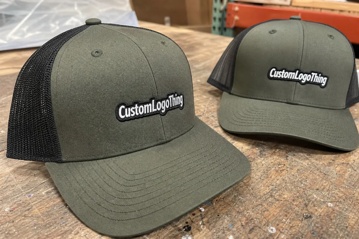
Most Custom Trucker Caps use a familiar structure: decorated front panels, mesh back panels, an adjustable closure, and either a curved or flat bill. The shape looks simple, but the decoration choices are not interchangeable.
The main logo zones are front center, front left or right offset, side panel, back strap area, underbill, and interior branding such as a label or sweatband mark. Front center dominates most orders because it gives the cleanest visual field and the strongest shelf presence. It also supports the widest range of decoration methods, including direct embroidery, woven patches, embroidered patches, heat transfer, screen printing, and printed foam applications.
Material changes the decision quickly. Foam fronts are common for promotional and retro-style trucker caps because they offer a broad, smooth branding area. They handle bold printed logos and patches well, especially when the design uses thick lines, high contrast, and limited fine detail. Foam can be less forgiving with heavy direct embroidery, though, because dense stitching may compress the panel or create puckering around filled areas.
Cotton and twill fronts usually support direct embroidery more cleanly, provided the logo is not too dense and the cap has enough structure. A structured cotton front holds its shape better under the embroidery head and during wear. An unstructured or very lightweight front can collapse around heavy stitching or wrinkle near the edge of a stiff patch.
Mesh is the most difficult surface for primary branding. Its open structure reduces print clarity, weakens small type, and makes registration less predictable. Some decoration is possible on certain mesh panels, but it is rarely the best choice for a detailed primary logo. Most buyers get a cleaner result by keeping the main branding on the front panel and reserving the side or back for simple accents.
The seam deserves special attention. A five-panel trucker cap often gives a cleaner uninterrupted front surface, which helps with patches, wide wordmarks, and centered badges. A six-panel cap has a center seam that can interrupt tiny lettering, narrow vertical icons, fine linework, and symmetrical crests. Suppliers can sometimes compensate with resizing, digitizing adjustments, or a patch with a firm backing, but the seam still needs to be considered before approval.
Decoration method and placement are linked. The same logo may work beautifully as a 2.5-inch woven patch and fail as direct embroidery at the same size because the letters are too small and the outlines are too thin. A printed foam cap might preserve a distressed effect that embroidery would simplify beyond recognition. A leather patch can look premium, but it may not carry color detail or tiny linework well.
Key Factors Before You Lock the Logo Position
Start with the logo shape. Horizontal wordmarks need width more than height, which can make them effective on a broad foam front but awkward on a lower-profile crown. Circular badges and shield emblems usually sit naturally at front center. Stacked emblems need more vertical clearance above the bill. Mascot marks can work offset, but only if the face or defining detail remains visible on the curve of the cap.
Readable size is the next filter. Thin outlines, gradients, distressed textures, hairline borders, and very small text often break down when reduced for embroidery or patch production. A letter that looks readable at 0.18 inches on screen may become a thread blob after digitizing. That does not mean every small mark fails, but it does mean small type should be treated as a production risk, not a styling preference.
Ask for real dimensions. For front placements, a proof should state logo width, logo height, and distance from the bill seam or lower crown edge. A screen mockup without measurements can be useful for discussion, but it is not precise enough for a higher-risk order, especially if resale, franchise consistency, sponsorship visibility, or repeat purchasing is involved.
Brand context should steer the choice. Retail caps often justify a premium front patch because texture, edge definition, and hand feel matter on a shelf. Employee uniform caps may favor durable embroidery because they need to survive repeated wear. Event giveaways may prioritize unit cost and high contrast from a distance. Outdoor crew identification needs bolder marks than influencer seeding, where subtle branding can be part of the appeal.
Color contrast deserves more scrutiny than it usually receives. Dark gray thread on charcoal cotton can look refined in a close-up photo and disappear outdoors. White patches on bright foam can look unfinished unless the patch has a defined border. Metallic thread catches light, but it can make small lettering harder to read. Tonal decoration can be tasteful; it simply needs to be chosen with the viewing distance in mind.
Order quantity also affects the placement decision. Some custom patch styles become economical at 250 or 500 units, while a 50-piece order may be better suited to direct embroidery or heat transfer. For larger runs, it is worth comparing quantity tiers because the best-looking option sometimes becomes affordable only after setup costs are spread across more caps.
If the order involves resale, sponsorship, strict brand standards, or a new cap style, request a physical sample or at least a production photo before approving bulk work. The extra step is not always necessary for a simple giveaway, but it is a sensible safeguard when the logo includes small lettering, multiple colors, unusual placement, or a specialty patch.
Production Steps and Timeline from Mockup to Finished Caps
A typical custom cap order moves through cap selection, logo file review, decoration recommendation, digital proof, sample or pre-production approval, bulk production, quality check, and shipping. Each step can move quickly when the artwork is clean and the placement is realistic. Each step can also stall when the file is weak or the requested decoration fights the cap construction.
Vector artwork is preferred because it allows clean resizing, stitch conversion, patch shaping, and color matching without fuzzy edges. AI, EPS, PDF, and SVG files usually give a supplier more control than a low-resolution PNG copied from a website. For embroidery, the file still needs digitizing, which converts the art into stitch paths. For patches, the supplier needs to define the border shape, edge type, thread count or print method, backing, and attachment method.
A digital proof is useful, but it has limits. It shows approximate position, scale, and color relationship. It cannot perfectly predict thread texture, foam compression, crown curve, patch thickness, or the way the bill shadow changes the lower part of the mark. Treat the proof as a specification document, not a promise that every material behavior has been simulated.
Sampling adds time, but it reduces risk. A common schedule for straightforward domestic decoration may be roughly 2 to 5 business days for proofing after usable artwork is received, then 7 to 15 business days for production after approval, depending on quantity and shop capacity. Custom woven, leather, PVC, or rubber patches can add one to three weeks before final cap assembly. Overseas manufacturing, custom trims, private labels, specialty closures, and freight constraints can push the timeline further.
Those ranges are not guarantees. They are planning numbers. Rush timing depends on blank cap availability, decoration capacity, artwork readiness, approval speed, and shipping method. A one-day delay in approving a proof can matter more than buyers expect if production slots are already full.
Common timing risks include artwork revisions, low-resolution files, Pantone matching, cap color changes, holiday production queues, late sample feedback, and last-minute placement adjustments. If exact brand color is critical, ask whether the supplier is matching to Pantone, thread cards, stock patch material, printed ink, or the closest available trim color. Each system has different tolerances.
ASTM and ISTA standards are more relevant to packaging validation than cap decoration, but the same discipline applies: define the condition before judging the result. For shipping-sensitive merchandise programs, buyers can review distribution testing principles from ISTA to understand how packed goods are evaluated for transit stress. Caps are light, but poor packing can still deform crowns, scuff patches, or flatten structured fronts during freight.
Approve placement, size, logo colors, and cap color together. Changing one can alter the balance of the whole cap. A tan patch that looks refined on navy may look flat on khaki. A 3-inch front mark that works on a high-profile foam crown may overpower a lower-profile cotton front.
Cost, Pricing, and MOQ Effects of Each Placement Choice
Logo placement changes price because it changes labor, setup, decoration method, stitch count, patch type, handling complexity, and inspection time. A single front embroidery is usually simpler than combining a front patch, side embroidery, and back strap branding. Every extra location means the cap must be handled again, aligned again, decorated again, and checked again.
Stitch count is one of the clearest pricing drivers for embroidered trucker caps. Larger logos and dense fill areas take longer on the machine, use more thread, and can stiffen the front panel. On lightweight foam or cotton, that stiffness may affect comfort and shape. A clean 4,000-stitch icon behaves very differently from a 12,000-stitch filled badge, even when both occupy a similar area.
Patch pricing has its own variables. Woven patches usually handle small text better than embroidered patches because the weave can carry finer detail. Embroidered patches have raised texture and a traditional look, but tiny letters may still close up. PVC and rubber patches create a dimensional modern finish, though tooling and minimums can be higher. Leather patches feel premium, while fine detail and color range are limited. Sublimated patches can reproduce gradients and complex artwork, but the surface looks flatter than woven or embroidered options.
| Placement or method | Best use | Typical cost effect | Buyer watch-out |
|---|---|---|---|
| Front direct embroidery | Simple logos, uniforms, 100+ pieces | Often efficient; price rises with stitch count | Small text and dense fills can distort |
| Front woven patch | Retail looks, small lettering, badges | Higher setup; better unit economics at larger tiers | Patch border and size must suit the crown curve |
| Side embroidery | Secondary marks, sponsors, small icons | Extra location charge plus setup | Too large can disappear around the head curve |
| Back strap branding | Private label feel, corporate store programs | Can add labor and minimums | Space is narrow; detail must be minimal |
| Underbill print | Limited editions, retail drops | Special handling; not always available | Lower visibility and higher production risk |
Minimum order quantities can change the best answer. Custom patches, private label trims, specialty closures, and unusual placements may require higher MOQs than standard front decoration. A buyer comparing 100, 250, 500, and 1,000 units may find that a patch option looks expensive at the first tier and reasonable at the second or third.
For ordinary promotional caps, a simple decoration choice may move the price by less than a dollar per unit. For larger programs, that small change becomes real money. An added $0.85 per cap is manageable on 100 pieces; on 2,000 pieces, it becomes $1,700 before freight, storage, or fulfillment costs. Numbers change opinions fast.
Ask what the quote includes. Setup charges, digitizing fees, sample fees, rush fees, extra location charges, freight, proof revisions, and overrun or underrun policies should be visible before approval. A low unit price with missing setup costs is not a useful comparison.
Step-by-Step Placement Checklist for a Clean Final Proof
A good proof starts before the supplier opens the art file. Use the placement decision as a filter, then turn it into measurable instructions.
- Choose the business goal first. Retail resale, employee uniforming, trade show giveaway, influencer seeding, and outdoor crew identification do not need the same logo treatment.
- Match the logo shape to the strongest zone. Use centered front placement for badges, front-offset placement for subtle fashion branding, and side placement for secondary marks.
- Select the decoration method by detail level. Embroidery is not automatically best. Patches, heat transfer, or printing may protect fine type, gradients, and distressed artwork more effectively.
- Set real dimensions. Ask for width, height, and distance from the bill or crown seam. Screen mockups alone are not precise enough for higher-risk orders.
- Check contrast under realistic lighting. Event caps, outdoor workwear, and online retail photos need stronger contrast than caps viewed across a desk.
- Review production risks. Look for centering, bill clearance, seam interference, thread color, patch color, and legibility at arm's length.
- Approve a sample or production photo when risk is high. Do this for small text, multiple logo locations, specialty patches, premium resale, or strict brand consistency.
There is a packaging parallel here. FSC-certified paperboard, for example, still needs the right coating, caliper, print method, and converting setup to perform well. Certification is not a substitute for specification. The same thinking applies to caps: the logo file may be correct, but the placement spec still needs to be engineered. Buyers interested in responsible sourcing standards can review the basics at FSC.
The cleanest final proofs usually answer five questions: What cap? What logo? What method? What size? What exact position? If any of those answers are vague, expect extra emails, slower quoting, and more room for production interpretation.
Common Logo Placement Mistakes That Make Caps Look Cheap
Oversized front logos are the first offender. Bigger can reduce perceived quality because the mark bends with the crown and competes with the cap shape. A 3.25-inch badge may look powerful on screen and bulky on the actual cap, especially if the crown is low or the artwork has a thick border.
Detailed artwork across a center seam is another common failure. The seam can split letters, distort icons, and make symmetrical logos feel slightly off. The viewer may not know why the cap looks wrong; they only see a mark that lacks polish.
Side placement also gets treated too casually. A side logo must be smaller, simpler, and positioned so it does not disappear behind the curve of the head. Sponsor marks, small icons, short initials, and simple secondary logos work better than detailed lockups.
Contrast mistakes are surprisingly expensive. Black embroidery on navy. Dark green thread on charcoal. Metallic thread on tiny lettering. White patches on bright foam without a border. These choices can look acceptable in a proof and weak in photographs, especially outdoors or under trade show lighting.
Mockup-only approvals create another risk. Flat digital previews can hide crown tension, patch bulk, thread pull, foam compression, and bill shadow. For a low-cost giveaway, that may be acceptable. For retail merchandise, premium employee gear, or a cap tied to a larger launch, the risk is higher.
Too many logo locations can cheapen the design. Front, side, back, and underbill branding may sound thorough, but it can feel like a vendor sample rather than something people want to wear. Restraint is one of the most overlooked brand cues in custom headwear.
Before moving the logo, simplify the artwork. Many placement failures are actually detail, scale, or production-method failures. Remove tiny text, thicken outlines, reduce distressed effects, simplify gradients, or convert a complex lockup into a patch with a defined border. The placement may suddenly work.
Build a Placement Brief Your Supplier Can Quote
A supplier can quote faster and more accurately when the brief is concrete. Include cap style, crown type, fabric, cap color, logo file, preferred placement, decoration method, logo size, quantity, delivery date, and target unit cost. If you know the cap SKU, add it. If not, describe the fit: high-profile foam trucker, mid-profile cotton twill, five-panel, six-panel, flat bill, curved bill, snapback, or adjustable strap.
Send two or three placement options instead of one rigid request. For example: front woven patch at 2.5 inches wide, front direct embroidery at 2.25 inches wide, and small side embroidery at 1.1 inches wide. That gives the supplier room to compare visibility, Cost, and Production risk without pulling the project away from the original design intent.
Include the end use. Retail sale, staff uniform, giveaway, event merch, corporate store, outdoor workwear, and influencer kit all imply different expectations for durability, finish, and budget. A cap meant for resale at $28 needs a different level of finish control than a one-day volunteer giveaway.
Ask for a decoration recommendation, not just a price. The cheapest placement may not protect the logo or the brand impression. A useful quote should clarify decoration method, maximum detail level, estimated setup charges, extra location charges, sample options, and lead time after proof approval.
Document approval details in writing: placement measurements, thread or patch colors, cap SKU, proof version, and any accepted limitations. If a supplier warns that 0.12-inch lettering may not sew cleanly, record that before production starts. Clear records prevent expensive memory-based arguments later.
Before requesting a quote or approving a proof, gather the logo file, choose one or two cap styles, define the quantity tier, and ask for a placement proof that shows front and side views. The better the brief, the less the project depends on guesswork, and the more likely the finished caps will look intentional rather than merely decorated.
FAQs
What is the best logo placement for custom trucker caps?
Front center is usually the strongest placement for visibility, especially for brand badges, event logos, and retail-style caps. Side placement works best for secondary marks, sponsor logos, small icons, or subtle fashion branding. The best choice depends on logo shape, cap material, decoration method, and whether the caps are for resale, uniforms, or giveaways.
How large should a logo be on a trucker cap?
Most front logos work best when they are large enough to read at arm's length but not so large that they bend into the crown curve. Horizontal wordmarks often need more width and less height, while circular or shield logos can sit more compactly on the front panel. Ask for exact proof measurements in inches or centimeters, not only a visual mockup.
Is embroidery or a patch better for trucker caps logo placement?
Embroidery is durable and efficient for clean, simple logos with limited detail. Patches are often better for small text, complex logos, vintage styling, premium retail looks, or designs that need a defined border. Foam-front caps may work especially well with patches or printing, while cotton and twill fronts often support embroidery cleanly.
Does logo placement change the cost of custom trucker caps?
Yes. Placement can change setup, labor, stitch count, patch cost, handling time, and the number of decoration locations. A single front logo is usually more economical than adding side, back, or underbill branding. Request tiered pricing because unit cost can shift significantly as quantity increases.
Can I put a logo on the mesh part of a trucker cap?
Mesh placement is possible in limited cases, but it is usually not ideal for detailed logos because the open structure reduces clarity and durability. Most brands use the front panel for the primary logo and reserve mesh or side areas for simpler accents when production allows. Ask your supplier whether the specific mesh density and decoration method can support the design before approving that placement.


