Embroidered Baseball Caps Logo Placement Guide for Buyers
Use this embroidered baseball Caps Logo Placement guide to compare front, side, back, and visor placements, avoid stitch issues, and quote cap orders with fewer surprises.
Embroidered Baseball Caps Logo Placement Guide Basics
Move a logo half an inch on a cap and the whole design can shift from polished to awkward. The embroidery may still be technically correct, but the cap can look crowded, tilted, cheap, or oddly empty. That is why an embroidered baseball Caps Logo Placement guide is more than a design reference; it is a buying tool for anyone ordering branded hats in volume.
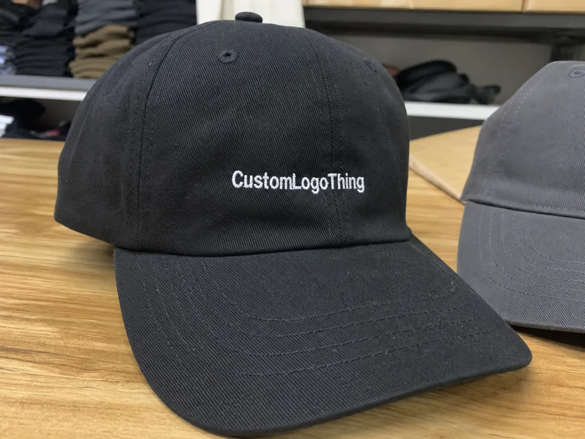
Placement means the exact decoration location on the cap. The most common choices are front center, left side, right side, back above the closure, and, for some cap styles, the visor. Front embroidery carries the main brand message. Side embroidery feels quieter and more retail-minded. Back embroidery works well for team names, role labels, web addresses, sponsor marks, or short identifiers.
Buyers care because placement affects more than appearance. It changes readability, stitch density, machine setup, thread tension, and how the embroidery holds against the curve of the crown. A 4.5-inch-wide logo can look excellent on a structured mid-profile cap, then look squeezed and lumpy on a soft unstructured dad hat. Same artwork, different result.
The best placement depends on three practical questions: what cap are you using, what shape is the logo, and how will the hat be worn? Retail merch needs shelf appeal and restraint. Workwear needs recognition from roughly 10 to 15 feet away. Event giveaways usually need a clean front mark that photographs well. A flat mockup helps, but it should never replace checking how the logo sits on the actual crown.
Buyer rule: choose placement based on the cap, not just the artwork file. A logo that looks balanced on a rectangle may fight the seams, panels, and curve of a real baseball cap.
How Embroidery Sits On The Cap Structure
Cap embroidery starts with stabilization. The blank cap is held in a cap frame or hoop, backing is added, and the embroidery machine follows a digitized stitch path. A digitizer decides stitch direction, underlay, density, pull compensation, color sequence, and trim points. If those decisions are poor, the finished cap looks rough even when the original logo file is clean.
A baseball cap is not a flat tote bag. The needle moves over curved panels, seams, buckram, foam, and sometimes soft washed cotton. The crown shape matters because thread has to sit cleanly on fabric that is already bending away from the machine. Any useful placement guide for embroidered baseball caps has to start with structure before it talks about decoration size.
Structured caps usually hold front logos better. They often include buckram or a firm front panel that supports dense stitching and helps the crown keep its shape. A standard structured six-panel cap can often take a front logo around 4 to 5 inches wide and 1.75 to 2.25 inches tall, depending on crown height and artwork shape. High-profile trucker caps may allow more vertical space. Low-profile caps usually do not.
Unstructured caps are softer and more casual, but they collapse more easily under heavy embroidery. Dense fills can pull the fabric, create wrinkles, or make the logo feel like a hard badge stitched to a soft hat. For washed cotton, twill dad hats, and other relaxed caps, smaller front marks around 2.75 to 3.75 inches wide often behave better. Side logos around 1.5 to 2.5 inches wide are usually safer.
Seams deserve special attention. A center-front seam can split small lettering, distort circles, and make thin outlines look broken. Some bold logos can cross a seam if the digitizing is adjusted and the stitch direction is planned around the panel break. Tiny text across a seam is a bad bet; that is how clean letters turn into uneven thread shapes.
The same artwork can also look different at the same size on two caps because crown depth, panel height, brim angle, and front-panel stiffness change the visual field. Ask for the mockup on the actual cap style whenever possible. A generic hat silhouette can be useful early in the design conversation, but it is not enough for final approval.
Key Factors That Change The Right Placement
Good placement decisions start with constraints. Cap style, logo width, logo height, color count, text length, and visibility goals all push the order in different directions. The job is not to force the artwork onto the cap; it is to make the artwork stitch well on the cap you actually plan to buy.
A wide horizontal logo usually wants the front panel. Many standard front-center embroideries sit around 4 to 5 inches wide, although the cap shape may call for a smaller size. A tall stacked logo may need to shrink so it does not crowd the brim seam or climb too high toward the crown peak. A small icon can work beautifully on the side, especially around 1.5 to 2.25 inches wide. Some marks look more expensive when they are not forced to dominate the front.
Text length is one of the biggest traps. “North Ridge Athletic Department” may look fine in a vector file. Once it is stitched at 2 inches wide on a side panel, it may turn into thread soup. For clean cap embroidery, many decorators prefer minimum letter heights around 0.20 to 0.25 inches for basic block text. Thin scripts, distressed fonts, and hairline serifs often need to be enlarged, thickened, or removed.
Use case changes the placement too. Team caps often need front visibility. Staff workwear may need a readable front mark with a department name or role label at the back. Promo hats can carry a bolder front logo because exposure is part of the purpose. Retail merch usually benefits from restraint. Many brands overdecorate hats because they confuse visibility with desirability.
Brand hierarchy matters as well. If the front panel is reserved for a woven patch, leather patch, PVC patch, or heat transfer, the embroidered mark may belong on the side or back. That gives the cap layers without making it look overloaded. Side placement is also useful for co-branding, sponsor marks, anniversary icons, or a small embroidery detail that supports the main design.
| Placement | Typical Size Range | Best For | Watchouts |
|---|---|---|---|
| Front center | 4 to 5 inches wide, 1.75 to 2.25 inches tall | Main brand logos, teams, events, retail caps | Seams, crown curve, dense fills, tall artwork |
| Left or right side | 1.5 to 2.5 inches wide | Small icons, secondary logos, subtle branding | Tiny text, panel angle, being too close to the front seam |
| Back above closure | 2 to 3.5 inches wide | Team names, URLs, staff roles, sponsor marks | Adjustable closures, curved openings, low visibility |
| Visor | Usually small marks only | Decorative accents, limited-edition details | Not all suppliers offer it; curve and thickness can limit detail |
Cost And Pricing Factors For Embroidery Orders
Placement affects price because embroidery pricing is built around labor, machine time, and risk. Every new location can mean more digitizing, extra machine setup, more handling, additional thread changes, and a longer run. Front-only embroidery is usually the lowest-cost route. Add side embroidery and the unit cost rises. Add back embroidery too, and the order can move into a premium tier quickly.
For basic custom embroidered hats, a simple front logo on a common cap blank might land around $7 to $14 per unit at moderate quantities, depending on cap quality, stitch count, and order size. Premium caps, specialty threads, puff embroidery, and multiple placements can push the price higher. Small runs cost more per piece because setup time is spread across fewer hats. That is not mysterious; it is production math.
Digitizing is another quote line to check. Some suppliers include digitizing on larger orders. Others charge around $30 to $90 for a standard cap logo, with higher costs if the artwork needs cleanup or multiple versions. A left-side version and a front version may require separate digitizing because scale, stitch direction, underlay, and registration change. Good quoting should make that clear before the invoice arrives.
Stitch count can raise the price even when the logo looks small on screen. Dense fills, tiny outlines, layered colors, 3D puff underlay, and seam-crossing layouts all add time. A 7,000-stitch logo generally runs faster than a 14,000-stitch logo. If the supplier prices by stitch tier, that difference is obvious. If they price by location, it still matters because production time and puckering risk go up.
Ask about minimum order quantity, setup charges, digitizing fees, sample fees, cap blank options, placement count, and thread color limits. Also ask whether pricing changes by cap style. A structured acrylic-wool cap, Washed Cotton Dad cap, foam trucker, and performance polyester cap do not behave the same under the needle.
| Cost Driver | Typical Range Or Impact | Buyer Advice |
|---|---|---|
| Digitizing | $30 to $90 for many standard logos | Confirm whether revisions and alternate placements are included |
| Sample or sew-out | $20 to $75, sometimes credited to a bulk order | Worth it for retail, staff uniforms, or detailed logos |
| Extra placement | Can add $1 to $4+ per cap | Use extra locations only when they add real brand value |
| Dense stitch count | Higher machine time and more puckering risk | Simplify fills, remove tiny text, and reduce overlapping details |
| Special effects | 3D puff, metallic thread, or specialty thread costs more | Test first; not every logo works with raised embroidery |
Process And Timeline From Mockup To Production
A clean order follows a simple path: submit artwork, review the cap style, digitize the logo, check placement mockups, approve a proof or sample, run production, inspect, and ship. Skip one of those steps and you usually pay for it later with delays, rework, or hats people avoid wearing.
Artwork review and simple digitizing often take 1 to 2 business days. Clean vector art, such as AI, EPS, or PDF files with outlined text, moves faster. Low-resolution PNGs, screenshots, gradients, tiny lettering, and distressed effects slow the process down. If a supplier has to rebuild your logo before digitizing, expect extra time and possibly an art fee.
Mockups are usually quick, but mockups are not magic. A proper placement proof should show finished size, position, cap color, thread colors, and distance from the brim. For front embroidery, buyers often need to confirm whether the logo is centered on the front panel or visually centered around the seam. Those are not always the same thing.
Sampling adds time. A photo sew-out may add 2 to 4 business days. A physical sample shipped to you can add a week or more, depending on transit time and how quickly your team reviews it. For repeat orders, a new sample may not be necessary unless the cap style, logo size, thread type, or placement changes.
Production lead time depends on quantity and complexity. Small runs may move in 5 to 10 business days after approval. Larger bulk orders, multi-location embroidery, specialty thread, mixed cap colors, or split shipments can take 12 to 20 business days or more. Shipping adds its own window. Rush orders exist, but rush embroidery is where small mistakes become expensive.
The biggest delays are predictable: unclear artwork, no placement reference, approvals sitting with too many people, and last-minute changes after digitizing. Give the supplier final art, preferred placement, target size, cap style, quantity, and event deadline upfront. Complete information makes production faster and reduces the number of assumptions being made on your behalf.
For shipping cartons and transit testing on larger merchandise programs, standards from organizations like ISTA can help buyers understand packaging performance during distribution. For paper tags, hangtags, or packaging inserts paired with merch, FSC certification may matter if your brand has responsible sourcing requirements.
Step-By-Step Placement Workflow For Buyers
A good buying workflow keeps opinion from taking over. Taste matters, but measurements matter more. Use this process before approving a cap embroidery order.
- Measure the logo first. Record the full width, full height, and smallest text height. Do not guess from the screen. If the smallest letters are under about 0.20 inches tall after scaling, ask whether they will stitch cleanly.
- Pick the primary placement. Decide whether the front, side, or back is the main brand position. For most brand logos, front center is the default. For subtle retail merch, a side icon may be stronger.
- Choose a fallback placement. If the front panel is too small or too curved, test a left-side or back placement. The fallback should be a real option, not an afterthought.
- Request a mockup on the actual cap. The proof should show crown height, seam lines, brim position, cap color, thread color, and finished logo size.
- Check the wearing angle. A cap looks different on a head than it does flat on a table. Review front, side, and three-quarter angles if the supplier can provide them.
- Approve size, location, and thread colors in writing. Put the finished width, placement, and thread color numbers in the approval. Vague approvals create very specific arguments later.
The placement process is simple: measure first, mock up second, sample when the order matters. That order saves money. It also prevents the familiar email chain where six people debate whether the logo is “a little too low” after production is already finished.
For front placement, check the distance from the brim. Many front logos sit roughly 0.5 to 0.75 inches above the brim seam, but that depends on cap shape and logo height. Too low and the logo feels cramped. Too high and it starts floating up the crown. For side placement, check the distance from the front seam and the ear line. Too far back and it disappears when worn.
Back placement needs the same discipline. Measure the available space above the closure, especially on snapbacks, buckles, hook-and-loop closures, and caps with low rear openings. A back logo that looks centered on a flat mockup may sit too close to the cutout once the cap is adjusted on a real head.
Common Mistakes That Ruin Cap Embroidery
The classic mistake is placing the logo too low. A low front logo fights the brim, bends into the lower crown, and can look heavy. The second classic mistake is putting side embroidery too close to a seam. The third is squeezing too much detail into too little space because someone wants the exact corporate lockup, tagline, registration mark, and tiny icon all on one cap. Thread has limits.
Bigger is not always better. Scaling artwork to fill space can make stitch density too high, blur the letters, and pull the fabric. A 5-inch-wide front logo may sound impressive, but if the cap has a short crown or soft front panel, 4 inches may look cleaner. Clean beats huge almost every time.
Readability at distance is another weak spot. A proof can look fine on a laptop at 200 percent zoom. Real people see the cap from 6 to 12 feet away, often while it is moving. If the brand name cannot be read at normal viewing distance, simplify the artwork. Remove the tagline. Thicken the type. Use fewer colors. Let the cap breathe.
Skipping a sample is risky for detailed logos, retail orders, and anything with 3D puff embroidery. A digital proof shows position and scale. A sew-out shows stitch behavior. Those are not the same thing. If the centerline, angle, or density is wrong, a sample catches it before you have 500 hats with a logo that leans like it is tired.
Thread color contrast deserves a hard look. Navy thread on black caps may match the brand palette, but it will be nearly invisible unless subtlety is the goal. White thread on a red cap pops. Charcoal on heather gray feels quiet. Metallic thread can look premium in small accents, but it is stiffer and less forgiving on fine detail. Specialty thread should be tested before it is approved for a large run.
Also watch the back closure. A logo above a snapback, buckle, or hook-and-loop closure needs enough clearance to avoid distortion. Back embroidery often works best as short text, a URL, a small icon, or a role label. Long phrases can curve awkwardly and sit too close to the opening.
Expert Tips Before You Approve
Ask for a stitch-count estimate before final approval. It is a fast way to spot designs that are too dense, too expensive, or too ambitious for the cap style. If a small logo has a surprisingly high stitch count, the design may need simplification. Fewer fills, fewer outlines, and stronger shapes usually improve both cost and appearance.
Compare two mockups side by side: one front-centered version and one side-placement version. Use the same cap color and thread colors for both. The stronger option is usually obvious once both are shown on the same hat. If the front version feels crowded and the side version feels intentional, believe your eyes.
Confirm three things in writing before production starts: placement location, finished size, and timeline. Add thread colors if brand matching matters. If you use Pantone references, remember that embroidery thread is not ink. It has sheen, texture, and a limited color range. A close match is normal. A perfect match is not always realistic.
For regulated industries, uniforms, safety programs, or franchise groups, keep an approved spec sheet. Include cap SKU, cap color, logo file name, stitch file name, thread colors, placement, finished size, and approval date. That turns reorder chaos into a controlled buying process and helps protect consistency if staff, suppliers, or artwork files change later.
Before approving, check the actual cap style, measure the artwork, review the placement proof, confirm the quote, and compare the final sew-out against this embroidered baseball Caps Logo Placement guide. That last check sounds basic. It is also the difference between caps people actually wear and caps that sit in a storage closet looking guilty.
FAQ
Where should embroidered baseball caps logo placement usually go?
Front center is the most visible choice for brand logos, event hats, team gear, and retail caps that need quick recognition. Side placement works better for small marks, subtle branding, sponsor icons, or secondary artwork. Back placement is useful for team identifiers, staff roles, website addresses, or short text that should not dominate the cap.
How big should a logo be on embroidered baseball caps?
Front logos often sit around 4 to 5 inches wide, but crown height, seam position, and artwork shape can force a smaller size. Side logos usually need to stay closer to 1.5 to 2.5 inches wide so they do not overpower the panel. Text should be large enough to read after stitching, which often means simplifying thin lettering, small taglines, and fine outlines.
Does logo placement affect embroidered cap pricing?
Yes. Every extra placement can add setup time, stitch time, handling, and sometimes separate digitizing work. Front-only embroidery is usually the lowest-cost option, while multi-location decoration costs more. Dense artwork, seam-crossing layouts, metallic thread, and 3D puff effects can raise the price further because they add time and production risk.
How long does placement approval take before production?
A clean digital proof can often be turned around in 1 to 2 business days. If the artwork needs digitizing changes, logo cleanup, or a sample review, the approval process can stretch several days longer. Production lead time starts only after the placement, artwork, cap style, thread colors, and order details are fully approved.
What is the biggest mistake in embroidered baseball caps logo placement?
The biggest mistake is putting the logo where the cap has too much curvature instead of where the crown is most stable. Ignoring seams can make stitched lines break, pull, or pucker. Approving a proof without checking how the cap looks when worn is another expensive mistake, because a flat-table view does not show the real wearing angle.


