A logo can look centered on a screen and still read off on a trucker cap. The curved front panel, center seam, structured crown, and mesh back all change how the eye sees proportion. A design that feels balanced in a flat mockup can land low, wide, or cramped once it is embroidered or patched onto the actual cap, especially on foam-front caps with a taller crown profile.
This trucker Caps Logo Placement guide focuses on the choices that matter before production starts: where the mark sits, how large it should be, which decoration method can hold the detail, and how those decisions affect price and turnaround. Buyers usually want one of a few things: clear brand visibility, a cleaner retail look, a fashion-led off-center placement, or a secondary hit on the side or back. Each option changes setup, stitch count, and unit pricing. Which choice makes sense for your order?
Trucker Caps Logo Placement Guide: Start Here
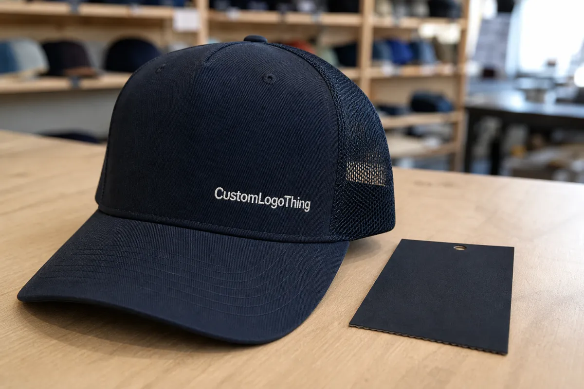
A structured trucker cap is not a flat billboard. Foam or buckram support helps the front hold shape, but the seam and curved crown still affect how the logo reads. On a typical foam-front trucker, the practical front decoration field is often around 4.5 to 4.75 inches wide and about 2 to 2.25 inches high, depending on the seam allowance, panel height, and brim curve. Centered artwork can look slightly low if the brim takes too much visual weight.
Most buyers choose one of three front strategies:
- Dead-center for the clearest brand read and a familiar promo look.
- Slightly high front for a cleaner, more retail-oriented feel.
- Off-center panel placement for a more styled, streetwear look.
The mesh back matters too. It limits decoration away from the front and makes small side or back marks harder to read. On most trucker caps, the front panel is the main branding zone, while side and back placements are secondary. If a supplier offers recycled polyester mesh, ask whether it is backed by GRS documentation; for organic cotton sweatbands or blends, GOTS and OEKO-TEX Standard 100 are the relevant certifications to request. For audited social compliance, ask for WRAP or BSCI documentation where applicable.
Decoration method changes the result as much as position. Bold embroidery works well for short wordmarks and simple icons. Woven patches handle finer detail more reliably. Tiny type that looks sharp in a digital proof can still blur once it is reduced to stitch width. As a rule of thumb, embroidery usually needs letter heights of at least 4 to 5 mm to stay readable, while woven patches can carry finer shapes but still need clean vector art and enough border space.
A logo that looks perfectly centered in a proof can still feel too low on the cap because the brim steals visual weight.
Promo gear and retail merch also behave differently. Promo caps usually favor larger, faster-to-read branding. Retail caps can be subtler, but they need cleaner spacing, a more deliberate placement spec, and tighter tolerances on stitch alignment, color matching, and edge finishing. In production, that usually means checking the cap on a form block or head form, not just on a flat art board.
How Placement Works on a Structured Trucker Cap
Placement is shaped by structure, not just taste. Foam-front and buckram-front caps hold decoration well, but they also punish poor spacing. A seam can interrupt stitching. A logo that sits too close to the brim can feel heavy. A mark that sits too high can look detached from the cap. Commercial embroidery heads typically use 12 to 15 needles, and the digitized file needs to account for underlay, pull compensation, and the cap frame angle before it ever reaches production.
Front center is the default for a reason
Front center is the easiest placement to read from a distance. It works well for short wordmarks, icons, and clean badges with enough negative space. If the logo is too busy, the seam and crown curvature can compress the detail and make the art feel crowded. For many buyers, this is the safest option for a first order because it minimizes approval risk and keeps the setup straightforward.
Slightly high front can improve balance
Moving the logo upward by a small amount can help when the brim makes the design feel bottom-heavy. It is useful for round badges, shields, and marks that need breathing room below them. The change should be modest. A few millimeters can fix the balance; too much shift makes the logo float. In practice, many production teams work within a shift range of about 3 to 6 mm from the exact centerline when tuning the look.
Left or right panel placement is intentional, not random
Off-center placement feels more casual and more fashion-led. It can work well for lifestyle brands or smaller premium runs, but it is less forgiving. The artwork usually needs to be simpler because seams, panel angles, and crown height work against fine detail. Side-panel placements are often kept under 2.5 inches wide so the mark stays clean once the cap is worn and curved.
And the tradeoff is obvious: more style usually means less distance read.
| Placement | Visual effect | Best use | Main risk |
|---|---|---|---|
| Front center | Most visible | Trade shows, team gear, promo runs | Can look crowded if the logo is too wide |
| Slightly high front | Cleaner balance | Retail merch, branded uniforms | Too high and it disconnects from the cap |
| Left or right panel | More styled | Lifestyle brands, premium small runs | Lower readability from a distance |
| Side or back strap area | Secondary branding | Sponsor marks, small identity hits | Tight space, more setup, slower production |
Decoration method matters as much as position. Embroidery is usually best for bold shapes and short text. Woven patches carry small detail more reliably. PVC patches offer stronger edges and a dimensional finish, but they usually cost more and add lead time. A clean vector file still cannot rescue artwork that is too thin, too crowded, or too intricate for the cap size. For a premium retail finish, many buyers specify a sewn patch with a merrowed or laser-cut edge, then secure it with a 3- or 4-point stitch depending on the patch shape.
What Changes Position, Size, and Balance
The question is rarely whether the logo fits. It is whether it feels proportional once it is on the cap. Buyers usually think in inches first. Production teams think in stitchability, surface tension, thread path, and visual weight. A design that looks fine at 3.0 inches wide may need to be reduced or simplified once the center seam, cap curve, and embroidery push-and-pull are added.
As a practical range, many simple front logos on trucker caps land well around 2.25 to 3.25 inches wide. Tall icons may need a different footprint. Wide wordmarks can stretch farther if the lettering is bold and open. Detailed crests usually need more room or a different decoration method. Tiny type is the classic failure point, especially when the smallest counters or strokes fall below about 1.2 mm in finished stitch width.
Shape changes placement too:
- Wide wordmarks usually read better a little lower and broader.
- Tall icons can sit higher without colliding with the brim.
- Round badges tend to balance neatly in the center.
Now compare that with a crest or monogram. It often needs extra breathing room, or it starts to feel compressed.
The cap itself also changes the decision. A high-profile foam front can carry a larger mark than a low-profile structured crown. Mesh openness can make the front feel lighter. Even the bill curve matters, because a steeper brim can steal visual weight from the artwork and make a centered logo look lower than planned.
That is why placement should be approved on a cap shape, not just on a screen.
Spacing is not decoration; it is readability.
Cost, MOQ, and Unit Pricing: What Moves the Quote
Price changes with both method and complexity. A simple one-color embroidery on a standard foam-front trucker is usually the lowest-cost option. Add colors, increase stitch count, move to a patch, or request a special placement, and the quote climbs. Why? Because every extra step takes machine time, setup time, or both.
Most suppliers price trucker caps with a mix of blank cap cost, decoration cost, and finishing cost. MOQ matters too. A higher minimum order quantity can lower the unit price, while a small test run often carries a premium. If the logo needs digitizing, sampling, or a special placement jig, those one-time charges usually appear before the first bulk run. A quick approval today can save a costly rerun later.
Simple orders move fastest. Complicated ones do not.
For buyers comparing quotes, the cleanest way to judge value is to ask for the same spec from each vendor: cap style, decoration method, placement location, logo size, thread colors, backing, and target ship date. If those details are not fixed, the cheapest quote may just be the vaguest one. And vague quotes are where surprises hide.
Production Steps and Turnaround: From Art File to Approved Sample
The production path is usually predictable. First comes the artwork review, then digitizing or patch setup, then sampling, then bulk production, then finishing and packing. Each step can add time if the artwork is not ready. A clean vector file speeds things up. Raster art, low-resolution logos, or overly thin linework slow everything down.
Sampling is where placement gets confirmed. A supplier may send a sew-out or a photo proof showing the logo on the actual cap style. That proof should answer a few practical questions: Does the mark sit too low? Is it too wide for the front panel? Does the stitch density hold the edges cleanly? If any of those answers is no, the sample needs another round.
Turnaround depends on stock, method, and order size. Simple embroidery on available blanks may move quickly. Woven or PVC patches, custom color matching, and special packaging take longer. And if a buyer changes the logo after sample approval, the clock starts again.
Good planning shortens the calendar. Poor planning stretches it.
Common Placement Mistakes That Make Caps Look Cheap
Many bad caps fail for the same few reasons. The logo is too large for the front panel. The design sits too low and fights the brim. The art is too detailed for embroidery. The patch edge is too thick. The side placement is chosen for style, but the mark is too small to read.
A crowded front is the fastest way to lose impact. So is a centered logo that ignores the seam. When the stitch path crosses awkwardly, the result can look forced even if the artwork is strong. Buyers often notice the problem only after the sample arrives, which is exactly when the fix is slowest and most expensive.
Ask for a cap-specific mockup, not a generic flat proof. Better yet, ask for a sew-out or photo on the actual hat shape. That small step catches most of the errors before production scales up.
Expert Tips for Cleaner Embroidery and Better Visibility
Choose bold shapes when the cap will be seen at a distance. Use a patch when fine detail matters. Keep important text larger than the minimum readable size. Leave room around the logo so the curve of the cap does not crush the edges.
For embroidered trucker caps, thicker strokes usually survive better than hairline details. For patches, border choice matters almost as much as the artwork itself. A merrowed edge can frame a simple shape cleanly, while a laser-cut edge can support more complex outlines. If the cap is meant for retail, balance matters more than maximum coverage. If it is meant for promo, visibility usually wins.
Need the shortest rule of all? Make it readable first, stylish second.
Next Steps: Lock a Placement Spec Before You Order
Before you place an order, write down the exact placement, width, height, and decoration method. Include the cap style, crown profile, thread colors, patch edge type, and any certification requests. Then ask the supplier to confirm the spec on the same blank cap that will be used in production. That one habit avoids most placement problems.
If you already have a logo, check whether it needs simplifying for embroidery. If you do not, build the design around the cap instead of forcing a desktop layout onto it. The best trucker caps feel intentional because the placement was decided early, not improvised at the end.
FAQ
What is the best logo placement on a trucker cap? For most orders, front center is the safest choice. It is the easiest to read, the easiest to produce, and the least likely to cause approval issues.
Can a logo go on the side or back of a trucker cap? Yes, but those areas work best for small secondary marks. They are not ideal for detailed or text-heavy logos.
Is embroidery or a patch better? Embroidery works best for bold, simple graphics. Woven or PVC patches are better when the logo has fine detail or a more premium finish.
How big should a trucker cap logo be? Many front logos work well between 2.25 and 3.25 inches wide, but the right size depends on the cap shape and the artwork itself.
If you want, I can also do a second pass and make the whole piece feel more editorial, more premium, or more sales-focused while keeping the same HTML tags.

