Buyer Fit Snapshot
| Best fit | Two-Color Brand Packaging Design Ideas That Stand Out projects where brand print, material claims, artwork control, MOQ, and repeat-order consistency need to be specified before quoting. |
|---|---|
| Quote inputs | Share finished size, material target, print colors, finish, packing count, annual reorder estimate, ship-to region, and any compliance wording. |
| Proofing check | Approve dieline scale, logo placement, barcode or warning zones, color tolerance, closure strength, and carton packing before bulk production. |
| Main risk | Vague material claims, crowded artwork, missing packing details, or unclear freight terms can make a low unit price expensive after revisions. |
Fast answer: Two-Color Brand Packaging Design Ideas That Stand Out should be specified like a repeatable production item. The safest quote records material, print method, finish, artwork proof, packing count, and reorder notes in one written spec.
Production checks before approval
Compare the actual filled-product size with the drawing, then confirm tolerance on folds, seals, hang holes, label areas, and retail display edges. Reserve space for logos, QR codes, warning copy, and material claims before decorative graphics fill the panel.
Quote comparison points
Review material grade, print process, finish, sampling route, tooling charges, carton quantity, and freight assumptions side by side. A quote is only useful when the supplier can repeat the same color, closure quality, and packing count on the next order.
Two-color brand Packaging Design Ideas solve a problem most brands keep overcomplicating: how to make a box, pouch, or folding carton look sharp without turning it into an ink circus. A customer usually decides what a package is in a few seconds. Shape, contrast, and hierarchy do the talking long before a headline gets a chance. That is why two-color brand packaging design ideas often beat louder systems that try to say too much and end up saying less.
The simplicity can fool people. Two colors sound like a cost-cutting trick until you see what happens when the palette is actually disciplined. The brands that pull this off are usually treating restraint as a design choice, not a fallback. They give each color a job, protect white space like it matters, and let typography carry the weight instead of stuffing the panel with extra visual noise.
For packaging teams, that matters because the pack never lives in one place. It sits beside competitors on a shelf. It shrinks into a thumbnail on a product page. It shows up on a desk with tape, labels, scuffs, and weird office lighting that nobody approved. Strong two-color brand packaging design ideas give a brand a system That Holds Up across all of that without turning fragile or expensive to produce.
I usually trust a packaging system more when it looks like it knows what it is doing. Not when it shouts. I’ve seen too many decks where the answer to every branding problem was “add another color.” That works until production, and then everybody acts surprised. The better question is not how many colors a brand can afford. It is how little color it can use and still be unmistakable. That is the actual promise behind two-color brand Packaging Design Ideas, and it is exactly why they keep showing up in retail packaging, DTC product packaging, and premium branded packaging that needs confidence more than decoration.
What Two-Color Brand Packaging Design Ideas Actually Solve
The strongest two-color brand packaging design ideas solve recognition first. Give a package one anchor color and one supporting color, and the eye can store that relationship faster than it can sort through a full rainbow of cues. Shoppers do not spend long decoding packaging. They glance, compare, and move on. A simple palette can improve recall if contrast, spacing, and hierarchy are tight enough to carry the load.
These layouts are not minimalism for its own sake. They force every visible element to earn a place on the panel. The logo has to be sized with intent. The product name has to sit where the eye expects it. The accent color has to support the message instead of stepping on it. When those pieces line up, the package feels designed. When they do not, it feels like someone got stingy and called it strategy.
There is also a quiet authority effect at work. A crowded package can feel needy, like it is trying to get attention from every direction at once. Two-color brand packaging design ideas often read as more deliberate because they show restraint. That kind of calm is powerful in premium categories, where confidence sells better than noise.
From a packaging buyer’s angle, this is where the format becomes practical, not just aesthetic. It helps a brand stay consistent across Custom Printed Boxes, cartons, labels, and wraps. That cuts down on the classic problem where one SKU looks polished and the next one looks like it belongs to a different company. Consistency is not glamorous. It is what keeps the brand from drifting apart.
Reviewing fewer colors also makes the approval process less chaotic. Teams can compare proofs faster when they are only judging a handful of relationships instead of debating twelve shades that all claim to be “almost the same.” Marketing, operations, and procurement still get opinions. They just have fewer hiding places. These packaging systems do not eliminate disagreement, but they make the argument shorter.
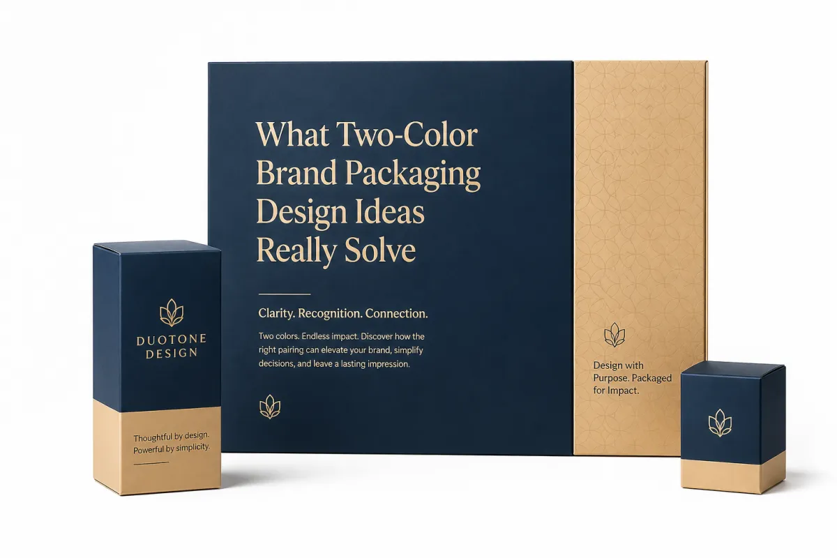
Think of two-color brand packaging design ideas as a visual contract. One color usually anchors the brand. The second color creates contrast, emphasis, or product differentiation. If that contract is clear, the package can do a lot with very little. If it is fuzzy, the whole thing collapses into something sparse instead of smart.
That is why the best versions start with purpose, not palette. Is the package trying to signal premium quality, natural ingredients, technical performance, or playful energy? A muted olive and warm cream combination sends a very different message than electric blue and black. The palette is not decoration. It is package branding in the strictest sense.
How do two-color brand packaging design ideas work on the shelf?
They work because the eye is a pattern-hunting machine. It notices where the darkest area sits, what dominates the top third of the panel, and how quickly it can identify the product name. When one color anchors the layout and the other color punctuates it, the package becomes easier to read from a distance. Retail packaging needs that edge because the competition is not just color. It is clutter.
The mechanics are simple. The execution is where people get careless. One color can act as the brand signature while the other carries emphasis, a border, a panel block, or a product-specific code. In a clean system, the second color might be reserved for the variant name, a seal, or a limited-edition marker. In a stronger system, the pair also creates depth: one color can hold the background while the other defines type and shape. That is why these layouts feel richer than the word “simple” suggests.
Typography becomes a bigger deal the moment color stops doing all the work. With fewer visual distractions, the font choice has to pull real weight. Weight, spacing, and case all matter. A condensed sans serif can feel technical. A serif can feel heritage-driven. A rounded face can soften the whole package. Two-color brand packaging design ideas get judged by color first, but they are won or lost through type discipline.
Surface behavior matters too. Kraft board absorbs ink differently from coated SBS. Matte film scatters light differently from gloss lamination. Textured paper can make a flat color feel warmer and quieter, while a coated surface can sharpen the same ink into something more precise. If a team approves the layout on a screen alone, they are guessing. Printed material always tells a messier story.
The same palette can behave very differently across substrates. A deep green on uncoated kraft may read earthy and organic. On white board, it may feel more controlled and retail-ready. A black-and-gold combination can look luxurious on a matte carton but turn aggressive on a glossy pouch. The design needs to be tested in the material that will actually ship.
Distance matters too. A package does not need to be beautiful from four inches away if it cannot hold attention at four feet. Many two-color brand packaging design ideas succeed because they simplify the visual path. The shopper sees contrast first, then the brand mark, then the product type, then the supporting claim. That sequence matters more than ornamental detail.
For brands that sell online and in stores, the same palette has to survive thumbnail compression. E-commerce images flatten detail fast. If the colors are too close in value, the package can blur into a gray rectangle on screen. If the contrast is too harsh, the design may feel cheap or over-processed. The system has to work in both environments, or it only solves half the problem.
Packaging teams that want more context can also check resources like ISTA for distribution simulation and The Packaging School for print and packaging fundamentals. Those references help move the discussion away from taste and toward actual performance criteria.
Key Factors Behind Strong Two-Color Brand Packaging Design Ideas
Contrast is the first filter. Low-contrast palettes are the fastest way to make a two-color system feel weak, vague, or tired. Two colors can be elegant, but they still need separation. If the pair is too close in value, the package becomes hard to read. If the pair is too loud without a clear hierarchy, the eye has nowhere to land. Good contrast does not mean harsh contrast; it means usable contrast.
Brand personality comes next. Two-color brand packaging design ideas can lean natural, clinical, playful, industrial, or premium depending on saturation and temperature. A soft sage and off-white combination may suit a wellness line. A navy and copper system can support a more elevated product packaging story. Bright orange and graphite might fit something energetic and contemporary. The palette should feel like the brand, not like a detached art project.
Typography often carries more weight in these systems than in multi-color packaging. With fewer visual distractions, the type hierarchy has to be clear and deliberate. Product name, descriptor, and claims should not fight for the same visual rank. If they do, the package starts looking unsure. That is a common packaging mistake: reducing color while leaving the information structure untouched.
Production realities matter just as much as aesthetics. Spot colors, Pantone matching, and substrate tone can shift the final result enough to change the perception of the design. A color that looks calm on screen may read muddy on recycled board. A bright white ink may need multiple passes on kraft. A metallic accent can lift the premium signal, but it can also make setup more complex. The design and the press schedule need to talk early.
Finish choices can alter the palette more than people expect. Soft-touch lamination makes a color feel denser and quieter. Gloss coating can increase perceived saturation. Uncoated papers mute everything slightly. That is not a flaw. It is part of the system. If the goal is a restrained premium look, a matte surface can support it. If the goal is high visibility, a sharper finish may help. The point is to make the finish part of the decision, not a random upgrade at the end.
Consistency across formats is another quiet test. A brand using two-color brand packaging design ideas on cartons, labels, wraps, and inserts needs rules, not just a palette. Where does the accent color live? Is the logo always one color? Does the product code sit in the same position? Does the secondary color appear as a band, a corner block, or a full field? Without those rules, the system fractures fast across SKUs.
That is where a basic style guide earns its keep. Even a short one can define color ratios, acceptable tints, typography rules, and minimum logo clear space. For teams juggling custom printed boxes and smaller secondary packs, that consistency is worth more than a flashy one-off concept. It protects the package when new sizes, seasonal flavors, or regional labels show up later.
Material sourcing can matter too. If sustainability claims are part of the story, FSC-certified paper options can support that message, while appropriate shipping and transit testing can help align the design with durability goals. Packaging does not need to turn into a compliance document, but it should acknowledge the reality of distribution and the expectations of buyers who care about documentation.
For brands comparing packaging systems, one simple rule helps: if the design makes the product easier to identify, easier to manufacture, and easier to keep consistent, it is probably doing its job. If the palette only looks good in a presentation deck, the system is not ready.
Step-by-Step Process for Two-Color Brand Packaging Design Ideas
Start with the business question, not the color question. What does the packaging need to communicate in one glance? Premium? Natural? Technical? Giftable? Everyday? Two-color brand packaging design ideas should grow out of that answer. Otherwise, the palette becomes a style preference instead of a selling tool. Packaging works best when it is built around the decision a shopper has to make.
Next, audit the current packaging mix. Is the problem recognition, clutter, weak hierarchy, or poor shelf differentiation? A brand sometimes thinks it needs a full redesign when the real issue is a confusing type hierarchy and a messy layout. Other times the issue is more basic: the package blends into the category. These layouts are not a cure-all, but they are often the quickest way to tighten the system.
Then choose the colors using real samples. Screen swatches can lie. Lighting shifts them, monitor calibration shifts them, and transparency on layered screens shifts them again. A printed drawdown, press proof, or sample board shows how the palette behaves on actual packaging stock. This is the point where teams often discover that a favorite combination is either too flat, too dark, or too close to a competitor’s look. Better to learn that before production.
Once the colors are fixed, build the layout rules. Define logo placement, minimum type size, and the order of information. On a small carton, a 2 mm shift can change the reading path. On a pouch, the zipper or seal area can steal real estate from the main panel. The design needs structural rules because the surface is finite, and every millimeter has a cost.
That is also the stage to think about line hierarchy. Which information should be visible first, second, and third? A disciplined packaging design usually follows a simple logic: brand first, product second, variation third, support claims fourth. If the package has five equally loud statements, the shopper may not know where to start. Two-color brand packaging design ideas make hierarchy easier to enforce, but only if the team commits to it.
Plan the approval process with fewer subjective loops. Internal review can drift into “I just prefer blue” territory very quickly. To avoid that, create an approval checklist focused on function: contrast, legibility, SKU consistency, production fit, and retail visibility. That keeps the conversation grounded. It also gives the designer a way to explain why a compromise might weaken the system even if someone likes it personally.
A realistic timeline usually includes concept development, color testing, prepress review, proofing, revisions, and production sign-off. Even a simple two-color system can take several weeks if there are multiple packaging formats involved. If the plan includes custom printed boxes plus labels and inserts, the timeline stretches further because each component needs its own fit check. Sloppy timelines are where otherwise good work gets rushed into the pressroom with avoidable mistakes.
For teams building a sample path, the workflow can stay simple: create two or three route concepts, narrow to one, print a sample, review under store lighting and daylight, then lock the system before expanding to the rest of the line. That process is not glamorous, but it is how good package branding gets built.
“The cheapest packaging mistake is usually not the ink bill. It is approving a system that looks good in a deck and falls apart the second it hits a shelf, a carton line, or a shipping lane.”
If the product will ship through normal distribution, it may be worth considering transit testing standards such as ISTA procedures to make sure the packaging survives the path it is meant to travel. That is not overkill. It is a practical check that can save reprints, rework, and awkward customer complaints later.
Cost and Pricing Considerations for Two-Color Packaging
Two-color brand packaging design ideas can reduce cost, but only if the rest of the system stays disciplined. Fewer inks often mean simpler press setup, less separation complexity, and fewer chances for production drift. That does not automatically make the package cheap. It means the design is less likely to carry hidden print burden. For many brands, that is the real win: lower complexity, not just a lower sticker price.
The budget picture is still messy. Specialty inks, tight matching requirements, premium paper stocks, and finishing effects can push costs up fast. A minimalist palette with foil, embossing, and soft-touch lamination may cost more than a lively full-color carton with no finishing at all. That is why these systems should be priced as systems, not as color counts alone.
Quantity changes everything. A small run often benefits from a simpler design because setup costs represent a larger share of the total. At higher volumes, the design can justify more planning because the per-unit print cost becomes easier to absorb. A 5,000-piece run may land in a different range than a 50,000-piece order even if the artwork is nearly identical. Buyers need line-item pricing, not a single lump sum that hides the real story.
The substrate also affects the number. Coated board, kraft paper, corrugated, and film all print differently. A matte carton may require more careful ink handling than a white coated surface. A textured paper may need more testing to keep the two colors legible. If the package includes a secondary label, insert card, or sleeve, each component adds its own setup and finishing considerations. Product packaging cost is rarely just about the face design.
Here is a useful comparison for common two-color systems:
| Packaging approach | Typical use | Cost tendency | Practical notes |
|---|---|---|---|
| Two spot colors on standard board | Folding cartons, mailers, inserts | Lower to moderate | Good for clean branded packaging and consistent reorders |
| Two spot colors with premium coating | Retail packaging, gift-ready boxes | Moderate to higher | Finish choices can lift perception more than extra colors |
| Two-color design with foil or embossing | Luxury or seasonal lines | Higher | Premium effect is strong, but tooling and setup increase |
| Two-color design on kraft or recycled stock | Natural, eco-positioned brands | Moderate | Material tone affects contrast; proofs are essential |
That table leaves out one thing that matters a lot: a disciplined two-color design can look more premium than a busy multi-color one at roughly the same price point. Why? Clarity reads as quality. A package that feels organized, balanced, and intentional often signals more value than a design that tries to prove itself through sheer decoration. Buyers notice that, even if they cannot always explain it.
Pricing discussions should also account for print method. Digital printing can make shorter runs easier to manage, especially for varied SKUs or seasonal versions. Offset may offer better economics at volume. Flexographic printing can be a strong fit for certain labels and flexible formats. Each method has different setup logic, and each one can change how the design is translated from screen to press.
There is a material sourcing angle too. If the brand wants FSC-certified papers or other documented options, the price may shift slightly, but the value can show up in buyer confidence and supply chain transparency. For companies that need to justify materials in procurement meetings, that documentation can be worth a small premium. Sometimes the real question is not whether a packaging choice costs a little more. It is whether it supports the story the brand is already telling.
Ask printers for separate quotes on substrate, ink, finishing, tooling, and freight. That way, the team can see where the money actually goes. Lump-sum quotes hide too much. A line-item breakdown makes these packaging systems easier to compare against a three-color alternative, a recycled board option, or a premium finish scenario. Better data leads to better decisions.
For brands that want a practical benchmark, compare the cost of a two-color system against the cost of a cluttered design that creates extra touch-ups, slower approvals, and more reprints. In that comparison, the cheaper option is not always the one with fewer inks. It is the one that causes fewer production headaches.
Common Mistakes in Two-Color Brand Packaging Design Ideas
The biggest mistake is choosing colors that look good separately but fail together on the actual package. A palette can seem elegant in isolation, then turn muddy, flat, or oddly weak once it lands on kraft board or an uncoated carton. That is why these systems need real substrate testing. A monitor mockup is not proof.
Weak hierarchy is another common issue. If the brand mark, product name, and support copy all fight for attention, the package becomes visually indecisive. The shopper has to work too hard, and most shoppers will not. Clear package branding means assigning each element a role and sticking to it. If everything screams, nothing leads.
Ignoring substrate color can quietly ruin the result. White board, gray recycled board, brown kraft, and clear film each shift how ink looks. A cream tone that feels warm on one material may disappear on another. These packaging layouts are often praised for simplicity, but they are more sensitive to material behavior than many teams expect. That sensitivity is manageable. It just has to be acknowledged.
Another trap is confusing minimalism with clarity. Removing color does not automatically improve the design. Sometimes it just removes information without improving the structure. If the layout still lacks hierarchy, if the typography still feels generic, or if the spacing is cramped, the package will look unfinished no matter how restrained the palette is. Simplicity only works when it is designed, not improvised.
Designing for a mockup instead of production is a costly habit. Folds, seams, glue flaps, zipper lines, and panel breaks all change how a package reads. A layout that looks elegant flat can become awkward once it wraps a carton or pouch. Two-color brand packaging design ideas should be reviewed in dieline form, then on a printed sample, then again in an assembled state. That is the only way to see what the customer will actually see.
Brands also forget to test the full family before launch. A single SKU can look wonderful while the next three variants collapse into a confusing set of near-identical packs. That is especially risky in lines with multiple flavors, scents, or sizes. If the secondary color is doing all the variant work, the system needs clear rules so the family stays coherent. Otherwise, the shelf turns into a guessing game.
There is a quieter but equally common mistake: trusting the first approval round too much. Early enthusiasm can hide small issues that become large problems in production. A slightly weak contrast, a logo that is a bit too small, or a product name that sits too low on the panel may not bother anyone in a presentation. On shelf, those same choices can feel off immediately.
Two-color brand packaging design ideas are not hard because they are complicated. They are hard because they leave less room to hide mistakes. The cleaner the system, the more obvious the flaws become. That is a feature, not a bug, if the brand is willing to use it honestly.
Expert Tips and Next Steps for Two-Color Brand Packaging Design Ideas
Start with one hero SKU before rolling the system across the whole line. That keeps the risk manageable and gives the brand a concrete sample to evaluate under real conditions. A single successful pack can reveal more than a dozen digital comps. Two-color brand packaging design ideas become much easier to judge once the team can hold the sample, photograph it, and compare it against competitors on the shelf.
Use a physical review checklist. It should cover legibility at distance, contrast on the chosen material, tactile feel, panel alignment, and how the package photographs in daylight and store lighting. That sounds basic because it is basic. Basic checks prevent expensive surprises. If the team cannot clearly read the product name from a few feet away, the design is not ready. If the accent color disappears in low light, the palette needs work.
Build a mini style guide before production starts. It does not need to be a giant brand book. It just needs to define the exact color ratios, approved placements, type hierarchy, and acceptable logo treatments. For these packaging systems, this kind of document prevents drift. It also makes future reorders easier because the system is already written down.
Ask for proofs and compare them under multiple light sources. Retail lighting, office light, and daylight all tell different stories. A package that looks calm under LEDs may feel warmer under sunlight, and a package that looks crisp in a studio may soften in a storefront. This is why experienced teams keep archive samples. The final approved sample becomes the reference point for future production runs.
If the brand wants a broader packaging system, this is also the right moment to look at supporting components. Inserts, sleeves, shipping cartons, and labels should echo the same logic. A package family that starts with two-color brand packaging design ideas can extend cleanly into Custom Packaging Products without losing the visual thread. That continuity matters more than a one-off hero piece that cannot scale.
For teams that need internal alignment, reviewing Case Studies can help anchor the conversation in practical outcomes instead of abstract preference. Seeing how other packaging programs handled structure, finish, and hierarchy often makes decisions faster. People tend to argue less when they can compare examples instead of opinions.
If sustainability is part of the brief, align the material choice with the message. FSC paper, recycled board, or reduced-ink systems can support the story, but only if the print execution stays sharp. Green positioning loses credibility fast when the package looks sloppy. Good two-color brand packaging design ideas should feel both restrained and capable. That combination matters more than trend language.
One more useful rule: do not overdesign the inside if the outside is intentionally quiet. A subtle outer pack can pair well with a smart inner reveal, a simple printed message, or a color shift on the insert. The trick is not to add noise. It is to build depth. That is where branded packaging starts to feel considered without becoming busy.
For brands comparing options, the workflow is easy enough to repeat: audit the current package, choose one product to pilot, request two or three printer quotes, review printed samples, then scale only after the system survives real handling. That is the kind of process that turns two-color brand packaging design ideas into something operational, not theoretical. It is also the best way to protect budget while improving shelf impact.
Two-color brand packaging design ideas are not a design fad. They are a practical system for making product packaging clearer, more memorable, and often easier to produce. In the right hands, they can sharpen shelf presence, support package branding, and control print costs without sacrificing quality. That is why these systems keep working: they force a brand to choose what matters, and then they make that choice visible.
The simplest next move is also the smartest one: pick one SKU, print it on the real stock, and review it under real light before you roll out the family. If the palette still reads clearly from a distance and the hierarchy holds up in production, you have a system. If not, tweak the structure before you scale. That is where the money gets saved, and where the packaging starts earning its keep.
Are two-color brand packaging design ideas cheaper than full-color packaging?
Often yes, because fewer inks can simplify setup and reduce press complexity. The final cost still depends on substrate, quantity, finishing, and whether special inks or coatings are involved. In many print runs, the bigger savings come from cleaner production and fewer revisions, not just from ink count.
How do two-color brand packaging design ideas work on different materials?
The same palette can look very different on kraft, coated board, corrugated, and film. Always proof the design on the actual material so you can see how absorption, texture, and brightness affect the colors. That step matters more than most screen-based reviews, especially for retail packaging that must stay consistent across formats.
Can two-color brand packaging design ideas still feel premium?
Yes, if the palette has strong contrast, the typography is intentional, and the spacing feels disciplined. Premium packaging is usually about clarity and finish quality, not just the number of colors used. A restrained system with clean hierarchy often looks more premium than a crowded design with extra ink coverage.
What files do printers need for two-color packaging design?
Printers typically need vector artwork, correct spot color definitions, dielines, and clear layer separation for each ink. Providing proof references and color specs helps reduce surprises during production. If the project includes custom printed boxes, it is also smart to share any finishing notes, fold details, and tolerances early.
How should I test two-color packaging before a full rollout?
Start with a single SKU or small batch, then review physical samples under retail and daylight conditions. Check legibility, shelf impact, and consistency across all intended packaging formats before scaling up. A pilot run is usually cheaper than correcting a line-wide launch that missed the mark.