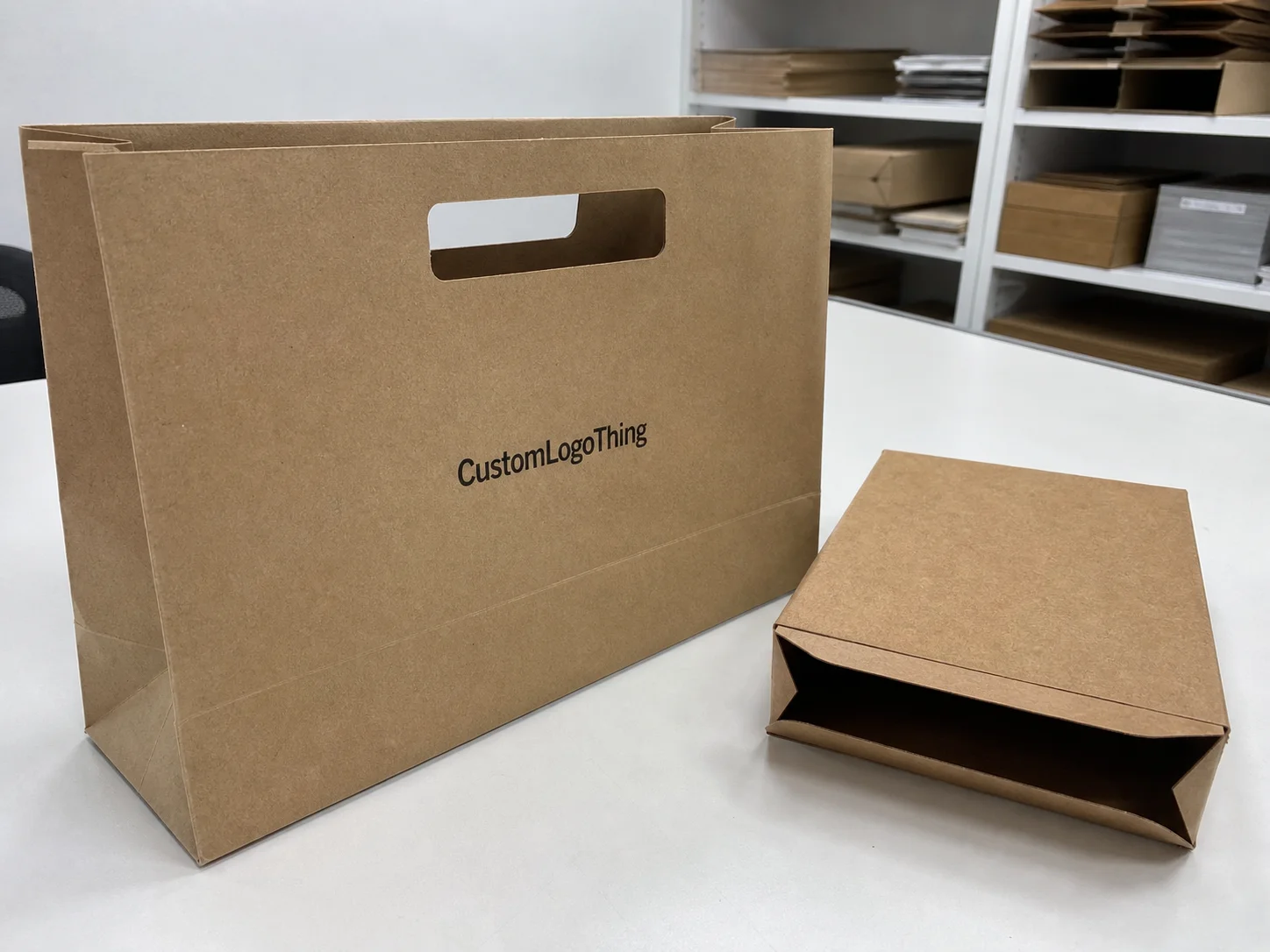
Buyer Fit Snapshot
| Best fit | Visual Hierarchy in Packaging projects where brand print, material claims, artwork control, MOQ, and repeat-order consistency need to be specified before quoting. |
|---|---|
| Quote inputs | Share finished size, material target, print colors, finish, packing count, annual reorder estimate, ship-to region, and any compliance wording. |
| Proofing check | Approve dieline scale, logo placement, barcode or warning zones, color tolerance, closure strength, and carton packing before bulk production. |
| Main risk | Vague material claims, crowded artwork, missing packing details, or unclear freight terms can make a low unit price expensive after revisions. |
Fast answer: Visual Hierarchy in Packaging: Artwork Proof, Packing Count, and Landed Cost should be specified like a repeatable production item. The safest quote records material, print method, finish, artwork proof, packing count, and reorder notes in one written spec.
Production checks before approval
Compare the actual filled-product size with the drawing, then confirm tolerance on folds, seals, hang holes, label areas, and retail display edges. Reserve space for logos, QR codes, warning copy, and material claims before decorative graphics fill the panel.
Quote comparison points
Review material grade, print process, finish, sampling route, tooling charges, carton quantity, and freight assumptions side by side. A quote is only useful when the supplier can repeat the same color, closure quality, and packing count on the next order.
What Is Visual Hierarchy in Packaging? Start With the Shelf Test
What is visual hierarchy in packaging? I explain it as the order of attention a package creates on purpose, so a shopper knows what to notice first, second, and third without having to decode the design. I’ve stood in front of retail endcaps in a warehouse club in Edison, New Jersey with a buyer watching over my shoulder, and the packages that won the moment were rarely the ones with the most information; they were the ones with one strong cue, often a sharp color block, a bold typeface, or a clean product image that grabbed the eye in under two seconds. Honestly, that kind of pressure is a little rude, but it is also real retail, especially when the store team is resetting 48 facings before 8:00 a.m.
That is the core of what is visual hierarchy in packaging. It is not decoration for decoration’s sake. It is the deliberate arrangement of design elements so the package reads clearly at a glance, whether it is a folding carton on a pharmacy shelf in Columbus, Ohio, a Rigid Gift Box on a boutique counter in Austin, Texas, or a pressure-sensitive label in a crowded beverage aisle in Los Angeles, California. In packaging terms, hierarchy is the silent salesperson that moves the eye from brand mark to product type to key benefit, then to the supporting details that help a buyer say yes. I remember one project at a corrugated plant outside Chicago where we kept saying, “If the shopper has to hunt for the product name, we’ve already lost,” and that became the guiding line for the whole run, from proof approval to final pallet wrap.
I’ve seen beautiful packaging fail because every element was shouting. The logo was huge, the flavor name was huge, three badges were huge, the background pattern was busy, and the net weight was hiding in a corner like it was apologizing for being there. That kind of design feels expensive and unfinished at the same time. When people ask me what is visual hierarchy in packaging, I tell them that premium is not the same as crowded. A package can have foil, embossing, a soft-touch coating, and still feel calm if the order of importance is clear. In fact, I’d argue it feels more premium that way, especially on a 350gsm C1S artboard folding carton with matte lamination and a single 1.25-inch spot UV hit on the brand mark, which is often enough to make the system feel intentional instead of overworked.
“A package has about three seconds on shelf before the eye moves on, and if the first read is confusing, the sale usually is too.”
That line came from a buyer meeting in a Midwest grocery chain in Minneapolis, Minnesota, and it stuck with me because it reflects how retail actually works. Good package branding makes the product look organized, confident, and trustworthy before anyone picks it up. Poor hierarchy does the opposite. It makes even strong branded packaging feel scattered, which is a shame because the product inside may be excellent. I still get mildly irritated when a great formula or a great snack gets buried under a front panel that looks like it lost a fight with a clip-art library, especially after the brand spent $12,000 on a launch render and still forgot the product name on the first read.
What Is Visual Hierarchy in Packaging in Real Packaging Design?
When I look at what is visual hierarchy in packaging in practical terms, I think about the path a shopper’s eyes usually follow: brand mark, product name, product descriptor, proof point, and then the supporting details like size, ingredients, certifications, or usage instructions. That path is not exact every time, of course, but it is common enough that smart packaging design uses it as a starting point. In a test print room in Shenzhen, China, I once watched a client compare two custom printed boxes for a skincare line; the version with the clearest order of information won immediately because the brand, product, and benefit were readable from about six feet away under bright fluorescent light. Fluorescent light is not kind, by the way. It exposes every weak choice like a very opinionated auditor, especially when the carton is printed on 18pt SBS board and the type is set below 6.5 points.

Designers control that eye path with a few basic tools: size, placement, contrast, spacing, and repetition. A larger element usually feels more important. An item placed high on the front panel tends to be seen earlier. Dark type on a light field reads faster than low-contrast combinations. Generous spacing gives elements room to breathe, while repeated shapes or line weights can reinforce a visual system across a product family. That is the practical answer to what is visual hierarchy in packaging: it is a controlled sequence, not a random arrangement, and it usually works best when the front panel is built around one dominant headline, one secondary descriptor, and one supporting cue.
In carton printing, the front face does most of the work, but the side panels matter too, especially for products displayed in facedown stacks or pegged displays. In rigid box decorating, hierarchy often starts with the lid panel and then continues inside with tissue, inserts, or a reveal layer. In label design, the challenge is different because the canvas is smaller, curved, and often crowded with legal text. Still, the same principle applies. The strongest focal point should land first, and the rest should support it, whether the substrate is 60# label stock, 24pt chipboard, or a 450gsm rigid board wrapped in printed art paper from a converter in Dongguan.
Finishing can strengthen hierarchy in a way that plain ink alone sometimes cannot. A matte lamination paired with spot UV on the product name creates a clear visual pop. Foil stamping can pull the eye to the brand mark or a key premium cue. Embossing and debossing add tactile emphasis, which matters because shoppers do not just see packaging; they handle it, especially in cosmetics, gifting, and specialty food. Even a window cutout can be part of the hierarchy if it reveals the product texture or color at the exact moment the shopper needs reassurance. On one chocolate box project produced in Milan, Italy, a 1.5-inch acetate window lifted sell-through simply because the shopper could see the truffle dusting before reading a single word.
Here is the part people often miss: what is visual hierarchy in packaging is not about making everything larger. It is about making the right thing feel first. I’ve seen a simple cereal box outperform a more elaborate competitor because the brand name was smaller but the product type was unmistakable, the flavor cue was easy to scan, and the nutritional promise was positioned where the eye naturally landed. Clear beats loud more often than designers like to admit, and it often does so on a $0.15-per-unit print run for 5,000 pieces when the layout is clean enough to keep the press moving without extra make-ready changes.
Key Factors That Shape Visual Hierarchy
If you want to understand what is visual hierarchy in packaging, you have to look at the building blocks that create it. Typography is one of the biggest. Font weight, letter spacing, and line breaks all affect readability and brand personality. A bold condensed sans serif can feel efficient and modern for electronics or supplements, while a serif with wider spacing may feel more established for a heritage food brand. But if the line breaks are awkward, even a beautiful typeface becomes hard to scan, especially on a 7-inch-wide mailer where the panel is competing with a shipping label and tamper seal.
Color contrast matters just as much. A limited palette usually supports clarity better than a color explosion. I once sat through a packaging review in Toronto, Ontario where a team had assigned a different bright color to every claim, badge, and flavor note, and the front panel looked like a candy store window after a storm. After we simplified the scheme to two main colors plus one accent, the product looked more expensive and the key message finally stood out. That is a core lesson in what is visual hierarchy in packaging: contrast helps, but too many competing colors flatten the message, especially when the package is printed in four-color process plus one Pantone accent.
Imagery and iconography are another major piece. A well-shot product image can anchor the package instantly, especially for food, beverages, and personal care. Illustration often works better when the brand wants a hand-crafted or playful feel. Simple pictograms are useful when the package needs to communicate speed, ingredients, or technical features without clutter. I’ve seen product packaging for an over-the-counter wellness line become much easier to shop after the brand replaced three paragraphs of claims with five small icons and one clean headline, all set on a 5.5 x 3.5-inch carton with a 0.125-inch bleed and a single-color line art system.
Structure also shapes hierarchy. A folding carton gives you a front, sides, and top flaps to organize information. A sleeve creates a natural band of emphasis where the opening reveals the core product name. A mailer box has a larger canvas but often needs hierarchy that works at shipping speed and unboxing speed. Rigid boxes, especially in luxury gifting, can rely on a very restrained front panel because the opening sequence itself becomes part of the story. That is why what is visual hierarchy in packaging cannot be separated from the structure carrying it, whether the box is made in Ho Chi Minh City, Vietnam or assembled in a finishing facility in Guadalajara, Mexico.
Material and finish choices alter how the eye lands on the design. Kraft paper signals earthiness and can support a quieter hierarchy, while SBS board gives a smoother print surface for crisp color and fine type. Corrugate has its own limitations because the fluting and print constraints can reduce detail. Soft-touch coating slows the eye down and can make the package feel more premium. Metallic foil tends to pull attention quickly, which is useful if used sparingly and dangerous if used everywhere. On the production side, I’ve seen a run on 350gsm C1S artboard with matte lamination and one spot UV hit look cleaner than a more expensive build with three special effects that fought each other, and the whole job still shipped in 12 to 15 business days from proof approval because the spec stayed disciplined.
Category expectations matter too. Cosmetics often use hierarchy to balance elegance and ingredient trust. Food packaging usually needs instant flavor recognition and serving clarity. Electronics packaging leans on model differentiation, feature proof, and technical credibility. Luxury gifting wants restraint, texture, and a sense of occasion. So when people ask me what is visual hierarchy in packaging, I always answer with another question: what category are you in, what board caliper are you using, and what problem are you solving on shelf in a store where 80 feet of aisle space may be the only stage you get?
Step-by-Step: How to Build Visual Hierarchy Into Packaging
The first step in answering what is visual hierarchy in packaging for a real project is choosing one primary message. Just one. Is it the brand? The product type? The benefit? The ingredient story? If everything is equally important, nothing is important. In a supplier meeting for a specialty tea brand in Portland, Oregon, I watched the team debate five possible headline priorities until we finally put them on a whiteboard and ranked them. Once they chose “organic wellness blend” as the lead message, the design team could finally build a package that felt deliberate instead of argumentative, and the prototype moved from concept to print-ready files in under a week.
Step two is ranking the content. Write every line of copy and every design element on a list, then sort them by importance. The logo may come first, but not always. In some private label or co-packing situations, the product type needs to dominate because the retailer wants the shopper to understand the item fast. Secondary items can include flavor, scent, size, certifications, and selling points. Optional items should only stay if they truly help the sale. This sort of discipline is central to what is visual hierarchy in packaging, especially when the front panel only has 42 square inches to do the work.
Step three is sketching the layout before polishing anything. I mean rough boxes, type blocks, arrows, and placeholders on a dieline. Nothing fancy. On the floor at a corrugated converter in Allentown, Pennsylvania, I once saw a veteran prepress operator mark up front panels with a red pen and a ruler, and his sketch solved a problem that two polished comps had missed: the eye was hitting the certification badge before the product name. A quick paper layout can reveal that kind of mistake long before printing custom printed boxes by the thousands. I’ve never trusted a “looks fine on screen” comment without a physical mockup since then, especially if the final build is a mailer with 32 ECT corrugate and a 200lb white liner.
Step four is distance testing. Put the package on a shelf mockup and look at it from ten feet, six feet, and arm’s length. Then turn on harsh light and try again. What is visual hierarchy in packaging becomes obvious when the package has to survive real viewing conditions, not just a monitor. A label that looks tidy on screen can disappear under store lighting if the contrast is too soft or the type is too small, and a front panel that reads well at 27 inches can still fail if the top flap hides the brand in a facing test.
Step five is proofing and sample review. This is where the real material, ink coverage, die line, and finishing effects reveal themselves. A gloss varnish may lift one area more than planned. A foil may overpower the brand name if it is too wide. A soft-touch lamination can mute contrast in ways the digital proof did not show. I’ve had clients approve a nice-looking PDF and then change their mind after seeing a physical sample, because print on paper and print on screen are never the same thing. Good packaging design respects the difference, even if that means another round of “just one more tweak” from everyone involved, which is usually how a $0.22-per-unit rigid insert becomes a $0.31-per-unit insert after three revision rounds and a new die line.
Step six is validation with real people. That can mean shoppers in a small usability test, or it can mean the sales team, or both. Ask them what they noticed first, second, and third. Ask them what they think the product is. Ask them what they would expect to pay. Those answers tell you whether the hierarchy is doing its job. That final check is where what is visual hierarchy in packaging moves from theory into selling power, especially when the project is headed for a 10,000-unit launch in a chain with stores across Texas, Arizona, and Georgia.
- Define the single most important message.
- Rank every other element by importance.
- Sketch a simple hierarchy before final artwork.
- Test at distance and at hand-held range.
- Review physical samples, not only digital proofs.
- Validate with real users or sales teams.
Common Mistakes That Break Visual Hierarchy
The most common mistake I see is trying to make every element bold. That usually creates noise, not clarity. If the logo is huge, the flavor is huge, the badge is huge, and the ingredient story is huge, the customer has to do the sorting in their own head. That is not good package branding. Good what is visual hierarchy in packaging work makes the package do the sorting for them, whether the shopper is standing in a Kroger aisle in Dallas or pulling a carton off a shelf in a pharmacy in Atlanta.
Overcrowded front panels are another problem. I’ve reviewed retail packaging for startups that had to fit in a logo, three claims, a QR code, a certification, a social handle, and a decorative border because everyone on the team wanted their piece visible. The result was predictable: the product looked busy, less credible, and harder to scan. Sometimes the smartest move is to leave something off the front and place it on a side panel or back panel where it can still exist without competing for the first glance, especially on a 6-panel carton with 0.25-inch margins and a strict retailer spec.
Poor contrast is a hierarchy killer. Light gray type on a cream background might look elegant in a design deck, but on a shelf under mixed lighting it can become invisible. Busy patterns behind essential text do the same thing. I’ve seen beautiful botanical graphics ruin legibility because the product name sat directly across a high-detail area. That is why what is visual hierarchy in packaging must always be checked in print context, not just in a brand presentation, ideally with a sample run reviewed under 4000K store lighting before final approval.
Inconsistent branding across SKUs creates another layer of confusion. One SKU uses a centered logo, another uses a diagonal one, and a third changes the color system entirely. The line no longer feels connected, so a shopper may not recognize the family. For branded packaging, consistency is not boring; it is a recognition tool. A family of products should feel related, while still being easy to distinguish, and that usually means keeping the same typographic scale, the same brand position, and the same benefit hierarchy across every 8-ounce, 12-ounce, and 16-ounce size.
Trend-chasing can also hurt. Metallic gradients, oversized textures, and heavy visual effects can look exciting in a mockup, but if they do not support the product story, they become decoration without purpose. I’m not against flash. I’ve specified plenty of foil-stamped lids and embossed panels. I just think the effect should earn its place. That is one of the clearest lessons in what is visual hierarchy in packaging: style should serve meaning, not bury it under a stack of effects that add cost without adding clarity.
Finally, there is the mistake of designing only for online mockups. Packaging has to work in print, under store lights, at multiple distances, and often in motion on a conveyor or in a shopper’s hand. A design that looks great on a flat screen may collapse once it is wrapped around a box or applied to a curved label. I learned that the hard way on a beverage project in Sacramento, California where the front panel looked perfect in the studio but lost legibility on the filled bottle because the shoulder curve changed the reading angle. That was one of those annoying-but-useful lessons that stick with you forever, especially after 20,000 labels were already scheduled at the co-packer.
Cost, Pricing, and Timeline: What Visual Hierarchy Changes
What is visual hierarchy in packaging also has a direct relationship to cost, and people do not always expect that. Cleaner designs can sometimes reduce expenses because they use fewer inks, fewer special treatments, and less complex layout work. A simpler front panel can be faster to print and easier to approve. On the other hand, elaborate hierarchy treatments like foil stamping, embossing, debossing, windowing, or custom inserts often add setup time, tooling expense, and extra handling steps, especially if the work is being done in a factory in Shenzhen, China or a finishing plant in Monterrey, Mexico.
Material choice changes the budget fast. A basic folding carton on SBS board will usually cost less than a rigid box with wrapped board, EVA or paperboard inserts, and specialty finishing. Corrugated mailers can be efficient for shipping and unboxing, but if you want premium print quality and fine type, you may need upgraded liners or coatings. For some projects, I’ve quoted around $0.15 per unit for 5,000 pieces on a straightforward printed carton, while a more elaborate rigid construction with foil and insert work can move several times higher depending on dimensions, board grade, and finishing complexity. That spread is exactly why what is visual hierarchy in packaging should be considered before the artwork is locked, not after the sales team has already promised a launch date.
Timeline follows the same logic. A package with a clean hierarchy may move through concept approval faster because stakeholders can understand it quickly and give sharper feedback. That saves round trips. But once you add specialty finishing, custom tooling, and multiple substrates, the schedule expands. A practical timeline might run 12 to 15 business days from proof approval for a straightforward production run, while a premium structure may need more time for die cutting, finishing setup, and assembly coordination. The actual schedule depends on the printer, the factory line, and the spec, and the difference between a 1-color carton and a 4-color carton with foil can be three or four additional setup checkpoints.
I’ve negotiated with suppliers who could hit a tight calendar on a simple carton because the hierarchy was clean and the print setup was straightforward. I’ve also seen a project lose a full week because the team kept changing the position of a foil mark, then added a spot UV panel, then decided the logo needed embossing. None of those choices were wrong individually, but together they stretched the schedule. That is why what is visual hierarchy in packaging should be treated like a production decision, not only a design decision, particularly when the carton is being printed in batches of 10,000 and the palletized freight window is fixed.
It also helps to think about revision cycles. A clear hierarchy reduces confusion, which usually reduces the number of stakeholder comments. Fewer comments often means fewer prepress changes, fewer proof rounds, and fewer delays. If the design reads well immediately, the brand team, the sales team, and the retailer can usually react faster. That is a real business advantage, especially when coordinating printing, finishing, and final assembly across multiple locations in the U.S. and overseas, where a two-day delay in one city can ripple into a missed ship date in another.
Expert Tips for Stronger Packaging Hierarchy
Design for the shortest attention span first. That sounds blunt, but it is the truth. Shoppers glance before they read, and they often decide before they fully process the copy. So when I think about what is visual hierarchy in packaging, I start by asking what the package must communicate in half a second. The answer might be the brand and product type, or it might be the flavor and a single benefit. Everything else should support that first read, especially if the package will sit in a 24-inch shelf bay next to six competing SKUs.
Use one dominant focal point per panel. Not two. Not three. One. The strongest panel should have a clear leader, and every other element should play a supporting role. If the product name is the lead, make it unmistakable. If the image is the lead, make sure the rest of the layout gives it room to breathe. I’ve seen Custom Packaging Products perform much better in sales mockups after a client reduced the number of competing accents from four to one. Honestly, the package just stopped arguing with itself, and the front panel felt like it had been given a clean 2-inch margin on every side.
Compare the package against direct competitors on a shelf mockup. That is one of the best reality checks you can do. Print the front panels, stand them next to the leading products in your category, and see whether the package reads cleanly without looking loud for the wrong reasons. This matters for branded packaging because shelf success is relative. A package is not judged in a vacuum; it is judged against the other ten packages sitting beside it, often under retail lighting that changes from one chain to the next.
Proof typography at actual size. This one saves pain. Type that feels elegant at 18 points can become tiny and weak on a narrow carton face. A line break that looks balanced in a layout file can push the hierarchy off when the package is folded and glued. I’ve had clients sign off on beautiful artwork and then call back after the first sample because the product descriptor was too small to read from a normal shelf distance. That is a classic example of why what is visual hierarchy in packaging needs physical testing, ideally with a taped-up sample and a ruler before final plate-making.
Use tactile contrast intentionally. A soft-touch surface with gloss accents, or a matte board with a raised logo, can create a hierarchy the fingers recognize as much as the eyes do. That tactile signal matters in luxury gifting, cosmetics, and premium food. It can also help the package feel more considered without overwhelming the design. I once worked on a rigid gift box in Paris, France where the visual system was very restrained, but a subtle deboss around the brand mark made the whole box feel more expensive the moment it left the sleeve, even though the build stayed within a $1.80-per-unit target for a 3,000-unit order.
Keep the product family consistent. If you are building a line with multiple flavors, sizes, or formulations, create a hierarchy system that stays recognizable across all SKUs. Use one layout rule for the brand area, one for the product name, and one for the differentiator. That way, shoppers can spot the line instantly, and your sales team can merchandise the family with confidence. In my experience, that kind of discipline is what separates decent packaging from package branding that actually builds recall over time, whether the line is assembled in Seattle, Washington or packed for distribution out of Louisville, Kentucky.
If you want a deeper look at industry expectations around materials and responsible sourcing, the Forest Stewardship Council is a useful reference for paper-based packaging, and the International Safe Transit Association provides standards that matter when packages need to survive Shipping and Handling. For broader sustainability context, the EPA’s packaging guidance is also worth reviewing when a design needs to balance shelf impact with waste reduction, especially for paperboard cartons, corrugated shippers, and mixed-material packs headed into national distribution.
I think the best packaging teams treat hierarchy like a production discipline, not a styling exercise. The strongest what is visual hierarchy in packaging work I’ve seen usually came from teams that cared about print behavior, shopper behavior, and operational reality in equal measure. That includes the board grade, the ink density, the die line, the tuck flap, and even how the box will sit in a shipper before it reaches a shelf, whether the run is being produced in a facility in Ohio, Ontario, or Guangdong.
What Is Visual Hierarchy in Packaging? A Clear: decision table
| Decision area | Best fit | What to verify | Risk if skipped |
|---|---|---|---|
| Product fit | Protection, display, and unboxing consistency | Measurement, tolerance, material, and sample approval | A nice design fails because the product fit was guessed |
| Brand presentation | Logo visibility, finish, and customer perception | Print method, color target, texture, and proof review | Packaging protects the item but does not sell the brand |
| Operations | Packing speed, storage, shipping, and reorder control | Carton count, warehouse label, and repeat spec | The package is attractive but hard to pack or reorder |
FAQ
What is visual hierarchy in packaging design, exactly?
It is the intentional ordering of design elements so shoppers notice the most important information first. In practice, what is visual hierarchy in packaging means using size, contrast, spacing, typography, imagery, and finish to guide attention toward the brand, product type, and key benefits in a clear sequence, often on a front panel that may be only 40 to 60 square inches.
How do you make visual hierarchy in packaging more effective?
Start by choosing one primary message and making everything else support it. Use readable type, strong contrast, and enough negative space so the front panel does not feel crowded. Then test the design from a distance and in printed form, because what is visual hierarchy in packaging often looks different on a monitor than it does on an actual box or label, especially under 3500K to 5000K retail lighting.
Does visual hierarchy affect packaging cost?
Yes. Complex finishes, specialty materials, and layered graphics can raise production costs, while a cleaner system may reduce print complexity and speed approvals. Early decisions matter most, because what is visual hierarchy in packaging influences tooling, proofing, finishing, and revision time before production begins, and that can change a quote by cents per unit or more on a 5,000-piece run.
How long does it take to create packaging with strong visual hierarchy?
Timing depends on concept development, proofing, sample approval, and production setup. A straightforward project may move quickly, while premium structures and finishing add steps. Clear hierarchy can actually save time because what is visual hierarchy in packaging makes the message easier for teams to understand and approve, and a simple carton can often move from proof approval to production in 12 to 15 business days.
What is the biggest mistake brands make with visual hierarchy in packaging?
The most common mistake is trying to make every element important at once. That creates clutter, weakens readability, and muddies the product message. A better approach is to let one element lead and use the rest to support it, which is the core idea behind what is visual hierarchy in packaging, whether the design is for a 250mL bottle, a 12-ounce carton, or a rigid gift box.
So, if you remember only one thing, remember this: what is visual hierarchy in packaging is the craft of making a package read in the right order, fast and clearly, under real retail conditions. I’ve watched that single discipline rescue launches, sharpen branded packaging, and turn weak shelf presence into something shoppers could understand in seconds. Good hierarchy does not just make a box prettier. It makes the message land, and in packaging, that is often the difference between being noticed and being passed over, especially when the packaging budget is fixed at $0.15 to $0.31 per unit and the line has to move through a factory in time for a national rollout.