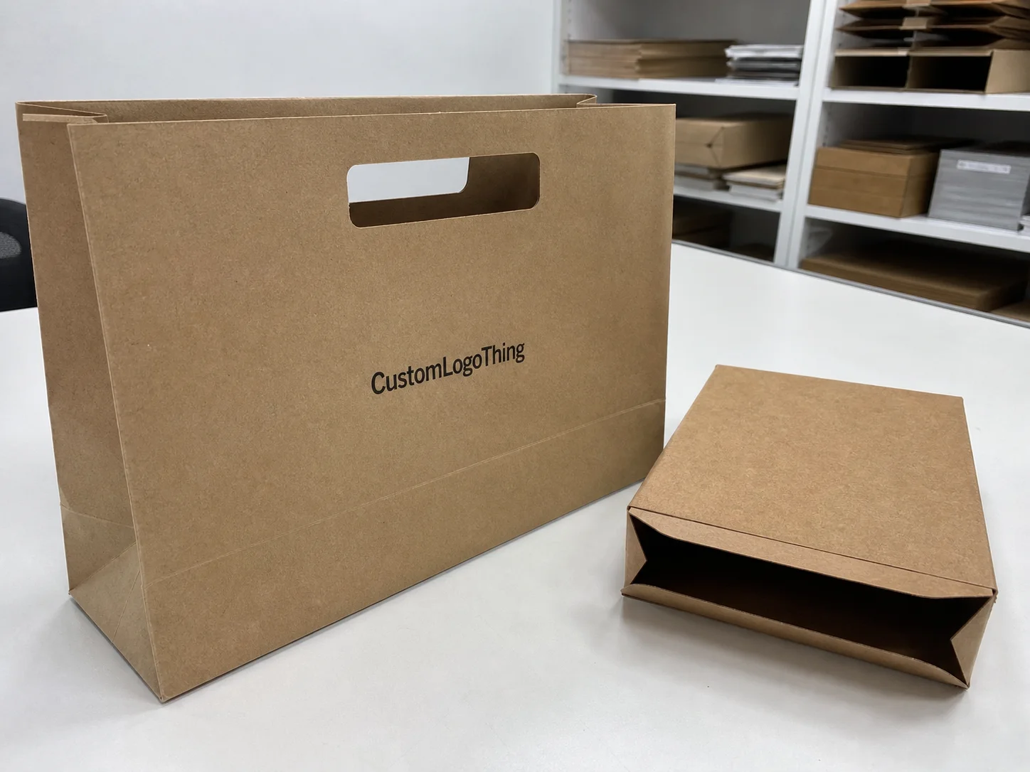
Buyer Fit Snapshot
| Best fit | Visual Hierarchy in Packaging projects where brand print, material claims, artwork control, MOQ, and repeat-order consistency need to be specified before quoting. |
|---|---|
| Quote inputs | Share finished size, material target, print colors, finish, packing count, annual reorder estimate, ship-to region, and any compliance wording. |
| Proofing check | Approve dieline scale, logo placement, barcode or warning zones, color tolerance, closure strength, and carton packing before bulk production. |
| Main risk | Vague material claims, crowded artwork, missing packing details, or unclear freight terms can make a low unit price expensive after revisions. |
Fast answer: Visual Hierarchy in Packaging: Production Spec, Color Control, and Delivery Risk should be specified like a repeatable production item. The safest quote records material, print method, finish, artwork proof, packing count, and reorder notes in one written spec.
Production checks before approval
Compare the actual filled-product size with the drawing, then confirm tolerance on folds, seals, hang holes, label areas, and retail display edges. Reserve space for logos, QR codes, warning copy, and material claims before decorative graphics fill the panel.
Quote comparison points
Review material grade, print process, finish, sampling route, tooling charges, carton quantity, and freight assumptions side by side. A quote is only useful when the supplier can repeat the same color, closure quality, and packing count on the next order.
On a shelf, most shoppers give a package about 2 to 4 seconds of real attention before they move on. That tiny window is exactly why what is visual hierarchy in packaging matters more than the kind of design debate that eats a week and a half of meetings and somehow still ends with nobody agreeing on the logo.
If you sell grocery, health, cosmetics, pet, or household products, the pack gets read in a rough order: shelf, distance, hand, then light. Before anyone flips it over, squeezes it, or checks the barcode, they are already sorting visual cues in their head. The way you structure what is visual hierarchy in packaging can decide whether a box earns trust, disappears into the row, or clicks as familiar the second time someone sees it.
I have sat through enough packaging reviews to know the usual failure mode. The team keeps adding one more badge, one more claim, one more shiny thing, and suddenly the front panel is doing karaoke instead of communicating. That is not hierarchy. That is a traffic jam with a varnish budget.
How do you define what is visual hierarchy in packaging?
It is the planned order of attention on a package: brand first, product type second, primary benefit third, and supporting details after that. Good hierarchy uses scale, contrast, spacing, typography, and finish to guide the eye without turning the front into clutter. In practice, what is visual hierarchy in packaging is the system that helps a shopper understand a pack fast, trust it faster, and move on without confusion.
That sounds simple because it is simple. The hard part is getting a team to act like it is simple. Marketing wants more story. Sales wants more visibility. Compliance wants more copy. Design wants the front to breathe. And somehow the front panel is supposed to survive all of that without looking like a ransom note.
What Is Visual Hierarchy in Packaging? A Brand Guide
The shelf reality: clarity in seconds
People standing in front of a crowded shelf do not absorb everything at once. They catch one strong cue, then a second, then one proof point, then they either lean in or walk away. That sequence is the whole point of what is visual hierarchy in packaging. It is the planned order of visual importance: what gets seen first, what gets seen next, and what gets pushed back so the useful stuff stays readable.
Practically speaking, what is visual hierarchy in packaging means your brand name is not wrestling your product claim, your ingredient callout is not hijacking the main promise, and the legal copy is not sitting in the spotlight like it paid for the ad slot. Think of it as a line of people waiting for attention. The front panel should answer who you are and why this exists immediately. A beautiful package that reads like static noise is still static noise.
Defining the concept without jargon
Here is the plain version: what is visual hierarchy in packaging is the ordered emphasis created through scale, contrast, spacing, and structure so a shopper can move from brand recognition to claim, then to detail, without tripping over the layout. In packaging design, that usually means the logo leads, the product name or category follows, the unique benefit comes next, and the supporting details sit underneath where they belong.
That is not decorative theory. If the first message on the pack is muddy, your package branding weakens immediately. Buyers start asking, "Is this the one I know?" or "What is this even for?" If those questions take more than a beat to answer, the pack loses recognition and purchase momentum. I see this all the time with launches that pile on graphics until the front looks expensive and behaves like clutter. Pretty does not fix confusion.
Why first impression and confidence are tied together
New products need hierarchy to do three things fast: show category, show benefit, and show trust. If the consumer can identify the Brand and Product type in one pass, they move on to the trust layer: certifications, feel, and claims. That is where what is visual hierarchy in packaging stops being a design term and starts affecting sales. Good hierarchy makes something understandable. Better hierarchy makes it believable.
At Custom Logo Things, this shows up constantly in custom packaging projects with too many cooks in the room. Founders, marketing, compliance, and print partners all have opinions. When hierarchy is set early, those conversations shift from "does this look nice?" to "does this communicate in the right order?" That simple move cuts rework. If the team argues style before structure, the project drifts. If the order is fixed first, the rest moves with far less drama.
A quick test helps. Ask, What does this pack say first, second, and last?
If nobody answers the same way, the hierarchy is not locked. If the answers keep changing, the hierarchy is not shared either.
How Visual Hierarchy in Packaging Guides the Eye
Contrast, typography, and the reading path
Most shoppers lock onto the strongest contrast first. The biggest contrast and scale at arm's length becomes the anchor. After that, typography takes over: large headline-like elements pull the eye, medium text explains, small text supports. Once those layers are clear, the pack can carry more information without feeling crowded.
In shelf conditions, what is visual hierarchy in packaging gets tested at two very different distances: roughly 6 to 12 feet, then about 1.5 to 2 feet when the product is in hand. A design can pass one distance and fail the other. That is why the hierarchy has to scale. From far away, only the broad structure and headline strength survive. Up close, the claims, icons, and instructions need to read without turning the front into a text wall.
Size, weight, placement, and whitespace as navigation tools
Designers love asking whether "heavier" fonts always mean stronger hierarchy. Not really. In many product packaging projects, an oversized phrase with weak contrast still looks loud and still reads badly under store lighting. Good hierarchy usually mixes visual weight with breathing room. A smaller element with sharper contrast can beat a giant block of text all day long.
Placement matters too. Top-left and top-center zones often get first attention, though the exact scan pattern shifts by region, language direction, and shelf layout. If the main offer sits too low without any support line, it gets swallowed by neighboring packs, especially in bright rows with a lot of visual noise. Clean whitespace between lines can improve comprehension speed more than most teams expect, and yes, that matters more than another decorative flourish.
Structure and substrate as visual magnets
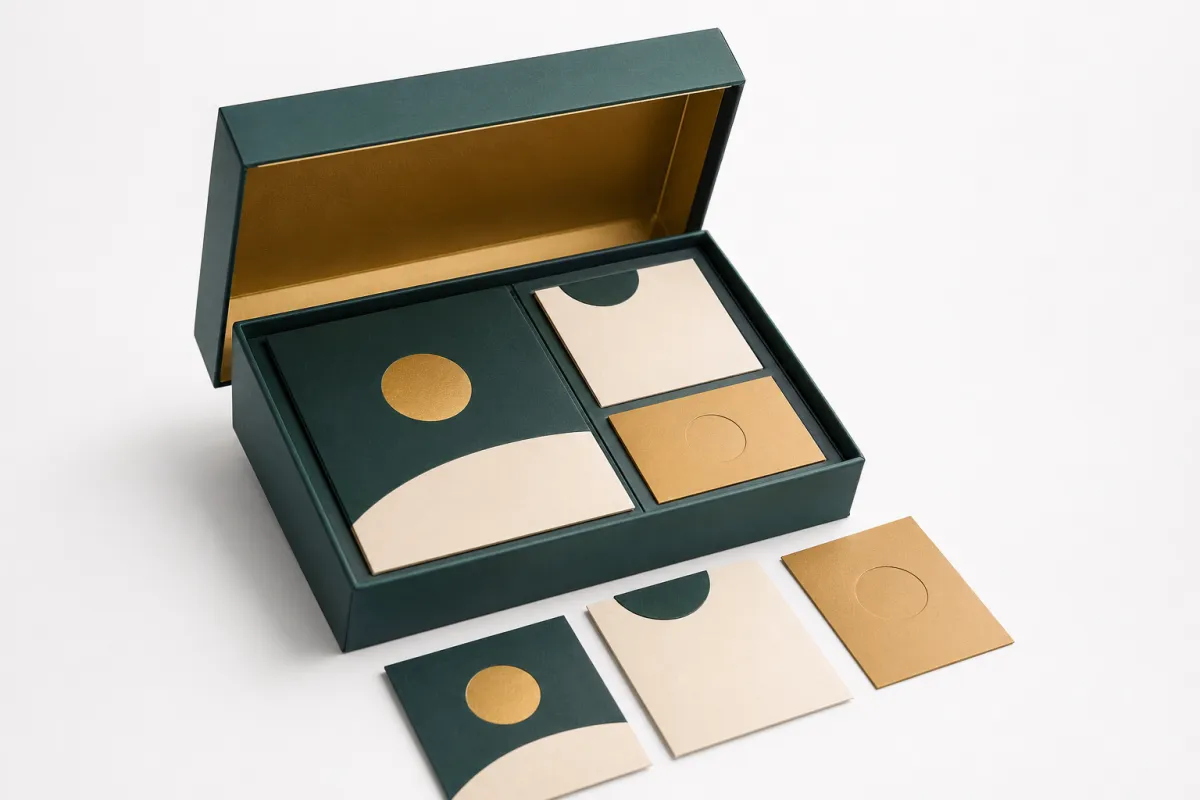
Hierarchy is not only a flat graphics problem. Fold lines, windows, embossing, die cuts, matte bands, spot varnish, and foil can all act like magnets for attention. That is why what is visual hierarchy in packaging has a physical side. A clear window at shoulder height can signal freshness instantly. An embossed brand crest at the bottom can reinforce premium positioning once the pack is in hand.
If the structure throws glare or warps the face, the hierarchy breaks. A reflective gloss on the wrong panel can steal attention from the product name. A soft-touch front, by contrast, can hold attention longer in both shelf photos and physical retail. That matters online too, because plenty of shoppers make a first decision from a thumbnail before they ever touch the box.
Distance, medium, and competitive scenes
What is visual hierarchy in packaging has to work in three places: the physical shelf, the social thumbnail, and the e-commerce zoom. A pack that performs in one medium can fall apart in another if contrast and sequencing are not consistent. On a screen, tiny lines may read better than they do under store glare. In-store, lighting can wash out subtle tints and flatten fine detail.
"The shopper does not buy from your spec sheet. They buy from what the front says in the first glance."
Keep the same message ladder across formats. If a pack says "organic, refillable, cruelty-conscious" online but leads with "new" on shelf, the story splits. That split may sound minor until sales teams start hearing confusion from retailers during replenishment. Hierarchy is a consistency system, not a styling accessory.
A useful diagnostic: print the artwork at 100%, 50%, and 25% scale, then ask one person what they noticed first at each size. If the primary message and secondary message keep switching places, the hierarchy is unstable.
Key Factors That Shape Visual Hierarchy in Packaging
Start with brand intent: premium, practical, playful, or technical
The first decision is strategic, not typographic. A premium skincare pack does not use the same visual language as a technical cleaning product. Before hierarchy starts, the team needs to define the tone: everyday, playful, clinical, wellness-focused, or performance-driven. That choice shapes which element gets the lead. In a branded packaging context, a playful brand may let illustration lead with benefit copy tucked behind it, while a technical brand may put dosage or performance data up front.
People buy using expected cues. In health categories, claims like "no sugar," "high fiber," or "dermatologist tested" cannot be buried. In technical categories, spec cues like "BPA-free" or "anti-shatter" may outrank the story layer. Ask the blunt question early: which cue helps the buyer decide right now? That is the top hierarchy gate in what is visual hierarchy in packaging.
Color systems, type scale, and contrast discipline
Color works like a traffic signal, but too many colors turn the pack into a shouting match. One strong anchor hue plus controlled neutrals usually beats a six-color scramble. A lot of Custom Printed Boxes look stronger with about 70% to 80% of the front panel in neutral values and 20% to 30% in one decisive accent. One accent can guide the eye to the benefit without fighting the product name.
Type scale should follow readable ratios. A simple field-tested ladder is 1.0 for legal copy baseline, 1.6 to 2.0 for secondary claims, and 2.5 to 3.2 for the headline or product name, adjusted by package width and audience. What is visual hierarchy in packaging gets messy fast when every line looks the same. Keep at least 1.2x contrast in size or weight so the eye has a real landing point, not a mushy pile of text.
Image use and icon behavior
Photography, illustration, and icons can help or hinder. A full-bleed product image works when the product is visually universal. If the category depends on ingredients or features, a tighter icon-plus-copy layout may outperform a photo-heavy face. Symbols for temperature, recyclability, allergen-free claims, or certification only work if they sit behind the main message instead of elbowing it out of the way.
If imagery and text both try to be the hero, they weaken each other. Pick a rule and stick to it: one hero image, two claim zones max, the rest in support. If you are using icons in retail packaging, keep their line weight stronger than decorative pattern lines. Otherwise buyers start reading ornaments as if they mean something, which is how design turns into accidental nonsense.
Material and finish choices that alter dominance
Finish matters because gloss, matte, foil, soft-touch, and spot treatments are not neutral. A gloss stripe on the top half can look premium and still become a glare trap under fluorescent lights. Matte laminate reduces glare and can help the first claim stay readable. Foil often boosts attention on premium launches, but it can also crush small text if the contrast is lazy. Spot UV can direct attention nicely when it highlights a single term like "new formula," yet overuse makes the front feel noisy.
If you are printing on paperboard with FSC goals, keep substrate behavior in mind. Recycled white and uncoated stock absorb ink differently than coated board. A pale color that looked sharp on screen can turn muddy on press. Build a test pass for two or three print conditions if the project uses more than one material. That keeps hierarchy consistent and saves you from expensive reprints.
Rules from standards and category norms
Hierarchy may be strategic, but standards still matter because they support trust. For logistics and damage behavior, many suppliers follow ISTA testing procedures. For sustainability claims and material guidance, teams often pair Packaging industry guidance with FSC and EPA-aligned disposal language. ASTM standards such as ASTM D4169 show up often in transportation durability work, and while they are not design rules, they shape what the structure can physically support.
One practical thing: when legal and claims teams add mandatory statements, place them as clear secondary items. They stay visible without hijacking the opening message. That is where many teams confuse compliance with hierarchy.
Step-by-Step Guide to Building Visual Hierarchy in Packaging
Step 1: Map the message in a ranked order
Start with the message map before opening the design file. Write the one thing the pack must communicate in fewer than 12 words. Then rank every other element by importance. A clean structure looks like this: 1) Core identity, 2) Product or pack purpose, 3) Primary benefit, 4) Proof point, 5) Practical details. If the list has more than eight top-level points, the package is already doing too much.
This is where what is visual hierarchy in packaging and package branding become the same problem. If the identity depends on six badges, cut it down to two: brand and core proof. Buyers forgive concise truth. They do not forgive a front panel that sounds like it lost an argument with itself.
Step 2: Audit current materials and remove competing signals
Pull the current dieline and flatten every print file. Delete duplicate value statements, repeated adjectives, and competing "featured" tags. If "all natural," "fresh," "better taste," and "no additives" all sit in the same band, one of them vanishes or all of them blur. Choose what matters for this SKU and this category. Repeating the same claim in three places usually lowers conversion instead of improving it.
Have the team mark each element as mandatory, useful, or optional. Mandatory stays. Useful needs a good reason. Optional gets removed until the first-order message is clear. In custom packaging projects with short lead times, this audit can happen in a 45-minute review with a simple spreadsheet. It often saves one or two revision rounds, which is the kind of savings people notice after the bill arrives.
Step 3: Sketch multiple hierarchies before layout
Do not jump into the "final" style until you have at least three hierarchy sketches. Use blocks: where the top band goes, where the brand mark sits, how many claim bands are actually justified, and where legal text belongs. Keep the first pass grayscale so color does not bully structure into looking smarter than it is. That is faster, clearer, and far less prone to the usual font-and-color rabbit hole.
Try at least one layout where the claim is top-heavy and one where the identity is top-heavy. If the second version performs almost as well in comprehension tests, pick the one that fits the packaging strategy better. If neither version survives a 10-foot read, start over. On print runs with one approved layout, this step is usually the biggest sanity saver in the entire process.
Step 4: Build and stress-test prototypes
Test prototypes at shelf distance, then at hand-held distance, then in a camera thumbnail. Use the same scorecard every time: can they identify the brand in under two seconds? Can they identify the product benefit in under five? Are the required details readable at the right size? A decent benchmark is this: at least 75% of testers should identify the product type and one benefit from the first glance.
Do not judge beauty alone. Judge message order. A version can score 90% on appearance and still fail at clarity. That is not ready. This is where you prove what is visual hierarchy in packaging in a real, useful way instead of a theoretical one.
Step 5: Move to production-ready files with revision discipline
Before finalizing, lock the hierarchy in the template and use a design QA checklist:
- Brand and product names have clear top-level priority.
- Product category is obvious from arm's-length distance.
- Primary claim is legible and unique.
- Secondary claims support rather than compete.
- Legal and regulatory text stays out of the headline zone.
This step also helps teams working with Custom Packaging Products see that hierarchy work is not endless. It is iterative, but it has a finish line. In many packaging production runs, locking hierarchy early cuts sign-off friction because everyone is reviewing the same order of priorities.
Visual Hierarchy in Packaging Costs and Pricing
Hierarchy versus special effects: where cost really grows
The phrase itself is not expensive. A disciplined hierarchy inside an existing workflow is often cost-neutral. The cost rises when hierarchy depends on special finishing or structural changes. A simpler layout with fewer competing elements often reduces plate changes, data cleanup, and prepress edits. A complex one can trigger more revisions, especially if marketing changes the message halfway through the process because someone saw a competitor do something shiny.
Common cost drivers include:
- Concept expansion beyond 2 to 3 iterations.
- Multi-pass printing to build layered emphasis.
- Special finishes like multi-tone foil, spot UV masks, and large-area soft-touch.
- Custom die lines or inserts that require new tooling.
- Variable-length claims that force repeated file rebuilds.
So no, what is visual hierarchy in packaging is not automatically premium in budget terms. The cost depends on the techniques used to support it. An overworked hierarchy raises both design and production cost, while a clean hierarchy holds the line better.
Where money usually goes
For custom projects, the budget usually breaks across concepting, revisions, prepress adjustments, and press setup in this order:
- Strategy and messaging map (8% to 15% of total)
- Visual mockups and hierarchy variants (20% to 30%)
- Prepress cleanup and placement QA (12% to 25%)
- Proofing and correction cycles (depends on number of revisions)
- Press setup, plates, and registration checks (fixed per run length)
- Tooling for die changes, special windows, and embossing
If hierarchy is clear from the start, proofing usually gets shorter. In a 5,000-unit to 20,000-unit run, it is not unusual to cut two revision cycles when message order is agreed before the visual exploration begins.
Pricing comparison: lean, balanced, premium hierarchy support
| Approach | What it includes | Typical added cost impact (5,000 units) | Best use case |
|---|---|---|---|
| Lean visual hierarchy | 2-level structure, clean text hierarchy, standard varnish/stock | $0.12 - $0.24 / unit | Fast launches, high-volume SKU updates, cost-sensitive labels |
| Mid-range hierarchy build | Dedicated callout zones, stronger contrast system, one controlled finish | $0.18 - $0.40 / unit | New hero SKUs, stronger brand repositioning, higher shelf competition |
| Premium hierarchy build | Custom structure, multi-level typographic system, spot treatments, precision registration | $0.35 - $1.00 / unit | Gift-ready, luxury retail, launch sets, strict brand differentiation needs |
The ranges above are directional and depend on press type, material choice, and unit size. A 200-gram board carton with full-color offset can land on one end, while a smaller flex pack or a carton with fewer colors sits lower. The production scope matters more than design ambition alone.
How to avoid unnecessary spend
A simpler hierarchy can cut waste in two places: digital rework and production defects. If the pack has too many competing claims, the prepress team may need to adjust spacing everywhere, which creates more chances for text overflow and cramped white space. Those issues often force make-ready changes that burn time and film.
From a buyer standpoint, clarity saves money in inventory too. Clear hierarchy reduces SKU confusion, and confusion leads to returns, overstock, and extra promotional support. The packaging budget is not just artboard cost. It is the whole decision chain.
If you are planning with Custom Logo Things, treat hierarchy assets like modular pieces. Strong baseline templates let you reuse the same structure across variants with minimal extra charge while keeping brand identity steady across flavors and pack sizes.
Visual Hierarchy in Packaging Process and Timeline
Workflow from brief to approval
A reliable timeline starts with a hierarchy step in the brief. A practical workflow looks like this:
- Briefing and goals: 1 to 2 days
- Hierarchy planning and message rank: 2 to 3 days
- Concept design and mockups: 4 to 8 days
- Stakeholder review and edits: 3 to 5 days
- Prepress and proofing: 2 to 6 days
- Manufacturing approval and test run: 5 to 10 days
- Final release and production: variable by run size
This is a practical default for a branded packaging refresh with moderate complexity. A small update with no structural change can shrink to 7 to 12 days. A new structure, a new finish, and a revised carton shape usually pushes the project into a 3 to 6 week window depending on print scheduling.
Where delays usually happen
Most delays are not random. They show up where hierarchy was never really settled and legal copy keeps shifting. Usual bottlenecks include:
- Late product claims or nutritional/legal text edits after layout lock.
- Copy changes that alter message priority without layout updates.
- Structural changes like new folds that force dieline rewrites.
- Digital-to-print mismatch where screen-approved colors shift on substrate.
- Approval cycles that start before a clear hierarchy map exists.
People love blaming color and registration. That is usually the symptom, not the cause. The real issue is message indecision. If the team keeps reordering claims, every edit spills into spacing, scaling, and plate alignment. On complex packs, one small correction can trigger a ridiculous chain reaction.
Why early hierarchy speeds approvals
When hierarchy is explicit, decision-makers evaluate function instead of taste. One person checks brand, one checks readability, one checks compliance. Fewer "I do not know what this is for" comments show up. That is why early agreement on what is visual hierarchy in packaging shortens the cross-functional loop.
For regulated categories, legal and compliance review should run alongside typography sizing, not after the art is finished. If legal text has to get bigger late in the process, it can crush the secondary hierarchy. A lot of that pain is avoidable if legal constraints are baked into the first draft. Tight timelines need legal character-count windows from day one, not after everyone has fallen in love with a layout.
How product packaging teams reduce rework
Use two checkpoints:
- Checkpoint one: hierarchy proof at preview scale, before decorative details.
- Checkpoint two: final hierarchy proof at production size, including edge and fold positions.
For custom printed boards and cartons, that guardrail prevents the classic trap of approving a hierarchy that only works inside design software. It also keeps approvals grounded in real press conditions and real buyer behavior, from aisle view to handoff. If your team can answer that during proofing, what is visual hierarchy in packaging is already doing the job.
Timelines and realistic expectations
If you are doing a rapid refresh and keeping the structure unchanged, you may finish in under two weeks with tight coordination. If the project adds new folds, embossing, or clear windows, plan for longer proofing and tooling. I usually tell teams to leave 10% to 20% schedule buffer for first-pass learning, especially when they are juggling multiple languages or regional claim variants.
That buffer is not waste. It is insurance against late-stage edits that wreck the hierarchy and create expensive approval loops. A clear hierarchy early lets the team spend the buffer on testing quality instead of firefighting the art file.
Common Mistakes, Expert Tips, and Next Steps
Frequent hierarchy errors in real projects
Some mistakes show up again and again in packaging runs:
- Too many equal-sized claims: nothing feels like the priority.
- Weak contrast between text and background, especially on tinted stocks.
- Relying only on color and ignoring scale and spacing.
- Burying the product name under slogans, process text, or legal clutter.
- Decorative elements that visually outrank useful information.
Another common mistake is designing for a desktop screen and fixing it later for shelf distance. That usually backfires. If the hierarchy cannot be read from a normal shelf distance, it will not survive a busy aisle. That is where practical buyer behavior and what is visual hierarchy in packaging meet in the real world.
Production-minded tips that prevent last-minute chaos
From a production angle, these checks are non-negotiable:
- Test at shelf distance under mixed lighting, not only office lighting.
- Print full-size mockups, not just digital previews.
- Confirm legibility at about 15 degrees, 45 degrees, and straight-on angles.
- Verify gloss, matte, and spot areas do not reduce contrast on the first line.
- Run a final contrast test on the exact substrate, especially recycled and matte stocks.
One honest warning: hierarchy does not stay frozen once the product lands in a real store. Price clips, competing colors, and promotional signs can change the way a pack reads. If possible, review the pilot shipment before scaling the full run.
Practical next steps you can run this week
Start with a quick diagnostic and the clarity problems usually show themselves fast:
- Write and rank 5 core statements in priority order.
- Draft one clean hierarchy map and remove the bottom three non-essential messages.
- Build two layout options with the same message order but different style and contrast.
- Test both at arm's length and at shelf distance with five real testers.
- Use a scorecard for first glance, trust signal, and claim recall.
If you need to compare alternatives quickly, check your packaging selection options under Custom Packaging Products and keep one retail packaging direction intentionally restrained. I also suggest separating the review of custom packaging design assets from the compliance pass so your team can judge what is visual hierarchy in packaging before it gets buried under gradients and surface texture.
Conclusion: hierarchy that works in the real world
By the time a design leaves the screen, the only test that matters is simple: can the shopper understand the pack quickly, trust it, and make a decision with less effort? The answer usually is not more stuff. It is a clear order, protected carefully. Whether you are launching a basic refill, a health-focused product, or a premium subscription sample pack, what is visual hierarchy in packaging is the framework that turns visual noise into a readable sales conversation.
The strongest packages read like a guided path: brand identity, product promise, proof, then detail. That path reduces confusion and keeps the team from making expensive late edits. Treat hierarchy as a production decision, not a design preference. A clear visual hierarchy in packaging builds recognition, trust, and purchase confidence before the customer even lifts the box. That is how package branding earns its keep in everyday commerce instead of just looking good in a mockup folder.
FAQs
How do you improve visual hierarchy in packaging without making it cluttered?
Limit the pack to one primary message, one secondary support message, and only the details that help the buyer decide. Use spacing, type scale, and contrast to separate each layer instead of adding extra graphics to force clarity. If the pack still feels busy, increase the breathing room around the brand name and benefit lines, then strip away any competing tagline. Test it at shelf distance so what is visual hierarchy in packaging still reads clearly from 8 to 10 feet.
What colors work best for visual hierarchy in packaging?
The best colors are the ones that create strong contrast between the top message and the background. In most branded packaging runs, one dominant accent plus controlled neutrals gives the cleanest result. Too many bright colors flatten the message ladder and make everything feel equally loud. Check the contrast on your actual stock too: gloss-coated paper, matte board, and plastic films all shift color in slightly annoying ways.
How does visual hierarchy in packaging affect cost?
Clear hierarchy often lowers revision cycles, especially for teams that would otherwise spend days arguing over copy placement. Once everyone agrees on the order, decisions happen faster. Costs can rise if the hierarchy depends on specialty finishes, multi-material structures, or extra passes. A simple, purpose-built layout usually lowers production complexity and reduces waste in proofing and change requests.
What is the best order for information in packaging hierarchy?
Most buyers respond best to this structure: brand or product name first, main benefit second, proof points third, and supporting details after that. Not every category follows the exact same script, but the highest-priority buying cue should always show up first. Keep legal text and extended details lower in the hierarchy so the purchase moment stays clean.
How long does it take to build strong visual hierarchy in packaging?
A small refinement of an existing layout can move quickly, sometimes in under two weeks. A full custom project usually needs more review rounds and more material testing. Timeline depends on copy finalization, dieline changes, and print method. If the project includes physical mockups and finish testing, expect a few extra review stages. The fastest path is still the same: decide what matters first, then build the design around that order.