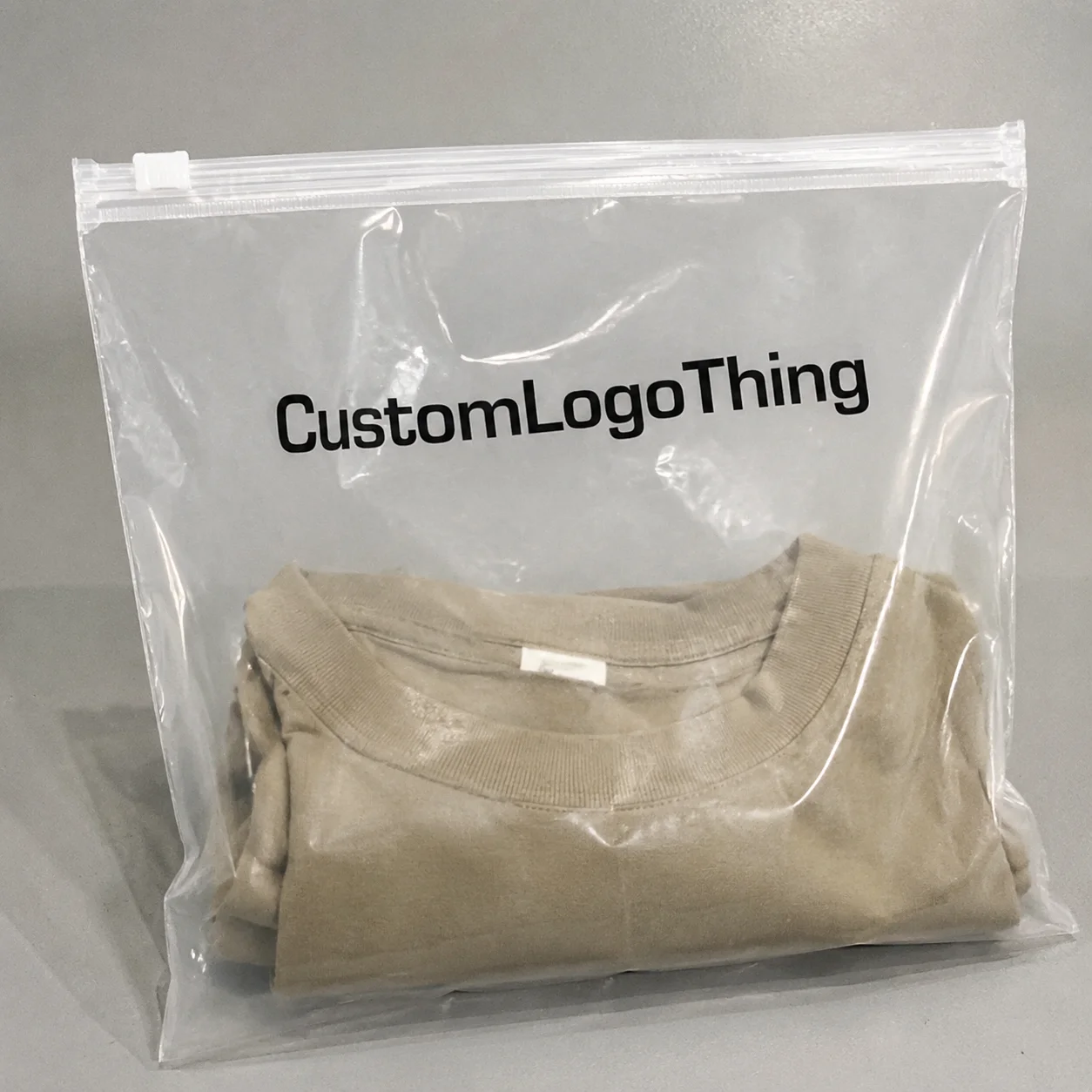
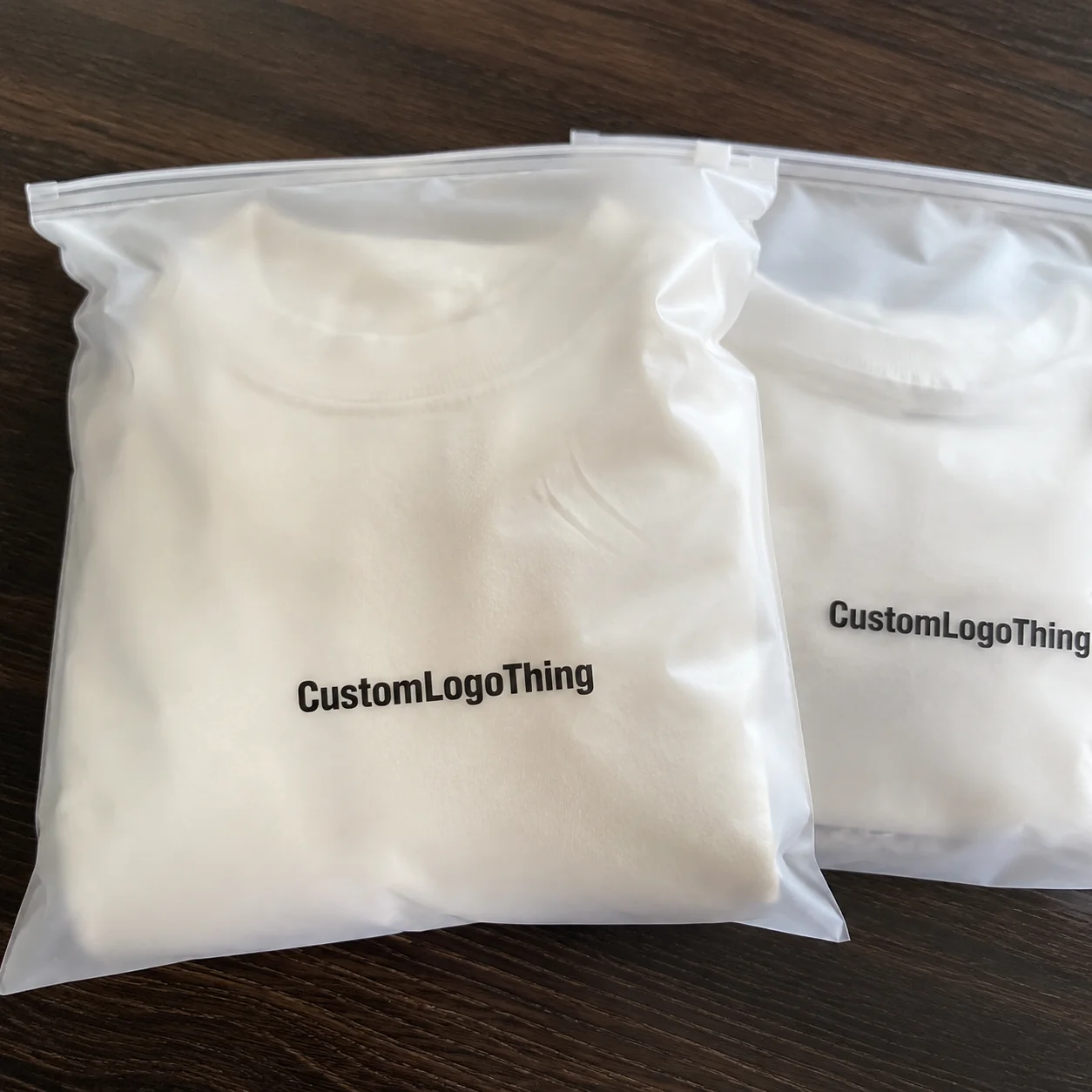
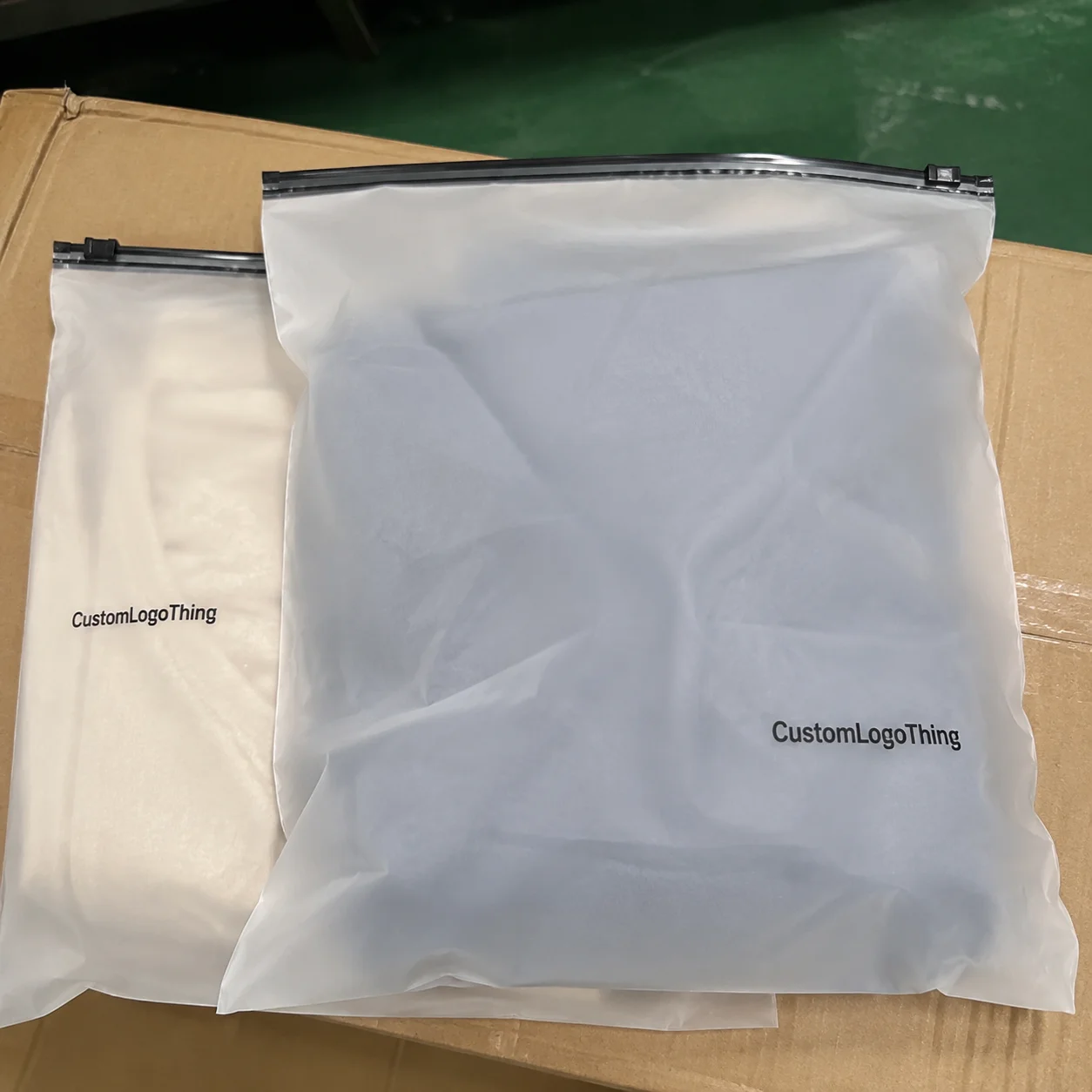
Wine retail packaging has a narrow job description, but it is not an easy one. A clear sleeve has to protect the bottle, keep the label visible, carry warning copy, and still look deliberate enough to support the shop’s pricing. That is the core of the wine shops OPP Header Bags warning label guide problem: the pack has to act like packaging and compliance at the same time, without looking improvised.
OPP works well here because it is light, clear, and stiff enough to hold a presentation shape without adding much bulk. The transparency matters. On a shelf full of similar bottles, customers read label design, closure style, and bottle silhouette very quickly. A cloudy bag or a heavy opaque wrap gets in the way of that first read. A clean header bag does the opposite. It frames the bottle, keeps the top area organized, and gives the warning label a defined place to live.
The warning label is where many orders go wrong. If it is too small, poorly placed, or printed in weak contrast, the bag loses both compliance value and retail polish. If it is attached to a film surface that rejects the adhesive, it starts lifting at the corners. If the layout tries to make the warning text disappear into the artwork, the pack becomes harder to read and more difficult to approve. That is not a design issue alone. It is a production issue.
A good wine pack does not ask the customer to search for the warning text or the product. It puts both in the right place and gets out of the way.
What OPP Header Bags Actually Do for Wine Shops
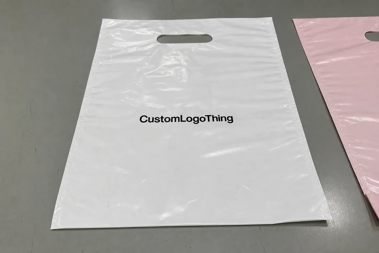
Opp Header Bags are practical retail packaging, not decorative extras. The oriented polypropylene film gives a mix of clarity, stiffness, and tear resistance that suits counter handling and short-term shelf display. The header area creates a natural zone for branding, product information, or warning copy. That combination matters for wine shops that need a clean presentation without moving into a rigid carton or a heavy printed box.
Clear film is a useful sales tool. It lets the bottle label remain visible, which is often the strongest merchandising cue in the package. Many customers decide on a bottle by looking at the varietal, the vintage, and the premium cues on the label itself. Hiding that information under opaque packaging makes the pack less useful, even if the surface graphics look attractive.
Warning labels change the design equation because they cannot be treated as a leftover block of text. They need a predictable location, enough margin around the copy, and enough contrast to stay legible under store lighting. If the label sits in a cramped or busy part of the layout, the pack starts reading like a compliance notice instead of a retail product.
What the pack needs to do well:
- Show the bottle clearly through the film.
- Hold warning copy in a readable, repeatable place.
- Stay presentable through handling, stacking, and checkout traffic.
- Support the shop’s price point instead of looking like a low-cost afterthought.
That last point matters more than buyers usually say out loud. A sleeve can be technically correct and still look cheap if the film finish, label placement, or header graphics are poorly balanced. Customers do not analyze why it feels off. They just notice that it does.
How the Bag and Warning Label System Works
The structure is straightforward. The bottle goes into the OPP sleeve, the header area carries the visible branding or product copy, and the warning label is placed where it can be read quickly. That sounds simple until the artwork, adhesive, and print method start working against each other. A label that looks fine on a proof can perform badly on glossy film. A layout that seems balanced on screen can become crowded once the bottle is inside.
There are three common production approaches. One is to print the warning text directly into the bag artwork. Another is to apply a separate adhesive label to a clear sleeve. The third is to combine a printed header with a secondary label for the legal copy. Each method has a different balance of flexibility, Cost, and Lead Time. The right choice depends on how often the copy changes and how many bottle formats the shop needs to support.
Printed warning text is tidy and efficient for a stable product line. Separate labels are more flexible when the warning wording changes by market or SKU. A hybrid build is often the most practical option for wine shops with multiple seasonal sets, because the base bag stays consistent while the variable text changes only where needed.
Readability is the real test. If a staff member can’t find the warning text at a glance, the customer probably can’t either. The copy should sit on a flat zone, not across a crease or a curve. It should have enough white space to breathe. And it should avoid competing with the bottle label for attention, because the bottle still has to feel like the main product.
Adhesive choice deserves more attention than many buyers give it. Some labels behave well on paper but curl on smooth polypropylene. Others hold at first, then lift once the pack is handled a few times or stored in warmer conditions. That is one reason physical samples matter. A proof can confirm artwork, but it cannot fully show how the adhesive, film finish, and bottle shape behave together.
For buyers managing several SKUs, one disciplined file system helps a lot. Keep the approved dieline, final warning copy, and image files together so future runs do not restart from scratch. That is where Custom Labels & Tags fit into the workflow cleanly, because the same structure can be reused for bottle sets, gift packs, and seasonal reorders without rebuilding the whole layout each time.
The wine shops opp header bags warning label guide approach works best when the label system is designed as part of the pack structure, not attached late in the process. That reduces mistakes, shortens proof cycles, and makes reorders far easier to manage.
Material, Size, and Label Placement Factors
Most wine-shop header bags use OPP film in the 30 to 50 micron range. Thinner film has a lighter feel and usually costs a little less, but it can seem too soft for bottles that are handled often. Thicker film improves stiffness and tear resistance, though it adds cost and can make the pack feel less airy on shelf. For a single-bottle retail presentation, 40 micron is a common middle point. For heavier glass, premium bottles, or gift formats, moving upward can be justified.
Size affects more than fit. It changes how the bottle sits, how much of the label stays visible, and whether the header looks balanced. A standard 750 ml bottle usually needs a different cut than a tall reserve bottle or a wider specialty format. If the bag is too narrow, the film wrinkles around the shoulder. If it is too loose, the presentation looks sloppy and the bottle can shift too much in the sleeve.
Label placement should be boring in the best way. Flat, centered, and easy to scan. Strong contrast helps more than elaborate graphics. A warning block that sits inside a narrow band or under a logo becomes harder to read and easier to overlook. If a compliance note matters, it needs more visual priority than decorative elements that can be moved anywhere.
Finish plays a part too. Glossy OPP gives a bright, clean look, but under strong retail lighting it can create glare that makes small text harder to read. A matte or satin finish on the printed header area can calm the design without hiding the bottle itself. That tends to work better than a high-gloss header trying to compete with the label under overhead lights.
Common format choices:
- Standard 750 ml sleeves for everyday wine-shop stock.
- Taller cuts for reserve bottles and specialty labels.
- Wider formats for duo packs or gift bundles.
- Custom dimensions for unusual bottles or limited releases.
For packaging that includes paperboard inserts or header cards, claims around recycled content or certification should be documented, not implied. If a buyer needs verified forest-material sourcing, third-party systems such as FSC are a much better reference point than vague sustainability language printed on the pack.
One practical rule holds across most projects: build around the label zone first, then adjust the artwork around it. If the bag shape is fixed and the warning text still has to fit, the remaining choices are easier to manage when the placement was planned from the start.
| Material / Format | Typical Spec | Best Use | Practical Tradeoff |
|---|---|---|---|
| Standard OPP sleeve | 30-35 micron | Light retail handling, low-cost reorders | Less stiffness |
| Premium OPP header bag | 40 micron | Most wine-shop presentations | Moderate cost increase |
| Heavier OPP format | 45-50 micron | Heavier bottles, gift packs | More cost, slightly less airy feel |
| Printed header plus label | Mixed build | Multi-SKU or market-specific copy | More production steps |
Pricing, MOQ, and Unit Cost Tradeoffs
Pricing is driven by four variables more than anything else: bag size, film thickness, print coverage, and whether the order is a stock format or a custom build. The warning label adds another cost layer depending on whether it is printed into the artwork, applied separately, or built into the header structure. Small runs cost more per unit because setup work is spread across fewer pieces. That is not a flaw in the quote. It is how the production model works.
For planning purposes, small custom runs of 500 to 1,000 pieces often land around $0.35 to $0.70 per unit, depending on the size and label complexity. At 3,000 to 5,000 pieces, many buyers see a simpler build move closer to $0.18 to $0.32 per unit. Heavier film, more colors, special finishes, or more intricate label work push the price upward. Anyone quoting a single number without specs is guessing, usually too optimistically.
MOQ changes the total spend more than the quote line often suggests. Lower minimums help with seasonal tests and new bottle launches, but the per-unit cost stays higher. Larger orders improve unit economics, but they also tie up cash and storage space. The right quantity is usually the one that will sell through before the next packaging refresh, not the one that looks best on a spreadsheet.
Freight, proofing, setup fees, and rush charges matter just as much as the unit price. A low quote that excludes those items can end up more expensive than a cleaner, slightly higher offer. The same is true of reprints caused by late artwork changes. Once production starts, revisions become expensive quickly.
Typical cost tiers:
- Stock OPP sleeve with simple label: $0.12-$0.24.
- Custom printed header bag: $0.18-$0.32.
- Custom bag plus separate warning label: $0.22-$0.40.
- Small-run fully custom format: $0.35-$0.70.
Those ranges are useful only if the specifications are clear. If the bottle dimensions are vague or the warning copy is unfinished, the quote will be rough and the schedule will move with every correction. Buyers get better pricing when the structure is already locked.
If a supplier can reference transit testing or handling expectations, that helps narrow risk on fragile presentations. Standards such as ISTA do not replace a real sample check, but they are a better production reference than assuming the bag will survive shipping because the art looks good.
The wine shops opp header bags warning label guide is easier to manage once total project cost is separated from unit price. A low-cost bag that needs rework, a second proof, and rushed freight is not a bargain. It is just a delayed bill.
Process and Lead Time: From Proof to Delivery
The production sequence is straightforward: request a quote, confirm dimensions, approve artwork, review the proof, run production, inspect the output, then ship. The process slows down when any one of those steps is incomplete. Packaging jobs usually do not fail because they are complicated. They fail because one piece of information is missing or changed after approval.
For a simple reorder using an approved format, lead times often land around 7 to 12 business days after proof approval, plus freight. Fully custom jobs with new dimensions, new warning copy, or special finishing often need 12 to 20 business days, and that can stretch further if the proof cycle is slow or the supplier is in a heavy production window. Rush requests help only if the job is already fully specified. If the files are incomplete, rush timing just raises the price.
Most delays are ordinary. Missing warning text. Low-resolution logos. Unclear bottle dimensions. Color changes after the proof is already circulated. Those issues stop production because the pack cannot be printed until the layout is final. The fastest jobs are the ones where the buyer sends complete specs at the start and then keeps the approval chain short.
There is a meaningful difference between artwork readiness and compliance readiness. A design can be visually finished and still be unfit for print if the warning wording is not final. If the legal text is still under review, keep the file in draft mode. Do not pretend it is ready just because the layout looks polished.
Reorders go smoother when the approved dieline, the final copy, and the last production notes are kept together. That avoids accidental changes and saves time on future runs. It also reduces the chance that someone “improves” the layout by moving the warning block or adjusting the type size without checking the impact on legibility.
For seasonal programs, send the full package in one go if possible: bottle size, artwork, quantity by SKU, delivery address, and final copy. Piecemeal changes force the production team to keep reopening the job, which is how a straightforward order turns into a small project with too many handoffs.
Quality Checks That Protect the Final Pack
Quality control on this kind of packaging does not need to be dramatic. It needs to be consistent. The first check is visual: does the bottle remain clearly visible, and does the warning copy Stand Out Without crowding the header? The second is tactile: does the film feel stiff enough to hold its shape, and does the adhesive stay put on the glossy surface? The third is handling: does the label stay flat after the pack is opened, closed, and moved a few times?
A useful sample test starts with a real bottle, not a dummy insert. Put the actual bottle in the sleeve and check how the shoulder, label area, and closure sit inside the format. Then look at it under the same kind of lighting used on the shop floor. A pack can look fine in a controlled office and still read badly under warm retail lights or reflective glass shelving.
Check the warning copy at a normal customer distance. If it needs effort to read, the layout needs adjustment. Check the corners of any applied label after a few minutes. If the adhesive starts to curl, the substrate or adhesive choice is wrong. Check the top seal or header area for clean edges, because rough finishing gives the whole pack a cheap feel.
For larger orders, ask whether the supplier inspects against a clear sample standard before shipment. That matters because one unstable unit in a sample run often points to a broader production issue. Small defects can be tolerable in proofing. They are much less tolerable once the order is packed and ready to ship.
One more practical point: if the bag is meant for gift retail, not just shelf display, make sure it survives customer handling. A gift item gets picked up, turned around, and examined more often than a standard stock bottle. That extra handling is usually where marginal film or weak labels show their weaknesses.
Common Mistakes That Create Compliance and Sales Problems
The most frequent problem is still the most basic one: warning text that is too small, too light, or pushed into a visually busy area. Pale gray copy on glossy clear film may look elegant in artwork review and still fail as a retail label. Small type under a logo block is another repeat issue. If the warning exists to be read, it needs enough contrast and enough space to work.
A second problem is mismatched presentation. One side of the pack looks premium, the other side reads like back-office paperwork. That happens when branding and compliance are handled as separate jobs by separate people. The result is a package that confuses the customer and weakens the shelf story.
Weak adhesive is another quiet failure point. Smooth polypropylene does not forgive poor label materials. If the adhesive is not suited to the film, corners start to lift, especially after warm storage or repeated handling. Once that happens, the bag looks used before it has sold once. It also makes the store look careless, even if the product itself is fine.
Overloading the header is a different kind of mistake. Buyers sometimes try to put too much information in the top area because it feels efficient. In practice, the pack becomes crowded and the bottle loses visual priority. The warning text should be visible, but it should not turn the bag into a notice board.
Quick sanity check before approval:
- Can the warning text be read at arm’s length?
- Does the label stay flat on the film?
- Does the bottle label remain visible?
- Does the pack still look premium under store lighting?
If two or more answers are no, the layout needs another pass. A small redesign at proof stage is far cheaper than a reprint after production.
This is where the wine shops opp header bags warning label guide mindset helps. The bag is not just a carrier. It is part of the selling surface. If the warning system works but the bottle gets hidden, or the bottle looks good but the warning fails, the pack still misses the mark.
What to Confirm Before You Request a Quote
Before asking for pricing, gather the core details. Bottle height. Shoulder width. Closure type. Desired bag size. Warning label text. Quantity by SKU. Print method. Delivery location. If any of those are uncertain, the quote will be loose and the revision cycle will start early. That is normal, but it is also avoidable.
The order of decisions matters. Lock the size first. Lock the warning copy second. Choose the print and finish third. If the size changes after the label is approved, the layout has to be reviewed again. That is why a tidy pre-quote checklist saves both time and money.
Request a sample or proof before full production, especially for new display programs, seasonal gift packs, or bottles that do not fit a standard format. A physical sample will reveal things a digital mockup cannot show: glare, stiffness, real spacing, and how the bottle actually sits in the sleeve. Screen previews are useful, but they are not enough on their own.
Compare suppliers on more than price. Look at whether the quote includes setup and proofing, how they handle revisions, whether they keep approved files for reorder use, and how fast they answer basic technical questions. A supplier that is clear early usually stays clear through the job. One that is vague at the quote stage usually stays vague later.
Pre-quote checklist:
- Confirm bottle dimensions and target bag size.
- Finalize the exact warning copy for the market.
- Decide whether branding lives on the film, the header, or both.
- Ask for a digital proof or sample before full production.
- Keep the approved art, dieline, and copy together for reorders.
If the shop runs recurring promotions, build one approved structure and reuse it. That reduces proof time, keeps warning copy consistent, and makes future orders easier to place. The real value of a disciplined wine shops opp header bags warning label guide process is not just compliance. It is fewer surprises, cleaner shelf presentation, and less wasted time on rework.
FAQ
What should wine shops put on OPP header bags warning labels?
Use the exact warning copy required for the market and product being sold. Keep the text readable at retail distance, with strong contrast and enough blank space around it. Final wording should be checked before production begins so the bag does not need a reprint.
How much do wine shop OPP header bags usually cost per unit?
Pricing depends on size, film thickness, print coverage, and order quantity. Smaller runs cost more per bag because setup is spread across fewer pieces. Standard formats with simpler printing usually come in lower than fully custom builds with special finishes or multiple label steps.
What affects lead time for custom header bags with warning labels?
Artwork readiness has the biggest impact because missing copy or low-resolution files stop production early. Proof approval is the next bottleneck, especially if the warning text still needs legal review. Once everything is approved, straightforward runs are usually faster than first-time custom jobs.
How do I choose the right size for wine shop header bags?
Measure the bottle height, shoulder width, and any label area that must remain visible. The bag should fit without stretching the header or wrinkling the warning area. A sample with the actual bottle is the best way to confirm fit before the full order is released.
Can I reorder the same warning label and artwork later?
Yes, if the approved files, dieline, and final copy are kept organized. Reorders move faster when the supplier can reuse the existing layout without rebuilding the package. If the law, product details, or bottle size change, treat the job as a new proof rather than reusing an old version blindly.