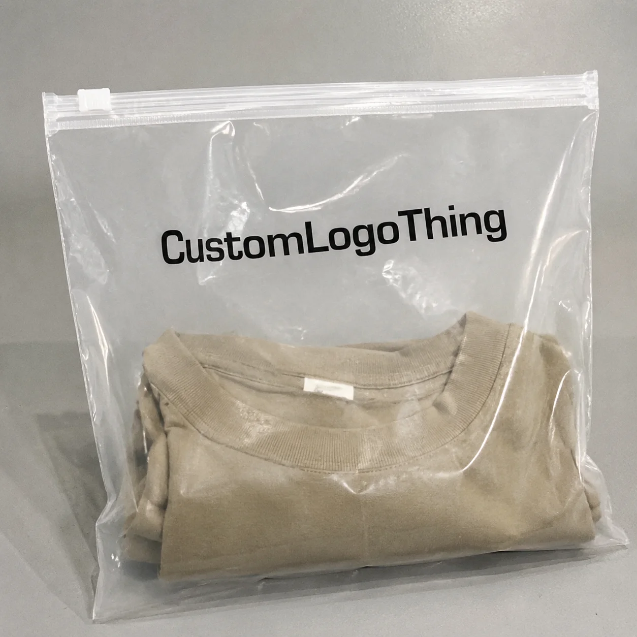
Private Label Buyer OPP Header Bags Logo Placement Guide
For a private label buyer, the Private Label Buyer OPP Header bags logo placement guide is not a branding preference. It is a production and shelf-readability decision. A logo can look polished in a flat artwork file and still fail on press because the hang hole, seal line, fold, or trim tolerance cuts into the visual field, which means the package loses clarity before the shopper ever picks it up.
That is why placement deserves as much attention as color, finish, or even the bag format itself. If the brand mark cannot be seen cleanly from the front, the package is not doing its job. It may still hold the product, but it will not help sell it. For a private label program, that is a costly miss because the packaging has to do more than contain inventory; it has to create recognition quickly and repeat that recognition across the line.
Why Logo Placement Decides Whether Header Bags Sell the Product
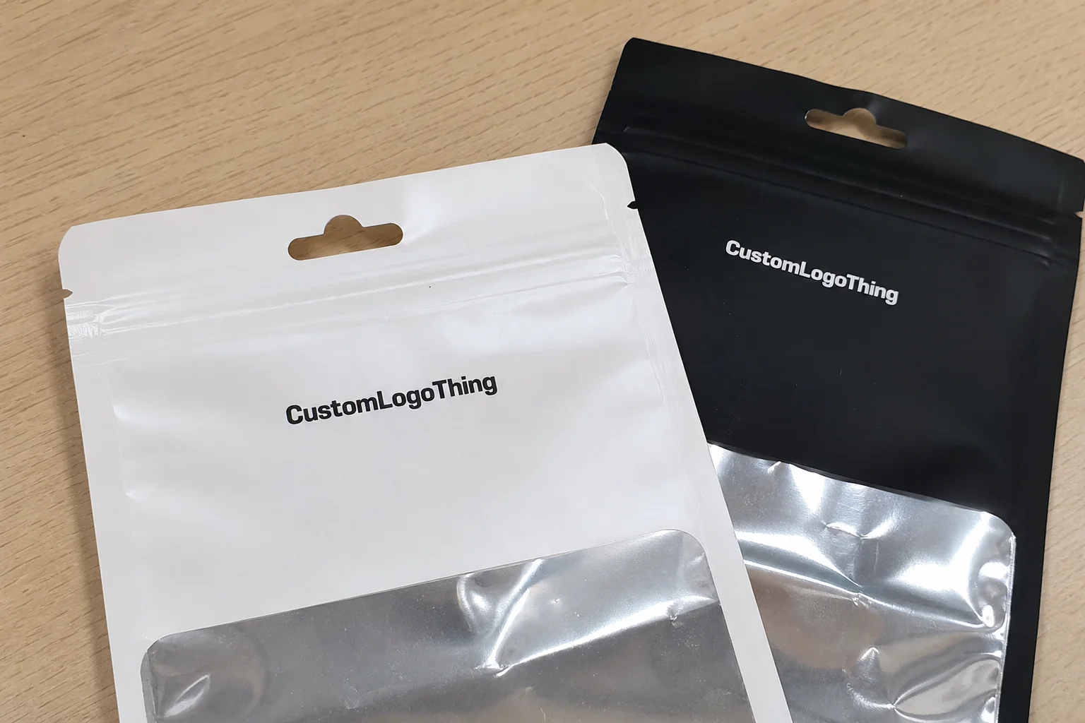
Header bags live or die by first glance. Retail buyers scan fast, distributors pack cases tightly, and consumers usually give a package only a second or two before moving on. A logo placed too high can disappear into the sealed header. Too low, and it competes with the product body or gets lost once the bag is filled and hung.
The top section of a header bag is not free space. It is a constrained zone with structural limits, and those limits affect how the artwork reads. The hang hole, heat seal, perforation, and edge tolerance all reduce usable area. If the artwork was built without those constraints in mind, the final print can feel awkward even when the press operator follows the file exactly.
Private label teams notice this sooner than most because the same bag style often carries multiple flavors, sizes, or seasonal versions. If the brand mark shifts around from one SKU to the next, the line looks less disciplined. Shoppers may not describe it that way, but they register the inconsistency. A uniform package system reads as intentional; a scattered one reads as rushed.
I see the same mistake repeatedly: teams approve a render and assume the production bag will mirror it. That assumption is expensive. A better approach is to treat placement as a structural decision, then build the design around the usable read zone. If the goal is shelf recognition, the logo has to sit where the eye lands first and where the bag construction is least likely to interfere.
One practical check helps more than any mockup alone: if the logo cannot be read cleanly when the bag is hung, flat, and half-reflective under store lighting, it is not in the right place.
For brands standardizing several package types, the logo should also work alongside labels and inserts without changing the visual hierarchy from one format to the next. If you are keeping typography and icon placement aligned across the line, Custom Labels & Tags can support that consistency.
Header Bag Construction, Print Areas, and Read Zones
To place artwork correctly, you need to understand the bag structure. A typical header bag has five key zones: the header panel, the bag body, the seal margin, the hang hole, and any gusset or reinforced edge. Each one changes how the logo reads, and each one can distort a design if the safe area is too tight.
The safe print zone is the area where artwork can sit without getting cut, sealed, creased, or punched. The no-print zone is the space that must stay clear. Most suppliers will provide a dieline, but not all dielines are equally useful. Some show only the outline. Better ones show seal margins, hole location, fold allowances, and the true finished size after conversion. Ask for that version before artwork is finalized.
As a practical working rule, I like to see at least 3 mm of clearance from any seal or cut line, and 5 mm is safer on narrow formats or jobs with tighter machine tolerance. That is not a universal standard, because different plants hold different tolerances, but it is a sensible cushion when you are placing a logo near the edge. If a supplier cannot explain the true no-print margin, that is a warning sign.
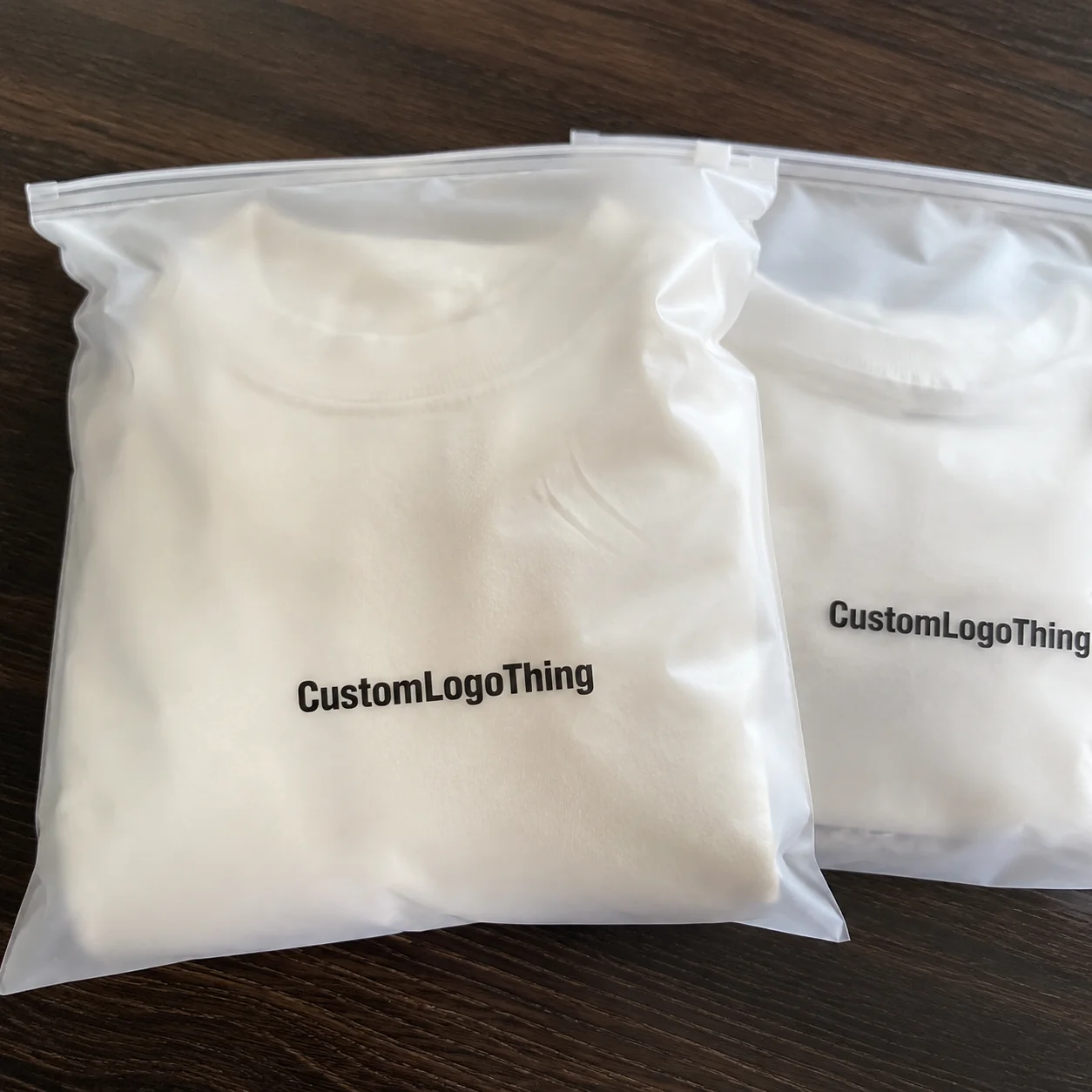
The film itself matters too. Clear OPP, frosted film, and opaque structures do not read the same way. A pale logo on clear film can vanish against a busy shelf or the color of the product inside. A dark mark on frosted film often reads better, but only if the contrast stays strong under overhead lighting. On narrow bags, decoration always comes second to legibility.
That is also where the buyer should challenge the proof. A correct vector file does not guarantee a correct finished bag. If the logo sits too close to the top edge on the proof, move it inward before production approval. Once plates or cylinders are made, even a small change can mean more time and more cost.
For buyers who need a general reference on packaging language and industry practice, the Institute of Packaging Professionals is a useful resource. It will not replace a vendor dieline, but it does help buyers and suppliers speak the same language when discussing tolerances, artwork, and package structure.
Logo Placement Rules for Front, Back, and Header Panels
The front panel is the primary brand surface. If the bag hangs on a peg or sits in a display tray, that is the first place the shopper will look. Put the core brand mark there whenever possible. If the logo is small, simplify the composition instead of shrinking everything into the top edge. More elements do not equal more clarity.
The header panel is useful, but it should not carry too much weight. Use it for a secondary mark, a short descriptor, or compliance text only when the spacing allows it. Once the header starts competing with the logo, the bag becomes harder to scan. Busy tops are common in private label because teams try to fit a logo, claim, flavor note, and regulatory text into one tight band.
Back panels deserve the same discipline. If you need a barcode, recycling note, lot code, or ingredient text, keep those items away from the primary brand mark. Barcode quiet zones matter. Text that crowds a barcode looks careless, and careless packaging rarely helps sell a private label line. If the back panel has to carry a lot of information, build that into the layout early instead of forcing it after the front panel is already approved.
Consistency across SKU families matters as much as the single bag design. If the size changes from 4 oz to 8 oz, the logo should still sit in the same relative position. That kind of consistency improves line recognition and reduces proof revisions. Buyers often miss this because they review one SKU at a time instead of the full range.
“The best placement is the one the shopper does not have to work to find.”
That sounds simple, but it is the point. Brand recall rises when the logo lands in the same place across every variant. The exact size may shift, but the visual anchor should stay fixed. For private label programs that run seasonally or across multiple flavors, that discipline matters more than an extra ink color.
If you are building a larger packaging family, keep the typography and icon spacing aligned across formats. A consistent logo lockup on the bag, label, and carton is easier to manage than a different layout for each item. That is one reason buyers often pair header bag work with custom label formats and coordinated tags.
There is also a production reality behind these rules. A logo that works on a wide pouch may not work on a narrow header bag because the viewing window is smaller and the usable height is tighter. If the artwork relies on generous white space, a compact format can make the entire design feel crowded. In that case, the right answer is usually not to force the logo larger, but to reduce supporting elements and keep the brand mark dominant.
Cost, Pricing, MOQ, and Quote Drivers
Pricing for header bags is driven by a small set of variables: size, film gauge, print color count, finish, seal style, and whether the job uses stock or custom tooling. Logo placement affects nearly all of them because tighter registration and more complex positioning raise the risk of waste. A design that looks simple can still be harder to produce if the artwork sits too close to structural boundaries.
For a simple one-color OPP header bag at 5,000 units, I often see pricing in the range of $0.18 to $0.28 per unit, depending on size and print coverage. Add multiple colors, metallic ink, or a larger printable area, and the range can move to $0.28 to $0.45 per unit or more. Custom structures, specialty finishes, and lower quantities can push it higher again.
MOQ usually follows the same pattern. A straightforward layout may be available at 3,000 to 5,000 units. Once the artwork needs tighter registration, extra print passes, or custom tooling, the minimum often rises to 8,000 or 10,000 units. That is not supplier overreach; it is press efficiency. Small runs absorb setup cost poorly, especially when the layout leaves little room for error.
Buyers should ask for a quote that clearly separates setup, material, print, freight, plates or cylinders, testing, and sample fees. If those items are bundled into one number, you cannot compare offers cleanly. Two quotes can look similar while hiding very different assumptions about placement tolerances, make-ready time, and waste allowance.
| Option | Typical Unit Cost | MOQ | Placement Risk | Best Fit |
|---|---|---|---|---|
| One-color stock OPP bag | $0.18-$0.28 | 3,000-5,000 | Low | Simple private label lines with clear front-panel branding |
| Multi-color printed bag | $0.28-$0.45 | 5,000-10,000 | Medium | Brands that need stronger shelf contrast or flavor differentiation |
| Custom structure or specialty finish | $0.40-$0.70+ | 8,000+ | Higher | Premium programs where appearance and tactile feel justify the spend |
Placement choices can raise cost even when the art looks simple. A larger logo that crosses more of the printable area may force a tighter tolerance window. More white space can be cheaper than more ink if it reduces registration problems. Buyers usually understand this after the first sampling round, but it is better to model it before ordering.
For packaging that includes paperboard components or inserts, ask about FSC chain-of-custody options. The Forest Stewardship Council is the standard reference if sustainability claims need to be backed by a recognized certification pathway. That does not change logo placement, but it can affect the overall package Spec and Quote.
Process and Lead Time: From Artwork to Production
The smoothest projects follow a predictable sequence: intake, specs review, dieline setup, artwork placement, proofing, sample signoff, then production release. Miss one step and the schedule slips. The most common delay is not manufacturing capacity; it is late artwork changes after proof approval.
Once a buyer says “approved,” the plant usually moves fast. If the logo needs to shift after that point, the job may need a new proof, new film output, or revised plates. That adds time and sometimes cost. For standard runs, a realistic lead time is often 12 to 15 business days after proof approval. Custom structures or larger print jobs can move into the 18 to 25 business day range, especially if sampling is needed first.
Rushed jobs narrow the margin for error. If you need a faster turn, keep the artwork simple and submit final files the first time. A clear vector logo, a locked SKU count, and confirmed dimensions can save days. The supplier should not have to chase basic information.
Here is the buyer checklist that speeds things up:
- Final logo files in vector format.
- Exact product dimensions and fill volume.
- Target quantity and acceptable MOQ.
- Ship-to address and distribution timing.
- Retail or marketplace packaging constraints.
- Any required barcode, claim, or compliance text.
For transport or distribution tests, some buyers also ask whether the finished pack should be reviewed against ISTA testing expectations. That matters more for shipped cartons than for the bag itself, but a packaging system should be judged as a whole. A clean logo position means little if the pack fails in transit or arrives scuffed, bent, or unreadable.
From a practical standpoint, the fastest way to avoid churn is to approve the placement on a line proof, not just on a flat art file. The proof should show the hang hole, the seal line, the safe print area, and the final logo position relative to each one. If you cannot see all four, you are approving blind.
That is the real purpose of the Private Label Buyer OPP Header bags logo placement guide: it turns a branding choice into a controlled production decision with fewer surprises.
Quality Checks and Common Placement Mistakes to Avoid
Most placement mistakes are preventable. The usual offenders are simple: the logo sits too close to the seal, the text drifts into the fold, the barcode collides with branding, or the type is too small to read through plastic glare. None of those errors are exotic. They happen because the team approved artwork on screen instead of checking it on a printed sample.
Inspect samples under retail conditions if possible. That means bright overhead light, movement, and a few feet of viewing distance. Plastic reflectivity changes everything. A mark that looks crisp on a monitor can disappear when the bag catches glare. If a shopper has to tilt the pack to read the brand, the placement is wrong.
Do not overlook legibility. Fine type under 6 pt can become weak on glossy film, especially if the ink coverage is light. On dark films, reverse type can close up. On clear films, contrast against the product inside can change from SKU to SKU. The same artwork may behave differently on different fills, which is why sample testing matters.
A simple approval standard works well:
- The logo is centered in the intended viewing area.
- The mark is readable from normal shelf distance.
- No key element touches the seal, hole, or fold.
- The layout stays consistent across all size variants.
- The sample matches the quoted material and finish.
For compliance-heavy programs, make sure the bag can carry the required product information without burying the brand. If the package needs ingredient copy, lot coding, or recycling guidance, those elements should be planned into the layout early. Retrofits are where mistakes happen, and they are rarely cheap to fix once the run is underway.
I would rather see a clean, conservative layout than a crowded one that tries to do too much. A well-placed logo and a clear support panel usually outperform a busy design that looks clever on a mockup and confusing on a shelf.
Another quality-control step worth adding is a side-by-side comparison of the first sample against the approved dieline. That catches small shifts that are easy to miss in isolation, such as a mark moving 2 to 4 mm higher than intended or a line of text creeping closer to the seal than the proof suggested. Those differences sound minor until the bag is hanging in a retail environment and the top edge disappears into hardware or glare.
Next Steps to Order the Right Header Bag Configuration
Before you request a quote, gather the facts the supplier actually needs: dimensions, quantity, target launch date, logo files, retail requirements, and any claims or copy that must appear on pack. If those details are incomplete, the estimate will be weak and the placement conversation will drag.
Ask for an annotated line proof. That proof should show the hang hole, seal line, safe print area, and the exact logo position. If the vendor cannot annotate it clearly, ask them to revise it. The point is to remove guesswork before production starts.
Then lock the placement, approve the sample, confirm MOQ, and release the order only after the proof is signed off. That sequence sounds basic because it is basic. It also prevents most of the problems that inflate cost, extend lead time, and trigger avoidable reprints.
For private label teams, the right header bag is not just a container. It is a visibility asset, a production spec, and a shelf signal all at once. Use the private label buyer OPP Header Bags logo placement guide to keep those three things aligned before you place the order.
If you are comparing multiple formats or planning a broader rollout, keep the decision rooted in what the bag has to do on shelf and on the line. The cleanest design is usually the one that respects the structure first and decorates second. That is especially true with OPP header bags, where a few millimeters can be the difference between a package that reads instantly and one that looks crowded before it ever reaches the customer.
Where should the logo go on private label buyer opp header bags?
Place the primary brand mark on the front panel where it stays visible after hanging, shipping, and retail display. Keep it clear of the seal and hang hole, and use the header area for secondary information only if it does not crowd the main mark.
How does logo placement affect pricing and MOQ?
Tighter placement tolerances, extra print colors, and custom tooling can increase setup costs and usually push MOQ higher. A simple one-color layout typically prices better than a multi-panel design because registration and waste are lower.
What is the safest print zone for a header bag logo?
The safest zone is the area that stays clear of the seal, perforation, and hang hole after the bag is finished. Your vendor should provide a dieline or annotated proof that shows the no-print margins clearly. If the logo touches a boundary line in the proof, move it inward before approval.
How long does production usually take after artwork approval?
Lead time depends on tooling, print count, sample approval, and current factory load, so it should be treated as a range. Standard projects often move in 12 to 15 business days after proof approval, while custom jobs can run longer if revisions are needed.
What should I check on the final sample before placing a full order?
Check logo position, readability, color consistency, and whether the artwork stays clear of the seal and hang hole. Confirm that the sample matches the quoted material, size, and MOQ, then request a placement adjustment if the layout looks crowded or off-center.