If you’ve ordered zazzle custom tote bags for an event, a shop launch, or a giveaway, you already know the odd truth about totes: they rarely stay “just a tote.” They become a grocery bag, a laptop carrier, a lunch bag, a conference handout sack, and sometimes the only branded item that keeps getting reused. That is why material, print quality, and layout matter more than first-time buyers usually expect.
From a packaging standpoint, a tote is a moving surface. It carries a brand through offices, classrooms, train stations, retail aisles, and hotel lobbies. That repeated exposure can outlast a flyer, a sticker, or a folded insert by months. It can also work against you. A weak design or thin fabric makes the item feel disposable the moment it leaves the box.
Zazzle custom tote bags: what they are and why shoppers use them
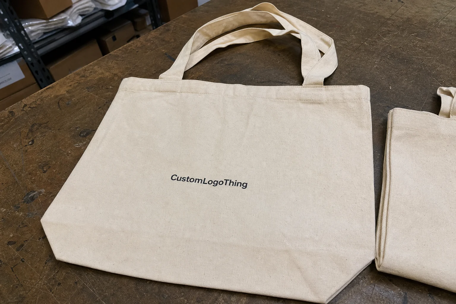
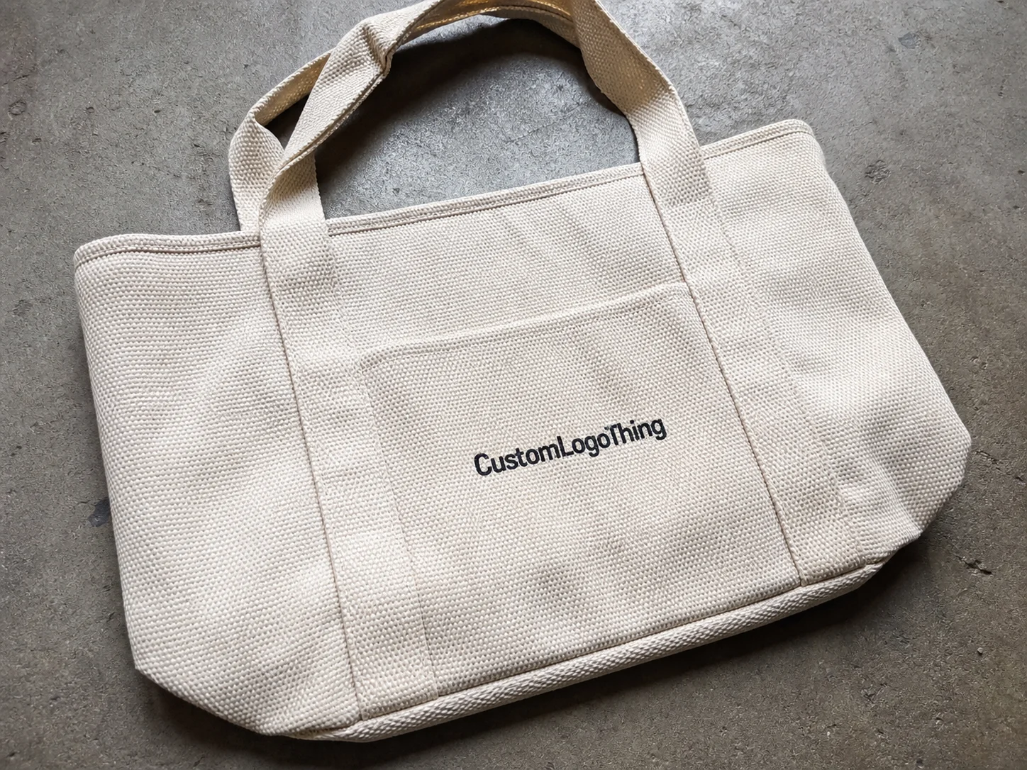
At a practical level, zazzle custom tote bags are personalized carry bags built around uploaded artwork, added text, and a set of product choices such as size, fabric style, color, and handle type. Most buyers start from a template, then swap in a logo, campaign message, illustration, or retail graphic. The appeal is simple: you can test a design quickly, see a mockup before paying, and avoid committing to a large production run.
That preview step is not a formality. A tote has a big print field, but not every artwork uses that space well. Dense copy often looks impressive on a screen and cluttered in real life. A clear logo, a short phrase, and enough negative space usually age better. Bags move. People hold them at angles, fold them into car trunks, and sling them over shoulders. Designs need to survive all of that, not just the checkout page.
Small brands, nonprofits, event planners, and independent sellers tend to like the low-friction ordering model because it removes a lot of the back-and-forth normally tied to custom merchandise. There is no need to issue a formal quote for every adjustment. You edit, preview, and order. That convenience matters, especially when the tote is part of a broader branding set that may also include inserts, labels, or custom printed boxes.
“A tote gets judged twice: once on the screen, then again in public. If the design only works in one place, it is not finished.”
Material and Print method change the result more than many buyers realize. The same logo can look sharp on a structured canvas-style tote and flat on a lighter bag. One reads as a considered branded item. The other reads as a cheap giveaway. That difference is not just aesthetic. It affects how often the bag gets used, which is the real measure of value for a reusable product.
How the customization and checkout process works
The ordering flow is usually straightforward: choose a tote style, upload or edit artwork, preview the layout, set the quantity, then review shipping and checkout. The easy part is the sequence. The harder part is making sure the file is actually ready for print.
Buyers who rush the upload stage often pay for it later. The common failures are familiar: fuzzy text, a logo that sits too close to the edge, artwork that looks balanced on-screen but cramped on the bag, or a color that is more muted in print than expected. Mockups help, but they are not a guarantee. They show placement and proportion. They do not fully predict how fabric texture, ink coverage, and bag color will behave together.
Text size deserves more attention than it gets. A sentence that reads clearly on a laptop can become too small once it is printed across a tote panel and seen from several feet away. Thin lines and low-resolution images fail for the same reason. For raster artwork, 300 dpi at final print size is a sensible baseline. Vector files are better for logos and simple graphics because they scale cleanly.
The editing tools should be used with discipline. Align the logo carefully. Test font sizes in context. Respect bleed and safe-zone guides if the platform shows them. Those margins are there because a design that hugs the edge often feels off-center in hand, even if the digital preview looks fine.
That last check can save real money. Fewer revisions mean less delay and a lower chance of receiving a technically correct order that still looks wrong. For buyers comparing branded packaging and promotional items, control at the proof stage matters almost as much as the bag itself.
Materials, print quality, and design factors that change the result
Material choice affects nearly everything. Cotton totes feel familiar and soft, but they can drape loosely depending on weight. Canvas-style bags usually hold their shape better and read as more premium. Lightweight reusable bags are easier to pack and ship, yet they may not project the same value when handed out at a retail counter or trade show.
There is no universal best option. The right bag depends on use case. A high-volume giveaway can work well with a lighter tote if the artwork is clean and the budget is tight. A client gift or retail add-on benefits from a heavier fabric, sturdier stitching, and a bag that looks good sitting on a desk instead of in a pile of event leftovers.
Print quality comes down to contrast, surface texture, and design complexity. Bold artwork usually reproduces better than subtle gradients. Photo-heavy layouts can work, but they need more careful color handling. Fine type and thin line work need a second look, because what looks elegant on a screen can disappear at arm’s length. A tote is not examined under studio lighting. It is seen in motion, in daylight, and often by people who have only a second to register the message.
Durability lives in the small things. Check the stitching at the handles, the way the side seams are finished, and whether the bag is built for repeated carrying rather than one-time distribution. If the tote will be reused often, washability matters too. Buyers do not need a lab report, but basic performance standards are worth understanding. ASTM material tests and ISTA distribution guidance are useful references when an order has more riding on it than a casual promo run. The ISTA resources are a practical starting point for packaging and transit thinking.
Design placement is another place where good orders separate from mediocre ones. A logo positioned too high can feel top-heavy. Too low, and it competes with the fold at the bottom. Long copy is risky. Short statements usually print cleaner, read faster, and feel more intentional. That is one reason the best tote designs are often simpler than the buyer first imagined.
Here is the usual trade-off in plain terms:
| Bag type | Typical feel | Best use | Common watchout |
|---|---|---|---|
| Lightweight reusable bag | Soft, flexible | High-volume giveaways | Can feel less premium |
| Cotton tote | Casual, familiar | Events, merch, everyday carry | Wrinkles and drape can affect layout |
| Canvas-style tote | Structured, sturdy | Retail packaging, client gifts | Usually costs more per unit |
Cost, pricing, and unit cost: what drives the total
Pricing for zazzle custom tote bags usually comes down to four variables: material, print complexity, quantity, and shipping speed. The pattern is predictable. Better material costs more. More complicated artwork costs more. Faster delivery costs more. Quantity often lowers the unit price, even if the total order size increases.
That last point matters. A 25-piece order can feel expensive on a per-bag basis because the fixed production and setup costs are spread across fewer units. A 250-piece order can look much better per unit, even though the total spend is higher. That is normal across promotional merchandise and branded packaging.
For small orders, custom totes often land in the low teens to the mid-twenties per bag before shipping, depending on material and print method. Larger quantities usually improve the unit economics. Premium fabric, heavier construction, and more elaborate artwork can push costs higher. That is not always a problem. If the bag is meant to function as a client gift, a retail launch piece, or a branded product, appearance and durability may matter more than chasing the cheapest option.
Watch the indirect costs too. They are small on paper and annoying in practice.
- Sample orders if you want to verify fabric feel and print quality before a larger purchase.
- Expedited shipping when the event date is fixed and non-negotiable.
- Revision cycles when the design still needs resizing or cleanup.
- Artwork prep if the original file needs conversion, cropping, or resolution fixes.
The cleanest way to judge value is to think in cost per impression rather than cost per item. A tote that gets used fifty times can outperform a cheaper item that is tossed after one event. That logic is the same one used in retail packaging and package branding. The object matters, but the number of times it is seen matters more.
If you are comparing totes with other branded packaging choices, weigh how each item fits the customer journey. A tote can function as a purchase carrier, a gift wrap substitute, a conference handout, or a post-purchase reminder. It is not just merchandise. It is part of the experience around the product.
Process, timeline, and lead time: how long ordering usually takes
The production timeline usually includes five stages: artwork upload, proof review, approval, production, and transit. That sounds tidy. In practice, the proof stage is where schedules slip. If the design needs resizing, type cleanup, or image correction, the clock keeps running while the file is being fixed.
Lead time depends on quantity, artwork complexity, and shipping choice. Rush shipping can shorten transit, but it does not erase production bottlenecks. If the bags need to be printed, packed, and routed during a busy period, the only real fix is to place the order early enough to absorb normal delays.
A useful rule is to simplify the artwork when the deadline is tight. One logo, one short line of copy, one strong color scheme. That is easier to approve and less likely to trigger proof revisions. It also reduces the chance of a bag that looks overworked once printed.
For event-driven orders, work backward from the date and leave room for one round of proof corrections. A practical schedule often looks like this:
- Day 1: upload art and select the tote style.
- Day 2-3: review the proof and make final edits.
- Day 4-7: production, depending on quantity and complexity.
- Day 8+: shipping buffer, which should not be treated as optional.
That timeline is not universal. Larger orders, holiday periods, and supply constraints can stretch it. The safe approach is simple: do not make the shipping date the only thing standing between the tote and the event table. If the bags are tied to a launch, a trade show, or a seasonal retail drop, an extra day or two can prevent a lot of unnecessary pressure.
Common mistakes buyers make with custom tote orders
The biggest mistake is designing for the screen instead of the street. A tote is viewed in motion, from a distance, and often in poor lighting. If the message only works in a polished mockup, it is not finished.
Ignoring the actual print area is close behind. A logo that seems well balanced on a laptop preview can look too small on a large tote panel or too cramped on a compact one. Bag dimensions matter as much as the design itself, and they should be checked together.
Low-resolution artwork still causes problems. Files pulled from social media, compressed logos, and tiny source images can print poorly no matter how nice they look on the screen. Fonts can also break down if they are not handled properly during production. Converting type to outlines and using production-ready files lowers the odds of substitution or distortion.
Timing mistakes are avoidable, which is why they are so frustrating. Ordering too late for a seasonal campaign or trade show can turn a useful branded item into an expensive exercise in stress. Color contrast is another easy miss. A logo that blends into the tote fabric may technically print correctly and still fail as a branding tool.
- Designing with too much detail.
- Forgetting to check the actual print area.
- Uploading low-resolution or poorly cropped art.
- Assuming the preview equals the finished bag.
- Leaving no buffer before the needed date.
Most of these mistakes come from treating tote bags like a minor purchase. They are not minor if they carry a brand into public view. A tote can do real work inside a packaging program, especially when it supports broader package branding across a campaign.
Expert tips for getting better value and better-looking bags
Start with one clear idea. A tote is not a brochure. It has limited space, and clutter weakens the result. One logo, one message, or one visual concept usually performs better than a pile of taglines, URLs, and decorative elements fighting for attention.
Use contrast aggressively. Dark-on-light and light-on-dark tend to print more clearly. If the bag is natural, cream, or off-white, test whether the logo needs an outline or darker fill to stay legible. That kind of adjustment is small, but it can change the perceived quality immediately.
If the tote is meant to represent a premium brand, a retail launch, or a client gift, order a sample first if the platform and budget allow it. A sample reveals things the mockup cannot: fabric hand-feel, handle comfort, ink coverage, stitching quality, and how the bag sits once filled. Those details matter more than people admit before the box arrives.
Think about reuse, not just distribution. A tote that people want to carry in public functions like a moving ad with a longer lifespan than most print items. That is the quiet advantage of this category. The item keeps working after the event is over. If the bag is attractive, durable, and easy to carry, the branding keeps paying rent.
Before approving the order, run one final check.
- Spelling is correct.
- Artwork is centered and scaled properly.
- Color contrast works on the chosen bag color.
- The shipping address is correct.
- The delivery window fits the event date.
That review is not glamorous. It catches expensive mistakes.
For buyers comparing tote bags with other branded packaging options, the best choice is usually the one that balances visibility, durability, and fit with the customer experience. A well-made tote can be a practical part of a merchandise or packaging program, and it can outperform cheaper items that disappear after one use. That is the real value behind zazzle Custom Tote Bags: not just the print, but the repeat exposure that comes from something people actually keep.
The most useful question is not “Does it look good in the mockup?” Ask whether it will print cleanly, hold up in daily use, and still represent the brand after the first day. If the answer is yes, the tote has a purpose beyond the initial unboxing. It becomes part of the customer’s routine, and that is where the impression count starts to separate from the purchase price.
What should I check before ordering zazzle custom tote bags?
Confirm the bag size, material, and print area match the design. Review image resolution, spelling, and contrast. Check shipping timing if the totes are tied to a specific event or launch.
Are custom tote bags from Zazzle better for gifts or promotions?
They can work for both. Gifts usually benefit from better fabric feel and stronger visual polish. Promotions lean more on readability, durability, and unit cost.
Why does the printed design sometimes look different from the preview?
Screens often display color more brightly than fabric printing does. Material texture, bag color, and very small text can change the final appearance. Fine lines may also soften in print.
How can I reduce the cost of custom tote bags?
Simplify the artwork, since complex layouts usually cost more to produce. Increase quantity if your use case allows it, because unit cost often drops as volume rises. Avoid rush shipping if the timeline is flexible.
What is the smartest timeline for ordering custom tote bags before an event?
Allow time for design review, proof approval, production, and shipping. Build in a buffer for at least one correction cycle. The safest plan is to order early enough that delays do not become the main risk.