If you need an acrylic Beanies Logo Placement guide, the real issue is usually not the artwork file. It is the placement choice that looks neat on a mockup and then shifts once the knit stretches, folds, and sits on a real head. A logo can be technically correct and still look wrong. That is where a lot of bulk orders lose time, money, and confidence.
Placement is not a styling detail. It controls visibility, comfort, decoration method, and how expensive the beanie becomes to produce. For buyers, the job is to find the spot that fits the hat, the logo, and the budget without creating avoidable revisions. That means thinking like a production team, not just a designer.
Acrylic Beanies Logo Placement Guide: What Actually Works
Acrylic beanies are simple in theory and annoyingly specific in practice. The knit stretches, the crown curves, and the front panel never behaves like a flat screen. So this acrylic Beanies Logo Placement guide starts with a practical rule: the best placement is the one that still looks intentional after the hat is worn, pulled, folded, and photographed.
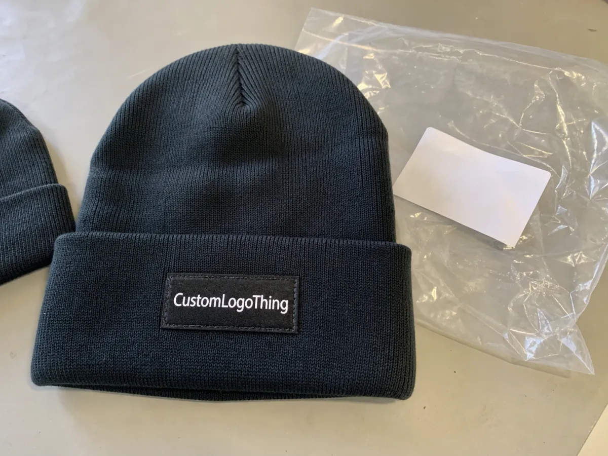
The main placement options are front cuff, front body, side hit, back center, woven label, and patch. Each one changes the visual weight of the beanie. A cuff gives the cleanest surface and the most stable decoration zone. A body placement feels looser and more casual, but it is easier to distort. A woven label reads as subtle and controlled. A patch gives more edge definition and usually handles detail better than direct stitching.
Acrylic knit does not forgive weak artwork. Small text can sink into the texture. Thin lines can disappear. Low-contrast colors can look fine in a file and nearly vanish outdoors. If the logo is already simple, you have room to experiment. If it includes a crest, a two-line slogan, or script that depends on fine spacing, the placement and method matter far more than most buyers expect.
If the logo only looks good on a flat screen, it is not ready for production.
The smartest use of an acrylic beanies logo placement guide is to match the position to the business goal. Strong retail visibility usually points to the front cuff or center front. A more restrained, premium look often works better as a side hit or a small woven label. If the goal is a bolder merch item, a patch tends to hold shape better than direct embroidery.
Do not place the logo where it happens to fit. Place it where the hat can carry it.
How Placement Affects Visibility, Wear, and Stitch Quality
Placement changes more than appearance. It changes how the decoration wears, how far away it can be read, and whether the beanie feels deliberate or improvised. A front cuff is usually the most stable zone because the fabric is often doubled and flatter. That is one reason front center embroidery remains the default for many bulk orders. It reads quickly, photographs well, and gives the stitch less fabric movement to fight.
A slouchy or looser-knit body behaves differently. The surface shifts, especially when the beanie is worn low or pushed back. Put stitched artwork there and you may see slight tilt, compression, or a pull line around the logo. That does not make body placement a bad choice. It means the artwork has to be simpler, larger, and less dependent on tiny detail.
Buyers usually end up choosing between two priorities: subtle branding or instant recognition. A small side placement can look polished and expensive. It also stays out of the way of facial framing in photos. A front-center logo, though, wins for distance visibility, event photography, and shelf impact. If the beanie needs to communicate the brand fast, the front is still the safest answer.
| Decoration Method | Best Placement | Typical Use | Approx. Bulk Price Per Unit |
|---|---|---|---|
| Direct embroidery | Front cuff, small side hit | Simple logos, clean branding | $0.45-$1.10 |
| Woven patch | Front cuff, body, side | Sharper detail, small type, premium look | $0.55-$1.35 |
| Rubber patch | Front cuff, center front | High contrast, durable retail merch | $0.75-$1.60 |
| Sewn label | Side or lower front | Subtle branding, low visual weight | $0.18-$0.45 |
Those figures are rough bulk ranges, usually for runs between 300 and 5,000 pieces. They move with logo size, stitch density, patch construction, and whether the art needs digitizing or cleanup. Direct embroidery is often the simplest route. Patches buy you more shape control and stronger detail retention.
One useful rule keeps showing up in production: the farther the logo sits from the flattest part of the beanie, the more the decoration method has to compensate. Embroidery looks great on a cuff. On a softer body panel, a patch or woven label often gives a cleaner result because it depends less on the knit underneath.
Readable branding usually means avoiding tiny elements unless the decoration method can support them. If a logo needs to be read from five to ten feet away, the lettering cannot be so small that the knit texture eats half of it. That is a common failure point. It is also one of the easiest to prevent.
Key Fit Factors That Decide the Best Spot
The beanie itself decides more than people think. Cuff height changes the usable decoration zone. Crown depth changes where the hat sits on a head. Stitch density changes how much the fabric gives under tension. Skip those basics and the logo can land a few millimeters off, which is enough to make it look too high, too low, or strangely compressed.
Construction is the first filter. A tall cuff gives more vertical room for a center-front mark. A shallow cuff may force the artwork lower than expected. A tighter acrylic knit can hold detail better than a very soft, loose knit, but even a dense knit still moves. That is why a flat artwork file never tells the whole story.
Artwork complexity changes the choice fast. A bold icon and one short word are easy. A stacked slogan with a thin script line is not. The more fine detail the logo has, the more likely you are to need a larger size, a patch, or a less ambitious placement. A design can be forced onto a beanie. The result often looks like it lost a fight with the fabric.
Use case matters too. Retail merch usually needs stronger shelf impact and cleaner center placement. Employee uniforms often do better with modest front branding that photographs neatly and does not dominate the outfit. Event giveaways can handle smaller placements if the main goal is distribution and cost control. Resale pieces often benefit from a patch, because buyers usually read that as more finished and less promotional.
Color contrast is not optional. A dark gray logo on a charcoal beanie can disappear even if the placement is perfect. A lighter thread, a high-contrast patch border, or a woven label with cleaner edges can fix that. Placement is one part of the answer. Contrast is the other half.
- Simple logo: front cuff embroidery usually works well.
- Detailed logo: woven or rubber patch usually holds detail better.
- Low-profile branding: side placement or sewn label feels quieter.
- Retail visibility: center-front placement usually reads fastest.
That is why a good acrylic beanies logo placement guide starts with the product, not the artwork. The beanie defines the space. The artwork defines how much of that space you actually need.
Acrylic Beanies Cost, MOQ, and Quote Factors
Pricing changes quickly once placement enters the conversation. The biggest drivers are decoration method, logo size, color count, digitizing, and whether you need a special patch or a second decoration location. A small front embroidery is usually the least complicated route. Add a second hit on the side, and the price climbs. Switch to a custom rubber patch, and you are paying for tooling, setup, and a more involved finish.
MOQ matters because it affects the per-unit cost. A supplier may price 500 or 1,000 pieces much better than 100, even if the product is identical. That does not mean small runs are impossible. It means you may need to choose a simpler placement or decoration method to stay on budget. Fancy artwork is expensive. The market rarely softens that blow.
For budgeting, the rough hierarchy usually looks like this:
- Front-center embroidery: the easiest to quote, with modest setup and solid visibility.
- Side placement: often similar cost, but the smaller footprint can limit logo size.
- Patch application: higher unit cost, but better for detail and stronger contrast.
- Multiple placements: the fastest way to add cost and approval time.
When requesting a quote, ask for the same details every time or the numbers will be hard to compare. Request the decoration area in inches or millimeters, setup or digitizing fees, sample cost, production lead time, and whether shipping is included. If a quote only gives a unit price with no detail, you are not comparing options. You are comparing guesses.
Packaging matters too. If the beanies will ship folded in retail sleeves or packed in cartons, ask how the items are packed and whether the decoration is protected during transit. If cartons will move through rough distribution, standards from organizations like ISTA are worth a look. If you are adding hang tags or insert cards, FSC paper is often the cleaner choice for brands that care about chain-of-custody claims.
A fair quote should make the tradeoff obvious: a front cuff logo might cost less than a complex patch, but the patch may save you from repeated proofing and unreadable detail. Cheapest is not the same as best value. Buyers learn that quickly, usually after seeing the sample.
Process, Lead Time, and Turnaround From Proof to Delivery
The production sequence is usually consistent: artwork review, placement proof, sample approval, bulk production, finishing, inspection, and delivery. The weak point is almost always the proof stage. That is where you catch a logo that sits too high, a patch that feels too wide, or type that becomes unreadable once it is scaled down.
Typical lead time for bulk acrylic beanies with decoration is often around 12 to 20 business days after proof approval, depending on order size and method. Rush jobs can shorten that window, but the tradeoff is obvious: less room for color matching, fewer placement revisions, and less tolerance for complex decoration. If a timeline sounds unusually fast and no caveats are mentioned, someone is probably planning to skip the parts that catch problems.
Delays usually happen in the same places. Artwork arrives in a file that needs cleanup. The initial logo scale looks fine on a screen but not on the hat. Or the buyer asks for two more placement options after the proof already moved forward. None of that is unusual. It just adds days.
Sample timing deserves more attention than it usually gets. A photo proof catches a lot, but a physical sample is better when the logo is small, the beanie is slouchy, or the placement is central to the brand. A $40 sample can save a $4,000 mistake. That is not a slogan. It is a better use of money.
If the order is sensitive, ask for a pre-production photo with measurements and a clear placement note. That gives you a reference point before the run starts. If the supplier cannot show where the logo will sit relative to the cuff edge or seam, the proof is not ready yet.
Shipping and packing can create their own problems. Damage usually comes from compression, snagging, or sloppy folding. Ask how the beanies are carton-packed, whether they are polybagged, and whether labels will be attached in a way that protects the decoration. Confirm carton count and unit count before approval. Small mistakes become expensive once freight is booked.
Step-by-Step Placement Checklist Before You Approve Artwork
A clean approval process keeps the order moving and avoids the classic "that looked bigger in the file" problem. Use this checklist before you sign off on the artwork.
- Confirm the beanie style. Measure cuff height, usable front area, and how much stretch the knit has.
- Pick the viewing angle. Decide whether the logo should read from the front, side, or three-quarter photo.
- Compare artwork at actual scale. Do not judge size from a zoomed-in screen view.
- Ask for placement shown on cuff, body, and side. One mockup is often not enough if the design is borderline.
- Check contrast. Make sure thread, label, or patch color does not blend into the beanie color.
- Approve for balance, not just size. The best version is the one that looks right and stays affordable.
If you want a simple rule, use this: readability first, symmetry second, size third. A logo that is perfectly centered but too small is still a weak placement. A slightly smaller logo that stays readable and lands in the right visual zone is usually the better commercial choice.
This is where the acrylic beanies logo placement guide becomes more than a design note. It turns into a buying tool. You are not just approving art. You are approving how the item will photograph, how it will wear, and how the brand will read from across a room.
If the answer is unclear, request one version with the logo on the cuff and one with a side placement. Seeing both at the same scale usually makes the decision obvious very quickly. Flat screens hide a lot. Real proportions do not.
Common Mistakes That Make Acrylic Beanie Logos Look Off
The biggest mistake is placing the logo too close to the cuff edge. That zone flexes, folds, and shifts. Once the beanie is worn, the design can get buried in the seam or look like it is hanging off the edge. It might pass in a mockup. In production, it looks careless.
Oversized artwork is the next problem. A logo that fills the entire front panel can make the beanie feel like a billboard. That might work for a loud promo giveaway, but it usually looks clumsy on retail merch. Strong branding does not need to shout. It needs to land cleanly.
Tiny text is another repeat offender. Thin serif fonts, slogan lines, and low-contrast type often break down on acrylic knit. The same goes for hairline icons and gradient-heavy art. If the decoration method cannot hold the detail, the placement will not save it. The beanie is not a rescue mission for weak artwork.
Skipping sample review is probably the most expensive mistake. One wrong placement decision can turn an entire batch into discount stock or giveaway filler. That is a painful way to learn that the proof was the cheapest part of the job.
Also, do not assume every acrylic beanie behaves the same. Some are tighter knit and hold stitching well. Others are softer and stretchier, which changes how the logo sits after wear. A design that works on one style can look awkward on another. That is why a real acrylic beanies logo placement guide has to account for the exact product, not just the category.
If the sample looks slightly off, it will not improve in bulk. Bulk only makes the mistake more visible.
Expert Tips and Next Steps for a Cleaner Final Order
My practical advice is simple: choose one hero placement and one backup option, then compare them side by side. A lot of poor orders happen because the buyer only sees one mockup and assumes it is the only path. It rarely is. A cleaner option is usually available if you are willing to adjust the size, shift the placement a little, or switch from embroidery to a patch.
Ask for placement dimensions in inches or millimeters. That sounds boring, but boring is useful here. Measurements turn a subjective mockup into something the whole team can judge the same way. Without them, the conversation becomes "looks fine to me," which is a weak production standard.
For small or detailed logos, order a sample or at least a pre-production photo. If the logo is a brand cornerstone, do not guess. If the beanies are for a retail launch or a paid event, do not guess. Guessing is how people end up explaining why 800 hats are technically correct and visually wrong.
For the cleanest result, use this sequence:
- Measure the beanie and identify the usable decoration zone.
- Choose the decoration method that fits the artwork.
- Request a quote with placement notes and setup details.
- Review a scale proof before approving production.
- Confirm color contrast, stitch density, and final placement one last time.
That process helps you avoid buying the wrong thing in the wrong way. And yes, the acrylic beanies logo placement guide still matters because it forces the question that actually decides the order: does this logo placement support the brand, or does it just occupy space?
Get that right, and the rest of the order gets much easier.
Frequently Asked Questions
Where is the best acrylic beanies logo placement for front-facing branding?
Front cuff placement usually gives the cleanest visibility because it sits on the flattest part of the beanie. If the logo needs to read clearly in photos and at a distance, center front is usually the safest choice. A small side placement works better if you want a quieter, more premium look.
Does acrylic beanies logo placement change the price?
Yes. Placement often changes the decoration method, logo size, and setup complexity. Front-center embroidery is usually more straightforward than multiple placements or oversized patches. Extra proofing, more thread colors, and special patch construction can push the price up.
Can you place a logo on a slouchy acrylic beanie without distortion?
Yes, but the placement needs more breathing room and a careful proof. A side hit or lower-front placement often looks better than forcing a large logo onto the crown. Avoid tiny text, because slouchy knits make small details harder to read.
What size works best for acrylic beanies logo placement?
Most buyers should keep the logo modest enough to fit the cuff area without crowding the edges. The right size depends on the beanie style, decoration method, and viewing distance. A scale mockup is always better than guessing from the art file alone.
How do I choose between embroidery and a patch for acrylic beanies?
Choose embroidery for a clean, direct look with simple shapes and short wording. Choose a patch when the logo needs sharper detail, stronger contrast, or a more structured finish. If the artwork is complex, a patch usually handles the placement better than stitching alone.


