Woven Label Beanies Logo Placement Guide for Buyers
A beanie gives you far less room than a flat garment panel, and that is usually the first thing buyers learn the hard way. A woven label can look perfectly centered on screen, then land a touch low once the cuff folds or the knit relaxes on an actual head. Half an inch can change the whole read of the product.
That is why a Woven Label Beanies logo placement guide has to deal with more than decoration. It has to account for stretch, seam lines, fold behavior, stitch tension, and the way the beanie will be photographed, packed, and worn. A placement that looks clean on a proof may still feel awkward in real use if the fabric shifts or the cuff depth changes from one size run to the next.
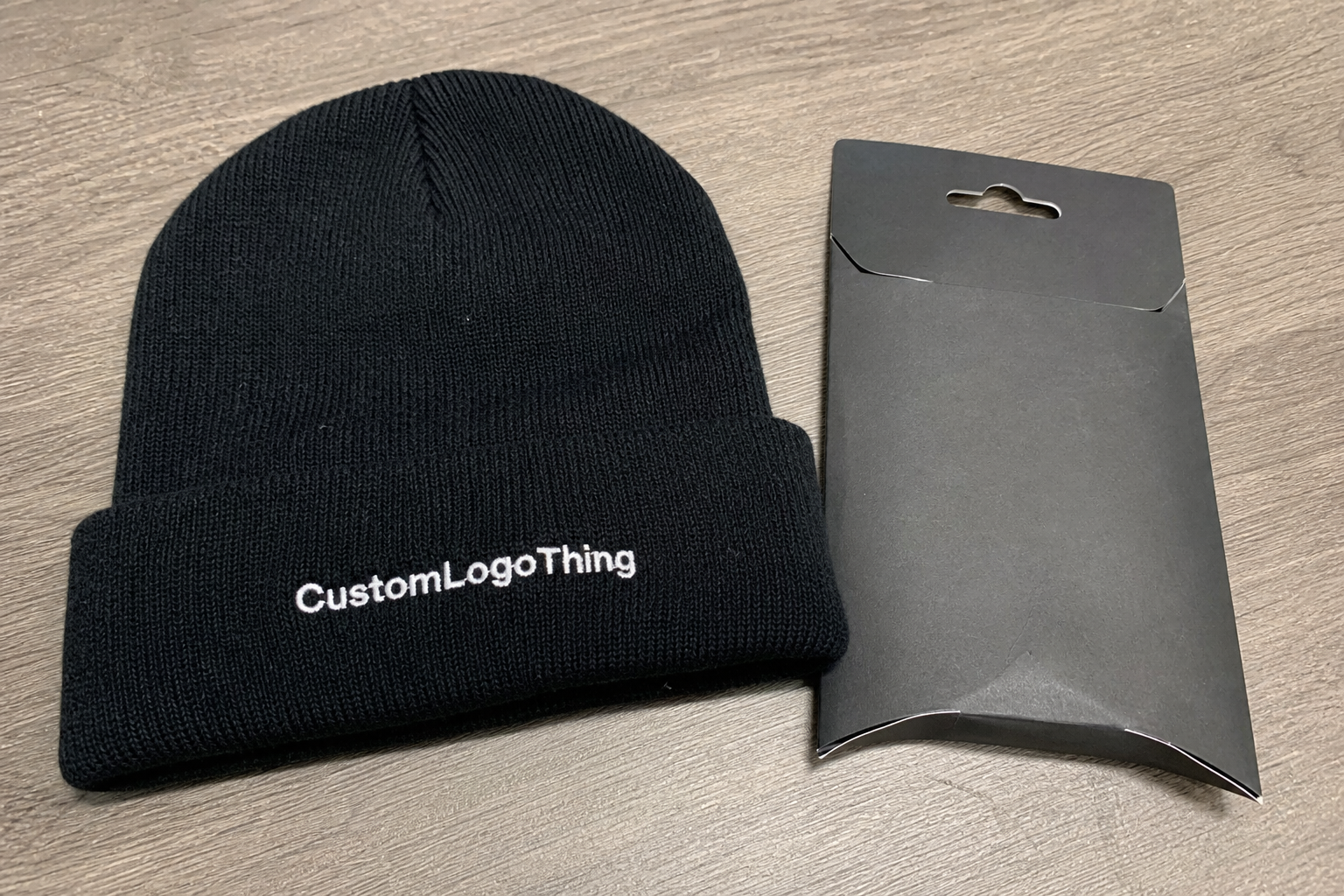
Woven labels remain popular because they give a crisp, finished look without the bulk of a heavy patch. For retail knitwear, they often deliver the best balance of detail, cost, and production efficiency. The tradeoff is that the logo has to fit the beanie’s geometry, not the other way around.
Woven Label Beanies Logo Placement Guide Basics
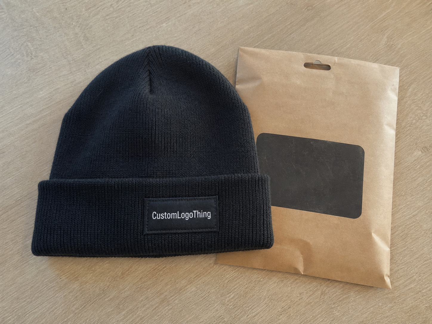
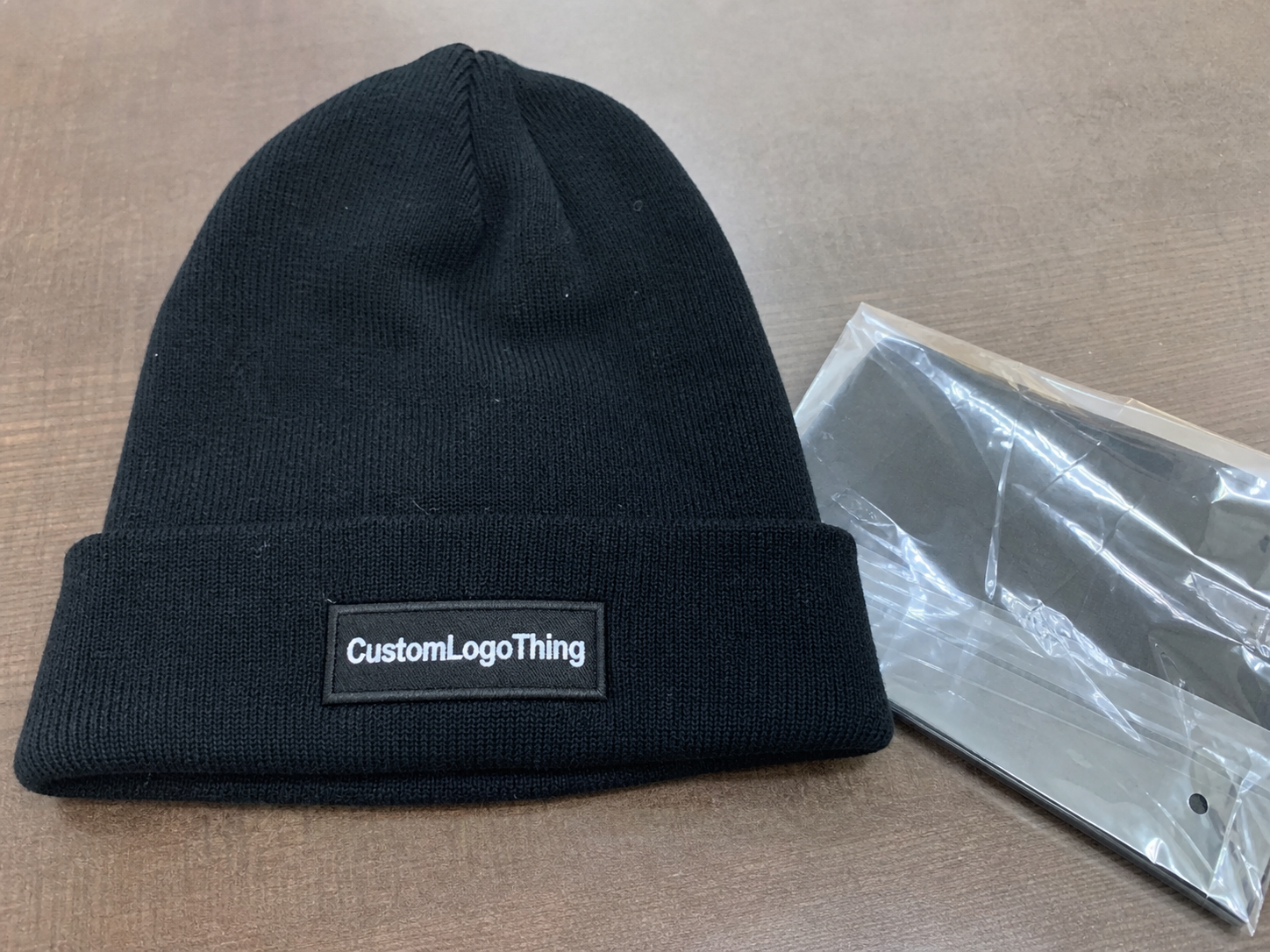
A woven label is usually made from high-density polyester yarns, often in a damask weave because it handles small type and fine borders better than looser constructions. On beanies, the label is typically sewn onto the cuff, near a seam, or on a flatter panel of the knit so it can sit as neatly as possible. The best result is not simply the prettiest artwork; it is the placement that survives stretching, folding, and repeated wear.
Buyers sometimes treat label position as a styling decision only. In practice, it is also a manufacturing decision. If the label sits too close to the edge of the cuff, it can drift into the fold and disappear when the beanie is worn. If it sits too high on the crown, the logo may fight the shape of the hat and look off-center even when the measurements are technically correct.
The product category matters too. A retail beanie usually needs visible, repeatable branding that photographs well. A uniform beanie often needs a more restrained mark that does not crowd other identifiers. A promotional beanie may prioritize lower cost and simple application over a polished fashion finish. The right answer depends on how the beanie will be sold and used, not just on the logo artwork itself.
Common woven label constructions include center-fold, end-fold, and flat sew-on styles. Each one behaves differently on knit headwear. Center-fold labels are easy to position on a cuff edge. Flat labels can be sewn down cleanly but need more care at the corners. End-fold labels often look tidy on slimmer profiles, though they can be more sensitive to placement error because there is less visual margin for adjustment.
How Logo Placement Works on Knit Beanies
Knit fabric changes the rules. A rib-knit beanie stretches and rebounds more than a denser knit, so the same label can appear larger, smaller, or slightly skewed depending on how tightly the hat is worn. A cuffed beanie gives a more stable display area, but the fold line can shift the apparent center by enough to matter in a photo or on a shelf. Slouch styles create more surface area, yet their drape makes precise centering harder to maintain.
Seams, stitch direction, and cuff depth all play a part. A label that crosses a seam can pucker on one side and pull tight on the other. If the stitches are too close to the edge, the label may curl. If the label is wider than the usable flat area, it can create visual tension that shows up immediately in production samples even when the mockup looked fine.
For most buyers, the placement decisions break down into a few practical options:
- Front-center: strongest visibility, easiest to read in product photos, and usually the most recognizable choice for retail and promo programs.
- Slightly offset front: softer and more editorial, often better for minimalist branding or when a seam blocks true center.
- Side placement: subtle and streetwear-friendly, though less visible from a distance and harder to capture in one-shot e-commerce images.
- Back-center: useful when the front needs to stay clean for another element, but usually not the first option for brand impact.
A beanie is not a flat canvas, so a logo that looks perfect on a digital proof may still sit low, lean left, or seem compressed once the knit is on a real head. That is why placement approvals should always be checked on an actual sample or a true-size fixture rather than on a screen alone.
A centered proof can still read low in hand if the cuff folds higher than expected or the knit relaxes more after steaming and packing.
That small shift matters because the eye reads symmetry quickly. A buyer may not measure the difference, but the product will still feel less polished if the label rides too close to the fold or floats too far above it. The best placements usually look calm rather than forced.
Placement Choices That Shape Brand Perception
Placement affects how a brand is perceived before anyone reads the logo. A centered front-cuff label feels direct and commercial. It says the brand is willing to be seen. A low-profile side placement feels quieter and more fashion-led, which can suit boutique labels that want the knit texture to stay dominant. Offset branding sits between those two poles and can look more intentional than strict center when the garment construction allows it.
Spacing makes a surprising difference. A label sewn too close to the cuff edge can feel rushed, even if the stitches are accurate. Leave some breathing room and the same label starts to read considered. Contrast works the same way. Strong contrast improves visibility on retail shelves and in low light. Softer, tonal combinations can look premium, but they need a careful legibility check or they can disappear against the yarn.
The sales channel changes the ideal answer. E-commerce images favor a placement that reads instantly from one angle, often front and center. In-store racks reward clear, compact branding that survives a quick glance from across the aisle. Event giveaways benefit from immediate recognition because the beanie may be seen in motion, outdoors, or under uneven light. A layout that looks elegant in a lookbook can underperform if the product is handed out on a busy floor.
Color choice matters too. Bright woven labels on dark knits can feel bold and promotional. Dark labels on dark knits can feel refined, but only if the texture remains visible enough to carry the logo. The safest spec is not always the best one. A slightly more deliberate contrast choice often improves the product without pushing it into loud territory.
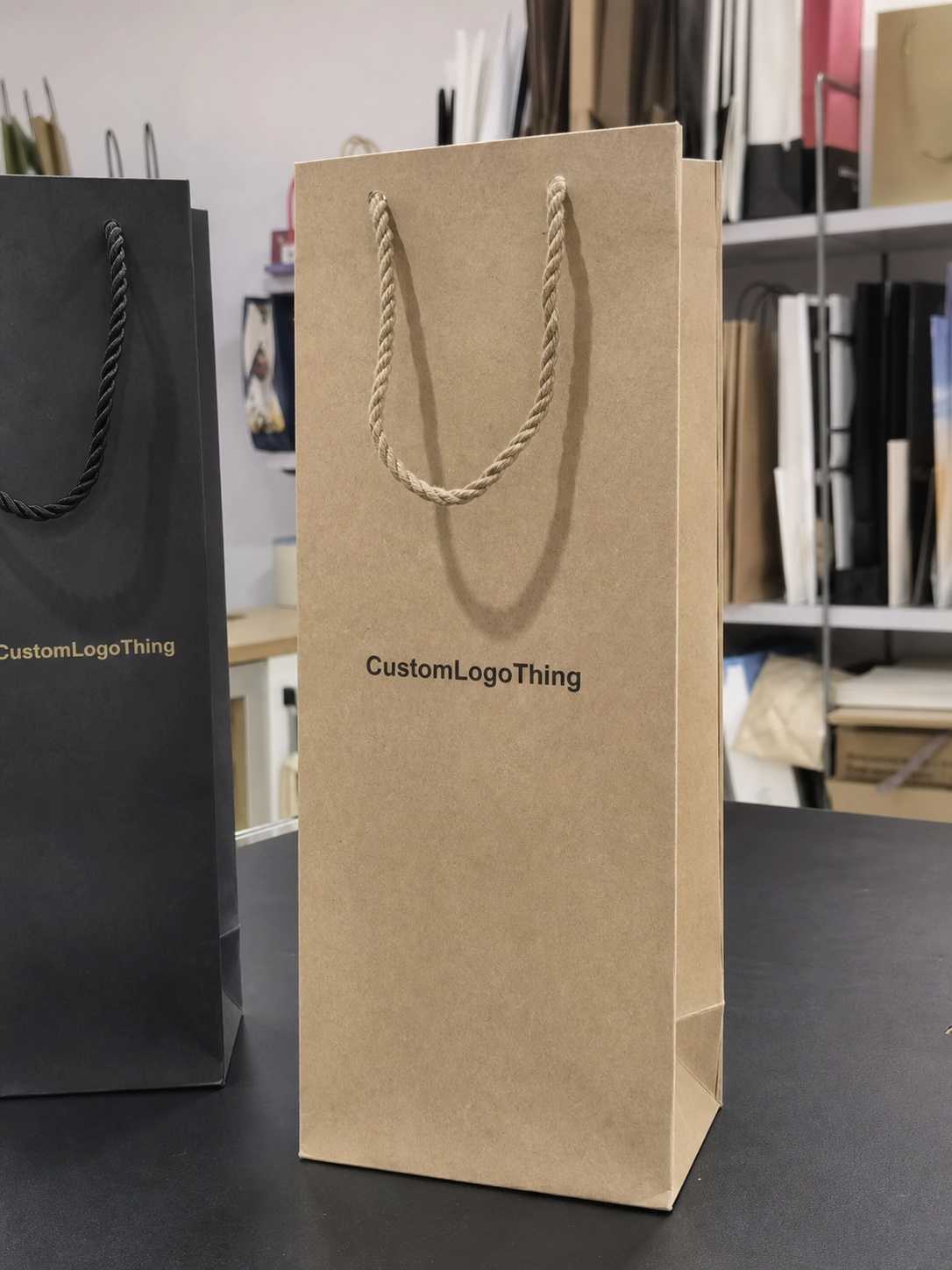
When a beanie is part of a broader trim system, the label placement should match the rest of the branding language. Hang tags, inserts, and packaging all contribute to the same first impression. If those pieces clash with the beanie’s label position or visual weight, the order can feel pieced together instead of planned.
Cost, Pricing, MOQ, and Unit Cost Tradeoffs
Pricing usually begins with the label itself, but labor drives more of the final cost than buyers sometimes expect. A simple front-center sew-on label on a stock beanie is generally the easiest route to quote. An offset placement, a seam-avoiding placement, or a multi-location branding setup adds handling time and raises the chance of rework. That extra effort rarely shows up as a dramatic jump on paper, but it does affect the line item.
MOQ changes the math quickly. At lower quantities, the setup cost, sampling time, and approval steps are spread over fewer units, which pushes the unit price up even when the decoration is straightforward. A run of 300 pieces will not price like 5,000 pieces, and that gap is usually about production efficiency rather than the label artwork alone.
| Placement Option | Typical Decoration Cost | Setup Complexity | Best Fit |
|---|---|---|---|
| Front-center label | $0.18-$0.35 per unit | Low | Retail basics, standard promos |
| Offset front label | $0.22-$0.42 per unit | Medium | Minimalist brands, fashion drops |
| Side or seam-adjacent label | $0.24-$0.48 per unit | Medium to high | Subtle branding, streetwear looks |
| Multi-position branding | $0.40-$0.75 per unit | High | Premium programs, layered identity systems |
Those numbers assume a stock beanie body and decoration only. Custom knit construction, special yarn blends, color matching across multiple components, or packaging upgrades move the order into a different pricing tier. A custom woven label can be inexpensive on its own, but the overall project cost climbs once the body, label, and packaging all have to align.
Sampling is another real cost. If the label size, thread contrast, or placement measurements change after the first proof, the factory may need to remake the sample. That delay is not just time lost; it can also affect shipping windows, carton planning, and retail launch dates.
For buyers who care about packaging integrity, transit testing matters too. If the product ships in retail cartons, the pack-out should be checked for crushing, bending, and abrasion. Resources from organizations such as ISTA are useful for understanding transport stress, while packaging.org is helpful for general packaging terminology and structure. Neither source is beanie-specific, but both help buyers ask clearer questions before production starts.
One practical takeaway: the most expensive placement is not always the most elaborate one. It is often the one that requires the most rechecking because the spec was vague. Clear measurements save more money than dramatic artwork changes.
Process and Timeline From Artwork to Production
A clean order starts before sampling. First, confirm the beanie style: cuffed, uncuffed, slouch, rib-knit, or double-layer construction. Then decide where the label should sit and how large it needs to be. If those decisions keep moving after the first sample, the whole schedule slows down.
The basic workflow is straightforward: define the style, approve the label dimensions, review the artwork, check the digital mockup, and sign off on the sample. Most of the preventable delays happen at the sample stage. That is when buyers discover that a seam cuts into the center point, the logo reads too small at actual size, or the chosen placement looks fine on a flat render but awkward on a curved surface.
For planning purposes, a realistic window is 7-10 business days for a sample and 12-20 business days for bulk production, plus shipping. Stock body availability can shorten that timeline, but it can also stretch if the preferred color is out of inventory or if the project requires yarn matching. Special packaging, added trims, or multiple decoration passes can extend the schedule further.
A useful spec sheet does not need to be elaborate. It needs to be exact. Include the artwork file version, label width and height, the distance from the cuff edge or seam, label orientation, color references, and the target delivery date. If the label should sit centered after the cuff is folded, say so directly. If it should be measured from the left seam rather than the true center, say that too.
- Artwork file type and version.
- Label dimensions in millimeters or inches.
- Placement note with a reference point, such as cuff edge or seam.
- Orientation, including which side faces outward.
- Color references, preferably with Pantone numbers when exact matching matters.
- Delivery target and ship-to details.
These details reduce back-and-forth. They also make the sample stage more meaningful, because the factory can test the exact placement instead of guessing at intent. On knit headwear, small guesswork becomes visible quickly.
Key Factors That Decide the Best Placement
Four variables usually determine whether the label looks right: knit gauge, cuff depth, fabric stretch, and label width. A tighter knit gives the label a cleaner foundation and usually better legibility. A looser knit can make thin type fade into the texture, especially if the label is small or the yarns are tonal. If the label is too wide for the usable front panel, it begins to compete with the beanie’s shape rather than complement it.
Type size matters more than many buyers expect. A logo that reads clearly on a screen can lose clarity when woven into a compact label, especially if the mark depends on thin lines or small copy. Fine detail is possible, but there is a limit. Once the artwork gets too delicate, the weave starts to simplify it. That is not a defect; it is just how the material behaves.
Audience and use case should guide the spec. Fashion brands often tolerate a quieter placement if the product overall feels refined. Outdoor merch usually needs stronger identification because the beanie will be seen in motion and in changing light. Employee uniforms benefit from repeatable placement across the full order so every piece looks consistent. Promotional orders usually favor immediate readability and a straightforward center position.
The best check is physical, not digital. Screens flatten texture and hide fold behavior. A 1:1 sample, or at least a true-size mockup printed and positioned on the correct beanie body, reveals whether the label still reads cleanly after the knit stretches and the cuff folds. That check usually catches the issues that create expensive corrections later.
Material choice can also influence placement. A heavier yarn body with more structure can support a bolder label, while a lightweight knit often works better with a smaller mark and more negative space. If the beanie has a heathered finish or irregular texture, the label may need stronger contrast just to remain readable. The goal is not always to dominate the fabric. Sometimes the right answer is to fit the label into the knit rather than fight it.
Common Mistakes That Make Beanies Look Off
The most common mistake is also the easiest to avoid: placing the label too low or too high. Too low, and it sinks into the cuff fold. Too high, and it starts competing with the crown shape. Either problem makes the beanie feel slightly off even if the artwork itself is strong.
Oversized logos cause a different kind of trouble. A mark that looks confident on a flat digital proof can feel cramped once the knit expands or the cuff bends. Beanies offer less usable space than many buyers assume, and the wrong scale can make even a good design feel crowded.
Seam lines are another source of trouble. A label that straddles a construction point can tilt, pucker, or sit with one corner under more tension than the other. Weak contrast creates a similar problem. On tonal combinations, the logo may disappear into the background; on high-contrast combinations, the beanie can start to read as overly promotional if the label is too loud.
Inconsistent placement across the run is the final issue, and buyers notice it quickly. One beanie sits perfectly centered, the next drifts low, and the third leans toward the seam. That kind of inconsistency usually comes from a vague spec sheet or an approval made before anyone checked a real sample under real light. The fix is not more decoration. It is tighter control over the placement standard.
Another common miss is ignoring how the beanie will be packed. If the cuff is folded hard for shipment, the label can arrive with a memory of that fold. It often relaxes after steaming or wear, but not always in a way that preserves the intended read. A simple post-pack check can save a lot of frustration later.
Expert Tips and Next Steps for a Cleaner Order
Build a placement matrix before approving samples. Compare front-center, slight offset, side, and back placement against the same artwork. That exercise usually makes the brand preference obvious very quickly. It also gives the factory a clearer target, which improves repeatability.
Ask for a sample or a true-size proof before bulk production, then check it under daylight and under indoor lighting. A beanie often looks different in each condition. If possible, test it on an actual head rather than only on a flat surface. The fold and stretch will reveal problems that a desk check will miss.
Write the spec sheet so there is very little room for interpretation. Include exact measurements, cuff position, label orientation, and whether the placement should be judged with the cuff folded or unfolded. If the order includes other trim pieces, keep them aligned with the same visual system so the whole product feels deliberate. A scattered trim language weakens the effect of an otherwise good label.
For buyers trying to keep the design restrained, the best result is often a small, well-centered woven label with enough margin to breathe. For a more editorial look, a slight offset can add character without turning the product into a novelty piece. The right answer depends on the brand tone, the knit construction, and how the beanie will live in the real world.
A useful final filter is simple: does the label still read clearly when the beanie is folded, worn, and photographed from arm’s length? If yes, the placement is probably doing its job. If not, adjust the spec before the bulk run begins. That is the core value of a woven label Beanies Logo Placement guide: it helps buyers make a decision that holds up after production, not just before it.
Where should woven label beanies logo placement usually go on a cuffed beanie?
The most common choice is the center of the front cuff because it gives the logo the strongest visibility without fighting the shape of the crown. Many buyers move the label slightly off-center if a seam interrupts the true center or if they want a softer, more fashion-led look. The best placement is measured against the folded cuff, not only the flat beanie.
Does woven label beanies logo placement affect pricing?
Yes. A straightforward front-center label usually costs less than an offset or seam-adjacent placement because it takes less handling and less adjustment. Multi-position branding adds more labor and more sample checks. MOQ also changes the unit price because setup costs are spread across fewer pieces on smaller runs.
How long does production take for woven label beanies?
Typical lead times are about 7-10 business days for sampling and 12-20 business days for bulk production, plus shipping. The schedule can move faster if the beanie body is in stock and the artwork is final, or slower if the sample needs revisions. Clear specs save more time than almost anything else in the process.
What label size usually works best for beanies?
Most beanie labels stay compact enough to fit the cuff without crowding the knit texture. The right size depends on the beanie style, cuff depth, and how much logo detail needs to remain readable after weaving. If the artwork includes small text, the label should be large enough to preserve legibility instead of forcing the design to shrink too far.
Can a woven label be combined with embroidery or a patch?
Yes, but the spacing has to be planned carefully so the decorations do not compete with each other. Factories usually need exact placement notes when a woven label sits near embroidery, a patch, or a seam. Combined decoration can improve branding, but it also raises cost and sampling complexity, so it should be specified as part of the full build rather than added late.