If you are comparing samples for a winter order, the embroidered Beanies Logo Placement guide matters more than most buyers expect. A logo can look perfectly centered on a flat mockup and still sit too high, too far forward, or awkwardly close to a seam once the beanie is stretched on a real head. That small shift changes the whole read of the product, and it is usually the difference between a hat that feels polished and one that feels off.
In packaging and apparel work, placement is not just decoration. It is visibility, balance, comfort, and durability all packed into a few inches of knit fabric. The right choice depends on the beanie construction, the size of the mark, and how much attention you want the logo to draw from across a room.
Embroidered beanies logo placement guide basics
Think of placement as the exact spot where the logo sits relative to the beanie’s structural points: the cuff edge, the center seam, the side panel, or the top crown. On a flat art proof, those positions look simple. On a finished knit hat, they move a little because the fabric has stretch, loft, and natural curve. That is why the same art file can read bold, subtle, or crowded depending on where it lands.
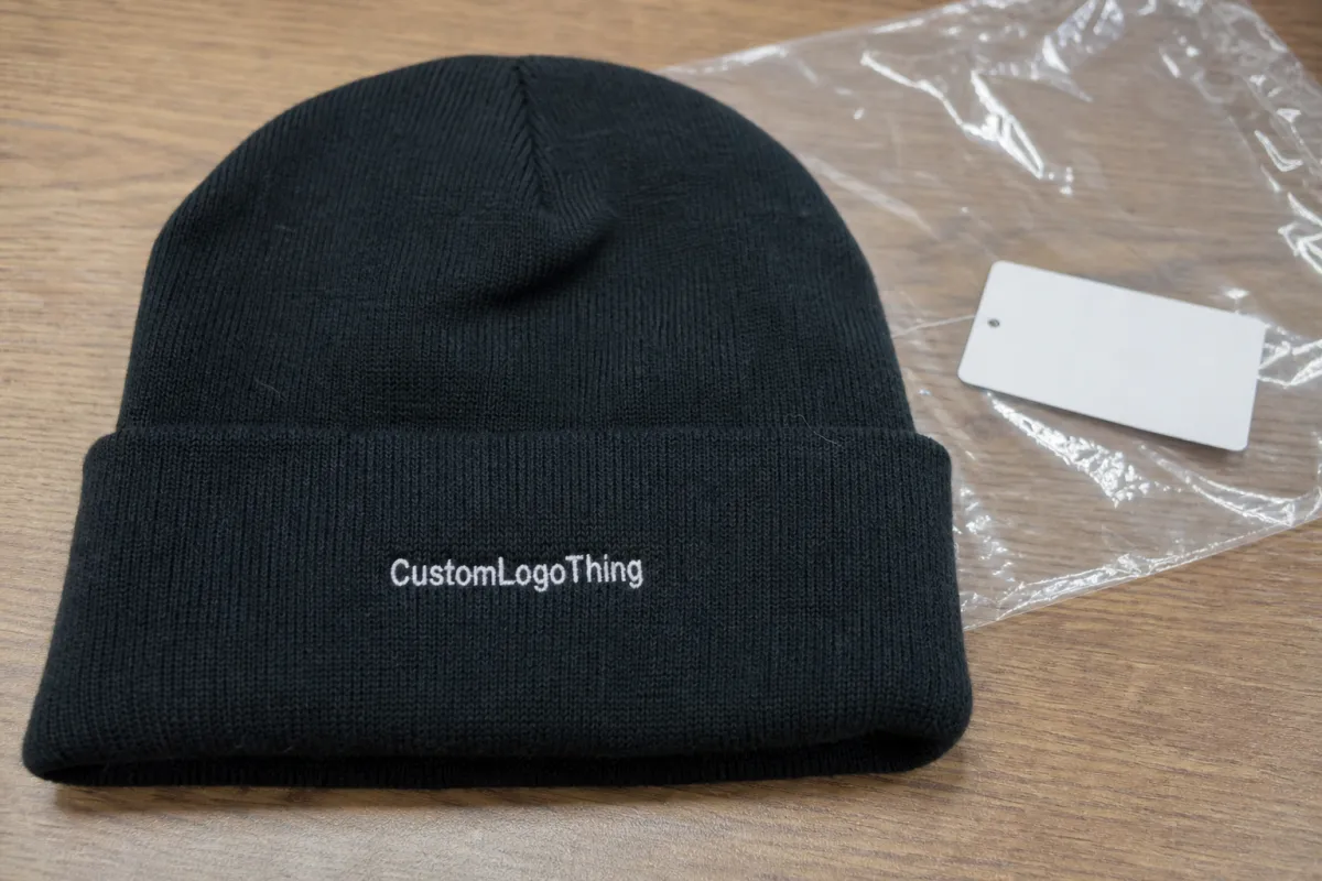
The most common locations are front cuff, above-cuff, side hit, back hit, and crown. Front cuff placement gives the clearest brand read and is usually the default for retail or giveaway programs. Side placement feels quieter and can look more premium, especially on cleaner knit styles. A crown hit is less common because it can be harder to keep centered once the hat is worn.
Here is the part buyers sometimes miss: the beanie is not a flat sign panel. It compresses, folds, and expands. A logo that seems balanced in a proof may rise visually when the cuff is rolled, or it may sit too low if the cuff depth is deeper than expected. From a buyer’s point of view, that means placement should always be judged on the actual hat style, not only on the digital mockup.
A flat proof shows intent. The worn beanie shows reality. The best placement respects both.
That is the core idea behind this embroidered Beanies Logo Placement guide: not just where to put the logo, but how to keep it readable, centered, and comfortable after the hat is produced and worn.
How embroidery sits on knit beanies
Embroidery on beanies starts with digitizing the artwork. The file is converted into stitch commands, and that step determines how the thread will build the logo line by line. After that, the factory stabilizes the knit fabric, stitches the design, trims the threads, and finishes the inside so the backing does not rub too much against the forehead. If the art is clean but the digitizing is rushed, the result can still look heavy or distorted.
Knit behaves differently than woven cap material. It stretches. It has texture. It can also vary in thickness from one beanie style to another, especially around seams and cuffs. That is why a small logo may shift slightly left or right when the fabric is hooped, and why the best placement often avoids seam bulk and the thinnest edge of the knit. The fabric wants to move; the placement plan has to account for that.
Stitch density, underlay, and backing matter more than many buyers realize. Dense embroidery can look sharp, but if it is too tight for the knit, the area may pucker. Too little underlay, and the logo can sink into the texture instead of sitting cleanly on top. For simple beanie branding, bold shapes, thicker lettering, and fewer tiny internal gaps usually stitch more cleanly than fine-line artwork.
Cuffed and uncuffed beanies need different thinking. A cuffed style gives you a more obvious front field and usually makes the logo easier to read at eye level. An uncuffed style gives less visual separation, so placement often needs to be measured more carefully to avoid looking high on the forehead or too close to the crown. The structure changes the center line, which changes the eye line.
If you want a sourcing standard to reference while you compare suppliers, the basics of quality and traceability are often discussed by industry groups such as ISTA for transit testing and FSC for responsible materials in packaging and presentation. Those standards do not control embroidery placement, of course, but they do help frame how professional suppliers think about process and finish.
Key factors that change the final placement
The first variable is the shape of the logo itself. Wide logos need more horizontal room. Tall logos need enough vertical space to avoid crowding the cuff edge or the crown line. Circular marks often fit nicely on the front, but they can feel compressed if the beanie is narrow or if the embroidery area is too close to the side seam. In practical terms, the artwork should fit the hat, not force the hat to carry the art.
Next is the beanie construction. Cuff height, crown depth, seam location, and yarn thickness all change where the design should sit. A thick rib knit can tolerate slightly heavier stitching, but it can also hide small letters. A slimmer knit may show detail better, yet it can pucker if the stitch count is too high. That is why a supplier who asks for the actual style, not just the logo, is usually doing the right thing.
Brand use case matters as well. Retail merch usually wants a cleaner, more deliberate look, so a restrained side hit or a tidy front cuff placement can feel right. Teamwear and event giveaways often need faster recognition, so front placement tends to win. Corporate gifts sometimes split the difference: strong enough to be seen, subtle enough to feel premium. The best placement is the one that matches the job the hat has to do.
Thread color changes the visual weight too. A high-contrast thread on a dark beanie reads louder and more exact. A tone-on-tone thread feels softer and more lifestyle-driven. Same logo, same size, different emotional effect. That is not marketing fluff; it is just how contrast works on a textured surface.
| Placement | Visual read | Best use case | Typical production note |
|---|---|---|---|
| Front cuff | Most visible | Retail, uniforms, giveaways | Usually the easiest to approve and repeat |
| Above-cuff | Clean and slightly understated | Minimal branding, modern looks | Needs careful measurement to avoid sitting too high |
| Side hit | Subtle but intentional | Premium merch, fashion-led programs | Works best with simplified logos |
| Back hit | Secondary branding | Team sets, sponsor marks | Often paired with a front mark or woven label |
| Crown | Least standard, most sensitive to fit | Specialty designs only | Can move visually when the hat stretches on head |
Cost, pricing, and MOQ drivers for embroidered beanies
Pricing usually starts with stitch count and then moves through a few other variables: number of thread colors, number of placement locations, digitizing complexity, and whether the logo needs special positioning. A simple one-location embroidery job is easier to quote than a two-hit design with a front mark and a side mark. That sounds obvious, but buyers sometimes focus only on blank hat cost and overlook decoration labor.
For many orders, digitizing is a one-time setup cost in the range of about $25-$60, depending on the artwork. Small runs often feel that cost more sharply because it is spread across fewer units. On the embroidery side, a common range for a straightforward one-location beanie logo is roughly $1.20-$3.25 per unit at higher quantities, with smaller runs often landing around $2.25-$5.50 per unit. Those numbers move with complexity, thread count, and production location, so they are not fixed quotes.
MOQ also matters. Many suppliers are comfortable around 24-48 pieces for basic beanies, while higher-volume orders can reduce the unit cost quite a bit. That is because the setup work does not change much whether you order 48 hats or 480 hats. The difference is how many pieces share the prep cost.
Below is a practical view of what tends to move the quote.
| Cost driver | Low-impact example | Higher-impact example |
|---|---|---|
| Stitch count | Small wordmark with clean lines | Large filled emblem with dense coverage |
| Placement | Single front cuff hit | Front plus side or back placement |
| Artwork detail | Bold icon, few letters | Fine text, thin outlines, gradients translated into stitches |
| Fabric behavior | Stable rib knit | Thicker yarn, deeper stretch, tricky seam area |
If the logo is hard to place cleanly, cost can rise for a reason that has nothing to do with the art’s value. It takes more sampling time, more careful digitizing, and more attention during sewing. A cleaner mark, positioned well, is usually the more economical choice.
Embroidery process and timeline from proof to ship
The production path is fairly consistent. First comes artwork review. Then digitizing. Then a digital proof, and often a sewout or sample approval if the program is more detailed or the buyer wants extra confidence. After that, the factory runs bulk embroidery, trims, inspects, folds, and packs the hats for shipment. Each step sounds simple, but each one can add time if something needs to be adjusted.
The biggest delay usually comes from artwork changes after proofing. If the placement moves, the stitch count changes, or the logo is resized after approval, the file may need to be reworked. That can push a schedule by a few business days. Another common pause is waiting for the customer to approve the proof. Even a good production slot can slip if the order is not cleared quickly.
Typical turnaround depends on season and order size, but many beanie projects land somewhere around 12-15 business days from proof approval for standard runs. During cold-weather demand, lead times can stretch because the same factories that handle custom headwear are also handling seasonal volume. If you are ordering for a launch, a trade show, or employee gifting, build in a buffer instead of trusting the fastest possible date on paper.
Buyers can keep schedules moving by sending vector art early, confirming thread colors up front, and deciding on placement before the proof stage. One of the simplest ways to save time is to mark exactly what you want: front cuff, left side, centered above cuff, or back hit. Vague instructions force more back-and-forth than most teams expect.
From a shipping and packing standpoint, it is worth asking how the supplier protects finished hats in transit. Loose cartons, crushed polybags, or poor stacking can affect presentation even if the embroidery is perfect. For buyers who care about packaging integrity, transit testing ideas from ISTA and packaging guidance from organizations like the Packaging School can be useful reference points when you are comparing vendors.
Common placement mistakes to avoid on beanies
The first mistake is placing the logo too close to a seam or edge. On paper, that may look centered. On the worn hat, the fabric shifts and the mark can sit crooked or bunch against the seam. If the placement is tight to the edge, the embroidery also has less room to sit flat, which raises the chance of puckering.
Another common issue is asking for a detailed logo in a very small field. Tiny text and thin strokes can disappear into the knit texture. That is especially true if the thread color is close to the beanie color. A design that works on a jacket chest may need simplification before it works on a 3-inch-wide hat panel.
Buyers also run into trouble when they say only “front center” and do not define the exact cuff relationship. Front center on a 3-inch cuff is not the same as front center on a 4.5-inch cuff. One style may look balanced with the mark halfway up the cuff; another may look better slightly above it. Without a measured spec, the placement can drift from one batch to the next.
Last, skipping a sample or a marked proof is risky. The flat mockup is useful, but it does not show the effect of stretch, cuff roll, or head shape. A measured proof against the actual beanie style is the safer move, especially for a first order or a premium program.
Expert tips for cleaner placement and better wear
Start by simplifying the art. That does not mean weakening the brand. It means making the beanie version of the logo work at a smaller scale. Thickening fine lines, reducing tiny text, and cleaning up internal detail often improve the final look more than a larger stitch count ever will. In embroidery, legibility usually beats ornament.
Match the placement to the story the hat should tell. A restrained side hit feels more lifestyle-oriented and often suits retail or premium gift sets. A bold front cuff mark says utility, team identity, or event branding. Neither is better in general; they just serve different jobs. The right choice is the one that fits the buyer’s audience.
Ask for a proof that shows exact dimensions and position, not just a floating logo on a mockup. Ideally, the supplier should mark the logo size in inches and indicate the distance from the cuff or seam. That gives you a real comparison point and helps prevent surprises after production starts.
The best beanie embroidery feels obvious in hindsight: visible enough to brand the hat, quiet enough to look intentional, and clean enough that the wearer forgets it is there.
Comfort matters too. Heavy backing, thick seams, and dense embroidery can rub if they land in the wrong spot. This is one reason a side hit or above-cuff placement can be a smart choice for all-day wear. The goal is not only to look good on the table. It is to feel fine after the beanie has been on someone’s head for an hour.
Next steps: build a clean placement brief before quoting
If you want a cleaner quote, start with a better brief. Measure the beanie style you plan to order, note the cuff height, and decide whether the logo should live on the front, side, back, or in more than one spot. That simple prep makes supplier conversations faster and the proofing stage much easier to manage.
Gather vector artwork, preferred thread colors, target quantity, and any must-have placement notes before asking for pricing. If visibility matters most, say so. If you want a subtler retail look, say that too. The more clearly you define the goal, the easier it is for a supplier to balance placement, stitch count, and production efficiency.
Then ask for a proof that shows exact logo size and position. If the factory can optimize for symmetry, subtle branding, or stronger visibility, have them state which direction they are taking. That is the real value of an embroidered Beanies Logo Placement guide: it turns a vague idea into a production-ready decision, and it gives you a way to approve artwork with confidence instead of guesswork.
Where is the best embroidered beanies logo placement for most brands?
Front cuff placement is the most recognizable option when the goal is simple brand visibility. Side placement works well if you want something more understated or if the logo is wider than the available front area. The best choice depends on the beanie style, cuff depth, and how much attention the brand wants the logo to draw.
How big should a logo be for embroidered beanie placement?
Large enough to read cleanly, but not so large that it crowds the knit fabric. Simple artwork usually works better than fine text or tiny details because embroidery needs clear shape separation. Ask for a proof with exact dimensions before approval so the size matches the intended placement.
Does embroidered beanies logo placement change the price?
Yes, harder placements, more stitches, and extra decoration locations can increase the quote. Simple one-location designs usually cost less because they are faster to digitize and stitch. Quantity also matters, since higher volume can lower the unit cost even when the placement stays the same.
How long does embroidered beanie production usually take?
Timing depends on artwork approval, digitizing, sample approval, and the factory schedule. Seasonal demand can slow turnaround because beanies are especially popular in colder months. The fastest orders are the ones with ready artwork, clear placement notes, and quick proof approval.
What is the biggest mistake in beanie logo placement?
The most common mistake is assuming the flat mockup shows the final worn position exactly. Another frequent issue is placing detailed art in too small an area, which can make the embroidery lose clarity. A measured proof on the actual hat style is the safest way to avoid alignment surprises.


