Apparel Embroidered Beanies logo placement that actually works
Apparel embroidered Beanies Logo Placement looks straightforward on a screen and immediately becomes less polite once it meets real knit fabric. A logo can be centered, enlarged, and perfectly balanced in a mockup, then land too low on a cuff, disappear into ribbing, or warp as the wearer pulls the beanie on. Beanies do not behave like flat apparel. They stretch, fold, slouch, and compress, which is why the most attractive layout is not always the most durable one.
The practical question is not only where the logo should sit. It is how the stitch holds, how the fabric moves, and whether the finished beanie still looks intentional after it has been worn for an hour. Good placement protects legibility. Better placement also respects the garment’s structure. That is where a lot of first-time orders go sideways: the art is fine, but the hat itself is asking for different rules.
For most buyers, the best result comes from choosing one strong location and one clean execution path. A simple front logo on the right beanie style will outperform a crowded design forced into the wrong area. That sounds obvious until the sample arrives and the logo is half-hidden by the cuff or stretched thin across a seam.
Apparel embroidered beanies logo placement: what actually works
Beanies are not neutral surfaces. A cuffed beanie creates a natural branding zone, but that zone changes once the cuff is folded and worn. An uncuffed beanie gives more uninterrupted knit, yet the logo can drift visually because the crown shifts. Slouchy styles add another layer of difficulty since the fabric collapses at the top and pulls attention away from the mark. Pom beanies are their own category; the pom draws the eye upward, so a small front logo can look undersized if the placement is not balanced.
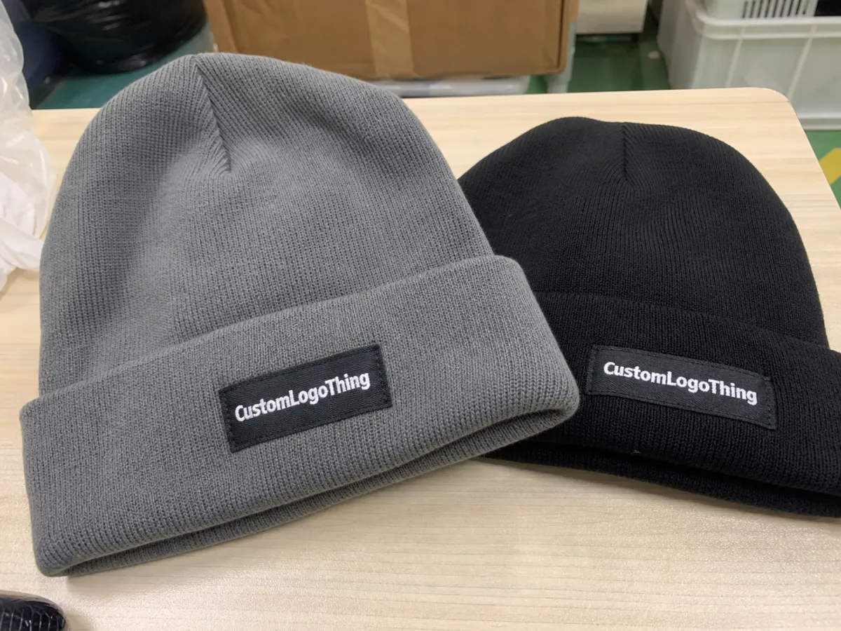
In practice, front-center is the safest choice for visibility. Left-front or right-front placement tends to feel a little more retail-friendly and less rigid. Side placement works when the brand wants subtlety, when the beanie is part of a fashion line, or when the logo is secondary to the product shape. Cuff placement is often the most familiar option on structured knit styles, but the cuff height has to be measured correctly or the logo will land in the wrong visual zone.
A polished mockup is not proof of a good stitch. Knit moves, and knit wins if the placement is careless.
That is why buyers should evaluate placement using three lenses at once: readability, stitch stability, and comfort. A logo placed too close to an edge can distort. A logo positioned too low can disappear under the fold. A logo set too high can float awkwardly on a soft crown and lose the visual anchor that makes it feel deliberate. The best apparel Embroidered Beanies Logo Placement is usually the one that survives real wear, not the one that looks biggest in a PDF.
- Center front: highest visibility, strongest for brand recognition, and usually the most dependable placement.
- Left or right front: cleaner and less aggressive, often a better fit for retail or fashion-led pieces.
- Cuff placement: reliable for cuffed beanies, but sensitive to fold height and edge clearance.
- Side placement: subtle and premium-feeling, useful for small marks or secondary branding.
How placement is built on a beanie
The placement decision starts well before the first stitch. Artwork is digitized into stitch paths, then translated into a machine-ready file. After that comes the physical setup: hooping, frame selection, stabilization, and test alignment on the actual beanie style. Every one of those steps is shaped by knit density, seam position, stretch, and the amount of slack the fabric can tolerate before the logo stops sitting where it should.
That is why size alone does not tell the whole story. A logo with thick strokes and smart spacing can stitch cleaner than a larger design packed with fragile details. Thread needs room to travel. Underlay needs space to support the top stitch. If a logo is compressed too aggressively, letters fill in, outlines fuzz out, and the result starts looking tired before the garment ever leaves the production table.
Stitch style matters almost as much as placement. Satin stitches read sharply when the shapes are large enough. Fill stitches help with broader areas but can make small logos feel dense. Thin lines need enough breathing room to avoid sinking into rib knit. On some beanies, a position that seems safe in a flat mockup becomes awkward once the machine has to work around a seam or a curve. A production-friendly placement often beats a graphic-perfect one.
Practical digitizing choices also affect the final location. Dense embroidery can pull fabric inward if the stabilizer is too light. Very small text can close up unless it is simplified. A good digitizer will often recommend increasing line weight, removing unnecessary detail, or moving the logo a quarter inch rather than forcing a layout that looks elegant only on a monitor.
Key factors that change visibility and wearability
Beanie construction changes everything. A cuffed beanie gives a predictable branding area. An uncuffed knit usually needs a different approach because the crown shape changes once the hat is on a head. Slouchy beanies are harder to place well because the fabric collapses and can push the logo lower than expected. Pom beanies need a different visual balance again. The pom creates movement up top, so the logo has to work harder to hold its place in the design.
Fabric texture matters just as much. Tighter knits usually support sharper edges and cleaner letterforms. Looser knits can swallow small details, especially on thin text or outline-heavy marks. Waffle knits and heavy rib knits create more surface variation, which means the embroidery has to fight for clarity. If the logo contains tiny serif text, gradients, or hairline strokes, simplify it before anyone suggests the stitch will rescue it.
Thread color contrast is another practical detail that changes the outcome quickly. White on charcoal reads fast. Navy on black often does not. Gold on olive can look rich from a distance and muddy up close. Sometimes the smarter answer is a smaller, more visible logo rather than a larger mark that disappears into the knit. That tradeoff shows up all the time in production, and it is one of the easiest ways to improve the final piece without changing the brand itself.
The intended use case also matters. Team merchandise usually needs strong readability from across a room. Employee apparel often looks better with restrained branding. Retail resale has to survive close inspection because customers will turn the garment over, stretch it, and judge the stitching in hand. Event giveaways can carry a bolder logo because the goal is recognition, not restraint. Apparel embroidered Beanies Logo Placement should follow the job the product has to do, not the designer’s favorite thumbnail.
There is also a difference between decoration and durable branding. A logo that looks good only while the hat sits flat on a table is not a finished decision. The wearer will pull the cuff down, shift the crown, and bend the knit. If that movement hides the mark or stretches it into an oval, the placement needs adjustment. The garment gets the last word.
For orders that include hangtags, folded inserts, or retail cartons, packaging quality can matter almost as much as the embroidery itself. FSC standards help verify responsible fiber sourcing for printed materials at fsc.org, and ISTA guidance is useful for shipping tests that protect presentation through transit at ista.org. Neither of those details changes the embroidery thread, but both affect how the product is received.
Cost, pricing, and MOQ basics
Pricing is driven by a small set of recurring variables: stitch count, logo size, number of thread colors, digitizing complexity, beanie style, and whether the placement requires extra handling. A simple front-center logo on a stable cuffed beanie is usually the easiest and least expensive route. A logo that crosses a seam, sits close to a fold, or demands a nonstandard frame setup costs more because it takes longer and carries more risk.
For rough budgeting, a digitizing fee often falls in the $25-$75 range for a straightforward logo. Per-piece embroidery on beanies can land around $1.50-$4.50 depending on stitch density, order size, and the amount of setup involved. More complex placements, dense fills, and multi-location branding can push the cost higher. Those ranges are not decorative. They reflect labor, machine time, and the fact that a troublesome placement can slow the rest of the run.
| Placement option | Typical use | Relative cost impact | Practical note |
|---|---|---|---|
| Center front | Brand visibility, events, uniforms | Baseline to low add-on | Usually the easiest to stitch cleanly |
| Left or right front | Retail, lifestyle brands, subtler branding | Baseline to slight add-on | Good balance of visibility and restraint |
| Cuff placement | Cuffed beanies with a clear display area | Often baseline, sometimes higher | Depends on fold height and edge clearance |
| Seam-adjacent or custom position | Special layouts or premium looks | Higher, often +$0.25-$0.75 per unit | More setup risk and more room for distortion |
MOQ exists because setup time is fixed. Whether the order is 24 beanies or 240, the digitizing, testing, and machine preparation still happen. That means small orders can become expensive quickly if the artwork is fussy or the placement is difficult. Buyers comparing quotes should ask for pricing by placement option, not just a single all-in number. Front-center, cuff, and side placements may look similar on paper and behave very differently in production.
One more cost factor tends to catch people off guard: corrections after proofing. A second round of digitizing, a placement adjustment, or a sample rerun is rarely free. The cheapest order is not always the lowest initial quote. Sometimes it is the one with the clearest instructions and the least need for do-overs.
Process, timeline, and production steps
The cleanest orders follow a predictable sequence. Artwork is reviewed first. Then digitizing begins. After that comes a placement proof. If needed, a sample or first-piece test is run. Only then does bulk production move ahead. That order matters because it catches mistakes before the machine spends time and thread on a run that should have been adjusted earlier.
- Artwork review: confirm vector files, thread colors, and exact logo dimensions.
- Digitizing approval: check stitch direction, density, and how fine details translate.
- Placement proof: verify where the logo lands on the actual beanie style.
- Sample stitch if needed: useful for small text, soft knits, or seam-heavy placements.
- Bulk production: run the order once placement and stitch quality are approved.
- Final inspection: catch thread tension issues, loose trims, and off-center pieces before packing.
Lead time depends on artwork quality and how quickly approvals move. A straightforward order with clean vector art can often ship in 7-12 business days after proof approval. If the logo needs simplification, if a sample round is requested, or if the beanie style is especially sensitive, add a few days. That is not a delay problem. That is how a good run avoids turning into expensive inventory.
Most bottlenecks are unglamorous. Unclear artwork. Slow approval. A logo that changes size three times after the first proof. Rushed jobs are possible, but rush jobs are where crooked placement and inconsistent stitch tension tend to show up. The machine does not care that someone wanted it by Friday. It only cares whether the file and the setup are ready.
Buyers can shorten the timeline by sending vector art, exact placement preferences, the beanie style, and one person who can approve the proof without routing it through six opinions. The fewer decision-makers, the less drift there is between what gets quoted and what gets stitched.
QC checks that prevent bad runs
Quality control on beanies is mostly about catching small problems before they become visible in bulk. Centering has to be checked in relation to the actual crown and cuff, not the flat template. Thread tension should be consistent across the batch. Edges should be clean, with no loose ends hanging from the back. If the beanie uses a soft knit, the sample should also be reviewed after it has been stretched, because a logo can look perfect flat and drift once the fabric relaxes.
A useful QC checklist is simple but strict. Measure placement from the same reference point every time. Confirm that the logo still reads at arm’s length. Verify that thread color matches the approved reference under natural light, not just under shop lighting. Watch for puckering around dense fills, especially on ribbed or low-gauge knits. If one piece in a run looks slightly off, compare it to the proof immediately instead of assuming it is close enough.
There is also a back-side check that gets skipped too often. A clean front does not guarantee a good garment if the backing is rough, the stabilizer is visible, or the trim is messy. People may not see the interior on first glance, but they will feel bulk, and they will notice when the beanie does not sit comfortably on the head. Good embroidery is partly visual and partly tactile.
If an order includes multiple sizes or multiple knit styles, QC has to be repeated for each style. A placement that works on a structured cuffed beanie may fail on a slouchy version by half an inch. Treating those as interchangeable is how brands end up with one sharp style and one awkward outlier in the same collection.
Common mistakes that make beanies look amateur
The most common error is placing the logo too low. That sounds minor until the cuff folds over the embroidery or the wearer pulls the hat down and the mark disappears into the crease. The second common mistake is trying to fit too much detail into too little space. Fine serif fonts, tiny subtext, and thin icon lines can look elegant in a design file and collapse into mush on knit fabric. Embroidery is not forgiving in that way.
Scale mistakes show up constantly. Too small and the logo vanishes. Too large and the knit pulls, which distorts the shape. The right size depends on the beanie construction, not just the artwork file. A logo that looks perfect at 2.5 inches wide in a mockup may need to be resized once cuff height, crown depth, and stitch density are factored in. Skipping a placement proof is the fastest route to a costly surprise.
- Too low: the logo gets hidden by the fold or sits awkwardly near the edge.
- Too detailed: tiny text and thin lines close up in stitch.
- Too large: the knit pulls and the logo loses shape.
- No proof: a good mockup does not guarantee a good garment.
- Inconsistent branding: different beanie styles need different placement logic.
Another mistake is treating every beanie as if it behaves the same way. A cuffed rib knit, a slouchy acrylic beanie, and a waffle-knit style do not read the same from a distance. If the collection includes multiple knit styles, the placement should be checked for each one. Otherwise one product looks sharp and the next looks like it was borrowed from a different order.
Overcomplicating the logo is a separate problem. Decorative borders, tiny taglines, and multiple line weights rarely improve the finished piece. The more parts a logo has, the more opportunities there are for thread to blur the edges. In embroidery, restraint usually looks more expensive than excess.
Expert tips for a cleaner order
Start with the beanie style, then choose the placement. That sequence saves time and prevents artwork decisions that fight the garment. A structured cuffed beanie may support a front or cuff logo comfortably. A slouchy or loosely knit beanie may read better with a slightly smaller mark placed a little higher. The hat decides more than most buyers expect.
My practical rule is simple: simplify before you scale. A bold wordmark usually survives embroidery better than a thin logo packed with internal detail. If the brand wants more visual impact, compare two placements instead of forcing every detail into one cramped location. Apparel embroidered beanies logo placement gets easier once the design is allowed to work with the fabric instead of against it.
Ask for two placement options side by side when visibility matters. Center front versus cuff. Left front versus side. That comparison often makes the decision obvious. One version will read better on the head, and the other may look better in the hand. The one that wins in both settings is usually the safest choice for production.
If the logo includes small text, a seam-adjacent edge, or an unusually tight curve, request a stitch simulation or sample before bulk approval. It costs less to catch a problem early than to discover that a 100-piece order has a logo that drifted, bunched, or lost legibility. That kind of mistake can usually be prevented with one extra approval step.
Material choice can also influence the final look more than buyers expect. Acrylic beanies are common because they are affordable, easy to source, and available in many colors. Wool blends can look richer and hold shape better, but they may change the hand feel and pricing. Heavy rib knit gives a more substantial appearance, while lightweight knit can feel softer but may need a larger logo or stronger contrast to stay readable. These are not abstract distinctions; they show up in the stitch and in the quote.
The safest order is usually the least dramatic one: clean vector art, one strong placement, one approval chain, and no last-minute request to make everything bigger.
A useful final check is to imagine the beanie in motion. On a hanger, in a stack, on a head, in a mirror, under different light. If the logo still reads clearly in those situations, the placement is probably right. If it only looks good when the hat is perfectly flat, it is not ready yet.
For a cleaner result, collect vector files, choose the beanie style first, compare two placements, and approve the proof only after checking how the logo sits on the actual knit. That is the easiest way to keep apparel embroidered beanies logo placement from becoming guesswork. Good embroidery is not just about thread. It is about making a small graphic survive a moving garment.
What is the best apparel embroidered beanies logo placement for everyday wear?
Center front usually gives the strongest visibility, but cuff placement can feel cleaner and less aggressive for daily wear. The better choice is the one that still reads clearly when the beanie is stretched and worn, not only when it is laid flat.
How big should a logo be on embroidered beanies?
Size depends on the knit, the cuff height, and how detailed the logo is. Most clean placements need enough room for stitch separation, and logos with tiny text or thin lines usually need simplification before they are scaled up. Bigger is not automatically better.
Does logo placement change the cost of embroidered beanies?
Yes. More complex placements can raise digitizing effort, labor time, and machine setup complexity. A simple front placement on a stable knit usually costs less than a custom position that crosses a seam, lands near a fold, or needs extra testing.
How long does production take for custom beanies with embroidery?
Timeline depends on artwork approval, digitizing, sample needs, and order size. Clean files and fast approvals speed things up. Changes after proofing are what usually push lead time out, which is why the first proof matters more than most people expect.
What is the biggest mistake with apparel embroidered beanies logo placement?
Placing the logo where it gets hidden by the cuff or distorted by the knit is the most common failure. The second mistake is forcing too much detail into a small area and expecting embroidery to repair it. That is how a polished beanie turns awkward very quickly.