Trade show woven label beanies logo placement matters because a beanie is one of the few giveaway items that can move from a box to a head in seconds. Cold halls, winter show schedules, and early setup shifts all create a use case that pens and tote bags do not have. People put the beanie on, keep it on, and carry the branding with them through aisles, meetings, and the long walk back to the hotel.
That sounds simple until the logo has to survive real-world viewing conditions. The audience is not standing still in a controlled photo setup. They are walking past a booth, reading signs, talking to a colleague, and glancing at a moving target from three to six feet away. A good beanie design respects that. A weak one looks polished on a proof and vanishes on the show floor.
Why beanies win attention when other swag gets ignored
Beanies work because they solve an immediate problem. Trade show floors can be cold, loading docks colder still, and booth crews often need something warm before the first coffee is finished. That gives the item practical value, which changes how it gets used. People keep useful apparel on their body; they do not carry it in a tote for the rest of the day and forget about it.
For a buyer, the real advantage is surface movement. A cuffed beanie gives the logo a visible band near eye level, and that band stays in motion as someone turns or walks. A desk item only gets seen once. A beanie keeps working every time the wearer moves. That is why placement, contrast, and cuff structure matter more than ornament.
Material choice matters too. Most trade show beanies are 100% acrylic or an acrylic blend because the yarn is consistent, warm, and predictable in production. Wool adds a softer hand and often a higher perceived value, but it can raise the price and bring more care considerations. A woven label on either base can look sharp, but only if the knit texture and label size are matched well.
A logo that looks crisp in a mockup can disappear fast on rib knit. The knit always wins if the placement is weak.
The decision is not whether to decorate the beanie. The real question is whether the decoration can be recognized while someone is moving through a noisy room under harsh lighting. That is a harder test than a product photo suggests, and it is where many promo orders fail quietly.
Trade Show Woven Label Beanies Logo Placement
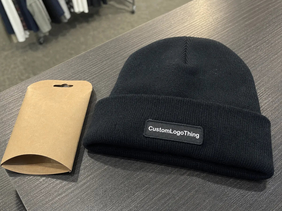
Trade show Woven Label Beanies logo placement works best when the label feels integrated with the garment rather than bolted onto it. A woven label uses tightly interlaced threads, which allows cleaner small text and sharper edges than a lot of other low-profile decoration methods. That is useful for brand marks with fine detail, small icons, or short taglines. It does not solve bad placement. If the label lands where the knit bends, the cuff folds, or the seam pulls, the artwork will still look awkward.
The most dependable location is the front cuff. It faces the crowd, sits in a readable zone, and stays visible whether the wearer is standing, talking, or walking. Side cuff placement can work well for brands that want a slightly more fashion-led look, especially if the beanie is meant to feel closer to retail merch than staff uniform. Lower crown placement is usually the least forgiving option because the fabric slouches and stretches as soon as the beanie is worn.
There is also a difference between woven labels that are stitched flat onto the cuff and woven patches that are sewn with more structure. Flat labels tend to sit cleaner on soft knits. Patches can create a stronger visual block, but they need enough cuff height to avoid crowding the fold. If the beanie only has a small cuff, a label that looks generous on a screen may end up feeling oversized on the actual garment.
One practical rule: match the label construction to the fabric. A fine-gauge beanie can handle a smaller, more detailed woven label. A chunky rib knit usually wants a bolder mark with thicker borders and less tiny type. If the artwork depends on hairline strokes or layered microtext, simplify it before production starts. Knit products are not forgiving with delicate detail.
Contrast is the next issue. Bright show lighting makes dark-on-dark combinations weaker than buyers expect. Navy on black, charcoal on graphite, or burgundy on wine can look restrained in a proof and muddy in person. A cleaner edge color, a slightly lighter base thread, or a bolder border often improves readability more than adding extra decoration. That is why a simple front-cuff woven label often outperforms a more complicated multi-placement concept.
Logo visibility factors that decide what people actually see
The first filter is distance. A logo that reads at arm’s length may dissolve into texture from the aisle. That is not a failure of the production team; it is how knitwear behaves. The eye catches contrast and shape first, then type. If the brand mark does not create a clean shape fast, it loses against all the other visual noise on a show floor.
Size is important, but size alone does not save a weak design. Thin letterforms, tiny counters, decorative scripts, and long stacked taglines all break down quickly on a small woven label. A compact icon or abbreviated wordmark usually reads better than a full sentence. This is one of those cases where less detail does not look cheap. It looks smarter because the garment has enough visual space to breathe.
Cuff height changes the game as well. A shallow cuff offers little room before the fold line starts cutting into the artwork. A deeper cuff gives more flexibility and allows the label to sit in a cleaner zone. Slouch beanies complicate things again because the fabric can collapse lower on the head than the proof suggests. What looks centered in a flat layout may drift once worn.
Practical check: look at the beanie from six feet away, then at one arm’s length, then while it is folded in half. If the logo still reads, the placement is probably strong enough for event use. If it only works in the digital proof, the design needs to be simplified or enlarged.
Thread and border color also deserve more attention than they usually get. The label border should either contrast clearly or mirror the garment in a deliberate way. Halfway contrast is the worst option because it looks intentional on a monitor and muddy under fluorescent lights. A crisp edge around the woven label helps separate the brand from the knit, especially on darker yarns.
Factories also care about stitch density and label edge finish. Too loose, and the label can curl or look soft at the corners. Too dense, and the patch can feel stiff against the forehead or lose flexibility at the cuff. The good middle ground depends on the yarn, the logo detail, and whether the beanie will be worn for a full workday or handed out as a one-time promo item.
Production process and timeline for approval and delivery
Production usually follows a predictable sequence: artwork submission, proofing, sample or strike-off approval when required, bulk production, final inspection, and packing. The routine part is not the problem. The delays usually come from missing details. A low-resolution logo, unclear front-and-back instructions, or a change to the placement after approval can set the schedule back fast.
For a stock beanie with one woven label, a realistic timeline is often 10 to 15 business days after proof approval, then transit time on top of that. Custom knit styles, special yarn colors, or alternate placements can stretch the timeline to 15 to 25 business days. If a pre-production sample is needed, add four to seven business days before the bulk run even starts. Rush service exists, but it usually limits revision rounds and narrows the available material choices.
The approval stage should be treated like a quality-control checkpoint, not a formality. The proof needs to confirm the logo size, exact placement, cuff height, label orientation, and which side is considered the front. Small misunderstandings at this stage become large boxes of finished product later. The hats may be well made and still be wrong for the show.
For any packaging inserts or belly bands, paper stock should be checked for durability and sourcing. FSC-certified paper is a sensible standard for inserts and tags: FSC. If the order will move through several handoffs before the event, carton strength matters too. A shipping profile aligned with an ISTA method is worth asking about, even for apparel. Flattened cartons and bent labels can wipe out the value of the design before anyone sees it.
One more production detail tends to get ignored: placement tolerance. On a small cuff, even a slight shift can make the label look crooked or too close to the edge. That is why a real sample or a high-quality photo of the actual blank matters. A flat mockup can hide how the knit stretches, but the finished product cannot.
Cost, MOQ, and pricing tradeoffs to plan for
Pricing usually comes down to four variables: the base beanie, the woven label construction, the number of colors, and order quantity. Stock beanies with one front label are the simplest route. Custom knit beanies with more complex branding cost more because setup is heavier, yarn selection is narrower, and the production run has less flexibility. That is manufacturing reality, not sales language.
Smaller runs carry a higher per-unit cost. A quantity of 100 to 300 pieces may land around $3.50 to $6.50 each for a straightforward stock beanie with a single woven label, depending on blank quality and decoration complexity. At 500 to 1,000 units, unit pricing often improves into the $2.40 to $4.50 range. At 2,500 pieces and above, pricing can improve further if the design stays simple and the color count remains controlled. Custom knit or fully custom construction lifts the ceiling quickly.
| Option | Typical unit price at 500 | Typical unit price at 2,500 | Best use |
|---|---|---|---|
| Stock beanie, one front woven label | $2.40-$4.25 | $1.80-$3.20 | Booth staff, broad giveaways, tighter budgets |
| Stock beanie, front label plus side detail | $3.10-$5.40 | $2.30-$4.10 | Premium promo item with stronger retail feel |
| Custom knit beanie with woven branding | $4.80-$8.50 | $3.70-$6.20 | Retail-style merch or higher-end event gifting |
The landed cost usually tells a more honest story than the unit quote. Freight, inserts, cartons, folding, and sample charges can add $0.20 to $0.85 per piece, sometimes more if the order is split or rushed. A buyer comparing two suppliers should ask what is included in the quote before treating the numbers as equal. Decoration, packing, freight, and sampling are not always bundled the same way.
For trade show Woven Label Beanies logo placement, the cheapest version is not the one with the smallest sticker price. It is the one that gives the brand enough visibility without forcing extra stitching, oversized labels, or custom construction that adds cost without improving read distance. If the logo needs more space than the beanie can comfortably offer, the design should be simplified rather than forcing the garment to carry too much.
A useful rule of thumb: if the beanie is for staff, spend more on readability and consistency. If it is for a large giveaway pool, keep the decoration restrained and the production path simple. That balance usually produces better value than trying to make every piece carry the same amount of branding.
Common placement mistakes that make beanies disappear
The most common mistake is making the logo too small for knit texture. This happens constantly with dark beanies. Buyers want a refined look, so the artwork gets reduced until it blends into the yarn. The result is a piece that looks stylish in a spreadsheet and invisible in a crowd.
Another miss is placing the label where the beanie naturally folds or slouches. That can happen near the back crown, in the lower side panel, or too close to a seam junction. Once the beanie is worn, the material shifts. A placement that looked centered on a flat sample can slide out of view the moment someone pulls the cuff down.
Too many brand elements create a different problem. Multiple logos, extra taglines, contrast accents, and decorative badges make a small item look crowded. On knitwear, clutter reads as noise, not sophistication. One strong mark usually wins over three weak ones, especially if the booth environment is already full of banners, lanyards, badges, and printed graphics.
Mockups also flatter bad decisions. Flat artwork hides the way the cuff rolls, stretches, and stacks. A real beanie sample reveals whether the label sits too high, whether the border gets swallowed by the fold, and whether the contrast is strong enough under actual lighting. That is the point where many designs get rescued from becoming a box of almost-right merchandise.
There is one more issue worth checking: orientation. A woven label can look fine in the file and still be sewn upside down relative to the way the beanie is meant to be folded. That sounds basic, but in production it is one of the easiest errors to miss if nobody confirms the front side in plain language.
If the same brand will appear on shirts, totes, and badges, keep the visual system aligned without copying the exact layout to every surface. The beanie needs its own logic. A flat tote can hold more copy; a cuffed knit hat cannot. Good merchandise design adjusts to the material instead of forcing one layout everywhere.
Next steps before you place the order
Start with the cleanest logo file available, then decide who will wear the beanies. Staff and attendees are not the same audience. Staff pieces need stronger visibility and more consistent sizing. Giveaway pieces can be simpler, but they still need a logo that can be read quickly from a short distance.
Before requesting quotes, choose one primary view angle: front cuff, side cuff, or folded edge. Then compare the same design across two or three beanie colors. Screen proofs can make dark shades look more readable than they will be in person, and lighting at a trade show only makes the problem worse. A charcoal knit and a heather gray knit may appear close in a PDF and behave very differently under fluorescent lights.
A useful quote request should include quantity, budget, delivery date, backup shipping window, logo file format, desired label style, and whether you need retail folding or bulk packing. Ask each supplier to state what is included. Decoration, packaging, sample cost, and freight should be visible in the quote. Without that, comparison becomes guesswork.
- Confirm the beanie style and cuff height before artwork starts.
- Approve placement on a real folded sample, not only a flat proof.
- Keep the logo simple if the wear distance is more than arm’s length.
- Build a shipping buffer if the event date is fixed.
The last sample check usually determines whether the beanies feel like planned merchandise or last-minute filler. If the logo reads clearly, the label sits straight, and the hand feel is comfortable, the item earns a place in the booth. If not, it becomes inventory that looks good in a closet and weak on the show floor.
Where should trade show woven label beanies logo placement go for the best visibility?
Front cuff is usually the safest choice because it faces the crowd and stays readable in motion. Side placement can work if the design is meant to feel more retail-led than promotional. Avoid low placement on slouchy styles, where the knit folds can hide the mark.
Are woven label beanies better than embroidery for trade shows?
Woven labels usually handle fine detail better than thick embroidery and can look cleaner on smaller placements. Embroidery still works well for a simple logo with a tactile finish. The better option depends on how much detail the art needs and how far away the audience will be.
How much do custom trade show woven label beanies usually cost?
Pricing depends on order size, label construction, beanie style, and the number of brand colors. Smaller runs cost more per piece; larger runs usually improve pricing. Ask for landed cost instead of only unit price so freight and packing do not appear later as a surprise.
What is the typical turnaround time for woven label beanies?
Timelines usually start after proof approval, then move into production and shipping. A simple stock order can often ship in about 10 to 15 business days after approval, while custom knit styles can take longer. Add buffer time if the beanies must arrive before a fixed event.
Can I put more than one logo on trade show beanies?
Yes, but one strong placement usually performs better than crowding the hat with multiple marks. A secondary mark can work on the back or side if the layout stays clean and readable. Too many placements make the beanie harder to read and less comfortable to wear visually.
Trade show Woven Label Beanies logo placement works best when the logo is simple, the contrast is honest, and the cuff gives the mark enough room to breathe. The most effective pieces are rarely the loudest. They are the ones that read fast, hold up under poor lighting, and still make sense once someone has worn them for an entire day.


