Most logo complaints on beer beanies are not really embroidery problems. They are thickness problems wearing an embroidery costume. The beer Embroidered Beanies Material Thickness guide you actually need starts with a basic truth: if the knit cannot support the stitch, the logo will look off before it ever reaches a shelf, a taproom counter, or a shipping carton.
Too thin, and the stitches tug the fabric until the surface puckers. Too thick, and small lettering disappears into the knit. Buyers usually spot the symptom first and blame artwork, thread color, or “bad embroidery.” Usually the fabric body, stretch, and knit density made the call long before the needle did.
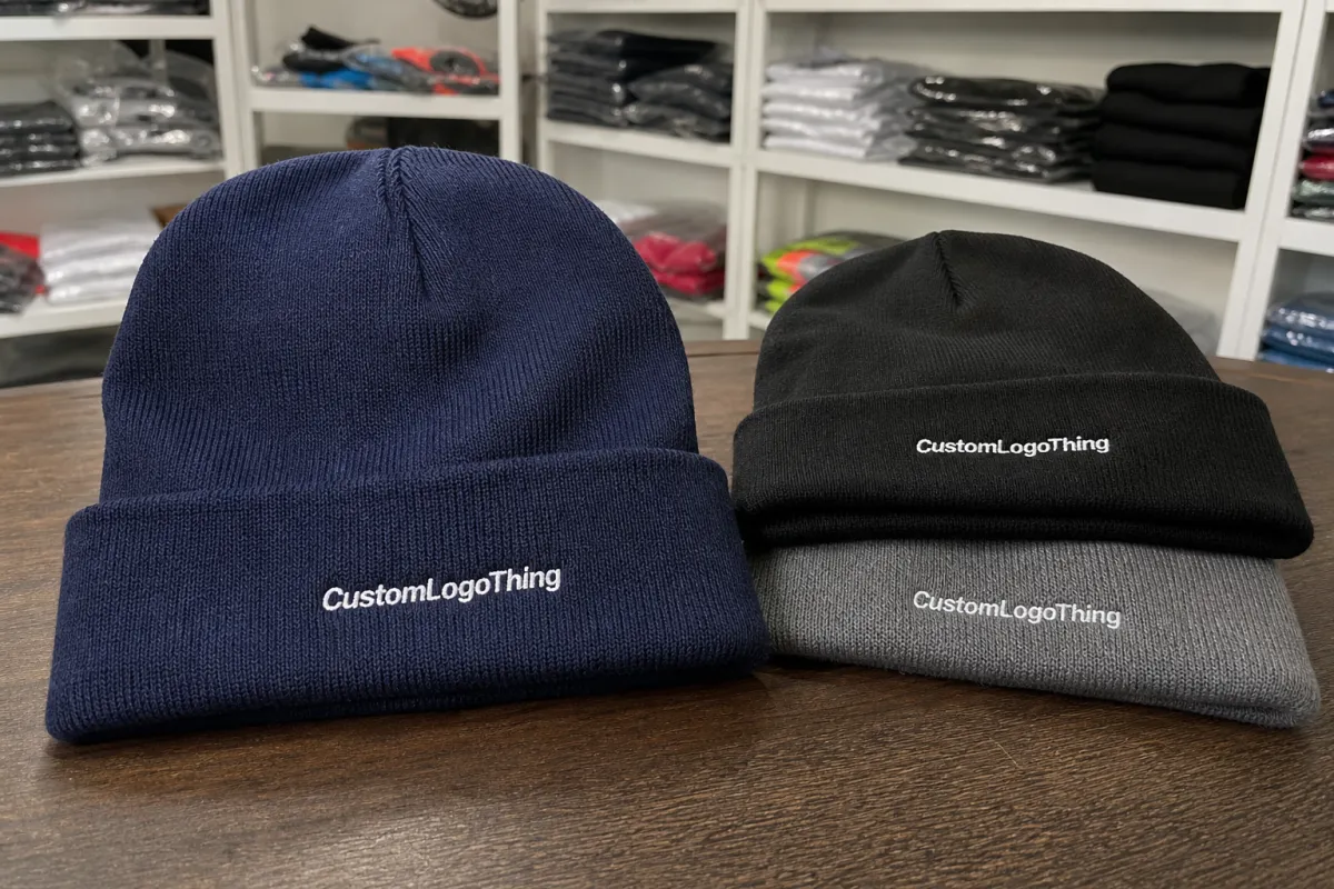
That does not mean every beanie needs to be heavyweight. It means the beanie and the logo have to be sized for each other. A clean midweight style often beats a bulky cap with a crowded mark, especially for beer brands that want something people will actually wear more than once.
Quick rule: design the logo for the knit, not the other way around. The best results usually come from a practical fabric choice and an artwork choice that respects it.
Beer embroidered beanies material thickness guide: what changes first
Thickness is not one number. Buyers talk about it like it is just fabric weight, but the real picture includes knit gauge, yarn weight, loft, stretch, cuff structure, and whether the beanie is single-layer, cuffed, or fleece-lined. Two beanies can feel equally “thick” in hand and behave very differently once embroidery enters the picture.
For a taproom giveaway, you usually want something soft, easy, and low risk. For retail, the spec can carry more structure because the customer expects a more substantial winter accessory. For a beer launch promo, a midweight cuffed style is often the safest balance: readable logo, decent comfort, and a price that does not spiral because someone got ambitious with yarn.
Thickness changes four things at once. It changes warmth, because more body traps more air. It changes logo legibility, because embroidery needs a stable base. It changes fit, because heavy fabrics sit differently on the head after repeated wear. And it changes price, because more yarn, more finishing, and more shipping weight all add up.
If thickness is treated like a side note, the result usually looks fine flat on a table and disappointing on a person. The smarter move is to decide the use case first, then match the beanie construction to the embroidery and the audience. That is less romantic than a mood board, but it works.
A buyer asking for “premium” sometimes really means “warmer” or “more substantial.” Those are not the same thing. A premium feel can come from a tighter knit, better recovery, cleaner seams, or a smoother yarn finish. It does not have to mean oversized bulk. In fact, too much bulk can make the beanie sit awkwardly and turn a good logo into a lumpy one.
How knit density and stitch count work together
Knit density and embroidery density have to cooperate. If the beanie fabric is loose and stretchy, a dense logo can distort the cuff or crown because the stitches pull against a moving base. If the knit is tighter and more stable, the same design can hold crisper edges and cleaner text. That is why a sample on the exact material matters more than a mockup on a screen.
Dense logos need more support. Fine text, sharp outlines, and small brand marks all ask a lot from a soft knit. There is no magic trick here. Simplify the mark, build in more body, or accept that some detail will vanish. The fabric does not care how attached you are to the original artwork.
Stretch matters just as much as thickness. A soft acrylic knit can feel nice on a hanger and still warp after stitching if it recovers poorly. That is also why backing matters. Stabilizer helps, but it does not rescue a bad material match. Thread weight and stitch direction matter too, because a heavy fill on a stretchy knit is a neat way to get a logo that looks tired before the first wash.
From a buyer’s point of view, the logic is pretty simple:
- More detail usually needs more body.
- More stretch usually needs less stitch density.
- More body can improve clarity, but too much makes the hat stiff.
- Better knit stability usually matters more than “thick” in the abstract.
That balance is why a clean 4,000-stitch mark on a stable midweight beanie can look better than an 8,000-stitch logo forced onto a floppy cap. More stitches are not automatically better. Sometimes they are just more expensive, which is a favorite way to inflate a merch quote without improving the product.
A useful test is to look at the logo from arm’s length after the beanie has been stretched and folded. If the mark only looks good at six inches, the spec is too fragile. If it still reads cleanly after a normal tug, fold, and wear simulation, you are closer to a production-safe choice.
Key material factors: yarn, cuff, lining, and stretch
Material choice changes the whole order. Acrylic is common because it is affordable, consistent, and easy to produce at scale. Wool blends feel warmer and more premium, but they cost more and usually need a little more care in production. Recycled materials are a solid option for brands that want a lower-impact story, especially when the fiber comes from post-consumer waste or recycled yarn streams. Just do not assume “eco” means cheap. It usually does not.
The cuff does more than hold the logo. It changes placement, visibility, and how the beanie sits after folding. A tall cuff gives you more embroidery space and usually makes center placement easier. A shorter cuff looks lighter, but it limits logo size and makes the mark easier to lose once the wearer starts tugging the beanie into shape.
Fleece lining is useful for colder markets. It adds comfort and warmth, and it can make the cap feel more substantial. It also changes the price and can tighten the fit if the base knit already runs close. I would not call fleece lining mandatory for beer merch. It makes sense for winter retail or outdoor events. For a casual promo giveaway, it can be too much hat for too little use.
Stretch recovery is the hidden variable that decides whether the beanie still looks neat after repeated wear. A knit that bags out will make even a good embroidered logo look sloppy. Buyers often notice that as a brand issue, but it starts as a material issue. Ask for a sample, stretch it, let it recover, then inspect the logo again. The difference is usually obvious.
There is also a yarn-hand feel issue that gets overlooked. A soft hand can read as premium, but if the yarn is too fuzzy or too slick, small embroidery details lose definition. A cleaner yarn surface usually helps the thread sit neatly. That does not mean every beanie has to feel crisp or dry. It means the yarn finish should support the logo, not fight it.
For buyer planning, match thickness to climate and intended lifespan:
- Mild climate or indoor-heavy use: lighter, softer knit with simple embroidery.
- Cold-weather retail: midweight to heavyweight knit with stronger structure.
- Staff merch or taproom wear: durable midweight with good recovery and easy care.
- Short-run giveaway: simpler construction, cleaner logo, fewer embellishments.
If the brand story includes sustainability, ask about the beanie itself and the packaging. A beanie wrapped in kraft paper, packed into corrugated cardboard, and shipped in FSC certified cartons can support the story better than a glossy box with no real material logic behind it. Keep the claims honest. “Biodegradable packaging” sounds nice, but only use it if the material and disposal path actually support the claim.
One caveat: recycled yarn is not automatically softer, thicker, or better for embroidery. Some recycled blends perform very well. Others trade consistency for the sustainability message. The sample is where that shows up. On paper, the specs can look clean. On the actual head, the knit tells the truth.
Cost and pricing: where thickness moves the quote
Thickness affects the quote in several ways. It changes yarn consumption, knitting time, and often shipping weight. If the beanie has heavier construction, more fleece, or a more elaborate cuff, the unit price rises. Add denser embroidery or extra finishing, and the price climbs again. No mystery there. Just more work and more material.
| Build | Feel and thickness | Best use | Rough unit price at 500 units | What drives the cost |
|---|---|---|---|---|
| Lightweight acrylic cuffed | Soft, flexible, low bulk | Giveaways, mild weather, simple logos | $3.80-$5.20 | Low yarn use, simple construction |
| Midweight acrylic | Balanced body and warmth | Most promo and staff merch | $4.60-$6.80 | Best mix of stability and comfort |
| Acrylic/wool blend | Warmer, more structured | Retail, winter launches, premium merch | $5.90-$8.90 | Fiber mix, hand feel, finishing |
| Fleece-lined heavyweight | Warmest, fullest, most substantial | Cold climates, outdoor events | $7.50-$11.50 | Extra lining, more weight, more labor |
Those ranges move with order size, stitch count, and artwork complexity. A simple mark with one thread color can stay near the low end. A detailed multi-color logo with cleanup work pushes upward fast. The same goes for small orders. MOQ effects are real, and setup fees spread across fewer units can make a lightweight beanie look expensive on paper.
There is a smarter way to save money than cutting thickness blindly. Simplify the logo before you slash the fabric. A cleaner mark on a midweight beanie will usually beat a crowded design on a cheap, thin cap. Buyers sometimes try to solve a budget problem by dropping thickness too far. That is usually the wrong lever. The better move is to reduce stitch complexity, limit thread changes, and keep the placement honest.
Packaging can also affect landed cost. A retail-ready setup with kraft paper belly bands, FSC certified hang tags, and corrugated cardboard master cartons costs more than plain bulk packing, but it can make sense for shelf presentation. If you are shipping long distances, packaging test standards from ISTA are worth checking. If your brand cares about paper sourcing, FSC certification is the cleaner path.
There is a second cost trap: overbuilding the product for a use case that does not need it. A thick fleece-lined beanie for a summer beer festival sounds premium until half the crowd leaves it in a tote bag. The unit price was higher, but the wear rate was worse. That is not value. That is overproduction with better branding.
Process and timeline: from spec sheet to shipped carton
The production flow is straightforward if the spec is clear. First, confirm the beanie style, thickness target, cuff type, and yarn color. Then review embroidery placement, logo size, and stitch count. After that, the factory makes a sample or pre-production version so you can judge both fit and appearance before bulk runs. Simple sequence. Much less simple when buyers keep changing the brief halfway through.
- Confirm the material spec and thickness target.
- Approve yarn, color, cuff style, and lining if used.
- Lock embroidery size, placement, and stitch density.
- Review the sample in real lighting and on-head.
- Approve bulk production only after the sample passes.
Timing usually breaks into two parts. Sampling often takes about 1 to 2 weeks, depending on the factory queue and how many revisions you need. Bulk production commonly adds another 2 to 4 weeks. If the order includes special yarn, custom packaging, or a dense embroidery layout, build in extra time. Rush work exists, but it usually costs more and gives you less room to correct mistakes.
What slows the schedule? Missing artwork files. Unclear thickness targets. Late sample revisions. Changes after approval. Those delays are avoidable. A clean spec sheet saves more time than any follow-up email chain ever will. Put the useful numbers in one place: thickness target, approximate finished width, cuff height, logo size, and acceptable color tolerance. The fewer questions the factory has to ask, the sooner you see a useful sample.
One more practical detail: ask for a blank sample or a close material match before you approve embroidery. The knit itself can change how the logo lands. A design that looks perfect on a digital proof may sit too high, too low, or too stretched once the real yarn is in play. That is not bad luck. That is production.
Quality control should happen before bulk, not after shipment. Check the first sample for seam comfort, cuff stability, yarn consistency, and logo placement. Look at the reverse side too. If the back of the embroidery is rough enough to irritate skin or create bunching, that will show up in wear, even if the front looks polished. People notice that stuff. They may not say it out loud, but they feel it.
Common mistakes that ruin fit, stitch quality, or margin
The first mistake is choosing thickness by hand feel alone. A beanie can feel premium on the table and still be wrong for the logo size. Buyers do this all the time. They squeeze two samples, pick the heavier one, and then wonder why the fine text looks muddy. The feel matters. It is just not the only thing that matters.
The second mistake is placing a detailed mark too low on a cuff that folds awkwardly. Once the beanie stretches, the logo shifts. Once the wearer adjusts the fold, the logo shifts again. If visibility matters, keep the artwork high enough to survive normal use. Not fancy. Just realistic.
The third mistake is over-specifying weight. If the beanie is so heavy that people stop wearing it, the brand loses the repeat impressions that made the order worthwhile. A massive winter build can be great for a cold-weather retail drop. It is a poor choice for a summer beer fest giveaway. Same logo. Very different behavior.
The fourth mistake is chasing the cheapest unit price without checking cleanup, sizing tolerance, or wash performance. A low quote can hide weak stretch recovery or sloppy finishing. That is how you save twenty cents and lose the whole order in the field. Smart buying means checking the sample for:
- Stretch test: does the knit recover after pulling?
- Logo visibility: can you read it at arm’s length?
- Seam comfort: does the inside feel clean against the head?
- Sample approval: do the colors and placement match the brief?
Practical test: put the sample on, fold the cuff twice, stretch it once, and take a photo. If the logo still reads cleanly, you are probably close. If not, revise the spec before bulk.
Another easy way to lose margin is underestimating artwork cleanup. If the original logo has tiny lettering, gradients, or thin outlines, the digitizing step may need simplification before it even reaches the machine. That is not a defect. It is the difference between a logo designed for print and one designed for knitwear. Different tools, different limits.
Expert tips for matching thickness to your audience
Match the beanie to the buyer, not just the brand. Staff merch, retail shelves, and event giveaways all need different thickness and hand feel. If the audience is beer fans buying on impulse, the cap should feel easy to wear and simple to style. If the audience is loyal customers who expect a premium item, a fuller build can make sense.
Climate is a useful filter. Mild-weather buyers usually prefer lighter stretch and less bulk. Cold-market buyers can justify a heavier, warmer build without complaint. That sounds obvious, but plenty of brands ignore geography and end up with a product that is too warm in one market and too flimsy in another. Geography still matters. Annoying, I know.
For beer brands, visibility matters after folding, stuffing into pockets, and repeated wear in crowded taprooms. A logo that disappears the moment the cuff gets adjusted is a weak logo. Keep the design readable from arm’s length. If the mark relies on tiny lines or small text, consider a cleaner version for the beanie and save the detailed version for print or packaging.
If the audience is unclear, test two prototypes. One lighter option and one fuller option usually tell you what you need to know fast. Watch how they sit on the head, how the embroidery behaves, and which one people actually reach for. I would rather compare two decent samples than argue over a spreadsheet for three weeks.
Packaging and presentation deserve a mention too. Thicker beanies need more space in retail cartons and sometimes in shipping cartons. That can affect freight cost and shelf display. If you are building a giftable set, pair the beanie with simple kraft paper wraps or a tidy biodegradable packaging sleeve only if the material claims are true. Recycled materials are useful, but the packaging should still protect the shape. A damaged knit looks cheap, no matter how nice the sustainability story sounds.
For buyers who want one extra check, look at transit durability as part of the spec. A beanie in a corrugated cardboard master carton may survive far better than loose packing, especially on longer routes. That is basic, boring, and correct. The boring solution usually wins.
Another small but useful detail: if the order is going to bars, stadium shops, or winter pop-ups, choose a shape that recovers quickly after being compressed. Those products get stuffed, stacked, and handled a lot. A pretty beanie that arrives misshapen is still a problem. The first impression is the unpacking, not the design file.
Next steps: build a clean spec before you request samples
Start with a one-page spec that lists target thickness, cuff style, embroidery size, placement, color, intended use case, and any packaging requirements. Keep it short enough that a production manager can read it once and know what you mean. If you need more than a page to explain a simple beanie, the spec is probably doing too much and saying too little.
Then ask for a blank sample or a close material match before approving the embroidered version. The knit itself can change the way the logo lands, and no mockup is honest about that. Review the sample under real light, stretch it, fold it, and check the logo from arm’s length. You are not testing for perfection. You are testing for fit, clarity, and repeatability.
If you want the order to move cleanly, lock every approval in writing: thickness, embroidery placement, stitch count, and packaging. That final note matters more than people think. A clear beer embroidered Beanies Material Thickness guide saves time, protects margin, and keeps the finished beanie looking like the brand meant it to look, not like a compromise someone rushed through because the sample felt nice in hand.
The best results usually come from a modest, deliberate choice. Not the thickest knit. Not the cheapest one either. Just the one that holds the stitch, wears well, and fits the actual job.
What thickness is best for beer embroidered beanies?
Midweight cuffed beanies are the safest default because they balance structure, warmth, and logo clarity. Choose a lighter knit only if the design is simple and the buyer wants less bulk. Go heavier when the audience expects winter wear or when the embroidery needs extra support.
Are thicker beanies always better for embroidery?
No. Thicker fabric helps support stitches, but too much thickness can make the beanie stiff and less comfortable. The logo size, stitch density, and stretch recovery matter just as much as raw weight. A well-matched midweight knit often beats a bulky option that nobody wants to wear.
How does material thickness change the price of embroidered beanies?
Thicker materials usually increase yarn use, knitting time, and shipping weight. If the thicker build also needs more embroidery stitches or extra finishing, the unit cost climbs again. The biggest savings usually come from simplifying the design, not from pushing the fabric thinner.
Can a thin beanie still hold a clean embroidered logo?
Yes, if the logo is small, the stitch count is controlled, and the knit has enough recovery. Thin beanies struggle with sharp detail and larger lettering, especially around stretchy areas. A sample is the only honest answer here, because the same design can look great on one knit and terrible on another.
What should I ask for before approving bulk beer embroidered beanies?
Ask for the exact material spec, embroidery placement, and finished measurement after stretch. Check a sample in real light and confirm the logo still reads at arm’s length. Confirm lead time, MOQ, and whether any thickness changes will alter price or production timing.


