A thick beanie can look premium on a shelf and still fail embroidery if the knit is too loose for the logo. A thin one can be perfectly legible if the gauge is right and the stitch plan respects the fabric. That is the real point of a coffee roaster embroidered Beanies Material Thickness guide: weight changes how thread sits, how letters read, and how comfortable the finished hat feels after a full day of wear.
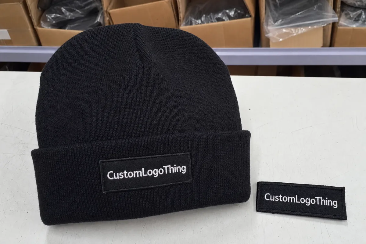
For coffee roasters, the safest starting point is usually a cuffed beanie. The fold gives you a flatter, more predictable panel for a logo, and that matters more than buyers expect when the design is small, the art has fine lines, or the mark needs to sit neatly above the brow without distortion. A cuff also makes the beanie easier to photograph and easier to read from a few feet away. That is useful if the item has to do real branding work instead of just looking good in a sample bag.
Most embroidery problems on beanies start before the first stitch: the artwork is too small for the knit, or the knit is too loose for the artwork.
Coffee Roaster Embroidered Beanies Material Thickness Guide: Why Beanie Weight Changes Logo Quality
Thicker knit does not automatically mean cleaner embroidery. A chunky beanie can feel warmer and more substantial, but it can also let stitches sink into the fabric, especially if the surface has a lot of loft or stretch. In practice, that means a bold, simple logo can look rich and tactile, while tiny text or hairline detail starts to disappear into the knit. The machine is not the villain here. The material is doing exactly what material does.
The coffee roaster embroidered Beanies Material Thickness guide is less about chasing the heaviest blank and more about matching the beanie to the artwork. A medium-gauge cuffed beanie usually gives the best balance of stability, comfort, and readable stitch edges. The fold creates a denser zone at the front, so the logo lands on a panel that behaves more like a flat canvas than a soft sweater.
That is why roaster brands often choose cuffed beanies first. The cuff gives the decorator a cleaner placement area, hides some of the inside backing, and helps the logo sit at eye level where it can actually be seen. Side embroidery can work too, but the fabric there may be more curved and more likely to shift during sewing. If the art is detailed, the front cuff usually wins by a wide margin.
Think about the difference between a large, blocky wordmark and a tiny icon with thin spokes. On a chunky rib knit, the wordmark might feel intentionally premium because the stitches hold their shape against the texture. The icon, though, can lose definition as the yarn loft rises up between each stitch. That is not a defect in the blank; it is the tradeoff for using a warmer, softer construction.
If you are buying for retail merch, staff wear, or tasting-room giveaways, the logo needs to survive real handling. A beanie gets stretched, folded, stuffed into pockets, and worn under a hood. The right thickness keeps the embroidery visible without making the hat feel stiff or overbuilt. The wrong one looks fine on a mockup and average in hand, which is usually where the buyer realizes the spec needs work.
How Knit Gauge and Yarn Loft Affect Stitching
Gauge is how tight the knit is. Higher-gauge beanies use more stitches per inch, so the surface is tighter and more supportive. Lower-gauge or looser knits have more visible loops and a softer, puffier hand, which can make the embroidery sit lower and blur the edge of small details. That is why knit gauge matters just as much as the actual fiber content.
Yarn loft is the fluffiness or body of the yarn itself. A lofty yarn can make the beanie feel cozy, but it also creates more surface movement under the needle. When the fabric shifts, the thread can appear to float in some spots and sink in others. The result is not always dramatic, but it is enough to change whether a logo looks crisp from arm’s length or only from a close inspection.
For logo placement, the cuff is usually the most forgiving zone. The crown can work for simple marks, but the rounded shape and added stretch can pull the design slightly off axis. Side placement is a middle ground: it can look clean, yet it often sits on a portion of the hat that flexes more during wear. If the artwork is detailed, the safer move is still the front cuff.
Backing choice matters here too. A knit with more stretch usually needs a carefully balanced stabilizer so the stitches do not cinch the fabric into ridges. Too little support and the logo puckers. Too much and the inside finish can feel scratchy or overly stiff, which is a problem on a product people wear right against the forehead. The best sample is the one that looks good and disappears on the inside.
There is a practical rule worth remembering: the thicker and stretchier the beanie, the more the embroidery plan has to respect the fabric instead of fighting it. That usually means a slightly larger logo, fewer tiny details, and a stitch path that avoids the tightest ribbing zones. A clean mark on a moderate blank will outperform a fussy mark on a dramatic knit almost every time.
What Thickness Means in Practical Terms
Buyers often ask for “thick” or “premium” without defining what that means. On the production side, those words are too vague to be useful. A better request includes gauge, yarn composition, cuff depth, and whether the beanie is single-layer or double-layer. Those four details tell you far more about embroidery behavior than a marketing description ever will.
As a rough guide, lightweight cuffed beanies usually land around a tighter, smoother feel that supports smaller embroidery without much drama. Mid-gauge blanks tend to offer the best blend of stitch definition and comfort. Chunky rib knits and wool blends look more elevated, but they ask for simpler artwork and a more forgiving logo scale. If the beanie is made for staff on a cold patio, that extra warmth matters. If it is meant for retail, the visual finish matters more.
Material composition matters as much as thickness. Acrylic is common because it is stable, cost-effective, and predictable under the needle. Poly blends can be a little cleaner in repeat production if the knit construction is consistent. Wool or wool blends feel premium, but they can vary more in hand and may require a little more care during stitch-out. The fiber choice changes feel, breathability, and price; the gauge changes legibility; the cuff changes placement.
Here is the short version buyers actually use: a dense, medium-gauge acrylic cuffed beanie is the safest all-around option for branded embroidery. If the visual direction calls for a heavier winter look, move up to a chunkier blank, but simplify the logo. If the brand mark depends on fine detail, do not force it onto a loose rib knit and hope the thread rescues it. It will not.
Key Spec Choices That Change Price and Finish
When a quote changes, it is usually because one or more of the same core specs changed: blank beanie material, knit weight, embroidery size, stitch count, thread colors, and the number of decoration locations. A simple logo on one cuff is one thing. A larger mark with several thread colors, a back hit, or a woven label becomes a different production job entirely.
The material thickness guide helps buyers simplify the artwork as the knit gets thicker. That does not mean shrinking every brand mark until it vanishes. It means choosing the version of the logo that will hold the clearest edge on the fabric you actually want to use. Often, one bold mark with a solid fill outperforms a more detailed version that asks too much from the knit. Clean shape beats clever detail when the fabric has texture.
Cuff height and fold depth matter more than many people expect. If the cuff is shallow, the logo can run into the seam or sit too close to the fold line. If the cuff is deep, you have more usable area, but the placement still has to respect where the hat stretches most during wear. A good mockup should show the logo width, seam line, and exact placement so nobody is guessing at production time.
Decorators also watch stitch density. Dense embroidery can give a premium, saturated look, but it raises the risk of puckering on soft knit. On thick beanies, a lighter stitch count often produces a better result because the design reads clearly without overloading the surface. That is one of those ugly little production facts people learn the hard way.
For premium retail merch or staff uniforms, a better blank is often worth the upgrade. A nicer hand-feel, tighter gauge, and more stable cuff can elevate the whole item, especially if the beanie is sold alongside bags, mugs, and other branded goods. For a one-time giveaway, a simpler blank may be the smarter move, because the logo and the event matter more than the fabric finish.
| Beanie Type | Surface Behavior | Typical Blank Price | Embroidery Fit | Best Use |
|---|---|---|---|---|
| Lightweight acrylic cuffed | Tight enough for clear stitching, but still soft | $2.75-$4.25 | Clean for small to medium logos | Promotional orders, giveaways, staff basics |
| Mid-gauge acrylic or poly blend | Balanced loft, good stitch support | $4.00-$7.00 | Best all-around option for legibility | Retail merch, tasting room sales, daily wear |
| Chunky rib knit or wool blend | Plush, textured, and more movement under the needle | $5.50-$9.50 | Works best with bold, simplified art | Premium merch, winter drops, gift bundles |
If the logo has lots of stitch density, the price can climb faster than the blank cost alone suggests. That is why a simplified art file is often the smartest move on thicker beanies: fewer stitches usually mean cleaner edges, faster machine time, and less risk of distortion. The design does not have to be boring. It just has to survive the fabric.
Pricing, MOQ, and Unit Cost Tradeoffs
Beanie pricing is really a stack of small costs. You have the blank itself, digitizing, embroidery setup, thread, backing, packing, and shipping. If the order also includes custom labels, hang tags, or special folding instructions, those add more labor and handling. Buyers usually feel the final number as one quote, but the factory sees a sequence of separate inputs.
MOQ changes the math in a big way. A larger order can lower the unit price because setup costs get spread across more pieces, but it also increases inventory risk. A small roaster with seasonal demand may not want 500 units sitting in storage for months, especially if colors or brand direction could change before the next winter cycle. There is no prize for owning more beanies than you can move.
The thickness guide matters here because thicker or more premium blanks tend to raise the base cost before decoration even starts. If the logo also needs more stitches or a second placement, the total unit cost can move up quickly. That is not a bad thing if the item is meant to feel like retail merchandise, but it is worth understanding before the purchase order is approved.
A practical way to price-shop is to ask for quotes at 50, 100, and 250 units. Those three quantity breaks usually show where the real savings begin. Sometimes the step from 50 to 100 is significant, while the jump from 100 to 250 is smaller than expected. Seeing the numbers side by side helps you tell the difference between a real break and a fake bargain.
For reference, simple embroidered beanies often land in the broad range of $6-$12 per unit at moderate quantities, while premium blanks with denser embroidery can move into the $10-$18 range or more, depending on stitch count, thread colors, and finishing. Those numbers only matter if the specs are comparable. A low quote on a thin blank is not the same product as a higher quote on a heavier knit with better shape retention.
Production Steps and Lead Time From File to Finished Beanie
A clean order usually moves through the same sequence: artwork review, digitizing, sew-out proof, sample approval, bulk production, trimming, quality control, and final packing. Each step sounds short on paper, but small changes in knit texture or logo size can ripple through the whole schedule. A stitch path that works on a mid-gauge cuff may need a revision on a chunkier blank.
That is one reason lead time is not fixed. If the fabric is especially thick, the first sew-out may show that the stitch density is too aggressive or the backing is too light. Fixing that before bulk production is the right move, even if it adds a couple of days. It is faster to correct a sample than to rework hundreds of finished hats, and it costs a lot less than explaining a flawed shipment after the fact.
Stock availability also matters. Some blanks are ready to go in limited colors, while others require a wait for replenishment. Custom labels, woven patches, or special fold-and-pack instructions can also add time. If the order has to ship in corrugated cardboard cartons with individual wrapping in kraft paper, that packout should be planned at the start, not at the end of the run.
If sustainability is part of the brand story, there are sensible packaging choices that still protect the product well. FSC certified cartons, recycled materials, and post-consumer waste paper are all reasonable asks for a merch shipment. In some programs, biodegradable packaging makes sense too, especially if the beanies are being handed out in small quantities rather than palletized for wholesale distribution. For carton sourcing and paper stewardship, FSC is a useful reference, and for transit testing guidance, ISTA is worth a look.
For launch planning, build in extra time for approvals before a trade show, opening, or holiday drop. Simple stock beanies with approved art may move in about 12-15 business days after proof approval, but sample-heavy orders, backordered blanks, or peak-season scheduling can stretch that window. A little buffer is cheaper than paying for rushed freight and living with a compromise on the logo.
If you need a hard deadline, assume the schedule will get tighter the moment someone asks for a different thread color, a deeper cuff, or “just one more version” of the artwork. That is not cynicism. That is how production actually behaves.
Common Mistakes That Cause Puckering or Waste
The most common mistake is asking too much detail from a knit that cannot support it. Tiny lettering, thin outlines, and intricate icons can look excellent in a PDF and then disappear into a chunky surface once stitched. On a beanie, the fabric is not a billboard; it is a soft, moving textile that changes shape with every pull.
Dense fill stitches can also create trouble, especially on stretchy ribbing. Too much thread in one spot pulls the knit inward and leaves visible puckers around the logo. That problem often shows up more clearly after the hat is worn a few times, which is why the first sample should always be judged in hand, not just in a photo. A flat image can lie. The beanie will not.
Skipping the sample is a costly shortcut. Photos can hide small tension changes, and flat mockups cannot show how the actual knit thickness, stretch, and backing will behave under a needle. A sample on the real beanie fabric tells you whether the design reads cleanly, whether the cuff placement sits straight, and whether the inside finish feels acceptable against the skin.
Comfort is part of quality too. A rough thread hand, too much backing, or a placement too close to the forehead can make a good-looking hat unpleasant to wear. That matters for coffee roasters because the beanie is often worn during early-morning service, cold warehouse work, or all-day events, not just for a single photo. If the decoration annoys the wearer, the brand loses more than the cost of the hat.
There is also waste to avoid in packaging and fulfillment. Overpacking a low-value giveaway in heavy material can cost more than the item itself. Underpacking a premium retail piece can lead to crushed shape and returns. The goal is simple: enough protection, not excess. That is where a thoughtful bag, folded presentation, and the right carton spec keep both the product and the budget in line.
One more quiet issue: inconsistent approval notes. If the art proof says one thing, the sample comment says another, and the purchase order says a third, expect delays. The cleanest jobs usually come from one clear instruction set and one person signing off. Not glamorous. Very effective.
Next Steps to Approve the Right Sample
Before you ask for a quote, gather the exact beanie style, color, logo file, desired placement, and target size. If you already know whether the hat is for staff, retail, or a tasting-room giveaway, say that too. Those details help the decorator steer you toward the right blank instead of forcing a one-size-fits-all recommendation.
Request a sample on the same knit weight you plan to order. That single step answers the questions a mockup cannot: Does the logo stay readable? Does the cuff give enough room? Does the stitching feel right in hand? The coffee roaster Embroidered Beanies Material Thickness guide is really a sample-approval tool, because the real test is how your art behaves on the actual fabric.
Use a short approval checklist before you sign off:
- Check logo width against the cuff and seam lines.
- Confirm thread color contrast from arm's length.
- Verify that the cuff depth leaves the logo fully in the flat zone.
- Ask whether backing or stabilizer changes the inside hand-feel.
- Look at the sample in natural light, not just under shop lighting.
It also helps to inspect the sample the way the end user will see it. Put it on a head, not just on a table. Stretch it a little. Fold the cuff twice. Check whether the embroidery still lies flat and whether the knit rebounds cleanly after being pulled. That tells you more than a dozen polished photos.
If the first run is meant to support repeat orders, keep a few extra units for staff, replacements, and reorders. That small buffer saves time later and protects the brand if a beanie goes missing, gets stained, or is handed out to a new team member after the main shipment is gone. It is also the easiest way to avoid redesign pressure when the next batch is needed fast.
For a coffee brand, the best beanie is usually the one that matches the art, the knit, and the way people will actually wear it. That is the value of the coffee roaster embroidered Beanies Material Thickness guide: it helps you buy a warmer, cleaner-looking, better-balanced product on the first try instead of fixing avoidable problems after production starts.
What material thickness is best for coffee roaster embroidered beanies?
A medium-gauge cuffed beanie is usually the safest choice when you want readable logos and everyday comfort. Chunkier knits can work well for bold, simple artwork, but they are less friendly to tiny text or fine line work.
Does thicker knit always improve embroidered beanie quality?
No. Thicker fabric can hide detail or make the thread sink too far into the knit if the stitch plan is not adjusted. The best results come from matching logo size, stitch density, and backing to the actual beanie construction.
How does beanie thickness change the unit cost?
Higher-gauge or premium blanks usually cost more before decoration even starts. Unit cost can also rise when the logo is large, uses many stitches, or needs multiple placements.
What lead time should I expect for custom embroidered beanies?
Simple stock beanies with approved art can move faster than custom-color or sample-heavy orders. Peak season, backordered blanks, and extra approval rounds can all add time, so build in buffer before a launch.
What should I send for a beanie embroidery quote?
Send the logo file, exact placement, approximate logo width, color preferences, and expected quantity. Also share your deadline and whether you want a sample first, since those details shape both price and timing.


