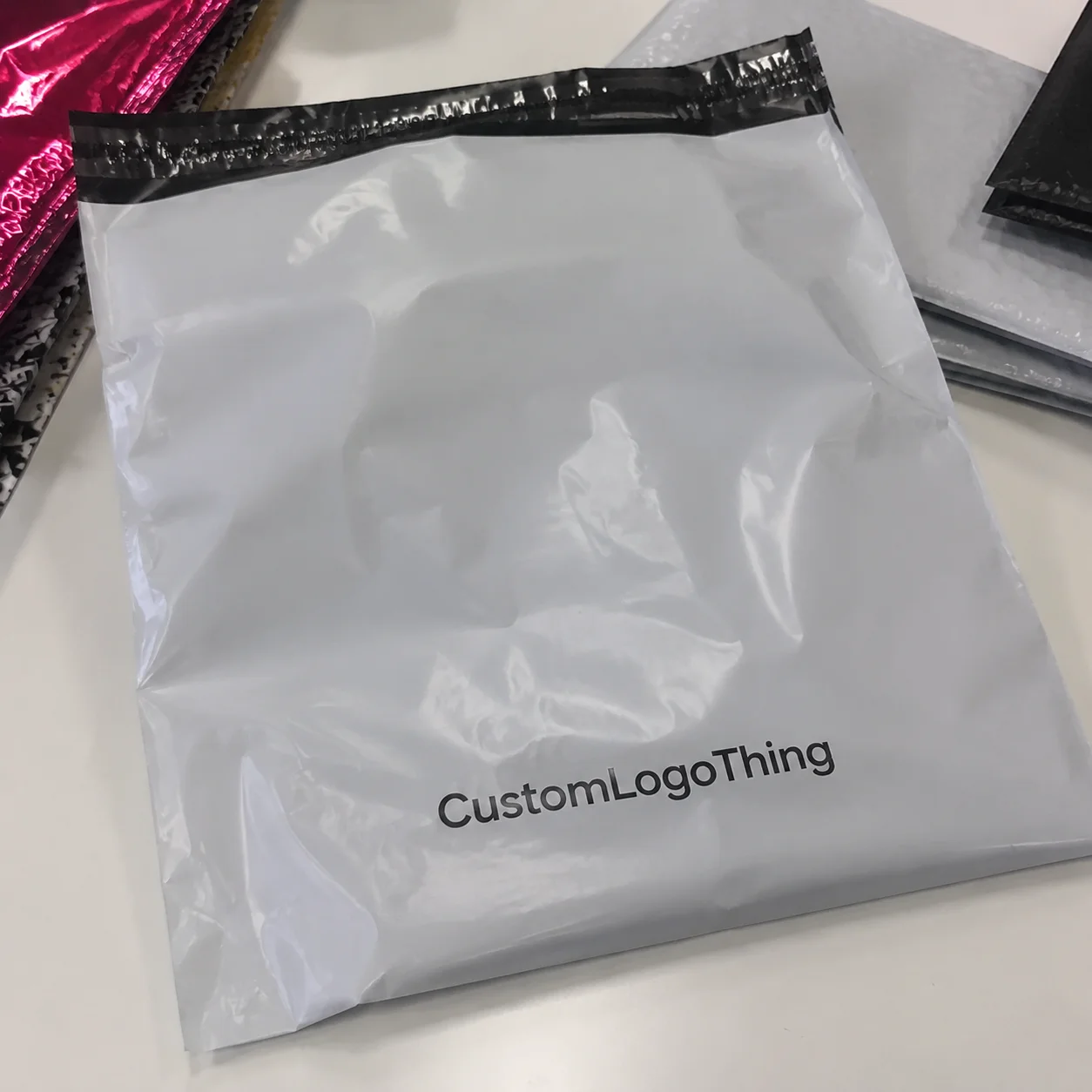
Buyer Fit Snapshot
| Best fit | Minimalist Packaging Design Sell Review projects where brand print, material claims, artwork control, MOQ, and repeat-order consistency need to be specified before quoting. |
|---|---|
| Quote inputs | Share finished size, material target, print colors, finish, packing count, annual reorder estimate, ship-to region, and any compliance wording. |
| Proofing check | Approve dieline scale, logo placement, barcode or warning zones, color tolerance, closure strength, and carton packing before bulk production. |
| Main risk | Vague material claims, crowded artwork, missing packing details, or unclear freight terms can make a low unit price expensive after revisions. |
Fast answer: Minimalist Packaging Design Sell Review: Material, Print, Proofing, and Reorder Risk should be specified like a repeatable production item. The safest quote records material, print method, finish, artwork proof, packing count, and reorder notes in one written spec.
Production checks before approval
Compare the actual filled-product size with the drawing, then confirm tolerance on folds, seals, hang holes, label areas, and retail display edges. Reserve space for logos, QR codes, warning copy, and material claims before decorative graphics fill the panel.
Quote comparison points
Review material grade, print process, finish, sampling route, tooling charges, carton quantity, and freight assumptions side by side. A quote is only useful when the supplier can repeat the same color, closure quality, and packing count on the next order.
The best minimalist Packaging Design Trends are not about making the box look empty and pretending that equals premium. I’ve stood on a Shenzhen factory floor while two samples sat side by side: one loud, one stripped back. The quiet one sold the room. The buyer picked it up first, stared at the typography for maybe three seconds, and said, “This feels more expensive.” That’s the whole point of the best minimalist packaging design trends when they’re done right. They help a product look clean, controlled, and worth the price tag without screaming for attention like a discount flyer. On that visit, the carton was a 350gsm C1S artboard with a matte AQ coating, and the whole debate came down to 1.5 mm of margin and a single black ink pass. Tiny details. Huge difference.
I’ve spent 12 years in custom printing, and honestly, minimal packaging is where brands either look sharp or look cheap fast. There’s very little room to hide bad spacing, weak paper stock, or sloppy color management. So if you’re comparing the best minimalist packaging design trends for skincare, cosmetics, wellness, food, or DTC boxes, I’m going to give you the blunt version: what works, what wastes money, and what makes a package look like it came from a serious brand instead of a weekend design sprint. And yes, I’ve seen all three. Usually in the same week. A basic folding carton run in Guangzhou can start around $0.18 per unit for 5,000 pieces, but if your line spacing is off or your foil border is too fine, that “simple” design suddenly behaves like a very expensive mistake.
Quick Answer: Best Minimalist Packaging Design Trends I’d Actually Bet On
If you want the short answer, here it is: the best minimalist packaging design trends are clean typography, restrained color palettes, structured white space, and one controlled tactile finish such as soft-touch lamination or blind embossing. That combination gives you strong brand recall, decent conversion odds, and a premium feel without turning production into a circus. And I mean that literally — once a client in Dongguan asked for “minimal but luxurious” and then added foil, spot UV, a window, and three badge icons. Minimal? Sure. If by minimal you mean emotionally exhausted. On a standard 4-color offset run, a soft-touch finish often adds $0.04 to $0.14 per unit at 5,000 pieces, while blind embossing usually adds $0.06 to $0.18 depending on the die size and board thickness.
During a skincare client meeting in Dongguan, I watched a buyer reject a fully illustrated carton and choose a plain off-white box with black type and a tiny emboss. The first version looked busy on screen. The second looked expensive in hand. That’s why the best minimalist packaging design trends keep winning: they create confidence. People trust products that look deliberate. They trust them faster than they trust a pack that seems like it was designed during a caffeine emergency. The winning sample used a 0.8 mm deboss on the logo and a warm white board that matched the bottle label within a Delta E of 1.5. That’s the kind of boring precision that sells.
Here’s my blunt verdict on what works best by category, with the material choices I’d actually put on a PO:
- Premium skincare and cosmetics: typography-led layouts, soft neutrals, matte soft-touch, emboss/deboss on 350gsm C1S or 1200gsm rigid board.
- Wellness and supplements: label-forward layouts, clean hierarchy, white space, monochrome systems on PP labels or 300gsm coated board.
- Food and beverage: minimal color blocking, transparent windows, restrained icon systems, clear compliance text on kraft or SBS board.
- DTC lifestyle brands: simple branded packaging with strong unboxing contrast, usually one bold type move and one matte finish.
The biggest mistake I see? Brands think “minimal” means removing personality. Wrong. That usually produces Product Packaging That feels unfinished. The best minimalist packaging design trends still need one signature move: a type treatment, a texture, a color edge, or a structural detail. Without that, your box looks like a sample, not a product. I’ve pulled too many samples off a press table in Shenzhen and Xiamen that looked exactly like that — technically correct, emotionally dead. Good luck charging $42 for something that looks like it was printed between meetings.
My fast verdict: the safest option for conversion is clean typography with a restrained palette. The strongest for brand perception is tactile minimalism with emboss or soft-touch. The only trend I’d keep selective is transparent windows, because they work beautifully for food and some wellness products, but they can cheapen luxury skincare if used badly. For small runs of 1,000 to 3,000 units, I’d rather see a better board and cleaner type than an overdesigned window cut that adds $0.08 to $0.15 per piece and does nothing for the product.
“Minimal doesn’t mean empty. It means every detail has to earn its place.”
Top Best Minimalist Packaging Design Trends Compared
The best minimalist packaging design trends all look calm on the shelf, but they behave very differently once you start printing, sampling, and photographing them. I’ve had brands fall in love with a design in a PDF, then panic when they saw it on an actual folding carton because the white was too cold, the gray text was too light, or the soft-touch film swallowed contrast. That happens more than people want to admit. Honestly, I think half of packaging design is just surviving reality with your enthusiasm intact. In one Hangzhou sample review, a light gray logo that looked elegant on screen vanished on a matte stock under 4000K showroom lights. We changed it to 85% black and fixed the problem in 20 minutes. Design heroics, apparently.
Here’s how I compare the core minimalist packaging design trends I see most often in custom printed boxes and retail packaging, with prices based on 5,000-piece runs from factories in Dongguan, Shenzhen, and Ningbo:
| Trend | Best For | Shelf Impact | Production Difficulty | Cost Range | My Verdict |
|---|---|---|---|---|---|
| Monochrome palettes | Luxury, clinical, modern brands | High contrast, clean recognition | Low to medium | $0.18–$0.42/unit at 5,000 pcs | Best for fast brand clarity |
| Soft neutrals | Skincare, wellness, eco-conscious brands | Warm, quiet, premium | Low | $0.20–$0.48/unit | Best for ecommerce photos |
| Bold typography | Indie, modern, DTC brands | Strong recognition from distance | Low | $0.17–$0.40/unit | Best for brand memory |
| Transparent windows | Food, tea, some wellness | Product visibility, honest feel | Medium | $0.24–$0.60/unit | Best when product itself sells visually |
| Emboss/deboss | Premium skincare, gifts, luxury | Subtle but tactile | Medium to high | $0.06–$0.18 add-on/unit | Best for perceived value |
| Matte soft-touch | Premium, lifestyle, cosmetics | Quiet, smooth, upscale | Low to medium | $0.04–$0.14 add-on/unit | Best for unboxing |
| Label-forward layouts | Supplements, jars, bottles, small food brands | Very legible, fast retail read | Low | $0.03–$0.12/unit | Best for budget efficiency |
From a shelf perspective, the best minimalist packaging design trends do one of two things: they create instant recognition or they create a premium pause. If you’re selling in retail, that pause matters. If you’re selling online, the camera matters even more. A soft neutral pack with black type can look elegant in natural light, but if your type is too thin, it can disappear in thumbnail images. I’ve seen that fail in a Toronto buyer review. Looked gorgeous in person. Completely bland in a product grid. That’s the sort of thing that makes me want to bang my head gently against a press table. On the plus side, a 90mm x 60mm label with a 7 pt font and a 1.2 mm stroke weight usually survives both shelf viewing and Shopify thumbnails if the contrast is strong enough.
For budget brands, the easiest entry point is usually monochrome or label-forward design. For luxury or clinical positioning, soft neutrals and embossing work better. For eco-conscious branding, simple materials with visible fiber texture can feel honest, but only if the print discipline is tight. Otherwise, “earthy” just means “unfinished,” and that’s a hard sell. I’ve seen a kraft carton in Suzhou look beautiful with 1-color black print and a 300gsm uncoated liner, then turn messy the minute the logo shrank below 14 mm wide. Minimalism punishes lazy hierarchy. Hard.
One more thing: the best minimalist packaging design trends are not all equally friendly to short-run production. Monochrome print and plain labels are simple. Transparent windows, custom dies, and blind debossing need more tool control and more sample rounds. That’s where brands get surprised by the quote and pretend they didn’t ask for a premium look. Cute. A custom window die can add 3 to 5 business days to sampling, and a misaligned glue flap can turn a $0.26 unit into a reprint nightmare.
Detailed Reviews of the Best Minimalist Packaging Design Trends
The best minimalist packaging design trends deserve more than a pretty mood board. You need to know what they do in print, how they photograph, and what kind of brand story they support. I’ve reviewed enough custom packaging to know that a trend can look gorgeous in Figma and fail on the line because the paper shade is off by two points or the black ink is too glossy. The file looked clean. The reality looked like a different planet. A carton that looked like warm white on a MacBook often prints closer to cream or eggshell, and that 5% shift is enough to make the whole pack feel different.
Typography-led design
This is the safest and strongest of the best minimalist packaging design trends. Big clean type, limited hierarchy, and generous margins make branded packaging feel focused. The best examples use one type family, two weights, and a hierarchy that works from three feet away. That matters in retail packaging. Nobody is squinting for fun, and if they are, they probably won’t buy. I usually recommend a minimum of 8 pt on side panels and 12 to 16 pt for the front-facing brand line, depending on carton size. Anything thinner than that can disappear once you add a matte coating.
What I like: it scales well across sizes, from a 50ml jar label to a 12oz folding carton. What I don’t like: brands sometimes choose a trendy font that looks elegant but prints weakly at small sizes. I watched one wellness brand approve a beautiful ultra-light serif in Shanghai, then discover it vanished on their matte paper stock under warehouse lighting. We had to rework the file with a sturdier weight and change the knockout areas. That cost them $380 in proofing and two days. Not the end of the world, but still avoidable. Also annoying enough to age me a little. If you’re printing in Guangzhou or Foshan, ask the supplier to proof both the front panel and the nutrition panel, because different ink densities can make the same font behave differently on the same run.
Minimal color blocking
This version of the best minimalist packaging design trends uses one strong color block, often with an off-white or black ground. It’s great for category separation and SKU architecture. If you’ve got five scents, flavors, or formulas, color blocking can make product packaging easier to shop. I’ve seen a tea brand in Hangzhou use four muted colors — clay, olive, slate, and sand — to separate SKUs without adding clutter. The result was simple, and the factory used a standard 4-color CMYK run with no extra plates, which kept the price around $0.22 per unit at 5,000 pieces.
The downside is print control. Large flat color areas expose every issue: banding, ink variation, and paper grain. If you’re using a recycled board with visible fibers, that texture can be lovely, but it also affects consistency. I usually recommend this for brands that want a modern look without overdesigning. It works especially well for custom printed boxes in beauty and wellness. Just don’t expect the press to magically fix a sloppy file. It never does. The press is not a therapist. On a 350gsm board in Dongguan, flat color blocks need tight drawdown checks and a pre-production proof under daylight-equivalent lighting, or the “minimal” pack turns patchy fast.
Soft-touch matte finishes
Soft-touch is one of the best minimalist packaging design trends for premium perception. It turns a simple carton into something people want to hold. I’ve had clients at trade shows literally stroke the sample and ask if it was “the expensive one.” Yes. That’s the point. On a 3 x 3 inch sample in Shenzhen, the difference between standard matte lamination and soft-touch was obvious the second it hit the table. Same artwork. Different reaction. Humans are predictable like that.
Here’s the catch: soft-touch can scuff. I’ve seen it pick up corner wear during transit, especially on darker colors. If the box is shipping across the country in a standard shipper, you need to test abrasion against your logistics setup. For e-commerce packaging, I’d pair soft-touch with a stronger outer mailer or a protective insert. If you want the finish but not the fingerprint drama, ask your supplier about anti-scuff lamination. The price usually adds around $0.03 to $0.07 per unit depending on quantity. In Ningbo, a 5,000-piece run with anti-scuff film and a simple one-color print usually lands in the $0.24 to $0.38 range, depending on carton size and glue style.
Emboss and deboss details
This is one of my favorite best minimalist packaging design trends because it adds depth without noise. A blind deboss on a logo, or a small emboss on a brand mark, can make a plain box feel intentional. The trick is restraint. One location. One depth. No fireworks. I usually specify a depth of 0.4 mm to 0.8 mm for carton board, because anything deeper can distort thin lines or crack cheaper paper.
I once negotiated a rigid box run for a cosmetics client in Guangzhou where the brand wanted emboss, foil, spot UV, and a printed pattern. I told them, bluntly, to pick two. They ignored me, paid for all four, and the result looked like a confused gift box. On the second run, we removed the foil and kept the emboss. Sales improved because the packaging finally matched the premium positioning. Fancy is not always better. Controlled is better. Clean is better. And less expensive, which is my favorite design outcome. On that job, the rigid set used 1200gsm grayboard wrapped in 157gsm art paper, and the final unit cost dropped by about $0.21 after we cut the decorative extras.
Transparent windows
Transparent windows are one of the more category-specific best minimalist packaging design trends. They work when the product itself has visual appeal, like tea, cookies, bath salts, or colorful supplements. They also help trust. People like to see what they’re buying. A bakery box from Shenzhen with a 60mm x 80mm PET window can move faster in retail because shoppers can actually judge the product in 1 second, not 10.
But windows are not a free win. For skincare or high-end beauty, too much visibility can make the pack feel more like a sample kit than a premium product. Also, window shapes add die-cut complexity. If your packaging design includes a curved window with a glued PET film, expect more time and a slightly higher unit cost. Usually, I budget an extra $0.05 to $0.15 per unit depending on size and adhesive setup. For a 5,000-piece order in Ningbo, a simple rectangular window might add 2 to 4 business days, while a custom arch or oval can push the schedule longer because the die has to be checked, adjusted, and checked again.
Reduced icon systems
One of the quieter best minimalist packaging design trends is simplifying icons and info markers. Instead of ten little badges screaming “natural,” “vegan,” “cruelty-free,” and “clinically tested,” use one or two that actually matter. Brands often overstuff packaging because they’re scared consumers won’t understand the product. Consumers understand more than you think. They mostly understand that too many badges mean somebody panicked in a design meeting. I’ve seen a supplement carton in Shanghai with nine icons across the front panel. Nine. It looked like a dashboard for a car nobody wants to drive.
Reduced icon systems help compliance too. Less clutter means room for the mandatory copy, batch codes, and barcode. On supplements especially, that matters. The design needs to stay readable once the legal text is added. I’ve seen beautiful layouts collapse because the brand forgot that compliance text has to live somewhere. Reality is annoying like that. A 30mm x 15mm barcode zone and a 6 pt ingredient line are not negotiable, no matter how committed the brand is to “clean vibes.”
“Minimalism only works when the typography, spacing, and print finish are all pulling in the same direction.”
Best Minimalist Packaging Design Trends by Price and Value
If you want the best minimalist packaging design trends without blowing the budget, you need to understand where the money goes. It’s rarely the ink. It’s the material choice, the finishing step, the die, and the small batch penalties that quietly eat margin. I’ve watched brands obsess over a $0.02 print change while approving a finish that added $0.11 per unit. That math is backwards. Painfully backwards. In a 5,000-piece run from Dongguan, the difference between standard matte coating and soft-touch can matter more than the difference between black and dark charcoal ink.
Here’s the honest breakdown I usually give clients looking for product packaging that feels premium but doesn’t need a luxury-size budget:
| Execution Level | Typical Packaging Type | Approx. Unit Cost | Best Trend Fit | Value Notes |
|---|---|---|---|---|
| Affordable | Labels, standard folding cartons, kraft mailers | $0.03–$0.20 | Typography-led, monochrome, label-forward | Best for testing demand and keeping MOQ risk low |
| Mid-range | Printed cartons with matte coating, simple windows | $0.20–$0.55 | Soft neutrals, minimal color blocking, subtle texture | Sweet spot for many DTC and retail launches |
| Premium | Rigid boxes, specialty board, emboss, soft-touch | $0.55–$2.20+ | Emboss/deboss, tactile minimalism, luxe monochrome | Best for high AOV products and gifting |
The cheapest route to a premium-looking minimalist pack is usually a one-color print on a good board with strong typography and a disciplined layout. That’s it. A 350gsm C1S artboard with a matte varnish can look sharp if the file is clean. I’ve sourced cartons like that for around $0.18/unit at 5,000 pieces from suppliers in Guangzhou and Foshan, depending on dimensions and shipping lane. The design is doing the heavy lifting, not a stack of expensive effects. Which, frankly, is how it should be. If the carton is 90mm x 60mm x 140mm and the type is set properly, you can get a premium look without paying for a parade of finishes.
Where costs jump fast: foil stamping, custom rigid structures, deep embossing, and low-opacity papers that force extra ink passes. Also, short runs get expensive because setup fees don’t care about your feelings. If you order 1,000 units of a complex box, the per-unit price can look absurd compared with 10,000. That’s normal. The press still has to be set up, plates still have to be made, and someone still has to check registration. In my last quote round out of Ningbo, a custom die and foil combination added $140 in setup alone before the first carton was even printed. That’s why “simple” is often the smartest premium choice.
My cheapest premium trick? Strong white space, one dark type color, and a texture-forward paper. It works for wellness, skincare, and some packaged food. Not always for bright consumer brands, but often enough to be worth testing. If you’re building branded packaging on a tighter budget, start there before chasing specialty finishes that may or may not move units. A 300gsm uncoated board with a single black ink pass and a clean 12mm logo lockup can look more expensive than a busier box that cost twice as much to make. Annoying, but true.
I’d also warn against the budget trap of “just one more effect.” That phrase has cost clients thousands. Soft-touch plus foil plus window plus emboss plus custom insert is not minimal. It’s a very polite way to overcomplicate custom printed boxes. If you want help browsing practical packaging options, start with our Custom Packaging Products page and compare structures before you decorate them. If you can’t name the material, the finish, and the MOQ in the same sentence, you’re probably not ready to add another decorative layer.
Process and Timeline: How Minimalist Packaging Gets Made
The best minimalist packaging design trends look simple because the process is disciplined. That’s the funny part. The cleaner the final pack, the more effort usually went into type spacing, sample checks, and material selection. Minimalism hides nothing. If a line is off by 1 mm, you’ll see it. If the paper shade is wrong, you’ll notice. If the finish is too glossy, congratulations, your “minimal” box now looks like it wants attention it didn’t earn. I’ve seen a white carton in Dongguan rejected because the print was a half-step too cool. Half a step. Enough to make the whole thing feel wrong.
Here’s the process I’ve used on dozens of packaging design runs, from Shenzhen to Xiamen:
- Concept and mood board: define brand position, color range, and material feel.
- Dieline selection: choose the right structure before artwork starts.
- Artwork setup: lock typography, barcode space, and compliance copy.
- Sampling: make a white sample or digital proof, then adjust proportions.
- Material and finish testing: confirm paper, coating, and ink behavior.
- Pre-production proof: approve the exact layout before mass print.
- Production: print, laminate, cut, fold, glue, pack, inspect.
The biggest timeline bottleneck is always “small” changes. I had one client in a supplier negotiation ask to move the logo 2.5 mm left after the proof stage. Fine. Then they changed the shade of off-white. Then they wanted a softer touch film. Then they wanted the barcode larger. Four tiny edits turned into an extra proof round, and the schedule slipped by eight business days. Minimalist design is unforgiving that way. Every micro-decision has consequences, and the factory never forgets them. If you approve proof one on Monday and make changes on Wednesday, you can easily push final delivery from 15 business days to 23 or 24, especially if the supplier is in Guangzhou and the insert supplier is in a different city.
For simple minimalist packaging design, I usually see timelines around 12 to 15 business days from final proof approval for standard folding cartons, plus shipping. Add another 5 to 10 business days if you need embossing, Custom Die Cuts, or rigid box structures. If the material has to be sourced specially, pad the schedule more. A supplier may quote fast, but factory reality has a different sense of humor. The machine will stop for a dozen reasons, and none of them will be because your launch calendar feels urgent. For a shipped run to Los Angeles or Rotterdam, I’d always add 7 to 14 days of freight time depending on the lane and customs paperwork.
Factory-floor detail matters here. On one visit, I watched a press operator reject a batch because the black ink density was slightly uneven on a matte board. Most consumers would never notice. But on a minimalist design, the inconsistency stood out immediately. That’s why the best minimalist packaging design trends rely on tighter process control than loud, busy artwork. Busy graphics can hide a lot. Minimal Packaging Design cannot. In a plant outside Suzhou, the QC team checked each sheet against a light box at 6500K, and that 30-second inspection probably saved the whole run.
For brands working toward FSC-aligned paper choices, check the certification details early, not after artwork approval. You can read more about the standard at FSC. If your packaging has to survive shipping tests, I also recommend reviewing ISTA shipping protocols through ISTA. If you skip those steps, you may save a week now and lose a whole run later. A standard drop test or compression test is far cheaper than 5,000 crushed cartons arriving in a warehouse in Texas or Hamburg.
How to Choose the Right Minimalist Packaging Design Trend
Choosing among the best minimalist packaging design trends should not feel like choosing a wallpaper sample. Start with the brand’s actual job. Is the package trying to sell on a shelf, win an unboxing video, support a premium price, or explain a functional product? The answer changes the design choice immediately. A box that needs to shout in retail should not behave like a quiet skincare carton. That sounds obvious, yet somehow it keeps getting mixed up in briefing calls. I’ve had a supplement client in Hong Kong ask for “quiet but urgent,” which is a fun way to say they had not decided what the packaging was supposed to do.
For ecommerce-first brands, I care most about photo readability and unboxing contrast. A pack that looks great in natural light and opens with a clean reveal usually performs well in DTC. For retail brands, contrast and quick recognition matter more. Your box has about two seconds to be noticed. That’s not much. Retail packaging lives or dies on that split-second scan. If you’re selling in stores in Singapore or Melbourne, the front panel has to work from six feet away and still hold up when a shopper picks it up at arm’s length.
Here’s my quick decision framework:
- If you want luxury: choose monochrome, soft-touch, and emboss/deboss.
- If you want clean: choose typography-led layouts with generous spacing.
- If you want natural: choose soft neutrals, kraft textures, and reduced icon systems.
- If you want modern: choose bold type, one accent color, and crisp geometry.
Common buying mistakes are painfully consistent. Brands choose a matte finish because they saw it on a competitor, then discover it scuffs in transit. They use tiny type because they want a “refined” look, then the compliance team forces a redesign. Or they order a beautiful foil treatment that looks great in mockups and terrible under fluorescent store lighting. I’ve seen each one. More than once. At this point I can spot the bad decision before the sample even cools down. In one factory review in Dongguan, a dark green soft-touch box picked up fingerprints within 90 seconds on the packing line. Gorgeous. Also a disaster.
My checklist before you lock a minimalist direction:
- Confirm MOQ and unit pricing for the exact size, not a rough estimate.
- Test the chosen paper or board with the intended finish.
- Check legibility at thumbnail size and on a shelf from 6 feet away.
- Verify compliance text placement before design polish.
- Review how the pack looks in daylight, not just on a monitor.
If you’re buying custom packaging through a supplier, ask for samples of the exact substrate, not a “similar” one. Similar is a dangerous word in printing. It usually means slightly different shade, different coating behavior, and another round of arguments. The best minimalist packaging design trends only look effortless because somebody handled all of that before the client saw the first proof. Ask for the factory address too. If they’re producing in Foshan, Shenzhen, or Wenzhou, the line behavior and lead times can differ by a full week.
Also, think about where your brand sits in the market. A clean clinical look works for supplements and skincare, but if you’re selling a playful snack product, too much restraint can make the packaging feel emotionally flat. The best minimalist packaging design trends are not one-size-fits-all. Good package branding respects category expectations while still giving you a signature. A cereal brand in Shanghai can use minimalism and still feel lively with a single orange accent, while a dermal serum in Guangzhou usually needs cooler tones and stricter spacing.
Our Recommendation: Best Minimalist Packaging Design Trends for Real Brands
If I had to rank the best minimalist packaging design trends for real brands, I’d do it like this:
- Typography-led layouts — best all-around for conversion, clarity, and budget control.
- Soft neutral palettes — best for premium perception and ecommerce photos.
- Matte soft-touch with one tactile detail — best for brand perception if you can handle the cost.
- Minimal color blocking — best for shelf recognition and SKU systems.
- Emboss/deboss — best for premium signaling without visual clutter.
- Transparent windows — best only when the product itself benefits from visibility.
The safest all-around choice is typography-led minimal packaging with a restrained palette and one texture move. That’s the sweet spot for most brands because it balances cost, speed, and professional appearance. If you want to stand out without overdesigning, add one tactile signature: emboss, a paper texture, or a subtle structural change in the carton flap or insert. A 350gsm C1S carton with a 0.6 mm deboss and black ink can look sharper than a heavily decorated box that costs three times as much to produce in Dongguan.
My practical recommendation for a launch is simple: get samples, test one design on two substrates, compare the mockups in natural light, and request a pre-production proof before mass printing. That sounds basic because it is. Yet brands skip it constantly. Then they pay for the education. Usually in reprints. Sometimes in panic. Sometimes in a very awkward call where everyone pretends they are “aligned” while quietly losing sleep. I’ve seen a launch slip from March 8 to March 29 because someone approved a screen proof instead of a physical sample. Screens lie. Paper does not.
I’ve had the best results when a brand picks one minimalist direction and commits to the rules. No random font swaps. No extra badges. No last-minute metallic accents because someone on the team “felt it needed more pop.” Minimalist packaging works because it is disciplined. The best minimalist packaging design trends don’t ask for more decoration. They ask for better judgment. They also ask for a supplier who can print consistently in Shenzhen or Guangzhou without improvising when the file gets hard. Funny how often that matters.
If you’re ready to turn inspiration into a spec sheet, start with your structure, finish, and budget ceiling. Then build the artwork around those limits instead of trying to force a luxury look onto a bargain structure. That’s how you get branded packaging That Actually Sells, not just packaging that photographs nicely once and disappoints in the wild. For a 5,000-piece launch, the difference between a $0.19 carton and a $0.34 carton can be the entire finish strategy, so choose the one that protects margin and still looks intentional.
For Custom Logo Things, my honest advice is this: choose the best minimalist packaging design trends that fit your category, your margin, and your production reality. Minimal can be powerful. It can also be painfully expensive if you try to fake premium with the wrong materials. Be selective. Be exact. And make the supplier prove it on paper and in hand before you approve the run. I’d rather see one clean carton from Foshan that nails the brief than a stack of overworked boxes from anywhere else with a prettier presentation deck.
What are the best minimalist packaging design trends for small brands?
The strongest options for small brands are typography-led layouts, soft neutral palettes, and one tactile finish such as a matte coating or blind emboss. Those best minimalist packaging design trends deliver a premium look without forcing a huge MOQ or a complicated production setup. For 1,000 to 3,000 units, a simple 300gsm board with clean black print can keep the budget under control while still looking polished.
Which minimalist packaging design trend is cheapest to produce?
Single-color printing with strong white space is usually the lowest-cost path. Standard folding cartons or labels with no foil, no embossing, and no custom windows keep the unit price down and reduce production risk. That’s why many best minimalist packaging design trends start there. A basic label run in Guangzhou can land around $0.03 to $0.12 per unit depending on stock, finish, and quantity, while a simple carton on 350gsm C1S artboard often stays under $0.20 at 5,000 pieces.
How do I make minimalist packaging look premium instead of plain?
Use better materials, tighten the typography, and add one controlled finish like soft-touch lamination or embossing. Premium minimalism comes from restraint and precision, not from stripping everything off the box and hoping nobody notices. That’s the difference between amateur and the best minimalist packaging design trends. A warm white board, a 12 pt type hierarchy, and a 0.5 mm deboss can do more for perception than a pile of decorative add-ons.
How long does minimalist packaging design and production usually take?
Simple projects can move quickly if the dieline is standard and the artwork is final. Special finishes, structural changes, and multiple proof rounds extend the schedule because every detail has to be checked before mass production. For many of the best minimalist packaging design trends, 12 to 15 business days after proof approval is a realistic baseline for standard runs, with another 5 to 10 business days if you need embossing, Custom Die Cutting, or rigid box assembly in cities like Dongguan or Ningbo.
What should I ask a supplier before choosing a minimalist packaging design trend?
Ask about material options, finish compatibility, MOQ, sampling cost, and realistic production lead time. Also ask for physical samples or print proofs, because minimalist designs reveal mistakes faster than busy artwork ever will. If a supplier can’t explain how a trend will behave in real production, that’s a warning sign, not a mystery. The best minimalist packaging design trends need proof, not promises. I’d also ask for the exact board spec, such as 350gsm C1S artboard or 1200gsm rigid board wrapped in 157gsm art paper, plus the factory location so you know whether the run is coming out of Shenzhen, Guangzhou, or Foshan.