Book Frosted Zipper Bags packaging insert checklist may sound administrative, but in production it acts like a pressure test. It forces the book, the insert, the bag, and the packout method to agree before anyone burns time on a proof that was destined to fail. A pack can pass the eye test on a monitor and still miss the mark in hand if the insert sits low, the barcode is too close to a fold, or the frosted film softens contrast more than expected.
For buyers, editors, and packaging teams, the checklist is less about paperwork than control. It keeps product packaging aligned with package branding, prevents avoidable reprints, and reduces the expensive gap between “approved” and “actually printable.” Retail sets are unforgiving in that way: a clean concept can still look unfinished if the physical components were not planned together.
That is why the insert and bag should be specified as one system. A Frosted Zipper Bag has its own visual behavior, its own handling issues, and its own constraints on type size, opacity, and packout sequence. If the insert is designed as if it will live inside a plain clear sleeve, the final result often looks flatter, weaker, and more improvised than the budget suggests.
Why a frosted zipper bag changes the first impression
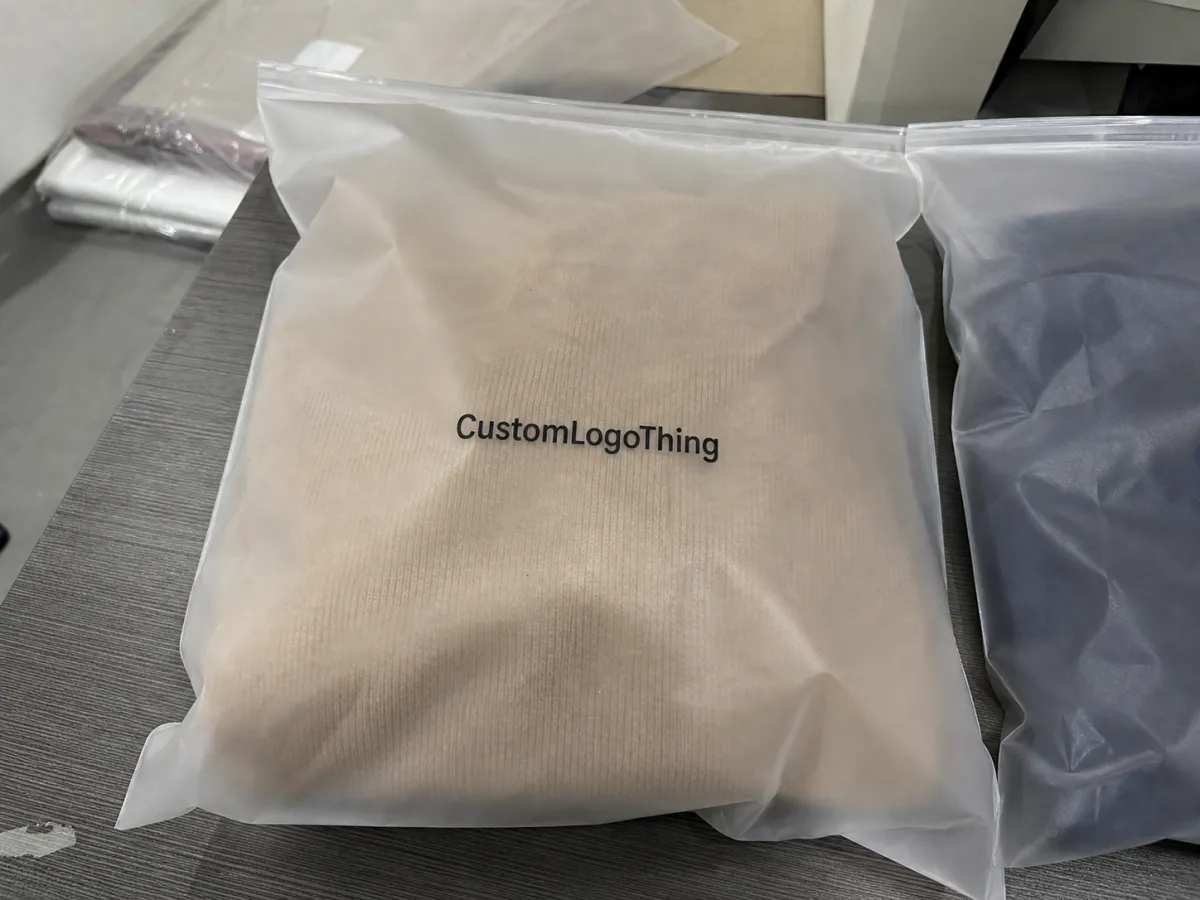
A frosted zipper bag changes the first read of a product before the customer touches it. The film diffuses light and softens edges, which can make a set feel considered rather than purely functional. That subtlety matters in branded packaging, because the bag stops acting like a shipping accessory and starts participating in the presentation.
The same surface that improves the look can also hide weak decisions. Pale gray text, thin rules, and crowded layouts lose clarity faster on frosted film than they do on a white insert sitting in open air. Under a store light, the surface mutes contrast; under a warehouse light, it can flatten color temperature. That is why the design needs to be built for the material, not merely placed onto it.
There is a useful comparison here. A clear bag exposes every alignment issue, while a frosted bag can disguise them just enough to let an error survive proofing. The customer then sees the mismatch at shelf or unboxing: the book feels premium, the bag feels premium, but the insert reads as an afterthought. Small discrepancies become visible because the presentation promises more discipline than the components deliver.
A frosted zipper bag improves presentation only when the insert is sized, printed, and packed with the same care as the rest of the set.
For practical buyers, this is where design and manufacturing stop being separate conversations. A simple two-color insert can outperform a complicated full-color layout if the spacing is cleaner, the hierarchy is clearer, and the content survives the bag’s muted finish. Premium is often a matter of restraint rather than coverage.
How the insert and bag work together on press and at packout
The insert is doing several jobs at once. It introduces the product, carries the barcode or QR code, provides legal or care information, and gives the buyer a quick sense of what is inside the pack. For some programs it behaves like a mini spec sheet; for others it is a brand card or a folded instruction panel. Its purpose changes, but its production burden does not.
On press, the frosted bag changes what counts as acceptable contrast. A layout that looks balanced on a white proof can feel weak once it is viewed through semi-opaque film. Darker type, better spacing, and larger quiet zones usually hold up better than delicate graphic tricks. White ink can help, yet it is not a default fix. It adds cost, complicates proofing, and should be used only when the artwork truly needs it.
Packout is where many “good on paper” jobs fail. Flat sheets are fast to handle but can drift in the bag if dimensions are loose. Folded cards need a fold plan that matches the visible panel. Hang-tag style inserts can twist when static builds in dry conditions, which is common in winter production environments and air-conditioned warehouses. None of this is dramatic; it is just the part of packaging that only shows up once human hands touch the stack.
- Flat sheets are simplest for fast packout, but they need tight size control so the edges do not wander inside the bag.
- Folded cards allow more copy, though the fold line has to be planned around the side the buyer sees first.
- Hang-tag style inserts improve shelf visibility, but they can rotate if the bag is handled before the seal or closure is fully set.
If the program includes related items, it helps to review the system as a whole rather than one SKU at a time. A coordinated run of Custom Packaging Products can keep the bag, insert, and any outer presentation piece visually consistent, which matters more than most teams expect once the set is on a table or shelf.
Book frosted zipper bags packaging insert checklist: specs to confirm before quoting
The fastest way to avoid a long quote cycle is to lock the physical specs first. Most delays do not come from machine speed or print capacity. They come from incomplete information: the supplier has artwork but does not yet know the finished bag size, whether the insert folds, or where the barcode has to sit. Once those gaps exist, every answer creates another question.
Start with the pack itself. Confirm the book dimensions, the finished bag dimensions, the zipper style, and whether there is a gusset or closure allowance that changes usable space. Then define the insert in finished form, not just on the artboard. Trim, fold, safe area, and visible area are not the same thing, and treating them as equal is a common source of rework.
- Bag size: finished width, height, and any gusset or side seam allowance.
- Book size: finished dimensions, binding thickness, and any sleeve or slipcase.
- Insert stock: paper or card grade, caliper, finish, and whether FSC-certified stock is required.
- Artwork setup: color mode, bleed, safe area, and live area for copy and barcode.
- Content blocks: title, ISBN, UPC or EAN barcode, QR code, legal copy, care notes, and retailer text.
- Assembly: insert count per bag, insertion order, and whether packout is hand-filled or machine-assisted.
The material choice should be explicit as well. A 14 pt cover stock behaves differently from a lightweight 100 lb text sheet, and those differences show up in stiffness, curl, and how well the insert holds its shape inside the bag. Coated stock gives sharper ink holdout. Uncoated stock reads softer, which can be useful for a more editorial look, but it also absorbs color differently and may need stronger type or larger point sizes.
Decide early whether the insert needs white ink or a backing layer. That choice depends on the frosted opacity, the ink density of the artwork, and how much contrast the buyer needs under retail lighting. Barcode placement deserves the same care. It needs quiet space around it and enough distance from any fold or cut line to scan reliably. A PDF preview is not proof enough; the final fold and final trim are what matter.
It also helps to put operational details in the same checklist as the creative ones. Add the approval owner, target quantity, proof status, sample status, and ship date. If the file only covers design fields, it stops being a control sheet and becomes another folder nobody trusts. The best version of the checklist behaves like a live record of what has been locked, what is pending, and who is responsible for the next sign-off.
For teams comparing suppliers, that shared sheet speeds the conversation. Everyone is looking at the same dimensions, the same content blocks, and the same packout rules. That matters even more if the order is connected to custom printed boxes or a broader launch kit that has to arrive ready for retail without an assembly delay.
Cost and pricing levers that change the unit cost
Pricing for an insert-in-bag program usually comes down to a handful of variables. Quantity is the most obvious. Small runs carry a higher unit price because setup, proofing, and waste are spread across fewer pieces. Once the order moves into larger volume, the per-unit cost tends to drop, but only if the specification stays stable. Change the size or artwork after quoting and the curve changes again.
Stock choice is another major lever. A heavier cover stock, a coated sheet, or a specialty finish will increase cost even if the layout looks plain. Full bleed color, spot color, white ink, and varnish all add process steps. A simple black-only insert may land in a rough range of $0.08-$0.18 per piece at a few thousand units. A more involved full-color insert with special handling can move well beyond that, especially if the job needs more than one proof round.
Assembly often becomes the hidden expense. Once the book, insert, and frosted bag are collated together, labor can matter as much as print. If the work is hand-filled, the quote may include insertion labor, inspection time, rework allowance, and carton packing. Freight matters too. Retail packaging that has to arrive clean and flat may require stronger shipper protection than a buyer expects at first glance.
| Option | Typical setup impact | Rough unit effect | Best fit |
|---|---|---|---|
| Simple one-sided insert | Lower setup, fewer proof rounds | Lowest cost band | Short messaging, barcode, care note |
| Folded insert card | More finishing and fold control | Moderate increase | Longer copy or multi-panel content |
| Full-color insert with white ink | More press setup and color checks | Higher cost band | Premium presentation or dark backgrounds |
| Hand kitting with bag insertion | Labor becomes a main line item | Can add $0.03-$0.12 per unit or more | Low volume or mixed-SKU packs |
| Rush scheduling | Compressed review and production window | May add expedite charges | Fixed launch dates and retailer deadlines |
Material price bands also shift with paper markets and finish requirements. In practice, the difference between a lightweight insert and a thicker premium card can matter more than a buyer expects once quantities exceed a few thousand units. That is why the quote should reflect both the physical spec and the assembly method, not just the printed artwork.
If the insert is part of a broader launch, compare its cost against the rest of the package instead of treating it as the only line item. Sometimes a small improvement in the insert or bag does more for perceived value than a more expensive outer carton. For material and supply-chain references, Packaging.org and ISTA are useful starting points.
Process and timeline: from artwork approval to packed cartons
A clean production path starts before artwork is finalized. First comes discovery: the bag size, insert dimensions, quantity, and exact content requirements are confirmed. Only then can the printer or converter review the dieline, map the fold logic, and decide whether the insert is being printed flat or finished folded. Skipping that sequence is one of the main reasons jobs slip.
- Discovery and spec capture: define bag size, book size, insert format, and pack count.
- Dieline and layout review: confirm trim, fold, safe area, barcode quiet space, and seal clearance.
- Copy lock: freeze product name, legal text, ISBN or barcode data, QR destination, and retailer wording.
- Proof review: check color, type size, placement, and any white ink or finish callouts.
- Sample approval: approve a flat proof or assembled sample before full production.
- Run and packout: print, finish, insert, and carton the job for ship.
Lead time changes quickly once special finishing enters the job. A straightforward insert paired with a stock-size frosted bag often lands in the 10-15 business day range after proof approval. Custom bag sizing, folded inserts, or white ink can extend that window, sometimes by a full week or more depending on the quantity and the shop schedule. If the buyer wants a physical proof, shipping and review time have to be added as well.
The delay points are predictable. Missing barcode data slows artwork. Unclear pack counts slow scheduling. Late changes to the fold or copy force a new proof. Approval bottlenecks are just as common; the work may be ready, but the sign-off is sitting with a stakeholder who was not clearly named in the first place. A checklist helps only if it is completed before the run is reserved.
Distribution should also be part of the timeline conversation. If the pack will be handled heavily in transit or reopened for retailer checks, the team should think about the carton spec and transit method at the same time as the insert. Packaging performance guidance from Packaging.org and test references commonly associated with ISTA are useful reminders that a good display pack still has to survive shipping.
Common mistakes that cause reprints, delays, or weak shelf appeal
The first mistake is designing to the artboard instead of the finished object. A layout can look perfectly aligned in software and still fail once the trim, seam, or fold allowance is applied. That is how type gets clipped, logos drift too near the edge, or the insert appears smaller than expected once it is held against the bag.
The second mistake is relying on subtle contrast. Frosted film softens detail, and that matters more than many design teams expect. Hairline rules, pale copy, and low-contrast backgrounds can disappear under bright retail lighting. If the design depends on nuance, ask for a physical sample before approving the run. A screen proof will not show how the bag changes the reading experience.
The third mistake is ignoring packout order. If the insert is placed after the book, it can curl, slip, or land reversed. Static makes that worse in dry environments. A simple insertion sequence, written clearly on the checklist, prevents a surprising amount of rework. It also keeps the line moving because packers do not have to improvise at speed.
- Barcode problems: wrong size, bad quiet zone, or placement too close to the fold.
- Legal copy misses: missing country-of-origin, warnings, or retailer-specific wording.
- Sample mismatch: approving a PDF without checking a physical bag sample.
- Late spec changes: changing quantity, fold, or stock after the proof stage.
Those mistakes cost more than the reprint. They add receiving labor, push launch dates, and reduce confidence in the packaging system. In resale packaging, delay can be as expensive as waste. A job that misses its window may need special freight, priority scheduling, or a second round of handling before it can even get into the channel. That is why teams should verify barcode readability and legal copy before approval, not after cartons are sealed.
Expert tips and next steps for a clean production handoff
The most practical handoff is a single master checklist with the owner, due date, quantity, insert copy, bag size, proof status, and approval history in one place. It sounds basic. It is also the fastest way to prevent the most common cross-team failure: everyone assumes someone else has already checked the spec.
If the insert folds, ask for both a flat proof and an assembled sample. The flat proof confirms type and color. The assembled sample tells you what the buyer actually sees first, how much copy remains visible, and whether the fold disrupts the visual balance. On frosted film, that first visible panel carries more weight than teams often expect because the bag already softens the artwork.
I would also check the layout against a real bag sample under bright light before final approval. Screen proofs flatten the truth. The physical sample shows whether type still reads, whether the barcode sits in a clean zone, and whether the pack feels deliberate once all components are together. That small step catches more issues than most rounds of discussion.
If the product line is expanding, align the insert, the bag, and any matching carton at the same time. That keeps the visual logic consistent across the set and reduces the chance that one component feels like it came from a different program. For teams building a larger release, the same discipline that helps with Custom Packaging Products also helps with future reorders, because the spec is documented instead of reconstructed from memory.
Used well, the checklist does more than organize the quote. It ties the brief, the proof, and the production run together so the final pack behaves the way the original concept promised. That is the difference between packaging that merely contains a book and packaging that makes the book feel finished.
What should be on a book frosted zipper bags packaging insert checklist?
Include the finished bag size, insert size, and book size so the pack closes cleanly and the visible copy lands in the right place. List all required content blocks, including the barcode or QR code, product title, care notes, legal copy, and retailer instructions. Add approval details such as quantity, proof status, pack count, and target ship date so production does not rely on memory.
How do I size the insert for a frosted zipper bag?
Size the insert to the finished pack, not only to the art file. The zipper seam, fold, and any closure allowance can hide edges or clip copy. Leave safe margins around text and barcodes so nothing touches the trim or disappears in the bag’s closure area. If the artwork is type-heavy, check it against a real bag sample before approving the run.
What drives the price of printed bag inserts?
Quantity, stock choice, and print coverage usually drive the biggest swings. Kitting labor matters when the book and insert are packed together inside the bag, because assembly time becomes part of the quote. Rush timing, proof count, and freight can also change the final number even when the insert itself looks straightforward.
How long does production usually take after approval?
A simple insert paired with a stock-size frosted bag often runs in about 10-15 business days after proof approval. Custom sizing, folded inserts, and white ink can extend that schedule. Physical proofs add time for print, delivery, and review, so the lead time should be confirmed before the artwork is locked.
Can one insert work for multiple book SKUs?
Yes, if the shared dimensions, messaging, and packout method stay consistent across the line. Variable stickers, SKU codes, or retailer-specific panels can handle the fields that change from one book to another. Recheck barcode, price, and legal copy before reusing the layout so one insert does not create several approval issues.

