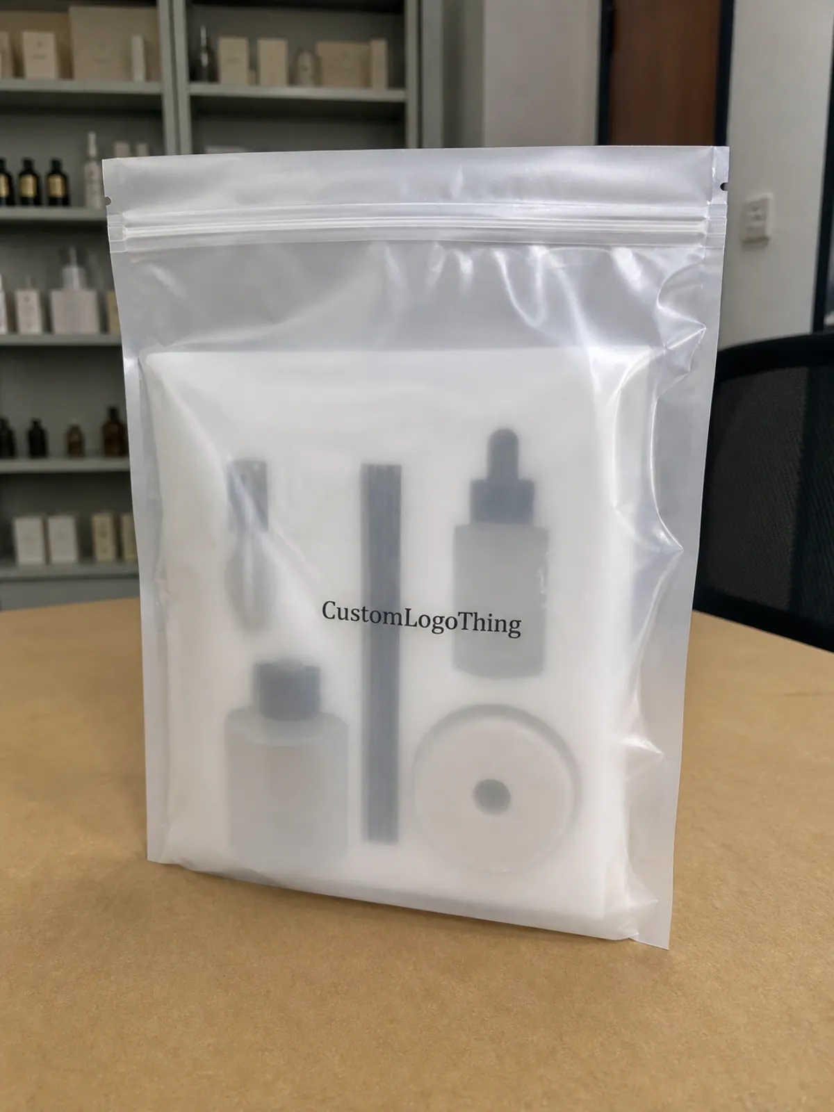
If you are building a home fragrance Frosted Zipper Bags Packaging Insert checklist, the goal is bigger than collecting specs. The insert has to carry the scent story, preserve brand clarity, and still read well through translucent packaging that softens contrast. That is a narrow target. Miss it, and the pouch looks vague; hit it, and the product feels considered before the zipper even opens.
For candles, reed diffusers, room sprays, and sachets, the insert behaves like a small billboard with a few hard limits. It sits behind the product, loses some visual sharpness through frosted film, and often has to survive handling during kitting, shipping, and retail display. Buyers who treat it as a throwaway sheet usually pay for that decision later in reprints or awkward shelf presentation.
Used well, the insert supports packaging design, clarifies claims, and helps the set look finished rather than assembled. If matching labels, cards, or cartons are part of the same launch, the broader Custom Packaging Products catalog can keep the branding system consistent across formats. The checklist exists for one reason: to keep creative choices and production constraints in the same room before the first proof is approved.
Why the Insert Changes the Whole Unboxing Story
Frosted Zipper Bags flatten some details and blur others. That can be useful for a clean, modern look, but it also means the insert has to do more of the communication work. A crisp mockup on a screen may look balanced; the real pouch, under store lighting, often tells a different story. Compared with an opaque carton, the frosted bag behaves a little like tracing paper over a poster. The image is still there, only less forgiving.
That is why the first question in any home fragrance frosted zipper Bags Packaging Insert Checklist should be about hierarchy. What must the shopper see first: the fragrance name, the scent family, a sustainability claim, or usage instructions? If everything is equally loud, nothing is legible. Thin scripts, low-contrast grays, and long paragraphs can disappear faster than most teams expect once the film diffuses the artwork.
A buyer can forgive a modest stock. They rarely forgive copy that disappears behind the bag or an insert that feels added after the fact.
The insert should act like a compressed sales sheet for product packaging. It can explain the fragrance profile, reinforce package branding, and make a small pouch feel intentional. That matters in seasonal sets and gift programs, where the bag may be hung, stacked, or angled on a shelf. A good insert does not need to say everything. It needs to say the right things in the right order.
- Check the hierarchy: brand, scent, and required claims should not compete for equal weight.
- Plan for translucency: the final bag always reads softer than a bright screen proof.
- Leave breathing room: frosted film and curved products both eat into legibility.
One practical observation: the tighter the pouch, the less margin for decorative type. A layout that feels spacious on an artboard can look crowded once the product is inside. The difference between elegant and cluttered is often a few millimeters, not a new concept.
How Frosted Zipper Bags and Inserts Work Together
Think of the frosted zipper bag as a soft visual filter. It creates a clean presentation, but it also reduces contrast and makes the insert carry more of the message load. That means the insert dimensions, fold position, and artwork placement should be mapped to the finished bag size, not estimated from a flat sketch. The bag is part of the design system, not just the container.
Fit matters. If the insert is too tall, it can buckle behind the closure or curl at the top edge. Too short, and it drops into dead space that makes the pack look undersized. For a filled pouch, the visible area should feel centered after the product is packed. Even a quarter inch can change the composition enough to make the brand feel either intentional or off-balance.
Orientation is another detail that gets missed. A frosted zipper bag may be sold from the front, but it is handled from the back, tilted in transit, and checked at odd angles during fulfillment. Barcode placement, safety copy, and panel breaks should all reflect that path. If the insert is folded, the front panel still needs to read like a complete layout, not a partial flyer.
Pack-out order matters just as much as print quality. A centered insert makes the pouch feel premium. A crooked one makes the whole assembly look rushed, even if the fragrance formula is excellent. That is why a useful checklist includes not only size and stock, but also how the piece is inserted, whether it ships flat or pre-folded, and who signs off on the final placement.
For small retail packaging runs, the real test is not the PDF. It is the finished pouch in hand, with the product inside, under ordinary indoor light. If the message still reads in that condition, the layout is doing its job.
Material, Print, and Finish Choices That Affect Performance
Material choice determines how much structure the insert brings to the pouch. A light text sheet may be fine for a mailer insert, but it can feel flimsy inside a retail pouch that is meant to hold candles or diffuser components. For home fragrance, a stiffer stock usually performs better because it resists curl and keeps the face of the piece flat behind the product. Common options include coated paper, uncoated paper, SBS, and synthetic stocks. Each one changes opacity, stiffness, and the way ink sits on the surface.
A 14pt C1S or 16pt SBS insert often gives a practical balance of structure and print quality for branded packaging. It is thick enough to hold shape, but not so heavy that it creates unnecessary bulk in the bag. Synthetic materials can help with moisture resistance, which may matter in humid fulfillment environments or bathroom-adjacent fragrance lines. They also tend to feel more plastic, so they are not the right answer for every brand. The finish has to match the product story.
Print method should follow run length and artwork behavior. Digital printing makes sense for shorter runs, variable copy, and designs that may change before launch. Offset printing is usually stronger for higher volumes because color consistency improves and per-piece cost drops as quantity rises. For heavy solids, tiny text, and repeated brand marks, offset often delivers a steadier result. If the line is still changing, digital is usually the safer choice.
Finish is where a lot of teams overreach. Matte or aqueous coatings tend to sit better with frosted film because they keep the package calm and readable. Soft-touch can feel premium, but it should be tested against the bag texture; too much softness in both materials can make the pack feel muted. High gloss is rarely the best fit here. Under bright retail lights, it can fight the frosted look and create glare that works against legibility.
Two outside checks are worth folding into the spec review. If the insert is paper-based, ask whether it can be sourced as FSC-certified material through FSC. If the pack is being shipped in volume or through mixed distribution, ask whether the finished setup should be evaluated against an ISTA test profile or an ASTM-style distribution test such as ASTM D4169. Those checks catch scuffing, shifting, and compression problems before they become returns.
- Short runs: digital print on a midweight coated stock with matte or aqueous finish.
- Premium shelf appeal: offset print on SBS or heavier coated board with disciplined color control.
- Humidity risk: synthetic or treated stock, if the tactile feel still suits the line.
There is a tradeoff here that buyers sometimes miss: the more protection the stock offers, the less it may feel like paper. That is not a defect. It is a signal that the material choice is changing the brand impression as much as the artwork does.
Packaging Process, Proofing, and Lead Time
Delays usually start with vague specs, then multiply when proofing begins. A practical home fragrance Frosted Zipper Bags packaging insert checklist should lock the production path before pricing is requested. Once the dimensions, copy, and finishing route are clear, the rest of the schedule becomes easier to defend.
- Brief: define the product family, audience, scent notes, and required claims.
- Dimensions: confirm finished bag size, insert size, fold lines, and visible area.
- Copy deck: finalize scent language, directions, warnings, and legal text.
- Dieline: place barcode zones, trim, and margin rules before artwork begins.
- Proof: review layout, color balance, and readability on the chosen stock.
- Sample: check the insert inside the actual bag with the actual product.
- Approval: lock the file only after the sample passes review.
- Production: print, cut, finish, and stage for shipment or insertion.
Before requesting pricing, gather the full spec set: finished bag size, insert dimensions, versioned artwork, color count, finish, quantity, and pack-out method. If the insert ships flat, folded, or pre-inserted, that changes labor and carton efficiency. It also changes the chance of damage during transit. Teams managing custom printed boxes alongside pouches should keep all of those specs in one system so the launch does not drift across multiple spreadsheets.
Timing is usually split into three blocks. Proofing and sample review often take a few business days. Production commonly runs one to three weeks depending on quantity, finishing, and press method. Freight is separate. That last point causes more missed launches than most teams admit, because shipping time gets mentally folded into production until the schedule starts slipping.
One revision cycle can push a launch by several days. If the insert is tied to a retail reset or a seasonal drop, that delay matters. The cheapest-looking choice on paper is not always the cheapest choice on the calendar.
The preproduction sample is the best money a buyer can spend. It reveals small problems that screens hide: fold direction mistakes, type that looks fine on screen but weak in hand, barcode placement that crowds the edge, and color shifts that appear once the sheet sits inside the frosted pouch. It also answers a more practical question: does the insert still look centered after the fragrance product is packed? That answer matters more than the mockup.
Pricing, MOQ, and Unit Cost Drivers
Insert pricing is usually easy to decode once the components are separated. Stock, size, ink coverage, finish, tooling, setup time, and whether the insert is shipped flat or folded are the main drivers. A simple one-sided card can stay relatively inexpensive. Add a second side, heavier board, a specialty coating, or manual insertion, and the cost rises quickly.
MOQ depends on print method. Digital work often starts lower because setup is lighter and the line is more flexible. Offset typically wants larger runs, but the unit economics improve as quantity rises. For many buyers, the right answer is not the lowest quote at one quantity. It is the best break point across several quantities.
| Option | Typical MOQ | Typical Unit Cost | Best Use | Main Tradeoff |
|---|---|---|---|---|
| Digital print, 14pt stock | 250-1,000 | $0.18-$0.42 each | Test launches, seasonal scents, frequent artwork updates | Higher per-piece cost at larger volumes |
| Offset print, 16pt SBS | 2,500-10,000 | $0.05-$0.16 each | Core retail packaging programs | Higher setup and less flexibility on changes |
| Premium finish with soft-touch or spot coat | 1,000-5,000 | $0.10-$0.28 each | Gift sets and elevated branded packaging | Added finishing cost and longer lead time |
| Manual kitting or pre-insertion | Project-based | $0.03-$0.12 added labor | Mailers, subscription sets, display-ready packs | Labor, carton efficiency, and handling risk |
Hidden costs are usually the ones that surprise a budget. Freight is obvious. Rush charges are less so. Extra sample rounds, special transit packaging, and hand-inserting cards into each pouch can all add up. If the insert program sits beside labels, cartons, or a broader Custom Packaging Products order, ask whether the jobs can be coordinated to reduce setup waste or simplify fulfillment. Sometimes the lowest line item is not the lowest project cost.
Design time can also become the real expense. If the insert must carry ingredients, warning copy, and multiple scent variants, artwork revisions expand quickly. Clean specs save money before the press even starts.
Common Mistakes That Lead to Reprints or Dull Shelf Appeal
The most common mistake is weak contrast. Frosted film softens the view, so copy that looked fine on a monitor can vanish once the insert is behind translucent packaging. Thin fonts, pale gray type, and dense paragraphs all become harder to read. In retail packaging, readability is not a style preference. It is part of the sale.
Sizing errors are next. Inserts are often approved before the final filled pouch is measured, which is a fast route to a poor reveal. Product volume changes the visible area. A candle jar, a reed bundle, and a flat sachet all occupy the bag differently, so the layout has to be checked with the actual fill. If the product blocks the key message, the insert has failed its job.
Compliance is a common late-stage trap. Fragrance packaging may need ingredients, safety warnings, usage directions, or region-specific copy. Leaving that out can force a redesign after artwork has already been signed off. That is expensive because it affects both content and production timing. Good packaging design does not hide required text just to keep the page pretty.
Color approval can drift too far if teams rely on screen proofs alone. A screen proof is useful for layout. It is not a final color promise. The better check is a sample on the actual paper or board, viewed under normal light, with the bag material in hand. Warm neutrals, deep blacks, and soft pastels can shift more than expected through frosted film.
Then there is the pack-out itself. A premium insert can still look poor if it is bowed, crooked, or folded against the wrong panel. That is where package branding gets lost in the details. The insert, bag, and product should read like one planned system, not three separate purchases assembled at the end.
Expert Tips for Cleaner Specs and Faster Reorders
If a fragrance line uses multiple scent families, standardize insert sizes wherever possible. Reusing one or two proven dimensions reduces artwork churn, simplifies inventory planning, and makes reorders easier to manage. It also lowers the chance that a future order will drift because someone recreated the file from memory.
Build one master checklist and keep it current. It should include artwork version, barcode placement, fold direction, finish, approved sample notes, warning copy, and pack-out method. Keep it with the rest of your Custom Packaging Products records so a new coordinator does not have to rebuild the project from scratch. Tidy specs save more time than rushed corrections ever do.
Keep a photo record of the approved insert inside the actual frosted zipper bag. That sounds small, but it prevents a lot of debate later. Six months from now, a reorder should not depend on memory or a cropped PDF. A real-world reference makes the next production run easier to judge.
It also helps to define a color baseline. If your house style uses cream, charcoal, sage, or soft gold, lock those references to the approved paper and finish. The more a line repeats, the more valuable the baseline becomes. The cleanest retail packaging programs are often the ones with the least drama in their specifications.
Before release, compare quotes side by side, request a preproduction sample, and walk through the checklist line by line. If the bag size, stock, finish, and insertion method are all clear, the insert becomes a quiet strength in the pack instead of a correction waiting to happen.
What should be on a frosted zipper bag packaging insert checklist?
Start with the finished bag size, insert dimensions, and the amount of artwork that will remain visible after the product is packed. Add stock, finish, artwork version, barcode placement, and any fragrance compliance or warning copy. The checklist should also confirm whether the insert ships flat, folded, or pre-inserted, because that changes handling and labor.
How do I keep insert text readable through home fragrance frosted zipper bags?
Use strong contrast, heavier type weights, and larger point sizes than you would choose for an opaque carton. Avoid thin scripts, pale colors, and dense paragraphs that can blur once the frosted film softens the image. Then test the design in actual lighting, with the actual product in the actual bag, because that is where readability is won or lost.
What MOQ is typical for frosted zipper bag inserts?
MOQ depends on print method, size, and finish, so digital and offset quotes can look very different. Smaller digital runs often start lower, while offset becomes more attractive as quantity rises. Ask for tiered pricing so you can compare flexibility against unit cost instead of guessing at the break point.
How long does the insert process usually take?
Proofing and sample review often take a few business days, while production commonly runs one to three weeks depending on complexity. Late artwork changes, specialty finishes, or sample revisions can add time quickly. Shipping is separate, so build the full timeline around production plus transit rather than assuming the freight window will fit itself in.
How can I lower unit cost without hurting presentation?
Standardize insert sizes, reduce the number of ink colors, and avoid specialty finishes unless they clearly improve the shelf story. Bundle similar scents under one spec when possible so buying power improves and reorders stay simpler. The cleanest savings usually come from tightening the home fragrance Frosted Zipper Bags packaging insert checklist, not from stripping away the part that makes the package feel finished.


