Buyer Fit Snapshot
| Best fit | packaging buyers who need clearer specs, stronger internal paths, and repeatable quote decisions where brand print, material, artwork control, and repeat-order consistency matter. |
|---|---|
| Quote inputs | Share finished size, material target, print colors, finish, packing count, annual reorder estimate, and delivery region. |
| Proofing check | Approve dieline scale, logo placement, barcode or warning zones, color tolerance, and any recyclable or compostable wording before bulk production. |
| Main risk | Vague material claims, crowded artwork, or missing packing details can create delays even when the unit price looks attractive. |
Fast answer: Branded Luxury Cartons with Foil: Design, Cost, and Process should be specified like a repeatable production item. The safest quote includes material, print method, finish, artwork proof, carton packing, and reorder notes in one written spec.
What to confirm before approving the packaging proof
Check the product dimensions against the actual filled item, not only the sales mockup. Ask for tolerance on folds, seals, hang holes, label areas, and retail display edges. If the package carries a logo, QR code, warning copy, or legal claim, reserve that space before decorative graphics fill the panel.
How to compare quotes without losing quality
Compare board or film grade, print process, finish, sampling route, tooling charges, carton quantity, and freight assumptions side by side. A lower quote is only useful if the supplier can repeat the same color, closure quality, and packing count on the next order.
Branded Luxury Cartons with Foil: Design, Cost, and Process
Branded luxury Cartons with Foil can make a modest carton feel far more premium than a larger, louder box, especially when the metallic detail is placed with restraint and the structure supports the reveal. The effect is immediate. A clean logo hit on a matte panel, a narrow edge catching light on a shelf, or a small seal on a rigid-style carton can change how a customer reads the product before the box is even opened.
For a packaging buyer, the real question is not whether foil looks attractive. It is whether the foil choice, board selection, printing method, and finishing stack all work together to deliver the right shelf signal without creating avoidable cost or production risk. Branded luxury cartons with foil should be treated as a design and manufacturing decision, not just a graphic one. That distinction matters, because a carton that looks excellent in a mockup can still fail if the board is too rough, the type is too small, or the foil sits across a fold line.
In practice, the best results usually come from a short chain of decisions made early: which product needs to feel premium, how much of the carton should shine, what the carton must survive in transit, and what the budget can support without forcing compromises later. A fragrance launch, a skincare gift set, and a limited-edition watch box all need different answers, even if the word "luxury" appears in the brief for all three.
Why Branded Luxury Cartons with Foil Stand Out
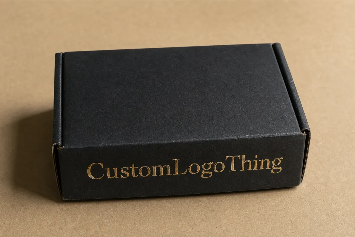
A carton does not need to be oversized to feel premium. Some of the strongest shelf performers are compact boxes with a disciplined layout, a stable surface, and one metallic accent that catches the light at the right angle. The foil is doing more than decorating the pack; it is directing attention, marking hierarchy, and signaling that the brand spent time on the details.
Luxury cartons are often built around paperboard folding cartons or rigid-style cartons with elevated graphics, a controlled finish stack, and a more deliberate unboxing experience. A folding carton made from 350gsm to 400gsm C1S or C2S board can feel refined with the right coating and print treatment, while a rigid carton wrapped on 1000 to 1500 micron greyboard adds structure, weight, and the kind of hand-feel many premium buyers expect. For brands shipping internationally, that extra stiffness can also help protect corners during fulfillment, though it increases material and freight costs.
Foil changes perception quickly because metallic light behaves differently from ink. A printed gold tone can suggest luxury, but real foil gives a crisp reflectivity that reads as intentional and tactile. The difference is subtle on a screen and obvious on a shelf. A narrow foil mark, especially over a matte or soft-touch background, often looks more expensive than full-coverage shine because the eye sees contrast rather than noise.
Practical rule: the more premium the brand story, the more carefully foil should be used. A single foil focal point usually reads stronger than multiple decorative accents competing for attention.
That subject sits squarely between branding and manufacturing. A designer may be thinking about mood and visual language, while a converter is thinking about die detail, registration tolerance, coating compatibility, and how the carton will behave through scoring and folding. Both views matter. If the foil area is too fine, the die may lose clarity. If the surface is too textured, the release can turn uneven. If the design ignores the fold lines, the finish can crack or drift off position. Good results come from planning all of that early.
Most premium lines benefit from a quiet approach rather than a loud one. A restrained metallic element over a well-chosen board does more for perceived value than a carton that tries to shine everywhere. A cosmetic brand that needs to stand out in a crowded retail bay may use a foil logo and a single edge detail, while a corporate gift box may reserve the foil for the lid only, keeping the rest of the pack understated.
How Foil Stamping Works on Luxury Cartons
Foil stamping starts with a heated die pressing foil from a carrier film onto the carton surface. Under the right combination of pressure, temperature, and dwell time, the foil transfers only where the die touches, leaving a crisp image behind. On paperboard, that usually means the surface must be smooth enough for clean release and strong enough to handle the heat without distortion.
Most branded luxury cartons with foil use hot foil stamping, not cold foil. Hot foil is generally preferred for premium cartons because it creates a sharper edge and a more deliberate metallic impression on paperboard. Cold foil can work well in certain inline print environments, but it behaves differently and does not always deliver the same tactile quality on short-run folding cartons or textured substrates.
The foil itself comes in several familiar but very different looks. Gold and silver remain the most common, but holographic, pigment, matte metallic, and colored foils each create a different brand mood. Gold can feel classic or modern depending on the surrounding palette. Silver tends to read cleaner and cooler. Copper and rose tones often feel warmer and more artisanal. Pigment foils create color without the mirror-like flash of metallic foil, which can work well for brands that want a premium feel without a high-gloss finish.
Foil rarely has to cover the whole carton to work. In fact, the strongest luxury cartons often place foil in just a few zones: a logo on the front panel, a small seal on the top flap, a border around a product name, or a hidden detail on the inside wall that appears during unboxing. That interior touch is a smart way to reward the customer without spending the finish budget on every exposed surface.
Foil can also be layered with other finishing methods. Embossing pushes the design up from the surface, while debossing presses it inward. Spot UV creates a glossy contrast over matte print. Soft-touch coating gives the board a velvety feel that makes the metallic detail stand out even more. A lamination layer can protect the surface, though it should be chosen carefully because some laminates can reduce foil adhesion or make the carton feel less natural in hand.
That layering gives the design depth, but restraint still matters. A foil mark paired with an emboss can look elegant. Add heavy spot UV, full metallic ink, and a crowded pattern, and the carton can start to lose its hierarchy. The finish stack should support the story, not compete with it.
Technical limits matter as well. Very fine lines, tiny type, and highly detailed gradients are all harder to stamp cleanly than bold shapes or simple letterforms. A good production file should be built with the stamping method in mind from the beginning, not patched together after the artwork is already approved. For fine foil text, many converters prefer to stay at or above 6 to 7 pt depending on the font, with enough stroke weight to hold detail after heat and pressure are applied. Serif faces and hairline scripts often need more caution than simple sans serif lettering.
Cost, Pricing, MOQ, and Quote Factors
Pricing for branded luxury cartons with foil depends on a few core variables, and the biggest mistake buyers make is treating foil as a single add-on instead of a chain of cost decisions. Board grade, carton style, print coverage, foil area, embossing, coating, die cutting, glueing, and final packing all move the number in different ways.
Setup costs are especially important on smaller runs. A stamping die or plate must be made, proofs may need to be checked, and the press setup takes time whether the order is 1,000 pieces or 10,000 pieces. That means short runs carry more of the setup burden on each unit. A larger run spreads those fixed costs more efficiently, which is why the per-unit price often drops noticeably as quantity increases.
Minimum order quantities can vary by supplier and by finish complexity. Simple printed folding cartons with one foil hit may be possible at lower quantities, but a rigid carton with multiple finishing layers usually becomes more practical at a higher volume. The challenge is not just whether a factory can make the box. It is whether the result stays consistent enough to justify the premium positioning. A buyer ordering 800 cartons for an influencer launch may get a very different quote structure than a brand ordering 12,000 cartons for retail distribution.
Here is a practical way to compare common options before asking for a quote:
| Carton Type | Typical Finish Stack | Approximate Cost Impact | Best Use Case |
|---|---|---|---|
| Folding carton | 350gsm C1S board, 1-color print, single foil hit, matte coating | Lowest premium finish cost; often around $0.45-$1.20 per unit at mid-volume, depending on quantity and coverage | Beauty, fragrance, accessories, and retail cartons that need a premium look without heavy structure |
| Enhanced folding carton | Thicker board, foil plus emboss or spot UV, precise registration | Moderate cost increase; often around $0.75-$1.80 per unit at mid-volume | Products that need stronger shelf impact and a more tactile finish |
| Rigid-style carton | Greyboard wrap, foil, specialty coating, ribbon or insert optional | Higher cost; often around $1.80-$4.50+ per unit depending on materials and labor | Gift sets, prestige goods, and high-value items where box feel matters as much as the graphics |
| Limited premium run | Custom structure, multi-step finishing, multiple SKUs | Highest unit cost because tooling and setup are spread across fewer pieces | Launches, seasonal collections, and test programs with a narrow quantity window |
That table is only a planning tool, not a quote. Actual pricing depends on the size of the carton, the amount of foil coverage, how many colors are printed, whether the design needs embossing, and whether the box is shipped flat or assembled. A quote should also state what is included: prepress review, digital proof, physical sample, tooling, die cutting, finishing, packing, and freight. If any of those are missing, the comparison can become misleading fast.
For buyers managing several SKUs, the easiest way to protect budget is to standardize what can be standardized. Keep the board caliper consistent across the range, use the same foil type on each SKU, and focus the premium effect on one visible area instead of trying to decorate every panel. That approach usually gives a cleaner brand family and keeps the finishing budget under control. It also reduces the chance that one item in the range looks noticeably "more expensive" than the others for reasons that have nothing to do with the product itself.
If you want to see how different packaging formats and finishing stacks behave in real projects, our Case Studies page shows examples that can help you compare structure, decoration, and shelf presentation.
Production Steps, Process, and Timeline
The production flow for luxury cartons is straightforward in theory, but the detail work can stretch the schedule if files are incomplete or if the finishing stack is still changing. A typical job begins with a concept brief, moves into structural design and artwork prep, then proceeds through digital proofing, sampling, approval, printing, foil stamping, finishing, die cutting, folding, and final packing.
Most delays happen before the press ever starts. The most common causes are unclear art files, dielines that do not match the chosen structure, changes to the copy after proofing, tooling that needs to be revised, and color or finish adjustments that were not addressed early. A launch team may think the job is ready, while the production team is still waiting on a correct foil layer or a font conversion that keeps the tiny details stable.
A realistic timeline depends on complexity. A simple folding carton with one foil hit might move through production faster than a rigid-style box with embossing and a custom insert, but both still need room for proofing and finish validation. A basic run may take 12 to 15 business days after proof approval, while a more detailed premium project can take 18 to 30 business days or longer once tooling, sampling, and final checks are included. If shipping is international or peak-season capacity is tight, that window can widen further. Buyers planning a seasonal launch should assume extra time for sign-off rather than hoping the sample passes on the first review.
Physical samples are worth the time. A screen mockup tells you almost nothing about foil sheen, board stiffness, color on the chosen substrate, or how the folds behave after scoring. A sample or prototype lets the team inspect the metallic edge, compare the warmth or coolness of the foil under real light, and check whether the carton feels balanced in the hand. That is also the best moment to decide whether the finish stack needs simplification.
Quality control should be built into the job, not added after the cartons arrive. Inspect foil adhesion, edge clarity, registration to print, score accuracy, glue performance, and consistency across the run. A carton that looks excellent on the first few pieces but drifts across the batch can damage a premium launch quickly, especially if the foil starts to break at fold lines or the emboss is not centered. One missed glue flap or one inconsistent foil panel can undo the perception of quality the customer formed in the first five seconds.
For transport testing and distribution planning, it helps to think beyond the box itself. If the product will ship through retail distribution or e-commerce, ask about carton compression, abrasion, and vibration testing. Standards and methods associated with ISTA can be useful reference points for shipping performance, especially when a premium carton also has to survive a real logistics chain without scuffing or crushing.
The strongest projects are the ones that treat approval as a production checkpoint, not a formality. Once the foil, board, and structure are signed off, changing any one of them can affect fit, finish, and cost. A few extra hours spent on sample review often save days later.
Key Design Factors That Shape the Final Look
Contrast is the first design decision worth paying attention to. Foil looks strongest against dark solids, quiet neutrals, or matte backgrounds that give the metallic surface room to breathe. A busy panel can dilute the effect because the eye has too many places to land. A calm field makes the foil feel intentional, not decorative for decoration's sake.
Typography matters just as much. Premium cartons usually rely on restrained type, generous spacing, and a clear hierarchy rather than crowded layouts with too many competing treatments. A brand name in foil, a smaller product descriptor in ink, and a carefully chosen amount of white space can carry more authority than an elaborate graphic system that tries to announce every message at once. If the type is squeezed too tightly, the carton can look expensive for the wrong reasons: effort without clarity.
Color choice changes the mood of the foil. Gold is not always traditional, and silver is not always cold. A warm beige carton with rose foil can feel contemporary and soft. A deep charcoal carton with bright gold can feel formal and high value. A black carton with matte silver can read technical, modern, and exact. The same foil color can tell a very different story once it sits next to the substrate and ink coverage.
Structure also belongs in the design conversation. A tuck-end carton gives a straightforward retail impression. A shoulder pack introduces a more ceremonial opening. A rigid carton feels heavier and more gift-like. A sleeve can reveal the inner carton in stages, which gives the brand more room to create anticipation. That reveal is not just theatrical; it affects how the customer perceives the box quality and the product inside.
Sustainability should be considered without oversimplifying it. Board selection, coating choice, foil coverage, and the mix of materials all influence recyclability and recovery. A carton with light foil decoration on paperboard may be easier to recover than one wrapped in heavy lamination or mixed films, but local recycling rules vary and the finish stack matters. If sustainability is part of the brief, keep the foil area focused and ask about board options that balance premium feel with end-of-life practicality. FSC-certified paperboard may also be a good fit for brands that want to document responsible sourcing; FSC provides background on certified forest materials and chain-of-custody expectations.
The design goal is not to make the carton shout. It is to make it look certain. That confidence usually comes from a single strong focal point, a controlled finish stack, and careful alignment between the visual language and the physical structure. A carton that feels certain tends to photograph better, display better, and survive more debate during internal approvals.
Common Mistakes to Avoid with Foil Cartons
The easiest mistake is overuse. Too much foil can flatten the hierarchy and make the carton feel noisy instead of refined. When every panel gleams, nothing stands out. A luxury carton benefits from contrast and pause, so the metallic detail has a chance to act like a highlight rather than wallpaper.
File prep causes another set of problems. Raster artwork for fine foil detail is risky because the edges may not hold cleanly in production. Tiny type placed too close to a fold can disappear after scoring. Dielines that are not respected can lead to foil ending up inside a glue flap or crossing a crease in a way that causes cracking. These are preventable issues if prepress reviews happen early and the artwork is prepared as vector where possible.
Material choice can ruin an otherwise strong design. Very textured stock can interfere with the sharpness of the foil edge. Weak coatings may not hold the release cleanly. Some inks and laminates are not compatible with the chosen foil or stamping method. If a carton is supposed to feel premium but comes back with uneven adhesion or fuzzy edges, the problem is often surface compatibility rather than the foil itself.
Another common issue is designing without production input. A concept may look excellent on a render and still fail at stamping speed because the linework is too fine, the coverage is too large, or the die area is too complex. That is why press feasibility should be checked before the final artwork is locked. The earlier the converter sees the file, the easier it is to adjust the look without sacrificing the brand idea.
Approval samples should never be skipped on premium work. Color, sheen, registration, and touch all behave differently in real life. A foil that looks elegant under one light source may appear harsher under another. A board that feels perfect in a sample may behave differently once the full run is die cut and folded. The sample stage is where those differences show up before the cartons are committed to shipment.
Finally, do not forget distribution. A carton can be beautiful and still fail if it scuffs during shipping or loses its finish at retail. That is why a premium carton needs to be designed as a finished object, not as a printed sheet. The board, coating, foil, glue, and structure all have to survive the real route from production to shelf.
Expert Tips and Next Steps for Your Foil Cartons
If the budget is tight, start with one strong focal point. A logo, seal, or product name usually gives the best return because it anchors the visual hierarchy and gives the carton a premium signal without adding unnecessary complexity. Once that point is set, the rest of the layout can stay quieter and let the finish do its job.
Ask for foil swatches or sample boards before approving a full run. The same foil can look different under store lighting, photography lights, and home lighting. That matters more than many teams expect, especially if the product will be sold through both retail and online channels. A foil that reads warm in person may photograph cooler, so checking it in more than one setting is smart planning.
A clean production brief makes the whole process easier. Include the quantity, target budget, board preference, preferred foil type, finish expectations, structural requirements, and any shipping or display needs. If the carton has to fit into a master case, survive fulfillment, or stand up in a retail tray, say that up front. Those details influence board choice and glue design, not just the appearance. If the pack will be handled by a high-volume fulfillment center, specify whether the carton must be scuff-resistant enough for conveyor contact and automated case packing.
It can also help to review three options side by side: a simple foil treatment, a foil-plus-emboss version, and a minimal premium layout with very controlled decoration. That side-by-side comparison gives the team a more honest sense of the tradeoff between cost and shelf impact. Often the simplest version wins because it keeps the line clean and the message clearer.
For brands preparing a launch, a final checklist is useful:
- Confirm the dieline and make sure the foil layer is separated clearly.
- Review the board grade and surface finish before production starts.
- Approve a physical sample, not just a digital rendering.
- Verify whether the cartons ship flat or assembled.
- Ask for a quote that separates tooling, print, finishing, packing, and freight.
If you want to move quickly, share the dieline, confirm the finishing stack, request a quote, and review a sample before release. That is the simplest path to branded luxury cartons with foil that look polished, stay within budget, and reach production with fewer surprises.
For teams comparing premium packaging choices, branded luxury cartons with foil work best when the design, board, and finishing plan are approved together from the start, because that is what keeps the final carton looking intentional rather than improvised. If the sample looks good but the production spec is vague, refine the spec first; if the spec is clear but the sample reveals weak adhesion or a rough edge, adjust the surface or the foil area before the run begins.
Frequently Asked Questions
What board works best for branded luxury cartons with foil?
A smooth, stable paperboard usually gives the cleanest foil edges, especially for fine type and logos. Heavier stocks can improve stiffness and hand-feel, but the coating and surface texture still need to match the stamping method. If the design includes embossing or tight registration, ask for a sample on the exact board before approving production. In many buyer meetings, that one sample answers more questions than a spec sheet can.
How much do branded luxury cartons with foil usually cost?
Pricing depends on quantity, board grade, foil coverage, finishing complexity, and whether new tooling is needed. Small runs tend to carry higher per-unit setup costs, while larger runs spread stamping and die expenses more efficiently. A quote should clearly separate printing, foil, die cutting, finishing, assembly, and freight so the comparison is accurate. If the supplier only gives a single lump sum, ask for a line-by-line breakdown before comparing it with another bid.
Are branded luxury cartons with foil recyclable?
Often the answer depends on local recycling rules and how much foil or coating is used on the carton. Light foil decoration on paperboard may be acceptable in some programs, while heavy lamination or mixed materials can reduce recyclability. If sustainability matters, ask the manufacturer about board options, coating choices, and the smallest foil coverage that still gives the desired look. It also helps to confirm whether the carton will be collected with household paper or through a commercial recovery stream, since those systems do not always treat the same materials the same way.
How long does production take for branded luxury cartons with foil?
Timeline usually includes design review, proofing, sampling, approval, production, and finishing, so early planning matters. Simple projects move faster, but custom foil, embossing, or structural changes add time for testing and confirmation. If the launch date is fixed, share it early so the supplier can plan tooling, material availability, and approval windows around it. A realistic lead time is often the difference between a controlled rollout and an expensive rush order.
What files do I need for branded luxury cartons with foil?
You usually need a dieline, editable vector artwork, and a clear foil layer or spot-color callout that shows exactly where the foil should go. Fine lines, tiny text, and overlapping effects should be checked carefully so the stamping detail remains legible after production. A prepress review is worth it because it catches registration problems, fold conflicts, and artwork issues before plates or dies are made. If the artwork team and the packaging engineer are looking at the same file early, the approval cycle tends to be shorter and far less frustrating.


