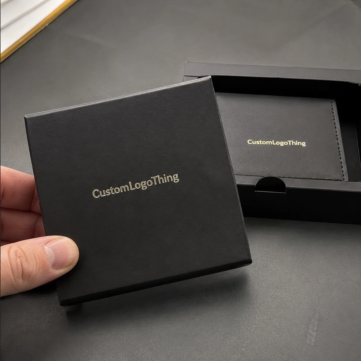
Buyer Fit Snapshot
| Best fit | Branded Packaging for Product Identity projects where brand print, material claims, artwork control, MOQ, and repeat-order consistency need to be specified before quoting. |
|---|---|
| Quote inputs | Share finished size, material target, print colors, finish, packing count, annual reorder estimate, ship-to region, and any compliance wording. |
| Proofing check | Approve dieline scale, logo placement, barcode or warning zones, color tolerance, closure strength, and carton packing before bulk production. |
| Main risk | Vague material claims, crowded artwork, missing packing details, or unclear freight terms can make a low unit price expensive after revisions. |
Fast answer: Branded Packaging for Product Identity: Material, Print, Proofing, and Reorder Risk should be specified like a repeatable production item. The safest quote records material, print method, finish, artwork proof, packing count, and reorder notes in one written spec.
Production checks before approval
Compare the actual filled-product size with the drawing, then confirm tolerance on folds, seals, hang holes, label areas, and retail display edges. Reserve space for logos, QR codes, warning copy, and material claims before decorative graphics fill the panel.
Quote comparison points
Review material grade, print process, finish, sampling route, tooling charges, carton quantity, and freight assumptions side by side. A quote is only useful when the supplier can repeat the same color, closure quality, and packing count on the next order.
Branded Packaging for Product Identity: Why It Stands Out
Two products can sit on the same pallet, share almost the same formula, and even leave the same filling line, yet the one in the better carton often moves faster because Branded Packaging for Product identity does the first selling before a shopper ever touches the item. I remember a cosmetics run in a Shenzhen facility where the matte rigid box with a tight tuck and soft-touch coating got better feedback from buyers, even though the product inside was functionally identical to the plain white version. The plain box cost about $0.22 per unit for 10,000 pieces. The finished rigid version landed closer to $1.48 per unit at 5,000 pieces. Packaging design did the heavy lifting. Not the logo. Not the marketing deck. The box.
Honestly, I think that is where a lot of brands get stubborn for no reason. They spend weeks arguing about a hero image and then treat the package like a cardboard afterthought. Bad plan. Branded Packaging for Product identity is the package system acting as one message: the box, mailer, sleeve, insert, print finish, and unboxing details all tell the customer who the brand is before the product is even opened. A kraft mailer with a one-color logo says something very different from a foil-stamped folding carton, and a Rigid Gift Box with a magnetic closure says something different again. A 350gsm C1S artboard carton with aqueous coating signals something lean and retail-ready; a 1200gsm chipboard rigid box wrapped in 157gsm art paper says premium and giftable. The structure, the surface, and the sequence of reveals all become part of the brand story.
Packaging works like a silent salesperson in retail, e-commerce, and wholesale settings, especially when the customer cannot test the product immediately. On a store shelf, it has to earn attention in about three seconds. In e-commerce, it has to survive a 24x18x12 corrugated shipper and still feel deliberate when the customer opens the mailer at home. In wholesale, it has to communicate quickly to buyers scanning a line sheet or opening a shipper with six SKUs inside at a showroom in Chicago or Dallas. That is why Branded Packaging for Product identity matters so much for product packaging and retail packaging alike.
Visual consistency builds trust, and trust is one of the first things a package can deliver. I’ve watched premium skincare brands use matte rigid boxes with a restrained color palette because those details matched a higher price point, while eco-focused brands leaned into kraft board, soy-based inks, and minimal graphics to signal environmental intent. Specialty food brands often do well with foil-stamped folding cartons because a small amount of shine can make a jar, pouch, or confection feel more considered without drifting into excess. A brand selling in Los Angeles may want brighter shelf impact than one focused on boutique stores in Portland, but Branded Packaging for Product identity works best when the package looks like the product’s promise, not a random container.
Here’s what most people get wrong: they think identity is just the logo. It is not. branded packaging for product identity includes the thickness of the board, the way a lid closes, the sound of a flap, the color tolerance between print runs, and the way the insert holds the product at a 2 mm tolerance instead of letting it rattle. I once had a supplier in Dongguan insist that “2 mm won’t matter.” It mattered. The bottle danced around in the box like it was trying to escape, and the sample looked cheap immediately. The fix was a 1.5 mm EVA insert adjustment and a tighter pocket cut. In the pages that follow, I’ll walk through how the system works, what drives cost, how the process unfolds, where brands slip up, and how to turn packaging into a measurable brand asset instead of a line item that only gets attention after a damage claim.
How Branded Packaging for Product Identity Works
Branded packaging for product identity works because several elements speak at once, and they all need to point in the same direction. Structure, material, print method, color, typography, and finishing each contribute to one clear signal. If the structure says premium but the print looks budget, customers feel the mismatch even if they cannot explain it in technical terms. That reaction is real, and it shows up fast. A $0.19 carton with a $0.07 one-color print can still feel more convincing than a $0.38 carton with sloppy graphics and a crooked die line.
Unboxing is a tactile brand moment. Texture, sound, fit, and reveal sequence shape how customers remember the product. A 350gsm SBS folding carton with a crisp reverse tuck gives one kind of experience; a 1200gsm chipboard rigid setup box wrapped in printed art paper gives another. I’ve stood beside an assembly line in Guangzhou where the insert was adjusted by just 1.5 mm, and the entire perception of the product changed because the item no longer knocked around when the box was lifted. That is not cosmetic detail; that is branded packaging for product identity working through touch and timing.
Different production methods influence identity as well. Offset lithography is the usual choice when the graphics need crisp type, tight registration, and strong brand color control across larger runs. Flexographic printing often makes more sense for high-volume corrugated cartons or mailers where speed and cost matter, and digital printing is useful for shorter runs, rapid revisions, or test launches where you do not want to pay for a large plate bill. A digital short run of 500 units in Shenzhen might ship in 5 to 7 business days after proof approval, while an offset run in Ningbo with foil and lamination usually needs 12 to 15 business days. Each method has a different feel, and that feel becomes part of package branding.
Consistency across SKUs matters more than many teams expect. A customer should be able to spot the brand instantly whether the item is in a subscription box, on a retail shelf, or on a social feed next to ten competing products. If your teal is slightly off on one SKU, your typography shifts on another, and your closure style changes without a reason, the line starts to look like three different companies. Strong branded packaging for product identity keeps the visual system aligned so the whole range reads as one family, whether the order ships from a factory in Suzhou or a co-packer in Mexico City.
Packaging identity is visual and structural
Identity is not only visual. Structural choices like magnetic closures, tray-and-sleeve formats, tuck-end cartons, and die-cut windows communicate positioning and price tier. A magnetic rigid box usually tells the buyer, “This is a premium presentation.” A simple tuck-end carton says efficiency and practicality. A die-cut window can say transparency, freshness, or product confidence, especially in specialty food and personal care. With branded packaging for product identity, the architecture of the box matters just as much as the artwork. A 2-piece rigid box with a 3 mm board wrap reads very differently from a 350gsm C1S straight tuck carton, even before a logo is printed.
One client in a distributor meeting in Atlanta once insisted on a full-bleed black box with four finishing effects for a line that sold best to practical, mid-market buyers. We mocked it up, and the test group kept describing the package as “expensive but not for me.” That is the kind of mismatch you only catch when you treat packaging as strategy, not ornament. The package had style, but it did not fit the customer’s expectations. That lesson still comes up in my notes whenever a brand pushes too far away from its market. A $2.20 rigid box can be the wrong choice for a product retailing at $14.99, no matter how pretty the foil looks.
Key Factors That Shape Branded Packaging for Product Identity
Brand positioning is the first filter. Premium, playful, sustainable, technical, minimalist, or luxury each call for a different packaging design language, and branded packaging for product identity should match the message rather than fight it. A playful brand can use brighter colors, rounded forms, and illustrated graphics. A technical brand may need clean type, structured grids, and restrained color blocking. A luxury brand usually depends on precision, depth, and a controlled use of finishes, not visual noise. If the product is selling for $18 on Amazon, a $3.00 packaging system in Japan, Singapore, or California probably makes less sense than a tighter carton with one premium cue.
Material selection comes next, and this is where a lot of decisions get expensive or smart very quickly. SBS paperboard is common for crisp retail cartons because it prints cleanly and folds well. Kraft stock works for natural or sustainability-focused positioning, especially if the brand wants an earthy, less processed look. Rigid chipboard is ideal for premium presentation, while corrugated board does better when protection and shipping strength matter. Specialty substrates can create standout effects, but they need to be chosen carefully because not every surface accepts ink or coating the same way. A 350gsm SBS sheet with C1S coating behaves differently from a 400gsm C1S artboard with matte lamination, and a 32 ECT corrugated board will outperform a lighter mailer when the route includes multiple handoffs. Branded packaging for product identity has to feel intentional and physically appropriate.
Print and finish decisions shape perceived value more than many owners expect. Embossing and debossing add texture you can feel with your fingertips. Soft-touch coating gives a velvety hand feel that often pairs well with cosmetics or premium accessories. Aqueous coating adds protection and a cleaner pressroom process than some alternatives. Foil stamping can emphasize a logo, border, or seal, while spot UV creates contrast by highlighting only selected areas. Varnish can be used strategically for protection or visual separation. I have seen a simple one-color box move up a shelf tier just because the brand used a well-placed blind emboss and a tight foil hit. That is the kind of small change that makes branded packaging for product identity feel more expensive without adding five unnecessary effects. A gold foil hit on 15% of the front panel is usually enough; 80% of the panel usually looks like a prom invitation.
Cost and pricing always come into the conversation, and they should. Order quantity, setup charges, print complexity, die-cut tooling, insert design, and finishing all affect the unit price. A 5,000-piece run of a simple folding carton may land around $0.15 to $0.42 per unit depending on size, board grade, and ink coverage, while a rigid box with custom inserts, foil, and soft-touch lamination can move into the $1.20 to $3.50 range or higher. A mailer printed in corrugated with one-color flexo might come in at $0.28 per unit at 10,000 pieces, while the same structure with CMYK offset, spot UV, and internal printing can climb past $0.90. That spread is normal. The point is not to chase the lowest number blindly; the point is to understand what the number buys in brand value and operational fit. Branded packaging for product identity should be evaluated as a business decision, not just a procurement quote.
Sustainability matters too, but it has to be practical. FSC-certified paperboard, recycled content, water-based coatings, and right-sized structures can support the brand message while meeting procurement goals. If you want to read more about forestry standards, the FSC site is a good reference. For shipping and transport damage testing, the ISTA guidelines help teams understand what packaging needs to survive in the real world. I also point brands toward industry references like the Packaging Corporation and Association resources when they are trying to balance presentation, material choice, and compliance. A recycled-content box from Vietnam or East China can still look premium if the print, board weight, and coating are chosen carefully. Branded packaging for product identity only works long-term if it can get through production, transit, and retail handling without falling apart.
| Packaging Option | Typical Use | Approx. Unit Cost | Identity Signal |
|---|---|---|---|
| SBS folding carton | Cosmetics, supplements, specialty food | $0.15–$0.42 at 5,000 pcs | Clean, retail-friendly, polished |
| Kraft mailer | E-commerce and subscription boxes | $0.30–$0.85 at 5,000 pcs | Natural, practical, eco-forward |
| Rigid setup box | Premium gifts, beauty, electronics | $1.20–$3.50+ at 3,000 pcs | High-end, giftable, durable |
| Corrugated custom printed box | Shipping cartons, club packs, DTC | $0.65–$2.10 at 5,000 pcs | Protective, branded, operational |
One thing I learned negotiating with a board supplier in Dongguan: the cheapest material quote can become the most expensive choice once you factor in scuffing, crushing, or a poor print hold. We tested a lighter board for a display carton, and the corners failed during a 48-inch drop simulation. The brand saved maybe three cents on paper but lost far more in returns risk and shelf damage. That is the sort of tradeoff that should always be discussed in branded packaging for product identity conversations. I still remember the supplier’s face when the sample corner folded like a sad taco. Not ideal. The requote for a 400gsm C1S board with a matte aqueous finish added $0.06 per unit, and it was still the smarter choice.
Process and Timeline: From Brief to Finished Packaging
The production flow usually starts with a discovery brief, and a good one saves weeks. The brief should outline the product dimensions, target audience, desired positioning, budget range, shipping method, display requirements, and any regulatory labeling needs. From there, concept development turns that information into initial directions for branded packaging for product identity, often with a few styles or structural routes to compare. I’ve seen a sharp brief cut sample rounds from four to two, which saved roughly 10 business days and a few hundred dollars in revision time.
Structural design comes next. A designer or packaging engineer builds the dieline, sets the wall thickness, confirms tuck flaps, verifies insert pockets, and checks that the package will actually hold the item without excess movement. After that, artwork prep happens, which includes bleed, safe area, barcode placement, panel hierarchy, and any copy that must stay clear for compliance. I’ve seen teams rush artwork onto a box before the dieline was final, and the result was a logo sitting 4 mm too low across 12,000 units. That kind of error is expensive and avoidable. In a clean workflow, final dieline approval happens first, then artwork, then proof, then production.
Proofing and sampling matter because paper on a monitor is not paper on a press. Prototype samples help confirm fit, strength, color, and brand impact before full production. A plain white mockup can check structure, while a printed proof checks visual balance. If you are using Pantone colors, make sure the factory confirms which stock and coating they are matching against, because the same ink can look different on matte artboard versus gloss-laminated board. A Pantone 186 C red on 350gsm SBS with matte lamination will not read the same as the same ink on kraft stock in a shop in Ho Chi Minh City. Branded packaging for product identity gets stronger when you catch these issues before the run starts.
Production timelines vary based on revisions, material availability, tooling, print method, and finishing. A straightforward folding carton project may move from approved artwork to finished shipment in 12 to 15 business days, while a rigid box with magnet, insert, foil, and soft-touch finish can take 20 to 35 business days or more. If a custom die is required, add tooling lead time. If a specialty coating needs extra drying or a hand-applied element is involved, add more. There is no honest way to compress every project into the same window. A corrugated DTC mailer printed in Guangdong may be ready in 8 to 12 business days from proof approval, while a gift box made in Suzhou with manual wrapping and ribbon can run 25 business days. Branded packaging for product identity depends on what the package is made to do.
Approvals that keep the job on track
Approvals should be treated like checkpoints, not paperwork. The main items are die-lines, artwork bleeds, barcode placement, Pantone color matching, and copy accuracy. If a customer changes a claim, adjusts a logo lockup, or wants a new finish after plates have been made, the schedule can move by days or even weeks. The cleanest projects I’ve managed had one decision-maker, one version-controlled file system, and a factory contact who responded within a business day. That discipline helps branded packaging for product identity stay accurate from proof to pallet. In one Nanjing project, a 6 p.m. signoff on the final PDF kept the shipment on a Friday truck instead of sliding to the next Tuesday.
Brand and operations teams need to stay aligned as well. Marketing tends to care about appearance and story, while operations cares about freight, packing speed, and damage risk. A package that looks beautiful but adds 18 seconds to the line can create a real labor cost. A package that ships well but looks generic may underperform at retail. The best branded packaging for product identity projects balance both sides instead of pretending one side does not matter. If the line assembles 1,200 units per hour in Monterrey, and your fancy insert knocks that down to 900, the packaging just got expensive in a very boring way.
How to Build Branded Packaging for Product Identity Step by Step
Step 1: define the customer and the emotional promise. Before you choose any stock or finish, decide what the package needs to communicate in three seconds or less. Is the buyer looking for luxury, simplicity, technical competence, eco-responsibility, or giftability? If you cannot state the promise clearly, the design process gets muddy fast. Strong branded packaging for product identity starts with a sentence, not a Pantone fan deck. For example: “A $24 skincare serum for first-time buyers in California should feel clean, trustworthy, and easy to open.” That is usable.
Step 2: Choose the Right package style. The right style depends on product weight, fragility, shelf presence, and shipping method. A serum bottle may do well in a folding carton with an insert. A premium candle might need a rigid box or tray-and-sleeve design. A subscription item may benefit from a custom printed corrugated mailer with a strong opening experience. The package must fit the product physically and fit the brand emotionally. That combination is where package branding becomes believable. A 120ml bottle in a 350gsm C1S tuck box with a 1.5 mm pulp insert is a very different operational decision than a 16 oz candle in a 3 mm rigid carton with EVA foam.
Step 3: select materials and finishes that support the story. A 400gsm artboard with matte lamination can read very differently from a 350gsm SBS sheet with aqueous coating. A kraft construction can signal simplicity and lower waste. Foil and embossing can elevate a limited-edition release. I usually advise teams to choose one primary visual effect and one supporting effect, because too many finishes often make the box feel busy. In my experience, restraint is often the smarter route in branded packaging for product identity. A single silver foil logo on matte black artboard often does more work than foil, emboss, spot UV, and a half-dozen icons fighting for attention.
Step 4: develop artwork with clear hierarchy. Your logo, product name, variant, and compliance copy all need a clear order of importance. Use typography that remains readable at retail distance and under warehouse lighting. Keep a color system that stays consistent across all packaging formats, from inserts to outer cartons. If the line has five SKUs, the family should feel coordinated without becoming repetitive to the point of boredom. That is a fine line, but it is absolutely manageable with disciplined packaging design. I like to see the product name on the front panel in at least 18 pt type for smaller cartons, because anything weaker starts losing legibility at shelf distance.
Step 5: prototype, test, revise, and finalize. I always prefer a physical sample before a full run. Put it on a shelf. Ship it through a test lane. Open and close it ten times. Compare the sample against the product brief and the sales team’s expectations. If something feels off, fix it while the change cost is still small. A factory floor test can reveal a weak corner, a loose insert, or a finish that fingerprints too easily. That is money well spent in branded packaging for product identity. A 72-hour sample cycle in Shenzhen or Ningbo is far cheaper than reprinting 8,000 cartons because the barcode sat under the glue flap.
- Check shelf contrast under store lighting.
- Confirm the package survives the chosen transit method.
- Review color consistency across SKUs and reorders.
- Make sure assembly time works on the packing line.
- Verify that the unboxing sequence feels intentional.
What Mistakes Undermine Branded Packaging for Product Identity?
The first mistake is chasing trends without matching the package to the actual product or audience. I’ve seen brands chase a trendy matte-black luxury look for value-priced goods, and the result was confusion rather than confidence. Customers sensed the mismatch immediately. Branded packaging for product identity only works when the visual language fits the price point and the buyer’s expectations. A $12 grocery item in a $2.80 rigid box usually feels like cosplay, not strategy.
Overdesign is another common problem. Too many finishes, too many fonts, too many icons, and too much copy can crowd the box until the message disappears. I once reviewed a carton that had foil, spot UV, embossing, three shades of blue, and six competing claims on one panel. It was expensive, but not elegant. Strong package branding often comes from editing, not adding. That restraint helps the product stand out instead of blending into visual noise. If the front panel needs a legend to explain it, the design probably lost the argument.
Choosing a package that looks good but performs badly in transit is a costly mistake. If the insert lets the product move, the outer carton crushes easily, or the closure opens too early, the brand pays for it later in damage claims and customer frustration. This is where branded packaging for product identity must be tested against shipping realities, not just design mockups. If the package cannot survive the route from factory in Vietnam to a warehouse in New Jersey, the identity story breaks before it starts.
Inconsistent color matching can quietly erode trust. A customer may not know the exact Pantone number, but they notice when a signature green shifts from one batch to the next. That is especially true for brands that rely on a specific visual cue across multiple SKUs. I’ve had clients reject an entire run because the main brand color drifted too far under fluorescent light. They were right to do it. Consistency is part of the promise. If the brand green was approved on coated stock in July, it should not show up muddy on uncoated board in October without a new proof.
There is also the pricing mistake of optimizing only for the lowest unit cost. A packaging quote that saves two cents but increases returns, labor time, or reprint risk is not really cheaper. Better structure, better stock, and better finishing can create a stronger retail presence and lower total headaches over time. That is why I treat branded packaging for product identity as a long-term brand asset, not a one-off purchase. The cheapest supplier in Shenzhen is not always the cheapest result after freight, rejects, and rework.
Expert Tips to Improve Branded Packaging for Product Identity
Use one strong brand cue consistently. That cue might be a signature color, a repeat pattern, a closure style, or a tactile texture. Customers remember repetition more than complexity. If you do that one thing well across custom printed boxes, mailers, and inserts, the brand becomes easier to recognize. That is a simple rule, but it pays off across branded packaging for product identity programs of almost every size. One repeatable cue across 12 SKUs beats seven random visual ideas every time.
Balance restraint and detail. The strongest packages often use fewer elements, but each element is chosen with precision. A single embossed logo on a matte surface can say more than a busy front panel full of claims and icons. This is especially true for premium or minimalist brands, where visual quiet can actually increase perceived value. I’ve seen brands save money by removing unnecessary print effects and reinvesting that budget into better board quality or a cleaner structural design. On a 10,000-piece run, dropping one finish can save $0.08 to $0.14 per unit, which adds up fast.
Test packaging under real conditions. Put it on the factory floor, into shipping cartons, on a retail shelf, and in the hands of someone who has never seen the line before. Watch whether the identity still holds when the package is stacked, bumped, or opened in poor light. If the branding only works in a design deck, it is not finished yet. Branded packaging for product identity has to survive the physical world, including a 48-inch drop, a humid warehouse in Florida, and a rushed pick-and-pack shift at 4:30 p.m.
Ask for mockups and print proofs before approving a large run, especially when metallic inks, specialty coatings, or dark solids are involved. Those details are harder to judge on screen than most teams realize. A proof can reveal a logo that is too small, a dark field that scuffs, or a coating that makes text less legible. I have prevented more than one expensive reprint by insisting on a physical check before release. A corrected proof in 2 days is much cheaper than a reprint of 6,000 cartons after the press has already run.
Treat packaging as a system, not a single box. Align inserts, labels, mailers, and outer cartons so the identity stays consistent at every touchpoint. If your unboxing insert uses a different tone, your shipping label looks generic, and your retail carton reads as a different brand, the customer experiences friction instead of cohesion. Good branded packaging for product identity is built across the entire journey, from a carton made in Dongguan to a fulfillment label printed in Ohio.
“The box did more selling than the product sheet,” a buyer told me once after a line review in Los Angeles, and that comment stuck with me because it was painfully accurate. The carton had a clean structure, a controlled color palette, and a foil accent that matched the pricing tier. The product was good, but the package made the buyer confident enough to place the order.
If you need examples of formats and finishes, our Custom Packaging Products page is a useful starting point, and our Case Studies section shows how different industries used packaging design to support sales, shelf presence, and fulfillment performance. Seeing real jobs often clarifies what kind of branded packaging for product identity makes sense for your line, whether you are building a $0.20 mailer or a $2.40 rigid presentation box.
Next Steps for Stronger Branded Packaging for Product Identity
Start with an audit of your current packaging touchpoints. List where the brand message is clear, weak, or inconsistent. Look at the folding carton, the mailer, the insert, the shipping label, and even the tape if it appears in customer photos. If the visuals do not line up, customers feel it even if they never mention it. That audit gives you a practical map for improving branded packaging for product identity. A 30-minute shelf walk can reveal more than a 40-slide deck.
Gather the core project information before you speak with a packaging partner: product dimensions, shipping requirements, annual or per-order volume, budget range, and brand references. If you already know whether you want SBS, kraft, corrugated, or rigid construction, include that too. The better the brief, the cleaner the quote and sample stage. I’ve seen projects move twice as fast simply because the brand came prepared. A clear brief can turn a 3-week back-and-forth into a 7-day sampling cycle.
Create a Packaging brief that includes audience, positioning, must-have finishes, sustainability goals, and timeline expectations. Keep it short enough that marketing, operations, and procurement can all read it without a meeting. A one-page brief can prevent a lot of confusion, especially when several people are giving feedback. That kind of clarity makes branded packaging for product identity easier to execute and easier to approve. If the brief says “matte black, silver foil, 350gsm C1S artboard, 5,000 units, needed in 15 business days,” everyone knows what job they are actually doing.
Request samples or prototypes before you commit to production. Compare materials, print quality, and structural performance side by side. If possible, test the package with real product fills and real shipping conditions. A sample that looks beautiful but collapses in transit is not a win. The point is to make the package carry the brand story while protecting the item inside. I’d rather spend $150 on prototypes than discover a fit issue after 20,000 units are already in the queue.
Finally, use the approved package as the standard for future SKUs so the identity stays consistent as the line expands. A brand can grow quickly and still feel unified if the rules are documented: color values, typography, finish choices, box styles, and insert logic. That standardization helps branded packaging for product identity remain strong as new products are added, channels change, and the business scales. A documented system also makes reorders in Qingdao, Monterrey, or Chicago a lot less chaotic.
FAQ
What makes branded packaging for product identity different from standard packaging?
Standard packaging mainly protects and contains the product, while branded packaging for product identity is designed to communicate personality, quality, and positioning. It uses structure, color, print, and finishing as deliberate brand signals, not just decoration. The goal is recognition and trust, so the package feels like part of the product experience rather than a separate container. A 350gsm folding carton with a precise spot color and clean dieline does much more identity work than a plain shipper printed with a tiny logo.
How much does branded packaging for product identity usually cost?
Pricing depends on quantity, material, structural complexity, printing method, and finishes such as foil or embossing. Simple folding cartons with one-color printing can start around $0.15 per unit for 5,000 pieces, while rigid boxes with specialty coatings and custom inserts often run $1.20 to $3.50 or more. Higher volumes usually lower the unit price, while short runs and frequent changes tend to raise it. If you want a sharper estimate, ask for pricing at 3,000, 5,000, and 10,000 units so you can see how tooling and setup spread across the order.
How long does the branded packaging process usually take?
Timeline varies by artwork readiness, sample approvals, tooling, and production method. A straightforward project can move in 12 to 15 business days from proof approval if the dieline is already final and the stock is in house. Complex projects with specialty finishes or custom structures usually take 20 to 35 business days because they require more proofing and setup. Add 3 to 5 business days if a new die is needed or if the order includes hand assembly in a factory in Shenzhen, Dongguan, or Suzhou.
Which materials work best for branded packaging for product identity?
SBS paperboard is common for crisp, polished retail packaging. Kraft board often suits natural or sustainability-focused brands. Rigid chipboard and corrugated constructions are strong choices when the brand needs a premium feel or extra protection. The best material depends on the product, the channel, and the message you want the package to send. A 350gsm C1S artboard carton can work beautifully for cosmetics, while a 3 mm rigid board may be better for a gift set or premium electronics accessory.
How do I make sure my packaging matches my brand identity across different products?
Use a consistent color palette, typography system, and visual signature across all packaging formats. Keep structural choices and finishing rules aligned so the brand feels unified from SKU to SKU. Build one packaging style guide so future launches stay on-brand even when products, sizes, or channels change. If your teal, foil placement, and box proportions stay consistent across a mailer in Dallas, a retail carton in London, and a gift box in Tokyo, the brand reads as one company instead of a collection of random jobs.
Good branded packaging for product identity is not about making a box look busy or expensive for its own sake. It is about creating a package that fits the product, supports the channel, survives production and transit, and communicates the brand with enough clarity that customers recognize it again next time. That is the kind of packaging I respect on a factory floor in Guangdong, and it is the kind of packaging that earns its keep in the market. If you want the shortest version of the takeaway, here it is: lock the message first, build the structure around it, test the physical sample, and do not approve anything that looks good but fails in the truck. That’s the whole job, kinda.