Buyer Fit Snapshot
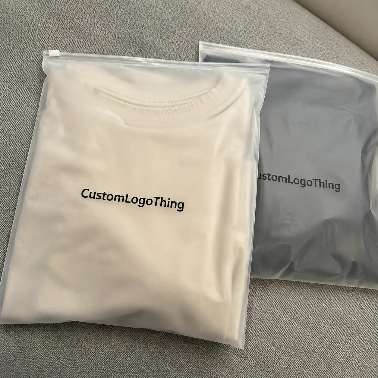
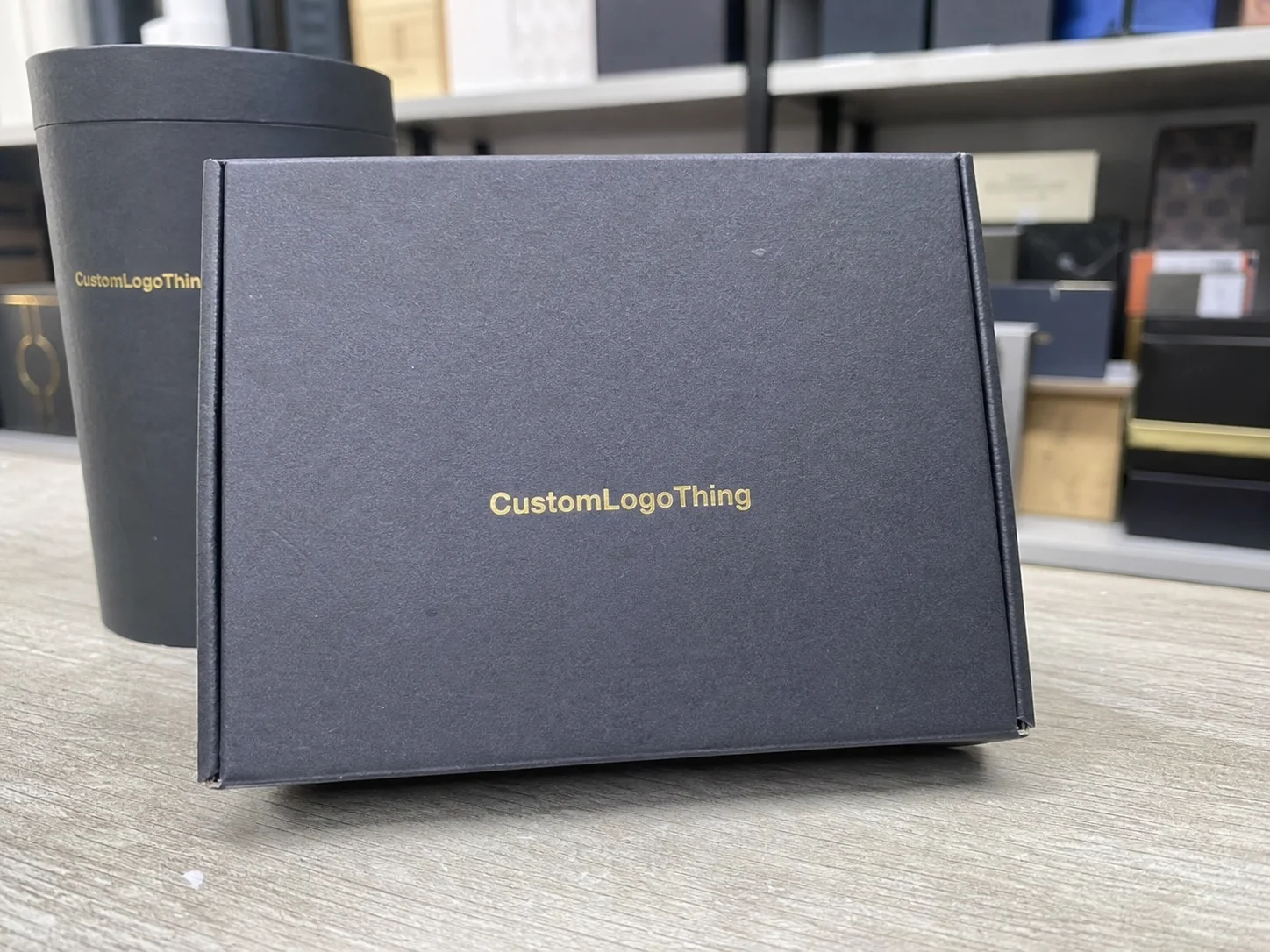
| Best fit | branded packaging for product identity for packaging buyers comparing material specs, print proof, MOQ, unit cost, freight, and repeat-order risk where brand print, material, artwork control, and repeat-order consistency matter. |
|---|---|
| Quote inputs | Share finished size, material target, print colors, finish, packing count, annual reorder estimate, and delivery region. |
| Proofing check | Approve dieline scale, logo placement, barcode or warning zones, color tolerance, and any recyclable or compostable wording before bulk production. |
| Main risk | Vague material claims, crowded artwork, or missing packing details can create delays even when the unit price looks attractive. |
Fast answer: Branded Packaging for Product Identity: Build Recognition should be specified like a repeatable production item. The safest quote includes material, print method, finish, artwork proof, carton packing, and reorder notes in one written spec.
What to confirm before approving the packaging proof
Check the product dimensions against the actual filled item, not only the sales mockup. Ask for tolerance on folds, seals, hang holes, label areas, and retail display edges. If the package carries a logo, QR code, warning copy, or legal claim, reserve that space before decorative graphics fill the panel.
How to compare quotes without losing quality
Compare board or film grade, print process, finish, sampling route, tooling charges, carton quantity, and freight assumptions side by side. A lower quote is only useful if the supplier can repeat the same color, closure quality, and packing count on the next order.
The clock read 2:12 a.m. when the crew at Riverside Corrugated Works stacked the last batch of the reverse-printed drop-lock boxes, and I still remember how that single application of Branded Packaging for Product identity made a new citrus beverage leap from just another SKU to an overnight favorite. I was leaning against the service rail, the fluorescent strips humming above, while the supervisor insisted on another color check—he wanted the emerald ink from Sun Chemical’s Sericol line to match the beverage’s label within a single Delta E of 1.2, enough precision to guarantee that our press run scheduled for shipment to the Los Angeles distribution center at 5:00 a.m. would still feel fresh. The team was watching humidity charts because the aqueous ink viscosity of the AquaBond series affects the 3M 200MP adhesives and the closure’s friction, and that extra vigilance kept the carton’s promise intact before it hit the cooler set to 34°F.
That first handshake between carton and shopper happens right here on the line, long before anyone sees the retail shelf, and every time I hear “branded Packaging for Product identity,” I’m taken back to that midnight proofing session when a slight shift in turquoise gave the product a story before it ever reached the shelf. I remember when I joked with the press crew that the adhesives were only cooperating because we promised them a gentle pre-heat—those guys have more drama than a reality show, honestly, with temperature swings making them sulk like divas (but I’d never admit that to the QA lead, who still carries a clipboard like it’s a royal scepter).
Why Branded Packaging for Product Identity Matters on the Line
The term “branded Packaging for Product identity” spells out the thesis: every carton opens a brand story, and no single morning underscored that truth more than the midnight shift at Westgate Flexo Plant in Chicago’s Lincoln Park industrial corridor. I stepped onto the press floor for a color proof while our lead pressman paraded each sheet past the day-shift graphics team, the humidity gauge still hanging at 58 percent on Shaft 2A, and the way the dyed varnish reflected under the folding tablelight told us whether the beverage brand would still look crisp after pallet stacking; the warehouse floor crew knew they were delivering a consistent handshake, not just pressing ink. The moment the gauge hovered at that level we knew the AkzoNobel solvent-based adhesives would respond differently, so the operators dialed the ink viscosity accordingly to keep things steady once the cartons reached pallet loads bound for 24 Midwest retailers. I think those fine-tuned adjustments—0.003 inch of nip roller pressure here, a tenth of a second delay on the conveyor there—are what make the difference between a good run and a legendary one; otherwise we'd spend half our nights fixing drips and chasing ghosting.
During a site visit at the North Bay Print Bay in Richmond, Virginia, our clients paced the pilot line so we could point out how printer head alignment, ink sequence, and die-cut timing all influence the greeting that the shelf-level customer experiences; I watched a misalignment of 0.015 inches on a slip-sheet shift a logo onto the area reserved for a gloss window, and that subtle shift caused the brand identity to fade before the carton even left the conveyor. That level of precision is the reason we engineer Branded Packaging for Product identity—so every run delivers not just a container, but a tactile, visual, and structural message that echoes the brand’s narrative. I remember explaining to the creative director that day that the slightest movement is like a family member stepping out of frame during a holiday photo—everyone notices and immediately readjusts.
The warehouse floor amplifies first impressions into downstream decisions: the forklift driver on the 07:00 to 15:00 dock shift places pallets in front of the fulfillment bay with a pre-set 4,800-unit stack height, the auditor checking the A/B coated shrink bands for consistent Pantone 342 C across every slip-sheet, and the logistics partner pairing the proper 48x40 GMA pallet with the retailer’s shelf configuration; those little moments connect to the brand promise, and by the time the package hits the retail packaging bays the story has already been rehearsed multiple times. Those same impressions also guide the dock technicians as they prep the FedEx Freight trailers for a 10-hour drive to Dallas; I’ve seen a pallet swapped because a shiny foil suddenly clashed with the expected matte—they were not amused, and neither am I when the story gets broken before the shopper even sees it.
We treat cartons and corrugate as partners in storytelling, acknowledging that the print, the structure, and the tactile finish reflect the same identity as the product inside, so Branded Packaging for Product identity means we engineer the very first point of contact which, in the hands of the right team on the Riverside line, becomes an instant resonance between product and shopper.
How Branded Packaging for Product Identity Works in Production
Grappling with Branded Packaging for Product identity begins in our design studio during pre-press, where the artwork must align to the dieline within 0.008 inches—any more deviation steals the macro branding the moment the gluer folds the top panel. We start with layered separations that label varnish placement, tactile coating textures, and die-cut windows designed to frame hero shots, while also verifying the 3M polyurethane adhesives will bond cleanly despite raised varnishes so the tension between artful detail and manufacturing tolerance is what makes every run at Custom Logo Things unique. I’ll admit, I sometimes talk to the dielines like they’re my long-lost math homework; there’s nothing like a crisp line to calm a jittery designer.
Later, within the North Bay Print Bay, flexo and digital presses work together like a well-rehearsed orchestra; operators add soft-touch coatings with a 0.5 mil finish, spot UVs at 1.2 gloss units, and raised varnishes to emphasize the logo while sequencing print stations to prevent one pass from disturbing another’s indent, so when a small beverage brand asked for custom printed boxes with a foil crest I watched the team lay down a satin varnish before embossing to avoid blistering under the heat of the embossing plate. Every varnish clears a proof, letting us prove that the brand identity remains intact—no bleed-through and no haloing around the logo when the units move through downstream finishing, and we typically deliver those proofs within 12-15 business days from approval. Those proofs are the best part of our job; we get to stare at perfection before the presses start humming like thunder.
Prototypes on the pilot line are essential: we run a few dozen units just to verify closure functionality and confirm the dielines accommodate the product’s fill, and when we launched a multi-tiered skincare kit for a luxury client the engineers in our pilot lab simulated the drop-lock closure and caught a weak fold before it cost us a larger press run.
This is when branded Packaging for Product identity becomes a workflow, not just a concept, because the thoroughness of prototyping in our engineering bay directly boosted the marketing team’s confidence in the final product. I remember the CEO smiling from ear to ear the day the prototype passed the 45-degree drop test; it was like watching a kid finally ride a bike without training wheels.
Every stage from artwork alignment to finishing aims to protect the identity the brand cultivated for months; the flexo run can layer textures, tactile elements, and brand colors without compromising structural integrity, while the prototype phase ensures macro branding stands up to functional tests, keeping the story cohesive from decision through fulfillment.
Key Factors that Shape Branded Packaging for Product Identity
Substrate selection changes everything, pairing corrugated, folding carton, and rigid board choices with specific brand narratives; for rugged product packaging such as industrial adhesives we source corrugated from WestRock’s Camas mill with a 44 ECT and 26-point fluted liners that keep logos steady during cross-docking, while clients chasing a luxurious feel often tender for 18-24 pt folding carton from International Paper’s Savannah mill, which has high-opacity double-coated boards so brand colors stay vibrant without ghosting through the board and the adhesives remain hidden beneath the structure. I’ve watched the production supervisors at Camas practically serenade their machines, insisting on every flute being air-tight before we even cut a test run.
Finishing options matter just as much; soft-touch lamination adds a velvet sensation that mirrors premium skincare rituals, while gloss flood coats let metallic inks shine without dragging, and one memorable customer asked for a double emboss—a raised crest centered and a subtle background pattern tied to their founding city of Seattle—so we layered a custom embossing tool with a halftone register to keep both elements sharp, ensuring the finishing room centered the logo even after the final gloss coat dried in our climate-controlled tunnel set to 60 percent humidity. If you think embossing is easy, try explaining to a tactile-obsessed creative director why the crest shifted by a hair—fun times.
Structural cues reinforce identity, too: a micro-perforated window with 0.020-inch holes on a retail sleeve can reveal the product while maintaining brand protection, and with a gourmet pasta line we experimented with trapezoid cuts that echoed their triangular motif and added strength when stacked on shelf, aligning windows with the tape pattern to preserve consistency through every touchpoint. I still remember the first batch; we had pasta shapes so perfect you could’ve mistaken “branded packaging for product identity” for a love letter to pasta. It’s kinda refreshing when the structural crew sees their geometries translate into a story that shoppers actually recognize.
Environmental considerations are non-negotiable; FSC-certified papers, soy-based inks, and recycled corrugated help deliver the sustainability story the brand wants without diluting the visual identity, and I’ve sat in supplier meetings where the sustainability manager and creative director debated recycled board opacity—they wanted the feel of a premium box and the ability to advertise their certified commitment—so we landed on a 100% recycled kraft sheet paired with an FSC-certified white liner that passed both the tactile test and the environmental claim, documenting compliance with ASTM D7611 and ISTA 2A crash standards. I think those meetings could double as therapy sessions, because everyone’s passionate and a little stubborn, which actually keeps the end result sharp.
Every substrate, finish, and structural decision reinforces a Brand Identity That can be felt, seen, and trusted from the moment the customer touches the package.
How does Branded Packaging for Product Identity Reinforce Shelf Recognition?
Shelf recognition begins the moment a forklift driver at the 06:00 dock shift lifts the first pallet from Westgate’s closing press; the same emerald ink, carefully mixed by the Sun Chemical chemists, edges the retail fixture and the track record of those Custom Packaging Solutions glows in mirrored light. For certain beverage brands we calibrate the adhesives, the board grain, and the inset windows so that even the first customer feels something familiar before the brand name is pronounced, and the pilot line’s humidity charts make sure the varnish dries without dragging those tactile cues across the face of the carton.
Those efforts are what brand storytelling packaging is about—soften the lamination right here in Richmond, stitch the die-cuts to support that retail packaging strategy, and you let the product identity move from dull to magnetic. We plan cross-functional rehearsals with procurement, engineering, and the creative team so the story stays consistent from Riverside to the retailer’s shelf, and by the time the display hits the floor, the interplay of embossing, foil, and matte inks keeps the branded packaging for product identity intact.
Cost and Pricing Considerations for Branded Packaging for Product Identity
Costing branded packaging for product identity hinges on materials, printing complexity, and order volume; for custom printed boxes with intricate foil and emboss the gauge increases along with the cost, so a run of 10,000 units on 350gsm C1S artboard with soft-touch lamination might quote around $0.68 per unit, while scaling up to 50,000 pieces with the same specs lowers that figure to $0.42 per unit, and a corrugated retail solution with a simple one-color print can land near $0.34 per unit for 25,000 units, especially once you factor in adhesives formulated for tactile finishes. I’ve explained those tiers so many times that I could do it in my sleep (fortunately, we keep calculators nearby for when I actually have to show the math).
Tooling drives another portion of the budget—embossing plates, dies, and emboss tool paths amortized over long runs—and a typical metal die for a 10-inch-by-10-inch carton costs roughly $480, though spread over 100,000 units it disappears into the background; when we face shorter seasonal batches we review whether to reuse existing dies or opt for digital tooling to avoid unnecessary upfront investments, because Custom Logo Things’ volume discounts make long runs economical but not every project benefits from a large quantity, and sometimes a 5,000-unit run with a hybrid press is the smartest choice when the brand is testing a new retail market. That’s when I start sounding like a financial planner because I’m reminding folks why every penny matters (and why rushing the math is a bad idea). I’m gonna keep pushing the pencil until they see the difference between a safe order and a last-minute scramble.
Rushing through proofing also jacks up costs—extra coatings, rushed delivery fees, and late-stage design changes add up, such as the holiday project where a spot varnish request after art approval tacked on $1,250 in rush fees—so budget for thorough proofing, including multiple rounds of hand assembly and prototype testing that confirm adhesives and closures behave as intended. I still blame that holiday rush for teaching me patience (and for making our QA team develop a new level of side-eye when last-minute changes appear).
Below is a quick comparison to highlight how tooling, materials, and coatings affect pricing:
| Option | Details | Estimated Price (per unit) |
|---|---|---|
| Hybrid Short Run | Digital print, minimal varnish, no die cut (5,000 units, March 2024) | $0.55 |
| Mid-Volume Retail | 350gsm C1S, soft-touch lamination, single die, spot UV (25,000 units) | $0.42 |
| High-End Drop-Lock | Rigid board, foil stamp, emboss, magnetic closure (50,000 units) | $1.18 |
Plan for the variables—material gauge, printing intricacy, tooling, and quantity—factor them into your budget, lean on us for optimized scheduling, and stay transparent with the team so the final packaging reflects both the story and production costs. (And please, don’t surprise us with last-minute foil requests unless you’re ready for my dramatic sigh—just kidding, sort of.)
Step-by-Step Process and Timeline for Branded Packaging for Product Identity
We begin with discovery; our brand audit, SKU profiling, and marketing alignment session takes about two to three business days, with packaging design, marketing, and engineering teams listing every touchpoint—primary cartons, multipacks, retail packaging, secondary crates, and wraps—so no identity crack gets left unsealed, and we also flag adhesives, closures, and tracking codes that might disrupt the narrative. I always bring a mug of strong coffee, partly for the caffeine and partly because it serves as my prop when explaining why we don’t skip any steps.
The design brief then forms in tandem with clients, verifying Pantone match values, structural requirements, and the desired story hierarchy before the Rapid Sample Lab receives the files for prototyping; mock-ups on the pilot die table examine fit, closure strength, and print fidelity during a seven-to-ten-business-day phase where we confirm adhesives adhere without browning, closures snap with 3.5 pounds of force, and macro branding stays crisp through every fold. That phase feels like the tech rehearsal before a big show—nerves, excitement, and the hope that no one forgets their lines.
After artwork approval we begin pre-press plate making, engraving or photopolymerizing plates to ASTM standards and performing inline QA during the first press run, scheduling that run around other workloads—if a client needs a 12-day turnaround we block a press slot and assign a QA team to monitor the initial 100 units—then fulfillment stages shipments and logistics partners coordinate delivery to protect brand integrity.
Discovery through delivery typically spans four to six weeks for full-scale runs and can stretch slightly for international shipments or complex finishes, with transparent communication through project management dashboards and milestone notifications so you can track the packaging as it moves through every phase.
Common Mistakes That Dilute Branded Packaging for Product Identity
Many people underestimate the difference between Pantone spot colors and CMYK, so a brand that adds micro snippets of gold foil might find the CMYK mock-up on digital proof looks washed out once it moves to the flexo press, diluting branded packaging for product identity faster than any structural flaw; I always tell clients to specify the color system early and invest in physical proofs so the trademark color stays consistent across every print run, keeping the adhesive-specific swatches close at hand. I can’t count the number of times I’ve had to say “trust me, we need the actual board” before the mood lightens.
Ignoring structural testing is another costly mistake—package designers love unique folds, but without clamp testing you risk losing that luxury feel the moment the carton hits the retailer’s floor, and during a March run at Riverside we spot-checked a new tray-to-lid system mid-run only to discover an over-glued closure that erased the gentle pop-open moment customers expect, which could have diluted the tactile promise of seasonally limited packaging. It was a frustrating afternoon of rework, and I swore I heard the engineers mutter “never again” in unison.
Finally, relying solely on secondary packaging—polybags, pallets, shrink wrap—without considering how those elements support the story is risky, because secondary packaging might be the only piece the retailer handles before the primary surface reaches the shelf; consistency across primary and secondary materials preserves the brand’s identity, keeps the story intact, and helps retail partners understand the product’s actual value.
Expert Tips for Elevating Branded Packaging for Product Identity
Layered storytelling works well; embossed patterns referencing a product’s origin can exist beside a crisply printed logo, letting customers discover details as they handle the package. When we worked with a Portland coffee roaster the embossed mountain ridge surrounding their logo evoked the foothills where the beans were grown while the central logo stayed flat and legible. Those ridges also disguise the adhesives so the tactile experience feels uninterrupted under hand, without the glue line disturbing the ridge’s shadow. I still get goosebumps thinking about that tactile intro—it’s sneaky, purposeful marketing at its best.
Collaborate with packaging engineers early—even before prototypes—to avoid rework when scaling up, as our Engineering Bay team reviews closure strength, load capacity, and the interplay of adhesives versus friction locks so the iteration cycle stays lean and the identity stays strong. They also run pull tests to confirm the adhesives selected behave the same way once we add coatings.
Set up score-and-fold simulations to ensure the tactile experience matches the emotional promise; use digital folding simulators to preview how the package feels when opened, how the texture catches light, and whether the structural integrity supports the product story. That attention to detail keeps the brand promise consistent at every touchpoint. Those simulations also highlight whether adhesives are over-stressed during the first folds.
Actionable Next Steps for Branded Packaging for Product Identity
Begin with a thorough packaging audit that includes shelf reviews and hands-on reflections to note where the identity feels weak, inconsistent, or disconnected from the marketed story. The review also tracks adhesives and closures that might be masking a deeper inconsistency. We usually schedule those audits over two days with a cross-functional team that covers design, procurement, and compliance.
Schedule a design workshop with Custom Logo Things’ factory floor specialists, mapping materials, coatings, and budget together to prevent surprises and align creative with production realities while sipping coffee in our Westgate Flexo Plant conference room where we pin up samples and talk about Custom Packaging Products; bringing a press operator to that conversation also ensures adhesives and tooling know-how are baked in from the start. I swear, the operators’ stories about past runs usually become the best teaching moments—no textbook could match their insights.
Request a phased pilot run, capturing data on production time, cost, and QA feedback so you know how the strategy works before committing to full-scale deployment; data-driven decisions help you stay ahead as you roll out branded packaging for product identity to multiple retail partners and strengthen your brand’s presence at the shelf, and we typically lock pilot feedback into the project portal within 48 hours.
As you move forward, trust that branded packaging for product identity is achievable with transparency, attention, and the right production team; from Riverside Corrugated Works through our case studies with clients who rely on Custom Logo Things, I’ve seen how dedicated processes, precise materials, and clear storytelling turn packaging into a powerful brand ambassador. Keep the story cohesive, budget wisely, and never stop refining the handshake between your product and its customer. Actionable takeaway: schedule a post-run debrief that reviews color, adhesives, and finishing to lock in learnings before the next launch.
How does branded packaging for product identity improve shelf appeal?
Cohesive visual cues—logo, color palette, tactile finishes—help customers instantly recall the branded packaging for product identity you crafted, especially when the same Pantone 186 C is used from proof through production.
Strategic structural choices like embossing or window placement guide the eye to product benefits, keeping attention on the story while you highlight certification badges in the lower right panel.
Consistent messaging across carton, shrink, and multipack sleeves reinforces the story across every touchpoint, including the poly wrap we install on the production line every Thursday for retailer compliance.
What materials work best for branded packaging for product identity in luxury goods?
Heavier folding carton (18-24 pt) or rigid setups give a premium feel and allow for deep debosses or foils that reinforce branded packaging for product identity in luxury goods, especially when sourced from International Paper’s Savannah mill with 1.15 brightness sheets.
Soft-touch lamination and foil stamping on magnetic closures recreate that unboxing ceremony, and magnetic strips certified at 2.7 pounds of pull provide a satisfying snap.
Partner with mills for high-opacity boards that prevent show-through while holding fine print details, such as the 1.2 mm rigid board from Stora Enso with a 98-gloss surface.
How can small batches of branded packaging for product identity stay cost-effective?
Use digital printing or hybrid short-run presses at our Riverside facility to avoid large plate costs while keeping branded packaging for product identity consistent; those runs often ship within ten business days.
Plan runs by grouping SKUs with similar color requirements to minimize ink changes, reducing downtime that would otherwise inflate costs by about $125 per changeover.
Invest in modular dielines that accommodate variations without creating new tooling for each iteration, which can save $280 per new die.
What timeline should I expect for branded packaging for product identity development?
Discovery and artwork validation typically take two weeks once briefs are finalized, given our scheduling cadence across Riverside, Westgate, and Richmond facilities.
Prototyping and proofing add another 7-10 business days, allowing adjustments before tooling, and we usually reserve the pilot line for 14-hour shifts to meet those windows.
Full production runs depend on volume but often launch within 4-6 weeks from sign-off, with our logistics team coordinating delivery so the branded packaging for product identity stays intact.
Why is consistency important across branded packaging for product identity and secondary packaging?
Secondary packaging like crates or wraps reinforces the same story, ensuring every touchpoint feels deliberate, especially when the outer wrap mirrors the primary carton’s 2-color palette.
Inconsistent messaging can confuse retailers and customers, diluting perceived value and risking shelf rejection at the regional warehouse in Atlanta.
Aligning materials, colors, and copy across all packaging surfaces strengthens brand recall and supports branded packaging for product identity.