Buyer Fit Snapshot
| Best fit | Branded Padded Mailers for Jewelry Prototype Approval projects where brand print, material claims, artwork control, MOQ, and repeat-order consistency need to be specified before quoting. |
|---|---|
| Quote inputs | Share finished size, material target, print colors, finish, packing count, annual reorder estimate, ship-to region, and any compliance wording. |
| Proofing check | Approve dieline scale, logo placement, barcode or warning zones, color tolerance, closure strength, and carton packing before bulk production. |
| Main risk | Vague material claims, crowded artwork, missing packing details, or unclear freight terms can make a low unit price expensive after revisions. |
Fast answer: Branded Padded Mailers for Jewelry Prototype Approval should be specified like a repeatable production item. The safest quote records material, print method, finish, artwork proof, packing count, and reorder notes in one written spec.
Production checks before approval
Compare the actual filled-product size with the drawing, then confirm tolerance on folds, seals, hang holes, label areas, and retail display edges. Reserve space for logos, QR codes, warning copy, and material claims before decorative graphics fill the panel.
Quote comparison points
Review material grade, print process, finish, sampling route, tooling charges, carton quantity, and freight assumptions side by side. A quote is only useful when the supplier can repeat the same color, closure quality, and packing count on the next order.
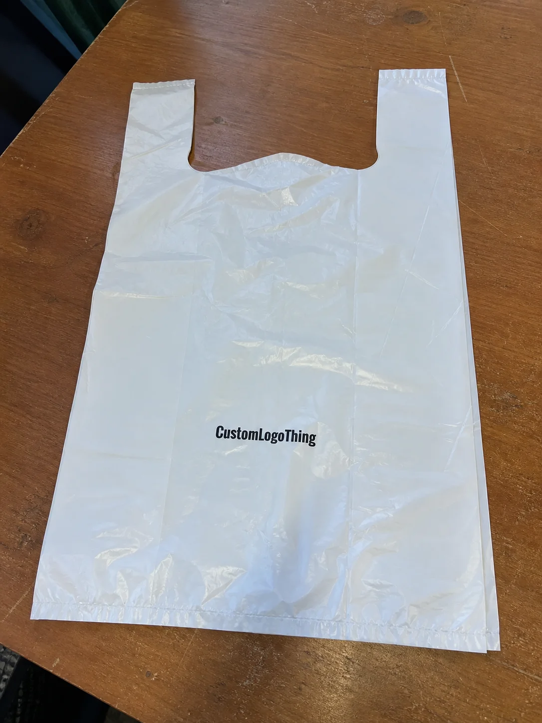
Branded Padded Mailers for Jewelry packaging prototype sample approval look like a small line item until the sample shows up with a crooked logo, a weak seal, or padding that feels thin enough to be embarrassed about. Then the whole package gets judged in about five seconds flat. Jewelry is unforgiving that way. The piece might be beautiful, the box might be polished, and the mailer still ruins the first impression if it feels cheap or inconsistent.
That is why the sample stage matters more than most buyers admit. The mailer is usually the first physical touchpoint in the product packaging chain, and it has to do more than carry the item from point A to point B. It needs to protect the jewelry, support package branding, and hold up under internal review without opening the door to endless revisions. A sample is not decoration. It is a stress test with opinions.
On real projects, the details get specific fast. Teams look at face stock, liner thickness, closure strength, print placement, and whether the outer finish still looks clean after handling. A sample built with 350gsm C1S artboard on the face and a 100gsm bubble liner can feel completely different from a lighter paper-mailer build, even before the logo goes on. The paper weight, adhesive, and cushioning all influence the final impression. Skip one of them, and the approval conversation gets messy.
Buying teams know the drill. A finish that looks rushed, a closure that feels inconsistent, or a logo shifted a few millimeters too high changes the mood immediately. People stop asking whether the package works and start asking what else is wrong. That is how rework starts. That is how launch calendars slip. A disciplined review process cuts most of that noise before production money gets involved.
Branded Padded Mailers for Jewelry Packaging Prototype Sample Approval
A jewelry launch rarely falls apart because the jewelry itself is weak. The problems usually start with the package. If the branded packaging looks thin, the adhesive is uneven, or the print lands a shade off, the sample stops being a checkbox and turns into a debate. That is exactly why branded Padded Mailers for Jewelry packaging prototype sample approval deserves real attention. The mailer is the first proof that the brand promise survives handling, shipping, and actual humans touching it with actual human opinions.
Jewelry buyers tend to review prototypes in layers. Protection comes first. Presentation comes second. Repeatability comes after that. A mailer can protect a ring box and still fail if it looks generic. It can look premium and still fail if it opens too easily in transit. The sample tells the truth faster than a render ever will. Annoying, yes. Useful, also yes.
There is a quieter effect too. A mailer is often the first object a customer touches before they see the piece inside. In retail packaging, that first touch shapes perceived value. A centered logo, a clean edge, and a closure line that sits straight can make a modest item feel considered. An off-center imprint or fuzzy edge can make a premium piece feel like it was packed during a fire drill.
A sample does not need to be perfect to be useful. It needs to be honest enough to expose the weak point before production locks it in.
That is the entire point of prototype approval. A useful sample lets the team ask sharper questions early: Does the mailer hold a rigid jewelry box without crushing the corners? Does it leave enough room for inserts or pouches without letting the contents slide around? Does the branding match the wider look of the website, the insert card, and any Custom Packaging Products already in use?
For teams shipping across multiple channels, the mailer also needs to sit comfortably beside custom printed boxes, tissue, labels, and inserts. The more pieces that share the same visual language, the more intentional the brand feels. That is the difference between packaging that looks assembled and packaging that looks designed. If you want a reality check on how those choices perform in live projects, the Case Studies page is a useful place to compare outcomes.
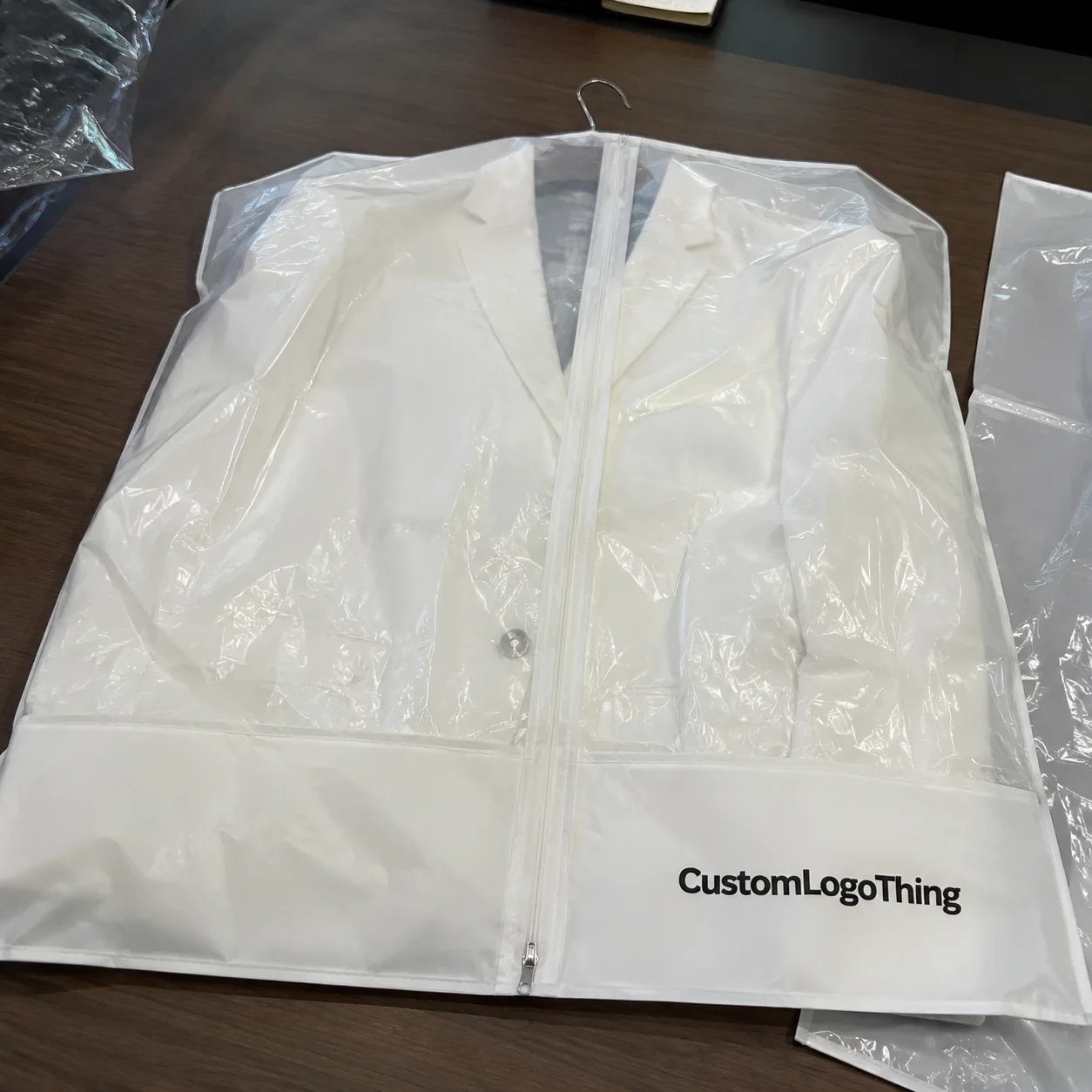
How Branded Padded Mailers Work in Jewelry Packaging
A padded mailer carries several jobs at once. The outer layer might be printable paper, a poly film, or a paper-based structure. Inside that shell sits the cushioning layer, usually bubble lining, paper padding, or a fiber insert. The closure system finishes the job: self-seal adhesive, tear strip, tamper-evident flap, or some mix of the three. Each part changes how the sample feels in hand and how it behaves in transit.
Jewelry protection is not the same as protection for a heavy consumer product. Rings, earrings, necklaces, chains, and small gift boxes are light, but they still pick up scuffs, pressure marks, bending, and impact damage. A soft insert or cushioned envelope reduces vibration and keeps a hard jewelry box from rubbing against the outer wall. Chain tangles matter too. A little movement inside the pack can turn into a complaint if the box shifts or the pouch opens during shipping.
Dimensions vary, but many teams start with a size that leaves room for the jewelry box plus some tolerance for inserts or tissue. A compact 5 x 8 inch format may suit small earrings or a slim ring box. A 7 x 10 inch or similar format gives more breathing room for branded cards and thicker presentation boxes. The right size depends on the interior build, not just the item itself. That distinction gets ignored constantly, then everyone acts surprised when the first sample is too tight.
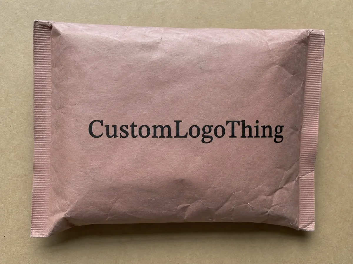
For a premium feel, some brands move to a stiffer face stock such as 350gsm C1S artboard laminated over a padded liner. That gives the mailer a cleaner front panel and a more carton-like hand feel without turning it into a rigid box. It is a practical middle ground if the brand wants structure without paying for a full custom carton.
Branding turns the package from a shipping shell into part of the product experience. That is why package branding still matters at the sample stage. A centered logo, a repeat pattern aligned to the flap, or a matte finish that softens glare can make the mailer feel like a continuation of the jewelry line instead of a random accessory slapped onto the order.
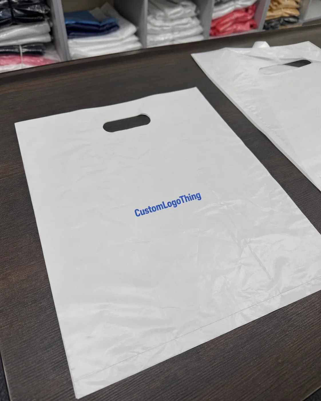
Plain stock mailers are faster and cheaper, and sometimes that is enough. They do the job. They just do a different job. If the brand sells presentation, a stock solution can leave value sitting on the table. The issue is not only visual. Customers read the outer package as a signal. If the outside feels considered, they assume the rest of the process got the same treatment.
For a practical benchmark, packaging teams often borrow test logic from shipping standards. The International Safe Transit Association offers a useful reference for impact, vibration, and compression thinking. A prototype does not need full certification to be informative. Drop it. Shake it. Stack it. See whether the package protects the product under normal handling, not just under ideal conditions in a clean room with perfect intentions.
Key Factors That Shape Prototype Quality and Brand Perception
The fastest way to judge a padded mailer sample is to look at structure, print, and fit together. One weak link is enough to make the whole thing feel unreliable. The annoying part is that each factor affects both performance and perception, which is why prototype review deserves more than a glance and a shrug.
Material thickness is usually the first thing people feel. A thinner outer face may look elegant, but if it wrinkles under light pressure or folds badly in the hand, it loses authority fast. A thicker face or more substantial cushioning often reads as premium, though it can add bulk and shipping cost. For jewelry packaging, the right choice depends on the fragility of the inner box and the mood the brand wants to project. A common middle ground is a paper face in the 150-200gsm range for flexible mailers, or a 350gsm C1S artboard face when the sample needs a stiffer, more polished surface for print.
Cushioning density matters just as much. Too little, and the mailer lets the contents move. Too much, and the mailer turns stiff or oversized, which makes fulfillment awkward. A solid sample should hold the jewelry box or pouch snugly without compressing it so hard that corners bend or edges rub. That balance affects transit and the unboxing moment, which are the two places customers actually notice. A typical bubble lining may run around 3/16 inch to 1/4 inch in thickness, while paper-based padding trades some shock absorption for a cleaner sustainability story.
Surface finish changes color reading, glare, and touch. Matte films usually photograph well and hide minor scuffs. Gloss can make color pop, but it also exposes fingerprints and handling marks. Paper-based surfaces can fit a sustainable branded packaging story, though they often need tighter print control so dark areas do not show grain or unevenness. Soft-touch coatings feel expensive, but they also reveal abrasion faster if the pack gets tossed around in fulfillment.
Print accuracy is where some samples get approved too early. A logo that looks fine in PDF form can shift when printed on textured stock or on a flexible padded surface. Color can drift, especially with solid brand fills and fine typography. Edge placement matters too. If the logo sits too close to a fold, the sample can look slightly off even when the artwork itself is technically correct. The human eye is annoyingly good at spotting asymmetry.
Fit matters just as much. A mailer that is too large lets the product move around. A mailer that is too tight can bend the jewelry box, stress the seal, or make hand packing miserable. The best prototype checks the actual boxed product, not just the dimensions in the brief. For small jewelry sets, even a 2 to 3 mm change in internal clearance can decide whether the sample feels intentional or sloppy.
Sustainability adds another layer. Many brands ask for recycled content, paper-based cushioning, or FSC-certified paper surfaces. That can strengthen trust if the claim is accurate and the structure still works. If a material is marketed as recyclable, teams should verify local guidance before putting that claim into customer-facing copy. The FSC label can support sourcing decisions, but the paperwork needs to match the actual material and print spec. Municipal recycling rules also vary more than most brands like to admit, so a quick local check is better than guessing.
The strongest samples usually balance presentation with restraint. They do not shout about every feature. They just feel right: enough cushioning, accurate branding, a clean closure, and a finish that supports the rest of the product packaging system.
Process and Timeline: From Artwork to Approval
The approval path should be predictable, even if the sample still needs refinement. Delays usually happen because teams treat the mailer like an artwork task instead of a packaging task. That mistake costs time. A proper review sequence starts with the physical structure, moves into the graphics, and then circles back to product fit.
A clean workflow starts with dieline review. Size, flap position, bleed, safe area, adhesive placement, and print zones all need checking before artwork gets locked. If the supplier provides a dieline, the team should confirm that it reflects the exact closure style and padding thickness. A mismatch here can waste days later. People love discovering that after the proof is already called final.
Artwork prep comes next. Logos, typography, and color references need to be formatted correctly. Vector files reduce risk. Pantone references help, even if they are not a guarantee on every material. Fine-line patterns, low-contrast text, and large solid blocks need special attention because they reveal print drift quickly.
The proof catches spelling, layout, and placement problems. It cannot show how a finish catches light or how an adhesive feels under your thumb. That is why a physical sample matters. It adds texture, weight, stiffness, and closure behavior to the review. For jewelry packaging, those traits are not side notes. They are part of the brand message.
Typical timelines vary. A straightforward print-only sample usually takes about 12 to 15 business days from proof approval, depending on supplier capacity and shipping distance. A more customized prototype with special coatings, structural adjustments, or a new cushioning build may take 15 to 25 business days or longer. If the sample needs revision, add another round. Delays usually come from slow feedback, missing specs, or a scattered approval chain more than from manufacturing itself. If the sample is going to a second check after comments, expect another 3 to 7 business days before the next version is ready.
One simple way to shorten the cycle is to centralize feedback. One person should collect comments from brand, operations, and fulfillment, then send a single consolidated response. Conflicting notes create churn. A firm response deadline helps too. If the team knows it has 48 hours to review, the sample moves faster and fewer small issues get missed.
Practical tip: send the exact jewelry box or pouch with the brief. Suppliers can estimate dimensions from a drawing, but a real sample shows where the product sits, how much movement exists, and whether the closure needs adjusting. That one step often saves a second prototype round.
If a team manages several packaging formats at once, it helps to compare the mailer choice against other structures, including Custom Poly Mailers. Even if the final answer is a padded paper or fiber-based mailer, the comparison clarifies what the brand values most: maximum protection, lighter shipping weight, lower print cost, or a more premium tactile feel.
Cost, Pricing, MOQ, and Quote Variables for Sample Runs
Sample pricing gets messy when buyers compare only the final number. Two quotes can look close on paper and still cover very different scopes. One may include tooling, freight, and revisions. The other may hide them in the fine print or leave them out entirely. The right comparison is not "Which one is cheaper?" It is "What is included, and what happens if the sample needs a change?"
Several variables drive price. Print complexity is a major one. A one-color logo on a kraft-style surface costs less than a full-bleed design with multiple spot colors, metallic ink, or a soft-touch laminate. Custom sizing adds setup work. Structural changes, such as a different cushioning thickness or a reinforced closure, raise cost too. A higher-end finish usually adds handling and an extra production step, because good-looking packaging loves being slightly annoying to make.
MOQ changes the math quickly. A low sample quantity often carries a higher unit price because setup costs are spread over fewer pieces. That is normal. Prototype samples almost always cost more per unit than mass production. The mistake is not paying more per sample. The mistake is assuming sample economics will match production economics. They usually do not.
Here is a practical comparison that helps most teams sort the options:
| Option | Typical Sample Price Range | Best For | Watch-Outs |
|---|---|---|---|
| Stock padded mailer with label or light print | $0.85-$1.75 per sample | Fast internal approval, low-visibility shipments | Limited branding impact, fewer finish choices |
| Custom printed padded mailer | $1.25-$3.25 per sample | Brand-led jewelry launches, retail packaging alignment | Artwork and color need tighter review |
| Custom printed mailer with upgraded cushioning or sustainable substrate | $1.75-$4.50 per sample | Premium brand presentation, recycled-content positioning | Higher setup cost, more time for testing and revision |
For production planning, a 5,000-piece run of a custom printed mailer often lands around $0.15-$0.24 per unit, depending on size, print coverage, material choice, and whether the artwork is a single-color logo or a full exterior print. A simple one-side design on a standard size sits near the lower end. Larger formats, heavier face stocks, and more ink coverage push the number up fast.
Those numbers are directional, not universal. Volume, location, shipping method, and the level of customization all change the quote. The pattern still holds: the more a sample behaves like final production, the more it costs to make.
Hidden line items deserve real attention. Tooling fees may apply if a new size or closure format is required. Plates or digital setup charges can show up on the first run. Freight matters too, especially if a sample crosses borders. Shipping can get surprisingly expensive if the prototype is bulky or needs to arrive quickly. Revision charges are another item to ask about, because the first sample rarely ends the process for custom packaging with visual branding requirements.
For a cleaner comparison, ask suppliers to separate pricing into three buckets: prototype sample, production unit cost, and optional upgrade cost. That keeps one-time setup from getting tangled up with repeatable manufacturing cost. Buyers who manage that split usually make better decisions on the final package.
There is also a brand tradeoff hiding in the quote. A cheaper sample that leaves the customer unsure about the finish may not be cheaper at all if it triggers another round. Delay has a cost. Missed launch windows, rescheduled photography, and reworked fulfillment plans all add friction that never shows up on a pricing sheet. Packaging always finds a way to collect its bill.
Common Mistakes That Slow Jewelry Mailer Approval
The biggest approval mistakes are usually small omissions that stack up. A team approves too early, skips a fit test, or assumes the digital proof says enough. Then the sample arrives and the hidden issue becomes obvious. It is never the glamorous mistake. It is always the annoying one.
Approving from flat artwork alone is the first trap. A PDF shows placement and color intent, but it cannot reveal how the mailer feels in the hand. It cannot show whether the seal is stiff, whether the coating scuffs under a fingernail, or whether the logo looks too low once the flap closes. That is why the physical sample is mandatory for jewelry packaging decisions.
Skipping fit tests causes plenty of delays too. A mailer may be the right size on paper and still fail with the actual box or pouch inside. Small movement can wear down the finish or make the package feel unstable at opening. If the jewelry is packed in a rigid box, the mailer should hold it with enough resistance to prevent rattling, but not so tightly that it crushes corners or forces the flap open. A 1/8 inch difference in clearance can be enough to change the whole feel.
Bringing in too many stakeholders too late slows everything down. Brand wants the logo perfect. Operations wants speed. Fulfillment wants a package that closes well on the line. If those groups do not review the same sample together, feedback comes in waves. The first revision solves one problem and reveals another. That is how a one-round approval turns into a three-round delay.
Ignoring handling wear is easy, and it matters anyway. Jewelry mailers get touched, stacked, slid across tables, and pulled apart in fulfillment. Scuff resistance, print durability, and edge wear show up faster than people expect. If the mailer will be photographed for e-commerce or social media, the visual standard has to be higher because the package becomes part of the sales asset.
Forgetting the wider system is the quietest mistake. A mailer should match the tone of the insert card, tissue, seal sticker, and any outer carton. If the brand already uses a refined envelope or box style, the mailer should not feel cut off from the rest of the packaging design. The strongest systems feel like one family of materials, not a pile of nice things that never met each other.
A good test mirrors how the customer and the warehouse will actually experience the package. Open it with gloved hands. Drop it from a normal belt height. Stack it with other outgoing packs. Photograph it in standard room light. Then check whether the branding still reads clearly, whether the closure still holds, and whether the surface picked up marks that would annoy a buyer.
Teams that skip those steps often pay twice: once in sample rework and again in avoidable brand doubt. That is not a packaging problem alone. It is a process problem with a shipping label on it.
Expert Tips and Next Steps for Faster Sign-Off
The easiest way to speed approval is to make the decision criteria visible before the sample arrives. A one-page checklist usually does the trick. Keep it short, but make it specific: size, fit, closure, branding placement, color, surface finish, cushioning, transit durability, and sustainability claims. When every reviewer uses the same checklist, the conversation gets sharper and less theatrical.
Comparing two or three variants usually works better than trying to perfect one version in a vacuum. Matte finish versus soft-touch finish can produce a surprisingly different reaction even when the artwork is identical. The same is true of adhesive type. Small changes in closure feel can change confidence in the sample. If budget allows, that comparison is often more efficient than arguing over a single design with too many unknowns.
Documentation matters more than most teams want to admit. Keep measurements, photos, revision notes, and version numbers in one shared file. That sounds basic because it is basic, and basic systems prevent the classic "which sample did we approve?" problem. A clean record also helps if the package later needs to be recreated for another size or a seasonal update.
For sustainability-led brands, confirm claim language before anything reaches the market. If the outer surface contains recycled content, document the percentage. If the paper is FSC-certified, make sure the paperwork matches the sourcing claim. If the structure is recyclable, verify local disposal reality before printing customer-facing copy. Responsible retail packaging is not about looking green. It is about being accurate enough that the claim can survive scrutiny.
Involving the fulfillment team earlier than usual helps too. They know how a package behaves under pressure, in a bin, and on a packing line. Their input often catches practical issues the brand team misses, like a flap that catches on the machine, a seal that needs too much force, or a mailer size that slows throughput. That matters even more on high-volume lines, where a small packaging inefficiency multiplies quickly.
For teams building a broader product line, the sample approval process should feed the whole system, not just one SKU. If a branded padded mailer works for one necklace collection, the same logic can guide future launches, holiday packaging, and other product families that use similar inserts or outer wrappers. Consistency is the goal. The more the mailer fits the brand's visual language, the less each new launch has to reinvent the wheel.
One final rule keeps projects moving: lock the requirements before asking for the sample. That means dimensions, print files, finish preferences, protection goals, and approval timeline. Once the sample is in hand, test it with the real jewelry, document the result, and sign off only when the package performs as expected. Do that well, and branded Padded Mailers for Jewelry packaging prototype sample approval stops being a bottleneck and starts acting like a useful checkpoint that keeps the whole launch moving.
Frequently Asked Questions
What should I send a supplier for branded padded mailers sample approval?
Send the exact outer dimensions, the jewelry box or pouch size, artwork files, print notes, and any finish or color references. A photo of the actual packed item helps the supplier test fit and protection instead of guessing from a dimension sheet. Ask for a written review checklist too, so every sample gets judged against the same criteria. If the build uses a specific material spec, include that too, such as 350gsm C1S artboard for the face stock or a target bubble thickness for the inner liner.
How many prototype rounds are normal for jewelry padded mailers?
One round can be enough for simple print-only changes, but two rounds are common when size, structure, or finish is customized. If several departments need to sign off, plan for at least one revision cycle. The fewer unknowns in the brief, the fewer rounds you usually need. For a cleaner first pass, send the actual jewelry insert, a dimensioned dieline, and a color target with clear tolerances instead of a loose description like "make it premium."
What affects the price of custom jewelry mailer samples?
Price usually changes with print complexity, custom sizing, material choice, cushioning thickness, and special finishes. Small sample runs often cost more per piece because setup and shipping are spread across fewer units. Before comparing quotes, ask whether tooling, freight, and revision costs are included. For production planning, ask for a separate estimate at 5,000 pieces as well; many brands see about $0.15-$0.24 per unit for a basic custom printed run, depending on size and print coverage.
Is a digital proof enough before approving branded padded mailers?
No. A digital proof cannot show real texture, closure strength, seal performance, or how the print looks in natural light. Use the proof to catch artwork issues, then verify the physical sample for fit and finish. For jewelry packaging, the tactile experience is part of the brand message, so the sample matters. Proofs are for layout. Samples are for reality.
What final checks should I run before production approval?
Check logo placement, color match, seal strength, fit with the jewelry box, and damage resistance after handling. Test the mailer in the same conditions it will face in fulfillment, shipping, and unboxing. Confirm the approved version number and lock the specs before placing the production order. If the package is meant to carry a premium feel, also check whether the print stays crisp on the chosen stock and whether the finish picks up scuffs after a few open-and-close cycles.