A logo can look perfectly centered on a flat proof and still feel too high, too low, or slightly warped once the bucket hat is on an actual head. That is the practical reason a bucket Hats Logo Placement guide matters. Soft crowns curve. Brims slope. Seams interrupt. Fabric moves under thread, heat, pressure, and wash.
Bucket hats are not baseball caps with softer brims. They have less structured front space, a rounder crown, and a viewing angle that changes as the wearer turns. Placement affects readability, stitch quality, comfort, and perceived value. A clean 45 mm embroidered icon can feel premium on the side panel, while the same artwork blown up to 95 mm across the front may pucker the fabric and make the hat look like cheap table swag. Brutal, but true.
Bucket Hats Logo Placement Guide: Why Position Changes Everything
The main decoration zones are the front crown, left or right side, rear panel, brim edge, under-brim, all-over pattern, and small woven, rubber, or leatherette labels. Each has a job. Front crown placement gives the fastest brand read. Side placement feels quieter. Brim details reward a closer look. Under-brim printing can be clever, but it rarely works as the only logo if people need to recognize the brand from a few feet away.
This guide is for buyers preparing artwork, comparing embroidery against patches or transfers, and trying to avoid the expensive little surprise of a sample that looks nothing like the mockup. The best logo spot depends on hat construction, logo size, fabric weight, seam layout, quantity, decoration method, and final use. A festival hat, a company store item, and a retail drop do not need the same decision.
Most placement mistakes start before the supplier quotes the order. If the request only says “put logo on front,” the supplier has to guess the width, height, distance from brim seam, thread colors, decoration method, and tolerance. That guess may be reasonable. It is still a guess. Soft goods need tighter instructions than flat packaging or printed cards.
Production rule: if the logo crosses a curve, seam, or stitched brim line, approve the placement on the actual hat pattern, not only on a clean digital mockup.
How Logo Placement Works on a Bucket Hat Crown, Brim, and Side Panel
A bucket hat is a soft, rounded product with a sloped crown and circular brim. Sounds simple. It is not. Artwork has to follow curved fabric instead of a flat rectangular print area, so a 70 mm wide logo on screen can visually shrink, bend, or tilt once it wraps around the front crown.
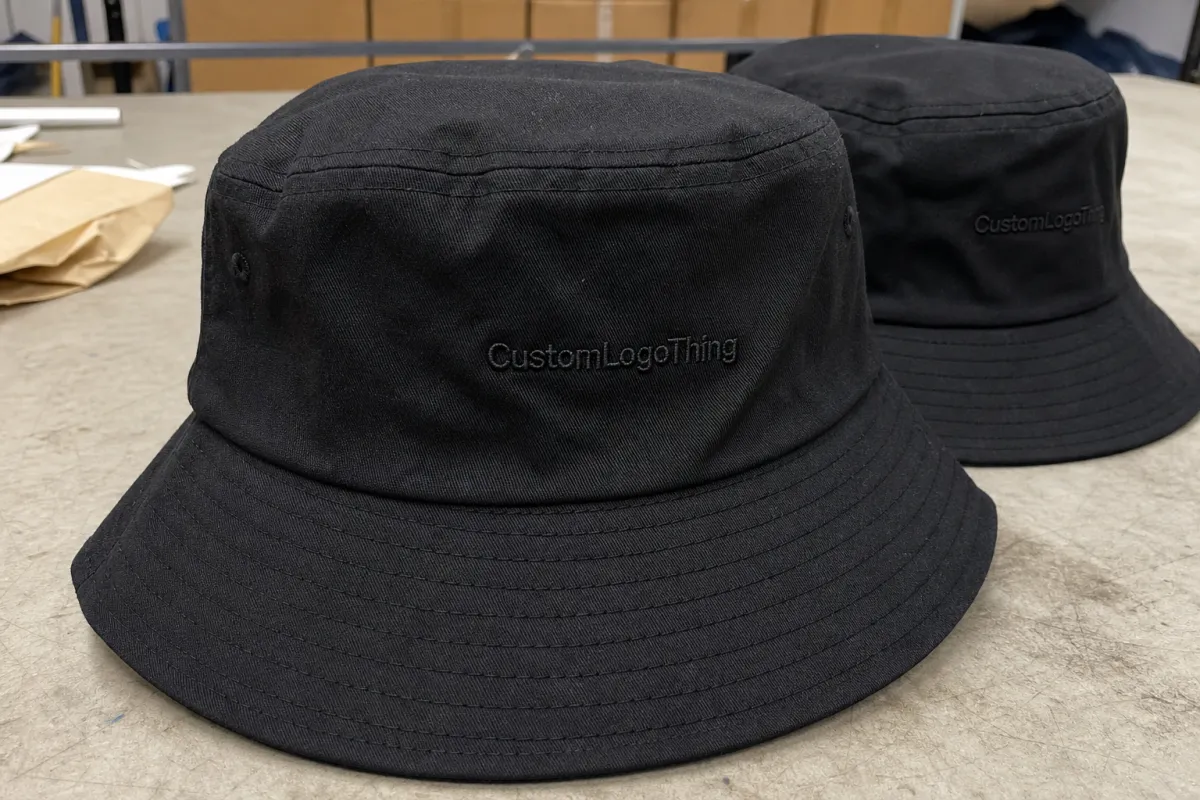
The front crown is the familiar placement. It works well for concise wordmarks, simple icons, small badges, and embroidered patches that need to show in photos or face-to-face settings. For embroidery, many front logos land well around 50-85 mm wide, depending on crown height and artwork detail. Taller stacked marks can work, but they need enough space above the brim seam so the lower stitches do not disappear into the curve.
Side placement is more understated. A 25-45 mm icon, initials, event mark, or small secondary logo often looks sharper on the left or right panel than it would as a tiny front mark. The side also has a more retail-driven feel, especially on washed cotton, denim, corduroy, or nylon bucket hats.
Brim placement includes embroidery along the brim edge, small woven labels sewn into or onto the brim seam, and under-brim printing. Keep brim artwork compact. Many brims have 4-8 rows of stitching, and those rows can fight fine detail. A small woven tab or 20-35 mm embroidered mark usually behaves better than a long slogan. Long slogans on brims often read like someone lost a bet with the layout file.
Check seams, eyelets, crown height, and brim stitching before approving the design. A logo that sits 12 mm from an eyelet may feel cramped even if the proof says it is centered. Clean placement usually comes from careful hooping, proper backing, good digitizing, and tension control, not just a polished mockup.
Key Factors That Decide the Best Logo Spot
Start with logo shape. Wide horizontal marks usually suit the front crown because the eye expects the main brand to read across the face of the hat. Stacked logos can work on taller crowns, but only if the lower edge clears the brim seam. Tiny icons often look cleaner on the side panel or brim because they are not fighting for attention across the whole front.
Artwork complexity matters just as much as placement. Fine lines, small lettering, gradients, tight outlines, and detailed crests do not always translate into embroidery. For standard embroidery thread, lettering below roughly 5-6 mm tall can close up, especially on washed cotton or soft canvas. If the logo includes small type, a woven patch, printed transfer, or rubber patch may hold detail better.
Fabric changes the result. Cotton twill is familiar and generally stable, though heavy stitch fills can still pucker. Washed canvas has character, but the surface can soften edges. Denim can look sturdy and expensive, yet dense embroidery may sink into the texture. Corduroy needs careful thread direction because ribs distort small curves. Nylon and performance fabrics are lightweight, but heat, needle marks, and shine need more caution.
Hat construction adds another layer. Crown height, panel seams, brim width, ventilation eyelets, lining, reversibility, and foldability all affect the safe decoration zone. A reversible bucket hat may need decoration that does not leave rough backing inside. A heavily washed hat may vary more from piece to piece, so expect a placement tolerance rather than machine-perfect alignment. Soft goods are not laser-cut acrylic signs. Annoying, yes. Normal, also yes.
Buyer intent should drive the final call. A festival giveaway may need a high-contrast front mark readable from 2-3 meters away. Retail merch may feel more expensive with a small side embroidery, woven label, or tonal patch. The common mistake is assuming bigger means more premium. On bucket hats, oversized artwork can wrap awkwardly and make the product feel less wearable.
Process and Timeline for Approving Bucket Hat Logo Placement
A clean order usually follows a predictable path: choose the hat style, confirm the decoration method, submit vector artwork, review the placement proof, approve a sample or pre-production image, then release bulk production. If packaging is included, confirm that early too. Polybags, hang tags, barcode stickers, size labels, carton marks, and bundled kitting can add labor and days.
The first serious placement decision should happen before the quote is finalized. Moving from a small side embroidery to a large front patch changes materials, machine handling, setup, and sometimes the base hat itself. A 40 mm side embroidery and a 90 mm woven patch are not the same job, even if both are described as “one logo.” That phrase hides a lot of cost.
During proofing, check the logo width and height, distance from the brim seam, left-right centering, thread colors, patch shape, and relationship to eyelets and seams. Ask for measurements in millimeters or inches. A proof that says “standard size” is not enough for repeatable production.
Embroidery digitizing and patch tooling can add time. Simple embroidery may move quickly after artwork approval. Woven patches, rubber patches, special merrow borders, heat-cut shapes, custom backings, and multi-location decoration usually need more proofing. For many stock-hat decoration orders, 12-20 business days after proof approval is common for simpler work. Custom fabric, dyeing, all-over prints, private-label trims, or complex packaging can stretch longer. Quantity, season, and supplier capacity all matter.
Sampling is worth the time for retail launches, influencer kits, company stores, and any order where the hat must feel finished rather than promotional. Approve artwork quickly, avoid changing logo size after sampling, and decide early whether you need individual polybags, FSC-certified hang tags, size stickers, or shipping cartons tested for distribution. For paper-based tags and labels, the Forest Stewardship Council is a useful reference. For packaged-product distribution testing, ISTA is the standard name to know.
Cost, MOQ, and Unit Cost Effects of Different Placements
Logo placement affects cost because it changes setup time, machine handling, decoration area, stitch count, patch size, number of locations, and sometimes the base hat style. A front-only embroidery on a stock cotton bucket hat is usually the simpler quote. Add a side mark, under-brim print, Custom Woven Label, and individual packaging, and the order becomes a different production plan.
| Placement Option | Best Use | Typical Cost Impact | Production Watchouts |
|---|---|---|---|
| Front embroidery | Visible brand marks, events, giveaways | Often economical for simple logos; setup plus stitch count drive price | Small text, dense fills, and low placement near the brim seam |
| Side embroidery | Subtle retail styling, small icons, secondary marks | Economical when small, often 25-45 mm wide | Eyelets, side seams, and left-right consistency |
| Woven or embroidered patch | Detailed logos, premium merch, repeated programs | Higher setup; unit cost depends on size, border, backing, and application | Patch shape, edge finish, minimums, and crown curve |
| Brim or under-brim decoration | Accent details, limited drops, brand surprises | Can add handling cost as a second location | Brim stitch rows, curved edges, and print opacity |
| All-over print | Retail collections, campaigns, pattern-based branding | Usually higher MOQ and longer lead time | Pattern matching, fabric shrinkage, color control, and cutting waste |
For rough planning, a simple one-location embroidery on stock hats may add only a modest decoration cost. Dense embroidery, multiple placements, or custom patches can raise unit pricing quickly. At 500 pieces, a small embroidered side logo may be manageable. At 5,000 pieces, even a $0.18-$0.35 handling difference per unit matters. Patch programs vary widely, but woven patches often become more attractive at higher quantities because tooling is spread across more units.
MOQ is tied to the base product and decoration. Stock bucket hats can often support lower quantities. Custom-dyed fabric, private-label trims, special corduroy colors, all-over printing, rubber patches, and custom woven labels usually require higher minimums. Ask for quotes by decoration location, not only by hat style, so you can compare front-only, front plus side, patch, and premium label packages without guessing.
Also ask what is included in the quoted price. Digitizing, patch sampling, thread color changes, PMS matching attempts, pre-production photos, packing method, inner cartons, freight terms, and rush handling may not sit in the same line item. That does not mean anyone is being sneaky. It means bucket hats are built from a pile of small decisions, and small decisions become invoices.
Step-by-Step Placement Checklist Before You Approve Artwork
- Choose the primary viewing angle. Decide whether the logo should read from the front, appear subtly from the side, or create a branded detail on the brim. One primary job keeps the hat from feeling crowded.
- Measure the real decoration zone. Confirm the safe distance from the brim seam, crown seams, ventilation eyelets, and stitched rows. A common front logo may need at least 10-15 mm of breathing room above the brim seam, depending on the hat.
- Match size to method. Keep embroidered lettering large enough to stitch cleanly. Use woven patches, printed transfers, or rubber labels if the artwork has gradients, tiny type, or fine outlines.
- Confirm color contrast. Tone-on-tone embroidery can feel refined on black, navy, olive, or sand hats, but it may disappear in photos. High contrast reads faster, though it can feel more promotional.
- Review at actual size. Print the proof at 100% or view it with measurements. Ask for a physical sample or production photo for retail sale, high-value gifts, or strict brand standards.
- Lock placement in writing. Record logo width, height, thread or material colors, panel location, distance from brim seam, and acceptable tolerance for soft-goods production.
This is where a bucket hats logo placement guide becomes practical instead of theoretical. If the logo is 78 mm wide, placed 18 mm above the brim seam, centered on the front crown, and stitched in two thread colors, everyone has something concrete to approve. If the instruction only says “same as proof,” small misunderstandings can travel into bulk production.
For quality control, ask what the supplier checks before packing. Useful checks include decoration location, logo size, thread color, loose threads, puckering, patch adhesion, skipped stitches, needle cuts, label orientation, and carton count. For embroidery, look at the back as well as the front. Messy backing, heavy thread buildup, or scratchy interior finishing can make an otherwise good-looking hat uncomfortable.
Common Placement Mistakes That Make Bucket Hats Look Cheap
Oversized front logos are the first problem. A bucket hat crown is curved and soft, so a large filled embroidery can bunch fabric, pull the panel, or turn the hat into a floppy billboard. Big can work with the right patch and crown shape, but it needs testing.
Placing artwork too close to the brim seam is another common issue. The lower edge can get visually hidden when the hat is worn, and the sewing foot may have less room to control tension. Even 8-10 mm can make a visible difference on a small logo.
Tiny embroidered text causes trouble fast. Taglines under a logo often look crisp in vector artwork but close up once thread is laid into soft fabric. If the buyer insists on tiny copy, I would rather move it to a woven label, printed care-style label, hang tag, or packaging sticker than force it into embroidery.
Ignoring seams and eyelets can make a logo appear off-center even when the measurement is technically correct. The human eye reads the whole hat, not just the center point. If the side eyelet is too close to the design, the logo may feel crowded. If a crown seam runs behind a patch edge, the patch may not sit as flat as the proof suggests.
Do not choose placement from a lifestyle photo of a different hat style. Crown height, brim slope, panel layout, wash level, and fabric stiffness vary more than buyers expect. A low-crown washed bucket hat will not carry artwork the same way as a taller nylon festival hat. Same category, different canvas.
Another mistake: approving only the front mockup when the order includes side or brim decoration. Secondary placements need their own scale, alignment, and color checks. A side logo that looks fine in isolation can clash with an eyelet. An under-brim print can look muddy if the brim fabric is dark and the ink system is not opaque enough. Ask before production, not after the cartons arrive.
Build a Placement Brief Your Supplier Can Quote Accurately
A good brief does not need to be fancy. It needs to be specific. Include the hat style, fabric preference, logo files, desired decoration locations, approximate logo size, target quantity, packaging needs, and in-hands date. If the hat is for retail, say so. If it is for a one-day event, say that too, because the supplier may recommend a simpler decoration method to protect the schedule.
Send vector artwork when possible: AI, EPS, SVG, or editable PDF. Add Pantone references if your brand requires them, while remembering that thread colors and fabric dyes may not hit coated-paper colors exactly. Previous merch photos can help, as long as everyone understands that final placement still has to be checked against the actual bucket hat pattern.
Ask the supplier to flag construction limitations early. Seam interference, small lettering risk, thread color limits, patch border concerns, heat sensitivity, reversibility, and placement tolerances should be discussed before the proof becomes “final.” For a practical comparison, request two or three quote options: front embroidery only, front patch plus side embroidery, or woven label plus under-brim print. That gives you a real cost and appearance decision, not one take-it-or-leave-it number.
Approve the final proof only after checking the logo at actual size and confirming that the written placement details match the mockup. A strong placement brief leads to a cleaner quote, fewer revision rounds, and a finished hat people actually want to wear. That is the bar. Not “technically decorated.” Wearable.
FAQ
What is the best logo placement for custom bucket hats?
The front crown is usually best for maximum visibility, especially for simple logos, event merchandise, and brand giveaways. Side placement works better for subtle retail styling, secondary marks, or small icons that should feel less promotional. Brim and under-brim placements are stronger as accent details than as the only brand location unless the design is intentionally understated.
How large should a logo be on a bucket hat?
Most bucket hat logos look better at a moderate size because the crown curves and the fabric is usually softer than a structured cap front. Many front designs fall around 50-85 mm wide, while side icons may sit closer to 25-45 mm. Embroidery size should be tested against stitch detail, especially if the logo includes small text, thin lines, or tight spacing.
Does bucket hats logo placement affect pricing?
Yes. Placement can affect setup, stitch count, labor time, patch size, and handling difficulty. A simple front embroidery is often more economical than multiple placements, oversized embroidery, or custom patch applications. Ask for separate pricing options by location so you can compare appearance and unit cost before approving the final layout.
Can I put a logo on the brim of a bucket hat?
Yes, brim logos can work well as small embroidered details, woven labels, edge marks, or under-brim prints. The brim has stitching rows and a curved edge, so the artwork usually needs to be compact and carefully positioned. Brim placement is often best paired with a front or side logo if the brand needs to be easy to recognize.
What files should I send for a bucket hat placement proof?
Send vector artwork such as AI, EPS, SVG, or editable PDF whenever available, because it gives the cleanest starting point for digitizing, patches, and print preparation. Include brand color references, preferred logo size, desired placement location, quantity, hat color, and deadline details. If you have a previous hat or mockup you like, include it as a visual reference, but still confirm placement against the actual bucket hat pattern.


