Dad Hats Logo Placement Guide for Smarter Ordering
Dad Hats Logo Placement Guide: What Buyers Need to Know
A dad hat can look polished or oddly cheap because of less than half an inch of logo movement. That sounds fussy until you see a soft crown pull a tall embroidered logo upward, wrinkle around dense stitches, or make a mark look like it is sitting on the bill instead of the front panel. This dad Hats Logo Placement guide is about matching logo size, embroidery method, cap shape, and wearer comfort before the order goes to sampling or production.
A dad hat is usually a low-profile, unstructured or lightly structured cap with a curved brim, a soft crown, and a relaxed fit. Unlike a rigid trucker cap or high-profile snapback, the front panels do not stand upright on their own. They move with the wearer’s head. That relaxed shape is exactly why people like them, and exactly why logo placement needs more care.
Placement is not only a design choice. It affects stitch quality, thread density, puckering risk, readability, unit cost, and consistency across a run of 48, 500, or 5,000 caps. A logo that looks balanced in a flat PDF may behave differently once it is digitized, hooped, backed, stitched, trimmed, steamed, packed, and worn.
The main decoration zones are front center, left front panel, right front panel, side panel, back arch, closure strap area, and small woven or embroidered labels. Each zone has its own working area, decoration limits, and cost implications. The goal is not to fill empty fabric. The goal is to place the mark where it supports the brand and survives production without looking forced.
Practical rule: if the cap has a soft, low crown, treat vertical space as the scarce resource. Width is usually easier to manage than height.
How Logo Placement Works on a Soft Dad Hat Crown
Most dad hats are decorated with embroidery while the cap is held in a curved cap frame. The machine is precise. The fabric is not a sheet of paper. Crown curve, seam position, fabric softness, backing, and tension all influence how cleanly the needle places each stitch.
A brushed cotton twill cap may handle a compact 2.25-inch-wide wordmark nicely. A washed, very soft cap may need lighter density to avoid puckering. Corduroy, canvas, pigment-dyed cotton, and performance fabrics all behave differently under the needle, so the same logo file can produce different results on different blanks.
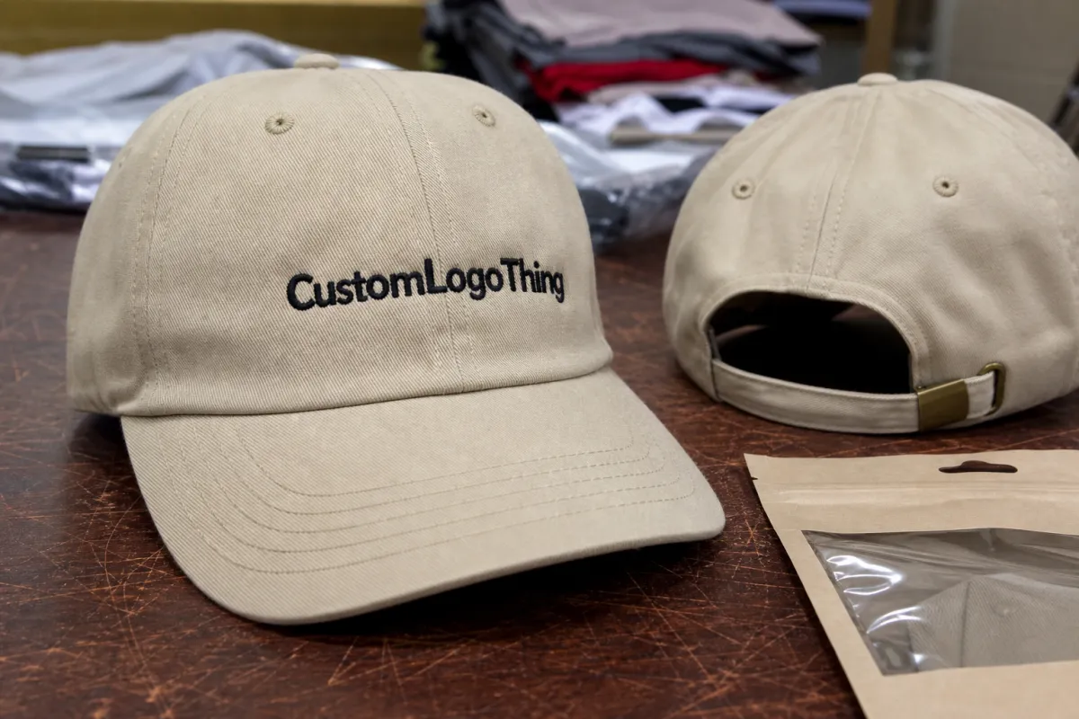
The most common placement is front center, positioned above the brim seam and centered between the front panel seams. Many buyers ask for the logo to sit “right above the brim,” but a little breathing room matters. If the bottom of the embroidery is too close to the bill seam, the design can look cramped, and hooping becomes less forgiving.
Embroidery height is often more important than width on dad hats. A horizontal wordmark at 2.5 to 3.25 inches wide may still look clean if the height stays around 0.5 to 1.25 inches, depending on the cap. A stacked logo at 2 inches tall can climb into the curved crown area where the fabric has less stable support. Fine details distort there. Small letters start to close up.
Side placements work best for small icons, short wordmarks, initials, or secondary branding. The available working area is narrower, and the cap frame has less room to hold the panel evenly. A 0.75-inch icon on the left side can look refined. A detailed mascot in that same space usually looks crowded. Thread is not magic. Sorry.
Back placement has its own limits. Embroidered arches, small marks above the strap, and strap embroidery must be spaced around the buckle, tuck strap, metal clasp, plastic snap, or hook-and-loop closure. Strap embroidery can look sharp, but the decorator needs enough clearance to hold the strap and keep stitches from interfering with hardware or adjustment.
If the logo has to be read from six to eight feet away, keep it on the front. If it is more of a brand accent, a side or back mark can feel quieter and more retail-minded. That single decision saves a lot of revision time.
Key Factors That Decide the Best Logo Position
Start with artwork shape. Horizontal wordmarks usually sit well across the front center because they use width without demanding too much crown height. Round seals and badges can work as compact front logos, especially if the inner text is simplified. Tall stacked marks need more caution. They may need to be resized, redrawn, or split into a shorter version before embroidery.
Detail level drives the next decision. Tiny lettering, thin outlines, gradients, shadows, and complex mascots can lose clarity at cap scale. Embroidery is built with thread, not pixels, so a 1 mm line on a screen may become a heavy stitch. A tiny gap may close once thread tension pulls into cotton twill. On brushed or garment-washed fabrics, thread can sink into the surface, which softens the edge even more.
Color contrast matters too. Tonal embroidery, such as navy thread on a navy cap or tan thread on a khaki cap, can look premium and understated. High-contrast thread, such as white on black or black on stone, improves readability for staff uniforms, promotional caps, trade show giveaways, and event merchandise. Mid-contrast can be the sweet spot for retail: visible, but not loud.
Fabric type changes the result. Pigment-dyed cotton may have a softer hand and slightly uneven surface. Canvas can feel sturdier but may show needle marks more clearly. Corduroy has ribs that can interrupt tiny details. Performance fabrics can be slick and may require adjusted tension or backing. If sustainability claims matter for the cap or packaging, ask for documentation rather than vague wording; resources such as the Forest Stewardship Council are useful for understanding chain-of-custody claims on paper packaging and hang tags.
Wearer and use case should guide placement. Employee uniforms often need clear front branding because customers need to recognize the team quickly. Golf, outdoor, and lifestyle merch can benefit from smaller side placement because the cap is part of a full outfit, not a billboard. Retail caps usually perform better with a restrained mark, especially if people are expected to wear the hat after the event ends.
Multiple positions need hierarchy. A main front logo with a small back text line can work. A front logo, both side panels, back arch, strap embroidery, and a woven label can feel overworked. Plenty of cap orders lose their charm here: every panel gets treated as advertising space, and the relaxed dad hat stops looking relaxed.
| Placement Zone | Best Use | Typical Decoration Size | Cost Impact |
|---|---|---|---|
| Front center | Main logo, wordmark, event mark | About 2.25-3.5 in wide, often under 1.5 in tall | Lowest for single-location embroidery |
| Side panel | Icon, initials, small secondary mark | About 0.5-1.25 in wide | Adds handling and alignment cost |
| Back arch | Short text, URL, team name | Usually compact and low-height | Adds a second decoration setup |
| Strap | Very small text or subtle brand detail | Narrow, closure-dependent | Higher difficulty due to hardware clearance |
| Woven label | Retail accent, side tag, back detail | Often 0.5-1.5 in wide | May require label MOQ and sewing labor |
Step-by-Step Process and Timeline for Approving Placement
A clean order starts with clean information. Send vector artwork if you have it, preferably AI, EPS, or editable PDF. If not, send the highest-resolution PNG or original design file available. Then choose the cap style and color, confirm decoration locations, review digitized embroidery artwork, approve a proof or sample, and move into production.
Digitizing deserves respect. It is not uploading a logo and pressing a button. A digitizer translates flat artwork into stitch paths, densities, underlay, thread changes, trims, pull compensation, and machine instructions. On a dad hat, that translation must account for the crown curve and the way fabric moves under needle pressure.
Ask for a virtual proof showing the logo on the specific cap style, not a generic cap outline if accuracy matters. The proof should list approximate finished dimensions, thread colors, placement zone, and a reference point such as “centered on front panels, bottom of logo approximately 0.5 inch above brim seam.” The proof is the document production follows, so vague notes are not your friend.
A physical sample is worth the added time for first-time retail launches, detailed logos, premium corporate gifting, multi-location embroidery, unusual fabrics, or orders where consistency is critical. Sampling may add several business days, sometimes more if blank caps, thread matching, or patch production is involved. It costs money, but it is cheaper than discovering after bulk production that a 1.75-inch-tall mark looks too tall on a low-profile cap.
Lead time depends on artwork readiness, digitizing complexity, approval speed, blank cap availability, production queue, quantity, finishing, packing, and shipping method. A small repeat order with approved files may move quickly. A new order with custom patches, multiple locations, retail hang tags, and individual polybags needs more runway.
Lock placement before production begins. Moving a logo by even a small amount after setup can require revised proofs, machine adjustments, or another sample. In production terms, “just a little higher” is still a controlled change, especially if the run has already been hooped and staged.
Cost, Pricing, and MOQ Effects of Logo Placement
Placement affects price because it changes labor, stitch count, machine run time, hooping difficulty, thread changes, quality checks, and the number of times each cap must be handled. A simple front embroidery is usually the most economical choice. Add a side mark, back arch, strap detail, or sewn label, and the cap needs another setup and another alignment step.
Stitch count is a major pricing driver. A clean wordmark with open lettering may stitch efficiently. A large filled logo, dense patch-style block, or detailed illustration can take much longer on the machine and may require extra backing or density adjustments. If the decorator prices embroidery in stitch-count tiers, a jump from 5,000 stitches to 11,000 stitches can affect the unit cost more than buyers expect.
MOQ is practical, not mysterious. Lower quantities carry higher per-unit costs because digitizing, setup, proofing, and operator time are spread across fewer hats. A 24-piece order may be possible, but it will rarely price like 500 pieces. Larger runs often reduce the unit cost once the cap, file, thread, and placement are dialed in.
For planning, a basic embroidered dad hat might land in a broad range such as $7-$14 per unit at moderate quantities, depending on blank cap quality, stitch count, and decoration location. Premium caps, specialty washes, patches, multi-location embroidery, or retail packing can push costs higher. Digitizing may be a separate charge, often in the $35-$95 range for straightforward artwork, though complex files can cost more.
Other possible add-ons include sample production, thread color matching, metallic thread, puff embroidery, woven patches, leather or faux leather patches, custom inside taping, hang tags, barcodes, individual polybagging, carton labeling, and retail-ready packing. If packaging performance matters during shipping, standards from groups such as ISTA can help frame transit testing expectations for cartons and packed goods.
Quote-ready information saves time: cap style, quantity, cap color, logo file, decoration locations, finished logo size, thread colors, desired delivery date, and whether a sample is required before bulk production. Without those details, the quote will be padded with assumptions. Assumptions are where budgets go to get weird.
Common Placement Mistakes That Make Dad Hats Look Off
The biggest mistake is making the front logo too tall for a low-profile crown. Tall artwork can force the embroidery into the curved upper area, where the fabric is less stable and the design starts to look crowded. Even a clean logo can feel awkward if it climbs too high.
Placing artwork too close to the brim seam is another common problem. The logo may look like it is sitting on the bill, and the natural shadow from the curved brim can compete with the bottom stitches. From a production standpoint, that lower zone is also harder to hoop cleanly on some cap styles.
Another issue is using artwork built for boxes, signs, or websites without adapting it for thread. Small taglines, thin registration marks, gradients, and photo-like effects do not translate well at cap scale. If the tagline is only readable at 12 inches away on a screen, it probably will not be readable on a soft cotton crown after stitching.
Over-branding is easy to spot. A front logo, two side marks, back text, and strap decoration can make a casual cap feel like a giveaway item rather than a considered uniform or retail piece. More branding does not always create more value. Often, one clear mark and one subtle secondary detail do the job better.
Seam alignment can also hurt the result. Many six-panel hats have a center seam running directly through the front. That seam can split small letters, distort circles, or create a ridge under dense stitches. Some designs can be split intentionally. Others should be simplified, moved slightly, or placed on a five-panel style if the cap option allows it.
Proof approval errors create avoidable headaches. Check actual logo dimensions, cap color, thread contrast, spelling, orientation, and the placement reference point. A phone screen can hide scale issues, so review the proof on a desktop or print it at rough size. A pretty mockup is not enough if it does not show the size and location production will use.
Expert Tips for Cleaner Embroidery and Better Wearability
Start with the final wear situation, not only the logo file. Will the cap be seen across a counter, across an event booth, on a golf course, in a retail display, or as part of daily staff uniforming? A front-center logo may be right for customer-facing staff, while a smaller side icon may be better for a lifestyle drop where wearability matters more than distance readability.
Simplify before shrinking. Remove tiny secondary text, thicken delicate lines, reduce color count, and choose one clear focal point. A logo that uses 3 thread colors and clean shapes usually has fewer production risks than one using 8 colors, shadows, and tiny outlines. Thread can do beautiful work, but it has physical limits.
A slightly smaller, well-spaced logo often looks more expensive on a dad hat than a large logo pushed to the edge of the available crown area. Give the embroidery room to breathe. On many low-profile caps, a front design around 2.5 inches wide can feel more balanced than a 3.75-inch mark, especially if the logo has height or dense fill.
Use contrast intentionally. High contrast helps readability. Tonal embroidery creates a quiet retail look. Mid-contrast thread, such as charcoal on washed black or cream on olive, can feel premium while still remaining visible. Ask for thread color references if brand matching is critical, because screen colors and thread colors are not the same material language.
If embroidery is not ideal, consider alternatives. Woven patches can hold small detail better than direct embroidery. Leather or faux leather patches suit lifestyle branding and outdoor merch. Printed patches can handle full-color artwork. Small woven labels work well for subtle side or back branding. Each option has different MOQ, lead time, durability, and wash behavior.
Document the standard once approved: logo size, placement zone, distance from brim seam if specified, thread colors, cap style, backing notes, proof version, and sample photos. Reorders months later are much easier when the standard exists in writing. Without it, a repeat order can drift just enough to look different beside the first run.
Next Steps Before You Send Artwork for Custom Dad Hats
Before asking for a quote, choose the main logo location, decide whether side or back branding is truly needed, select the cap color, confirm the preferred logo size range, and gather clean artwork files. That five-point checklist answers most of the first questions a decorator will ask.
If possible, measure the logo visually against a real cap. Print the artwork at 2 inches, 2.5 inches, and 3 inches wide, cut the paper close to the shape, and hold it on a similar low-profile crown. It is not production-grade proofing, but it quickly reveals whether the design feels balanced or too large.
Prepare both a full logo and a simplified logo option. The simplified version often performs better in embroidery, while the full version may still be useful for packaging, inserts, printed marketing materials, or e-commerce graphics. Buyers sometimes resist this step because they want the full brand mark everywhere, but thread rewards clarity.
Ask direct questions before approval: What is the maximum recommended embroidery height for this cap? Will the center seam affect the artwork? Is a sample recommended? How will extra locations affect unit cost and lead time? Can the proof list exact logo dimensions and placement reference points?
Make approval easier by requesting a proof with cap style, cap color, thread colors, finished logo size, and placement clearly listed. Review spelling slowly. Check left versus right orientation. Confirm whether the proof shows the wearer’s left or the viewer’s left, because that detail causes more confusion than people expect.
A practical dad hats logo placement guide helps buyers avoid fuzzy embroidery, awkward positioning, surprise costs, and production delays before the first cap is stitched. Use it as a working checklist, not a rigid rulebook. The best placement still depends on the cap shape, artwork, fabric, quantity, and how people will actually wear the finished hat.
FAQ
What is the best logo placement for dad hats?
Front center is the safest and most visible placement for most dad hats, especially for brand names, event marks, and employee uniforms. Side or back placement works well for small icons, initials, secondary marks, or a more understated retail look. The best choice depends on crown height, logo shape, fabric, and whether the design needs to be readable from a distance.
How big should a logo be on a dad hat?
Most dad hat logos look better when kept compact because the crown is soft and low-profile. Horizontal logos can usually be wider than they are tall, while tall stacked logos may need to be simplified. Ask for the finished embroidery size on the proof, not just a visual mockup, so the logo does not end up too large or too close to the brim.
Can I put a logo on the side or back of a dad hat?
Yes, side and back placements are common, but they usually need smaller, simpler artwork than the front. Back embroidery must be planned around the closure strap, buckle, tuck opening, or hook-and-loop area. Adding side or back decoration normally increases unit cost because it requires additional setup, alignment, and production handling.
Does dad hats logo placement affect embroidery cost?
Yes, placement can affect cost through stitch count, setup time, hooping difficulty, and the number of decoration locations. A single small front logo is generally more economical than front, side, and back embroidery on the same cap. Detailed artwork, specialty threads, patches, samples, and retail packing can also change the final quote.
What files should I send for a dad hat logo placement proof?
Vector artwork such as AI, EPS, or PDF is preferred because it gives the decorator clean shapes to digitize for embroidery. If vector files are not available, send the highest resolution PNG or original design file you have. Also include desired cap color, thread colors, logo location, approximate logo size, quantity, and deadline so the proof is practical from the start.


