A bucket hat can make a logo look sharp and intentional, or awkward if the placement ignores the hat's shape. The crown sits low, the brim changes the sightline, and the front panel curves more than a cap panel does. That is why a bucket Hats Logo Placement guide matters before artwork is approved: placement changes readability, perceived size, and whether the hat feels retail-ready or promotional.
The first mistake buyers make is treating placement as a simple front-versus-side choice. In practice, it is a mix of crown depth, seam position, logo width, decoration method, and the look the brand wants. The same artwork can read bold on one bucket hat and cramped on another. A useful guide focuses on what will actually be produced, not just what looks clean in a flat mockup.
"A flat mockup can hide the two things that matter most on a bucket hat: the curve of the crown and the shadow from the brim. Once those show up, placement becomes part of the design."
Bucket hats logo placement guide for clean, wearable branding
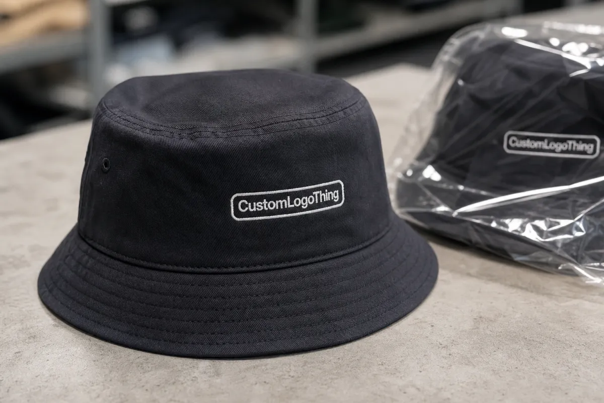
On bucket hats, the usable visual window is smaller than many buyers expect. A front-center logo may only be 2 to 3 inches wide, yet it can dominate the hat because the crown sits close to the face. Move the same mark to the side and it can feel understated, even if the artwork size stays the same. That is the practical lesson most teams learn after the first proof.
The main placement zones are simple, but each creates a different result.
- Front-center gives the clearest visibility and suits retail branding, events, and team wear.
- Front-off-center keeps the logo visible while softening the promotional look.
- Side placement feels more fashion-led and often works better for lifestyle or streetwear programs.
- Wrap-style placement can work for graphics or longer wordmarks, but it needs a wider, cleaner surface.
Bucket hats are more sensitive to placement than baseball caps because the fabric is soft and the brim changes the sightline. A cap gives a stable front panel. A bucket hat gives movement, shadow, and a lower silhouette. If the logo sits too low, the brim can cut into it. If it sits too high, it can feel disconnected from the hat. The best placement lives between those extremes.
For buyers, the fastest way to narrow the options is to answer three questions before requesting a quote: does the logo need to read from across a room, does it need to hold up in product photos, and should the hat feel premium or promotional? Those answers usually point toward a front placement, a side placement, or a smaller mark that sits slightly off-center.
Approximate placement targets also help. On many standard bucket hats, a front logo often works best around 2 to 3 inches wide, while a side mark may sit closer to 1.5 to 2.5 inches depending on the artwork. Wordmarks need more breathing room than icons, and fine text should stay large enough to survive stitching or patch construction. Tiny letters may look fine on screen and turn muddy in production.
How placement works on different bucket hat structures
The structure of the hat decides how much space is really available. Sewn bucket hats usually have panel seams that can cut through a logo path, especially on the front panel. If a design crosses a seam, the artwork often needs a shift so the edge stays clean and the stitch line does not buckle. A centered logo on paper can still look off once it is forced to follow the hat's construction.
Front-panel placement remains the strongest choice for ecommerce and retail shelves because it reads quickly in photos. Side placement works better for brands that want the hat to feel more like apparel than signage. It is less immediate, but often more wearable. That difference matters for fashion buyers, because some hats are meant to advertise a logo and some are meant to carry a mark quietly.
Crown height also affects the usable area. A deeper crown gives more room above the brim, while a shallow crown narrows the safe zone and makes oversized decoration feel cramped. On a low-profile hat, a 2-inch logo can look more balanced than a 3-inch version if the brim and seam spacing are tight. Bigger is not automatically stronger. On soft goods, proportion matters more than area coverage.
Fabric changes the read
Material changes finish and durability. Cotton twill, usually in the 260 to 340 gsm range, gives a stable surface and clean embroidery edges. Canvas holds structure well, though heavier thread fills can make it feel stiffer. Denim has texture and character, but small details may lose crispness. Washed or garment-dyed fabric looks good in fashion lines, yet the surface variation can reduce the sharpness of thin lines and tiny type.
Polyester and poly-cotton blends behave differently. They often hold up well in promotional runs and can be easier to color-match, but they may not have the same tactile feel as a heavier cotton twill. If the design relies on tiny lettering, a woven patch or printed patch usually preserves detail better than direct embroidery. That is less about style and more about the limits of thread width and stitch density.
For distribution-heavy orders, packaging matters too. If the crown gets crushed or the brim is folded too tightly, the hat can arrive looking different from the approved proof. Shipping tests from ISTA help reduce that risk, and paper-based packaging can be specified with FSC certified fiber if the program has a material requirement.
Logo size, decoration method, and cost factors
Placement and decoration method are tied together, so cost follows the placement decision. A simple front embroidery is not the same job as a seam-aware patch or a multi-color print. The more the art has to work around the hat's structure, the more setup and approval time it usually needs. MOQ also matters: smaller runs carry higher unit costs because setup is spread across fewer pieces.
For standard custom runs, a compact front embroidery on 300 to 500 hats often adds roughly $0.45 to $1.20 per hat, depending on stitch count, size, and thread changes. A custom woven patch often lands around $0.75 to $1.60. Printed patches or heat-applied graphics can fall between $0.35 and $1.40, depending on finish and complexity. Those ranges are working estimates, not fixed rules, but they help a buyer check whether a quote matches the decoration plan.
| Decoration method | Best use | Typical add-on at 300-500 pcs | What to watch |
|---|---|---|---|
| Embroidery | Simple logos, one to three colors, durable everyday wear | $0.45-$1.20 | Fine text can fill in; seam crossings need careful placement |
| Woven patch | Sharper lines, smaller type, cleaner logo borders | $0.75-$1.60 | Border shape and edge finish affect the final read |
| Printed patch | Complex art, gradients, and detailed illustration | $0.65-$1.40 | Looks flatter than embroidery but preserves detail better |
| Heat-applied graphic | Fast promotional runs and simple flat-color art | $0.35-$0.95 | Heat resistance and wash durability depend on film quality |
Three factors drive most of the price swing. First, stitch count: dense fill on a larger logo takes more machine time. Second, color count: every extra thread color adds handling, even if the finished design still looks simple. Third, placement complexity: moving the logo away from a clean flat zone or avoiding a seam usually adds prep work. Custom patch shapes, thick borders, and oversized decoration push the price up further.
Buyers get better quotes when they send the basics upfront: hat style, hat color, logo dimensions, decoration method, quantity, and target MOQ. If a supplier still has to guess the placement or redraw the artwork, the quote will be slower and usually less accurate. A clear spec also reduces revision churn, which is where many small orders lose time.
Process, proofs, and turnaround timelines
Most placement problems show up in the proof stage, not on the production floor. The usual flow is artwork review, digital mockup, proof approval, decoration, inspection, and packing. That sounds simple, but the middle step can slow everything down if the file is rough or if the placement is still undecided. One small change to logo width can alter thread charts, patch dies, and spacing around the brim.
Vector art speeds up the process. AI, EPS, or PDF files let the supplier work from clean outlines and maintain better edge quality. Low-resolution PNGs and JPGs often need redraws, especially if the logo contains thin lines or small type. That matters even more for patches, because the border needs enough margin around the art to stay clean once it is cut and sewn.
Turnaround depends on how finished the artwork already is. A straightforward single-location embroidery job can move quickly. A woven patch with multiple proof revisions, seam adjustment, or custom thread colors usually takes longer. In many production schedules, that difference is several business days, and busy periods can stretch it further. For event orders or retail launches, the safest move is to approve the artwork early enough to absorb one revision without risking the ship date.
A few habits keep the schedule under control:
- Send the final logo in vector format whenever possible.
- Confirm the exact bucket hat style before asking for placement, since shape changes the usable space.
- Approve a proof with dimensions, not just a visual mockup.
- Ask whether seam avoidance, patch tooling, or special thread changes the lead time.
- Leave a small buffer if the hats need to arrive for a fixed date.
For a simple run, the artwork-to-shipment window may be short. For custom patches or more technical embroidery, the timeline can be noticeably longer. A buyer who builds in a few extra days usually ends up with fewer surprises than one who asks production to compress every step.
Common mistakes that weaken bucket hat branding
One of the most common errors is placing the logo too low on the crown. Once the brim cuts across the front view, the mark becomes harder to read, especially when the hat is worn loosely or tilted. A logo sitting near the crown-to-brim seam can feel buried instead of intentional. That placement may look acceptable on the proof and still fail in real use.
Oversized artwork creates a different problem. A soft hat does not hold a rigid billboard shape, so a logo that stretches too wide can pucker the fabric or look compressed as soon as the panel bends. Dense embroidery makes that issue more obvious because the stitch fill fights the natural curve of the hat. Smaller, better-proportioned art often looks more expensive than art that tries to dominate every available inch.
Contrast matters more than many buyers expect. Dark thread on dark fabric can disappear in thumbnail images. A patch with low-contrast edges can flatten in retail lighting. Even a strong logo loses impact if the fabric color and decoration color sit too close together. A simple, high-contrast treatment often outperforms a complicated one because it reads in a split second.
Movement is the other overlooked factor. Bucket hats are folded, packed, adjusted, and worn again. If the placement sits too close to a seam or depends on a perfectly flat surface, it can appear off-center after normal use. The production may be correct and the hat may still look wrong in the hand. Soft goods need decoration that can tolerate motion, not just one perfect angle.
- Too low on the crown, where the brim steals visibility.
- Too wide for the usable panel space.
- Too little contrast between art and fabric color.
- Too close to seams, which can distort stitching or patch edges.
- Too much detail for the decoration method selected.
Expert checks and next steps before you quote
The last pass in a bucket Hats Logo Placement guide should be practical, not theoretical. Before requesting pricing, confirm the hat style, measure the usable front panel, choose the decoration method, and decide how visible the brand needs to be. Promotional, retail, and fashion-led hats all point toward different placement choices. It is easier to settle that early than to rework mockups after the fact.
If the team is unsure about scale, order or test a blank sample. A physical hat shows the curve, seam positions, crown depth, and how the brim changes the viewing angle. Screen mockups hide those details. A sample does not. That is often the difference between a proof that feels right and one that only looks right on a monitor.
Ask for a placement map that shows the distance from the brim, the nearest seam, and the top and side margins of the logo. That single document removes a lot of confusion. It also gives the supplier a precise target, which is the easiest way to avoid revision time. A clear map is better than an optimistic sketch every time.
A clean workflow usually follows these steps:
- Choose the hat style and color.
- Compare two placement options, usually front-center and side.
- Select the decoration method based on detail, budget, and feel.
- Request a proof with exact dimensions and seam distances.
- Approve the proof quickly so production can start on schedule.
Used well, this guide helps the hat look deliberate. The logo fits the structure, the decoration method matches the art, and the finished piece feels considered rather than forced. On bucket hats, that distinction is visible immediately.
Where is the best logo placement on a bucket hat?
Front-center usually gives the strongest read in photos and at a distance. Side placement works well if the brand wants a quieter, more fashion-forward look. The best choice depends on crown height, brim width, seam positions, and how bold the logo needs to feel.
What size should a bucket hat logo be?
Many front logos work best around 2 to 3 inches wide, but the right size depends on the hat style and decoration method. Smaller logos often look cleaner on soft bucket hats than oversized artwork. Ask for a proof with exact dimensions before production.
Is embroidery or a patch better for bucket hats?
Embroidery gives a direct sewn-in look and holds up well on simple marks, but it can struggle with fine detail or seam-heavy areas. Patches often preserve sharper lines and smaller text. The better choice depends on the artwork, budget, and finish you want.
How does logo placement affect bucket hat pricing?
Placement affects pricing when it changes stitch count, decoration size, or setup complexity. Crossing seams, using larger patches, or adding multiple colors can increase unit cost. A clear placement spec helps the supplier quote more accurately.
How long does it take to produce custom bucket hats?
Turnaround depends on artwork readiness, decoration method, quantity, and how many proof revisions are needed. Simple embroidery moves faster than custom patch work or detailed multi-step decoration. Approving artwork quickly is the easiest way to keep the schedule on track.


