Bucket hats show up in more event photos than most sponsors expect, which is why placement matters more than people assume. A logo that looks balanced on a flat proof can disappear once the hat is worn, the brim casts a shadow, or the camera catches only a side angle from ten or fifteen feet away. For outdoor events, the real test is not whether the artwork fits; it is whether it reads in motion, in sun, and in a crowd.
This is the practical side of a bucket Hats Logo Placement guide for outdoor event sponsors: choose the placement that survives real use, not the one that only looks strong on a mockup. The hat itself creates limits. The crown is soft, the brim takes up visual space, and there is rarely enough uninterrupted area for oversized art. That limitation can work in your favor if the logo is simplified early and placed with the event environment in mind.
Bucket Hats Logo Placement Guide for Outdoor Event Sponsors
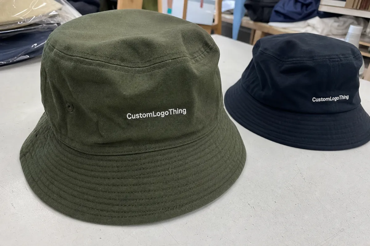
A bucket hat is small in product terms, but it is not small in photo terms. It sits high in the frame, catches light, and often remains visible even when a wearer is turned away from the camera. That makes placement strategy part branding and part camera planning. A sponsor logo does not need to dominate the hat to be effective. It needs to land where the eye naturally looks first.
Front-center placement still gives the clearest sponsor read for most outdoor programs. It is straightforward, familiar, and easy to approve because everyone understands what it will look like in use. Side placement feels quieter but can perform better for moving staff, volunteers, or activation teams who are constantly turning their heads. Lower-panel and brim-edge placements are more specialized; they suit subtle branding, premium merch, or secondary sponsor marks, but they rarely carry the main visual load on their own.
"The best logo placement on a bucket hat is usually the one that survives motion, shadow, and distance without asking for attention."
Outdoor conditions make this more demanding than an indoor giveaway. Strong sunlight can wash out thin thread on pale fabric. Wind and movement change the viewing angle every few seconds. Heat, sweat, and long wear also matter, because decoration that feels too stiff or too heavy can make the hat less likely to be worn at all. If the hat gets left in a bag, the sponsor loses the impression before the event even starts.
That is why the best decisions are usually simple: keep the placement high enough to stay visible above the brim line, give the logo enough breathing room, and match the decoration method to the material. The hat should still feel wearable. A sponsor hat that looks forced is easy to spot, and even easier to ignore.
How Logo Placement Works Across Crown, Side, and Brim
Most bucket hats give you four workable zones: front crown, side crown, lower front panel, and brim edge. Each one changes how the logo is seen. The front crown is the most direct. The side crown is often cleaner in profile photos. The lower front panel has less room and can be partially hidden by the brim, while the brim edge works best for very short marks or understated labels.
For sponsors who want obvious visibility, front-center remains the safest choice. It reads quickly in crowd shots and does not require a special camera angle to make sense. Side placement is often the better fit for crew hats because staff are constantly in motion, and profile views are common. Brim-edge decoration can look sharp on premium runs, but it should be treated as a detail, not the main event.
| Placement zone | What it communicates | Best camera angle | Best decoration method | Typical use |
|---|---|---|---|---|
| Front-center crown | Direct sponsor visibility | Head-on, slightly above | Embroidery, woven patch, heat transfer | Hero sponsor, staff hats, VIP gifts |
| Side crown | Cleaner profile read | Profile and movement shots | Embroidery, woven label, small patch | Volunteers, event teams, walk-around staff |
| Lower front panel | Subtle branding | Close-range views | Flat print, patch, low-profile embroidery | Secondary sponsor marks |
| Brim edge | Accent detail | Very close shots | Woven tab, narrow print, small tag | Retail-style or premium merch runs |
Decoration method affects the final read as much as placement does. Embroidery is durable and usually the most familiar option, but very small text can close up and thin lines can blur together. Woven patches preserve detail better and give a cleaner edge, which helps when the sponsor mark includes fine type or a complicated icon. Heat transfers can handle gradients and slim lettering, although they tend to be less tactile and less premium in hand than stitched options.
Material also changes the result. Cotton twill takes embroidery well and usually gives a clean, stable surface. Polyester ripstop is lighter and often better for outdoor wear, but it can show puckering if stitch density is too high. Brushed cotton lands somewhere in between, with a softer hand and a slightly more casual look. If the hat body is very soft, oversized embroidery can distort the crown and make the logo sit unevenly.
One practical rule helps more than any trend advice: place the logo for the way the hat will actually be worn. Staff hats should read clearly from the front and side. Giveaway hats need a graphic that stays legible when people put the hat on quickly and move back into the crowd. VIP hats can carry a more restrained placement if the finish is clean and the sponsor only needs a refined mark.
Key Factors That Change Placement Choices
The hat structure itself decides how much freedom you really have. A five-panel or six-panel bucket hat with stronger seam lines will interrupt large logos sooner than a smoother crown. Every seam creates a potential break in the art, and a line running through a letter can make an otherwise solid design look careless. Buyers often think the issue is the logo, but the real problem is usually the shape of the hat body.
Brim stiffness matters too. A very soft brim can collapse slightly and change the reading angle of the logo, especially when the wearer bends forward. A firmer brim keeps the silhouette cleaner, but it also limits where a patch can be placed without curling. That tradeoff matters more than most proofs suggest. A patch that looks perfectly flat on a table can still sit awkwardly once the hat is on a head.
Logo complexity needs to be handled early. Fine taglines, narrow outlines, gradients, and layered marks are all harder to reproduce at bucket hat scale. For embroidery, a simple mark usually performs best once stitch count is controlled. For patches, the art can hold more detail, but the image still needs to stay readable at a small size. If the logo depends on tiny copy to make sense, it should be simplified before production art starts.
Multi-sponsor events add another layer. A single hero sponsor can own the front crown without issue. Once several sponsors need recognition, the hat has to be treated with restraint. One dominant mark usually belongs on the front, while secondary sponsors move to a side placement, a woven tab, or a smaller label. That approach keeps the hat readable and avoids the cluttered look that happens when every logo is trying to be the headline.
Use case changes the priority. Staff hats need fast recognition and durability. Fan giveaways need good camera behavior and enough contrast to read from a distance. Premium hospitality hats can carry a more minimal treatment if the fabric, stitching, and logo edge all feel deliberate. The right placement is a mix of visibility, wearability, and how much control the sponsor has over the event setting.
There is also a packaging and transit angle that buyers sometimes forget. If the hats are being packed into event kits, shipped in cartons, or handed out at scale, the logo can only help if the product arrives in the right shape. Flat packing can crease a soft brim. Overstuffed cartons can crush the crown. Those details are not glamorous, but they affect whether the final product looks polished when it reaches the event floor.
Cost, Pricing, and MOQ Drivers
Placement changes price in ways that are easy to miss if you only compare hat styles. Each decoration zone adds setup work, and every added process adds time. A single front embroidery is the simplest route. Once you add a side logo, a woven patch, or a second decoration method, the quote climbs because the run now includes more proofing, more setup, and more labor.
For planning purposes, a simple front embroidery on a stock bucket hat often falls around $0.60-$1.25 per unit at moderate volume. Woven patches or more complex decoration setups commonly move into the $1.10-$2.50 per unit range, depending on size, detail, and how many color changes the design needs. The hat body itself usually sits in a separate range of about $2.10-$4.50 per unit for stock styles before decoration, with premium fabrics or custom colors costing more. These are working ranges, not fixed rates, but they help buyers spot where the budget is being spent.
| Decoration option | Setup drivers | Typical add-on per hat | MOQ pressure | Best fit |
|---|---|---|---|---|
| Single embroidery position | Digitizing, stitch count | $0.60-$1.25 | Lowest | Simple sponsor logos |
| Woven patch | Patch tooling, sew-on labor | $0.90-$1.80 | Moderate | Small text, sharper detail |
| Front plus side mark | Extra placement setup | $1.25-$2.25 | Higher | Staff hats, sponsor hierarchy |
| Patch plus embroidery | Two decoration processes | $1.50-$2.50+ | Highest | Premium sponsor-facing orders |
Minimum order quantities usually track with decoration complexity, hat color, and whether the body is stock or custom. Stock hats with a standard color can often be done in lower quantities, sometimes around 100-200 pieces, while custom color runs or built-to-order bodies may push the minimum to 300-500 or more. Multi-color logos and specialty patch finishes can also increase MOQ because they need more setup and more efficient production planning.
The most useful quote comparison is by placement, not just by style. Ask for front-only, front-plus-side, and patch-plus-embroider versions if the event has multiple sponsor levels. That makes the cost difference visible right away and keeps a small change in layout from becoming a large surprise later. It also helps the buyer explain why one version is worth the extra spend and another is not.
Production Timeline and Approval Checkpoints
Timelines are usually manageable if the artwork is ready. For stock hats with a simple decoration, a realistic schedule often looks like 1-3 business days for artwork cleanup, 1-2 days for proofing, 10-15 business days for production, and 3-7 days for transit. Patch-heavy or multi-location jobs can take longer, especially if the supplier needs a strike-off or physical sample before the run is approved.
- Artwork submission: Send vector files first. AI, EPS, and editable PDF files are the fastest starting point because the digitizer can work from clean edges and exact type shapes.
- Logo cleanup: Thin text, tiny taglines, and decorative lines are simplified so the final art still reads at hat size.
- Digital proof: The proof should show size, placement, thread or print color, and the logo's position relative to the brim line.
- Approval chain: Lock sponsor hierarchy here. Last-minute changes usually come from people who were not included in the first round.
- Sample or strike-off: Useful for premium programs or tricky placements because flat proofs do not always reveal seam distortion or stitch behavior.
- Production: The hats are stitched, printed, patched, or assembled according to the approved spec.
- Packing and shipping: Hats should be packed to protect the crown and brim shape, especially if presentation matters on arrival.
Revisions are what slow most projects down. A larger logo request, a thread color change, or a late sponsor swap can reset proofing and delay production by days. That is why the approval process has to be tight before the run starts. A clean workflow matters more than a rush order promise.
The safest timeline is the one with buffer built in. Outdoor events rarely move their date for a late hat order, and freight delays do not care how important the sponsor program is. If the hats are tied to a launch, activation, or opening day, the schedule should leave enough room for one round of corrections without putting the finish line at risk.
Common Mistakes That Weaken Sponsor Visibility
The biggest placement mistake is setting the logo too low on the crown. Once the brim starts casting a shadow, the mark can disappear in the exact photos sponsors want to collect. On a flat proof, it may look centered. On a worn hat, it can feel buried.
Another common issue is shrinking the artwork instead of editing it for the product. Fine lines, tiny type, and decorative detail often vanish in embroidery or become muddy on a small patch. If the logo cannot be recognized quickly, the hat is doing more design work than branding work.
Contrast is often underplanned. A dark logo on a dark hat can be technically visible and still fail in sunlight. Light art on a pale fabric can wash out for the same reason. Good placement without contrast is only half a solution. The color pair has to work from a distance and under changing light.
Buyers also approve the artwork from the wrong perspective. They look at a flat layout, then the event photos are taken from above, from the side, or while people are moving. A worn mockup matters more than a table mockup because the hat only has to perform in one state: on a person, outdoors, under pressure.
- Too low on the crown: The brim shadow hides the mark.
- Too much detail: Fine text and narrow lines close up in production.
- Low contrast: The logo blends into the hat color.
- Flat-only approval: The worn view tells a different story.
"If the sponsor cannot read it from the camera angle, the placement has not done its job."
Expert Tips and Next Steps for Sponsor-Ready Orders
The strongest sponsor hats usually follow one discipline: one primary logo placement, then any secondary marks are pushed into a smaller side position or a subtle label. That keeps the hat legible and gives each sponsor a clear level of importance. When every logo gets the same size and the same placement, the hat starts to look crowded instead of intentional.
Always review two versions before approving production. A flat mockup shows the layout, but a worn model photo shows how the brim changes the read. That second view is where most problems appear. It is also where the most useful decisions get made, because it reveals whether the logo sits above the shadow line and whether the hat still feels balanced on a head.
Before requesting quotes, standardize four basics: the file format, the logo owner, the decoration method, and the approval path. If those are clear, suppliers can quote faster and with fewer assumptions. That matters because quote delays often come from missing files or from two people giving conflicting instructions about placement.
A practical order checklist looks like this:
- Choose the decoration method that fits the logo structure.
- Collect vector artwork and brand color references.
- Approve the placement on a worn mockup, not only a flat proof.
- Confirm quantity, hat color, and sponsor hierarchy.
- Lock the deadline before production begins.
If the goal is sponsor visibility without clutter, the simplest path is usually the strongest one. Keep the front clear, simplify the artwork, and use secondary placements with restraint. That is the core of a good bucket Hats Logo Placement guide for outdoor event sponsors: a practical plan that respects the hat, the artwork, and the way people actually wear branded gear outside.
Where is the best bucket hat logo placement for outdoor sponsors?
Front-center placement is usually the strongest option when one sponsor needs clear visibility. Side placement works well for staff hats or situations where profile views are common. A worn mockup helps confirm that the logo stays above the brim shadow.
What logo size works best without crowding the hat?
The logo should be large enough to read from several feet away, but not so large that it fights the brim or seam structure. Thin text and fine outlines should be simplified before production. A flat art file is not enough to judge size accurately.
How does placement affect cost and pricing?
Every additional placement zone adds setup, labor, or tooling. Embroidery is usually the simplest path, while woven patches or multi-location decoration cost more. The cleanest comparison is to ask for quotes by placement option rather than by hat style alone.
How long does production usually take?
Simple stock-hat orders can move through proofing and production in a few weeks if the artwork is ready. More complex jobs take longer, especially if they need samples or multiple approval rounds. Build in time for shipping and possible revisions.
How do I place multiple sponsor logos on one bucket hat?
Give the primary sponsor the front and move secondary sponsors to a smaller side mark, woven tab, or label. Keep the hierarchy obvious so the hat still looks polished. Too many logos in the same sightline usually weakens every brand on the hat.
For outdoor event sponsors, the best bucket hat is not the busiest one. It is the one that reads clearly in photos, fits the decoration method, and arrives on time without compromising wearability.


