The Dad Hats Logo Placement guide for Fashion Boutique Orders matters because a small run has to do three jobs at once: look clean on the rack, hold up in product photos, and still feel right when a customer tries it on. A logo that is placed a few millimeters too low can read heavy and casual; the same logo lifted slightly can look sharper, more intentional, and easier to sell at boutique price points.
Here is the part many buyers miss: on dad hats, placement changes perception faster than artwork changes do. The crown curves away from the eye, the brim pulls attention downward, and even a modest shift can make a mark feel wider, taller, or simply more expensive. In practice, placement is not a decoration choice. It is a merchandising decision.
"If the logo sits low, the hat looks bargain-bin. If it sits cleanly, the whole collection looks curated."
Dad hats logo placement guide for fashion boutique orders
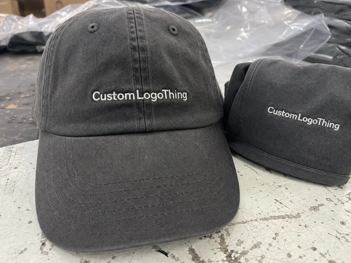
For a boutique buyer, the safest way to start is with the front panel. That is the default for a reason. It gives immediate brand recognition, it photographs cleanly, and it is easier for store staff to explain on the floor. If you are building a compact assortment for a seasonal drop, the dad Hats Logo Placement guide for fashion boutique orders should begin with the front because it keeps the message simple: customers know what brand they are buying the moment they see the hat.
Still, front placement is not one-size-fits-all. On a curved dad hat, a logo that looks balanced in flat artwork can look oversized once it wraps the crown. A shift of 3 to 5 mm can change the visual weight more than buyers expect. That is why mockups matter. The same icon can feel assertive, neutral, or clumsy depending on whether it sits centered, slightly raised, or too close to the brim seam.
For fashion boutiques, placement also affects resale appeal. Front-center embroidery usually reads more brand-forward and easier to merchandise with matching tees or sweatshirts. Off-center or side hits can feel more premium, more editorial, and less mass-market. Neither is automatically better. The right answer depends on whether the hat is meant to be a hero product or a quieter add-on in a wider collection.
Most ordering mistakes happen when a buyer treats the cap like a flat canvas. It is not. The crown depth, the softness of the fabric, and the bend of the brim all change the visual result. That is why a good dad Hats Logo Placement guide for fashion boutique orders focuses on sell-through, not just decoration.
Front panel placement rules that keep logos readable
The front panel is the most reliable choice for a clean, retail-friendly look. For simple wordmarks, a common embroidery width is about 2.25 to 3.75 inches, with many boutique orders landing near the middle of that range. Icons or compact monograms often sit well at 2.0 to 2.75 inches wide. That is not a hard rule, but it is a practical starting point for curved, low-profile hats.
Placement height matters just as much as width. On a dad hat, centered embroidery usually works best when the bottom of the design stays far enough above the brim seam to avoid distortion. If the art is too low, the stitches can dip into the curve and lose their shape. If it is too high, the logo may float and look disconnected from the cap. A slightly raised position often helps when the hat sits low on the forehead after wear.
Simple art wins here. Bold sans-serif wordmarks, single icons, and short brand names tend to stitch cleanly. Thin serif details, tiny taglines, and stacked artwork with small gaps can blur once they are stitched onto soft cotton twill or garment-washed canvas. A lower stitch density can improve flexibility, but too little density makes the logo look thin. Too much density makes the front panel stiff.
If the front art needs more than one line of text, keep the lower line very short. Many production teams start to simplify once text drops below about 0.18 to 0.20 inches tall. That is a useful guardrail. It keeps the final hat readable in photos, at arm’s length, and on a display wall where customers are moving fast.
Side and back placements for premium boutique assortments
Side-panel and back placements make sense when the goal is a quieter luxury feel. A side hit can be subtle, almost editorial. A back embroidery, especially a small arc above the opening, can feel collectible and casual at the same time. For boutiques that want to offer more than one hat style in a single drop, these placements help separate the assortment without changing the blank hat family.
There is also a merchandising advantage. The front can carry the primary brand mark, while the side or back carries a collection name, a seasonal word, or a small icon. That means one cap line can support several SKUs without looking repetitive. It also gives retailers a reason to show multiple angles in product photography, which matters because many shoppers now decide from images long before they touch the hat.
Here is the tradeoff. Subtle placements look elevated, but they are less legible at a glance. If the buyer is scanning a product grid quickly, a tiny side mark may disappear. If the hat is being worn in a street-style photo, that same placement can look refined. The placement decision therefore depends on the selling channel. DTC social content, wholesale lookbooks, and in-store racks do not reward the same design choices.
| Placement | Visual effect | Typical size | Best use | Main caution |
|---|---|---|---|---|
| Front-center | Most readable, strongest brand signal | About 2.25-3.75 in wide | Core retail styles, branded basics | Can look bulky if art is too tall or too dense |
| Side panel | Quiet, fashion-forward, editorial | About 1.0-1.5 in wide | Premium assortments, small icon marks | Lower visibility in quick product scans |
| Back arch | Casual, collectible, easy to wear | About 2.5-4.0 in wide | Collection names, small runs, multi-SKU drops | Needs clean spacing or it will crowd the opening |
One practical rule: if the front logo already has strong presence, use the side or back for detail, not for another loud message. That keeps the hat from feeling overdesigned. A boutique assortment usually benefits more from restraint than from filling every open panel.
Artwork specs, panels, and embroidery limits to check first
Before production starts, send clean vector art. That usually means AI, EPS, or PDF with outlines converted and text finalized. If a supplier asks for stitch-ready art, they are really asking for artwork that can be digitized without guesswork. Exact wording matters. So do spelling, spacing, and any punctuation. A small typo is expensive once thread hits fabric.
Hat construction changes the result more than many buyers expect. An unstructured dad hat collapses more than a structured one, so the logo often needs to sit a touch higher. A mid-profile crown can carry slightly larger art than a low-profile crown. The front panel seam, if present, also affects placement because embroidery crossing a seam can create distortion or needle stress.
Stitch limits are real. Tiny text, hairline lines, and complicated gradients do not transfer well to embroidery. A clean custom logo cap usually performs best with 1 to 3 thread colors, moderate stitch count, and bold enough linework to survive production. Once a design gets into the 5-color range or pushes toward a dense fill, the cap starts looking heavier and can cost more to stitch.
Two checks are especially useful during proof review:
- Minimum line thickness: thin strokes should be thick enough to survive digitizing and wear.
- Exact placement measurements: ask for logo width, height, and distance from the seam or brim reference point.
- Blank contrast: high-contrast combos read best; low-contrast pairs need stronger digitizing control.
If the order also includes retail inserts, hang tags, or mailer boxes, ask whether the supplier can source paper that aligns with FSC standards. For brands trying to keep packaging claims clean, that detail matters. It is not a styling issue. It is a sourcing issue.
Cost, pricing, MOQ, and unit cost drivers for small runs
For boutique buyers, price is rarely just a unit number. It is a bundle of variables. The blank hat, embroidery complexity, number of placements, thread count, digitizing, sample handling, and packaging all move the final cost. A simple single-location logo on a stock blank can be far cheaper than a two-placement design with custom labels and retail-ready folding.
As a working range, a small boutique run might land around $8 to $14 per unit for 24 to 48 pieces, depending on the blank and the embroidery. At 100 to 250 pieces, the same style may settle closer to $5.50 to $9 per unit. Blank quality changes the picture quickly. A brushed cotton dad hat with a brass buckle will cost more than a basic polyester-cotton blank with a standard strap.
Set-up and digitizing are often the hidden costs. Many suppliers charge $25 to $75 for digitizing a logo, and some will add a separate sample or proof fee. Additional placements can add $1 to $2.50 per hat because each location needs its own setup and inspection. Freight is another line item that can swing the margin more than buyers expect, especially if the run is time-sensitive.
MOQ is worth asking about early. A common minimum for embroidered dad hats is 24 to 48 pieces per design, but that can change if the order mixes colors, changes placement, or uses a less common blank. Ask whether the minimum applies per design, per color, or per placement. That one question prevents confusion later.
For buyers comparing several vendors, the cleanest starting point is a written quote that separates:
- Blank hat cost
- Digitizing or setup
- Sample or proof charge
- Per-placement embroidery fee
- Packaging and freight
If you are building a larger assortment, the Wholesale Programs page is a practical place to review order structure before you commit to a specific mix of colors and placements. A slightly bigger order can sometimes reduce the per-unit decoration cost enough to improve retail margin without making the buy feel heavy.
Production steps, proofing, and turnaround expectations
A clean order follows a predictable sequence: artwork review, digital mockup, proof approval, sample or pre-production check, bulk production, then packing and shipment. Buyers who approve proofs quickly usually get fewer delays. Buyers who keep changing placement after the quote often lose time in the queue. That sounds obvious, but it is one of the most common reasons boutique runs drift past the original plan.
Typical turnaround is often 10 to 15 business days after proof approval if blanks are in stock and the artwork is simple. Rush orders can move faster, sometimes into the 7 to 10 business day range, but only when inventory, digitizing, and approvals line up. If any part of the order needs rework, the clock resets. Color matching revisions are a frequent delay point, followed by artwork simplification and placement changes.
A useful proof should show more than a thumbnail. It should include exact logo size, placement distance from a reference point, stitch direction, thread colors, and the final hat color. If the supplier will send a first-piece photo before continuing the run, even better. That small checkpoint can save a full remake.
Shipping and carton protection matter too. If the hats are headed to a store, a pop-up, or a fulfillment center, ask how they will be packed so the crowns do not crush in transit. For more demanding distribution, packaging teams often look at ISTA test methods as a reference point for how products survive shipment. It is a simple way to think about whether the packed order will arrive ready to sell, not just ready to unpack.
For common proofing questions, the FAQ page is useful before you approve artwork. The best orders are not the fastest ones. They are the ones that move forward with the fewest assumptions.
How to compare suppliers before you place a boutique cap order
Cheap quotes can be expensive. That sounds backward, but it is true in this category. A low bid that misses placement accuracy, sends weak mockups, or hides setup fees often ends up costing more once the buyer has to approve corrections, replace misstitched hats, or explain delays to retail accounts.
Look for suppliers that can show three things without hesitation: consistent stitching, clear proofing, and responsive communication. If the first reply is vague, the production stage usually will be too. If the mockup is blurry or the placement is not measured, the order may need more back-and-forth before it is safe to run.
Quality control is not just about the embroidery itself. Ask whether the supplier checks placement on the first piece, samples the run before continuing, and sends photo proof if the design is complex. Ask how they handle misaligned logos, thread breaks, or blank shortages. A good answer usually includes a real process, not just an apology in advance.
Packaging and presentation matter for boutique sell-through. Individual polybags, clean carton labeling, careful folding, and clear color or size marks make store handling easier. If the supplier also understands retail-ready presentation, the caps arrive looking intentional instead of warehouse-like. That can save labor at receiving and helps the product hit the floor faster.
Most importantly, compare suppliers on what they include, not just the headline unit price. The strongest partner is the one that protects margin by reducing rework and keeping the order on schedule. In that sense, the Dad Hats Logo Placement guide for fashion boutique orders is also a supplier checklist.
Next steps for placing a dad hat order with confidence
Before you approve a run, lock down five things: placement, logo width, blank color, quantity, and artwork format. Then ask for a mockup that shows the design on the actual crown shape, not just on a flat cap template. If the mockup does not show measurements, ask for them. Precision here is cheaper than correction later.
A simple buyer checklist helps:
- Choose front, side, or back placement.
- Confirm the exact logo width and height.
- Prepare vector art with final wording.
- Decide whether the order needs individual polybags or retail labels.
- Request a written quote that separates setup, sample, unit cost, and shipping.
That process is straightforward, but it is not casual. A boutique cap order has to look good from 10 feet away and still feel deliberate at close range. The right placement does both. The wrong one can make an otherwise solid collection look off-balance, even if the embroidery itself is technically clean.
Use this dad hats logo placement guide for fashion boutique orders as a buying filter, not just a style note. Verify artwork, pricing, MOQ, and turnaround before you approve production, and you will cut the risk of remakes while keeping the final assortment sharper on the rack, in photos, and on the customer.
FAQ
Where is the best logo placement on dad hats for boutique orders?
Front-center is usually the most readable and works best for brand-first retail assortments. Side and back placements are stronger when you want a quieter, more premium feel. The best choice depends on how customers will see the hat in photos, on racks, and when they try it on.
What logo size works best for a custom dad hat placement guide?
Most front embroidery stays in a compact range so the design sits cleanly on the curved crown, often around 2.25 to 3.75 inches wide. Thin details, long taglines, and stacked text usually need simplification before stitching. A proof should show the exact size you plan to approve.
What MOQ should a fashion boutique expect for custom dad hats?
Many suppliers set modest minimums for embroidered dad hats, commonly 24 to 48 pieces per design, but the exact MOQ depends on the blank, placement, and decoration complexity. Mixing colors or adding extra placements can increase the minimum or change pricing. Ask whether the MOQ applies per design, per color, or per placement before you order.
How long does production usually take after proof approval?
Proofing often takes only a few days if the artwork is ready and revisions are limited. Production time depends on inventory, stitch count, and whether the supplier needs to digitize the logo first. Rush orders are possible in some cases, but they usually depend on blank availability and approval speed.
Can I mix placements or colors in one boutique dad hat order?
Often yes, if the supplier has the same blank hats available and the design stays consistent. Different placements can add setup time or extra fees because each location may need its own proof and production step. Confirm mixed-color and mixed-placement pricing before you approve the order.


