dad hats logo placement guide for Coffee Shop Merchandise sounds narrow until a sample lands on the table and the logo looks too small, too crowded, or slightly off balance on the crown. A design that feels polished on a flat mockup can change fast once it meets a low-profile cap, a curved brim, and the seams that define a dad hat. That is where merch decisions stop being theoretical and start becoming very practical.
A dad hat is a soft, unstructured cap with a curved brim and a relaxed front panel. Those details are part of the appeal, but they also create limits. The front panel does not behave like a flat canvas, and embroidery, patches, and printed marks all read differently once the fabric bends around the head. For coffee shops, that matters more than it does for a one-off promo item because the hat has to work as retail product, staff gear, and brand signage at the same time.
Most buyers do not need design theory. They need placement that reads clearly, a decoration method that matches the art, and a production plan that does not create surprises later. The right dad Hats Logo Placement guide for Coffee Shop Merchandise is the one that helps you brief the decorator cleanly, approve faster, and avoid rework.
Why Dad Hats Logo Placement Guide for Coffee Shop Merchandise Matters
A clean logo on a flat render is only a starting point. On a dad hat, the crown slopes forward, the fabric has give, and the front panel often sits lower than buyers expect. That changes the way a logo feels in real life. Marks that looked balanced in a digital proof can end up too wide for the panel, too tall for the seam line, or too close to the brim stitching.
Coffee shop merch has a slightly different job than general apparel. Hats sit beside cups, tumblers, and tote bags near the register, but they also end up on customers walking through a neighborhood, a campus, or a weekend market. The placement has to read from a few feet away, yet still feel wearable enough that someone will keep the hat after the first visit. If the logo is too aggressive, it feels like advertising. If it is too small, it disappears.
Placement is also a production decision. A decorator can only work inside the physical constraints of the cap: the center seam, the eyelets, the front panel height, and the tension of the fabric. That means a bad placement choice often becomes a digitizing issue, a stitch-count issue, or a quality-control issue. Better to settle that early than discover it after the proof is approved.
The most reliable test is simple: if someone cannot read the mark from a normal standing distance, the hat is doing too much work for the design.
For coffee shops that reorder often, consistency matters as much as the first sample. Once the placement is locked in, future runs should match the original size and position closely. A merch line gets stronger when customers can recognize the hat from one season to the next.
How Logo Placement Reads on a Curved Dad Hat
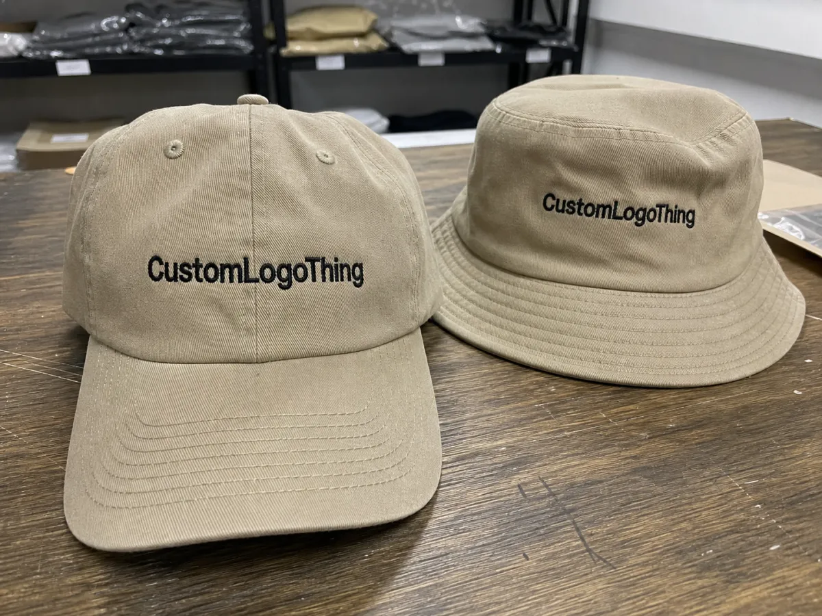
There are a few standard places to put a logo on a dad hat, and each one sends a different signal. Front-center is the most familiar retail placement. A side-panel mark feels quieter and more design-driven. A small back detail can support staff wear or a limited run. The right choice depends on how visible the coffee shop wants the branding to be.
- Front-center: Best for clear brand recognition, first-time customers, and simple logos that need quick reading.
- Front-left or front-right: Useful for understated marks, tiny icons, or hats that should feel more like fashion than promo.
- Side panel: A strong option for initials, small symbols, or staff hats that should stay subtle.
- Back arch: Works well for location text, a short tagline, or a supporting secondary mark.
The front panel is still the default starting point. It is the most visible zone, and for a lot of coffee shops that is exactly the point. The downside is that the panel also has the least forgiveness. Wide artwork can run into the seam, and dense artwork can flatten awkwardly once the hat is worn. On unstructured cotton twill or washed canvas, the front panel may shift slightly from hat to hat, so the placement should tolerate minor variation.
Bold, simple artwork usually belongs in the front. Smaller icons, initials, and text-heavy marks often work better on the side or back. If a logo depends on tiny inner details to make sense, it should probably be simplified before anyone commits to stitching or patch work.
Distance changes everything. A placement that feels polished at arm’s length may vanish when the hat is worn across a counter or across a patio table. That is why the logo placement conversation should always include real viewing distance, not only the mockup dimensions.
Placement Variables That Change the Final Look
Logo size is the first variable to check, and width causes more trouble than height. If the artwork is too wide, it starts fighting the seams and eyelets. If it is too small, the branding can feel timid on a busy shelf or disappear on dark fabric. For front embroidery on a dad hat, a common working range is about 2.25-2.75 inches tall and 3.5-4.75 inches wide, though the shape of the logo changes that range quickly.
The decoration method also shifts the result. A blocky wordmark can usually sit front and center without trouble. A round badge may feel better on the front panel or a side panel. A detailed illustration with thin interior lines may need a patch rather than direct stitching, because embroidery has a real stitch limit and fine elements can close up once thread density increases.
Color contrast matters more than many buyers expect. High-contrast thread on a medium-tone cap reads fast and clean. Low-contrast thread on a dark cap can look premium in a photo and nearly vanish under regular indoor lighting. That might be fine for a staff hat, but it is a weak choice for retail if the goal is immediate recognition.
Brand context should guide the decision. A cafe that sells mostly to first-time visitors usually benefits from a more visible front placement. A neighborhood coffee shop with regulars can get away with a quieter side mark or a small front icon because the audience already knows the brand. Same hat, different job.
Budget changes the answer too. Direct embroidery is usually the most straightforward and lowest-cost clean option. Woven patches and leather patches cost more, but they can improve legibility or give the hat a more finished feel. The right choice is not the cheapest one on paper; it is the one that matches the logo, the blank, and the shelf price the shop wants to hit.
| Decoration Method | Best Placement | Typical Add-On Cost | Best Use | Main Tradeoff |
|---|---|---|---|---|
| Direct embroidery | Front-center or small side mark | $2.25-$5.00 per hat | Simple logos, short text, everyday cafe merch | Fine detail can collapse |
| Woven patch | Front or side | $2.00-$4.50 per hat | Sharper small text and cleaner edges | Patch edge is visible |
| Leather patch | Front-center | $2.50-$6.00 per hat | Premium retail feel | Limited color detail |
| Printed patch | Front or side | $1.75-$4.00 per hat | Illustrations with more color | Less texture, more graphic look |
For coffee shop merchandise, the most reliable results usually land in the middle ground: not oversized, not tiny, and not crammed against the brim. If the placement needs a long explanation, it is probably too complicated for a hat that should sell quickly and wear comfortably.
Artwork Prep and File Setup Before You Quote
Start with a vector file if at all possible. AI, EPS, SVG, or a properly built PDF gives the digitizer clean edges to work with. A low-resolution JPEG can be fine for a web preview, but embroidery turns soft artwork into visible problems very quickly. Ragged curves, fuzzy edges, and inconsistent line weights all become more obvious once thread enters the picture.
Before asking for pricing, send the basics in one clean note: final logo file, hat color, preferred placement, estimated size, thread colors, quantity, and decoration method. That saves time and keeps the quote grounded in actual production assumptions instead of guesses. It also prevents the common problem of pricing one layout and approving another.
Mark the safe area on the mockup. The decorator needs to know what should stay away from the front seam, the brim stitching, and the eyelets. On a dad hat, even a decent logo can look odd if it is placed too high, because the crown slopes down and the visual center shifts lower than people expect. That is a small detail on a screen and a big one in the hand.
Digitizing is the translation from artwork into stitches, and stitch count affects both cost and clarity. Dense graphics with tiny fonts often need simplification. A three-line script that looks elegant on a menu board may turn into a thread-heavy mess on a cap. Good digitizing is not about preserving every pixel; it is about preserving the shape of the idea.
A proof should show more than just the logo. Ask for the placement relative to seams, the expected finished size, and the thread colors. If the order is important enough to launch a merch display, a sew-out sample is a sensible step, especially for a new placement or a more detailed mark.
Some decorators will suggest a patch when the logo is too fine for direct embroidery. That is usually a practical recommendation, not a sales pitch. A slightly simplified artwork choice often saves time, money, and disappointment later.
Production Steps, Turnaround, and Lead Time
The sequence is usually straightforward: submit artwork, confirm placement, digitize the logo, approve the proof, sample if needed, then move into bulk production. The part that slows buyers down is often not the sewing. It is the back-and-forth before sewing starts. One delayed approval can hold up the entire order.
For a simple repeat run, a realistic production window is often 12-18 business days after proof approval. New artwork, new placement, or a required sample can add 3-7 business days, sometimes more if revisions are needed. Special-order blanks can push the timeline further. That is normal planning, not a problem with the order.
Transit time is separate from production time. A hat order can finish on schedule and still arrive late if shipping is not factored in early. If the merch needs to be on the shelf for an opening weekend, holiday display, or seasonal drop, it is safer to build a cushion into the calendar rather than rely on the fastest possible ship date.
For shipping cartons and outer packaging, it is reasonable to ask whether packing follows common transit-testing logic such as ISTA protocols. That does not sound glamorous, but it helps reduce avoidable damage in transit. If you are adding hang tags, insert cards, or sleeves, ask about FSC-certified paper when the budget allows. It is a better sourcing choice than generic stock paper and easier to explain to customers who pay attention to materials.
The fastest orders tend to be the simplest ones: clear art, standard placement, stock colors, and quick approvals. The slowest orders are the ones that start with vague instructions, then add design changes after the proof is already in motion. That pattern is predictable, and it almost always costs more time than the buyer expected.
Cost, MOQ, and Unit Cost
Pricing for dad hats depends on the blank, the decoration method, the stitch count, and the quantity. For a basic cotton twill dad hat, blank cost can sit around $2.50-$5.50 per unit in wholesale conditions, with heavier washed fabrics or premium blanks climbing higher. Once decoration is added, the total can move quickly.
For small coffee shop runs, a decorated hat often lands around $8-$14 per unit for 50-100 pieces, depending on method and artwork complexity. At a few hundred pieces, the per-unit cost usually drops because setup is spread across more hats. A 24-piece test order is useful for validation, but it is rarely the cheapest way to build a retail program.
MOQ is real, even if some suppliers can do modest runs. Small embroidery orders often start in the 24-50 piece range. Better pricing usually appears once the quantity reaches a more efficient band, often 100 pieces or more. If a coffee shop is testing the market, starting small makes sense. If the first batch sells through, the reorder should be planned around the volume break that gave the best landed cost.
Before comparing quotes, ask about the extras:
- Digitizing fee: often $15-$50 for standard logos, more for complex art.
- Patch setup: sometimes included, sometimes $25-$75.
- Sample fee: common on first orders, especially for new placement work.
- Rush charge: worth confirming before you need it.
- Blank upgrade: brushed cotton, garment-washed fabric, or specialty dye can change the total fast.
Compare landed cost, not just sticker price. A quote that looks inexpensive can become more expensive after setup, freight, sample approvals, and any correction work. That is one of the most common traps in merch buying because the small lines on the invoice are easy to ignore until they are no longer small.
Common Mistakes When Ordering Cafe Merch Hats
The most frequent mistake is making the logo too large because someone wanted it to “pop.” On a dad hat, oversized art often runs into the seam line or the brim zone and starts to look crowded. The cap stops looking intentional and starts looking like the logo is fighting for space.
The opposite problem is just as common: making the mark so small that it disappears on dark fabric. A tiny logo can look refined in a mockup and nearly vanish in normal indoor light once it is stitched in black, navy, or forest green thread. If the goal is subtle branding, that may be fine. If the goal is visibility, it is a weak choice.
Approving placement before checking the real dimensions is another easy way to create trouble. Browser mockups flatten the cap and hide how much shape changes once the hat is worn. A real sample tells you more than a polished render ever will.
Style mismatch also causes problems. A playful cafe mark might work beautifully as a front patch. A detailed illustration with beans, florals, steam lines, and tiny lettering may need to be simplified before it can survive a hat. If the artwork needs a long explanation, it probably needs another pass before production.
Skipping the sample stage to save a little money can be a false economy. One awkward placement can weaken the entire merch display, especially if the hats are meant to sit alongside mugs and totes as an easy add-on purchase. Testing the first piece is usually cheaper than correcting the whole run.
One more issue shows up often: staff wear and retail merch get treated as the same brief. They are not. Staff hats can be quieter and more functional. Retail hats need broader appeal and a clearer visual payoff. A design that works for one audience can underperform for the other.
Expert Tips and Next Steps for a Clean Hat Drop
Start with one primary placement and one backup. Compare both on the same hat color before committing to a full run. A front-center version and a side-mark version can reveal what feels right in hand, on head, and on shelf.
If the coffee shop sees a lot of tourists or first-time visitors, front placement usually wins because it reads immediately. If the shop has a loyal neighborhood crowd and treats merch as part of the brand experience, a quieter side mark can feel more premium. Neither option is universally better. The audience decides.
Build a simple test matrix: two hat colors, two placements, one approved logo size. Review them in daylight rather than under office lighting that makes everything look cleaner than it really is. That small check catches more mistakes than a long internal discussion.
For reorders, lock the thread colors, confirm the final proof, and keep the quantity break that delivered the best landed price. Then set a reorder reminder before stock gets thin. Running out of a good merch item is annoying; running out while customers are still asking for it is avoidable.
The most useful Dad Hats Logo Placement guide for coffee shop merchandise is not the one with the longest list of options. It is the one that keeps the art readable, the placement honest, and the production plan realistic. Simplicity usually sells better than overdesign, especially on a soft cap with limited space.
Where should dad hats logo placement go for coffee shop merchandise?
Front-center is usually the safest choice for retail visibility. Side placement works well for quieter staff wear or minimalist branding. Keep the logo away from seams and the brim line so the cap still wears cleanly and the design stays readable.
What size logo works best on a dad hat for a cafe?
Small wordmarks and compact icons usually perform best when they stay balanced on the front panel. Wide artwork crowds the cap quickly, so measure the actual hat area before approving the design. If the logo needs more detail than the space allows, simplify the art rather than forcing a larger stitch field.
Is front embroidery or side embroidery better for coffee shop hats?
Front embroidery is usually better for retail merch that needs quick recognition. Side embroidery is a better fit when the brand wants a quieter, more understated look. The right answer depends on whether the hat is meant to act like fashion, staff uniform, or both.
How long does a custom dad hat order usually take?
New artwork and placement approvals usually add more time than repeat orders. Production time depends on quantity, decoration method, and whether a sample is required. Shipping is separate from production, so ask for both timelines before promising a launch date.
What MOQ should a coffee shop expect for custom dad hats?
MOQ varies by supplier and decoration method, but small runs are common for testing merch. Larger quantities usually lower the unit cost because setup is spread across more hats. Always ask about sample fees, digitizing fees, and rush charges before comparing quotes.


