A bucket hat can win or lose a sale before a shopper even picks it up. In resort retail, the decision often happens at arm's length and under bad conditions: glare, movement, crowded displays, and a customer who is already half-focused on the next thing. That is why a Bucket Hats Logo Placement guide for resort retail shops is less about decoration and more about merchandising discipline.
The logo is only one variable. Placement changes how the hat reads on a wall, how it looks folded in a stack, how it behaves on a head, and how much room the decoration has before seams start to interfere. A mark that feels refined in a flat mockup can become lopsided once the crown curves. Move it 10 to 15 mm and the whole product changes tone. Boutique, souvenir, youth-driven, premium: the same blank can slide between all four.
For buyers, the useful lens is practical. Match visibility to the sales environment, fit the logo to the hat structure, and keep decoration compatible with packing, pricing, and turnaround. The best results usually come from three tested zones: front crown, side panel, and brim. Under-brim placement can work too, but it changes the job. It becomes a detail for shoppers to discover rather than a mark that announces itself from the aisle.
Bucket Hats Logo Placement Guide for Resort Retail Shops
Resort retail compresses attention. Shoppers move quickly, often while carrying bags, holding drinks, or waiting in line. They are not studying headwear for two minutes. They are scanning for color, price, and brand cues, then deciding whether the hat feels like something they would actually wear on holiday. That matters because logo placement has to communicate in seconds, not sentences.
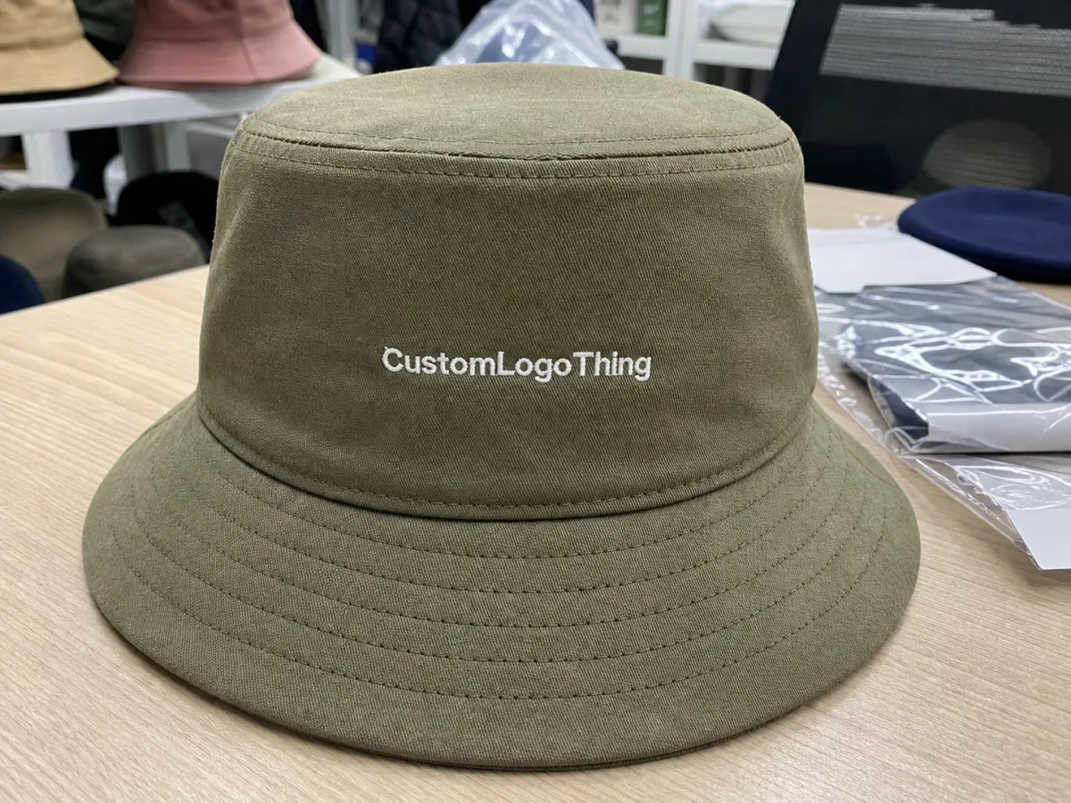
Front crown placement gives the fastest read. It is the most direct choice for souvenir racks, checkout displays, and programs that need immediate recognition. A centered mark can look clean and practical, especially when the logo itself is simple and the hat color does not fight the artwork. Side placement shifts the mood. It feels quieter and often more expensive because the brand sits off-axis instead of dominating the hat. Brim placement changes the visual hierarchy again. It can look playful, editorial, or streetwear-adjacent, but it gives up distance readability.
There is also the display question, which is easy to underestimate. A hat hanging on a peg does not look the same as a hat stacked in a cube or pressed against a mannequin head. The same logo can appear bold in one context and almost invisible in another. Buyers who only review a flat artwork proof usually discover that mismatch too late. A placement decision should be made with the shelf, hook, and packing method in mind.
"If the logo reads clearly from three feet and still feels intentional in hand, the placement is probably in the right zone."
Here is a quick comparison of the main options:
| Placement zone | What shoppers notice | Best use case | Main risk |
|---|---|---|---|
| Front crown | Immediate brand read; easiest to see from across the fixture | Souvenir lines, resort basics, logo-led assortments | Can look promotional if the artwork is too large |
| Side panel | More restrained; often feels more premium | Boutique retail, fashion-led color stories, understated branding | Can disappear if the mark is too small or too tonal |
| Brim or edge | Distinctive and style-driven | Statement styles, younger shoppers, editorial collections | Less readable from a distance and harder to line up cleanly |
| Under-brim | Hidden detail that rewards closer inspection | Premium capsules, limited drops, fashion-forward retail | Poor for fast brand recall and easy to lose in folding |
The right answer depends on the selling story. A resort shop near the beach may want fast brand visibility, while a higher-end boutique might prefer a mark that feels discovered rather than announced. That is why the bucket Hats Logo Placement guide for resort retail shops should start with the retail setting, not the logo file.
One more factor matters: the hat is both accessory and souvenir. That dual role makes placement more sensitive than on a standard cap. A logo low on the crown may look tidy on a board but warp when worn. A mark pushed too high can vanish once the hat is folded into luggage. The best placement survives both states.
Logo Size, Materials, and Placement Rules That Matter
The blank determines how much freedom you really have. A six-panel bucket, a four-panel bucket, and a soft low-profile shape do not behave the same way. Curved surfaces pull graphics in different directions, and seam lines can make a centered logo look off even when the digitizing is accurate. That is why some placements that look fine in an artwork deck turn awkward the moment the first sample arrives.
Size is the next constraint. Small marks can look elegant, but only if the line work survives the material. Fine lettering, thin outlines, and delicate icons tend to break down on textured fabric or in direct sun. Medium sizing usually gives the best trade-off for resort retail: readable from several feet, still polished up close, and less likely to dominate the crown. Oversized decoration can work, but it has to be intentional. If it spreads too far down the side or wraps over multiple panel joins, the hat starts to feel like advertising rather than retail merchandise.
Material choice changes the outcome as much as placement. Cotton twill holds embroidery well and gives a familiar retail hand feel. Washed cotton softens the finish and makes the hat feel more casual, though the texture can blur tiny details. Nylon and polyester blends are lighter and often better for bright-weather wear, but they can show puckering if the stitch density is wrong. Terry cloth, canvas, and blended fabrics each bring their own limits. A mark that looks crisp on canvas may not behave the same on terry or a brushed surface.
Decoration method should follow the artwork, not the other way around. Embroidery remains the standard for many bucket hats because it gives texture and survives rough handling better than a printed effect on the same blank. Woven patches handle small lettering and multi-color logos more cleanly. Heat transfers can work for sharp graphics and short runs, but they depend on clean application and a substrate that will not fight the adhesive. Woven labels are useful when the brand wants a quieter look, though they are usually better as a secondary cue than as the main logo.
If you want a supplier brief that actually helps production, use concrete ranges instead of vague adjectives:
- Front crown: often around 30 to 45 mm tall for a balanced retail read.
- Side panel: often around 22 to 35 mm tall for a more restrained look.
- Brim or edge: usually works best with simple artwork and fewer fine lines.
- Under-brim: best for compact marks that stay crisp at smaller sizes.
Color contrast deserves more attention than it usually gets. Resort assortments often lean toward stone, sand, olive, navy, white, and faded pastels. Those shades photograph well, but some of them swallow low-contrast logos. A gold thread on a tan cap may look rich in hand and vanish on a sunlit display wall. A navy patch on deep green may read as one dark shape instead of two separate elements. If the logo cannot be identified quickly in the aisle, the placement has not done its job.
There is also a packing reality. If the hat will be folded, polybagged, or inserted into a retail carton with a hang tag, the decoration needs to survive that sequence. The same logic behind transit testing applies here: the product may look perfect leaving the machine and still fail after compression, stacking, or repeated handling. For printed inserts or hang tags, FSC-certified stock can be a meaningful detail when a retailer tracks paper sourcing, so FSC remains relevant if the program includes collateral.
For general shipping resilience standards, organizations such as ISTA are useful reference points. Their work exists because physical products do not stay pristine by luck. Headwear is no different once it is compressed into cartons, unpacked, and returned to display.
Production Process and Turnaround Timeline
Good production starts before the sample. A clean vector file, a defined color target, and a placement spec with measurements save time that would otherwise disappear into corrections. The usual sequence is straightforward: artwork submission, digitizing or artwork conversion, proofing, sample review, bulk production, inspection, and packing. None of those steps is exotic. The delays come from unclear instructions and late-stage changes.
Simple placements move faster. A front crown embroidery with two or three thread colors is easier to approve than a brim design with multiple alignment points or an under-brim print that needs exact registration. In many programs, a basic order can land in the 12 to 15 business day range after proof approval. More complex runs, especially those using patches, mixed materials, or multiple decoration stages, often need 18 to 25 business days. Shipping sits outside that window and can swing with season, port conditions, and destination.
The most common delay is not manufacturing; it is indecision. Late artwork revisions, a request to shift the logo after the sample is already built, or internal approval loops that stall for days can push a clean order into a crowded production queue. Resort programs are especially sensitive to this because buy windows are seasonal. Miss the launch date and the hat may still arrive, but the selling moment has passed.
Sampling should include more than a visual check. The hat should be evaluated on head, folded once or twice, and compared against the carton or retail pack format. If the logo sits in a crease line or the placement looks different on a larger head size, the sample is not ready. A ruler, a spec sheet, and a second set of eyes prevent a lot of regret.
Quality control should look for measurement tolerance, stitch consistency, and fabric distortion. A practical tolerance for placement is usually within a few millimeters, but the exact acceptance range depends on the decoration method and the visual weight of the logo. Thicker embroidery can hide a small drift. Fine-line graphics cannot. Thread tension also matters. Too tight, and the fabric puckers. Too loose, and the logo loses shape. On bucket hats, that problem shows up faster than on stiffer headwear because the fabric moves more.
Logo Placement Cost, MOQ, and Quote Factors
Price is usually driven more by setup than by the blank itself. Digitizing, patch tooling, stitch count, thread changes, and placement complexity all add cost. If the artwork includes tiny detail, the supplier may need extra stabilization or a different decoration method. If the logo sits near a seam or runs across a curved area, the sample stage may take more than one pass. None of that is hidden machinery. It is just the price of making fabric behave.
MOQ follows the same logic. A simple front embroidery on a standard blank generally supports lower quantities than a woven patch with custom edges or a mixed-finish design that combines embroidery and print. More setup usually means a higher minimum. That is not a sales tactic; it is how factories keep cutting, sewing, decorating, and packing efficient enough to quote the job at all.
For buyers, the best quote request is the one that removes guesswork. Include the exact logo size in millimeters, the placement zone, the hat color, fabric type, quantity by colorway, packaging needs, and delivery destination. If any of those pieces are missing, the quote can look attractive at first and then expand once sample changes begin. Clear specs usually save more money than aggressive price shopping.
| Decoration option | Typical setup | MOQ pressure | Indicative decoration cost at scale |
|---|---|---|---|
| Embroidery | Digitizing and stitch programming | Usually the easiest to keep lower | About $0.35 to $0.95 per hat |
| Woven patch | Patch construction and application setup | Medium, especially with custom shapes | About $0.55 to $1.30 per hat |
| Printed transfer | Artwork prep and heat-press workflow | Moderate if the art is simple | About $0.20 to $0.60 per hat |
| Under-brim decoration | Extra alignment and finishing checks | Usually higher because placement control is tighter | About $0.30 to $0.75 per hat extra, depending on setup |
Those numbers are only useful if they are read in context. A low decoration cost on a poor-selling style is not a bargain. A more expensive placement that improves sell-through, display quality, and perceived value can be the better buy. The bucket hats logo placement guide for resort retail shops is really a margin guide in disguise: protect the retail story first, then negotiate the unit cost.
For broader budget planning, a simple resort bucket hat program often lands somewhere in the $3.50 to $12 landed range per piece depending on blank quality, decoration method, quantity, and packing. Premium materials, specialty patches, or tighter lead times push higher. Thin margins do not forgive sloppy placement, and the cheapest-looking hat on the table is rarely the one that wins repeat orders.
Common Mistakes That Make Bucket Hats Look Off
The most common mistake is placing the logo too close to a seam or too low on the crown. Once the hat is worn, the graphic can tilt, wrinkle, or sit inside a fold line. Buyers often spot the issue only after the first sample arrives. The logo itself may be fine. The placement is what fails.
Overcomplicated artwork causes a second set of problems. Tiny text, thin outlines, and too many color shifts rarely improve a bucket hat. They raise the production risk, slow down sampling, and usually read worse in retail lighting. If the design cannot be understood from several feet away, it is probably asking too much of the fabric.
Low contrast is another silent failure. Neutral hats sell well in resort settings because they match beachwear and travel wardrobes, but beige-on-beige or sand-on-stone can disappear in bright stores and in social photos. A logo that disappears under fluorescent light or sunlight is not a branding choice. It is a miss.
Many teams also approve only one size sample. That is too narrow. The same placement can look balanced on a small head and awkward on a larger one, especially if the crown is shallow or the brim is soft. Test the sample on different head sizes and hair volumes. It takes minutes. It avoids a lot of rework.
Folding needs its own check. Resort customers fold hats differently, tuck them into bags, and sometimes compress them into luggage pockets. If the logo sits where the fabric creases sharply, wear and presentation can degrade fast. A proper sample should be reviewed in hand, on head, and folded once or twice. If it fails one of those conditions, it is not ready for bulk.
Material mismatch can also ruin a good design. A dense embroidered mark on a lightweight nylon body may pucker. A printed transfer on brushed fabric may soften at the edges. A woven patch on a very soft crown can pull the hat out of shape if the backing is too stiff. The blank and the decoration have to agree with each other. That sounds obvious. It is also where many programs go wrong.
Expert Tips and Next Steps for Buyers
Request two or three placement mockups if the collection matters to your retail presentation. A front crown sample, a side placement sample, and one more expressive option can tell you more than a week of emails. Put them on a rack, step back five feet, and view them from the angle customers will actually have. The best option usually becomes obvious once it is in context.
Do not treat the hat as a standalone object. The hang tag, polybag, carton, and shelf signage all affect how expensive or cheap the product feels. If the hat looks premium but the pack-out is sloppy, the value drops. If the insert uses recycled stock or FSC-certified paper, keep the language straightforward and factual. Buyers need coherence more than a sustainability speech.
Before approval, ask for a pre-production sample and confirm the logo location with a ruler or spec sheet. One master reference should govern the run. Write down the distance from the seam, the top edge, and the centerline if there is any room for confusion. That one page saves time later, especially when sales, artwork, and production teams are all reading the same order differently.
For most resort programs, the smartest sequence is simple: gather vector artwork, choose the primary placement, confirm budget and timeline, and send one clear specification sheet for quoting and sampling. That is the practical way to use a bucket hats logo placement guide for resort retail shops without drowning the project in revisions. When the placement is right, the product looks better, sells faster, and needs fewer corrections.
FAQ
Where is the best logo placement on bucket hats for resort retail shops?
Front crown placement usually gives the fastest brand recognition on display, especially for souvenir and resort-basic assortments. Side placement feels quieter and often more premium in boutique settings. The best choice depends on how the hats will be shown: stacked, hung, folded, or placed on mannequins.
Does brim logo placement work for bucket hats sold in resorts?
Yes, but it suits fashion-led assortments better than fast-recognition branding. Brim placements can look distinctive and editorial, yet they are harder to read from a distance. They work best when the design stays clean at a small size and still looks good after folding.
What affects bucket hat logo placement cost and MOQ?
Embroidery stitch count, patch construction, digitizing complexity, and alignment difficulty are the biggest cost drivers. MOQ often rises when the decoration method needs more setup or multiple materials. Special colors, custom packaging, and under-brim decoration can also push the quote upward.
How long does production usually take for custom resort bucket hats?
Simple orders can move in about 12 to 15 business days after proof approval, while more complex runs often need 18 to 25 business days. Sampling, revisions, and shipping all add time. Extra buffer helps if you need multiple placement tests, mixed materials, or retail packaging that must land on a fixed store date.
What is the safest logo size for bucket hats in retail displays?
Medium-sized logos usually balance readability and a premium look better than oversized marks. Keep the design clear at arm's length, then test it on the actual hat shape before approving the sample. If the logo includes fine detail, simplify it before shrinking the placement zone; that is the most useful version of a bucket hats logo placement guide for resort retail shops.


